(Practice) PropTypes
Below is a link to an unfinished, mini React app. Your job is to analyze the props that are being passed to the Badge component, then, using propTypes , validate each one.
In the Codepen, the prop-types package has already been included for you. You can access it via PropTypes .
Practice Problem
(Solution) PropTypes
Solutions
(Project) Language Nav PropTypes
The code for this video can be found here.
The commit for this video can be found here.
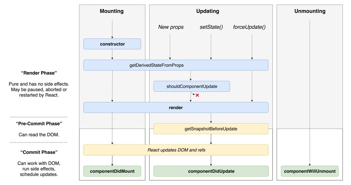
The Component Lifecycle
With React, it’s all about components. In their most basic form, components can manage their own state, receive data via props, and describe their UI. Unfortunately, when building complex applications, components have to take on a few more responsibilities. Things like Ajax requests, setting and removing listeners, and reacting to new props are all tasks that fall within the component’s responsibility. In this post, we’re going to look at how we can hook into different moments in a component’s lifecycle in order to accomplish these tasks.
The Component Lifecycle
Every time your React app runs, all of your components go through a specific lifecycle. You can break down that lifecycle into three parts.
- When the component gets added to the DOM (mounting).
- When the component updates its state or receives new data via props (updating).
- When the component gets removed from the DOM (unmounting).
1. Mounting
For a moment, I want you to think about everything that may need to occur in a typical application during and when a component is mounted to the DOM.
Here are the most common ones (in order in which they occur).
- Set the component’s initial state
- Render a DOM node
- Make an Ajax request
- Set up listeners (i.e. via Websockets or Firebase)
Now let’s take that list, and look at which lifecycle methods of a component we’d use to accomplish each one.
Set the component’s initial state
To set the initial state of the component, you’ll use the constructor method. constructor is the first lifecycle method that will be invoked.
constructoris part of the ES6 class spec; it’s not React specific.
class Hello extends React.Component {
  constructor(props) {
    super(props)

    this.state = {
      name: 'Tyler'
    }
  }
  render() {
    return (
      <h1>Hello, {this.state.name}</h1>
    )
  }
}
Render a DOM node
Once the initial state of the component is set using constructor , the next lifecycle method to be called is render . Though you’re not exactly rendering a DOM node yourself, you’ll use the render lifecycle method in order to describe (using JSX) the type of DOM node you want to render.
It’s important that render is a pure function. It shouldn’t do anything other than examine the component’s state and props and return a description of the UI.
class Badge extends React.Component {
  render() {
    return (
      <React.Fragment>
        <h1>{this.props.name}</h1>
        <p>{this.props.profile}</h1>
      </React.Fragment>
    )
  }
}
Make an Ajax request
If constructor is used to set the initial state of a component and render needs to be a pure function, where do we make Ajax requests? This brings us to our next React specific lifecycle method, componentDidMount .
componentDidMount is invoked only one time when the component is first mounted to the DOM. Because of this, it’s a great place to make an Ajax request.
class Home extends React.Component {
  constructor(props) {
    super(props)

    this.state = {
      user: null
    }
  }
  componentDidMount() {
    fetchUser(this.props.username)
      .then((user) => {
        this.setState({ user })
      })
  }
  render() {
    if (user === null) {
      return <Loading />
    }

    return <Dashboard data={this.state.user} />
  }
}
Set up listeners
Similar to making an Ajax request, we want to set up any listeners once the component has been mounted to the DOM, i.e., in componentDidMount .
At this point we’ve seen how we can use constructor , render , and componentDidMount to accomplish tasks for during and after a component is mounted to the DOM. Next is when the component gets updated with new props.
2. Updating
Like we did above, can you think of a real example for when we’d want to hook into when a component updates its state or receives new data via props?
Here’s my list.
- Re-render the UI with the updated state or props
- Re-fetching data
- Re-setting a listener
Re-render
We saw earlier how render allowed us to describe our UI. It’s important to note that render will be invoked not only when the component is first added to the DOM, but also any time after that when its state changes (via setState ) or when it receives new, updated props. This is the reason we say that in React, your View is a function of your State. You just worry about how your state and props update and React will take care of re-rendering and updating the DOM.
Re-fetching data
Earlier we used componentDidMount to make an initial Ajax request. We learned that componentDidMount is only invoked once right after the component is mounted to the DOM. It’s common to need to re-fetch data without having to re-mount the component. This is where another React specific lifecycle method can help us out, componentDidUpdate .
componentDidUpdate is invoked after the component’s local state changes or after it receives new props - but it’s not invoked on the initial render. It’s passed two arguments, the component’s previous props and the component’s previous state. This allows you to compare the previous props/state to the current props/state so you can decide if you need to do anything.
Imagine we were using the Github API to fetch the popular repositories for whatever props.language was. We’d want to make our initial request inside of componentDidMount and then anytime props.language changed, we’d want to re-fetch the popular repositories. This would be a perfect use case for componentDidUpdate .
class Repos extends React.Component {
  constructor(props) {
    super(props)

    this.state = {
      repos: null
    }
  }
  componentDidMount() {
    fetchRepos(this.props.language)
      .then((repos) => {
        this.setState({ repos })
      })
  }
  componentDidUpdate(prevProps, prevState) {
    if (this.props.language !== prevProps.language) {
      this.setState({repos: null})

      fetchRepos(this.props.language)
        .then((repos) => {
          this.setState({ repos })
        })
    }
  }
  render() {
    if (this.state.repos === null) {
      return <Loading />
    }

    return <Grid data={this.state.repos} />
  }
}
Re-setting a Listener
Similar to re-fetching data, you’d use componentDidUpdate to listen for prop/state changes in order to re-set a listener.
At this point we’ve seen how we can use constructor , render , and componentDidMount to accomplish tasks for during and after a component is mounted to the DOM. We’ve also seen how we can use componentDidUpdate to accomplish tasks for when a component’s state changes or it receives new props. Next is when the component gets removed from the DOM.
Unmounting
Can you think of anything we’d want to do when a component gets removed from the DOM? Typically, this is where you’ll do some “cleanup”. For example, if you set up a listener inside of componentDidMount or componentDidUpdate , you’ll want to make sure you remove that listener once the component has been removed from the DOM. If you don’t, hello memory leaks. To do this, you can hook into React’s componentWillUnmount lifecycle method. It’ll be called when the component is about to be removed from the DOM.
class Repos extends React.Component {
  constructor(props) {
    super(props)

    this.state = {
      repos: null
    }
  }
  componentDidMount() {
    this.removeListener = listenToRepos(this.props.language, (repos) => {
      this.setState({ repos })
    })
  }
  componentWillUnmount() {
    this.removeListener()
  }
  render() {
    if (this.state.repos === null) {
      return <Loading />
    }

    return <Grid data={this.state.repos} />
  }
}
Here’s an overview of the methods we covered.
class App extends React.Component {
  constructor(props) {
    // Good for establishing the initial state of a component
    super(props)
    this.state = {}
  }
  componentDidMount(){
    // Invoked once the component is mounted to the DOM.
    // Good for making AJAX requests.
  }
  componentDidUpdate(){
    // Invoked immediately after updating occurs.
    // Good for AJAX requests based on changing props or DOM operations.
  }
  componentWillUnmount(){
    // Called right before a component is unmounted.
    // Good for cleaning up listeners.
  }
  render() {
    return ...
  }
}
There are a few other lifecycle methods that are available to you. However, they’re rare, and you’ll almost always be just fine using the ones we covered. If you’re curious, they are getDerivedStateFromProps , shouldComponentUpdate , getSnapshotBeforeUpdate .
If it helps you, here’s a great lifecycle diagram built by Dan.
(Project) Fetch Repos
The code for this video can be found here.
The commit for this video can be found here.
(Project) Caching Repos
The code for this video can be found here.
The commit for this video can be found here.
React Icons
A fundamental part of any UI is the icons. Instead of including our own icons, we’ll leverage the react-icons package from NPM. react-icons will give us access to all the icons available in Font Awesome, Ionicons, Material Design, Github Octicons, and more.
As you’d expect, the API is pretty simple. You use a named import to import the icon component you want then you can customize it via its props.
Importing
The import path is different depending on which icon set you want to use.
// Font Awesome
import { FaIconName } from 'react-icons/fa'

// Material Design
import { MdIconName } from 'react-icons/md'

// Ionicons
import { IoIconName } from 'react-icons/io'

// Github Octicons
import { GoIconName } from 'react-icons/go'
For a full list of the icons available, visit their site.
Customizing
The main 3 props you’ll use to customize each icon are size , color , and className .
size is an integer and allows you to change the size of the icon. color is a string and allows you to set the color of the icon. className is a string and allows you to apply a CSS class to the svg element that is rendered.
(Project) Repositories Grid
The code for this video can be found here.
The commit for this video can be found here.
(Project) Battle Instructions
The code for this video can be found here.
The commit for this video can be found here.
Controlled vs Uncontrolled Components
With React, instead of having the state of your app live inside of the DOM, it lives inside of your React components. Historically when you’re dealing with forms, the opposite is usually true. The form state lives inside of the DOM (specifically in an input field), and whenever you need it, you grab it from the DOM. So assuming both of those things are true, how do you go about handling form state with React? Should the form state live in the DOM or inside of a React component? This question is at the heart of the difference between what are called “Controlled Components” and “Uncontrolled Components”.
With “Controlled Components”, you do things the “React way”. The form state lives inside of the component’s state and the value of the input field is whatever the value on the component state is. If you want to update the input field, you have to update the component state.
“Uncontrolled Components” are the opposite. You don’t have any component state and instead, the form state lives inside of the DOM (or the input ) field. Then, whenever you need to get the state, you grab it from the DOM.
Let’s see some code.
Controlled Component
You can play around with the live version here .
class Form extends React.Component {
  constructor(props) {
    super(props)

    this.state = {
      email: ''
    }

    this.handleChange = this.handleChange.bind(this)
    this.handleSubmit = this.handleSubmit.bind(this)
  }
  handleChange(e) {
    this.setState({
      email: e.target.value
    })
  }
  handleSubmit() {
    alert('The email is ' + this.state.email)
  }
  render() {
    return (
      <div>
        <pre>The email is {this.state.email}</pre>
        <br />
        <input
          type='text'
          placeholder='Email'
          value={this.state.email}
          onChange={this.handleChange}
        />
        <button onClick={this.handleSubmit}>Submit</button>
      </div>
    )
  }
}
The take away here is the value prop on the input field. Notice we’re saying that the value of input is always going to be whatever this.state.email is. That means, in order to change the text inside of the input field, we need to update this.state.email . This is the essence of a Controlled Component. React is in control of the email state. When we need to access whatever the email is (like in handleSubmit ), we access it just like we would any other property on our component’s state, by using this.state.email .
Uncontrolled Component
Now instead of having the state of our form live inside of a React component, we’ll have it live inside of the DOM. To do this, we’ll use React’s createRef method and pass that ref to our input . By doing this, we’ll be able to reference the input DOM node directly to grab its value.
You can play around with the live version here .
class Form extends React.Component {
  constructor(props) {
    super(props)

    this.input = React.createRef('')
    this.handleSubmit = this.handleSubmit.bind(this)
  }
  handleSubmit() {
    alert('The email is ' + this.input.current.value)
  }
  render() {
    return (
      <div>
        <input
          type='text'
          placeholder='Email'
          ref={this.input}
        />
        <button onClick={this.handleSubmit}>Submit</button>
      </div>
    )
  }
}
The first thing you’ll notice is there’s no more state. Instead, we create a new ref, then pass that as a ref prop to our input field. Then, anytime when we need to access the value of our input field (like in handleSubmit ), we can grab it with this.input.current.value .
Now the big question, should you use a Controlled component or an Uncontrolled component? In my opinion, you should favor Controlled components. The whole point of React is to give React control of your state. Controlled components align better with that model.
Also, you may have noticed we had to remove <pre>The email is {this.state.email}</pre> from our Uncontrolled Component. The reason for this is because the state of email lives in the DOM, React doesn’t re-render whenever it changes. If you want to update the UI based on a piece of form state, you need to use Controlled components or else the UI won’t update.
(Project) Player Input
The code for this video can be found here.
The commit for this video can be found here.
(Project) Render PlayerInput
The code for this video can be found here.
The commit for this video can be found here.
(Project) Player Preview
The code for this video can be found here.
The commit for this video can be found here.
(Project) Result’s Skeleton
The code for this video can be found here.
The commit for this video can be found here.
(Project) API
The code for this video can be found here.
The commit for this video can be found here.
(Project) Result’s Data
The code for this video can be found here.
The commit for this video can be found here.
(Project) Result’s UI
The code for this video can be found here.
The commit for this video can be found here.
children in React
At this point, you should be comfortable with props. As you’ve seen, props are how you pass data into components. You pass data to components just like you’d set attributes on regular HTML elements.
<a href='/' class='link'>Home</a>

<Clock time='12:49' period='AM' />
Now thinking more about regular HTML elements ( span , div , etc), is there any other way that we’re able to pass information to the element? What about the text Home in our a tag above? As part of the API for almost every HTML element, you can pass data via the opening and closing tag of the element.
<h1>You can have text between tags.</h1>

<div>
  <h1>You can also have</h1>
  <p>elements between tags</p>
</div>
Now, what if instead of those being regular HTML elements, they were React components?
<Header>You can have text between tags.</Header>

<Container>
  <h1>You can also have</h1>
  <p>elements between tags</p>
</Container>
Now, instead of passing data (props) into the component via setting attributes as we usually would, we’re passing data into the components via the opening and closing tags. How would we go about implementing those? And more specifically, how would we get access to the data inside of the opening and closing tag of the element? React makes this simple. Whatever is between the opening and closing tag of an element will be accessible inside of the component via props.children .
function Header ({ children }) {
  return (
    <h1 className='header'>
      {children}
    </h1>
  )
}

function Container ({ children }) {
  return (
    <div>
      <Logo />
      {children}
    </div>
  )
}
As you can see with both of our implementations, this API is nice as it allows you to abstract common UI/functionality into its own reusable component.
(Project) Reusable Card Component
The code for this video can be found here.
The commit for this video can be found here.
(Project) Profile List
The code for this video can be found here.
The commit for this video can be found here.
(Project) Reset Players
The code for this video can be found here.
The commit for this video can be found here.
Default Props
There are times when you’ll want to set default props for a component. For example, say we were building a “Star Rating” component that rendered the following UI.
The gold color for the stars is nice, but that’s an option we’d want to give the consumer of our component the ability to customize. We can do that by adding a color prop.
<StarRating color='#ff0000' />
Now, what would happen if they used our component without passing it a color prop?
<StarRating />
Well, it would depend on the implementation of StarRating but the most likely scenario would be that the backgroundColor of the star is set to this.props.color , which is now undefined .
What we want is a way to allow the consumer of our component to specify a color prop, but if they don’t, have a reasonable default in place (i.e., a gold color). There are different ways to accomplish this depending on if you’re using a class component or a function component.
Class component - Default Props
If you’re using a class component, you’ll add a static property of defaultProps to your class. defaultProps is an object whose keys represent the props being passed to the component and whose values are the default values for those props. In our example, we want color to have a default value of #ECB244 .
class StarRating extends React.Component {
  ...
}

StarRating.defaultProps = {
  color: '#ECB244'
}
Now, if someone consumes our StarRating component without passing in a color prop, props.color will default to #ECB244 .
Function Component - Default Props
ES6 introduced a new feature called Default Parameters. Default Parameters allow you to set default values for any arguments that are undefined when a function is invoked. Because function components are just functions, we can use Default Parameters (along with destructuring) to set a default value for any props that are passed to our function component.
function StarRating ({ color = '#ECB244' }) {
  ...
}
Now, if someone consumes our StarRating component without passing in a color prop, color will default to #ECB244 .
(Project) Loading Component
The code for this video can be found here.
The commit for this video can be found here.
Higher Order Components
There are two important things to note before we get started. First, what we’re going to talk about is just a pattern. It’s not even a React thing as much as it is a component architecture thing. Second, this isn’t required knowledge to build a React app. You could skip this post, never learn what we’re about to talk about, and still build fine React applications. However, just like building anything, the more tools you have available, the better the outcome will be. If you write React apps, you’d be doing yourself a disservice by not having this in your “toolbox”.
You can’t get very far into studying software development before you hear the (almost cultish) mantra of Don't Repeat Yourself or D.R.Y . Sometimes it can be taken a bit too far, but for the most part, it’s a worthwhile goal. In this post, we’re going to look at the most popular pattern for accomplishing DRY in a React codebase, Higher-Order Components. However before we can explore the solution, we must first fully understand the problem.
Let’s say we were in charge of recreating a dashboard similar to Stripe’s. As most projects go, everything goes great until the very end. Just when you think you’re about to be done, you notice that the dashboard has a bunch of different tooltips that need to appear when certain elements are hovered over.
There are a few ways to approach this. The one you decide to go with is to detect the hover state of the individual components and from that state, show or not show the tooltip. There are three components you need to add this hover detection functionality to - Info , TrendChart and DailyChart .
Let’s start with Info . Right now it’s just a simple SVG icon.
class Info extends React.Component {
  render() {
    return (
      <svg
        className="Icon-svg Icon--hoverable-svg"
        height={this.props.height}
        viewBox="0 0 16 16" width="16">
          <path d="M9 8a1 1 0 0 0-1-1H5.5a1 1 0 1 0 0 2H7v4a1 1 0 0 0 2 0zM4 0h8a4 4 0 0 1 4 4v8a4 4 0 0 1-4 4H4a4 4 0 0 1-4-4V4a4 4 0 0 1 4-4zm4 5.5a1.5 1.5 0 1 0 0-3 1.5 1.5 0 0 0 0 3z" />
      </svg>
    )
  }
}
Now we need to add functionality to it so it can detect whether it’s being hovered over or not. We can use the onMouseOver and onMouseOut mouse events that come with React. The function we pass to onMouseOver will be invoked when the component is hovered over and the function we pass to onMouseOut will be invoked when the component is no longer being hovered over. To do this the React way, we’ll add a hovering state property to our component so that we can cause a re-render when the hovering state changes, showing or hiding our tooltip.
class Info extends React.Component {
  state = { hovering: false }
  mouseOver = () => this.setState({ hovering: true })
  mouseOut = () => this.setState({ hovering: false })
  render() {
    return (
      <div onMouseOver={this.mouseOver} onMouseOut={this.mouseOut}>
        {this.state.hovering === true
          ? <Tooltip id='info' />
          : null}
        <svg
          className="Icon-svg Icon--hoverable-svg"
          height={this.props.height}
          viewBox="0 0 16 16" width="16">
            <path d="M9 8a1 1 0 0 0-1-1H5.5a1 1 0 1 0 0 2H7v4a1 1 0 0 0 2 0zM4 0h8a4 4 0 0 1 4 4v8a4 4 0 0 1-4 4H4a4 4 0 0 1-4-4V4a4 4 0 0 1 4-4zm4 5.5a1.5 1.5 0 1 0 0-3 1.5 1.5 0 0 0 0 3z" />
        </svg>
      </div>
    )
  }
}
Now we need to add the same functionality to our other two components, TrendChart and DailyChart . If it’s not broke, don’t fix it. Our hover logic for Info worked great so let’s use that same code again.
class TrendChart extends React.Component {
  state = { hovering: false }
  mouseOver = () => this.setState({ hovering: true })
  mouseOut = () => this.setState({ hovering: false })
  render() {
    return (
      <div onMouseOver={this.mouseOver} onMouseOut={this.mouseOut}>
        {this.state.hovering === true
          ? <Tooltip id='trend' />
          : null}
        <Chart type='trend' />
      </div>
    )
  }
}
You probably know the next step. We can do the same thing for our final DailyChart component.
class DailyChart extends React.Component {
  state = { hovering: false }
  mouseOver = () => this.setState({ hovering: true })
  mouseOut = () => this.setState({ hovering: false })
  render() {
    return (
      <div onMouseOver={this.mouseOver} onMouseOut={this.mouseOut}>
        {this.state.hovering === true
          ? <Tooltip id='daily' />
          : null}
        <Chart type='daily' />
      </div>
    )
  }
}
And with that, we’re all finished. You may have written React like this before. It’s not the end of the world (#shipit), but it’s not very “DRY”. As you saw, we’re repeating the exact same hover logic in every one of our components.
At this point, the problem should be pretty clear, we want to avoid duplicating our hover logic anytime a new component needs it . So what’s the solution ? Well before we get to that, let’s talk about a few programming concepts that’ll make the step to understanding the solution much easier, callbacks and higher-order functions .
In JavaScript, functions are “first-class objects”. What that means is that just like objects/arrays/strings can be assigned to a variable, passed as an argument to a function, or returned from a function, so too can other functions.
function add (x, y) {
  return x + y
}

function addFive (x, addReference) {
  return addReference(x, 5)
}

addFive(10, add) // 15
Your brain might have got a little weird on this one if you’re not used to it. We pass the add function as an argument to the addFive function, rename it addReference , and then we invoke it.
When you do this, the function you’re passing as an argument is called a callback function and the function you’re passing the callback function to is called a higher-order function .
Because vocabulary is important, here’s the same code with the variables re-named to match the concepts they’re demonstrating.
function add (x,y) {
  return x + y
}

function higherOrderFunction (x, callback) {
  return callback(x, 5)
}

higherOrderFunction(10, add)
This pattern should look familiar; it’s everywhere. If you’ve ever used any of the JavaScript Array methods, jQuery, or a library like lodash, you’ve used both higher-order functions and callbacks.
[1,2,3].map((i) => i + 5)

_.filter([1,2,3,4], (n) => n % 2 === 0 );

$('#btn').on('click', () =>
  console.log('Callbacks are everywhere')
)
Let’s go back to our example. What if instead of just creating an addFive function, we also wanted an addTen function, addTwenty function, etc. With our current implementation, we’d have to duplicate a lot of our logic whenever we needed a new function.
function add (x, y) {
  return x + y
}

function addFive (x, addReference) {  return addReference(x, 5)}
function addTen (x, addReference) {  return addReference(x, 10)}
function addTwenty (x, addReference) {  return addReference(x, 20)}
addFive(10, add) // 15
addTen(10, add) // 20
addTwenty(10, add) // 30
Again, this isn’t terrible, but we’re repeating a lot of the same logic. The goal here is to be able to create as many “adder” functions ( addFive , addTen , addTwenty , etc) as we need while minimizing code duplication. To accomplish this, what if we create a makeAdder function? This function can take in a number and a reference to the original add function. Because the goal of this function is to make a new adder function, we can have it return a brand new function that accepts the number to add. That was a lot of words. Let’s see some code.
function add (x, y) {
  return x + y
}

function makeAdder (x, addReference) {
  return function (y) {
    return addReference(x, y)
  }
}

const addFive = makeAdder(5, add)
const addTen = makeAdder(10, add)
const addTwenty = makeAdder(20, add)

addFive(10) // 15
addTen(10) // 20
addTwenty(10) // 30
Cool. Now we can make as many “adder” functions as we need while minimizing the duplicate code we have to write.
If you care, this concept of having a function with multiple parameters return a new function with fewer parameters is called “Partial Application” and it’s a functional programming technique. JavaScript’s “.bind” method is a common example of this.
Alright, but what does this have to do with React and the problem we saw earlier of duplicating our hover logic anytime a new component needs it? Well just as creating our makeAdder higher-order function allowed us to minimize code duplication, so too can making a similar “higher-order component” help us in the same way. However, instead of the higher-order function returning a new function that invokes the callback, the higher-order component can return a new component that renders the “callback” component  . That was a lot. Let’s break it down.
(Our) Higher-Order Function
- Is a function
- Takes in a callback function as an argument
- Returns a new function
- The function it returns can invoke the original callback function that was passed in
function higherOrderFunction (callback) {
  return function () {
    return callback()
  }
}
(Our) Higher-Order Component
- Is a component
- Takes in a component as an argument
- Returns a new component
- The component it returns can render the original component that was passed in
function higherOrderComponent (Component) {
  return class extends React.Component {
    render() {
      return <Component />
    }
  }
}
So now that we have the basic idea of what a higher-order component does, let’s start building ours out. If you’ll remember, the problem earlier was that we were duplicating all of our hover logic amongst all of the component that needed that functionality.
state = { hovering: false }
mouseOver = () => this.setState({ hovering: true })
mouseOut = () => this.setState({ hovering: false })
With that in mind, we want our higher-order component (which we’ll call withHover ) to be able to encapsulate that hover logic in itself and then pass the hovering state to the component that it renders. That will allow us to prevent duplicating all the hover logic and instead, put it into a single location ( withHover ).
Ultimately, here’s the end goal. Whenever we want a component that is aware of it’s hovering state, we can pass the original component to our withHover higher-order component.
const InfoWithHover = withHover(Info)
const TrendChartWithHover = withHover(TrendChart)
const DailyChartWithHover = withHover(DailyChart)
Then, whenever any of the components that withHover returns are rendered, they’ll render the original component, passing it a hovering prop.
function Info ({ hovering, height }) {
  return (
    <>
      {hovering === true
        ? <Tooltip id='info' />
        : null}
      <svg
        className="Icon-svg Icon--hoverable-svg"
        height={height}
        viewBox="0 0 16 16" width="16">
          <path d="M9 8a1 1 0 0 0-1-1H5.5a1 1 0 1 0 0 2H7v4a1 1 0 0 0 2 0zM4 0h8a4 4 0 0 1 4 4v8a4 4 0 0 1-4 4H4a4 4 0 0 1-4-4V4a4 4 0 0 1 4-4zm4 5.5a1.5 1.5 0 1 0 0-3 1.5 1.5 0 0 0 0 3z" />
      </svg>
    </>
  )
}
Now the last thing we need to do is actually implement withHover . As we saw above, it needs to do three things.
- Take in a “Component” argument.
- Return a new component
- Render the “Component” argument passing it a “hovering” prop.
Take in a “Component” argument.
function withHover (Component) {

}
Return a new component
function withHover (Component) {
  return class WithHover extends React.Component {

  }
}
Render the “Component” argument passing it a “hovering” prop.
Now the question becomes, how do we get the hovering state? Well, we already have the code for that that we build earlier. We just need to add it to the new component and then pass the hovering state as a prop when we render the argument Component .
function withHover(Component) {
  return class WithHover extends React.Component {
    state = { hovering: false }
    mouseOver = () => this.setState({ hovering: true })
    mouseOut = () => this.setState({ hovering: false })
    render() {
      return (
        <div onMouseOver={this.mouseOver} onMouseOut={this.mouseOut}>
          <Component hovering={this.state.hovering} />
        </div>
      );
    }
  }
}
The way I like to think about it (and how it’s mentioned in the React docs) is a component transforms props into UI, a higher-order component transforms a component into another component. In our case, we’re transforming our Info , TrendChart , and DailyChart components into new components which are aware of their hover state via a hovering prop.
At this point, we’ve covered all of the fundamentals of Higher-Order Components. There are still a few more important items to discuss though.
If you look back at our withHover HOC, one weakness it has is it assumes that the consumer of it is fine with receiving a prop named hovering . For the most part this is probably fine but there are certain use cases where it wouldn’t be. For example, what if the component already had a prop named hovering ? We’d have a naming collision. One change we can make is to allow the consumer of our withHover HOC to specify what they want the name of the hovering state to be when it’s passed to their component as a prop. Because withHover is just a function, let’s change it up to accept a second argument which specifies the name of the prop that we’ll pass to the component.
function withHover(Component, propName = 'hovering') {  return class WithHover extends React.Component {
    state = { hovering: false }
    mouseOver = () => this.setState({ hovering: true })
    mouseOut = () => this.setState({ hovering: false })
    render() {
      const props = {        [propName]: this.state.hovering      }
      return (
        <div onMouseOver={this.mouseOver} onMouseOut={this.mouseOut}>
          <Component {...props} />        </div>
      );
    }
  }
}
Now we’ve set the default prop name to hovering (via ES6’s default parameters), but if the consumer of withHover wants to change that, they can by passing in the new prop name as the second argument.
function withHover(Component, propName = 'hovering') {
  return class WithHover extends React.Component {
    state = { hovering: false }
    mouseOver = () => this.setState({ hovering: true })
    mouseOut = () => this.setState({ hovering: false })
    render() {
      const props = {
        [propName]: this.state.hovering
      }

      return (
        <div onMouseOver={this.mouseOver} onMouseOut={this.mouseOut}>
          <Component {...props} />
        </div>
      );
    }
  }
}

function Info ({ showTooltip, height }) {  return (
    <>
      {showTooltip === true        ? <Tooltip id='info' />
        : null}
      <svg
        className="Icon-svg Icon--hoverable-svg"
        height={height}
        viewBox="0 0 16 16" width="16">
          <path d="M9 8a1 1 0 0 0-1-1H5.5a1 1 0 1 0 0 2H7v4a1 1 0 0 0 2 0zM4 0h8a4 4 0 0 1 4 4v8a4 4 0 0 1-4 4H4a4 4 0 0 1-4-4V4a4 4 0 0 1 4-4zm4 5.5a1.5 1.5 0 1 0 0-3 1.5 1.5 0 0 0 0 3z" />
      </svg>
    </>
  )
}

const InfoWithHover = withHover(Info, 'showTooltip')
You may have noticed another problem with our withHover implementation as well. Looking at our Info component, you’ll notice that it should also take in a height property. With the current way we’ve set it up, height is going to be undefined. The reason for that is because our withHover component is the one rendering the Component . Currently, how we’ve set it up, we’re not passing any props to <Component /> besides the hovering prop that we created.
const InfoWithHover = withHover(Info)

...

return <InfoWithHover height="16px" />
The height prop gets passed to the InfoWithHover component. But what exactly is that component? It’s the component that we’re returning from withHover .
function withHover(Component, propName = 'hovering') {
  return class WithHover extends React.Component {    state = { hovering: false }    mouseOver = () => this.setState({ hovering: true })    mouseOut = () => this.setState({ hovering: false })    render() {      console.log(this.props) // { height: "16px" }      const props = {        [propName]: this.state.hovering      }      return (        <div onMouseOver={this.mouseOver} onMouseOut={this.mouseOut}>          <Component {...props} />        </div>      );    }  }}
Inside of the WithHover component this.props.height is 16px but from there we don’t do anything with it. We need to make sure that we pass that through to the Component argument that we’re rendering.
    render() {
      const props = {
        [propName]: this.state.hovering,
        ...this.props,      }

      return (
        <div onMouseOver={this.mouseOver} onMouseOut={this.mouseOut}>
          <Component {...props} />
        </div>
      );
    }
At this point, we’ve seen the benefits of using Higher-Order Components to reuse component logic amongst various components without duplicating code. But, does it have any pitfalls? It does, and we’ve already seen it.
When using a HOC, there’s an inversion of control happening. Imagine we were using a third part HOC like React Router’s withRouter HOC. According to their docs, " withRouter will pass match , location , and history props to the wrapped component whenever it renders."
class Game extends React.Component {
  render() {
    const { match, location, history } = this.props // From React Router

    ...
  }
}

export default withRouter(Game)
Notice we’re not the ones creating the Game element (i.e. <Game /> ). We’re handing over our component entirely to React Router and we’re trusting them to not only render it but also pass it the correct props. We saw this problem earlier when we talked about naming collisions with hovering . To fix that we decided to let the consumer of our withHover HOC pass in a second argument to configure what the prop name was going to be. With the 3rd party withRouter HOC, we don’t have that option. If our Game component is already using match , location , or history , we’re out of luck. We’d either have to modify those names in our component or we’d have to stop using the withRouter HOC.