lesson1
lesson2
- Starting Code
- Easing Functions
- Ending Code
-
CSS Transitions
lesson3 - Starting Code
-
Ending Code
lesson4 - Starting Code
-
Ending Code
lesson5 - Starting Code
-
Ending Code
lesson6 - Starting Code
-
Ending Code
Lesson7
Ending Code
lesson 8 - Starting Code
-
Ending Code
lesson9 - Starting Code
- Ending Code
Why Animate
You’ve probably heard that web animations can improve the user experience of your Vue application. But do you know what you should be animating, and how to do that in Vue? In Vue Mastery’s Animating Vue course, we’ll explore what makes an effective web animation and learn the simplest ways to start animating your interfaces so your users can better navigate, and enjoy, your application.
Before learning how to animate in Vue, let’s understand why we should, by exploring how we can use animation to improve our user experience.
Directing Focus
In today’s world, the human mind is constantly bombarded by information. We’re sending emails, receiving texts, scrolling through feeds… our attention is pulled in an endless amount of directions. So when a user arrives at your app, it’s likely their brain is already swirling with information they’ve been processing throughout the day. Our job, as user interface builders, is to quickly orient and direct our users’ attention, guiding them on how to effectively use our app.
We can harness the power of animation to focus our user’s attention. And once we have it, we can direct it where we want it to go.
Inspiring Action
What is the first thing you want your users to do when they reach your application? It may be a line of copy you want them to read, or a button you want them to click… some first step you want them to take. By effectively utilizing animation, you can remove distraction and inspire that specific action.
In this example, our call to action is a button we want the user to click. By using motion, we have removed distraction and eliminated any confusion in the user’s mind about where they should be focusing, and how they should start engaging with our app.
The reason motion is so effective at drawing attention is due to a primal human instinct. Whether for hunting down dinner, or avoiding becoming another animal’s dinner, visual sensitivity to motion is a core process of the human brain that has helped us survive and evolve throughout our time here on this planet.
As developers, we can tap into this sensitivity to visual motion in order to direct our users’ attention to the elements we want them focusing on so they’re more likely to take the action we want them to take. But with great power comes great responsibility, so we should be using motion in a graceful way that mimics nature.
Creating Flow
If I begin telling you what the next reason to animate is, and I end up telling you there are 100 billion stars in our galaxy, that’s called a non sequitur . Where I ended up abruptly shifted away from where I started. Unfortunately, non sequiturs are very common in poorly designed web interfaces. What does that look like? Have you ever clicked on a button or link, and everything you were just looking at disappeared in a flash, only to be replaced with an entirely new page? This can be disorienting and cause your user to have to re-orient to your site every time something like this happens. Over time, this causes cognitive fatigue in your users.
Instead of breaking context, we can harness the power of animation to create a seamless flow as the user navigates around our application. We can morph elements into one another, we can transition between pages and components in a way that feels natural.
We can show the user where that menu they just had open went, by animating it into its collapsed state. We can use animation to create a sense of physical space and time within or application, where elements transition between positions and states over a predictable duration. When this is implemented well, the user gains a sense of familiarity with the “world” of our app. They understand where things live within it so they better remember how to find what they need when they need it, and they understand how the app behaves so they don’t get disoriented , frustrated, or exhausted by it.
Instead, they can be delighted, which brings me to the last major reason I believe we ought to be animating our interfaces.
Delight & Surprise
With an endless amount of apps out there, many of which may be rather routine and dull, our users will appreciate thoughtful touches that make your app more fun and pleasing to use. If you make your user smile, you’ve just gained a fan.
These thoughtful touches could be anything from a customized loading spinner, to a super clean and helpful form that eases the burden of filling in a bunch of fields, to a button that communicates a success or error state.
When done well, these delightful touches will make your app more memorable, can differentiate you from your competition, and can even help you hold your user’s attention for longer than if you hadn’t gone that extra mile. But it’s worth sharing a word of caution here: it is easy to go overboard and animate too much . Animations are like adding spice to a dish. Too little, and the dish is bland; too much, and the dish is ruined. Like any good meal, an effectively animated interface must be well balanced.
Let’s ReVue
In the following lessons, we’ll look at several ways we can harness the power of Vue to create animations that just about any web app can use. While there are many ways to animate in Vue and it can get quite advanced and complex, the goal of this course isn’t to show you every one of the many options out there. The goal is to provide you with the tools and insight you’ll need to start adding simple, practical animations to your Vue apps that direct focus, inspire action, create flow, and delight and surprise.
Transitions
Now that we understand the value of animating our interfaces, we’re almost ready to start coding. But first, we need to understand how Vue’s transition component works, then we’ll build our first simple transition animation.
Vue Transitions
Before we begin, it’s worth mentioning that depending on whom you ask, they might say that transitions and animations are categorically different things. But for the sake of this course, we’ll consider a transition to be a simple animation.
A transition is exactly what it sounds like. It’s when something transitions from _____ to _____. From off the screen to on , from here to there , from open to closed , from visible to invisible , and so on. As such, transitions can provide the user visual feedback about how something is changing.
In Vue, we use the built-in transition component, which serves as a wrapper that gives us classes we can hook into during the lifecycle of the transition. Let’s explore how we harness those classes to define entering and leaving transitions.
Default Style
When designing a transition with Vue’s transition component, we’ll first want to ask ourselves this question: What should the default style be? In other words, how should the element/component appear when it is not transitioning?
To make this more clear, let’s look at a simple example, where we want a box to transition on and off the screen and fade its visibility as it transitions.
What should its default style be? How should it appear when it is not transitioning? In this case, we’d want it to be opacity: 1 by default because that is the style we are transitioning to and away from as the visibility fades in and fades out.
You may be aware that an HTML element’s default style is already opacity: 1 So in this case, we don’t need to define a default style for the element we are transitioning, since opacity: 1 is already defined for us by the browser. Actually, in the majority of cases you won’t need to define the default style because that style is already how the element will appear. Imagine if you were transitioning an element’s scale from 10% to 100% An element’s scale is already 100% by default, so we wouldn’t need to bother explicitly defining that again.
There are caveats to this, where we need to set a default style that is different from how the browser would style the element by default, but we’ll get to that later.
Once we are clear on what the element (or component’s) default style is, we can then make use of the transition component’s built-in classes to design the transition to and away from that default style. In other words: we can build our entering and leaving transitions.
Entering Transition
The next question we ought to ask ourselves when designing a transition is: What should the starting style be?
Since we want the square to go from invisible to visible, we’ll need it to start at opacity: 0 . We put that style inside of the v-enter class, to set the transition’s starting style.
    .v-enter { /* starting style */
    	opacity: 0;
    }
Now, when the element enters the DOM, it will start off completely invisible and then transition away from that style ( 0 ) and towards our default style ( 1 ). This brings us to the next question we should ask ourselves when defining a transition: What should the active style be?
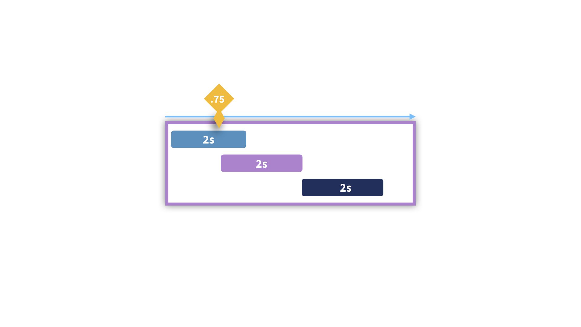
In this case, we need to know: How long should the transition take? Should we speed up or slow down the transition during the course of the transition? We use the v-enter-active class to define the behavior of the transition while it is active , while it is happening , specifying things like its duration and easing. If easing functions are new to you, you can learn more about them here.
    .v-enter { /* starting style */
    	opacity: 0;
    }

    .v-enter-active { /* active entering style */
    	transition: opacity 2s ease-in;
    }
Here, we’ve specified that we are transitioning the opacity property and set the duration of the transition to last 2s and gave it an [ease-in](https://cubic-bezier.com/#.42,0,1,1) curve, meaning it will fade in slowly then get faster as it approaches 1 .
Leaving Transition
Now that our box is on the screen, how do we transition if off? In the entering transition, we needed to define the starting state, which was opacity: 0 For the leaving transition, we need to define the ending state, which brings us to the next question: What should the ending style be?
Since we are transitioning away from visible ( 1 )and going towards invisible ( 0 ), we’d set that ending style in the v-leave-to class.
    .v-enter { /* starting style */
    	opacity: 0;
    }

    .v-enter-active { /* active entering style */
    	transition: opacity 2s ease-in;
    }

    .v-leave-to { /* ending style */
    	opacity: 0;
    }
Now, the box will transition away from the default state of 1 to our ending state of 0 . And this brings us to the final major question we need to ask ourselves when defining a transition: What should the active leaving style be?
Similar to the entering transition, we define this in the v-leave-active class, setting its duration, easing, etc.
    .v-enter { /* starting style */
    	opacity: 0;
    }

    .v-enter-active { /* active entering style */
    	transition: opacity 2s ease-in;
    }

    .v-leave-active { /* active leaving style */
    	transition: opacity 2s ease-out;
    }

    .v-leave-to { /* ending style */
    	opacity: 0;
    }
Now that we understand the mechanics of a Vue’s transition classes, let’s use Vue’s transition component to build our first practical transition.
To Follow Along
You can download the starting code in the Lesson Resources on this page to follow along. Just remember to run npm install to get all the dependencies.
A Simple Transition
Whenever something abruptly pops into the DOM, it can be a bit disorienting to our user and they may not immediately know what changed on the screen. A simple fix for this is to fade the element into view over time to provide them context about what is changing. Let’s take the concepts from our opacity example from earlier and implement a simple fade transition in our example app.
Let’s say we have a modal. It could be a login modal, a configuration modal, etc. When a ****button is clicked, the modal fades in. Then the modal itself has button, and when that is clicked, the modal fades away.
Our starting template looks like:
src/views/Home.vue
    <template>
    	<div>
    	  <button @click="toggleModal">Open</button>

        <div v-if="isOpen" class="modal">
          <button @click="toggleModal">Close</button>
        </div>

    	</div>
    </template>
And the script section looks like:
src/views/Home.vue
    <script>
    export default {
      data() {
        return {
          isOpen: false
        }
      },
      methods: {
        toggleModal() {
          this.isOpen = !this.isOpen
        }
      }
    }
    </script>
We have an isOpen data property, which we toggle between true and false when the toggleModal method is run. Because we have v-if="isOpen" on our modal div , the modal will appear and disappear whenever the open and close buttons are pressed.
By wrapping the modal in a transition component, we can then create a transition for it as it opens and closes.
src/views/Home.vue
    <template>
    	<div>
    	  <button @click="toggleModal">Open</button>

    		<transition name="fade"> // <-- named transition
    	    <div v-if="isOpen" class="modal">
    	      <button @click="toggleModal">Close</button>
    	    </div>
    	  </transition>

    	</div>
    </template>
Named Transitions
Notice how we used the name attribute to give the transition a name of fade . This allows us to prepend our transition’s classes with that name ( fade-enter instead of v-enter ). Named transitions help us stay organized as our app scales, and makes our transitions more reusable. We may want to use this fade transition on other elements throughout our app, which is why we ought to be naming our transitions based on what they do instead of what element they target. We could’ve named this transition modal but that name just describes this one specific use case, and we may want to fade things that aren’t modals.
Entering Transition
Now we can make use of our named transition classes to create the enter transition, which entails defining the starting style. Remember the questions we should be asking ourselves?
What should the starting style be?
src/views/Home.vue
    .fade-enter { /* starting style */
      opacity: 0;
    }
What should the active entering style be?
src/views/Home.vue
    .fade-enter { /* starting style */
      opacity: 0;
    }

    .fade-enter-active { /* entering style */
      transition: opacity .5s ease-out;
    }
Within .fade-enter-active we defined how we want the CSS transition to behave, specifying what property we’re transitioning ( opacity ) how long the transition’s duration is ( .5s ) and the timing function ( ease-out ).
Leaving Transition
Now that our enter transition is built, we can create our leaving transition.
What should the ending style be?
src/views/Home.vue
    .fade-leave-to { /* ending style */
      opacity: 0;
    }
What should the active leaving style be?
src/views/Home.vue
    .fade-leave-active { /* leaving style */
      transition: opacity .5s ease-out;
    }
As you can see, the transition’s ending style ( .fade-leave-to ) has opacity at 0 and the leaving state ( .fade-leave-active ) contains the same CSS transition as our entering transition. Because it’s the same, we can condense our styles like so:
src/views/Home.vue
    .fade-enter {
      opacity: 0;
    }


    .fade-enter-active,
    .fade-leave-active {
      transition: opacity .5s ease-out;
    }

    .fade-leave-to {
      opacity: 0;
    }
Additional Transition Classes
If you look at the documentation for Vue’s Enter/Leave transitions, you’ll also find the v-enter-to and v-leave classes. The reason we didn’t cover them in this lesson is because the style we were transitioning to ( opacity: 1 ) was already the default style of our element. The same goes for what we were transitioning away from ( opacity: 1 ). That is why we did not need to explicitly set our opacity to 1 in v-enter-to or v-leave . You’ll only ever need to use these classes when the style you are transitioning to ( v-enter-to ) or away from ( v-leave ) is different from the inherent style of the element OR if you run into browser compatibility issues, where these classes may come in handy for you.
Let’s ReVue
In this lesson, we’ve covered what the nature of a transition is, explored the mechanics of Vue’s transition component and its built-in classes, then built our first simple transition, using these questions to guide our decisions:
- What should the default style be?
- What should the starting style be?
- What should the active entering style be?
- What should the ending style be?
- What should the active leaving style be?
In the next lesson, we’ll look at using these same concepts to create a page transition using Vue Router.
Page Transitions
Now that we understand how to use Vue’s transition component to create our own transitions, let’s apply this concept to a common use-case in a single page application: page transitions .
Prerequisite: This lesson assumes you have working knowledge of Vue Router.
Vue Router + Transitions
As a user navigates around our app, we can smooth out the way one view replaces another by using a page transition. Let’s look at how quickly we can reuse the fade transition from the previous lesson to fade between pages (i.e. route-level components).
Currently, in our example app, we have two routes: the newly renamed modal and about . If we open up our App.vue file, we can see that we already have a router-link for each route, and the router-view component below it. Because router-view is really just a dynamic component that is replaced by the modal or about component, we can wrap router-view with Vue’s transition component and use the fade transition here to fade in the page component we’re routing to.
 src/App.vue
    <template>
      <div id="app">

        <div id="nav">
          <router-link to="/">Modal</router-link> |
          <router-link to="/about">About</router-link>
        </div>

        <transition name="fade">
          <router-view />
        </transition>

      </div>
    </template>
Since our fade transition currently lives in Modal.vue , let’s move it into App.vue ’s style section so we can use it globally throughout our app. Now, when we navigate between the modal and about routes, it’s already working for us.
Transition Modes
Currently, the way this transition happens, the content of the page being navigated away from fades out at the same time the new page fades in, creating a bit of a messy transition where content jumps into place. We can resolve this by utilizing Vue’s transition modes , which include:
-
in-out: The new element transitions in, then when complete, the current element transitions out. -
out-in: The current element transitions out, then when complete, the new element transitions in. - (By default, the current element and new element will transition in and out simultaneously)
Let’s use the out-in mode to smooth out our fade transition. We do that by specifying it within the transition component’s mode attribute, like so:
src/App.vue
    <transition name="fade" mode="out-in">
    	<router-view />
    </transition>
Now as we can see, the page transition is a lot smoother. After one page fades out, the new page fades in.
Another Page Transition
Hopefully you’re feeling comfortable about implementing page transitions now that you’ve seen how simple it can be, but you might feel a bit underwhelmed that we merely reused the fade transition we’d already built. So let’s create a bit more nuanced page transition now.
A common way pages might transition into one another is in a horizontally scrolling manner. You might see this kind of transition in a blog or photo gallery, for example. We can achieve this effect by translating the X position as we animate the page components off and onto the screen (in addition to fading the opacity over time like before).
To start, when a component transforms onto the screen, we want it to come in a bit from the right. So we’ll set the starting state of the entering transition 10px over in the X direction, like so:
src/App.vue
    .slide-fade-enter {
      transform: translateX(10px);
      opacity: 0; /* still fading opacity */
    }
Notice how we’re also setting opacity to 0 like before.
When the component performs its leaving transition, where do we want it to ****leave to ? We can do the inverse of our entering transition, and make it transition -10px to the left as it fades away. We’ll define that like so:
src/App.vue
    .slide-fade-leave-to {
      transform: translateX(-10px);
      opacity: 0;
    }
``
Finally, how do  we want this transition to behave while it's happening? How long should it be, and should it have an easing function? We'll set those **active** settings up in the `.slide-fade-enter-active` and `.slide-fade-leave-active` classes, leaving us with:

📄 **src/App.vue**
```css
    .slide-fade-enter {
      transform: translateX(10px);
      opacity: 0;
    }

    .slide-fade-enter-active,
    .slide-fade-leave-active {
      transition: all 0.2s ease;
    }

    .slide-fade-leave-to {
      transform: translateX(-10px);
      opacity: 0;
    }
Now when we test this out in the browser, we see that our page components are fading out and in nicely in a horizontally scrolling manner. Note that here we are still using the mode="out-in" on our transition component to smooth out this transition.
Another Use Case
It’s worth noting that we aren’t limited to using these sort of transitions only when routing between pages. We may want to transition between components that are using the is attribute. We could also use this kind of transition in this case as well.
Let’s ReVue
In this lesson, we learned how simple it can be to use Vue’s transition component to create smooth page transitions as users navigate around our app, and how transition modes can help us modify that transition’s behavior. In the next lesson, we’ll learn how to transition groups of elements/components with Vue’s transition-group component.
Group Transitions
So far we’ve learned how to transition individual components/elements in and out of our interfaces, and applied that concept to transitioning between route-level page components with Vue Router. But what if we have a group of components/elements to which we want to apply the same transition?
For example, every time we add a new item to a list, we might want the item to transition into that group in a specific way. Or we may have a group of elements that we want to reorder in the same way as filters are updated. To achieve this kind of group-based transition behavior, we can harness the power of Vue’s built-in component, which functions similarly to the component, but is designed for use with a group of components/elements.
Let’s start understanding how it works with a simple example.
A Simple List Transition
We know that displaying data in a list is very common, so let’s start there. After all, a list is simply a group of
We can start with the code below and solve from there.
 src/views/List.vue
<template>
  <div>

    <input v-model="newContact" placeholder="Name" type="text" />
    <button @click="addContact">Add Contact</button>

		<ul>
      <li v-for="(contact, index) in contacts" :key="index">
        {{ contact }}
      </li>
		<ul>

  </div>
</template>

<script>
export default {
  data() {
    return {
      newContact: "",
      contacts: [
        "Beau Thabeast",
        "Cindy Rella",
        "Alice Wunderlind"
      ]
    }
  },
  methods: {
    addContact() {
      this.contacts.push(this.newContact)
      this.newContact = ""
    }
  }
}
</script>
As you can see, our starting code simply contains a template that displays the list of contacts from our data, which is an array we can add to. So if we want a transition to be applied every time a new list item is added to that group, we can simply switch out our ul for the transition-group component, like so:
src/views/List.vue
    <transition-group tag="ul">
      <li v-for="contact in contacts" :key="contact">
        {{ contact }}
      </li>
    </transition-group>
Notice how we’ve add the tag attribute and set it to “ul”. This is because the transition-group renders an element that wraps the group itself. While the default element that transition-group renders is a span, we can change it to something else like a div, or for our current use case: a ul. You can think of the tag as what you otherwise would’ve wrapped the group of child elements with, because that’s essentially what happens when the transition-group renders anyhow.
Note: The transition component does not render an element; this behavior is unique to transition-group
The transition-group won’t yet do anything because, just like the transition component, we’ll give it the name of the transition we want applied to every member of the group. We’ll create a similar transition from the previous lesson, and give this a name of “slide-up”.
src/views/List.vue
    <transition-group name="slide-up" tag="ul">
      <li v-for="contact in contacts" :key="contact">
        {{ contact }}
      </li>
    </transition-group>
Then over in our App.vue file’s style section, we’ll build out the slide-up transition.
src/App.vue
.slide-up-enter {
  transform: translateY(10px); /* start 10px down*/
  opacity: 0;
}

.slide-up-enter-active {
  transition: all 0.2s ease;
}
In this simple example, we are only transitioning elements into the list and not out of it, so we can remove the leave-based transition classes.
Now, as we add new members to the contacts list, we’ll see them slide-up into it.
If you’re wondering why we used 10px to start from lower down on the page instead of -10px, that’s a great question! Remember, a webpage’s coordinates start at (0,0) from the upper lefthand corner of the page. So going down the page is actually going “up” in the Y coordinate direction.
Triggering Transitions on Initial Render
If we refresh the page, we’ll notice that our list looks like it’s slide-fading into place.That’s only because the entire route-level component is transitioning in like that (remember: we added slide-fade as our page transition). However, if we specifically wanted to make it so that the list would slide-up when the page (and therefor the list) was initially rendered, we can achieve that quite easily by using the appear attribute, like so:
src/views/List.vue
	<transition-group name="slide-up" tag="ul" appear>
      <li v-for="contact in contacts" :key="contact">
        {{ contact }}
      </li>
    </transition-group>
The appear attribute is our way of telling the transition-group that not only do we want the slide-up transition to happen every time a new member of the group is added, but also when the entire group (the entire ul) is first rendered.
Now, when we refresh the page and our component initially loads, we’ll see those list items slide-up into place.
Note: The appear attribute can also be used on the transition component. It is not exclusive to transition-group.
Moving Items within a Group
If we were to add a feature to sort this list in some way, such as an alphabetical sorting method, what would happen when the items in our list moved into their new position?
For example, if our code had a sort button:
src/views/List.vue
<template>
	...
		<button @click="sortContacts">Sort</button>
	...
</template>
And a new alphabetical sorting method:
src/views/List.vue
methods: {
	...
    sortContacts() {
      this.contacts = this.contacts.sort()
    }
  }
When we click the sort button, we’ll see our list items just kind of snap into their new position. That’s not bad, but wouldn’t it be nice if we could fine-tune how the items in our list move as they’re sorted? We can make use of the v-move transition class to adjust how our elements are moving as they change position within the group.
Let’s add v-move to our slide-up transition styles. Notice how the v- prefix is replaced by the name of our transition.
src/App.vue
.slide-up-enter {
  transform: translateX(10px);
  opacity: 0;
}

.slide-up-enter-active {
  transition: all 0.2s ease;
}

.slide-up-move {
  transition: transform 0.5s ease-out;
}
If we check this out in the browser, now the members of our group are moving according to these styles. If we wanted to speed up or slow down the duration, or change the easing function, we could tweak this move style to our heart’s content.
If you’re curious how v-move works under the hood, it’s making use of the FLIP transition, which you learn more about here.
Let’s ReVue
That brings us to the end of our exploration of the fundamentals of group transitions. This topic is quite broad, as there are many ways that data (and the elements/components that display that data) can be grouped, and just as many ways to apply transitions to those groups. But with the fundamentals in place, I hope you feel confident to start writing your own when your app calls for them.
In the next lesson, we’ll dive into animating with JavaScript.
JavaScript Hooks + Velocity
So far we’ve been learning about Vue’s transition and transition-group components, which provide us the necessary classes to build out enter and leave transitions. However, when our needs become a bit more unique or complex, we’ll need to start using JavaScript to build out our animations.
In this lesson, we’ll look at Vue’s JavaScript Hooks and combine that with a helpful animation library called Velocity.js to build out some more powerful animations.
JavaScript Hooks
So what are JavaScript Hooks? They are similar to Vue’s lifecycle hooks (beforeCreate, created, etc), but are specific to Vue’s transition and transition-group components. You can think of them as the stages of the lifetime of a Vue transition.
Below is a list of them
before-enter
enter
after-enter
before-leave
enter-cancelled
leave
after-leave
leave-cancelled
As you can see, there are hooks that are called during both the enter and leave transitions. When they are called, we can have them trigger methods, which may contain more complex behavior using JavaScript that we couldn’t have accomplished with just CSS alone.
<transition
  @before-enter="beforeEnter"
  @enter="enter"
  @after-enter="afterEnter"
  @enter-cancelled="enterCancelled"

  @before-leave="beforeLeave"
  @leave="leave"
  @after-leave="afterLeave"
  @leave-cancelled="leaveCancelled"
>
  <!-- ... -->
</transition>
Now that we understand what hooks are available to us, let’s build our first JavaScript-powered Vue transition.
A Drawer Transition
A common feature in a web app is a drawer-type component, which slides out to reveal something such as a user profile, a navigational menu, or dashboard. Inside of our starting code, you’ll see we now have a Drawer.vue file, which contains a user profile that pops on and off the screen with a button click.
Using the help of JavaScript hooks and the Velocity animation library, we’ll turn this into a “drawer” that slides out from the left side of the browser. But first, let’s examine the starting code.
Drawer.vue
<template>
  <div>
    <button @click="isOpen = !isOpen">
      My Profile
    </button>

    <div v-if="isOpen" class="drawer">
      <img src="../assets/avatar.png" alt="avatar" />
      <div></div>
      <div></div>
      <div></div>
      <div></div>
    </div>

  </div>
</template>

<script>
export default {
  data() {
    return {
      isOpen: false
    }
  }
}
</script>
The template has our button that toggles the isOpen data boolean, which determines if we’re displaying our drawer or not. And below that, we’ve got some scoped styles.
<style scoped>
img {
  height: 2.5em;
  width: 2.5em;
  border-radius: 50%;
}

.drawer {
  display: flex;
  flex-direction: column;
  align-items: center;
  width: 12em;
  height: 20em;
  border-radius: 1%;
  background-color: #e0e0e0;
  box-shadow: 0.08em 0.03em 0.4em #ababab;
  padding-top: 0.7em;
}
.drawer div {
  height: 3.5em;
  width: 95%;
  margin-top: 0.6em;
  background-color: #f0f0f0;
  border: 0.02em solid #ababab;
  border-radius: 1%;
}
</style>
Our first step is to wrap the drawer in the transition component, and add the hooks we’ll be using.
Drawer.vue
<template>
	<div>
	  <button @click="isOpen = !isOpen">
	    My Profile
	  </button>

    <transition
      @before-enter="beforeEnter"
      @enter="enter"
      @leave="leave"
      :css="false"
    >
      <div v-if="isOpen" class="drawer">
        <img src="../assets/avatar.png" alt="avatar" />
        <div></div>
        <div></div>
        <div></div>
        <div></div>
      </div>
    </transition>
  </div>
</template>
As you’ll see, we’ll only need before-enter(), enter() and leave(), each of which will trigger a method by the same name. But what do we want these methods to do?
As for beforeEnter(), we want that method to set the initial style of the drawer before it enters the interface.
We’ll use the enter() method to set the styles we want the drawer to end up with when it enters.
The leave() method will set the styles we want the drawer to transition to when it leaves our interface.
Note: We’re using :css=“false” to tell Vue it doesn’t need to worry about handling the transition classes here since we’re relying on the JavaScript hooks instead.
Before we write out these methods, we’ll import Velocity. If you look inside the package.json, you’ll see this library is already installed in our project (I did this for you - you’d just run npm i velocity-animate --save-prod to do so yourself).
Drawer.vue
<script>
import Velocity from 'velocity-animate'

export default {
  data() {
    return {
      isOpen: false
    }
  },
  methods: {
    beforeEnter(el) {
      // we'll place our starting style here
    },
    enter(el, done) {
			// style to transition to on enter
    },
    leave(el, done) {
	   // style to transition away to on leave
    }
  }
}
</script>
Notice how our methods each have the el parameter. This will give our methods access to the element that is being transitioned, in this case our drawer div.
So how do we want our drawer to start out as? Well, we don’t want it to be visible, so it’ll need to be opacity: 0, and if it has width: 0 we can then expand it outward by transitioning it’s width. Let’s add those styles into beforeEnter()
Starting Style
Drawer.vue
beforeEnter(el) {
  el.style.opacity = 0
  el.style.width = '0em'
},
Now in enter(), we can tell this method to turn our drawer visible and give it a width. We’ll use the Velocity() method to animate our opacity and width.
Enter Style
Drawer.vue
enter(el, done) {
  Velocity(
    el, // element to animate
    { opacity: 1, width: '12em' }, // new style rules
    { duration: 1000, easing: 'easeOutCubic', complete: done } // define how transition happens and complete it
  )
}
Let’s break down what is happening here. We’ve passed in a few arguments to the Velocity() method, first handing it the element to animate (el) and then giving it an object with the new style rules we want applied to that element. Finally, we’re passing in some rules to define our transition’s duration, its easing function, and then we’ve handed it done, which is a method that will be run when the velocity animation is complete. This lets Vue know this hook has completed, and it can move on to the next one in its lifecycle.
Note: We’ve used the easeOutCubic easing function, which is a one of many that are available to us thanks to Velocity. However, if you’re using this reference, know that the Back, Elastic and Bounce functions are not available to us via Velocity.
Leave Style
Now that we have defined how our drawer should enter, let’s define how it should leave().
Drawer.vue
leave(el, done) {
  Velocity(
    el,
    { opacity: 0, width: '0em' },
    { duration: 500, easing: 'easeInCubic', complete: done }
  )
}
Here, we’re again using the Velocity() method, passing it the el to animate, telling it to return to the styles we started with (invisible and no width), and we told it how to transition, setting the duration and
easing function, and then we passed it done so Vue knows when that hook is complete.
Note: It may seem odd to you that we’re using easeInCubic on our leave transition and easeOutCubic on our enter transition. But the “In” and “Out” only refer to the curve of the ease itself. The “In” and “Out” don’t correlate to how you should use them with an enter vs leave transitions. The best way to pick an easing function is to simply try them out and see which feels most natural for the transition you’re building.
Now, when we check this out in the browser, we’ll see that our user profile drawer slides nicely in and out of our interface.
The Power of Velocity
You might be thinking that all of this was overkill since we didn’t use Velocity for much that CSS alone couldn’t have accomplished (except for some special easing functions). But that’s because we started out quite simple. Velocity has more features we haven’t played with yet, such as spring physics which allows us to create springy/snappy/bouncy motion in our interfaces.
To see spring physics in action, let’s switch out the easing function on our enter() transition with a 2-item array.
Drawer.vue
enter(el, done) {
  Velocity(
    el,
    { opacity: 1, width: '12em' },
    { duration: 1000, easing: [60, 10], complete: done } // now with spring physics
  )
}
What are these numbers in the array? The first (60) is the amount of tension and the second (10) is the amount of friction for this spring function. We can tweak these to achieve dynamic effects. For example, a lower friction increases the ending vibration speed. Like easing functions, these numbers are something you’ll want to play around with until you find the right combination that feels natural for the effect you’re going for.
Now, when we check the browser, we’ll see our drawer slides open with a bit of spring in its step. Fun!
Another Example: Cards
To see another example of spring physics in action, in combination with the transition-group component, check out the Cards.vue component in this lesson’s ending code. You’ll see that the same concepts we just learned can be applied to another use case, where we might want cards to spring into view when a user loads the page. They could display anything from user reviews to pricing or product options… you name it.
Cards.vue
<template>
  <transition-group
    appear
    @before-enter="beforeEnter"
    @enter="enter"
    :css="false"
  >
    <div class="card" v-for="card in cards" :key="card.id">
      <p>{{ card.title }}</p>
    </div>
  </transition-group>
</template>

<script>
import Velocity from 'velocity-animate'

export default {
  data() {
    return {
      cards: [
        { title: 'Could contain anything', id: 123 },
        { title: 'Endless possibilities', id: 456 }
      ]
    }
  },
  methods: {
    beforeEnter(el) {
      el.style.opacity = 0
      el.style.width = '0em'
    },
    enter(el, done) {
      Velocity(
        el,
        { opacity: 1, width: '12em', rotateZ: '3deg' },
        { duration: 1000, easing: [70, 8], complete: done }
      )
    }
  }
}
</script>

<style scoped>
.card {
  height: 4em;
  width: 12em;
  border-radius: 1%;
  background-color: #e0e0e0;
  box-shadow: 0.08em 0.03em 0.4em #ababab;
  padding-top: 1em;
}
</style>
Let’s ReVue
In this lesson, we learned how to build more complex motion into our interfaces by using JavaScript Hooks to trigger animation logic from a third-party library. Velocity is a lot more powerful than what we’ve touched on in this brief lesson, so I encourage you to continue playing with what is possible with the features it gives you.
In the next lesson, we’ll look at State Transitions along with an even more powerful animation library: GSAP.
Intro to GSAP
In the previous lesson, we learned how to use JavaScript Hooks in combination with a third-party animation library (Velocity.js) to build custom animations. In this lesson, we’ll see another example of how to do this but with a different animation library, called GreenSock Animation Platform (GSAP). We’ll then see a couple different ways of using GSAP to animate our interfaces.
What’s GSAP?
If you look at what leading developers in the web animation community are using, you’ll find that GSAP is a go-to tool for them. The library is a robust, high-performance library that enables you to animate anything that JavaScript can touch, and it smooths out browser inconsistencies by default.
In this lesson, we’ll be focusing on the TweenMax portion of the GSAP library. For context, TweenMax is a more fully featured version of the foundational TweenLite tool within GSAP. While it’s larger than its little sibling, TweenMax is more powerful and handles some tasks for us due to the plugins it comes with, such as CSS Plugin. Because of its helpful plugins, TweenMax is a bit easier to get started learning GSAP with, but if size is of concern to you, I recommend using the paired-down TweenLite version in your project.
Our First GSAP Animation
To get started using TweenMax, we’ll look at a simple example, which is similar to the previous lesson, where we’re running animations via our methods when the corresponding JavaScript Hooks are triggered.
Here’s our starting code:
src/views/Simple.vue
We have a transition component that wraps a card div, which will appear when this component is loaded. We’re using the before-enter and enter JavaScript Hooks to trigger our methods by the same name, and binding false to :css so Vue won’t worry about adding/removing the transition classes.
Nothing new here yet, but now let’s import TweenMax from GSAP, which I’ve already installed into the demo project. You could install it yourself by running npm i gsap from the terminal.
src/views/Simple.vue
Now that TweenMax is imported, we can move on to our methods. First, we’ll need to define how we want the card to be styled before it enters our interface. We’ll set that up in our beforeEnter method.
src/views/Simple.vue
methods: {
beforeEnter(el) {
el.style.opacity = 0
el.style.transform = ‘scale(0,0)’
},
We’re telling it to start out invisible and have a scale of 0 for both its x and y values. Now, in our enter method, we’ll use TweenMax to animate it into a visible card at full scale.
src/views/Simple.vue
enter(el, done) {
TweenMax.to(el, 1, {
opacity: 1,
scale: 1,
onComplete: done
})
}
So what’s going on here? This is pretty similar to how we wrote our Velocity methods in the last lesson. We’re using the TweenMax.to() method, and passing it some arguments. The to() method is used to define what we want the animation to go to, versus start from. So what do we want the card’s styles to transition to? We’ll set that up in this method’s arguments.
The first argument (el) tells TweenMax which element to animate. (This is exactly the same as Velocity). The second argument is where we pass in the animation’s duration. The third argument is an object which gives TweenMax the styles to end up as, or to animate to. As you can see, we’re making the card visible (opacity: 1) and fully scaled to 100% with scale: 1. Similar to Velocity, TweenMax also has a property where we can pass in a method to run when the animate is complete. So we’re passing in done to run when this transition is complete (onComplete). As a reminder, done lets Vue know that this step in the transition lifecycle is done, so Vue can move on to the next one.
If we run this in the browser, we’ll see that when the card appears, it fades from invisible to visible while its scale increases from 0 to 100%.
Great. Now let’s continue using TweenMax to build out a bit more complex animation.
Staggering Elements
It’s fairly common to see elements that stagger into place when they enter a web interface. You can imagine doing an API call for a list of data that you’re displaying within cards, and each card staggers into place. We can accomplish this fairly easily using TweenMax.
It’s worth noting before we start coding this that we don’t always need to rely on using the transition / transition-group components and their JavaScript Hooks when we’re building out third-party-based JavaScript animations like this. There are many ways to skin this cat, and using the component’s lifecycle methods is one of them. So in this example, we’ll rely on our component’s mounted hook. Let’s take a look at the starting code.
src/views/Stagger.vue
As you can see, we’re creating a list of cards based on our data, using v-for. If we were to view this component in the browser, the cards would already be in their position. But in this example, we want them to stagger into place when the component is mounted, so let’s set that up. As you’ll see, TweenMax is already imported, so we can start using it immediately.
This is what that stagger code would look like:
src/views/Stagger.vue
mounted() {
TweenMax.staggerFrom(’.card’, 0.5, { opacity: 0, y: 200 }, 0.1)
}
As you can guess, the staggerFrom() method enables us to stagger our elements into place by passing in instructions that tell the elements where and how to start the staggering-in process. So, we’re telling TweenMax what element to animate (.card), giving it a duration (0.5) and then passing in the transition instructions, telling the elements to start out invisible (opacity: 0) and 200 pixels down in the y direction. The additional argument at the end (0.1) is the delay between each element, meaning there will be a 0.1 second pause between each card that animates in. Without this delay, they’d each come in at the same time.
Now, if we check this out in the browser, we’ll see they’re staggering into place just like we wanted them to.
To make this a little nicer, we could animate its scale as well with:
Now that we have the foundation in place, we can add to this animation to make it even nicer. Let’s say we also want to animate the scale as the cards stagger in.
src/views/Stagger.vue
mounted() {
TweenMax.staggerFrom(’.card’, 0.5, { opacity: 0, y: 200, scale: 0 }, 0.1)
}
Now our elements will expand their size from 0 to 1 (0% to 100%) as they stagger into position. Nice!
Let’s ReVue
We’ve learned how to use another the industry standard JavaScript-based animation library GSAP to build out animations that happen in two different ways: when JavaScript Hooks are triggered on the transition component, as well as when our component’s lifecycle methods fire. In the next lesson, we’ll continue using GSAP and look at animating based upon some changing state.
State with GSAP
It’s not uncommon for a web app to display data that is always changing. Whether this is the real-time score of players in an online game, or some sort of company or financial stats, it’s helpful to know how to display this kind of always-changing state in a nice way. In this lesson, we’ll look at using GSAP to achieve this.
Under the hood, GSAP performs “tweens” for us. But what does that actually mean? Tweening is short for in-betweening, which is a process of generating the frames that will be displayed in between the beginning and end of the animation. For example, the values between 1 and 10 are: 2, 3, 4, 5, 6, 7, 8 and 9 (and their decimals, respectively: 2.123…). In the case of scaling from 0% to 100%, the values in between would be everything greater than 0 and less than 100. So by using GSAP, we can tween between values naturally and performantly.
Let’s look at an example, where we have some always-changing state and display that state as a bar graph. This could be useful for something like a realtime scoreboard, or anywhere you’re displaying data that is constantly changing in real time.
src/views/State.vue
To create some dummy data, when this component is created, we’re using setInterval to run our randomNumber method every 1500ms. The randomNumber method updates our number data with a new value (ranging from 0-800), and our template uses that always-changing number to set the width of our div via style binding: :style="{ width: number + ‘px’ }" We’re also displaying the number value itself in the span.
As-is, our bar width jumps from value to value as the number changes, and the number it displays simply updates to the new number. However, wouldn’t it be nice if our bar smoothly grew and shrank to its new width value? Simultaneously, the number value it displayed could tween as well. Let’s make this happen.
We’ll start out by importing GSAP.
src/views/State.vue
Now we can use it to generate the values between the old number and the new number. To do this, we’ll use watch. If you haven’t used this before, it’s a built-in Vue component option that allows us to watch a reactive value, and when that value changes, we can do things like perform operations using the new and/or old value. So let’s watch our number data value.
src/views/State.vue
watch: {
number(newValue) {
// now what?
}
},
Notice how we simply created a watcher by the same name as the data value it is watching (number), and we’re passing it the newValue. Before we move on, let’s create another data value by the name of tweenedNumber. You’ll understand why in a moment.
src/views/State.vue
data() {
return {
number: 0,
tweenedNumber: 0
}
},
Now that we have the number and tweenedNumber data values, we can use them in our watcher with the gsap.to() method. In this case, we don’t need GSAP to animate an element directly, we want it to animate our data, because it’s our data value that is being used to widen our bar, and we’re displaying that data value within the bar.
So instead of passing GSAP the element we want it to animate, we’re going to pass in the data we want it to animate:
src/views/State.vue
watch: {
number(newValue) {
gsap.to(this.$data, {})
}
},
We’ve now passed in our component’s data object with this.$data. Now GSAP has access to our data, and can update its properties. Now we can give this animation an object including instructions about how to animate our data. We’ll give it a duration of 1 second, an ease, and specify the data value we want to animate.
src/views/State.vue
watch: {
number(newValue) {
gsap.to(this.$data, {
duration: 1,
ease: ‘circ.out’
tweenedNumber: newValue
})
}
},
Notice how we’re telling gsap to update the tweenedNumber property on our data (on this.$data) and animate it to the newValue. By the very nature of the gsap.to() method, it will animate that value by tweening it up or down to that new value, instead of just jumping abruptly to that value.
In other words, instead of jumping from 1 directly to 5, this method would create a path of smooth steps that arrive at 5 by going from 1 and progressively getting higher and closer until it reaches 5. Because we have these between values, we can now use them to smooth out what’s happening in our template.
Instead of binding our bar style to number, let’s bind it to tweenedNumber, and display that number as well.
src/views/State.vue
While these are helpful for a smooth tween, they’re not so pretty to look at, so let’s just add .toFixed(0) to where we’re displaying the value in our span, to clean this up.
src/views/State.vue
Here’s the final code for the component all together:
src/views/State.vue
Let’s ReVue
In this lesson, we’ve learned about the concept of tweening, and how to use GSAP to create smooth transitions between changing state in our app. In the next lesson, we’ll learn how to use GSAP’s timelines to create a sequence containing multiple animations.
Timelines with GSAP
When working with GSAP, often our animations start to increase in complexity. There comes a point where a simple tween isn’t sufficient and we need to create multiple animations that work together in a sequence. For this, we can use GSAP’s timeline feature, which allows us to chain a group of tweens together to create more complex animations that work together as one.
Our first Timeline
Let’s start by taking at the Timeline.vue component in our starting code.
src/views/Timeline.vue
In the template, we have three images of runners. In a moment, we are going to make each of them “race” to the right side of the browser. Since we already have gsap imported into this component, we just need to initialize our timeline, which we’ll do in our mounted hook.
src/views/Timeline.vue
mounted() {
let tl = gsap.timeline()
}
Here, we’ll also add a tween for each runner onto the timeline. Let’s start with the first runner:
src/views/Timeline.vue
mounted() {
let tl = gsap.timeline()
tl.to(’.first’, { x: 700, duration: 2, ease: ‘expo.out’ })
}
Here, we’re using the to method like we’ve used in previous lessons. This method allows us to create a tween and apply it to the target (the element we’re animating). In this case, we are animating the element with the class name of ‘.first’. We’re telling that element to “run” 700 pixels to the right, over a duration of 2 seconds, and giving that motion an ease called ‘expo.out’.
If we check this out in the browser, we’ll see that runner “race” 700px over to the right. So far so good, now let’s create two more to tweens, one for each of the remaining runners.
src/views/Timeline.vue
mounted() {
…
tl.to(’.first’, { x: 700, duration: 2, ease: ‘expo.out’ })
tl.to(’.second’, { x: 700, duration: 2, ease: ‘expo.out’ })
tl.to(’.third’, { x: 700, duration: 2, ease: ‘expo.out’ })
}
Now, when this component is mounted, each of our runners “race” 700 pixels to the right. As it stands, our runners “take off” one after the other. After the first runner reaches its destination, the second runner goes, then the third after that. However, what if we wanted our runners to take off at the same time? Or what if we wanted the second runner to start a half second after the first runner goes?
Position Parameter
We can alter the timing that animations within our timeline fire by using the the position parameter. This parameter lets us define when a tween occurs within the timeline’s sequence, and there are several ways for us to set that position.
Absolute Position
One way to set the position of a tween within a timeline is by setting its absolution position. This means we provide an integer value, which represents the value of seconds from the start of the animation. So if we wanted an animation to fire a half second into the timeline, we’d set that animation’s position value as 0.5, like so:
src/views/Timeline.vue
mounted() {
…
tl.to(’.first’, { x: 200, duration: 2, ease: ‘expo.out’ })
tl.to(’.second’, { x: 400, duration: 2, ease: ‘expo.out’ }, 0.5) // now with an absolute position
tl.to(’.third’, { x: 600, duration: 2, ease: ‘expo.out’ })
}
Now, the second runner will start “running” 0.5 seconds into the sequence.
Relative Position
Sometimes it may be more useful for us if the position of our animations are set in relation to other animations. To set a relative position, we use a string like ‘-=.75’ or +=.75 to set the start of one tween .75 seconds before (-=) or after (+=) the end of the animation before it. So let’s add a relative position to the second tween in our timeline.
src/views/Timeline.vue
mounted() {
…
tl.to(’.first’, { x: 200, duration: 2, ease: ‘expo.out’ })
tl.to(’.second’, { x: 400, duration: 2, ease: ‘expo.out’ }, ‘-=.75’)
tl.to(’.third’, { x: 600, duration: 2, ease: ‘expo.out’ })
}
Now the second animation will start .75 seconds before the first one ends.
Start/End Position
If we wanted our second animation to start at the same time as our first, you might think we would change the second animation’s position parameter to -=2.
src/views/Timeline.vue
mounted() {
…
tl.to(’.first’, { x: 200, duration: 2, ease: ‘expo.out’ })
tl.to(’.second’, { x: 400, duration: 2, ease: ‘expo.out’ }, ‘-=2’)
tl.to(’.third’, { x: 600, duration: 2, ease: ‘expo.out’ })
}
This would work for now, but what if we need to change the duration of our first animation later on? For example, if the first animation’s duration changed to 4, then our second animation’s position would only move back halfway toward the start of our first because 4-2=2. If we want the first and second tweens to fire at the same time regardless of how long our first runner’s duration is, we can achieve that by using a third way of setting position: <
When we set the position of our second runner as ‘<’, that tells it to always start when the first animation starts. Alternatively, ‘>’ tells it to start when the first animation ends.
src/views/Timeline.vue
mounted() {
…
tl.to(’.first’, { x: 200, duration: 2, ease: ‘expo.out’ })
tl.to(’.second’, { x: 400, duration: 2, ease: ‘expo.out’ }, ‘<’) // starts when first tween starts
tl.to(’.third’, { x: 600, duration: 2, ease: ‘expo.out’ }, ‘<’) // starts when second tween starts, which is when first tween starts
}
In the code above, all three runners will start at the same time. Why? Well, we’re telling our third runner to start when the second runner does, and the second runner starts when the first runner does.
We can also add to these to make them relative. For example, what do you think a position of ‘<0.5’ would do?
src/views/Timeline.vue
mounted() {
…
tl.to(’.first’, { x: 200, duration: 2, ease: ‘expo.out’ })
tl.to(’.second’, { x: 400, duration: 2, ease: ‘expo.out’ }, ‘<0.5’) // What will this do?
tl.to(’.third’, { x: 600, duration: 2, ease: ‘expo.out’ })
}
If you guessed that the second animation would fire a half second after the start of the first, taking the third along with it, then you’re correct.
As you can see, there are a lot of different ways to position animations within a timeline, including even more that you can check out here.
Timeline Duration
With a simple timeline like this, we can quite easily count up the timeline’s total duration. However, in more complex timelines, we can run tl.duration() and that would add up all of our tweens’ individual durations and return our timeline’s total duration for us. This may be helpful when deciding where to position the tweens within your timeline’s sequence.
Repeating / Looping Timelines
You may have the need to repeat or even loop a timeline. We can easily achieve that by passing in an object when creating our timeline, like so:
gsap.timeline({ repeat: 2 })
Now, our timeline will repeat itself twice. If we wanted it to repeat indefinitely on a loop, we’d use -1.
gsap.timeline({ repeat: -1 })
There’s also the ability to add a delay before the next repetition.
gsap.timeline({ repeat: -1, repeatDelay: 1 })
Now this timeline will wait 1 second before starting over.
Let’s ReVue
In this lesson, we saw how gsap timeline’s allows us to sequence multiple animations, adding or removing space between them with the position parameter. In the next and final lesson of the course, we’ll see how we can create more flexible and scalable animations by using nested timelines.
Nested Timelines
Sometimes there are situations when just a single timeline is not sufficient for more complex animations. In this lesson, we’ll learn how we can create more scalable, modular, and reusable animations by nesting multiple timelines within one master timeline.
Let’s open up the Master.vue component from our starting code. It currently has only one timeline, so we’re going to add a new timeline and see how we can nest both timelines within a newly created Master timeline.
src/views/Master.vue
  <img id="fox" src="../assets/fox.png" alt="fox-logo" />
</div>
Let’s break this down. In our template, we have several images. Four of them are pngs of paws and the other is a fox. Down in our mounted hook, we have a GSAP timeline and each paw has an animation informing it to fade in (opacity: 1) and scale up (scale: 1) over a 0.5 second duration, with a bouncy ease. Notice how the paws have a position of ‘<.3’, meaning they bounce in .3 seconds before the animation before it ends.
Conceptually, there’s nothing new here from what we covered in the previous example. But what if our animation needs start to get more complex. For example, we might need to add animations to our fox as well. In that case, it could be helpful if we created a timeline that was exclusively used to sequence our paws-based animations, and another timeline for our fox-based animations. Then we could add, or nest, both of those to a master timeline.
We can use methods to create these timelines. Let’s refactor our paws-based timeline into a method now.
src/views/Master.vue
Now we have a method that we can call, which will create our timeline and return it. In a moment, you’ll see how we can make this timeline available to a master timeline, but first let’s make a method that creates a new timeline for a fox-based animation.
src/views/Master.vue
foxTL() {
let tl = gsap.timeline()
tl.to(
‘#fox’,
{
opacity: 1,
filter: ‘blur(0)’,
scale: 1,
duration: 0.4,
ease: ‘slow’
}
)
return tl
}
Now we have a separate timeline to enclose any fox-based animations we currently have, which we can add to in the future .
Sidenote: Because our timeline is fading the opacity and removing the blur of our fox, we’ll just need to add some styles to the fox’ CSS, like so:
src/views/Master.vue
This way, our fox will start out invisible and blurred, so as it animates into view, it un-blurs into focus.
Creating the Master Timeline
Now that we have two methods, each creating its own timeline, we can create a master timeline and add those timelines to it. We’ll initialize our master timeline just below our import statement:
src/views/Master.vue
While we could certainly make use of our mounted hook like before, I want to show you how we can add interactivity to trigger our master timeline, so let’s add a new play method, which, when run, will add our other timelines to the master timeline, then play() it.
src/views/Master.vue
…
methods: {
play() {
masterTL.add(this.pawsTL())
masterTL.add(this.foxTL())
masterTL.play()
},
…
Now we just need a button to trigger this method, which we’ll add to our template now:
src/views/Master.vue
And here’s the component’s code all together:
src/views/Master.vue
  <img id="fox" src="../assets/fox.png" alt="fox-logo" />
</div>

<button @click="play">Play</button>
What about SVGs?
You might have noticed that in these examples, for the sake of simplicity in teaching these concepts, we are simply using pngs. In a production-level app that is widely used across multiple device sizes, you’ll want to instead use SVGs (scalable vector graphics). Working with SVGs is a very deep and broad topic that we don’t have time to cover in this lesson, but we do touch on it in our Real World Vue course.
Let’s ReVue
In this lesson, we learned how we can nest timelines within timelines to create even more modular and scalable animations in our apps. Congratulations on finishing Animating Vue. I hope you now feel more confident and capable of introducing more motion, flow, and visual originality to your Vue apps.