Introduction
-
Table of Contents
-
Why this book?
-
Who is this book for?
-
What will you learn?
-
Project structure
-
Screenshots
- Customer pages
- Admin pages
-
Authors
Table of Contents
In this book, you’ll build a full-stack JavaScript web application from scratch, using ES6 syntax. The final app can be used to publish and sell books. We use it ourselves for this book!
Below is a list of all chapters and the main topics covered. Click any title to see a free preview of that chapter. You can also access the Table of Contents by clicking the menu icon at the top left.
Book Chapters:
- [App structure. Next.js. HOC. Material-UI. Server-side rendering. Styles.]
- [Server. Database. Session. Header and MenuDrop components.]
- [Authentication HOC. Promise. Async/await. Static method for User model. Google OAuth.]
- [Testing with Jest. Debugging with Winston. Transactional emails. In-app notifications.]
- [Book and Chapter models. Internal API. Render chapter.]
- [Github integration. Admin dashboard. Testing Admin UX and Github integration.]
- [Table of Contents. Highlight for section. Hide Header. Mobile browser.]
- [BuyButton component. Buy book logic. ReadChapter page. Checkout flow. MyBooks page. Mailchimp API. Deploy app.]
Why this book?
“What I cannot create, I do not understand.” Richard Feynman
Now is the best time to learn how to code - the number of learning resources has never been so high. You can choose from numerous reference guides, video courses, blog posts, books, and online boards (e.g. Stack Overflow).
We personally used (and still use) all of these resources while learning web development. An abundance of learning resources is a good thing, but it does not guarantee that you will become a good engineer. An abundance of resources and limited time force you to choose resources carefully. In other words, learning how to learn and what to learn has never been as important as it is today.
If you just started learning web development, then reference guides, video courses, and tutorials will help you get familiar with basic principles and syntax. Great resources will show you not only how to do something but also explain why .
Once you are familiar with principles and some syntax, the next step is to build your own web application. At this point, you’ve learned how to think logically like a developer, so you’ll enjoy learning backend engineering as much as frontend. You will still use reference guides and other resources when you forget something or need to learn a new concept. However, despite the abundance of resources to learn the basics, the number of resources that teach you how to build a modern, large-scale, production-ready web application from scratch is relatively low.
We don’t argue that everyone who learns coding should start with building a large project. But we do strongly suggest that developers - who have learned the basics and want to take the next step in advancing their web development skills - build a complete application from scratch. Since knowledge is organized as a tree-like structure, building one large web application will force you to glue all the disconnected pieces of knowledge you’ve learned into one, tree-like, systematic structure.
Say you’ve read about HTML, CSS, and JavaScript. You’ve followed tutorials, solved exercises, perhaps even cloned some large apps from Github and edited the code to learn how it works. You’ve learned a lot! However, at this point, the knowledge that you’ve acquired is fragmented. You’ve learned pieces of information here and there, but you haven’t seen all that information used in one application. This fragmented knowledge is easy to forget and hard to apply. Building a large web application from scratch will help you see all of your knoweldge put together. Thus, our book.
This book walks you through building a modern web application from scratch. We wrote it because we wish we had a similar resource when we were learning how to build web apps. You will start from 0 lines of code in Chapter 1 and end up with over 10,000 lines of code by Chapter 8. In the end, you’ll have your own production-ready web app, which you can add to your portfolio or even use to start a business.
You may have learned about server-side rendering, session, cookie, API endpoint, internal API, GET/POST methods, Promise, async/await, model, schema, index, routing, express, http, request/response, server/client, third-party APIs, lifecycle hooks, OAuth, and many other concepts. But have you ever put them all together into one working application?
To rephrase one popular meme
Do you even lift, bro?
would be
Have you ever built a production-ready web application from scratch by yourself?
Who is this book for?
This book assumes basic knowledge of HTML, CSS, React, and JavaScript. However, we’ve aimed to explain every line of code in our book. In cases where we do not describe a feature of JavaScript, React, or frameworks and packages that we use, we provide links for you to learn about them.
We provide a free preview for every chapter to help you decide whether this book is for you. You can see the following for free in each chapter:
- Detailed table of contents with sections and subsections
- Complete codebases for the chapter’s start and end
- List of packages discussed in the chapter
- A preview of the chapter’s beginning content
To see a detailed list of all the technologies that you will learn, check out package.json.
This book will be a great resource if you have a basic level of experience with React and JavaScript. Perhaps you worked on a large project with someone but never built one by yourself. Perhaps you wrote an asynchronous callback using Promise.then but you prefer async/await . If so, this book will help you organize many unrelated concepts that you’ve learned from reference guides and tutorials into a single system.
What will you learn?
In this book, you will build your own production-ready web application (see the project structure below). Throughout the book, you will:
- get familar with React, Next.js, and Material-UI
- learn about client-side and server-side rendering
- learn about internal and external APIs
- learn about JavaScript’s fetch, async-await, Promise and more
- learn about request, response, cookie, session, authentication
- create an Express server and Session
- connect your app to MongoDB with the help of Mongoose
- learn about Mongoose’s and MongoDB’s APIs
- add Google OAuth 2.0 for user authentication
- integrate your app with third-party applications: Google, Github, Stripe, AWS SES, and Mailchimp
- create User, Book, Chapter, EmailTemplate, and Purchase models
- learn and create over a dozen of static methods for these models, as well as for Express routes and API methods
- learn and create over a dozen of page components, non-page components, and more
- prepare your app for production and deploy app to Now v1 (depreciated) and Heroku
You could spend weeks searching these topics on Google. We did all heavy lifting. Our book puts everything about building a web app into one place.
Project structure
Take a look at the final code and the codebase for each chapter.
In total, you will write more than 10,000 lines code over 8 chapters. Your final web app will have the following structure:
.
├── components                  # React components
│   ├── admin                   # Components used on Admin pages
│   │   ├── EditBook.js         # Edit title, price, and repo of book
│   ├── customer                # Components used on Customer pages
│   │   ├── BuyButton.js        # Buy book
│   ├── Header.js               # Header component
│   ├── MenuDrop.js             # Dropdown menu
│   ├── Notifier.js             # In-app notifications for app's users
│   ├── SharedStyles.js         # List of _reusable_ styles
├── lib                         # Code available on both client and server
│   ├── api                     # Client-side API methods
│   │   ├── admin.js            # Admin user methods
│   │   ├── customer.js         # Customer user methods
│   │   ├── getRootURL.js       # Returns ROOT_URL
│   │   ├── public.js           # Public user methods
│   │   ├── sendRequest.js      # Reusable code for all GET and POST requests
│   ├── context.js              # Context for Material-UI integration
│   ├── env.js                  # Universal config for environmental variables
│   ├── notifier.js             # Contains notify() function that loads Notifier component
│   ├── withAuth.js             # HOC that passes user to pages and more
│   ├── withLayout.js           # HOC for SSR with Material-UI and more
├── pages                       # Pages
│   ├── admin                   # Admin pages
│   │   ├── add-book.js         # Page to add a new book
│   │   ├── book-detail.js      # Page to view book details and sync content with Github
│   │   ├── edit-book.js        # Page to update title, price, and repo of book
│   │   ├── index.js            # Main Admin page that has all books and more
│   ├── customer                # Customer pages
│   │   ├── my-books.js         # Customer's dashboard
│   ├── public                  # Public pages (accessible to logged out users)
│   │   ├── login.js            # Login page
│   │   ├── read-chapter.js     # Page with chapter's content
│   ├── _document.js            # Allows to customize pages (feature of Next.js)
│   ├── index.js                # Homepage
├── server                      # Server code
│   ├── api                     # Express routes, route-level middleware
│   │   ├── admin.js            # Admin routes
│   │   ├── customer.js         # Customer routes
│   │   ├── index.js            # Mounts all Express routes on server
│   │   ├── public.js           # Public routes
│   ├── models                  # Mongoose models
│   │   ├── Book.js             # Book model
│   │   ├── Chapter.js          # Chapter model
│   │   ├── EmailTemplate.js    # Email Template model
│   │   ├── Purchase.js         # Purchase model
│   │   ├── User.js             # User model
│   ├── utils                   # Server-side utilities
│   │   ├──slugify.js           # Generates slug for any Model
│   ├── app.js                  # Custom Express/Next server
│   ├── aws.js                  # AWS SES API
│   ├── github.js               # Github API
│   ├── google.js               # Google OAuth API
│   ├── logs.js                 # Logger
│   ├── mailchimp.js            # MailChimp API
│   ├── routesWithSlug.js       # Express routes that contain slug
│   ├── sitemapAndRobots.js     # Express routes for sitemap.xml and robots.txt
│   ├── stripe.js               # Stripe API
├── static                      # Static resources
│   ├── robots.txt              # Rules for search engine bots
├── test/server/utils           # Tests
│   ├── slugify.test.js         # Unit test for generateSlug() function
├── .env                        # Environmental variables for sever code
├── .eslintrc.js                # Config for Eslint
├── .gitignore                  # List of ignored files and directories
├── now.json                    # Settings for now from Zeit
├── package.json                # List of packages and scripts
├── yarn.lock                   # Exact versions of packages. Generated by yarn.
Screenshots
In this book, you will build your own Builder Book app. This website itself is a Builder Book app! You are welcome to add the final app you build in this book to your portfolio or resume. You can even use it to start a business.
The main use cases for this app, besides learning, are:
- to write and host free documentation
- to write, host, and sell books
The app has two primary users, Customer and Admin :
- the Customer user reads chapters (for free or buys a book)
- the Admin user writes content and hosts content (free or paid) on his/her website
The app uses both server-side and client-side rendering. For initial load, pages are rendered by the server; for subsequent loads, pages are rendered on the client.
Below are screenshots of the main pages you’ll build for your app.
Customer pages
- Chapter excerpts: this page shows some free, sample content to visitors and registered users who have not bought a book yet.
- Purchased book content: after logging in (with Google) and purchasing the book (via Stripe), the Customer can see the full content of the chapters.
Admin pages
- Add/edit book: to create a book, the Admin chooses a price, writes a title, and selects a Github repo that contains the book content.
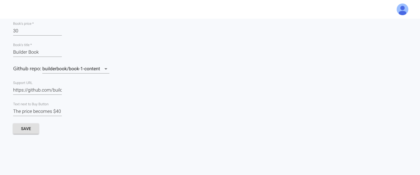
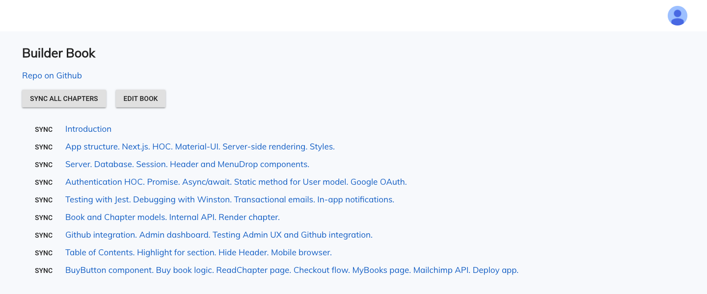
- Book details: to update the content of a book, the Admin syncs with content hosted on a Github repo.
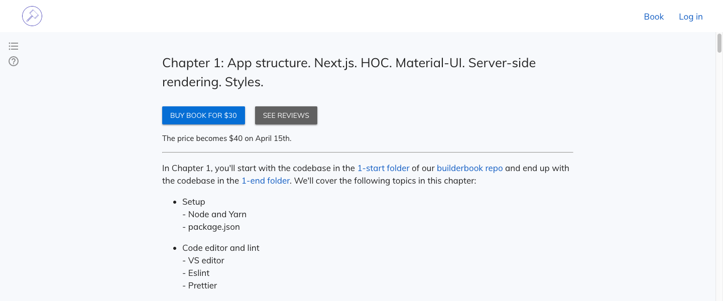
Chapter 1: App structure. Next.js. HOC. Material-UI. Server-side rendering. Styles.
-
Setup
- Node and Yarn
- package.json
-
Code editor and lint
- VS editor
- Eslint
- Prettier
-
App structure
- Next.js
- Document
- Project structure
-
Index page
-
Header component
-
withLayout HOC
-
Material-UI integration
- Add styles on server
- Remove server-side styles
-
Server-side rendering
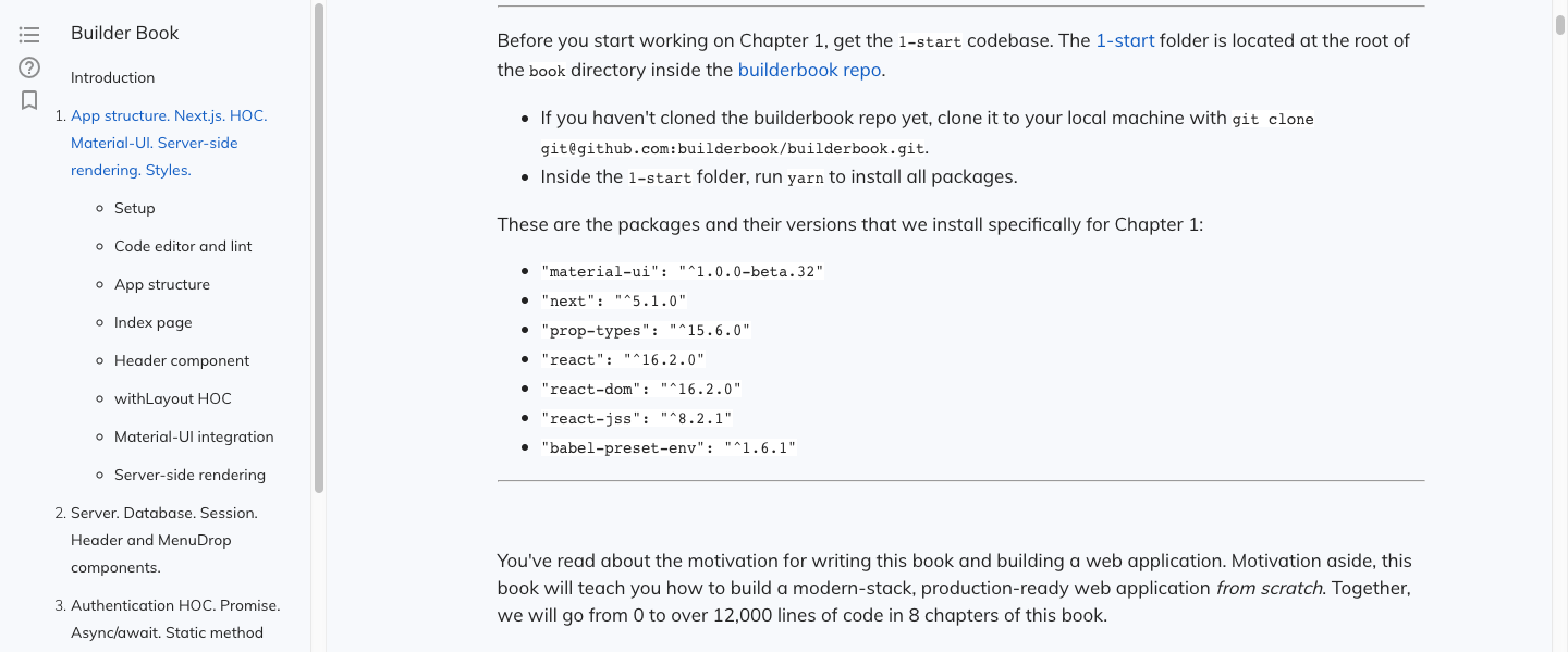
Before you start working on Chapter 1, get the 1-start codebase. The 1-start folder is located at the root of the book directory inside the builderbook repo.
- If you haven’t cloned the builderbook repo yet, clone it to your local machine with
git clone https://github.com/builderbook/builderbook.git. - Inside the
1-startfolder, runyarnto install all packages.
These are the packages that we install specifically for Chapter 1:
"@material-ui/core""next""prop-types""react""react-dom""react-jss"
Check out the 1-start package.json and 1-end package.json for Chapter 1.
- Be sure to use these specific packages and ignore any warnings about upgrading. We regularly upgrade all packages and test them in the book. But before testing, we cannot guarantee that a new package version will work properly.
You’ve read about the motivation for writing this book and building a web application. Motivation aside, this book will teach you how to build a modern-stack, production-ready web application from scratch . Together, we will go from 0 to over 10,000 lines of code in 8 chapters of this book.
In this very first chapter, we have multiple goals:
- set up our coding environment
- create our app structure
- get familiar with Next.js (Next)
- create our first page and component
- create a higher-order component
- integrate Next with Material-UI
- learn about server-side rendering
- add global and shared styles
Setup
We work on Ubuntu 16.04 LTS. we skipped the 17.04 release and decided to wait for stable 18.04. Thus, we provide installation instructions specific to a Linux-based OS (for example, Ubuntu and MacOS). We use the Visual Studio editor (VS editor), which we find easier to use and automate than any other popular editor. The web application that we build in this book will allow you, via integration with Github, to use VS editor for writing documentation and books.
The core technologies of the Builder Book app are React, Material-UI, Next, Express, Mongoose, and MongoDB. By the end of this chapter, we will create a static web app (no server and no database yet). To do so, we will install and integrate the first three technologies - React, Material-UI, and Next.
link Node and Yarn
We are building a Node app, and many of the tools that we use in this app also require Node.
We suggest using Node with the help of nvm (Node Version Manager). On Linux, press Ctrl+Alt+T to open your terminal (alternatively, use the search bar to search for terminal).
- Run the command below to install nvm:
curl -o- https://raw.githubusercontent.com/creationix/nvm/v0.33.11/install.sh | bash - Check the nvm version to confirm successful installation:
nvm --version - Trigger nvm:
. ~/.nvm/nvm.sh - Install Node 10.5.0:
nvm install 10.5.0 - Make it default:
nvm alias default 10.5.0 - Check Node version to confirm successful installation:
node -v
Node version should be 10.5.0.
Once Node is installed, we can install Yarn, a manager for third-party packages (also called dependencies or modules). Whenever we need to use code developed by other developers - we add the package name and version to a package.json file and run yarn in the app’s directory. More on package.json in the next section.
If you’re using Ubuntu:
- Configure the Debian package repository for Yarn by running the following two commands in your terminal:
curl -sS https://dl.yarnpkg.com/debian/pubkey.gpg | sudo apt-key add -
echo "deb https://dl.yarnpkg.com/debian/ stable main" | sudo tee /etc/apt/sources.list.d/yarn.list
- Then install Yarn with:
sudo apt-get update && sudo apt-get install yarn
- Check Yarn version to confirm successful installation:
yarn -v
If you’re using another operating system, find specific instructions here on yarn’s official website. Select your OS from the “Operating system” dropdown menu.
In this book, the Yarn version is 1.12.3 .
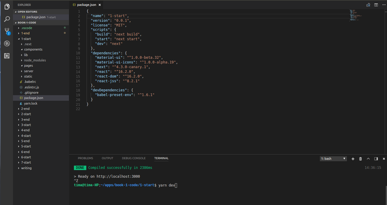
package.json
package.json is a required file at the root of any Node application. This file contains the app’s metadata: app name, app version, scripts, and dependenices (described by name and version), among other properties. Read about working with a package.json file to learn more about metadata. Some parameters are optional ( keywords , license ), but some are required ( name , version ).
Open the 1-start folder located at builderbook/book/ . Take a look at our package.json file:
package.json :
{
  "name": "1-start",
  "version": "0.0.1",
  "license": "MIT",
  "scripts": {
    "build": "next build",
    "start": "next start",
    "dev": "next"
  },
  "dependencies": {
    "@material-ui/core": "^3.3.1",
    "next": "^7.0.2",
    "prop-types": "^15.6.2",
    "react": "^16.6.0",
    "react-dom": "^16.6.0",
    "react-jss": "^8.6.1"
  },
  "devDependencies": {}
}
You can see required metadata like name and version (version format is major.minor.patch ).
The section of package.json called scripts contains shortcuts for commands. At the end of this book, the scripts section will contain the following command:
“dev”: “nodemon server/app.js --watch server”
This command (shortcut) allows us to run our app locally by typing yarn dev in the terminal instead of manually typing:
yarn nodemon server/app.js --watch server
It’s ok if you don’t understand the above command. We will discuss it detail in Chapter 2 when we write our first server-side code. In this chapter and part of Chapter 2, since there is no server to start, you will run your app locally with yarn next or yarn dev ( "dev": "next" ).
Also in Chapter 2, we’ll introduce the dotenv package, which will manage most of our environmental variables (over a dozen in total) in our app.
Inside the scripts commands, you may choose to pass environmental variables. You would set it up by adding NODE_ENV=production to one of the commands in the scripts section. Let’s consider an example. At the end of this book, we will start our app locally using yarn dev , which has the following shortcut in the scripts section:
“dev”: “nodemon server/app.js --watch server”
We don’t pass any environmental variables inside this command. Thus, NODE_ENV and ROOT_URL default to development and http://localhost:8000 , respectively.
We are able to pass environmental variables by prepending them to the command. For example, to build our app on a remote production server, we may use yarn build with this shortcut:
“build”: “NODE_ENV=production next build”
In this case, the value of NODE_ENV is explicitly set to production . Next.js will build the production app properly with NODE_ENV equal to production . In Chapter 2, we will discuss how to manage server-side environmental variables. In Chapter 8, we will discuss how to manage universally available (available on client and server) environmental variables.
The next section in our package.json file is dependencies . This section contains a list of third-party packages that we need in production and development environments. To install all packages from package.json , simply run yarn in your terminal while inside the app’s directory.
To check if Yarn successfully installed the packages, look for a newly generated node_modules folder and yarn.lock lockfile at the app’s root directory. The former folder contains the code of third-party packages, and the latter file contains the exact versions of packages and their dependencies.
In the scripts section, you can specify a combination of commands or run the scripts directly from your files. From our package.json file, if you run yarn dev in your terminal, you will first run yarn next .
devDependencies are dependencies that our app uses in development but not in production. Typically, developers use packages in devDependencies to run tests, compile code, or lint code locally.
If you ran the yarn command inside the 1-start folder, then you successfully installed all packages we need for Chapter 1. We will discuss each installed package later in this chapter.
Code editor and lint
In this section, we will set up preferences for Visual Studio Code editor (VS editor) and discuss/install two extensions that help us format code: Eslint and Prettier.
VS editor
We prefer the Visual Studio code editor, because it easily integrates with Github and Eslint (which formats code), and it comes with Terminal (this allows you to stay within the editor while running commands). Here is a typical view of the editor with terminal. A list of staged changes is one click away, and you can see that we have 2 staged changes:
In addition, VS editor has many optional settings that may increase your productivity. VS editor has 2 types of settings: User settings and Workspace settings. Read more in Visual Studio’s docs.
The User settings are specific to your machine and will apply globally to any project you work on unless you configure Workspace settings. Since we only want to create settings for our builder book project, and not affect any settings you’d like on your own machine, we will modify the Workspace settings.
You can access Workspace Settings by going to File (or Code )> Preferences > Settings > Workspace Settings . Then click ... at the top right and select Open settings.json . Here is a list of our Workspace Settings:
{
  "window.zoomLevel": -1,
  "files.autoSave": "afterDelay",
  "git.enableSmartCommit": true,
  "editor.formatOnSave": true,
  "eslint.autoFixOnSave": true,
  "prettier.eslintIntegration": true,
}
And here is a snapshot of our Workspace Settings:
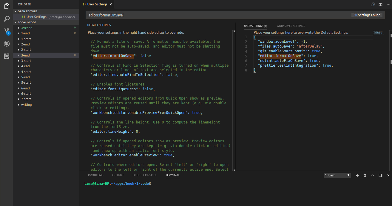
-
"window.zoomLevel": -1sets the zoom level to 80% - our personal preference, since we like to scroll less, especially when writing a tutorial or book. -
"files.autoSave": "afterDelay"saves files automatically for you, so you don’t need to save your files manually. -
"git.enableSmartCommit": truestages changes automatically, so you don’t need to stage your changes manually. -
"editor.formatOnSave": truedetects formatters, such as Eslint, and formats your code on each save event. To format code on a save event, you have to manually save the file.
Below, we will discuss the remaining 2 settings that are related to Eslint and Prettier code formatters.
To format code, we use the ESLint extension by Dirk Baeumer in Visual Studio. We configure this extension with dependencies for Prettier by Esben Petersen:
Eslint and Prettier
Eslint lints code, i.e. it checks code for potential formatting problems and fixes them. After you install the Eslint extension on VS editor, you will see new settings. Read the full list of settings here. One setting that we want to set to true is:
“eslint.autoFixOnSave”: true
This setting makes Eslint apply fixes to your code when you save a file manually.
Prettier is also a code formatter. Rather than install the Prettier extension in VS editor, we will use Prettier installed as a dev dependency with Eslint. We chose this set up because it is compatible with VS Editor, Sublime Text 3, and Atom, in case you prefer one of the latter two code editors over VS Editor.
Before we jump in and test Eslint and Prettier out, we need to create a configuration file and install missing dependencies. Eslint requires a .eslintrc.js file that contains a list of formatting rules. Formatting rules can specify the type of quotes and commas to use, the maximum length for a line of code, and more. Make sure to place the .eslintrc.js file at the app’s root directory:
.eslintrc.js :
module.exports = {
  parser: 'babel-eslint',
  extends: ['airbnb', 'plugin:prettier/recommended'],
  env: {
    browser: true,
    jest: true,
  },
  plugins: ['react', 'jsx-a11y', 'import', 'prettier'],
  rules: {
    'max-len': ['error', 100],
    'no-underscore-dangle': ['error', { allow: ['_id'] }],
    'no-mixed-operators': 'off',
    'prefer-destructuring': [
      'error',
      {
        VariableDeclarator: {
          array: false,
          object: true,
        },
        AssignmentExpression: {
          array: true,
          object: false,
        },
      },
      {
        enforceForRenamedProperties: false,
      },
    ],
    'import/prefer-default-export': 'off',
    'jsx-a11y/anchor-is-valid': 'off',
    'react/react-in-jsx-scope': 'off',
    'react/jsx-filename-extension': [
      'error',
      {
        extensions: ['.js'],
      },
    ],
    'prettier/prettier': [
      'error',
      {
        singleQuote: true,
        trailingComma: 'all',
        arrowParens: 'always',
        printWidth: 100,
      },
    ],
  },
};
We included the .eslintrc.js file with all necessary rules in our 1-end folder.
To make Eslint and Prettier work properly, we need to install the missing packages that they rely on.
Add the following dependencies to your package.json file and run yarn :
"devDependencies": {
    "babel-eslint": "^10.0.1",
    "eslint": "^5.7.0",
    "eslint-config-airbnb": "^17.1.0",
    "eslint-plugin-import": "^2.14.0",
    "eslint-plugin-jsx-a11y": "^6.1.2",
    "eslint-plugin-react": "^7.11.1",
    "eslint-config-prettier": "^3.3.0",
    "eslint-plugin-prettier": "^3.0.0",
    "prettier": "^1.15.3"
  }
}
A list of all Eslint rules is in the official docs. Check out, for example, the max-len rule.
Here’s an example of code with an Eslint error for max-len :
var foo = { “bar”: “This is a bar.”, “baz”: { “qux”: “This is a qux” }, “difficult”: “to read” };
And here’s the same code without the max-len error:
var foo = {
  "bar": "This is a bar.",
  "baz": { "qux": "This is a qux" },
  "easier": "to read"
};
You may have noticed that we installed the eslint-config-airbnb package and extended Eslint with extends: 'airbnb' . In addition to rules that we specified in .eslintrc.js , we use rules from the eslint-config-airbnb package.
Now that you’ve properly installed and configured Eslint and Prettier, let’s test them. We’ll start with testing Eslint.
Create a pages/index.js file inside your 1-start folder, then paste the following code:
pages/index.js :
[1, 2, 3].map(function (x) {
  const y = x + 1;
  return x * y;
});
Eslint will highlight this code, and when you hover over the highlighted code, you will see a description of the error(s):
[eslint] Unexpected unnamed function. (func-names)
[eslint] Unexpected function expression. (prefer-arrow-callback)
This type of Eslint error is a result of Airbnb’s format rule for arrow functions. To fix this error, simply save the file manually with Ctrl+S , and the code will be edited into:
pages/index.js :
[1, 2, 3].map((x) => {
  const y = x + 1;
  return x * y;
});
As we mentioned above, Eslint is able to fix some problems automatically when you save the file manually and have "eslint.autoFixOnSave": true in your User Settings on VS editor.
You can also find Eslint problems in all files of your application. To do so, add one new script shortcut to the scripts section of your package.json file:
"lint": "eslint pages"
The scripts section becomes:
"scripts": {
    "build": "next build",
    "start": "next start",
    "dev": "next",
    "lint": "eslint pages"
}
Go back to pages/index.js and re-add the code that contains Eslint errors:
pages/index.js :
[1, 2, 3].map(function (x) {
  const y = x + 1;
  return x * y;
});
Run yarn lint inside your 1-start folder. Eslint will find errors and a warning in pages/index.js :
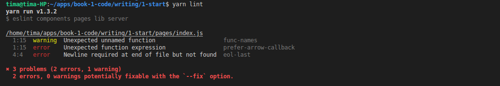
Cool part - you can fix some of these code style errors automatically by running yarn lint --fix .
Run yarn lint --fix and check out the pages/index.js file. The code will be automatically fixed by Eslint.
In case you want to prevent Eslint from editing or noting errors on part of your code, you can specify lines of code or files that Eslint should not run on.
To disable Eslint on a line of code, add the following code to that line:
// eslint-disable-line
To disable Eslint inside a file, add the following code to the top of that file:
/* eslint-disable */
Now that we’ve tested Eslint, let’s do a practical example to understand why we need Prettier.
Open your pages/index.js file and paste the following code:
foo(reallyLongArg(), reallyReallyLongArg(), omgSoManyParameters(), IShouldRefactorThis(), isThereSeriouslyAnotherOne());
Hover over the first highlight by Eslint:
[eslint] Line 17 exceeds the maximum line length of 100. (max-len)
n bg573
Manually save file the with Ctrl+S , and the code will be automatically be formatted to:
foo(
  reallyLongArg(),
  reallyReallyLongArg(),
  omgSoManyParameters(),
  IShouldRefactorThis(),
  isThereSeriouslyAnotherOne(),
);
Note that this code, unlike the arrow function example from above, does not get fixed with Eslint. In this case, we needed Prettier.
Now you’re set for writing cleaner, formatted code. In the next section, we will discuss how to structure our app and get familiar with the Next.js framework.
App structure
In this section we will discuss how to organize our app. We’ll discuss where to put:
- client-only code
- code that is available on both client and server
- server-only code
Next.js
Next.js provides our app with simple routing, error handling (404 and 500 HTTP errors), server-side rendering on initial load, and hot code reloading. In addition, Next.js uses webpack to automatically bundle modules (for example, pages and components) without any manual configuration by developers. Basically, if you like to start quickly and don’t want to build these basic features of your web app from scratch, Next.js is a good choice.
We’ll be discussing Next.js as we go through this book. To learn the basics, check out this tutorial created by Arunoda Susiripala from Zeit.
We will discuss server-side rendering in more detail in the last three sections of this chapter, especially in the section titled Server-side rendering .
If you ran yarn inside the 1-start folder, then Next.js is already installed. To check it - run yarn build in your terminal, and the .next folder will be generated at the root. Alternatively, run yarn dev , and the app should start at http://localhost:3000 . You won’t see any page on your browser, since we haven’t created a page yet.
Next.js specifies rules on how to structure your app. You store code for pages in a /pages folder, and the name of each page file becomes that page’s route.
You store components and static files (such as images) in /components and /static folders, respectively. Important note - when we prepare our app for production, we strongly recommend moving files from /static to some content delivery network (CDN). We store static resources at Google Cloud.
├── components                  # React components
├── lib                         # Code available on both client and server
├── pages                       # Pages
├── server                      # Server code
├── static                      # Static resources
├── package.json                # List of packages and scripts
We place code that should be available on both client and server (for example, higher-order components and API methods) in the /lib folder. Code in this folder should be available on the server for server-side rendering of pages (more on this below), and also on the client for client-side rendering.
We will put all server-only code, such as Express server, Express routes, and third-party APIs, in the /server folder.
Next.js lets you configure webpack by creating a next.config.js file at the root. You can also customize error pages 404 and 500 by creating a custom page inside pages/_error.js .
We won’t customize webpack or error pages, but we will customize <Document> by creating pages/_document.js .
Document
In Next.js, you don’t need to specify <head> , <html> , and <body> elements on every page. These elements are included automatically, but you can customize them by extending the Document class inside a pages/_document.js file.
Create your pages/_document.js file:
pages/_document.js :
import Document, { Head, Main, NextScript } from 'next/document';

export default class MyDocument extends Document {
  render() {
    return (
      <html lang="en">
        <Head />
        <body>
          <Main />
          <NextScript />
        </body>
      </html>
    )
  }
}
Our web app, like any other, should have the following three elements inside its <Header> :
- useful metadata for browsers
- static resources (favicon, font, Material icons, minified css files for Nprogress bar and code highlighting)
- global styles
In addition:
- though not inside
<Header>, we should add some styles for the<body>element as well
Translate English into HTML and update the code snippet above. You get this carcass for our page:
pages/_document.js :
import Document, { Head, Main, NextScript } from 'next/document';

class MyDocument extends Document {
  render() {
    return (
      <html lang="en">
        <Head>

          // 1. metadata

          // 2. static resources (from CDN)

          // 3. global styles

        </Head>
        <body
          style={{ /* styles for body */ }}
        >
          <Main />
          <NextScript />
        </body>
      </html>
    )
  }
}

export default MyDocument;
Let’s fill it out.
- Add the following four meta tags, though all of them are optional:
<meta charSet="utf-8" />
// tells browser that content is UTF-8 encoded

<meta name="viewport" content="width=device-width, initial-scale=1.0" />
// sets page width to screen width, sets initial zoom

<meta name="google" content="notranslate" />
// tell google to not show translate modals

<meta name="theme-color" content="#1976D2" />
// specifies color of browser on mobile device
- Add these four resources from CDN (we use Google Cloud, but you can upload your resources to any other CDN). We suggest adding favicon image, font, styles for Nprogress (introduced in Chapter 3), and styles for highlighting markdown (introduced in Chapter 5):
<link
 rel="shortcut icon"
 href="https://storage.googleapis.com/builderbook/favicon32.png"
/>
<link
 rel="stylesheet"
 href="https://fonts.googleapis.com/css?family=Muli:300,400:latin"
/>
<link
 rel="stylesheet"
 href="https://fonts.googleapis.com/icon?family=Material+Icons"
/>
<link
 rel="stylesheet"
 href="https://storage.googleapis.com/builderbook/nprogress.min.css"
/>
<link rel="stylesheet" href="https://storage.googleapis.com/builderbook/vs.min.css" />
- Add global styles for
<a>,<blockquote>,<pre>, and<code>. Our book content will contain the latter three elements. In Chapter 5, you will learn about themarkedpackage and how it convertsmarkdownintoHTML. Styles:
<style>
 {`
   a, a:focus {
     font-weight: 400;
     color: #1565C0;
     text-decoration: none;
     outline: none
   }
   a:hover, button:hover {
     opacity: 0.75;
     cursor: pointer
   }
   blockquote {
     padding: 0 1em;
     color: #555;
     border-left: 0.25em solid #dfe2e5;
   }
   pre {
     display:block;
     overflow-x:auto;
     padding:0.5em;
     background:#FFF;
     color: #000;
     border: 1px solid #ddd;
   }
   code {
     font-size: 14px;
     background: #FFF;
     padding: 3px 5px;
   }
 `}
</style>
- Finally, add a
<body>element with these styles:
<body
 style={{
   font: '16px Muli',
   color: '#222',
   margin: '0px auto',
   fontWeight: '300',
   lineHeight: '1.5em',
   backgroundColor: '#F7F9FC',
 }}
>
 // some code
</body>
Paste the code snippets from steps 1 to 4 into the page carcass, and you get:
pages/_document.js :
import Document, { Head, Main, NextScript } from 'next/document';

class MyDocument extends Document {
  render() {
    return (
      <html lang="en">
        <Head>
          <meta charSet="utf-8" />
          <meta name="viewport" content="width=device-width, initial-scale=1.0" />
          <meta name="google" content="notranslate" />
          <meta name="theme-color" content="#1976D2" />

          <link
            rel="shortcut icon"
            href="https://storage.googleapis.com/builderbook/favicon32.png"
          />
          <link
            rel="stylesheet"
            href="https://fonts.googleapis.com/css?family=Muli:300,400:latin"
          />
          <link
            rel="stylesheet"
            href="https://fonts.googleapis.com/icon?family=Material+Icons"
          />
          <link
            rel="stylesheet"
            href="https://storage.googleapis.com/builderbook/nprogress.min.css"
          />
          <link rel="stylesheet" href="https://storage.googleapis.com/builderbook/vs.min.css" />

          <style>
            {`
              a, a:focus {
                font-weight: 400;
                color: #1565C0;
                text-decoration: none;
                outline: none
              }
              a:hover, button:hover {
                opacity: 0.75;
                cursor: pointer
              }
              blockquote {
                padding: 0 1em;
                color: #555;
                border-left: 0.25em solid #dfe2e5;
              }
              pre {
                display: block;
                overflow-x: auto;
                padding: 0.5em;
                background: #FFF;
                border: 1px solid #ddd;
              }
              code {
                font-size: 14px;
                background: #FFF;
                padding: 3px 5px;
              }
            `}
          </style>
        </Head>
        <body
          style={{
            font: '16px Muli',
            color: '#222',
            margin: '0px auto',
            fontWeight: '300',
            lineHeight: '1.5em',
            backgroundColor: '#F7F9FC',
          }}
        >
          <Main />
          <NextScript />
        </body>
      </html>
    );
  }
}

export default MyDocument;
Babel
Babel is a JavaScript compiler. It will take the Javascript code that we wrote and convert it into JavaScript that browsers understand. To configure Babel, we need to tell Babel which presets to use.
Babel preset is a set of plugins that support particular language features. For example, the preset react supports JSX features, while the preset es2015 supports ES2015/ES6 features. You specify presets in a .babelrc file at your app’s root. Normally, since Babel does not do anything to the code by default, you would need to create .babelrc file at the app’s root and specify presets and plugins in this file.
However, Next.js uses Babel internally. Currently, Next.js uses the following Babel presets and plugins.
It’s important to emphasize: since Next.js uses Babel internally to compile code - we don’t need to configure Babel with .babelrc .
If you build some other app that requires you to configure babel, check out how to customize Babel in a Next.js app. In short, you would create a .babelrc file:
{
  "presets": ["next/babel"],
  "plugins": []
}
The default behavior of Next.js will be overwritten with configs specified in the .babelrc file.
Important note: Next.js compiles all modules that are imported to pages . That means that any code that is not imported into pages has to be compiled by us. If we want to use newer ES6 syntax (such as import/export instead of require/module.exports ) for server code, we would have to compile server code with babel-node . However, in this book we use older require/module.exports and there is no need in using babel-node . Eventually, Node.js will support newer ES6 syntax for importing and exporting modules.
In addition to the .eslintrc.js file, we provided you with a .gitignore file that contains a list of sensitive files that we strongly recommend not to store on a remote Github repository. For example, .gitignore has the .env file that contains sensitive API keys and secrets (discussed in Chapter 2).
In the next section, we will write our first page and component. After that, we will start our app with yarn dev and check out <head> , <html> , and <body> of our page using Developer tools > Elements on Chrome.
Index page
Time to create our very first page - the Index page. In ES6, const Index = React.createClass({}) becomes class Index extends React.Component {} . Thus, you get:
pages/index.js :
import React from 'react';

class Index extends React.Component {
  render() {
    return <div>some content</div>;
  }
};
We will use the above syntax for components with state . However, since our first version of the Index component has no:
-
state, - refs,
- lifecycle methods (such as
componentDidMountor any other).
Thus we may choose to write component as stateless functional component. Example of a stateless functional component, Pure :
const Pure = () => {
  return <div>some content</div>
};

export default Pure;
In the case of our Index component, we get:
pages/index.js :
import Head from 'next/head';
const Index = () => (
<div style={{ padding: '10px 45px' }}>
<Head>
<title>Index page</title>
<meta name="description" content="This is the description of the Index page" />
</Head>
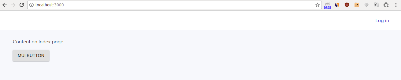
<p>Content on Index page</p>
</div>
);
export default Index;
Check out this blog post about the pros and cons of using stateless functional component.
We imported Head from next/head and specified a title and description for proper indexing by search engines (good for SEO). Title and description will be added to the <head> element of our Index page. We also added some padding to the page by using the inline (local) style style={{ padding: '10px 45px' }} .
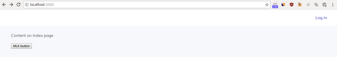
Time to test. Start your app with yarn dev , go to http://localhost:3000 . You will see a page with Content on Index page . On Chrome, go to Developer tools > Elements . Find and click on the <head> element:
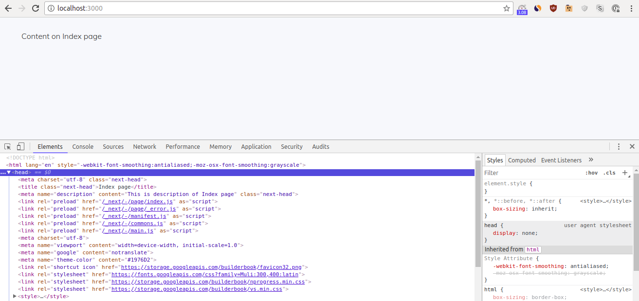
Good job if you see the proper <title> and <meta name="description"> from pages/index.js . You can also see the link tags and styles, as well as other meta tags, that we added earlier to pages/_document.js . Now you know how customize <Document> and create a page in a React/Next.js app!
Rename pages/index.js to pages/about.js . Start your app with yarn dev and go to http://localhost:3000 . You see a simple 404 error page provided by Next.js:
To see our page, you have to navigate to the /about route ( http://localhost:3000/about ), since the file name is the page route in Next.js.
Remember to rename the file back to pages/index.js .
Header component
You may have noticed that our Index page has no Header. Let’s create a Header component as a stateless functional component in the same way we wrote the Index component:
components/Header.js :
const Header = () => {
  return <div>some content</div>
};

export default Header;
We use Next.js’s <Link> element for routing - read more about it. It’s possible to prefetch a route with <Link prefetch> . The prefetch feature is production-only. If you specify a prefetch option, then your app will download the static code of a page with the route specified in the href parameter of <Link> .
If your page has only static code and no data to wait for, then loading the prefetched page will feel almost instant. When a page needs to wait for data, there will be a delay; however, the page will still load faster than without using prefetch .
We will use the prefetch option to almost instantly load our Login page (introduced in Chapter 3 and tested, after deployment, in Chapter 8). The Login page is a static page that has no data to wait for. In Chapter 3, we will test how prefetch works. For now, we will only add prefetch to <Link> :
components/Header.js :
import Link from 'next/link';

const Header = () => (
  <div>
    <Link prefetch href="/login">
      <a style={{ margin: '0px 20px 0px auto' }}>Log in</a>
    </Link>
  </div>
);

export default Header;
Import this Header component into the Index page:
import Head from 'next/head';
import Header from '../components/Header';

const Index = () => (
  <div style={{ padding: '10px 45px' }}>
    <Head>
      <title>Index page</title>
      <meta name="description" content="This is the description of the Index page" />
    </Head>
    <Header />
    <p>Content on Index page</p>
  </div>
);

export default Index;
Start your app with yarn dev and go to http://localhost:3000 :
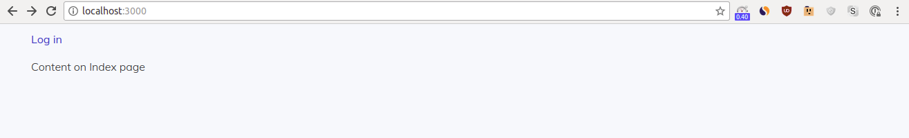
That’s a starting point but not acceptable. We should make some UI improvements.
Eventually, in our Header component, we want to place multiple items in separate columns. In the Material-UI library (installed with yarn at the start of this chapter), the Grid element creates a column grid, and the Toolbar element adds a bar with action items. Click the hyperlinks to learn more about their properties. We use them as follows:
components/Header.js :
import Link from 'next/link';

import Toolbar from '@material-ui/core/Toolbar';
import Grid from '@material-ui/core/Grid';

import { styleToolbar } from './SharedStyles';

const Header = () => (
  <div>
    <Toolbar style={styleToolbar}>
      <Grid container direction="row" justify="space-around" align="center">
        <Grid item xs={12} style={{ textAlign: 'right' }}>
          <Link prefetch href="/login">
            <a style={{ margin: '0px 20px 0px auto' }}>Log in</a>
          </Link>
        </Grid>
      </Grid>
    </Toolbar>
  </div>
);

export default Header;
Earlier in this chapter, we added some global styles to our pages/_document.js . We call these styles global because our app applies them to all elements. However, in some situations, you want to use a style only in a few places. We can call these styles shared to emphasize that they can be exported/imported and shared among a few components and pages.
We place shared styles in components/SharedStyles.js . Create this file with the following content:
const styleToolbar = {
  background: '#FFF',
  height: '64px',
  paddingRight: '20px'
}

module.exports = {
  styleToolbar
}
As you can see, we imported styleToolbar to our Header component and used this style on the <Toolbar> element.
In 1-end/components/SharedStyles.js , we provide a few more styles that we will use in this book.
Start your app with yarn dev and go to http://localhost:3000 :
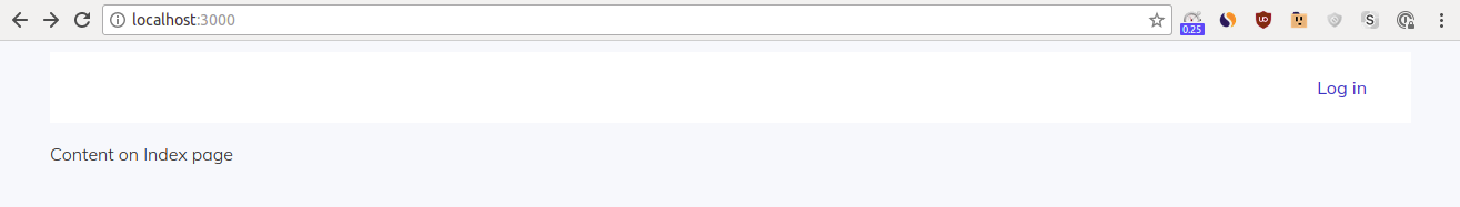
Looking better. We will add one more improvement in the next section.
withLayout HOC
In the previous section, we imported and added the Header component to our Index page. Our app will have 5+ pages, so importing and adding the Header component to each page will be time-consuming. It will be much faster to wrap our pages with a higher-order component that contains the Header component. In addition to the Header component, this higher-order component (HOC) can pass some props to our pages. In Chapter 2, we will use a HOC to pass a user prop to our Header component.
In React, by definition, a HOC (or HOC function) is a function that takes a component ( BaseComponent ) and returns a new component ( App ):
const App = higherOrderComponent(BaseComponent)
In our case, we will wrap our Index component with our withLayout HOC during export:
export default withLayout(Index)
Before we start using the withLayout HOC for wrapping pages, we need to construct it. Based on the HOC definition above, our withLayout function should take BaseComponent as an argument and return a new component App . You already know from the Index page section that, in ES6, we define an App component with class App extends React.Component {} :
class App extends React.Component {
  render() {
    return (
      <div>
        <CssBaseline />
        <BaseComponent {...this.props} />
      </div>
    );
  }
}
We’ll wrap this App component with our withLayout() function that takes BaseComponent as an argument and returns a new App component:
function withLayout(BaseComponent) {
  class App extends React.Component {
    render() {
      return (
        <div>
          <CssBaseline />
          <BaseComponent {...this.props} />
        </div>
      );
    }
  }

  return App;
}
Create a lib/withLayout.js file. Add missing imports and the code block above to the file:
lib/withLayout.js :
import React from 'react';
import CssBaseline from '@material-ui/core/CssBaseline';

function withLayout(BaseComponent) {
  class App extends React.Component {
    render() {
      return (
        <div>
          <CssBaseline />
          <BaseComponent {...this.props} />
        </div>
      );
    }
  }

  return App;
}

export default withLayout;
You may have noticed that we added <CssBaseline /> from Material-UI. This element adds some basic styles to our withLayout HOC. For example, <CssBaseline /> adds this style:
html: {
      WebkitFontSmoothing: 'antialiased',
      MozOsxFontSmoothing: 'grayscale',
    },
Fonts look a bit better with this style. You can see exactly what adding CssBaseline does.
At this point, we made a basic version of our withLayout HOC. Now it’s time to test.
Import and add the Header component to our withLayout component:
lib/withLayout.js :
import React from 'react';
import CssBaseline from '@material-ui/core/CssBaseline';
import Header from '../components/Header';

function withLayout(BaseComponent) {
  class App extends React.Component {
    render() {
      return (
        <div>
          <CssBaseline />
          <Header {...this.props} />
          <BaseComponent {...this.props} />
        </div>
      );
    }
  }

  return App;
}

export default withLayout;
At this point, Eslint will suggest you to re-write the component as a stateless function. Since our withLayout HOC will get more complicated, you can ignore this suggestion by adding /* eslint-disable */ to the top of lib/withLayout.js .
Add our withLayout HOC and remove the Header component on our Index page. Remember to include all imports:
pages/index.js :
import Head from 'next/head';
import withLayout from '../lib/withLayout';

const Index = () => (
  <div style={{ padding: '10px 45px' }}>
    <Head>
      <title>Index page</title>
      <meta name="description" content="This is the description of the Index page" />
    </Head>
    <p>Content on Index page</p>
  </div>
);

export default withLayout(Index);
This is a good place to test. Start your app with yarn dev and go to http://localhost:3000 :

Good job if you can see the Header component.
Open lib/withLayout.js , remove <Header {...this.props} /> and import Header from '../components/Header'; . Save the file, and Next.js will reload the app. Go to http://localhost:3000 :
As we expect, no Header component this time. Remember to add the two lines back to your withLayout.js file.
Material-UI integration
Material Design is a design framework for web and mobile apps. It was developed and released by Google under an Apache-2 license. Since then, developers have created React-specific libraries for material design. We use the Material-UI library.
To test out if we properly integrated Material-UI with Next.js, let’s add <Button> from Material-UI to our Index page:
pages/index.js :
import Head from 'next/head';
import Button from '@material-ui/core/Button';
import withLayout from '../lib/withLayout';

const Index = () => (
  <div style={{ padding: '10px 45px' }}>
    <Head>
      <title>Index page</title>
      <meta name="description" content="This is the description of the Index page" />
    </Head>
    <p>Content on Index page</p>
    <Button variant="contained">
      MUI button
    </Button>
  </div>
);

export default withLayout(Index);
Start your app with yarn dev and go to http://localhost:3000 . Look at the button while refreshing the tab a few times. You will see a flash of style - at first, the button looks like a simple HTML button:
After 500 ms or so, the button gets styling from Material-UI and looks like:

You see a flash of style because the server renders the page with HTML only, without styles . The server sends this HTML-rendered page to the client (browser), where you see a simple HTML button. A few moments later, the client injects styles to HTML, and you see the button styled with Material-UI.
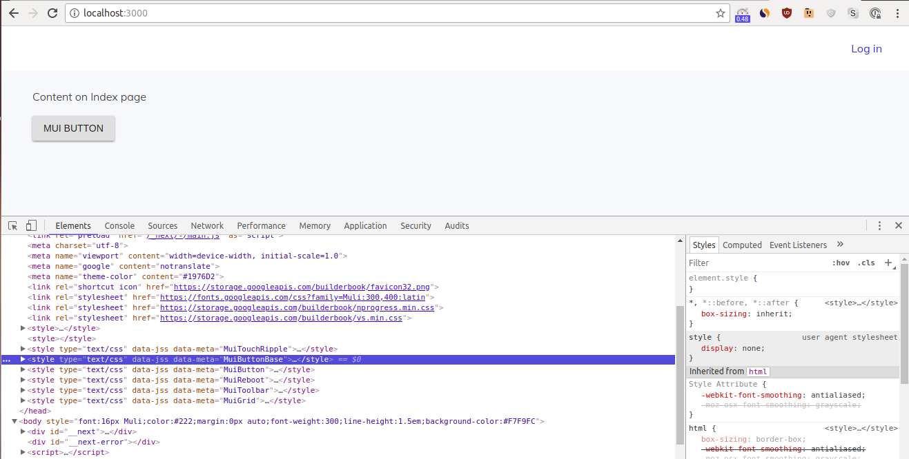
To better understand what we mean by the client injects styles to HTML , go to http://localhost:3000 . Open Developer tools > Elements . Click on the <head> element and delete the following two <style> tags:
<style type="text/css" data-jss="" data-meta="MuiButtonBase"></style><style type="text/css" data-jss="" data-meta="MuiButton"></style>
Here is a screenshot to help you find these tags:
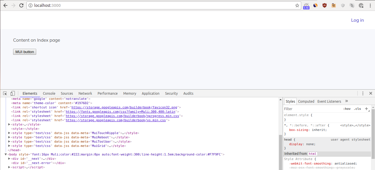
After you delete these <style> tags, you will see a simple HTML button with no style, i.e. the client has no style to inject to the HTML:
Next.js renders pages on the server (for initial load); however, server-side rendering does not come out-of-the-box in Material-UI. We need to write code to integrate Material-UI with Next.js. It’s a big task, but luckily, Material-UI contributors maintain a good example of Next.js/Material-UI integration. We encourage you to check out this official example, since we will follow it closely.
From our testing, we understand what happens between server and client to cause the flash of style. We see that the client injects styles to HTML, but our app does not add styles to HTML on the server .
We want to set up our app to add styles on the server. But after we successfully inject styles to our HTML on the server (server-side styles), we’ll need to remove the server-side styles once the client injects styles (client-side styles).
If we don’t remove server-side styles, then the same HTML elements will have both server-side and client-side styles, and this may lead to errors. Remember that with Next.js, only the initial load is server-rendered. Subsequent renders happen on the client, so there’s no reason to keep server-side styles after injecting client-side styles.
To be able to pass styles to a page on the server, we need to create a pageContext object that contains theme , sheetManager , sheetRegistry , and generateClassName . We’ll discuss the purpose of these 4 parameters in the next section. To inject styles on the server, we will pass pageContext to our MyDocument component ( pages/_document.js ) before rendering.
Let’s summarize what we need to do:
- Create page context
- Inject styles on the server
- Remove server-side styles to avoid side effects
Create page context
We will create pageContext by following the official Next.js/Material-UI example closely.
pageContext is defined as:
function createPageContext() {
  return {
    theme,
    sheetsManager: new Map(),
    sheetsRegistry: new SheetsRegistry(),
    generateClassName: createGenerateClassName(),
  };
}
To inject styles on the server, we need to stringify our CSS styles. To stringify CSS styles, we use SheetsRegistry from the react-jss package. We access sheetRegistry inside pageContext and apply the toString() method:
pageContext.sheetsRegistry.toString()
- The theme object allows us to theme our
withLayoutHOC (atlib/withLayout.js) with simply:
<MuiThemeProvider
 theme={this.pageContext.theme}
>
 <BaseComponent {...this.props} />
</MuiThemeProvider>
For example, we can add primary and secondary colors to our theme:
const theme = createMuiTheme({
 palette: {
   primary: { main: blue[700] },
   secondary: { main: grey[700] },
 },
 typography: {
   useNextVariants: true,
 },
});
We added the typography block of code to eliminate Material-UI deprecation warnings, as described in the docs.Once specified, we can use these colors to style any element, such as a button:
<Button color="primary" variant="contained">MUI button</Button>
2. sheetsManager counts how many elements use the same Style Sheet and automatically attaches/detaches the Style Sheet to/from elements. We use sheetsManager to inject styles to our withLayout HOC:
<MuiThemeProvider
 theme={this.pageContext.theme}
 sheetsManager={this.pageContext.sheetsManager}
>
 <BaseComponent {...this.props} />
</MuiThemeProvider>
- sheetsRegistry gets all CSS styles as a string with:
pageContext.sheetsRegistry.toString()
We need to add a string of styles to the <style> tag using innerHTML (DOM method that sets the HTML content of an element). React uses dangerouslySetInnerHTML instead of innerHTML to set HTML content. Thus, we will pass a string of styles on the server with:
<style
 id="jss-server-side"
 dangerouslySetInnerHTML={{
   __html: pageContext.sheetsRegistry.toString(),
 }}
/>
We use dangerouslySetInnerHTML for styles, since JSX does not support HTML inside the <style> tag.Here is an example of passing Style Sheets to <App /> with <JssProvider> :
<JssProvider registry={sheets}>
   <App />
</JssProvider>
In our case:
<JssProvider
 registry={pageContext.sheetsRegistry}
>
 <Component pageContext={pageContext} {...props} />
</JssProvider>
-
generateClassName generates unique class names for HTML elements. For example, a rendered button may get the unique class
class="jss111 jss96 jss101 jss104". Here is an example of passinggenerateClassNameto<App />with<JssProvider>:
<JssProvider generateClassName={generateClassName}>
 <App />
</JssProvider>
In our case:
<JssProvider
 registry={pageContext.sheetsRegistry}
 generateClassName={pageContext.generateClassName}
>
 <Component pageContext={pageContext} {...props} />
</JssProvider>
Let’s put together a lib/context.js file based on the official example:
lib/context.js :
import { SheetsRegistry } from 'react-jss';
import { createMuiTheme, createGenerateClassName } from '@material-ui/core/styles';
import blue from '@material-ui/core/colors/blue';
import grey from '@material-ui/core/colors/grey';

const theme = createMuiTheme({
  palette: {
    primary: { main: blue[700] },
    secondary: { main: grey[700] },
  },
  typography: {
    useNextVariants: true,
  },
});

function createPageContext() {
  return {
    theme,
    sheetsManager: new Map(),
    sheetsRegistry: new SheetsRegistry(),
    generateClassName: createGenerateClassName(),
  };
}

export default function getContext() {
  if (!process.browser) {
    return createPageContext();
  }

  if (!global.INIT_MATERIAL_UI) {
    global.INIT_MATERIAL_UI = createPageContext();
  }

  return global.INIT_MATERIAL_UI;
}
The following code snippet calls the function createPageContext() , or creates new page context for every server-side request ( !process.browser ):
if (!process.browser) {
  return createPageContext();
}
The following code snippet points global.INIT_MATERIAL_UI to createPageContext() and returns (i.e. makes available on the client) global.INIT_MATERIAL_UI :
if (!global.INIT_MATERIAL_UI) {
  global.INIT_MATERIAL_UI = createPageContext();
}

return global.INIT_MATERIAL_UI;
When we are done integrating Material-UI with Next.js, we will check the value of global.INIT_MATERIAL_UI on the client (browser).
Inject styles on server
In this subsection, our goal is to render a page inside our custom document ( pages/_document.js ) with the renderPage() function as shown in the Next.js example for custom Document:
static getInitialProps ({ renderPage }) {
  const sheet = new ServerStyleSheet()
  const page = renderPage(App => props => sheet.collectStyles(<App {...props} />))
  const styleTags = sheet.getStyleElement()

  return { ...page, styleTags }
}
However, we need to adapt the example to our situation:
- In our situation, we want to import context:
import getContext from ‘…/lib/context’;
And point pageContext to it:
const pageContext = getContext();
- We also want to pass the
pageContextprop and other props to<Component>:
<Component pageContext={pageContext} {...props} />
- And pass
sheetsRegistryandgenerateClassNameto<JssProvider>as discussed in the previous subsection. Wrap<Component>in<JssProvider>:
<JssProvider
 registry={pageContext.sheetsRegistry}
 generateClassName={pageContext.generateClassName}
>
 <Component pageContext={pageContext} {...props} />
</JssProvider>
- Finally, in addition to the page, we want to return
pageContextandstyles:
return {
 ...page,
 pageContext,
 styles: (
   <style
     id="jss-server-side"
     // eslint-disable-next-line
     dangerouslySetInnerHTML={{
       __html: pageContext.sheetsRegistry.toString(),
     }}
   />
 ),
};
Let’s make a short detour to understand how the spread operator works.
You may have noticed ... or spread operator. The spread operator creates a new object with parameters that are cloned from the original object. To better understand it, paste the following code into your browser console. Go to Chrome, open a tab, and access Developer tools > Console :
var foo = { a:1, b:2, c:3 }

console.log({ ...foo });
console.log(Object.assign({}, foo));
Run the code by pressing Enter .
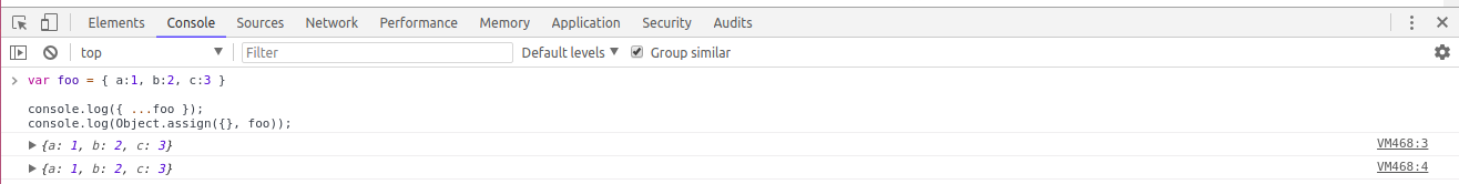
The line console.log({ ...foo }); outputs a new object with parameters cloned from the foo object:
{a: 1, b: 2, c: 3}
Since the outputs of both console.log() statements are the same, you can see that the statement { ...foo } is equivalent to Object.assign({}, foo) . Object.assign with an empty first parameter also creates a new object with cloned parameters from the original object.
In this book, we strive for shorter and more readable syntax. Thus, we pick the spread operator ( ... ) over Object.assign() .
Back to our situation. Instead of cloning the parameters of a foo object, we clone parameters of our page object and add two more parameters - pageContext and styles - to our newly created object:
{
  ...page,
  pageContext,
  styles
}
The code snippet above is equivalent to:
var foo = { a:1, b:2, c:3 }
console.log({ ...foo, d:4, e:5 });
Run this code snippet in your browser console:

As expected, the output is:
{a: 1, b: 2, c: 3, d: 4, e: 5}
Let’s go back to editing pages/_document.js . Modify the official example using our discussion from steps 1-4 above, and you get:
MyDocument.getInitialProps = ({ renderPage }) => {
  const pageContext = getContext();

  const page = renderPage(Component => props => (
    <JssProvider
      registry={pageContext.sheetsRegistry}
      generateClassName={pageContext.generateClassName}
    >
      <Component pageContext={pageContext} {...props} />
    </JssProvider>
  ));

  return {
    ...page,
    pageContext,
    styles: (
      <style
        id="jss-server-side"
        // eslint-disable-next-line
        dangerouslySetInnerHTML={{
          __html: pageContext.sheetsRegistry.toString(),
        }}
      />
    ),
  };
};
The final, updated MyDocument component:
pages/_document.js :
import React from 'react';
import Document, { Head, Main, NextScript } from 'next/document';
import JssProvider from 'react-jss/lib/JssProvider';
import getContext from '../lib/context';

class MyDocument extends Document {
  render() {
    return (
      <html lang="en">
        <Head>
          <meta charSet="utf-8" />
          <meta name="viewport" content="width=device-width, initial-scale=1.0" />
          <meta name="google" content="notranslate" />
          <meta name="theme-color" content="#1976D2" />

          <link
            rel="shortcut icon"
            href="https://storage.googleapis.com/builderbook/favicon32.png"
          />
          <link
            rel="stylesheet"
            href="https://fonts.googleapis.com/css?family=Muli:300,400:latin"
          />
          <link
            rel="stylesheet"
            href="https://storage.googleapis.com/builderbook/nprogress.min.css"
          />
          <link rel="stylesheet" href="https://storage.googleapis.com/builderbook/vs.min.css" />

          <style>
            {`
              a, a:focus {
                font-weight: 400;
                color: #1565C0;
                text-decoration: none;
                outline: none
              }
              a:hover, button:hover {
                opacity: 0.75;
                cursor: pointer
              }
              blockquote {
                padding: 0 1em;
                color: #555;
                border-left: 0.25em solid #dfe2e5;
              }
              pre {
                display:block;
                overflow-x:auto;
                padding:0.5em;
                background:#FFF;
                color: #000;
                border: 1px solid #ddd;
              }
              code {
                font-size: 14px;
                background: #FFF;
                padding: 3px 5px;
              }
            `}
          </style>
        </Head>
        <body
          style={{
            font: '16px Muli',
            color: '#222',
            margin: '0px auto',
            fontWeight: '300',
            lineHeight: '1.5em',
            backgroundColor: '#F7F9FC',
          }}
        >
          <Main />
          <NextScript />
        </body>
      </html>
    );
  }
}

MyDocument.getInitialProps = ({ renderPage }) => {
  const pageContext = getContext();

  const page = renderPage(Component => props => (
    <JssProvider
      registry={pageContext.sheetsRegistry}
      generateClassName={pageContext.generateClassName}
    >
      <Component pageContext={pageContext} {...props} />
    </JssProvider>
  ));

  return {
    ...page,
    pageContext,
    styles: (
      <style
        id="jss-server-side"
        // eslint-disable-next-line
        dangerouslySetInnerHTML={{
          __html: pageContext.sheetsRegistry.toString(),
        }}
      />
    ),
  };
};

export default MyDocument;
Remove server-side styles
We are almost done. Here, we modify our withLayout HOC to remove server-side injected styles after this component is mounted on the browser. We’ll closely follow this official example.
Our tasks for modifying withLayout are:
- before the component renders (componentWillMount()), define
pageContextby pointing it to an existing context (this.props.pageContext) or new context (getContext()):
componentWillMount() {
 this.pageContext = this.props.pageContext || getContext();
}
However, componentWillMount is in the process of depreciation and React won’t support it in versions 17+. Thus let’s set component’s pageContext with React’s constructor(props) like this:
constructor(props) {
 super(props);
 const { pageContext } = this.props;
 this.pageContext = pageContext || getContext();
}
Read more about constructor() method in React docs and Mozilla docs.
2. after the component renders (componentDidMount()), remove server-side styles by selecting an element with the id id="jss-server-side" with the document.querySelector method:
componentDidMount() {
 const jssStyles = document.querySelector('#jss-server-side');
 if (jssStyles && jssStyles.parentNode) {
   jssStyles.parentNode.removeChild(jssStyles)
 }
}
- pass
themeandsheetsManagerto<MuiThemeProvider>, then wrap<MuiThemeProvider>around<BaseComponent {...this.props} />:
<MuiThemeProvider
 theme={this.pageContext.theme}
 sheetsManager={this.pageContext.sheetsManager}
>
 <CssBaseline />
 <div>
   <Header {...this.props} />
   <BaseComponent {...this.props} />
 </div>
</MuiThemeProvider>
Add missing imports and the code snippets from above:
lib/withLayout.js :
import React from 'react';
import PropTypes from 'prop-types';
import { MuiThemeProvider } from '@material-ui/core/styles';
import CssBaseline from '@material-ui/core/CssBaseline';

import getContext from './context';
import Header from '../components/Header';

function withLayout(BaseComponent) {
  class App extends React.Component {
    constructor(props) {
      super(props);
      const { pageContext } = this.props;
      this.pageContext = pageContext || getContext();
    }

    componentDidMount() {
      const jssStyles = document.querySelector('#jss-server-side');
      if (jssStyles && jssStyles.parentNode) {
        jssStyles.parentNode.removeChild(jssStyles);
      }
    }

    render() {
      return (
        <MuiThemeProvider
          theme={this.pageContext.theme}
          sheetsManager={this.pageContext.sheetsManager}
        >
          <CssBaseline />
          <div>
            <Header {...this.props} />
            <BaseComponent {...this.props} />
          </div>
        </MuiThemeProvider>
      );
    }
  }

  App.propTypes = {
    pageContext: PropTypes.object, // eslint-disable-line
  };

  App.defaultProps = {
    pageContext: null,
  };

  return App;
}

export default withLayout;
I’ve used propTypes and defaultProps on the App component. This usage is optional but recommended. We discuss propTypes and defaultProps in more detail in Chapter 2. If you choose to use them, remember to import:
import PropTypes from ‘prop-types’;
Start your app with yarn dev and navigate to http://localhost:3000 :
The button on the Index page, which originally had a flash of style, now loads without any flash. We successfully integrated Material-UI with Next.js!
We should run two experiments to confirm our conclusion.
- On Chrome, go to
Developer tools > Elementsand clickCtrl+Fto search forjss-server-side. You won’t be able to find any element.Openlib/withLayout.jsand comment out the following line:
// jssStyles.parentNode.removeChild(jssStyles);
Save the file, reload your tab, and go back to Developer tools > Elements . Click Ctrl+F to search for jss-server-side . Now, you will see <style id="jss-server-side"> , which contains server-side styles:

2. Go to
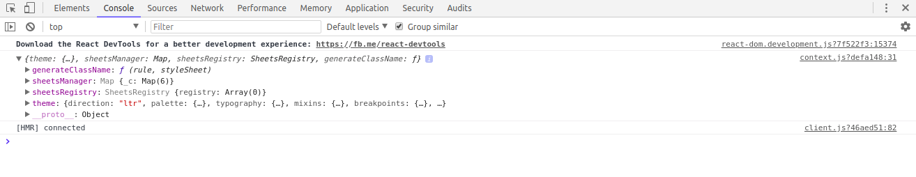
lib/context.js and add console.log(global.INIT_MATERIAL_UI); in this location:
if (!global.INIT_MATERIAL_UI) {
 global.INIT_MATERIAL_UI = createPageContext();
 console.log(global.INIT_MATERIAL_UI);
}

console.log(global.INIT_MATERIAL_UI);

return global.INIT_MATERIAL_UI;
Save the file, reload your tab, and go to Developer tools > Console . You will see a context object that consists of theme , sheetsManager , sheetsRegistry , and generateClassName :
// global.INIT_MATERIAL_UI = createPageContext();
or this line:
// return global.INIT_MATERIAL_UI;
Then you’ll get an error:
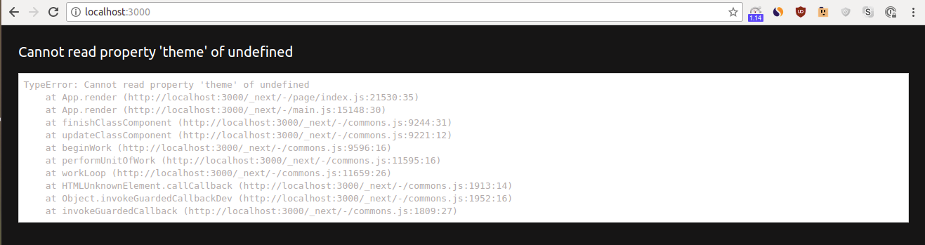
theme ( this.pageContext.theme ) is undefined.
Good job! You successfully finished Next.js/Material-UI integration.
Custom styles
At this point, we’ve discussed a few ways to add styles to your app. We’ll summarize them here and provide examples. As you build your app, feel free to use any of these methods to apply your own styles.
We recommend the following 4 ways to add styles, though you can certainly think of other methods:
- Inline style for a single element.
Add an inline style when you want to apply a style to one element on a single page/component .For example, on ourIndexpage, we wrote this single inline style:
<div style={{ padding: '10px 45px' }}>
  // some code
</div>
- Reusable style for multiple elements within single page or component.
Create a reusable style when you want to apply the same style to multiple elements on a single page/component .For example, in the code snippet above, we could have written a resusable style at the top of the page and then applied that style to the<div>element. In this case, the style is reusable and can be applied to multiple elements on the page.
const styleDiv = {
  padding: '10px 45px',
};

<div style={styleDiv}>
  // some code
</div>
- Reusable/importable style for multiple pages or components.
Create a reusable/importable style when you want apply the same style to elements on multiple pages/components .For example, as described in the Header component section, we createdstyleToolbarinsidecomponents/SharedStyles.jsand exported the style at the bottom of the file:
const styleToolbar = {
  background: '#FFF',
  height: '64px',
  paddingRight: '20px',
};

module.exports = {
  styleToolbar,
};
We then imported styleToolbar into our Header component, and applied the style to a <Toolbar> element from Material-UI:
import { styleToolbar } from './SharedStyles';

<Toolbar style={styleToolbar}>
  // some code
</Toolbar>
- Global style for all pages in application.
Create a global style when you want to apply the same style to elements on all pages of your app. You create your style inpages/_document.js.For example, we specified a style for all hyperlinks that use the<a>element:
<style>
  {`
    a, a:focus {
      font-weight: 400;
      color: #1565C0;
      text-decoration: none;
      outline: none
    }
  // some code
</style>
We also specified styles for all content inside a <body> element:
<body
  style={{
    font: '16px Muli',
    color: '#222',
    margin: '0px auto',
    fontWeight: '300',
    lineHeight: '1.5em',
    backgroundColor: '#F7F9FC',
  }}
>
Server-side rendering
Let’s look at a default behaviour of Next.js: server-side rendering (SSR) on initial load .
Unlike client-side rendering (CSR), SSR has a few advantages. Two specific advantages are SEO (search engine optimization) and UX (user experience):
- server-rendered JavaScript is properly indexed by search engine crawling bots
- server-side rendered pages have no loading delay, i.e. a user sees no empty page with a loading spinner - pages appear on the browser fully rendered
One more potential advantage of SSR is faster loading speed for initial load. Compare server-side rendering with client-side:
- SSR (server-side rendering). For initial page load with SSR, there is only one over-network round trip between client (browser) and server. It takes the server time to render the page with data; however, the client gets both HTML and data for the requested page in one round trip .
- CSR (client-side rendering). For initial page load with CSR, there are two over-network round trips between client and server. After the first round trip, the client gets a page’s HTML. After the second round trip, the client gets that page’s data. Typically, after the second round trip, the client gets HTML for all other app pages. Thus, subsequent page loads (after initial load) are faster, since they do not require HTML but smaller JSON data.
Doing SSR on initial load and CSR on subsequent loads will be best for user experience. That’s exactly what Next.js does: SSR on initial load and CSR for subsequent loads.
Here is an informative blog post that compares SSR with more traditional CSR.
The best way to see that Next.js renders on the server for initial load is to disable SSR. Let’s do an experiment and disable server-side rendering using dynamic import.
Start your app with yarn dev and navigate to http://localhost:3000 .
- With SSR.
- Refresh the browser tab a few times.
Notice that theHeadercomponent andIndexpage show up on the browser at the same time. There is no empty page with a loading element. - Right click anywhere on the page and select
View page source.
Find theLog inlink (inside theHeadercomponent).
Notice that the<a style="margin:0px 20px 0px auto" href="/login">Log in</a>element is wrapped in the server-rendered<div id="__next">...</div>element.
- Refresh the browser tab a few times.
- Without SSR. Let’s see what happens if we disable server-side rendering for the
Headercomponent.Openlib/withLayout.jsand comment out this line:
// import Header from ‘…/components/Header’;
Then, import dynamic :
import dynamic from ‘next/dynamic’;
Finally, define Header as:
const Header = dynamic(import(’…/components/Header’), { ssr: false });
Save the file and reload your tab.
- Refresh your browser tab. Notice how the
Headercomponent now arrives after theIndexpage, with a slight but noticable delay. For a split second, you see that theIndexpage arrives empty (without theHeadercomponent). And while the page is empty, it shows a loading element<p>loading...</p>. After theIndexpage loads,<p>loading...</p>gets replaced by theHeadercomponent. - Right click on the page and select
View page source. Find the server-rendered<div id="__next">...</div>element. Inside it, you won’t find<a style="margin:0px 20px 0px auto" href="/login">Log in</a>. But you will find a<p>loading...</p>element instead of the entireHeadercomponent. The element<p>loading...</p>is server-rendered, and theHeadercomponent replaces the<p>loading...</p>element on the client.
Besides loading UX and SEO, SSR page may load faster than CSR page when network is slow, since in case of CSR there is one extra trip over network. We did a detailed comparison of SSR and CSR in our tutorial at Hackernoon. We compared performance metrics in addition to loading UX. Here is link to sample app that is used to compare SSR to CSR pages: https://ssr-csr.builderbook.org.
In our app, we will use both SSR and CSR:
- if we want SSR on initial load, we will make sure that the page gets data with the
getInitialProps()method. This method executes on the server for initial page load and then on the client if a user gets to the page with<Link href="route">orRouter.push('route'). - if we want CSR only, we will call an API method inside the
componentDidMount()lifecycle hook (see Chapter 5 and 6 for detailed examples) when data loads passively, without any extra action from user. If we want to call an API method after a user takes an action_, such as clicking a button (see Chapter 8, BuyButton), we would place the API method inside an event-handling function (for example,onButtonClick()) _instead ofcomponentDidMount().
In this chapter, you learned integrated Next.js with Material-UI, and learned about server-side rendering. At this point, you have a basic template for static websites. In the next chapter (Chapter 2), we will create an Express server, connect our app to a database, and learn about session and cookie .
At the end of Chapter 1, your codebase should look like the codebase in 1-end . The 1-end folder is located at the root of the book directory inside the builderbook repo.
Compare your codebase and make edits if needed.
Enjoying the book so far? Please share a quick review. You can update your review at any time.