s00e00 - Hello new friend 
Introduction
Hello new friend!

This is me, Swizec
Welcome to what I hope is the best and most fun React and D3 learning resource on the internet. No TODO apps here, just fun interactive stuff that makes you look great at a dinner party.
After an hour with React + D3 , you’ll know how to make React and D3.js play together. You’ll know how to create composable data visualizations. Understand why that’s a good idea, and you will have the tools to build your own library of interactive visualization components. Or use and understand somebody else’s.
It’s going to be fun!
I believe learning new tech should be exciting, so I did my best to inject joy whenever I could.
250+ pages as a book, 8 example apps, near 8 hours of video, a bunch of skill building blocks. 
Going through this course you will:
- build a bunch of reusable visualization components
- build an interactive data dashboard
- learn about reusable animation components
- learn the basics of D3.js
- master React
- learn the basics of Redux and MobX
- look into rendering rich animations on canvas
- explore React alternatives like Preact and Inferno
- learn about server-side rendering
- learn a few basics of data science
- learn some WebGL and 3D rendering
You might be thinking “How the hell does this all fit together to help me build interactive graphs and charts?” . They’re building blocks!
First I will show you the basics. Stuff like how to make React and D3 like each other, how to approach rendering, what to do with state.
Then you’ll build a big project to see how it all fits together.
When you’re comfortable with React and D3 working together, I will show you animation. Cool things like how to approach updating components with fine grained control and how to do transitions. I’ll show you how tricks from the gaming industry work on the web.
Short on time? Don’t worry.
The initial examples work in CodeSandbox, a web-based IDE. Read the explanation, run the code, master enough React to be dangerous. You won’t even have to leave the browser.
In about an hour, you’ll know React and D3 well enough to explore on your own, to sell the tech to your boss and your team, and to assess if the React+D3 combination fits your needs.
I believe learning new tech should be exciting.
Foreword
I wrote the first version of React+D3 in Spring 2015 as a dare. Can I learn a thing and write a book in a month? Yes.
That first version was 91 pages long and sold a few hundred copies. Great success!
You are reading, and watching, the pinnacle of how this material has evolved over almost 4 years. 4 years I’ve been working on this. Not every day, not all the time.
Little experiments here and there, launches and relaunches about once a year. Learning how to do video, exploring new approaches, hosting in-person workshops.
A lot has changed.
React isn’t what it used to be. The internals are different, the API is easier to use. Hooks just flipped everything on its head all over again. Suspense and async rendering are here and getting even better.
D3 has seen less change, but still went through major improvements. It’s easier to use now. Easier to understand. More modern.
It feels like the web development world is a different place in late 2018 than it was in early 2015. It really does. Look at my code from 3 years ago and I think “What!? We used to live like this? This is horrible”
Almost 200 people bought this version of React+D3 in preorders alone. It started as a book update and grew into a proper online course.
If you’re one of those early supporters, thank you! You are the best. Without you this never would have happened. 
Because I think it’s interesting, here’s what I had to say about that first version back in 2015:
I wrote this book for you as an experiment. The theory we’re testing is that technical content works better as a short e-book than as a long article.
You see, the issue with online articles is that they live and die by their length. As soon as you surpass 700 words, everything falls apart. Readers wander off to a different tab in search of memes and funny tweets, never to come back.
This hurts my precious writer’s ego, but more importantly, it sucks for you. If you’re not reading, you’re not learning.
So here we both are.
I’m counting on you to take some time away from the internet, to sit down and read. I’m counting on you to follow the examples. I’m counting on you to learn .
You’re counting on me to have invested more time, effort, and care in crafting this than I would have invested in an article. I have.
I’ve tried to keep this book as concise as possible. iA Writer estimates it will take you about an hour to read React+d3.js , but playing with the examples might take some time, too.
A lot of that still rings true. People are distracted, busy, the internet is shiny. It’s hard to sit down and learn stuff.
The most common feedback I get from students goes something like this 
Loving your book! It’s amazing. So clear and concise and relatable. But I read 20 pages, then my wife had a kid, my boss pulled the project, and I’m doing backend now. But truly amazing. I’m gonna get back to it as soon as I can!
Sometimes they do.
That’s okay. Life happens. I understand. Hell, I procrastinated for months before sitting down to update this stuff 
I recommend you go through the basic chapters at least. The little building blocks. You can do that in an afternoon or two. It’s worth it, I promise.
s00e01 - What you need to know
What you need to know
I’m going to assume you already know how to code and that you’re great with JavaScript. Many books have been written to teach the basics of JavaScript; this is not one of them.
If you’re struggling with modern JavaScript syntax, I suggest visiting my Interactive ES6 Cheatsheet
I’m assuming you’ve tried D3 before, or at least heard of it. You don’t have to know how D3 works, or understand what the code you copy pasted to meet a deadline does. I’ll show you all you need to know.
If you want to learn D3 in depth, there’s plenty of great resources out there. For example, the third edition of my first ever book, D3.js 4.x Data Visualization - Third Edition. Written by Ændrew Rininsland with some chapters left from yours truly.
As for React, same deal: I expect you have some idea how to use it, but you’ll be fine even if this is your first time looking at React. We’ll go through everything you need to know as it’s happening.
All examples in React + D3 use modern JavaScript. That is JavaScript from ES6 – ES2015 – and beyond. No special mods, just stuff you get by default in all React projects in recent years. Even if some syntax isn’t in the standard yet.
I’m going to explain any new syntax that we use.
s00e02 - How to approach React for Dataviz
How to approach React for Data Visualization
I recommend starting with an idea, a problem. Something you want to build. A dataset you want to play with. A feature you want to add to your app.
That makes it easier. Helps focus your brain. Notice things in this course that help you specifically.
From there, I think you should see how much time you’ve got. The course is designed so you can go over the important stuff in a couple hours. Watch a video, read some text, try some code. See how it feels.
If the best way is a daily practice, 20 minutes after work, 5 minutes on the pooper, do that. If you’re more of a sit down and cram it out kind of person, a nice Sunday afternoon with some coffee will do just fine.
But don’t make it a chore. We’re here to have fun
Two suggestions  :
:
- Try the example code. Don’t just copy-paste; type it and execute it. Execute frequently. If something doesn’t fit together, look at the linked Github repositories or solved CodeSandboxes. Each project has one.
- If you know something, skip that section. You’re awesome.

React + D3 is based on code samples. They look like this:
let foo = 'bar';
foo += 'more stuff';
Each code sample starts with a commented out file path. That’s the file you’re editing. Like this:
// ./src/App.js

class App ...
Commands that you should run in the terminal start with an $ symbol, like this:
$ npm start
s00e03 - Why React and D3
Why React and D3
React is Facebook’s approach to writing modern JavaScript front-ends. It encourages building an app out of small, re-usable components. Each component is self-contained and only knows how to render a small bit of the interface.
The catch is that many frameworks have attempted this: everything from Angular to Backbone and jQuery plugins. But where jQuery plugins get become messy, Angular depends too much on HTML structure, and Backbone needs a lot of boilerplate, React has found a sweet spot.
I’ve found React a joy to use. Using React was the first time in my life that I could move a piece of HTML in a modern app without rewriting half my JavaScript. It’s like a super power.
React being the most popular JavaScript framework out there, the world seems to agree. React is great. 
D3 is Mike Bostock’s infamous data visualization library. It’s used by The New York Times along with many other sites. It is the workhorse of data visualization on the web, and many charting libraries out there are based on it.
But D3 is a fairly low-level library. You can’t just say “I have data; give me a bar chart” . Well, you can, but it takes a few more lines of code than that. Once you get used to it though, D3 is a joy to use.
Just like React, D3 is declarative.
You tell your code what you want instead of how you want it. It gives you access straight to the SVG so you can manipulate your lines and rectangles as you want. The problem is that D3 isn’t so great, if all you want are charts.
That’s where React comes in.
Once you’ve created a histogram component, you can always get a histogram with <Histogram x="5" ... /> . Once you have a piechart, it’s always <Piechart x="20" ... /> . Just like they were HTML elements.
Doesn’t that sound like the best? I think it’s amazing.
It gets better!
With React, you can make different graph and chart components share the same data. When your data changes, the whole visualization reacts.
Your graph changes. The title changes. The description changes. Everything changes. Mind, blown.
Look how this H1B salary visualization changes when the user picks a subset of the data to look at.
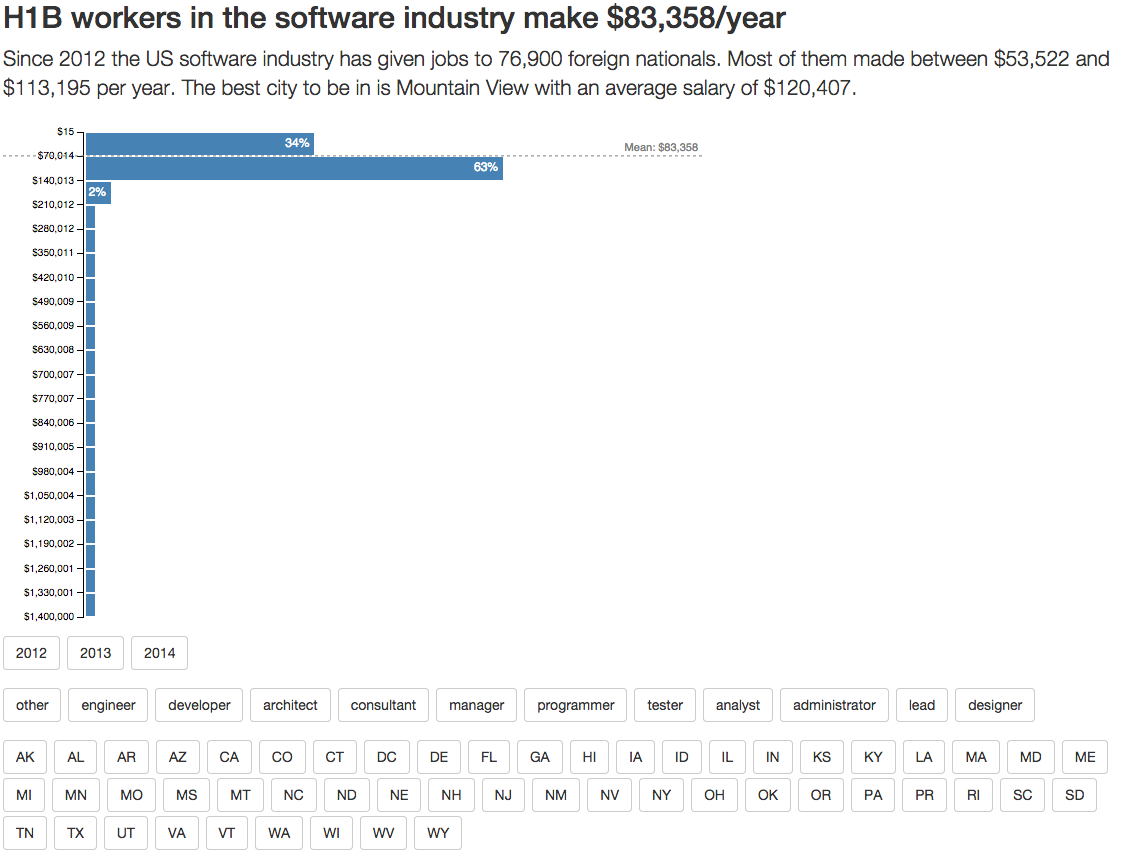
Default H1B histogram
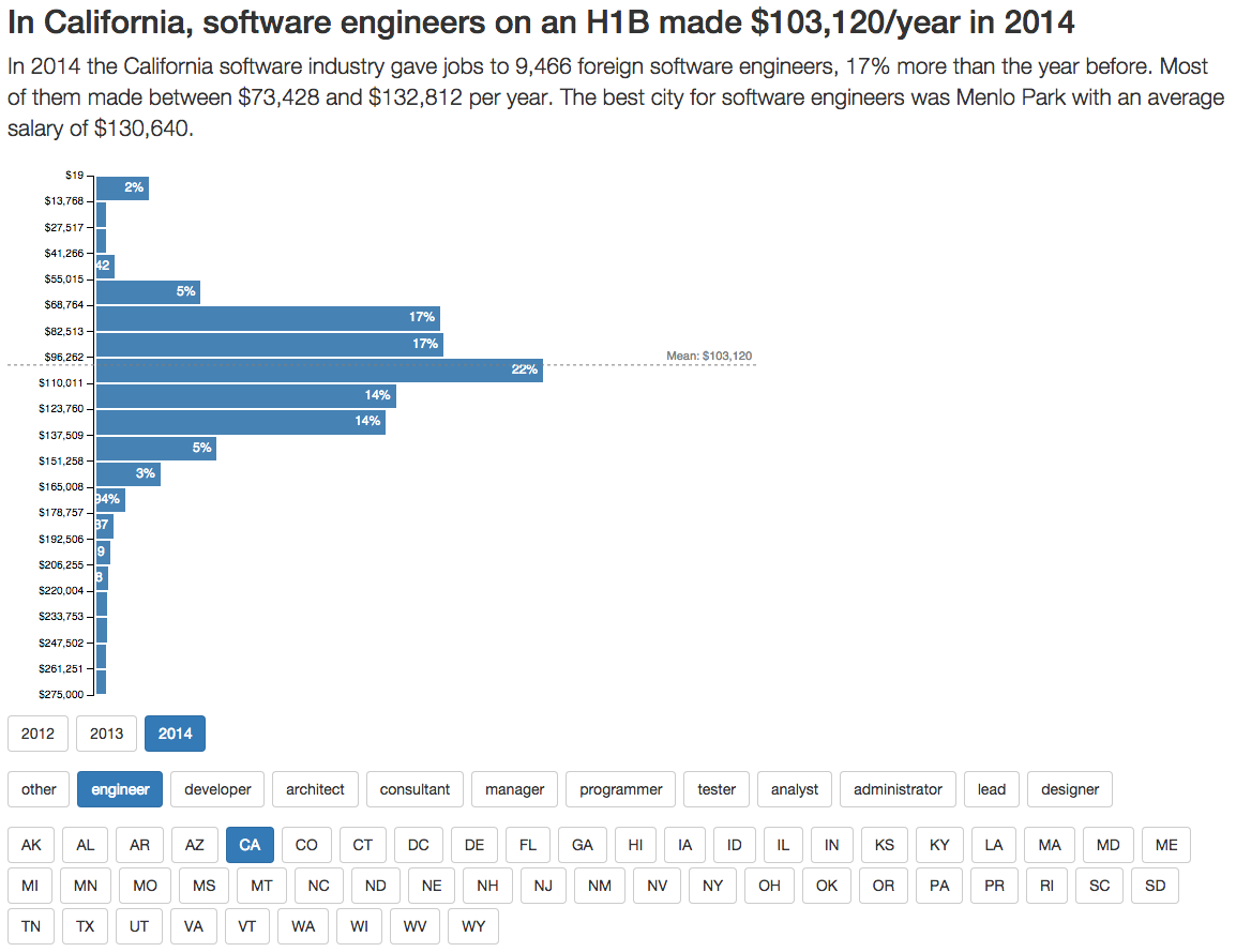
Changes after user picks a data subset
React + D3: a powerful combination indeed.
s00e04 - Buzzword soup explained
We’re going to use some buzzwords in this book. Hell, we’ve used some already. Most will get a thorough explanation further on, but let me give you a quick rundown.
- Babel , a JavaScript transpiler that makes your code work on all browsers.
- ECMAScript2015,16,17,18 , official names for JavaScript as new features come out every summer
- ES5 , any JavaScript features that existed before June 2015
- ES6 or ES6+ , a common name for JavaScript as it exists past June 2015
-
fat arrows , a new way to define functions in ES6 (
=>) -
Git , a version control system. It’s pretty popular, you probably know it
- H1B , a popular type of work visa in the United States
-
JSX , a language/syntax that lets you use
<a href="/example">as a native part of JavaScript -
Mustache , a popular way to write HTML templates for JavaScript code. Uses
{{ ... }}syntax. - npm , most popular package manager for JavaScript libraries
- props , component properties set when rendering
- state , a local dictionary of values available in most components
- functional components , React components expressed as pure functions that take props and return markup
- Webpack , a module packager for JavaScript. Makes it more convenient to organize code into multiple files. Provides cool plugins.
s00e05 - JSX
JSX
Our components are going to use JSX, a JavaScript syntax extension that lets us treat XML-like data as normal code. You can use React without JSX, but JSX makes React’s full power easier to use.
The gist of JSX is that we can use any XML-like string just like it was part of JavaScript. No Mustache or messy string concatenation necessary. Your functions can return HTML, SVG, or XML.
For instance, code that renders one of our first examples – a color swatch – looks like this:
ReactDOM.render(
  <Colors width="400" />,
  document.getElementById('svg')
);
Which compiles to:
ReactDOM.render(
  React.createElement(Colors, {width: "400"}),
  document.querySelectorAll('svg')[0]
);
HTML code translates to React.createElement calls with attributes translated into a property dictionary. The beauty of this approach is two-pronged: you can use React components as if they were HTML tags, and HTML attributes can be anything.
You’ll see that anything from a simple value to a function or an object works equally well.
s00e06 - What you’ll build
Visualizing data with React and d3.js
Welcome to the main part of React + D3 2018. We’re going to talk a little theory, learn some principles, then get our hands dirty with some examples. Through this book you’re going to build:
- [A few small components in Codesandbox]
- [A choropleth map]
- [An interactive histogram]
- [A bouncing ball]
- [A swipe transition]
- [An animated alphabet]
- [A simple particle generator with Redux]
- [A particle generator pushed to 20,000 elements with canvas]
- [Billiards simulation with MobX and canvas]
- [A dancing fractal tree]
Looks random, right? Bear with me. Examples build on each other.
The first few examples teach you about static data visualizations and the basics of merging React and D3 using two different approaches.
The choropleth and histogram visualizations teach you about interactivity and components working together.
You learn about game loop and transition animations through two types of bouncing balls. Followed by more complex enter/exit transitions with an animated alphabet.
We look at how far we can push React’s performance with a simple particle generator and a dancing fractal tree. A billiards game helps us learn about complex canvas manipulation.
Throughout these examples, we’re going to use React 16 , compatible with React 17 , D3v5 , and modern ES6+ JavaScript syntax. The particle generator also uses Redux for the game loop and the billiards simulation uses MobX. We use Konva for complex canvas stuff.
That way you can build experience in large portions of the React ecosystem so you can choose what you like best.
Don’t worry, if you’re not comfortable with modern JavaScript syntax just yet. By the end of this book, you’re gonna love it!
Until then, here’s an interactive cheatsheet: es6cheatsheet.com. It uses runnable code samples to compare the ES5 way with the ES6 way so you can brush up quickly.
To give you a taste of React alternatives, we’ll check out Preact , Inferno , and Vue in the fractal tree example. They’re component-based UI frameworks similar to React. Preact is tiny, Inferno is fast, and Vue is about as popular as React.
Let’s talk about how React and D3 fit together. If there’s just one chapter you should read, this is the one. It explains how things work and fit together. Takes you from beginning to being able to figure out the rest on your own.
Although you should still play with the bigger examples. They’re fun.
This section has five chapters:
- [A quick intro to D3]
- [How React makes D3 easier]
- [When should you use an existing library? Which one?]
- [Quickly integrate any D3 code in your React project with Blackbox Components]
- [Build scalable dataviz components with full integration]
- [Handling state in your React app]
- [Structuring your React App]
s01e07 - Why D3
D3 is the best library out there for custom data visualization. It comes with a rich ecosystem of functions for almost anything you can think of. From simple medians, to automatic axis generators, and force diagrams.
Most data visualization you see on the web is built with D3. The New York Times uses it, Guardian uses it, r/dataisbeautiful is full of it.
Learning D3 from scratch is where life gets tricky.
There are several gotchas that trip you up and make examples look like magic. You’ve probably noticed this, if you ever looked at an example project built with D3. They’re full of spaghetti code, global variables, and often aren’t made to be maintainable.
Most examples are just one-off toys after all. It’s art.
A lot of dataviz that isn’t art, is charts and graphs. You’ll often find that using D3 to build those, is too complicated. D3 gives you more power than you need.
If you want charts, I suggest using a charting library.
Where many charting libraries fall short is customization. The API is limited, you can’t do everything you want, and it gets easier to just build it yourself.
A lot of what you end up doing in real life is finding a D3 example that looks like what you want to build and adapting it. That’s why you should learn at least some D3.
But D3 is hard to read. Take this barchart code, for example
d3.tsv("data.tsv", function(d) {
  d.frequency = +d.frequency;
  return d;
}, function(error, data) {
  if (error) throw error;

  x.domain(data.map(function(d) { return d.letter; }));
  y.domain([0, d3.max(data, function(d) { return d.frequency; })]);

  g.append("g")
      .attr("class", "axis axis--x")
      .attr("transform", "translate(0," + height + "😉")
      .call(d3.axisBottom(x));

  g.append("g")
      .attr("class", "axis axis--y")
      .call(d3.axisLeft(y).ticks(10, "%"))
    .append("text")
      .attr("transform", "rotate(-90)")
      .attr("y", 6)
      .attr("dy", "0.71em")
      .attr("text-anchor", "end")
      .text("Frequency");

  g.selectAll(".bar")
    .data(data)
    .enter().append("rect")
      .attr("class", "bar")
      .attr("x", function(d) { return x(d.letter); })
      .attr("y", function(d) { return y(d.frequency); })
      .attr("width", x.bandwidth())
      .attr("height", function(d) { return height - y(d.frequency); });
});
Can you tell what’s going on? I’d need to read it pretty carefully.
Which brings us to 
s01e08 - 3 key insights to learn D3 from scratch
3 key insights that help you learn D3.js from scratch
Somebody once asked me how to learn D3.js from scratch. I quipped that it took me writing a book to really learn it. It’s one hell of a library.
Most people don’t go that far. They don’t have to.
You start with a problem, find similar examples, do some copy pasta, tweak until it works and end up with a working visualization you don’t understand. You’d be surprised how few engineers actually understand how their D3 data visualization works.
Fear not! There are just 3 key concepts you have to grok. Then you can understand every D3 example out there.
s01e09 - Data vs. DOM manipulation
1) Data manipulation vs. DOM manipulation
All D3 examples are split into two parts:
- Data manipulation
- DOM manipulation
First you prep your values, then you render.
You have to go through many examples to notice what’s going on. Inference learning is hard. Most beginners miss this pattern and it makes D3 look more confusing than it is.
Let’s take an example from D3’s docs, a bar chart with a hover effect.
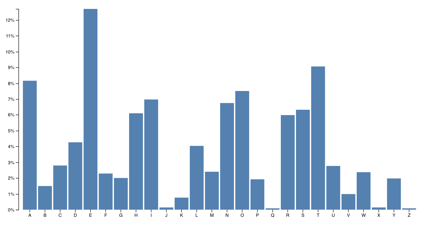
An example D3 barchart
You can try it online. When you hover on a bar, it changes color. Pretty neat.
Mike Bostock, the creator of D3, built this chart in 43 lines of code. Here they are
var svg = d3.select("svg"),
    margin = {top: 20, right: 20, bottom: 30, left: 40},
    width = +svg.attr("width") - margin.left - margin.right,
    height = +svg.attr("height") - margin.top - margin.bottom;

var x = d3.scaleBand().rangeRound([0, width]).padding(0.1),
    y = d3.scaleLinear().rangeRound([height, 0]);

var g = svg.append("g")
    .attr("transform", "translate(" + margin.left + "," + margin.top + "😉");

d3.tsv("data.tsv", function(d) {
  d.frequency = +d.frequency;
  return d;
}, function(error, data) {
  if (error) throw error;

  x.domain(data.map(function(d) { return d.letter; }));
  y.domain([0, d3.max(data, function(d) { return d.frequency; })]);

  g.append("g")
      .attr("class", "axis axis--x")
      .attr("transform", "translate(0," + height + "😉")
      .call(d3.axisBottom(x));

  g.append("g")
      .attr("class", "axis axis--y")
      .call(d3.axisLeft(y).ticks(10, "%"))
    .append("text")
      .attr("transform", "rotate(-90)")
      .attr("y", 6)
      .attr("dy", "0.71em")
      .attr("text-anchor", "end")
      .text("Frequency");

  g.selectAll(".bar")
    .data(data)
    .enter().append("rect")
      .attr("class", "bar")
      .attr("x", function(d) { return x(d.letter); })
      .attr("y", function(d) { return y(d.frequency); })
      .attr("width", x.bandwidth())
      .attr("height", function(d) { return height - y(d.frequency); });
});
There are two parts to this code: Data manipulation and DOM manipulation.
var // ..,
    margin = {top: 20, right: 20, bottom: 30, left: 40},
    width = +svg.attr("width") - margin.left - margin.right,
    height = +svg.attr("height") - margin.top - margin.bottom;

var x = d3.scaleBand().rangeRound([0, width]).padding(0.1),
    y = d3.scaleLinear().rangeRound([height, 0]);

// ...

d3.tsv("data.tsv", function(d) {
  d.frequency = +d.frequency;
  return d;
}, function(error, data) {
  if (error) throw error;

  x.domain(data.map(function(d) { return d.letter; }));
  y.domain([0, d3.max(data, function(d) { return d.frequency; })]);

// ...
});
Bostock here first prepares his data:
- some sizing variables (
margin,width,height) - two scales to help with data-to-coordinates conversion (
x, y) - loads his dataset (
d3.tsv) and updates his scales’ domains
In the DOM manipulation part, he puts shapes and objects into an SVG. This is the part that shows up in your browser.
var svg = d3.select("svg"),
    // ..

// ..

var g = svg.append("g")
    .attr("transform", "translate(" + margin.left + "," + margin.top + "😉");

// ..
  g.append("g")
      .attr("class", "axis axis--x")
      .attr("transform", "translate(0," + height + "😉")
      .call(d3.axisBottom(x));

  g.append("g")
      .attr("class", "axis axis--y")
      .call(d3.axisLeft(y).ticks(10, "%"))
    .append("text")
      .attr("transform", "rotate(-90)")
      .attr("y", 6)
      .attr("dy", "0.71em")
      .attr("text-anchor", "end")
      .text("Frequency");

  g.selectAll(".bar")
    .data(data)
    .enter().append("rect")
      .attr("class", "bar")
      .attr("x", function(d) { return x(d.letter); })
      .attr("y", function(d) { return y(d.frequency); })
      .attr("width", x.bandwidth())
      .attr("height", function(d) { return height - y(d.frequency); });
});
DOM manipulation in D3 happens via D3 selections. They’re a lot like jQuery $(something) . This is the part we’re doing with React later on.
Here Bostock does a few things
- selects the
<svg>node (d3.select) - appends a grouping
<g>node (.append) with an SVG positioning attribute (translate) - adds a bottom axis by appending a
<g>, moving it, then callingd3.axisBottomon it. D3 has built-in axis generators - adds a left axis using the same approach but rotating the ticks
- appends a text label “Frequency” to the left axis
- uses
selectAll.datato make a virtual selection of.barnodes and attach some data, then for every new data value (.enter), appends a<rect>node and gives it attributes
That last part is where people get lost. It looks like magic. Even to me.
It’s a declarative approach to rendering data. Works great, hard to understand. That’s why we’ll do it in React instead
You can think of .enter as a loop over your data. Everything chained after .enter is your loop’s body. Sort of like doing data.map(d => append(rect).setManyAttributes())
That function executes for any new data “entering” your visualization. There’s also .exit for anything that’s dropping out, and .update for anything that’s changing.
s01e10 - Scales
2) Scales
Scales are D3’s most versatile concept. They help you translate between two different spaces. Like, mathematical spaces.
They’re like the mathematical functions you learned about in school. A domain maps to a range using some sort of formula.
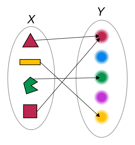
A basic function
Colored shapes in the domain map to colors in the range. No formula for this one. That makes it an ordinal scale.
let shapes = d3.scaleOrdinal()
  .domain(['red', 'orange', ...)
  .range(['red', 'orange', ...)
Once you have this scale, you can use it to translate from shapes to colors. shapes('red triangle') returns 'red' for example.
Many different types of scales exist. Linear, logarithmic, quantize, etc. Any basic transformation you can think of exists. The rest you can create by writing custom scales.
You’re most often going to use scales to turn your data values into coordinates. But other use-cases exist.
s01e11 - D3 layouts
3) D3 layouts
Sure .enter.append looks like magic, but D3 layouts are the real mind=blown of the D3 ecosystem. They take your input data and return a full-featured visualization thing.
For example, a force layout using forces between nodes to place them on the screen.

Force layout
Or a circle packing layout that neatly packs circles.

Circle packing layout
I don’t know the maths that goes into most of these. And that’s the point, you shouldn’t have to!
Here’s a key insight about the magic of layouts: They’re the data part.
You take a forceLayout and feed it your data. It returns an object with a tick event callback.
var simulation = d3
  .forceSimulation()
  .force(
    'link',
    d3.forceLink().id(function(d) {
      return d.id;
    })
  )
  .force('charge', d3.forceManyBody())
  .force('center', d3.forceCenter(width / 2, height / 2));
This simulation now handles everything about rendering your nodes. Changes their positions on every tick callback, figures out how often to change stuff, etc.
But it is up to you to render them. A layout handles your dataviz in the abstract. You’re in control of the rendering.
For a force layout, you have to update the DOM on every tick of the animation. For circle packing, you render it once.
Once you grok this, all the fancy visualizations out there start making sense. Also means you can use these fancy layouts in React 
s01e12 - Recap
Recap
There’s a lot more D3 can do, but those are the 3 key insights you need to understand any example you find in the wild.
- Code is split into data and DOM manipulation
- Scales are great and used a lot
- You’re always in control of rendering
Then you can start using D3’s more advanced features like maps and axes and shape generators and geo computations and data loading and transitions and user interactions.
There’s a lot. We’re not going to cover it all but you can find those advanced features in the docs and the skills you learn here will help you get started.
s02e13 - React + D3 =
How React makes D3 easier
Our visualizations are going to use SVG – an XML-based image format that lets us describe images in terms of mathematical shapes. For example, the source code of an 800x600 SVG image with a rectangle looks like this:
<svg width="800" height="600">
    <rect width="100" height="200" x="50" y="20" />
</svg>
These four lines create an SVG image with a black rectangle at coordinates (50, 20) that is 100x200 pixels large. Black fill with no borders is default for SVG shapes.
SVG is perfect for data visualization on the web because it works in all browsers, renders without blurring or artifacts on all screens, and supports animation and user interaction. You can see examples of interaction and animation later in this book.
But SVG can get slow when you have many thousands of elements on screen. We’re going to solve that problem by rendering bitmap images with canvas. More on that later.
Another nice feature of SVG is that it’s just a dialect of XML - nested elements describe structure, attributes describe the details. Same principles that HTML uses.
That makes React’s rendering engine particularly suited for SVG. Our 100x200 rectangle from before looks like this as a React component:
const Rectangle = () => (
    <rect width="100" height="200" x="50" y="20" />
);
To use this rectangle component in a picture, you’d use a component like this:
const Picture = () => (
    <svg width="800" height="600">
        <Rectangle />
    </svg>
);
Sure looks like tons of work for a static rectangle. But look closely! Even if you know nothing about React and JSX, you can look at that code and see that it’s a Picture of a Rectangle .
Compare that to a pure D3 approach:
d3.select("svg")
  .attr("width", 800)
  .attr("height", 600)
  .append("rect")
  .attr("width", 100)
  .attr("height", 200)
  .attr("x", 50)
  .attr("y", 20);
It’s elegant, it’s declarative, and it looks like function call soup. It doesn’t scream “Rectangle in an SVG” to as much as the React version does.
You have to take your time and read the code carefully: first, we select the svg element, then we add attributes for width and height . After that, we append a rect element and set its attributes for width , height , x , and y .
Those 8 lines of code create HTML that looks like this:
<svg width="800" height="600">
    <rect width="100" height="200" x="50" y="20" />
</svg>
Would’ve been easier to just write the HTML, right? Yes, for static images, you’re better off using Photoshop or Sketch then exporting to SVG.
Dealing with the DOM is not D3’s strong suit. There’s a lot of typing, code that’s hard to read, it’s slow when you have thousands of elements, and it’s often hard to keep track of which elements you’re changing. D3’s enter-update-exit cycle is great in theory, but most people struggle trying to wrap their head around it.
If you don’t understand what I just said, don’t worry. We’ll cover the enter-update-exit cycle in the animations example.
Don’t worry about D3 either. It’s hard! I’ve written two books about D3, and I still spend as much time reading the docs as writing the code. The library is huge and there’s much to learn. I’ll explain everything as we go along.
D3’s strong suit is its ability to do everything except the DOM. There are statistical functions, great support for data manipulation, a bunch of built-in data visualizations, magic around transitions and animation … D3 can calculate anything for you. All you have to do is draw it out.
That’s why our general approach sounds like this in a nutshell:
- React owns the DOM
- D3 calculates properties
We leverage React for SVG structure and rendering optimizations; D3 for its mathematical and visualization functions.
Now let’s look at three different ways of using React and D3 to build data visualization:
- using a library
- quick blackbox components
- full feature integration
s02e14 - What about existing libraries?
When should you use an existing library? Which one?
The quickest way to achieve the benefits of integrating React with D3 is to use a library. A collection of components with pre-built charting visualizations. Plug it into your app, move on with life.
Great option for basic charts. I recommend it dearly to anyone who comes to me and asks about building stuff. Try a library first. If it fits your needs, perfect! You just saved yourselves plenty of time.
Where libraries become a problem is when you want to move beyond the library author’s idea of How Things Are Done. Custom features, visualizations that aren’t just charts, disabling this or that default behavior … it gets messy.
That’s why I rarely use libraries myself. Often find it quicker to build something specific from scratch than figuring out how to hold a generalized API just right.
But they’re a great first step. Here’s a few of the most popular React & D3 libraries
List borrowed from a wonderful Smashing Magazine article, because it’s a good list.
s02e15 - Victory.js
Victory
React.js components for modular charting and data visualization
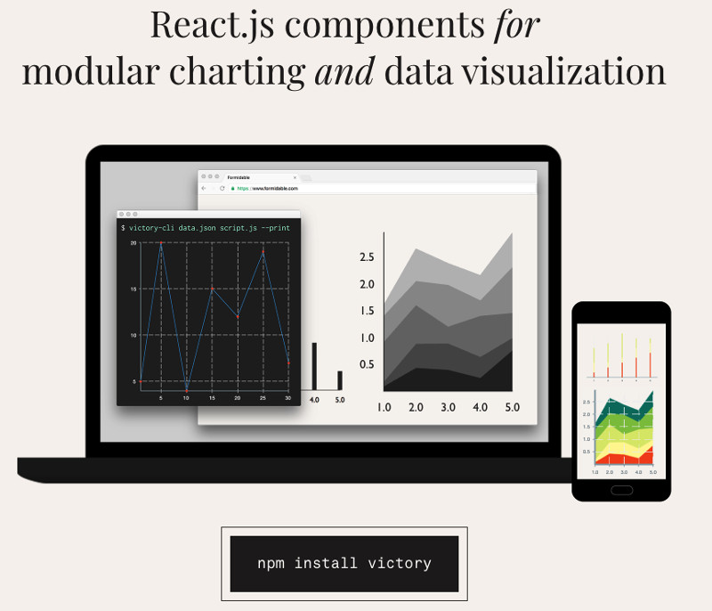
Victory offers low level components for basic charting and reimplements a lot of D3’s API. Great when you need to create basic charts without a lot of customization. Supports React Native.
Here’s what it takes to implement a Barchart using Victory.js. You can try it on CodeSandbox
const data = [
  { quarter: 1, earnings: 13000 },
  { quarter: 2, earnings: 16500 },
  { quarter: 3, earnings: 14250 },
  { quarter: 4, earnings: 19000 }
];

const App = () => (
  <div style={styles}>
    <h1>Victory basic demo</h1>
    <VictoryChart domainPadding={20}>
      <VictoryBar data={data} x="quarter" y="earnings" />
    </VictoryChart>
  </div>
);
Create some fake data, render a <VictoryChart> rendering area, add a <VictoryBar> component, give it data and axis keys. Quick and easy.
My favorite feature of Victory is that components use fake random data until you pass your own. Means you always know what to expect.
s02e16 - Recharts
Recharts
A composable charting library built on React components
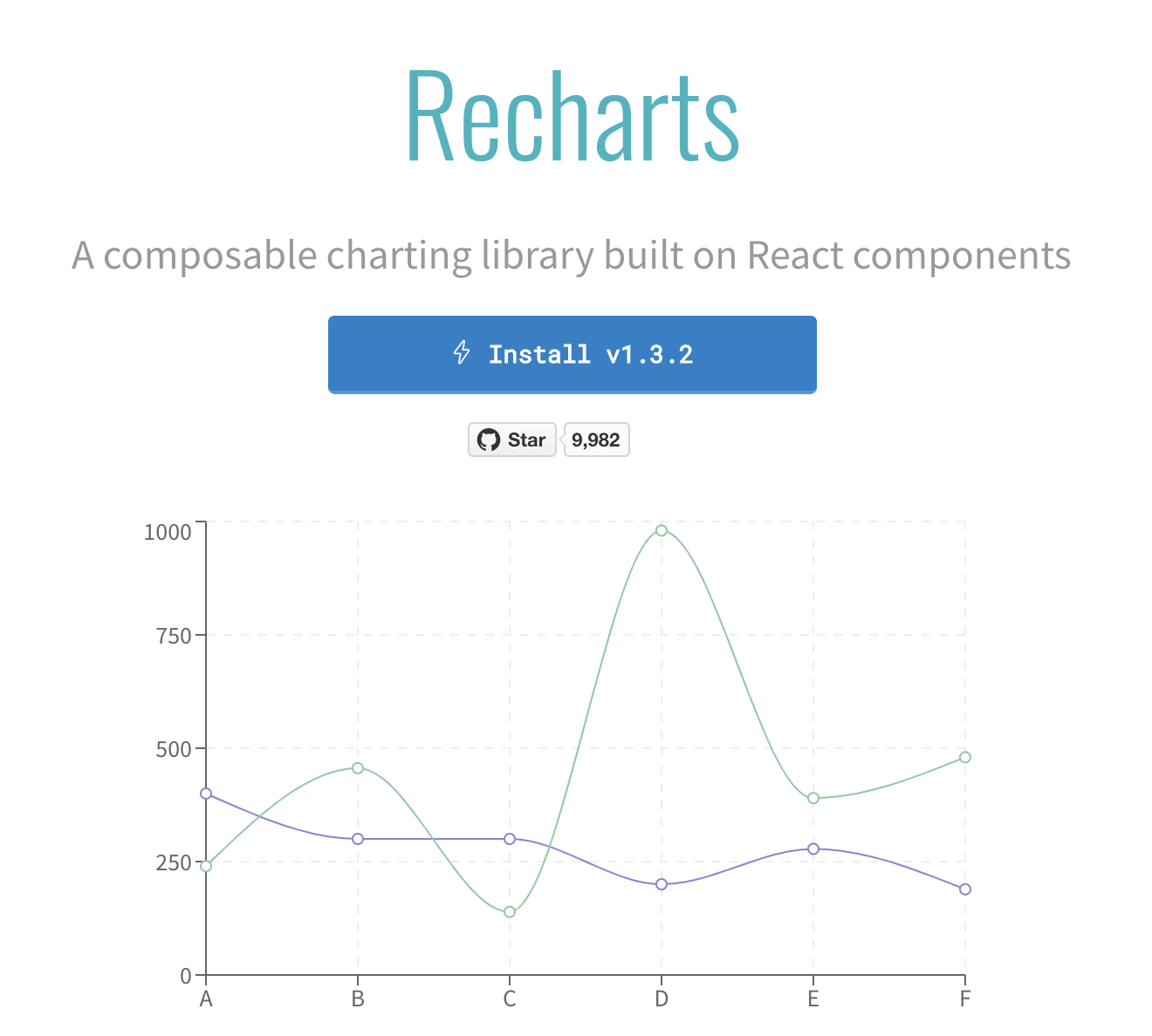
Recharts is like a more colorful Victory. A pile of charting components, some customization, loves animating everything by default.
Here’s what it takes to implement a Barchart using Recharts. You can try it on CodeSandbox
const data = [
  { quarter: 1, earnings: 13000 },
  { quarter: 2, earnings: 16500 },
  { quarter: 3, earnings: 14250 },
  { quarter: 4, earnings: 19000 }
];

const App = () => (
  <div style={styles}>
    <h1>Recharts basic demo</h1>
    <BarChart width={500} height={300} data={data}>
      <XAxis dataKey="quarter" />
      <YAxis dataKey="earnings" />
      <Bar dataKey="earnings" />
    </BarChart>
  </div>
);
More involved than Victory, but same principle. Fake some data, render a drawing area this time with <BarChart> and feed it some data. Inside the <BarChart> render two axes, and a <Bar> for each entry.
Recharts hits a great balance of flexibility and ease … unless you don’t like animation by default. Then you’re in trouble.
s02e17 - Nivo
Nivo
nivo provides a rich set of dataviz components, built on top of the awesome d3 and Reactjs libraries.
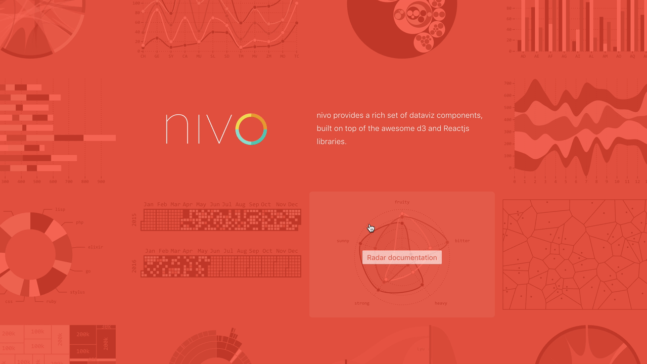
Nivo is another attempt to give you a set of basic charting components. Comes with great interactive documentation, support for Canvas and API rendering. Plenty of basic customization.
Here’s what it takes to implement a Barchart using Nivo. You can try it on CodeSandbox
const data = [
  { quarter: 1, earnings: 13000 },
  { quarter: 2, earnings: 16500 },
  { quarter: 3, earnings: 14250 },
  { quarter: 4, earnings: 19000 }
];

const App = () => (
  <div style={styles}>
    <h1>Nivo basic demo</h1>
    <div style={{ height: "400px" }}>
      <ResponsiveBar data={data} keys={["earnings"]} indexBy="quarter" />
    </div>
  </div>
);
Least amount of effort! You render a <ResponsiveBar> component, give it data and some params, and Nivo handles the rest.
Wonderful! But means you have to learn a whole new language of configs and props that might make your hair stand on end. The documentation is great and shows how everything works, but I found it difficult to know which prop combinations are valid.
s02e18 - VX
VX
vx is collection of reusable low-level visualization components. vx combines the power of d3 to generate your visualization with the benefits of react for updating the DOM.

VX is the closest to the approaches you’re learning in this book. React for rendering, D3 for calculations. When you build a set of custom components for your organization, a flavor of VX is what you often come up with.
That’s why I recommend teams use VX when they need to get started quickly.
Here’s what it takes to implement a Barchart using Nivo. You can try it on CodeSandbox
const data = [
  { quarter: 1, earnings: 13000 },
  { quarter: 2, earnings: 16500 },
  { quarter: 3, earnings: 14250 },
  { quarter: 4, earnings: 19000 }
];

const App = ({ width = 400, height = 400 }) => {
  const xMax = width;
  const yMax = height - 120;

  const x = d => d.quarter;
  const y = d => d.earnings;

  // scales
  const xScale = scaleBand({
    rangeRound: [0, xMax],
    domain: data.map(:satisfied:,
    padding: 0.4
  });
  const yScale = scaleLinear({
    rangeRound: [yMax, 0],
    domain: [0, max(data, y)]
  });

  return (
    <div style={styles}>
      <h1>VX basic demo</h1>
      <svg width={width} height={height}>
        {data.map((d, i) => {
          const barHeight = yMax - yScale(y(d));
          return (
            <Bar
              width={xScale.bandwidth()}
              height={barHeight}
              x={xScale(x(d))}
              y={yMax - barHeight}
              data={{ x: x(d), y: y(d) }}
            />
          );
        })}
      </svg>
    </div>
  );
};
Move involved than previous examples, but means you have more control and fight the library less often. VX does the tedious stuff for you, so you can focus on the stuff that matters.
This code creates value accessor methods, D3 scales, then iterates over an array of data and renders a <Bar for each. The bar gets a bunch of props.
s02e19 - When you shouldn’t use a library
When not to use a library
Libraries are great. Quick to get started, quick to keep using, great for common usecases.
Now, if you want to build something custom, something that delights and astounds, something that makes your users love you … You’re gonna have to understand how combining React and D3 works under the hood. Whether you use a library or not.
A rule of thumb you can use is to consider how custom you want to make your visualization. The more customizations, the more likely you are to benefit from rolling your own.
Or if you’ve had a lot of practice with rolling your own and it’s literally easier than learning a library.
If you have to customize an existing library, or build your own for the team, that’s what we’re here for today