s12e57 - Render a Histogram of salaries
Render a Histogram of salaries
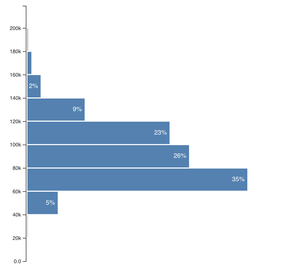
Knowing median salaries is great and all, but it doesn’t tell you much about what you can expect. You need to know the distribution to see if it’s more likely you’ll get 140k or 70k.
That’s what histograms are for. Give them a bunch of data, and they show its distribution. We’re going to build one like this:
Basic histogram
In the shortened dataset, 35% of tech salaries fall between $60k and $80k, 26% between $80k and $100k etc. Throwing a weighed dice with this random distribution, you’re far more likely to get 60k-80k than 120k-140k. It’s a great way to gauge situations.
It’s where statistics like “More people die from vending machines than shark attacks” come from. Which are you afraid of, vending machines or sharks? Stats say your answer should be heart disease. 
s12e58 - Step 1: Prep App.js
Step 1: Prep App.js
You know the drill, don’t you? Import some stuff, add it to the render() method in the App component.
// src/App.js
import _ from 'lodash';

// Insert the line(s) between here...
import './style.css';
// ...and here.

import Preloader from './components/Preloader';
import { loadAllData } from './DataHandling';

import CountyMap from './components/CountyMap';
// Insert the line(s) between here...
import Histogram from './components/Histogram';
// ...and here.
We import style.css and the Histogram component. That’s what I love about Webpack - you can import CSS in JavaScript. We got the setup with create-react-app .
There are competing schools of thought about styling React apps. Some say each component should come with its own CSS files, some think it should be in large per-app CSS files, many think CSS-in-JS is the way to go.
Personally I like to use CSS for general cross-component styling and styled-components for more specific styles. We’re using CSS in this project because it works and means we don’t have to learn yet another dependency.
After the imports, we can render our Histogram in the App component.
// src/App.js
// ...
render() {
    // ...
    return (
        <div className="App container">
            <h1>Loaded {this.state.techSalaries.length} salaries</h1>
            <svg width="1100" height="500">
                <CountyMap usTopoJson={this.state.usTopoJson}
                           USstateNames={this.state.USstateNames}
                           values={countyValues}
                           x={0}
                           y={0}
                           width={500}
                           height={500}
                           zoom={zoom} />
                // Insert the line(s) between here...
                <Histogram bins={10}
                           width={500}
                           height={500}
                           x="500"
                           y="10"
                           data={filteredSalaries}
                           axisMargin={83}
                           bottomMargin={5}
                           value={d => d.base_salary} />
                // ...and here.
            </svg>
        </div>
    );
}
We render the Histogram component with a bunch of props. They specify the dimensions we want, positioning, and pass data to the component. We’re using filteredSalaries even though we haven’t set up any filtering yet. One less line of code to change later 
That’s it. App is ready to render our Histogram .
You should now see an error about missing files. That’s normal.
s12e59 - Step 2: CSS changes
Step 2: CSS changes
As mentioned, opinions vary on the best approach to styling React apps. Some say stylesheets per component, some say styling inside JavaScript, others swear by global app styling.
The truth is somewhere in between. Do what fits your project and your team. We’re using global stylesheets because it’s the simplest.
Create a new file src/style.css and add these 29 lines:
.histogram .bar rect {
    fill: steelblue;
    shape-rendering: crispEdges;
}

.histogram .bar text {
    fill: #fff;
    font: 12px sans-serif;
}

button {
    margin-right: .5em;
    margin-bottom: .3em !important;
}

.row {
    margin-top: 1em;
}

.mean text {
    font: 11px sans-serif;
    fill: grey;
}

.mean path {
    stroke-dasharray: 3;
    stroke: grey;
    stroke-width: 1px;
}
We won’t go into details about the CSS here. Many better books have been written about it.
In broad strokes:
- we’re making
.histogramrectangles – the bars – blue - labels white
12pxfont -
buttons and.rows have some spacing - the
.meanline is a dotted grey with gray11pxtext.
More CSS than we need for just the histogram, but we’re already here so might as well write it now.
Adding our CSS before building the Histogram means it’s going to look beautiful the first time around.
s12e60 - Step 3: Histogram component
Step 3: Histogram component
We’re following the full-feature integration approach for our Histogram component. React talks to the DOM, D3 calculates the props.
We’ll use two components:
-
Histogrammakes the general layout, dealing with D3, and translating raw data into a histogram -
HistogramBardraws a single bar and labels it
Let’s start with the basics: a Histogram directory and an index.js file. Keeps our code organized and imports easy. I like to use directories for components made of multiple files.
export { default } from "./Histogram";
Import and re-export the histogram componenet from ./Histogram . This way you can keep your histogram code in a file called Histogram and pretend the directory itself is exporting it.
Great way to group files that belong together without exposing your directory’s internal structure.
Now we need the Histogram.js file. Start with some imports, a default export, and a stubbed out Histogram class.
// src/components/Histogram/Histogram.js
import React from "react";
import * as d3 from "d3";

class Histogram extends React.Component {
    state = {
        histogram: d3.histogram(),
        widthScale: d3.scaleLinear(),
        yScale: d3.scaleLinear()
    };

    static getDerivedStateFromProps(props, state) {
        let { histogram, widthScale, yScale } = state;

        return {
            ...state,
            histogram,
            widthScale,
            yScale
        };
    }

    makeBar = bar => {
        const { yScale, widthScale } = this.state;

    };

    render() {
        const { histogram, yScale } = this.state,
            { x, y, data, axisMargin } = this.props;

        return null;
    }
}
We import React and D3, and set up Histogram .
Default state for our D3 objects: histogram, widthScale, and yScale. An empty getDerivedStateFromProps to keep them updated, makeBar to help us render each bar, and render returning null for now.
getDerivedStateFromProps
// src/components/Histogram/Histogram.js
    static getDerivedStateFromProps(props, state) {
        let { histogram, widthScale, yScale } = state;

        histogram.thresholds(props.bins).value(props.value);

        const bars = histogram(props.data),
            counts = bars.map(d => d.length);

        widthScale
            .domain([d3.min(counts), d3.max(counts)])
            .range([0, props.width - props.axisMargin]);

        yScale
            .domain([0, d3.max(bars, d => d.x1)])
            .range([props.height - props.y - props.bottomMargin, 0]);

        return {
            ...state,
            histogram,
            widthScale,
            yScale
        };
    }
First, we configure the histogram generator. thresholds specify how many bins we want and value specifies the value accessor function. We get both from props passed into the Histogram component.
In our case that makes 20 bins, and the value accessor returns each data point’s base_salary .
We feed the data prop into our histogram generator, and count how many values are in each bin with a .map call. We need those to configure our scales.
If you print the result of histogram() , you’ll see an array structure where each entry holds metadata about the bin and the values it contains.
console.log(this.histogram())
Let’s use this info to set up our scales.
widthScale has a range from the smallest ( d3.min ) bin to the largest ( d3.max ), and a range of 0 to width less a margin. We’ll use it to calculate bar sizes.
yScale has a range from 0 to the largest x1 coordinate we can find in a bin. Bins go from x0 to x1 , which reflects the fact that most histograms are horizontally oriented. Ours is vertical so that our labels are easier to read. The range goes from 0 to the maximum height less a margin.
Now let’s render this puppy.
render
// src/components/Histogram/Histogram.js
class Histogram extends React.Component {
    // ...
    render() {
        const { histogram, yScale } = this.state,
            { x, y, data, axisMargin } = this.props;

        const bars = histogram(data);

        return (
            <g className="histogram" transform={`translate(${x}, ${y})`}>
                <g className="bars">
                    {bars.map(this.makeBar))}
                </g>
            </g>
        );
    }
}
We take everything we need out of state and props with destructuring, call histogram() on our data to get a list of bars, and render.
Our render method returns a <g> grouping element transformed to the position given in props and walks through the bars array, calling makeBar for each. Later, we’re going to add an Axis as well.
This is a great example of React’s declarativeness. We have a bunch of stuff, and all it takes to render is a loop. No worrying about how it renders, where it goes, or anything like that. Walk through data, render, done.
makeBar
makeBar is a function that takes a histogram bar’s metadata and returns a HistogramBar component. We use it to make our declarative loop more readable.
// src/components/Histogram/Histogram.js
class Histogram extends React.Component {
    // ...
    makeBar = bar => {
        const { yScale, widthScale } = this.state;

        let percent = (bar.length / this.props.data.length) * 100;

        let props = {
            percent: percent,
            x: this.props.axisMargin,
            y: yScale(bar.x1),
            width: widthScale(bar.length),
            height: yScale(bar.x0) - yScale(bar.x1),
            key: "histogram-bar-" + bar.x0
        };

        return <HistogramBar {...props} />;
    };
}
See, we’re calculating props and feeding them into HistogramBar . Putting it in a separate function just makes the .map construct in render easier to read. There’s a lot of props to calculate.
Some, like axisMargin we pass through, others like width and height we calculate using our scales.
Setting the key prop is important. React uses it to tell the bars apart and only re-render those that change.
s12e61 - Step 4: HistogramBar (sub)component
Step 4: HistogramBar (sub)component
Before our histogram shows up, we need another component: HistogramBar . We could have shoved all of it in the makeBar function, but it makes sense to keep separate. Better future flexibility.
You can write small components like this in the same file as their main component. They’re not reusable since they fit a specific use-case, and they’re small enough so your files don’t get too crazy.
But in the interest of readability, let’s make a HistogramBar file.
// src/components/Histogram/HistogramBar.js
import React from "react";

const HistogramBar = ({ percent, x, y, width, height }) => {
    let translate = `translate(${x}, ${y})`,
        label = percent.toFixed(0) + "%";

    if (percent < 1) {
        label = percent.toFixed(2) + "%";
    }

    if (width < 20) {
        label = label.replace("%", "");
    }

    if (width < 10) {
        label = "";
    }

    return (
        <g transform={translate} className="bar">
            <rect
                width={width}
                height={height - 2}
                transform="translate(0, 1)"
            />
            <text textAnchor="end" x={width - 5} y={height / 2 + 3}>
                {label}
            </text>
        </g>
    );
};

export default HistogramBar;
Pretty long for a functional component. Most of it goes into deciding how much precision to render in the label, so it’s okay.
We start with an SVG translate and a default label . Then we update the label based on the bar size and its value.
When we have a label we like, we return a <g> grouping element with a rectangle and a text. Both positioned based on the width and height of the bar.
Make sure to import HistogramBar in the main Histogram file.
// src/components/Histogram/Histogram.js

import HistogramBar from './HistogramBar'
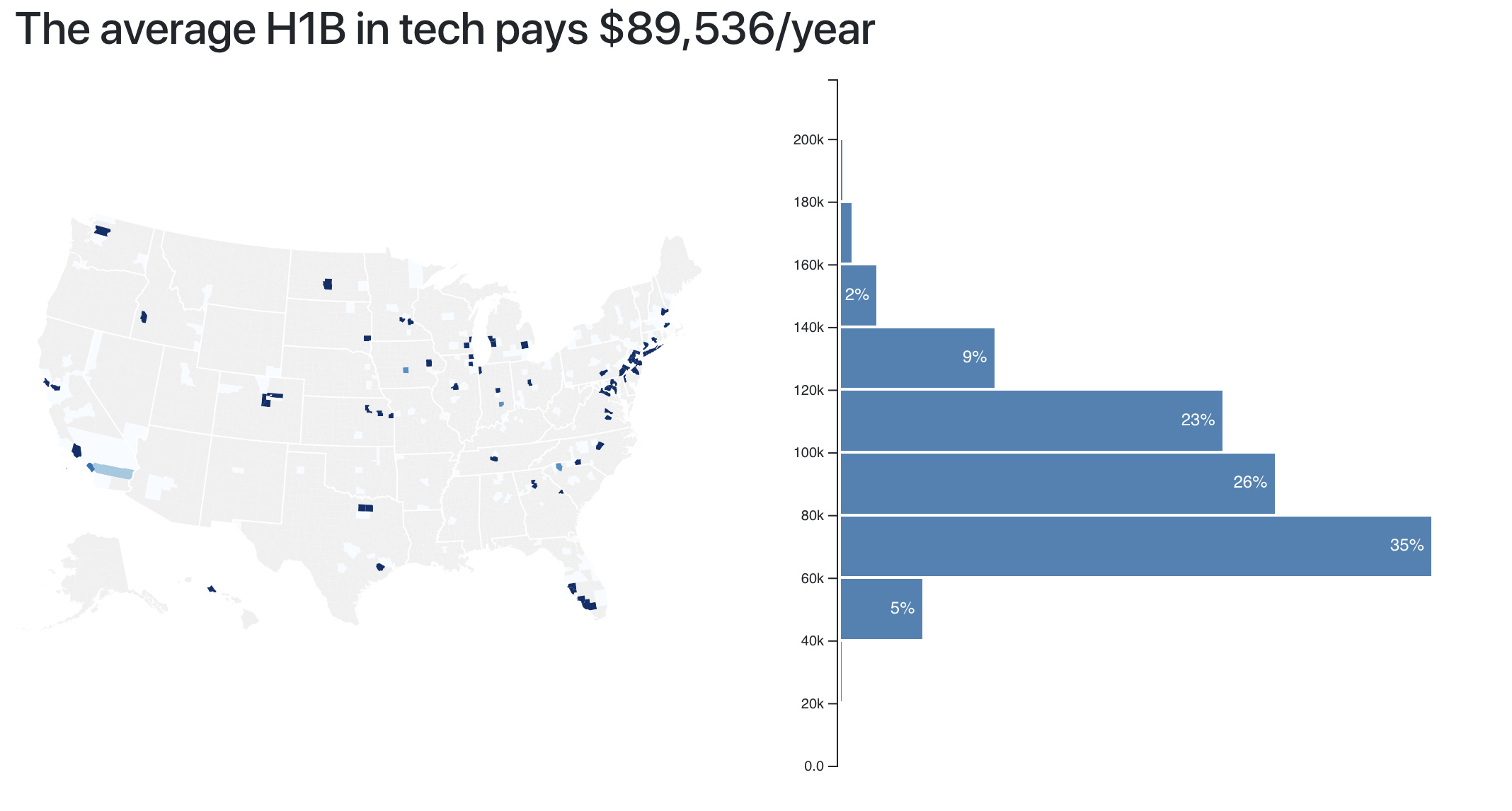
You should now see a histogram.
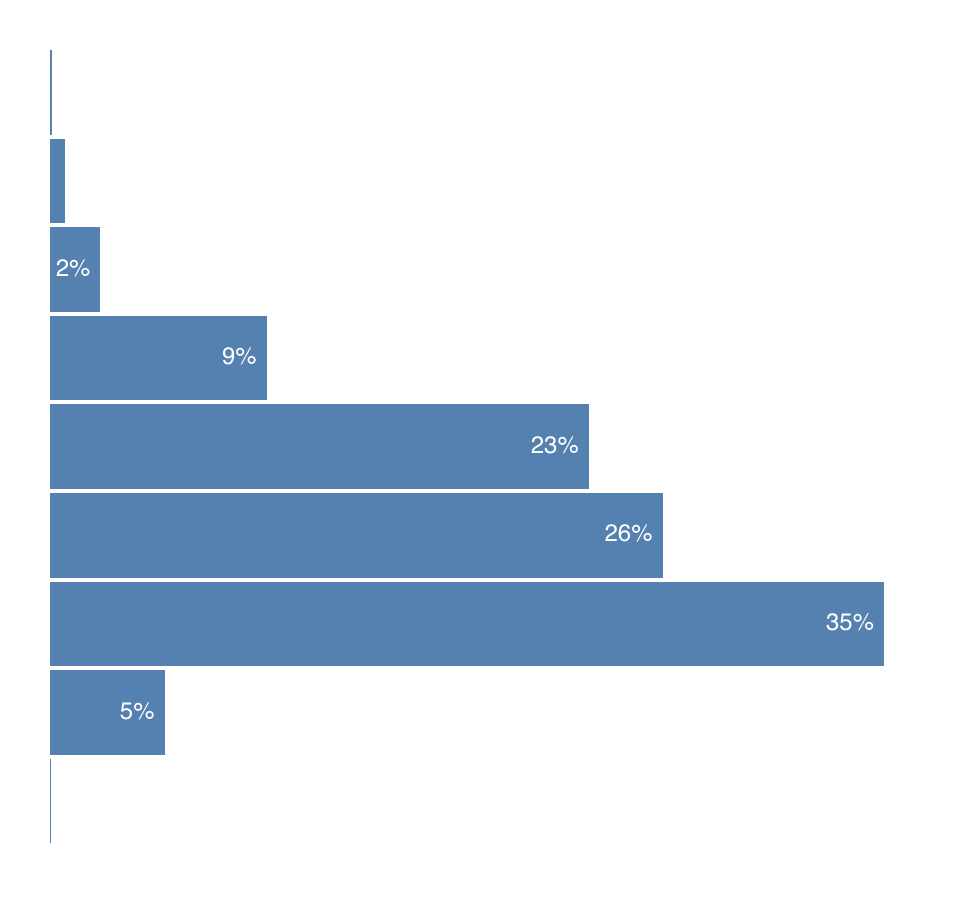
Histogram without axis
s12e62 - Step 5: Add an axis
Step 5: Axis HOC
Our histogram is pretty, but it needs an axis to be useful. You’ve already learned how to implement an axis when we talked about blackbox integration. We’re going to use the same approach and copy those concepts into the real project.
D3blackbox
We start with the D3blackbox higher order component. Same as before, except we put it in src/components .
import React from "react";

export default function D3blackbox(D3render) {
    return class Blackbox extends React.Component {
        anchorRef = React.createRef();

        componentDidMount() {
            D3render.call(this);
        }
        componentDidUpdate() {
            D3render.call(this);
        }

        render() {
            const { x, y } = this.props;
            return (
                <g transform={`translate(${x}, ${y})`} ref={this.anchorRef} />
            );
        }
    };
}
Take a D3render function, call it on componentDidMount and componentDidUpdate , and render a positioned anchor element for D3render to hook into.
Axis component
With D3blackbox , we can reduce the Axis component to a wrapped function. We’re implementing the D3render method.
import * as d3 from "d3";
import D3blackbox from "../D3blackbox";

const Axis = D3blackbox(function() {
    const axis = d3
        .axisLeft()
        .tickFormat(d => `${d3.format(".2s")(d)}`)
        .scale(this.props.scale)
        .ticks(this.props.data.length);

    d3.select(this.anchorRef.current).call(axis);
});

export default Axis;
We use D3’s axisLeft generator, configure its tickFormat , pass in a scale from our props, and specify how many ticks we want. To render, we select the anchor element from D3blackbox and call the axis generator on it.
Yes, this Axis works just for our specific use case and that’s okay. No need to generalize your code until you know where else you’re using it.
Remember the YAGNI principle.
Add Axis to Histogram
To render our new Axis , we add it to the Histogram component. It’s a two step process:
- Import
Axiscomponent - Render it
// src/components/Histogram/Histogram.js
import React, { Component } from 'react';
import * as d3 from 'd3';

// Insert the line(s) between here...
import Axis from './Axis';
// ...and here.

// ...
class Histogram extends Component {
    // ...
    render() {
        const { histogram, yScale } = this.state,
            { x, y, data, axisMargin } = this.props;

        const bars = histogram(data);

        return (
            <g className="histogram" transform={translate}>
                <g className="bars">
                    {bars.map(this.makeBar)}
                </g>
                // Insert the line(s) between here...
                <Axis x={axisMargin-3}
                      y={0}
                      data={bars}
                      scale={yScale} />
                // ...and here.
            </g>
        );
    }
We import our Axis and add it to the render method with some props. It takes an x and y coordinate, the data , and a scale .
An axis appears.
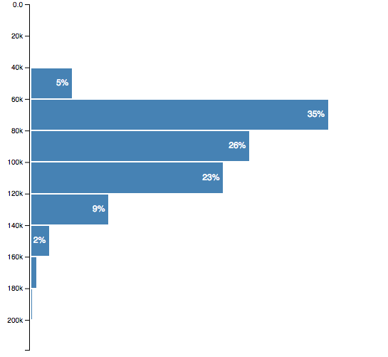
Basic histogram with axis
If that didn’t work, try comparing your changes to this diff on Github.
s13e63 - Add meta info
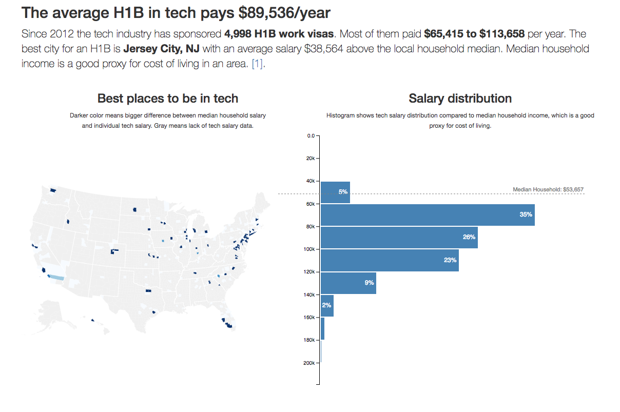
Make it understandable - meta info
You’ve come so far! There’s a US map and a histogram. They’re blue and shiny and you look at them and you go “Huh?” .
The key to a good data visualization is telling users what it means. An easy way to do that is a good title and description. Just tell them. The picture supports the words, the words explain the picture.
Let’s add those words.
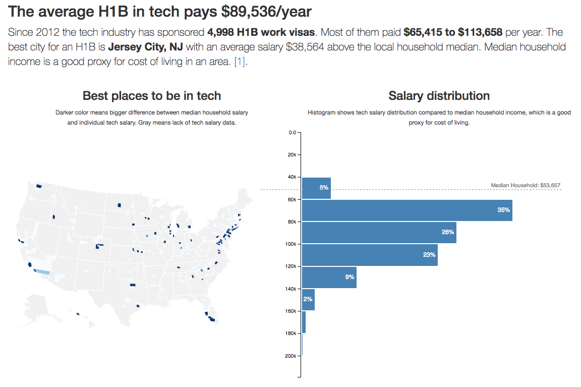
We’re adding a dynamic title and description, and a median line on the histogram. The text is dynamic because we’re adding user controls later, and we want the pictures and the words to stay in sync.
At the end of this section, you’ll have a full visualization of the shortened dataset.
Full visualization without user controls
s13e64 - Dynamic title
Dynamic title
We begin with the title because it shows up first.
We start with an import in App.js and add it to the render method. You know the drill 
// src/App.js
import CountyMap from './components/CountyMap';
import Histogram from './components/Histogram';
// Insert the line(s) between here...
import { Title } from './components/Meta';
// ...and here.

class App extends Component {
    state = {
        techSalaries: [],
        countyNames: [],
        medianIncomes: [],
        // Insert the line(s) between here...
        filteredBy: {
            USstate: '*',
            year: '*',
            jobTitle: '*'
        }
        // ...and here.
    }

    // ...

    render() {
        const { filteredBy } = this.state;
        // ..
        return (
            <div className="App container">
                // Insert the line(s) between here...
                <Title data={filteredSalaries}
                       filteredBy={filteredBy} />
                // ...and here.
                // ...
            </div>
        )
    }
}
Ok, I lied. We did a lot more than just imports and adding to render.
We also set up the App component for future user-controlled data filtering. The filteredBy key in state tells us what the user is filtering by – 3 options: USstate , year , and jobTitle . We set them to “everything” by default.
We added them now so that we can immediately write our Title component in a filterable way. No need to make changes later.
As you can see, Title takes data and filteredBy props.
Prep Meta component
Before we begin the Title component, there are a few things to take care of. Our meta components work together for a common purpose – showing meta data. Grouping them in a directory makes sense.
We make a components/Meta directory and add an index.js . It makes importing easier.
// src/components/Meta/index.js
export { default as Title } from './Title'
export { default as Description } from './Description';
We have to name our Title and Description re-exports because you can’t have two default exports.
Get the USStatesMap file
You need the USStatesMap file.
It’s a big dictionary that translates US state codes to full names. You can get it from Github and save it as components/Meta/USStatesMap.js .
We’ll use it when creating titles and descriptions.
Implement Title
We’re building two types of titles based on user selection. If both years and US state were selected, we return In {US state}, the average {job title} paid ${mean}/year in {year} . If not, we return {job title} paid ${mean}/year in {state} in {year} .
I know, it’s confusing. They look like the same sentence turned around. Notice the and . First option when both are selected, second when either/or.
We start with imports, a stub, and a default export.
// src/components/Meta/Title.js
import React, { Component } from 'react';
import { scaleLinear } from 'd3-scale';
import { mean as d3mean, extent as d3extent } from 'd3-array';

import USStatesMap from './USStatesMap';

class Title extends Component {
    get yearsFragment() {
    }

    get USstateFragment() {
    }

    get jobTitleFragment() {
    }

    get format() {
    }

    render() {
    }
}

export default Title;
We import only what we need from D3’s d3-scale and d3-array packages. I consider this best practice until you’re importing so much that it gets messy to look at.
In the Title component, we have 4 getters and a render. Getters are ES6 functions that work like dynamic properties. You specify a function without arguments, and you use it without () . It’s neat.
The getters
-
yearsFragmentdescribes the selected year -
USstateFragmentdescribes the selected US state -
jobTitleFragmentdescribes the selected job title -
formatreturns a number formatter
We can implement yearsFragment , USstateFragment , and format in one code sample. They’re short.
// src/components/Meta/Title.js
class Title extends Component {
    get yearsFragment() {
        const year = this.props.filteredBy.year;

        return year === '*' ? "" : `in ${year}`;
    }

    getteFragment() {
        const USstate = this.props.filteredBy.USstate;

        return USstate === '*' ? "" : USStatesMap[USstate.toUpperCase()];
    }

    // ...

    get format() {
        return scaleLinear()
                 .domain(d3extent(this.props.data, d => d.base_salary))
                 .tickFormat();
    }
In both yearsFragment and USstateFragment , we get the appropriate value from Title’s filteredBy prop, then return a string with the value or an empty string.
We rely on D3’s built-in number formatters to build format . Linear scales have the one that turns 10000 into 10,000 . Tick formatters don’t work well without a domain , so we define it. We don’t need a range because we never use the scale itself.
format returns a function, which makes it a higher order function. Being a getter makes it really nice to use: this.format() . Looks just like a normal function call
The jobTitleFragment getter is conceptually no harder than yearsFragment and USstateFragment , but it comes with a few more conditionals.
// src/components/Meta/Title.js

class Title extends Component {
    // ...
    get jobTitleFragment() {
        const { jobTitle, year } = this.props.filteredBy;
        let title = "";

        if (jobTitle === "*") {
            if (year === "*") {
                title = "The average H1B in tech pays";
            } else {
                title = "The average tech H1B paid";
            }
        } else {
            title = `Software ${jobTitle}s on an H1B`;
            if (year === "*") {
                title += " make";
            } else {
                title += " made";
            }
        }

        return title;
    }
    // ...
}
We’re dealing with the (jobTitle, year) combination. Each influences the other when building the fragment for a total 4 different options.
The render
We put all this together in the render method. A conditional decides which of the two situations we’re in, and we return an <h2> tag with the right text.
// src/components/Meta/Title.js
class Title extends Component {
    // ...
    render() {
        const mean = this.format(d3mean(this.props.data, d => d.base_salary));

        let title;

        if (this.yearsFragment && this.USstateFragment) {
            title = (
                <h2>
                    In {this.USstateFragment}, {this.jobTitleFragment}
                    ${mean}/year {this.yearsFragment}
                </h2>
            );
        }else{
            title = (
                <h2>
                    {this.jobTitleFragment} ${mean}/year
                    {this.USstateFragment ? `in ${this.stateFragment}` : ''}
                    {this.yearsFragment}
                </h2>
            );
        }

        return title;
    }
}
Calculate the mean value using d3.mean with a value accessor, turn it into a pretty number with this.format , then use one of two string patterns to make a title .
And a title appears.
Dataviz with title
If it doesn’t, consult this diff on Github.
s13e65 - Dynamic description
Dynamic description
You know what? The dynamic description component is pretty much the same as the title. It’s just longer and more complex and uses more code. It’s interesting, but not super relevant to the topic of this book.
So rather than explain it all here, I’m going to give you a link to the diff on Github
We use the same approach as before:
- Add imports in
App.js - Add component to
Apprender - Add re-export to
components/Meta/index.js - Implement component in
components/Meta/Description.js - Use getters for sentence fragments
- Play with conditionals to construct different sentences
142 lines of mundane code.
All the interesting complexity goes into finding the richest city and county. That part looks like this:
// src/components/Meta/Description.js
get countyFragment() {
  const byCounty = _.groupBy(this.props.data, 'countyID'),
        medians = this.props.medianIncomesByCounty;

  let ordered = _.sortBy(
      _.keys(byCounty)
       .map(county => byCounty[county])
       .filter(d => d.length/this.props.data.length > 0.01),
      items => d3mean(items,
                      d => d.base_salary) - medians[items[0].countyID][0].medianIncome);

  let best = ordered[ordered.length-1],
      countyMedian = medians[best[0].countyID][0].medianIncome;

  // ...
}
We group the dataset by county, then sort counties by their income delta. We look only at counties that are bigger than 1% of the entire dataset. And we define income delta as the difference between a county’s median household income and the median tech salary in our dataset.
This code is not super efficient, but it gets the job done. We could optimize by just looking for the max value, for example.
Similar code handles finding the best city.
Render the description
I recommend copying the Description component from GitHub. Most of it has little to do with React and data visualization. It’s all about combining sentence fragments based on props.
You then render the Description like this:
// src/components/App.js

import { Title, Description } from "./components/Meta";

// ..

<Description
    data={filteredSalaries}
    allData={techSalaries}
    filteredBy={filteredBy}
    medianIncomesByCounty={this.state.medianIncomesByCounty}
/>
Dataviz with Title and Description
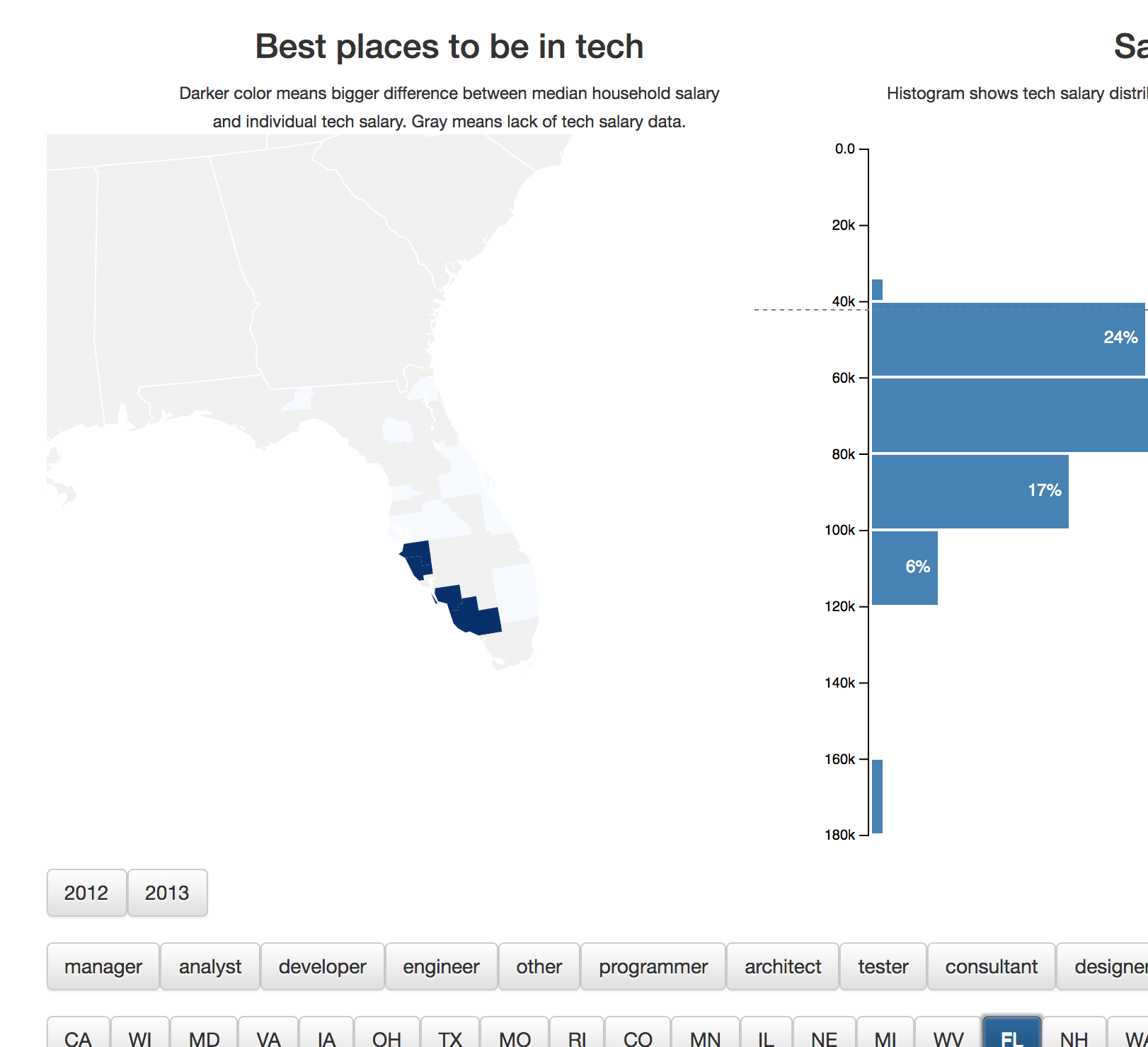
s13e66 - Overlay a median household line
Overlay a median household line
Here’s a more interesting component: the median dotted line. It shows a direct comparison between the histogram’s distribution and the median household income in an area. I’m not sure people understand it at a glance, but I think it’s cool.
We’re using a quick approach where everything fits into a functional React component. It’s great for small components like this.
Step 1: App.js
Inside src/App.js , we first have to add an import, then extract the median household value from state, and in the end, add MedianLine to the render method.
Let’s see if we can do it in a single code block
// src/App.js
import Histogram from './components/Histogram';
import { Title, Description, GraphDescription } from './components/Meta';
// Insert the line(s) between here...
import MedianLine from './components/MedianLine';
// ...and here.

class App extends Component {
    // ...
    render() {
        // ...
        let zoom = null,
            // Insert the line(s) between here...
            medianHousehold = this.state.medianIncomesByUSState['US'][0]
                                  .medianIncome;
            // ...and here.

        return (
            // ...
            <svg width="1100" height="500">
                <CountyMap // ... />
                <Histogram // ... />
                // Insert the line(s) between here...
                <MedianLine data={filteredSalaries}
                            x={500}
                            y={10}
                            width={600}
                            height={500}
                            bottomMargin={5}
                            median={medianHousehold}
                            value={d => d.base_salary} />
                // ...and here.
            </svg>
        )
    }
}
You probably don’t remember medianIncomesByUSState anymore. We set it up way back when tying datasets together. It groups our salary data by US state.
See, using good names helps
When rendering MedianLine , we give it sizing and positioning props, the dataset, a value accessor, and the median value to show. We could make it smart enough to calculate the median, but the added flexibility of a prop felt right.
Step 2: MedianLine
The MedianLine component looks similar to what you’ve seen so far. Some imports, a constructor that sets up D3 objects, an updateD3 method that keeps them in sync, and a render method that outputs SVG.
// src/components/MedianLine.js

import React from "react";
import * as d3 from "d3";

const MedianLine = ({
    data,
    value,
    width,
    height,
    x,
    y,
    bottomMargin,
    median
}) => {

};

export default MedianLine;
We have some imports, a functional MedianLine component that takes our props, and an export. It should cause an error because it’s not returning anything.
Everything we need to render the line, fits into this function.
// src/components/MedianLine.js

const MedianLine = ({
  // ...
}) => {
    const yScale = d3
            .scaleLinear()
            .domain([0, d3.max(data, value)])
            .range([height - y - bottomMargin, 0]),
        line = d3.line()([[0, 5], [width, 5]]);

    const medianValue = median || d3.median(data, value);

    const translate = `translate(${x}, ${yScale(medianValue)})`,
        medianLabel = `Median Household: ${yScale.tickFormat()(median)}`;

    return (
        <g className="mean" transform={translate}>
            <text
                x={width - 5}
                y="0"
                textAnchor="end"
                style={{ background: "purple" }}
            >
                {medianLabel}
            </text>
            <path d={line} />
        </g>
    );
};
We start with a scale for vertical positioning – yScale . It’s linear, takes values from 0 to max , and translates them to pixels less some margin. For the medianValue , we use props, or calculate our own, if needed. Just like I promised.
A translate SVG transform helps us position our line and label. We use it all to return a <g> grouping element containing a <text> for our label, and a <path> for the line.
Building the d attribute for the path, that’s interesting. We use a line generator from D3.
line = d3.line()([[0, 5], [width, 5]]);
It comes from the d3-shape package and generates splines, or polylines. By default, it takes an array of points and builds a line through all of them. A line from [0, 5] to [width, 5] in our case.
That makes it span the entire width and leaves 5px for the label. We’re using a transform on the entire group to vertically position the final element.
Remember, we already styled medianLine when we built histogram styles earlier.
.mean text {
    font: 11px sans-serif;
    fill: grey;
}

.mean path {
    stroke-dasharray: 3;
    stroke: grey;
    stroke-width: 1px;
}
The stroke-dasharray is what makes it dashed. 3 means each 3px dash is followed by a 3px blank. You can use any pattern you like.
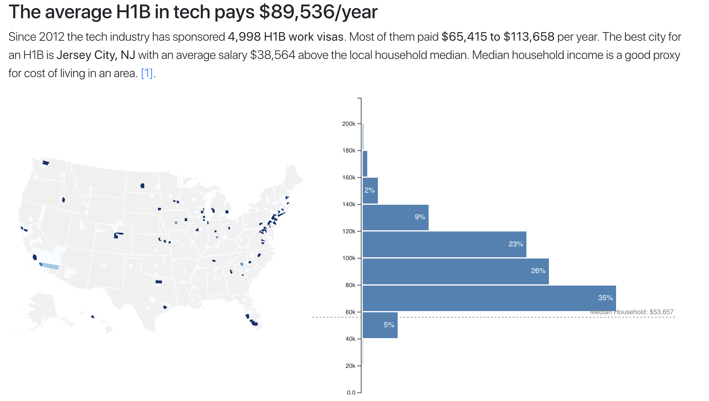
You should see a median household salary line overlaid on your histogram.
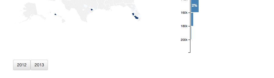
Median line over histogram
Almost everyone in tech makes more than an entire median household. Crazy, huh? I think it is.
If that didn’t work, consult the diff on Github.
s14e67 - Add user controls for data slicing and dicing
Add user controls for data slicing and dicing
Now comes the fun part. All that extra effort we put into making our components aware of filtering, and it all comes down to this: User controls.
Here’s what we’re building:
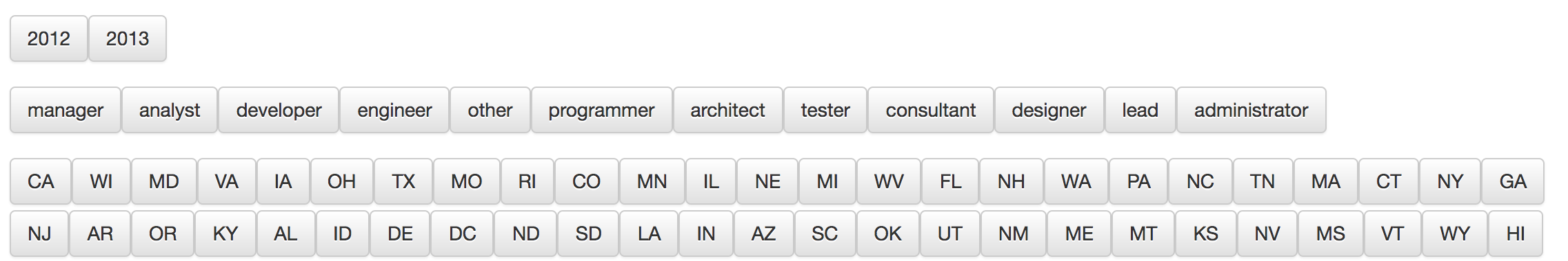
User controlled filters
It’s a set of filters for users to slice and dice our visualization. The shortened dataset gives you 2 years, 12 job titles, and 50 US states. You’ll get 5+ years and many more job titles with the full dataset.
We’re using the architecture we discussed earlier to make it work. Clicking buttons updates a filter function and communicates it all the way up to the App component. App then uses it to update this.state.filteredSalaries , which triggers a re-render and updates our dataviz.
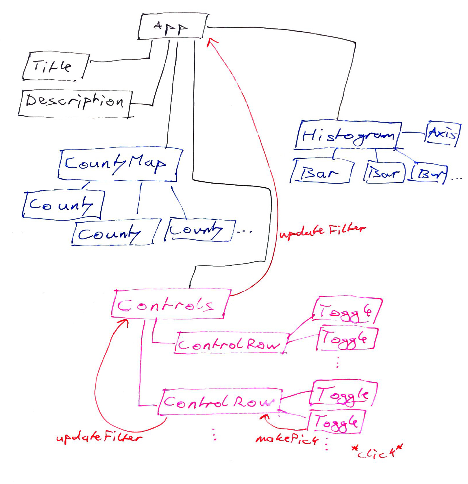
Architecture sketch
We’re building controls in 4 steps, top to bottom:
- Update
App.jswith filtering and a<Controls>render - Build a
Controlscomponent, which builds the filter based on inputs - Build a
ControlRowcomponent, which handles a row of buttons - Build a
Togglecomponent, which is a button
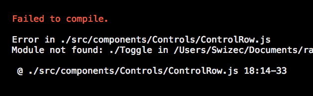
We’ll go through the files linearly. That makes them easier for me to explain and easier for you to understand, but that also means there’s going to be a long period where all you’re seeing is an error like this:

Controls error during coding
If you want to see what’s up during this process, remove an import or two and maybe a thing from render. For instance, it’s complaining about ControlRow in this screenshot. Remove the ControlRow import on top and delete <ControlRow ... /> from render. The error goes away, and you see what you’re doing.
s14e68 - Step 1: Update App.js
Step 1: Update App.js
All right, you know the drill. Add imports, tweak some things, add to render. We have to import Controls , set up filtering, update the map’s zoom prop, and render a white rectangle and Controls .
The white rectangle makes it so the zoomed-in map doesn’t cover up the histogram. I’ll explain when we get there.
// src/App.js
import MedianLine from './components/MedianLine';

// Insert the line(s) between here...
import Controls from './components/Controls';
// ...and here.

class App extends React.Component {
    state = {
        // ...
        medianIncomes: [],
        // Insert the line(s) between here...
        salariesFilter: () => true,
        // ...and here.
        filteredBy: {
            // ...
        }
    }

    // ...

    // Insert the line(s) between here...
    updateDataFilter = (filter, filteredBy) => {
        this.setState({
            salariesFilter: filter,
            filteredBy: filteredBy
        });
    }
    // ...and here.

    render() {
        // ...
    }
}
We import the Controls component and add a default salariesFilter function to this.state . The updateDataFilter method passes the filter function and filteredBy dictionary from arguments to App state. We’ll use it as a callback in Controls .
The rest of filtering setup happens in the render method.
// src/App.js
class App extends React.Component {
    // ...

    render() {
        // ...
        // Delete the line(s) between here...
        const filteredSalaries = techSalaries
        // ...and here.
        // Insert the line(s) between here...
        const filteredSalaries = techSalaries
                                     .filter(this.state.salariesFilter)
        // ...and here.

        // ...

        let zoom = null,
            medianHousehold = // ...
        // Insert the line(s) between here...
        if (filteredBy.USstate !== '*') {
            zoom = this.state.filteredBy.USstate;
            medianHousehold = d3.mean(medianIncomesByUSState[zoom],
                                      d => d.medianIncome);
        }
        // ...and here.

        // ...
    }
}
We add a .filter call to filteredSalaries , which uses our salariesFilter method to throw out anything that doesn’t fit. Then we set up zoom , if a US state was selected.
We built the CountyMap component to focus on a given US state. Finding the centroid of a polygon, re-centering the map, and increasing the sizing factor. It creates a nice zoom effect.
Zoom effect
And here’s the downside of this approach. SVG doesn’t know about element boundaries. It just renders stuff.

Zoom without white rectangle
See, it goes under the histogram. Let’s fix that and add the Controls render while we’re at it.
// src/App.js
class App extends React.Component {
    // ...

    render() {
        // ...

        return (
            <div //...>
                <svg //...>
                    <CountyMap //... />

                    // Insert the line(s) between here...
                    <rect x="500" y="0"
                          width="600"
                          height="500"
                          style={{fill: 'white'}} />
                    // ...and here.

                    <Histogram //... />
                    <MedianLine //.. />
                </svg>

                // Insert the line(s) between here...
                <Controls data={techSalaries}
                          updateDataFilter={this.updateDataFilter} />
                // ...and here.
            </div>
        )
    }
}
Rectangle, 500 to the right, 0 from top, 600 wide and 500 tall, with a white background. Gives the histogram an opaque background, so it doesn’t matter what the map is doing.
We render the Controls component just after </svg> because it’s not an SVG component – it uses normal HTML. Unlike other components, it needs our entire dataset as data . We use the updateDataFilter prop to say which callback function it should call when a new filter is ready.
If this seems roundabout … I’ve seen worse. The callbacks approach makes our app easier to componentize and keeps the code relatively unmessy. Imagine putting everything we’ve done so far in App ! 
s14e69 - Step 2: Build Controls component
Step 2: Build Controls component
The Controls component builds our filter function and filteredBy dictionary based on user choices.
Controls renders 3 rows of buttons and builds filtering out of the choice made on each row. That makes Controls kind of repetitive, but that’s okay.
To keep this book shorter, we’re going to build everything for a year filter first. Then I’ll explain how to add USstate and jobTitle filters on a higher level. Once you have one working, the rest follows that same pattern.
Make a Controls directory in src/components/ and let’s begin. The main Controls component goes in your index.js file.
Stub Controls
// src/components/Controls/index.js
import React from "react";

import ControlRow from "./ControlRow";

class Controls extends React.Component {
    state = {
        yearFilter: () => true,
        year: "*"
    };

    componentDidMount() {

    }

    updateYearFilter = (year, reset) => {
        let filter = d => d.submit_date.getFullYear() === year;

        if (reset || !year) {
            filter = () => true;
            year = "*";
        }

        this.setState(
            {
                yearFilter: filter,
                year: year
            },
            () => this.reportUpdateUpTheChain()
        );
    };

    render() {
        const { data } = this.props;
    }
}

export default Controls;
We start with some imports and a Controls class-based component. Inside, we define default state with an always-true yearFilter and an asterisk for year .
We also need an updateYearFilter function, which we’ll use to update the filter, a reportUpdateUpTheChain function, and a render method. We’re using reportUpdateUpTheChain to bubble updates to our parent component. It’s a simpler alternative to using React Context or a state management library.
Filter logic
// src/components/Controls/index.js
class Controls extends React.Component {
    // ...
    updateYearFilter = (year, reset) => {
        let filter = d => d.submit_date.getFullYear() === year;

        if (reset || !year) {
            filter = () => true;
            year = "*";
        }

        this.setState(
            {
                yearFilter: filter,
                year: year
            },
            () => this.reportUpdateUpTheChain()
        );
    };
}
updateYearFilter is a callback we pass into ControlRow . When a user picks a year, their action triggers this function.
When that happens, we create a new partial filter function. The App component uses it inside a .filter call like you saw earlier. We have to return true for elements we want to keep and false for elements we don’t.
Comparing submit_date.getFullYear() with year achieves that.
The reset argument lets us reset filters back to defaults. Enables users to unselect options.
When we have the year and filter , we update component state with this.setState . This triggers a re-render and calls reportUpdateUpTheChain afterwards. Great use-case for the little known setState callback 
reportUpdateUpTheChain then calls this.props.updateDataFilter , which is a callback method on App . We defined it earlier – it needs a new filter method and a filteredBy dictionary.
// src/components/Controls/index.js
class Controls extends React.Component {
// ...
reportUpdateUpTheChain() {
    window.location.hash = [
        this.state.year || "*"
    ].join("-"😉;

    this.props.updateDataFilter(
        (filters => {
            return d =>
                filters.yearFilter(d)
        })(this.state),
        {
            year: this.state.year
        }
    );
}
}
Building the filter method looks tricky because we’re composing multiple functions. The new arrow function takes a dictionary of filters as an argument and returns a new function that && s them all. We invoke it immediately with this.state as the argument.
It looks silly when there’s just one filter, but I promise it makes sense.
Render
Great, we have the filter logic. Let’s render those rows of controls we’ve been talking about.
// src/components/Controls/index.js
class Controls extends React.Component {
    // ...
    render() {
        const { data } = this.props;

        const years = new Set(data.map(d => d.submit_date.getFullYear()));

        return (
            <div>
                <ControlRow
                    data={data}
                    toggleNames={Array.from(years.values())}
                    picked={this.state.year}
                    updateDataFilter={this.updateYearFilter}
                />
            </div>
        );
    }
}
Once more, this is generalized code used for a single example: the year filter.
We build a Set of distinct years in our dataset, then render a ControlRow using props to give it our data , a set of toggleNames , a callback to update the filter, and which entry is picked right now. Also known as the controlled component pattern, it enables us to maintain the data-flows-down, events-bubble-up architecture.
If you don’t know about Set s, they’re an ES6 data structure that ensures every entry is unique. Just like a mathematical set. They’re pretty fast.
s14e70 - Step 3: Build ControlRow component
Step 3: Build ControlRow component
Let’s build the ControlRow component. It renders a row of controls and ensures only one at a time is selected.
We’ll start with a stub and go from there.
// src/components/Controls/ControlRow.js
import React from "react";

import Toggle from "./Toggle";

class ControlRow extends React.Component {
    makePick = (picked, newState) => {

    };

    _addToggle(name) {
    }

    render() {
        const { toggleNames } = this.props;
    }
}

export default ControlRow;
We start with imports, big surprise, then make a stub with 3 methods. Can you guess what they are?
-
makePickis theToggleclick callback -
_addToggleis a rendering helper method -
renderrenders a row of buttons
// src/components/Controls/ControlRow.js

class ControlRow extends React.Component {
    makePick = (picked, newState) => {
        // if newState is false, we want to reset
        this.props.updateDataFilter(picked, !newState);
    };
makePick calls the data filter update and passes in the new value and whether we want to unselect. Pretty simple right?
// src/components/Controls/ControlRow.js
class ControlRow extends React.Component {
    // ...

    _addToggle(name) {
        let key = `toggle-${name}`,
            label = name;

        if (this.props.capitalize) {
            label = label.toUpperCase();
        }

        return (
            <Toggle
                label={label}
                name={name}
                key={key}
                value={this.props.picked === name}
                onClick={this.makePick}
            />
        );
    }

    render() {
        const { toggleNames } = this.props;

        return (
            <div className="row">
                <div className="col-md-12">
                    {toggleNames.map(name => this._addToggle(name))}
                </div>
            </div>
        );
    }
}
Rendering comes in two functions: _addToggle , which is a helper, and render , which is the main render.
In render , we set up two div s with Bootstrap classes. The first is a row , and the second is a full-width column. I tried using a column for each button, but it was annoying to manage and used too much space.
Inside the divs, we map over all toggles and use _addToggle to render each of them.
_addToggle renders a Toggle component with a label , name , value and onClick callback. The label is just a prettier version of the name, which also serves as a key in our toggleValues dictionary. It’s going to be the picked attribute in makePick .
Your browser should continue showing an error, but it should change to talking about the Toggle component instead of ControlRow .
Let’s build it.
s14e71 - Step 4: Build Toggle component
Step 4: Build Toggle component
Last piece of the puzzle – the Toggle component. A button that turns on and off.
// src/components/Controls/Toggle.js
import React from "react";

const Toggle = ({ label, name, value, onClick }) => {
    let className = "btn btn-default";

    if (value) {
        className += " btn-primary";
    }

    return (
        <button className={className} onClick={() => onClick(name, !value)}>
            {label}
        </button>
    );
};

export default Toggle;
Import React to enable JSX and make a functional Toggle component. It’s fully controlled and takes event handlers as callbacks in props. No need for a class.
We set up a Bootstrap classname: btn and btn-default make an element look like a button, the conditional btn-primary makes it blue. If you’re not familiar with Bootstrap classes, you should check their documentation.
Then we render a <button> tag and, well, that’s it. A row of year filters appears in the browser. onClick passes
A row of year filters
Click on a button and the onClick handler passes a toggle’d value to its parent via the onClick callback. This triggers an update in Controls , which calls reportUpdateUpTheChain , which in turn updates state in App and re-renders our button with the new value toggling its color on or off.
If that didn’t work, consult this diff on GitHub.
s14e72 - Step 5: Add US state and Job Title filters
Step 5: Add US state and Job Title filters
With all that done, we can add two more filters: US states and job titles. Our App component is already set up to use them, so we just have to add them to the Controls component.
We’ll start with the render method, then handle the parts I said earlier would look repetitive.
// src/components/Controls/index.js
class Controls extends Component {
    // ...
    render() {
        const { data } = this.props;

        const years = new Set(data.map(d => d.submit_date.getFullYear())),
              // Insert the line(s) between here...
              jobTitles = new Set(data.map(d => d.clean_job_title)),
              USstates = new Set(data.map(d => d.USstate));
              // ...and here.

        return (
            <div>
                <ControlRow data={data}
                            toggleNames={Array.from(years.values())}
                            picked={this.state.year}
                            updateDataFilter={this.updateYearFilter}
                            />

            // Insert the line(s) between here...
                <ControlRow data={data}
                            toggleNames={Array.from(jobTitles.values())}
                            picked={this.state.jobTitle}
                            updateDataFilter={this.updateJobTitleFilter} />

                <ControlRow data={data}
                            toggleNames={Array.from(USstates.values())}
                            picked={this.state.USstate}
                            updateDataFilter={this.updateUSstateFilter}
                            capitalize="true" />
                // ...and here.
            </div>
        )
    }
}
Ok, this part is plenty repetitive, too.
We created new sets for jobTitles and USstates , then rendered two more ControlRow elements with appropriate attributes. They get toggleNames for building the buttons, picked to know which is active, an updateDataFilter callback, and we tell US states to render capitalized.
The implementations of those updateDataFilter callbacks follow the same pattern as updateYearFilter .
// src/components/Controls/index.js

class Controls extends React.Component {
    state = {
        yearFilter: () => true,
        jobTitleFilter: () => true,
        USstateFilter: () => true,
        year: "*",
        USstate: "*",
        jobTitle: "*"
    };

    updateJobTitleFilter = (title, reset) => {
        let filter = d => d.clean_job_title === title;

        if (reset || !title) {
            filter = () => true;
            title = "*";
        }

        this.setState(
            {
                jobTitleFilter: filter,
                jobTitle: title
            },
            () => this.reportUpdateUpTheChain()
        );
    };

    updateUSstateFilter = (USstate, reset) => {
        let filter = d => d.USstate === USstate;

        if (reset || !USstate) {
            filter = () => true;
            USstate = "*";
        }

        this.setState(
            {
                USstateFilter: filter,
                USstate: USstate
            },
            () => this.reportUpdateUpTheChain()
        );
    };

    // ..
}

export default Controls;
Yes, they’re basically the same as updateYearFilter . The only difference is a changed filter function and using different keys in setState() .
Why separate functions then? No need to get fancy. It would’ve made the code harder to read.
Our last step is to add these new keys to the reportUpdateUpTheChain function.
// src/components/Controls/index.js

class Controls extends React.Component {
    reportUpdateUpTheChain() {
        this.props.updateDataFilter(
            (filters => {
                return d =>
                    filters.yearFilter(d) &&
                    filters.jobTitleFilter(d) &&
                    filters.USstateFilter(d);
            })(this.state),
            {
                USstate: this.state.USstate,
                year: this.state.year,
                jobTitle: this.state.jobTitle
            }
        );
    }
We add them to the filter condition with && and expand the filteredBy argument.
Two more rows of filters show up.
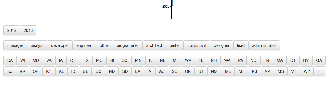
All the filters

Again, if it didn’t work, consult the diff on GitHub.
s15e73 - Add rudimentary routing
Rudimentary routing
Imagine this. A user finds your dataviz, clicks around, and finds an interesting insight. They share it with their friends.
“See! I was right! This link proves it.”
“Wtf are you talking about?”
“Oh… uuuuh… you have to click this and then that and then you’ll see. I’m legit winning our argument.”
“Wow! Kim Kardashian just posted a new snap with her dog.”
Let’s help our intrepid user out and make our dataviz linkable. We should store the current filteredBy state in the URL and be able to restore from a link.
There are many ways to achieve this. ReactRouter comes to mind, but the quickest is to implement our own rudimentary routing. We’ll add some logic to manipulate and read the URL hash.
The easiest place to put this logic is next to the existing filter logic inside the Controls component. Better places exist from a “low-down components shouldn’t play with global state” perspective, but that’s okay.
// src/components/Controls/index.js

class Controls extends React.Component {
    // ..

    componentDidMount() {
        let [year, USstate, jobTitle] = window.location.hash
            .replace("#", "")
            .split("-");

        if (year !== "*" && year) {
            this.updateYearFilter(Number(year));
        }
        if (USstate !== "*" && USstate) {
            this.updateUSstateFilter(USstate);
        }
        if (jobTitle !== "*" && jobTitle) {
            this.updateJobTitleFilter(jobTitle);
        }
    }

    // ..
    reportUpdateUpTheChain() {
        window.location.hash = [
            this.state.year || "*",
            this.state.USstate || "*",
            this.state.jobTitle || "*"
        ].join("-");

        // ..
    }
We use the componentDidMount lifecycle hook to read the URL when Controls first render on our page. Presumably when the page loads, but it could be later. It doesn’t really matter when , just that we update our filter the first chance we get.
window.location.hash gives us the hash part of the URL. We clean it up and split it into three parts: year , USstate , and jobTitle . If the URL is localhost:3000/#2013-CA-manager , then year becomes 2013 , USstate becomes CA , and jobTitle becomes manager .
We make sure each value is valid and use our existing filter update callbacks to update the visualization. Just as if it was the user clicking a button.
In reportUpdateUpTheChain , we make sure to update the URL hash. Assigning a new value to window.location.hash takes care of that.
You should see the URL changing as you click around.
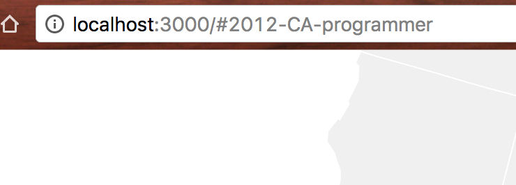
Changing URL hash
There’s a bug with some combinations in 2013 that don’t have enough data. It will go away when we use the full dataset.
If it doesn’t work at all, consult the diff on Github.
s15e74 - Prep your app for launch
Prep for launch
You’ve built a great visualization. Congratz! Time to put it online and share with the world.
To do that, we’re going to use Github Pages because our app is a glorified static website. There’s no backend, so all we need is something to serve our HTML, JavaScript, and CSV. Github Pages is perfect for that.
It’s free, works well with create-react-app , and can withstand a lot of traffic. You don’t want to worry about traffic when your app gets to the top of HackerNews or Reddit.
There are a few things we should take care of:
- setting up deployment
- adding a page title
- adding some copy
- Twitter and Facebook cards
- an SEO tweak for search engines
- use the full dataset
Setting up deployment
You’ll need a Github repository. If you’re like me, writing all this code without version control or off-site backup made you nervous, so you already have one.
For everyone else, head over to Github, click the green New Repository button and give it a name. Then copy the commands it gives you and run them in your console.
It should be something like this:
$ git init
$ git commit -m "My entire dataviz"
$ git remote add origin git://github ...
$ git push origin -u master
If you’ve been git-ing locally without pushing, then you only need the git remote add and git push origin commands. This puts your code on Github. Great idea for anything you don’t want to lose if your computer craps out.
Every Github repository comes with an optional Github Pages setup. The easiest way for us to use it is with the gh-pages npm module.
Install it with this command:
$ npm install --save-dev gh-pages
Add two lines to package.json:
// package.json
// Insert the line(s) between here...
"homepage": "https://<your username>.github.io/<your repo name>"
// ...and here.
"scripts": {
  "eject": "react-scripts eject",
  // Insert the line(s) between here...
  "deploy": "npm run build && gh-pages -d build"
  // ...and here.
}
We’ve been ignoring the package.json file so far, but it’s a pretty important file. It specifies all of our project’s dependencies, meta data for npm, and scripts that we run locally. This is where npm start is defined, for instance.
We add a deploy script that runs build and a gh-pages deploy, and we specify a homepage URL. The URL tells our build script how to set up URLs for static files in index.html .
Github Pages URLs follow the schema:
https://<your username>.github.io/<your repo name>
For instance, mine is:
https://swizec.github.io/react-d3-walkthrough-livecode
Yours will be different.
You can deploy with npm run deploy . Make sure all changes are committed. We’ll do it together when we’re done setting up.
s15e75 - Twitter and Facebook cards and SEO
Twitter and Facebook cards and SEO
How your visualization looks on social media matters more than you’d think. Does it have a nice picture, a great description, and a title, or does it look like a random URL? Those things matter.
And they’re easy to set up. No excuse.
We’re going to poke around public/index.html for the first time. Add titles, Twitter cards, Facebook Open Graph things, and so on.
<!-- public/index.html -->
<head>
    <!-- //... -->
    // Insert the line(s) between here...
    <title>How much does an H1B in tech pay?</title>

    <link rel="canonical"
          href="https://swizec.github.io/react-d3-walkthrough-livecode/" />
    // ...and here.
</head>
<body>
    <!-- //... -->
    <div id="root">
        // Insert the line(s) between here...
         <h2>The average H1B in tech pays $86,164/year</h2>

   <😜 class="lead">
             Since 2012 the US tech industry has sponsored 176,075
             H1B work visas. Most of them paid <b>$60,660 to $111,668</b>
             per year (1 standard deviation). <span>The best city for
             an H1B is <b>Kirkland, WA</b> with an average individual
             salary <b>$39,465 above local household median</b>.
             Median household salary is a good proxy for cost of
             living in an area.</span>
         </p>
        // ...and here.
    </div>
</body>
We add a <title> and a canonical URL. Titles configure what shows up in browser tabs, and the canonical URL is there to tell search engines that this is the main and most important URL for this piece of content. This is especially important for when people copy-paste your stuff and put it on other websites.
In the body root tag, we add some copy-pasted text from our dataviz. You’ll recognize the default title and description.
As soon as React loads, these get overwritten with our preloader, but it’s good to have them here for any search engines that aren’t running JavaScript yet. I think both Google and Bing are capable of running our React app and getting text from there, but you never know.
To make social media embeds look great, we’ll use Twitter card and Facebook OpenGraph meta tags. I think most other websites just rely on these since most people use them. They go in the <head> of our HTML.
<!-- public/index.html -->
<head>
    <meta property="og:locale" content="en_US" />
    <meta property="og:type" content="article" />
    <meta property="og:title"
          content="The average H1B in tech pays $86,164/year" />
    <meta property="og:description"
          content="Since 2012 the US tech industry has sponsored
176,075 H1B work visas. With an average individual salary
up to $39,465 above median household income." />
    <meta property="og:url"
          content="https://swizec.github.io/react-d3-walkthrough-livecode" />
    <meta property="og:site_name" content="A geek with a hat" />
    <meta property="article:publisher"
          content="https://facebook.com/swizecpage" />
    <meta property="fb:admins" content="624156314" />
    <meta property="og:image"
          content="https://swizec.github.io/react-d3js-step-by-step/thumbnail.png" />

    <meta name="twitter:card" content="summary_large_image" />
    <meta name="twitter:description"
          content="Since 2012 the US tech industry has sponsored
176,075 H1B work visas. With an average individual salary
up to $39,465 above median household income." />
    <meta name="twitter:title"
          content="The average H1B in tech pays $86,164/year" />
    <meta name="twitter:site" content="@swizec" />
    <meta name="twitter:image"
          content="https://swizec.github.io/react-d3js-step-by-step/thumbnail.png" />
    <meta name="twitter:creator" content="@swizec" />
</head>
Much of this code is repetitive. Both Twitter and Facebook want the same info, but they’re stubborn and won’t read each other’s formats. You can copy all of this, but make sure to change og:url , og:site_name , article:publisher , fb:admins , og:image , twitter:site , twitter:image , and twitter:creator . They’re specific to you.
The URLs you should change to the homepage URL you used above. The rest you should change to use your name and Twitter/Facebook handles. I’m not sure why it matters, but I’m sure it does.
An important one is fb:admin . It enables admin features on your site if you add their social plugins. If you don’t, it probably doesn’t matter.
You’re also going to need a thumbnail image. I made mine by taking a screenshot of the final visualization, then I put it in public/thumbnail.png .
Now when somebody shares your dataviz on Twitter or Facebook, it’s going to look something like this:
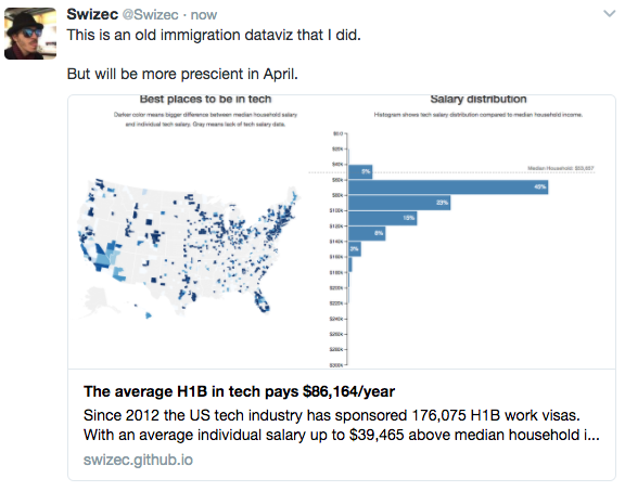
Dataviz Twitter card
s15e76 - Use full dataset
Full dataset
One more step left. Use the whole dataset!
Go into src/DataHandling.js and change one line:
// Example 4
//
// src/DataHandling.js
export const loadAllData = (callback = _.noop) => {
    d3.queue()
        // ..
        // Delete the line(s) between here...
        .defer(d3.csv, 'data/h1bs-2012-2016-shortened.csv', cleanSalary)
        // ...and here.
        // Insert the line(s) between here...
        .defer(d3.csv, 'data/h1bs-2012-2016.csv', cleanSalary)
        // ...and here.
We change the file name, and that’s that. Full dataset locked and loaded. Dataviz ready to go.
s15e77 - Launch!
Launch!
To show your dataviz to the world, make sure you’ve committed all changes. Using git status shows you anything you missed.
Then run:
$ npm run deploy
You’ll see a bunch of output:
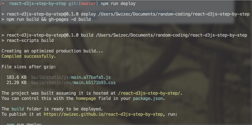
Deploy output
And you’re ready to go. Your visualization is online. My URL is https://swizec.github.io/react-d3-walkthrough-livecode/ , yours is different. Visit it and you’ll see what you’ve built. Share it and others will see it too.
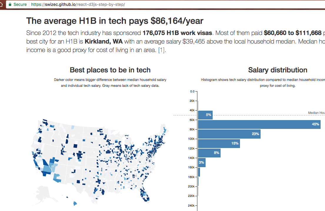
Deployed dataviz
Congratz! You’ve built and deployed your first React and D3 dataviz. You’re amazing \o/
Thanks for following along with the meaty part of my book. You’re now well equipped to build cool things.
In the next section, we’re going to look at building animations.