s26e130 - Using a React alternative like Preact or Inferno
Using a React alternative like Preact or Inferno
We’ve been using React so far, and that’s worked great. React is fast, easy to use, and not too hard to understand. However, two alternative frameworks promise the ease of React, but faster with a smaller footprint.
Preact looks just like React when you’re using it, but the smaller code footprint means your apps open faster. Performing fewer sanity checks at runtime makes it faster to run too. Async rendering can make your apps feel even faster.
Inferno also promises to look just like React when you’re using it, but its sole purpose in life is to be faster. According to its maintainers, converting to Inferno can improve performance of your real-world app by up to 110%.
Both Preact and Inferno have a -compat project that lets you convert existing React projects without any code modifications. While React has gotten much faster in recent years, so have Preact and Inferno. You should give them a try.
I know Uber uses Preact for their Uber lite mobile app.
s26e131 - Stress test your framework with a recursive fractal
Stress test your framework with a recursive fractal
To show you how these speed improvements look in real life, I’ve devised a stress test. A pythagorean fractal tree that moves around when you move your mouse.

Pythagorean tree
It’s a great stress test because a render like this is the worst case scenario for tree-based rendering. You have 2048 SVG nodes, deeply nested, that all change props and re-render with every change.
You can see the full code on Github. We’re going to focus on the recursive <Pythagoras> component.
How you too can build a dancing tree fractal
Equipped with basic trigonometry, you need 3 ingredients to build a dancing tree:
- a recursive
<Pythagoras>component - a mousemove listener
- a memoized next-step-props calculation function
We’re using a <Pythagoras> component for each square and its two children, a D3 mouse listener, and some math that a reader helped me with. We need D3 because its mouse listeners automatically calculate mouse position relative to SVG coordinates. Memoization in the math function helps us keep our code faster.
The <Pythagoras> component looks like this:
const Pythagoras = ({ w, x, y, heightFactor, lean, left, right, lvl, maxlvl }) => {
    if (lvl >= maxlvl || w < 1) {
        return null;
    }

    const { nextRight, nextLeft, A, B } = memoizedCalc({
        w: w,
        heightFactor: heightFactor,
        lean: lean
    });

    let rotate = '';

    if (left) {
        rotate = `rotate(${-A} 0 ${w})`;
    }else if (right) {
        rotate = `rotate(${B} ${w} ${w})`;
    }

    return (
        <g transform={`translate(${x} ${y}) ${rotate}`}>
            <rect width={w} height={w}
                  x={0} y={0}
                  style={{fill: interpolateViridis(lvl/maxlvl)}} />

            <Pythagoras w={nextLeft}
                        x={0} y={-nextLeft}
                        lvl={lvl+1} maxlvl={maxlvl}
                        heightFactor={heightFactor}
                        lean={lean}
                        left />

            <Pythagoras w={nextRight}
                        x={w-nextRight} y={-nextRight}
                        lvl={lvl+1} maxlvl={maxlvl}
                        heightFactor={heightFactor}
                        lean={lean}
                        right />

        </g>
    );
};
We break out of recursion when we get too deep or try to draw an invisible square. Otherwise we:
- use
memoizedCalcto do the mathematics - define different
rotate()transforms for theleftandrightbranches - return an SVG
<rect>for the current rectangle, and two<Pythagoras>elements for each branch.
Most of this code deals with passing props to children, which isn’t the most elegant approach, but it works. The rest is about positioning branches so corners match up.

Corners matching up
The math
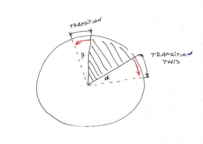
I don’t really understand this math, but I sort of know where it’s coming from. It’s the sine law applied correctly. The part I failed at when I tried to do it myself.
const memoizedCalc = function () {
    const memo = {};

    const key = ({ w, heightFactor, lean }) => [w,heightFactor, lean].join('-');

    return (args) => {
        const memoKey = key(args);

        if (memo[memoKey]) {
            return memo[memoKey];
        }else{
            const { w, heightFactor, lean } = args;

            const trigH = heightFactor*w;

            const result = {
                nextRight: Math.sqrt(trigH**2 + (w * (.5+lean))**2),
                nextLeft: Math.sqrt(trigH**2 + (w * (.5-lean))**2),
                A: Math.deg(Math.atan(trigH / ((.5-lean) * w))),
                B: Math.deg(Math.atan(trigH / ((.5+lean) * w)))
            };

            memo[memoKey] = result;
            return result;
        }
    }
}();
We expanded the basic law of sines with a dynamic heightFactor and lean adjustment. We’ll control those with mouse movement.
To improve performance our memoizedCalc function has an internal data store that maintains a hash of every argument tuple and its result. So when we call memoizedCalc with the same arguments multiple times, it reads from cache instead of recalculating.
At 11 levels of recursion, memoizedCalc is called 2,048 times and only returns 11 different results. Great candidate for memoization if I ever saw one.
Of course, a benchmark would be great here. Maybe sqrt , atan , and ** aren’t that slow, and our real bottleneck is redrawing all those nodes on every mouse move. Hint: it totally is.
Our ability to memoize calculation also means that we could, in theory, flatten our rendering. Instead of recursion, we could use iteration and render in layers. Squares at each level are the same, just at different (x, y) coordinates.
This, however, would be far too tricky to implement.
The mouse listener
Inside App.js , we add a mouse event listener. We use D3’s because it gives us SVG-relative position calculation out of the box. With React’s, we’d have to do the hard work ourselves.
// App.js
state = {
        currentMax: 0,
        baseW: 80,
        heightFactor: 0,
        lean: 0
    };

componentDidMount() {
  d3select(this.refs.svg)
     .on("mousemove", this.onMouseMove.bind(this));
}

onMouseMove(event) {
  const [x, y] = d3mouse(this.refs.svg),

  scaleFactor = scaleLinear().domain([this.svg.height, 0])
                             .range([0, .:sunglasses:),

  scaleLean = scaleLinear().domain([0, this.svg.width/2, this.svg.width])
                           .range([.5, 0, -.5]);

  this.setState({
    heightFactor: scaleFactor(y),
    lean: scaleLean(:satisfied:
  });
}

// ...

render() {
  // ...
  <svg ref="svg"> //...
  <Pythagoras w={this.state.baseW}
              h={this.state.baseW}
              heightFactor={this.state.heightFactor}
             lean={this.state.lean}
             x={this.svg.width/2-40}
             y={this.svg.height-this.state.baseW}
             lvl={0}
             maxlvl={this.state.currentMax}/>
}
A few things happen here:
- we set initial
leanandheightFactorto0 - in
componentDidMount, we used3.selectand.onto add a mouse listener - we define an
onMouseMovemethod as the listener - render the first
<Pythagoras>using values fromstate
The lean parameter tells us which way the tree is leaning and how much, the heightFactor tells us how high those triangles should be. We control both with the mouse position.
That happens in onMouseMove :
onMouseMove(event) {
  const [x, y] = d3mouse(this.refs.svg),

  scaleFactor = scaleLinear().domain([this.svg.height, 0])
                             .range([0, .:sunglasses:),

  scaleLean = scaleLinear().domain([0, this.svg.width/2, this.svg.width])
                           .range([.5, 0, -.5]);

  this.setState({
    heightFactor: scaleFactor(y),
    lean: scaleLean(:satisfied:
  });
}
d3mouse - an imported mouse function from d3-selection - gives us cursor position relative to the SVG element. Two linear scales give us scaleFactor and scaleLean values, which we put into component state.
When we feed a change to this.setState , it triggers a re-render of the entire tree, our memoizedCalc function returns new values, and the final result is a dancing tree.
Dancing Pythagoras tree
Beautious. 
s26e132 - Stress testing Preact and Inferno
Trying the stress test in Preact and Inferno
The Pythagoras tree example got converted into 6 different UI libraries: React, Preact, Inferno, Vue, Angular 2, and CycleJS.
Mostly by the creators of those libraries themselves because they’re awesome and much smarter than I am. You can see the result, in gifs, on my blog here.
We’re focusing on React-like libraries, so here’s a rundown of changes required for Preact and Inferno with links to full code.
Preact
Implemented by Jason Miller, creator of Preact. Full code on Github

Jason used the preact-compat layer to make Preact pretend that it’s React. This might impact performance.
What I love about the Preact example is that it uses async rendering to look smoother. You can see the redraw cycle lag behind the mouse movement producing curious effects.
I like it.
Here’s how he did it: full diff on github
In package.json , he added preact , preact-compat , and preact -compat clones for React libraries. I guess you need the latter so you don’t have to change your imports.
He changed the functional Pythagoras component into a stateful component to enable async rendering.
// src/Pythagoras.js
export default class {
  render(props) {
    return Pythagoras(props);
  }
}
And enabled debounced asynchronous rendering:
// src/index.js
import { options } from 'preact';
options.syncComponentUpdates = false;

//option 1:  rIC + setTimeout fallback
let timer;
options.debounceRendering = f => {
    clearTimeout(timer);
    timer = setTimeout(f, 100);
    requestIdleCallback(f);
};
My favorite part is that you can use Preact as a drop-in replacement for React and it Just Works™ and works well. This is promising for anyone who wants a quick win in their codebase.
Inferno
Implemented by Dominic Gannaway, creator of Inferno. Full code on Github
You can use Inferno as a drop-in replacement for React, and I did when I tried to build this myself. Dominic says that impacts performance, though, so he made a proper fork. You can see the full diff on Github
Dominic changed all react-scripts references to inferno-scripts , and it’s a good sign that such a thing exists. He also changed the react dependency to inferno-beta36 , but I’m sure it’s out of beta by the time you’re reading this. The experiment was done in December 2016.
From there, the main changes are to the imports – React becomes Inferno – and he changed some class methods to bound fat arrow functions. Probably a stylistic choice.
He also had to change a string-based ref into a callback ref. Inferno doesn’t do string-based refs for performance reasons, and we need refs so we can use D3 to detect mouse position on SVG.
// src/App.js

class App extends Component {
  // ...
  svgElemeRef = (domNode) => {
    this.svgElement = domNode;
  }
  // ...
  render() {
    // ..
    <svg width={this.svg.width} height={this.svg.height} ref={this.svgElemeRef }>
  }
In the core Pythagoras component, he added two Inferno-specific props: noNormalize and hasNonKeyedChildren .
According to this issue, noNormalize is a benchmark-focused flag that improves performance, and I can’t figure out what hasNonKeyedChildren does. I assume both are performance optimizations for the Virtual DOM diffing algorithm.
s27e133 - An intro to hooks
Refactor your components with React Hooks
Hooks launched with great fanfare and community excitement in February 2019. A whole new way to write React components.
Not a fundamental change, the React team would say, but a mind shift after all. A change in how you think about state, side effects, and component structure. You might not like hooks at first. With a little practice they’re going to feel more natural than the component lifecycle model you’re used to now.
Hooks exist to:
- help you write less code for little bits of logic
- help you move logic out of your components
- help you reuse logic between components
Some say it removes complexity around the this keyword in JavaScript and I’m not sure that it does. Yes, there’s no more this because everything is a function, that’s true. But you replace that with passing a lot of function arguments around and being careful about function scope.
My favorite React Hooks magic trick is that you can and should write your own. Reusable or not, a custom hook almost always cleans up your code.
Oh and good news! Hooks are backwards compatible. You can write new stuff with hooks and keep your old stuff unchanged. 
In this section we’re going to look at the core React hooks, talk about the most important hook for dataviz, then refactor our big example from earlier to use hooks.
You’ll need to upgrade React to at least version 16.8.0 to use hooks.
s27e134 - useState, useEffect, and useContext
useState, useEffect, and useContext
React comes with a bunch of basic and advanced hooks. The core hooks are:
-
useStatefor managing state -
useEffectfor side-effects -
useContextfor React’s context API
Here’s how to think about them in a nutshell 
useState
The useState hook replaces pairs of state getters and setters.
class myComponent extends React.Component {
    state = {
      value: 'default'
    }

    handleChange = (e) => this.setState({
      value: e.target.value
    })

    render() {
      const { value } = this.state;

      return <input value={value} onChange={handleChange} />
    }
}
const myComponent = () => {
  const [value, setValue] = useState('default');

  const handleChange = (e) => setValue(e.target.value)

  return <input value={value} onChange={handleChange} />
}
Less code to write and understand.
In a class component you:
- set a default value
- create an
onChangecallback that firessetState - read value from state before rendering etc.
Without modern fat arrow syntax you might run into trouble with binds.
The hook approach moves that boilerplate to React’s plate. You call useState . It takes a default value and returns a getter and a setter.
You call that setter in your change handler.
Behind the scenes React subscribes your component to that change. Your component re-renders.
useEffect
useEffect replaces the componentDidMount , componentDidUpdate , shouldComponentUpdate , componentWillUnmount quadfecta. It’s like a trifecta, but four.
Say you want a side-effect when your component updates, like make an API call. Gotta run it on mount and update. Want to subscribe to a DOM event? Gotta unsubscribe on unmount.
Wanna do all this only when certain props change? Gotta check for that.
Class:
class myComp extends Component {
  state = {
      value: 'default'
    }

    handleChange = (e) => this.setState({
      value: e.target.value
    })

    saveValue = () => fetch('/my/endpoint', {
        method: 'POST'
        body: this.state.value
    })

    componentDidMount() {
        this.saveValue();
    }

    componentDidUpdate(prevProps, prevState) {
        if (prevState.value !== this.state.value) {
            this.saveValue()
        }
    }

    render() {
      const { value } = this.state;

      return <input value={value} onChange={handleChange} />
    }
}
const myComponent = () => {
  const [value, setValue] = useState('default');

  const handleChange = (e) => setValue(e.target.value)
  const saveValue = () => fetch('/my/endpoint', {
        method: 'POST'
        body: value
    })

    useEffect(saveValue, [value]);

  return <input value={value} onChange={handleChange} />
}
So much less code!
useEffect runs your function on componentDidMount and componentDidUpdate . And that second argument, the [value] part, tells it to run only when value changes.
No need to double check with a conditional. If your effect updates the component itself through a state setter, the second argument acts as a shouldComponentUpdate of sorts.
When you return a method from useEffect , it acts as a componentWillUnmount . Listening to, say, your mouse position looks like this:
const [mouseX, setMouseX] = useState();
const handleMouse = (e) => setMouseX(e.screenX);

useEffect(() => {
    window.addEventListener('mousemove', handleMouse);
    return () => window.removeEventListener(handleMouse);
})
Neat :okay_hand:
useContext
useContext cleans up your render prop callbacky hell.
const SomeContext = React.createContext()

// ...

<SomeContext.Consumer>
  {state => ...}
</SomeContext.Consumer>
const state = useContext(SomeContext)
Context state becomes just a value in your function. React auto subscribes to all updates.
And those are the core hooks. useState, useEffect, and useContext. You can use them to build almost everything. :okay_hand:
s27e135 - useMemo is your new best friend
useMemo is your new best dataviz friend
My favorite hook for making React and D3 work together is useMemo . It’s like a combination of useEffect and useState .
Remember how the rest of this course focused on syncing D3’s internal state with React’s internal state and complications around large datasets and speeding up your D3 code to avoid recomputing on every render?
All that goes away with useMemo – it memoizes values returned from a function and recomputes them when particular props change. Think of it like a cache.
Say you have a D3 linear scale. You want to update its range when your component’s width changes.
function MyComponent({ data, width }) {
    const scale = useMemo(() =>
        d3.scaleLinear()
            .domain([0, 1])
            .range([0, width])
    ), [width])

    return <g> ... </g>
}
useMemo takes a function that returns a value to be memoized. In this case that’s the linear scale.
You create the scale same way you always would. Initiate a scale, set the domain, update the range. No fancypants trickery.
useMemo ’s second argument works much like useEffect’s does: It tells React which values to observe for change. When that value changes, useMemo reruns your function and gets a new scale.
Don’t rely on useMemo running only once however. Memoization is meant as a performance optimization, a hint if you will, not as a syntactical guarantee of uniqueness.
And that’s exactly what we want. No more futzing around with getDerivedStateFromProps and this.state . Just useMemo and leave the rest to React. 
s27e136 - my useD3 hook
my useD3 hook
Remember when we talked about D3 blackbox rendering? I built a hook for that so you don’t have to mess around with HOCs anymore 
Read the full docs at d3blackbox.com
It works as a combination of useRef and useEffect . Hooks into component re-renders, gives you control of the anchor element, and re-runs your D3 render function on every component render.
You use it like this:
import { useD3 } from "d3blackbox";
function renderSomeD3(anchor) {
    d3.select(anchor);
    // ...
}

const MyD3Component = ({ x, y }) => {
    const refAnchor = useD3(anchor => renderSomeD3(anchor));
    return <g ref={refAnchor} transform={`translate(${x}, ${y})`} />;
};
You’ll see how this works in more detail when we refactor the big example to hooks. We’ll use useD3 to build axes.
s27e137 - Refactoring our big example to hooks
Refactoring our big example to hooks
I considered writing this section out as text, but I don’t think that’s the best way to learn about refactoring. Too many moving pieces. You should watch the videos
As always, they’re cut so you can enjoy bitesized pieces.
s28e138 - Merging transitions and game loops
Check this out!
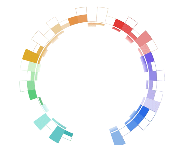
It’s a donut chart that transitions to a bar chart. Same component, same React code, different radius. 29,905px instead of 728px. 
I actually got the idea from that flat earth documentary on Netflix. Behind the Curve. No joke.
Why do flat earth people believe the earth is flat?
It’s because the curve is soooooooo big that it looks flat.
That gave me an idea for a client project. They asked me to build a smooth transition from a donut-shaped visualization to a bar chart shape.
No idea how to do that so I stalled for weeks by building everything else first. Until one day I had an idea
I just discovered a new approach to React + D3 transitions
Check this out, it combines the “game loop via state changes” with the “D3 runs transitions” approach pic.twitter.com/mMglR4hDwp
— Swizec Teller (@Swizec) March 5, 2019
You can combine the two approaches to animation you learned in React for Data Visualization. We talked about
-
The game loop approach. Borrows ideas from the gaming industry. Call
this.setState60 times per second and your React component animates. Wonderful. -
The D3 transition approach. You take a React component, use props as a staging area, render from state, and use
componentDidMountoruseEffectto hand over rendering control to D3. D3 runs its transition, manipulates the DOM, then gives control back to React.
A new approach to complex transitions
Now there’s a 3rd approach. Something I never thought of before and it works great.
Let’s look at the transition again
Here’s what happens behind the scenes to make it work:
- A
<Donut>component renders a bunch of<Arc>s - Each
<Arc>takes care of its complex shape. Built from 3 different D3 arc generators - The whole thing is driven by D3’s pie generator. It calculates start and end angles for individual arcs
- Donut size is a function of radius. The bigger the radius, the bigger the donut.
- As the radius increases from 728 to 29,905 the donut grows
- And it moves down as fast as it grows. Without moving, it would fly off the screen and you’d never see it again
- To keep the pie exactly 728px wide even though it’s rendered on a 29,905px donut … well you gotta calculate the arc segment and derive start and end angles from that
That’s a lot of stuff.
And it’s all driven by this code. The transition
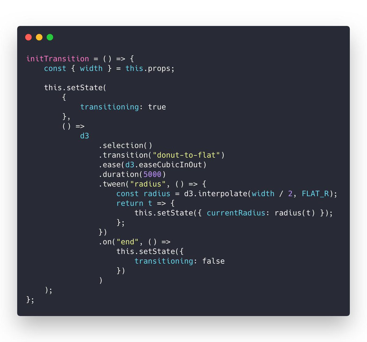
I call this on component mount. Could be on a click event or whatever. Starts a custom tween transition with D3.
That lets D3 control the timing, the easing functions, keeping it smooth, all of that. You don’t have to think about any of it.
But instead of changing a DOM attribute, my tween calls this.setState on the React component. Meaning it’s changing React state instead.

Since the donut bar chart knows how to render itself based on a radius … well … you can keep re-rendering at various radiuses and It Just Works.
Smooth transition by re-rendering the whole visualization 60 times per second. Even though it’s a super complex component. Lots of moving parts and subcomponents.
Knowing everything that’s going on behind the scenes I am blown away by how well it works.
React is magic.
s28e139 - Understanding custom tweens
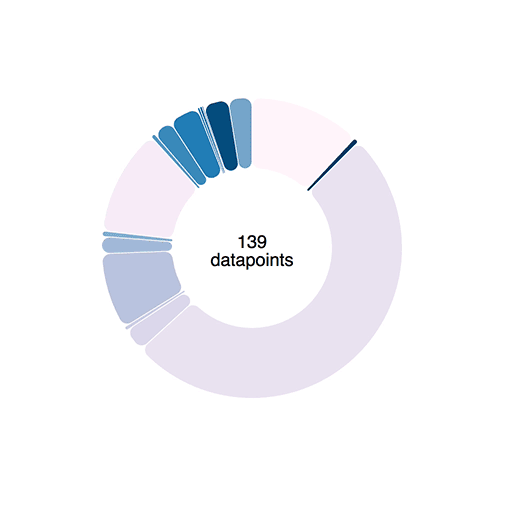
A smoothly transitioning piechart
Transitions like we used above work using interpolators. For numbers, an interpolator is easy: A function that parametrizes changes to a single argument.
let i = d3.interpolateNumber(10, 20);
i(0.0); // 10
i(0.2); // 12
i(0.5); // 15
i(1.0); // 20
D3 can interpolate everything from numbers, to colors, and even objects or strings. It does so by finding interpolatable parts of your argument and manipulating them linearly depending on the t parameter.
But sometimes you need custom interpolators – tweens.
Say you want to animate an arc shape. The path definition argument is a complex string
M100.6434055594246,-99.8203632756589A8,8,0,0,1,112.2823856114007,-99.46188154973098A150,150,0,0,1,-104.56274177607584,107.54828233063364A8,8,0,0,1,-104.38099615277264,95.90520136696549L-64.39381262786019,59.38549403963366A8,8,0,0,1,-53.635344263429694,59.35696964757701A80,80,0,0,0,61.78081312913049,-50.82451307295977A8,8,0,0,1,62.30830828934212,-61.57007978883599Z
If that doesn’t make sense, don’t worry. I can’t read it either.
When you transition a shape like that, funny things can happen. Sometimes arcs fly around the screen, sometimes you get an error.
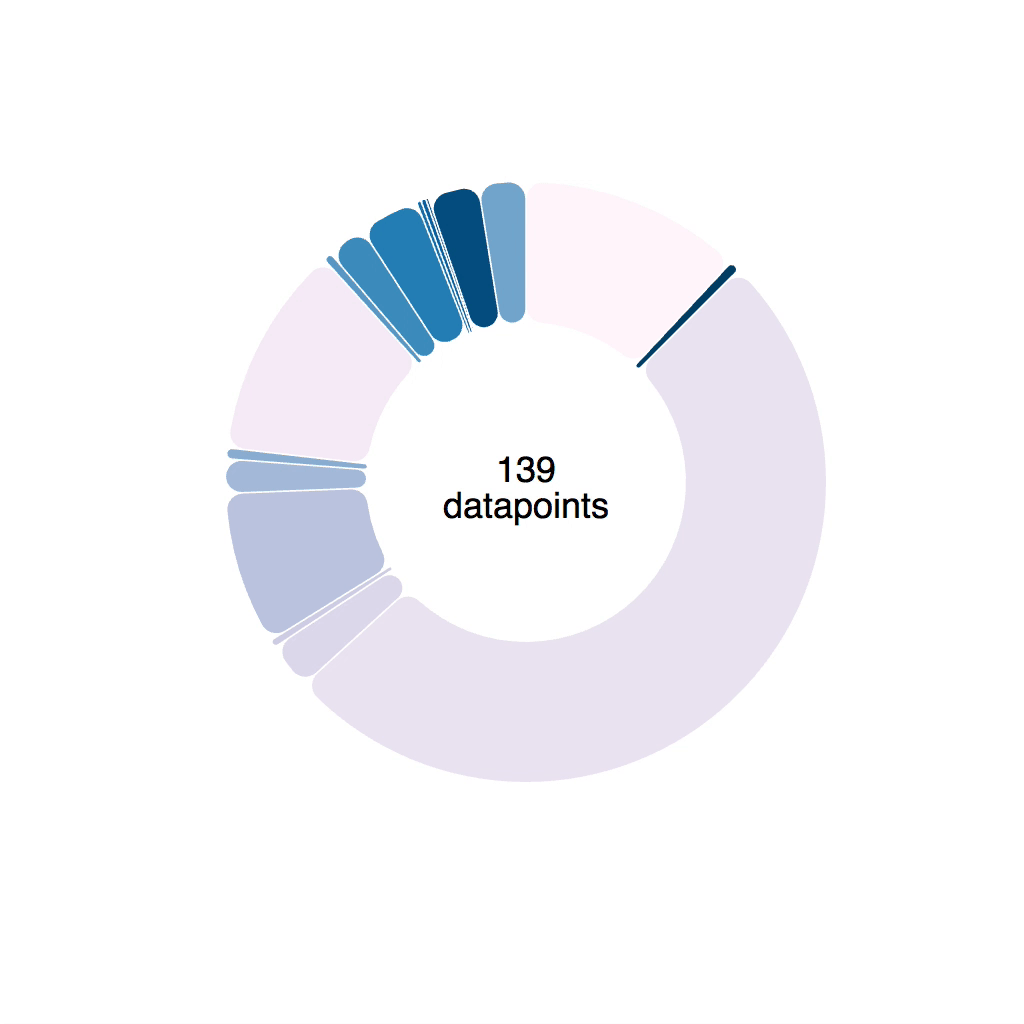
Naively implemented transition. Notice the arcs change shape sometimes
Notice the arc wobble.
Tweens to the rescue
Luckily, D3 lets us define custom transitions called tweens. To smoothly animate a piechart we can build an arcTween . Because piecharts are made of arcs.
The idea is to move from transitioning path definitions, to transitioning angles on a pie slice. We build a tween generator that takes some params and returns a tweening function.
Tweening functions lie behind all transitions. They take an argument, t , and return the value of your prop at a specific “time” of your transition. All transitions you’ve used so far are built with tweens in the background.
Our tween generator is going to need:
-
oldData, the definition of our pie slice at the start of the transition -
newData, the definition of our pie slice that we want to tween towards -
arc, a D3 arc generator
Both oldData and newData come from a D3 pie generator. The startAngle and endAngle is what we’re interested in.
Our arcTween function uses these to build a tween method that we then feed into attrTween .
// inspired from http://bl.ocks.org/mbostock/5100636
function arcTween(oldData, newData, arc) {
  const copy = { ...oldData };
  return function() {
    const interpolateStartAngle = d3.interpolate(
        oldData.startAngle,
        newData.startAngle
      ),
      interpolateEndAngle = d3.interpolate(oldData.endAngle, newData.endAngle);

    return function(t) {
      copy.startAngle = interpolateStartAngle(t);
      copy.endAngle = interpolateEndAngle(t);
      return arc(copy);
    };
  };
}
We make a copy of oldData so we don’t change input data by accident, then we return a function. This function creates two interpolators with d3.interpolate . One for each angle.
Each interpolator starts from an oldData angle and moves towards a newData angle.
This function then returns our interpolation function. It takes the argument t , feeds it into our two interpolators, adjusts values on the copy object, feeds that into the arc generator, and returns a new path definition.
You use it like this
// Arc.js
d3.select(this.refs.elem)
  .transition()
  .duration(80)
  .attrTween('😜', arcTween(this.state.d, newProps.d, this.arc))
  .on('end', () =>
    this.setState({
      d: newProps.d,
      pathD: this.arc(newProps.d),
    })
  );
Select an element, a <path> , start a transition, make it last 80 milliseconds, attrTween the path definition, d , attribute using the tween returned from arcTween .
s28e140 - Custom tweens in practice
A practical example
Here’s an example of how you might use that in an animated piechart. Same idea works for any custom transition you want to build.
s28e141 - Use tweens to drive state – hybrid animation
Use tweens to drive state – hybrid animation
You now have all the ingredients for hybrid animation:
- Custom tweens for tight transition control
- State changes to drive animation
Let’s bring them together
Red squares in a circle. Click one, they all fly out – bouncing like they’re tied to an elastic. Click again and the circle contracts.
Silly example, sure, but a useful technique. Same way the piechart to bar chart transition worked.
It all happens in the <HybridExample /> component.
<HybridExample width={500} height={500} x={250} y={250} />
Hybrid example is a functional component based on React Hooks. We use state for the radius , an angleScale to position rectangles, and an explode function to trigger the transition.
const HybridExample = ({ x, y }) => {
  const [radius, setRadius] = useState(10);
  const N = 10;

  const angleScale = d3
    .scaleLinear()
    .domain([0, N])
    .range([0, Math.PI * 2]);

  const explode = () => {
    // transition
  };

  return (
    <g transform={`translate(${x}, ${y})`} onClick={explode}>
      {d3.range(N).map(i => (
        <Square
          x={Math.cos(angleScale(i)) * radius}
          y={Math.sin(angleScale(i)) * radius}
          key={i}
        />
      ))}
    </g>
  );
useState hook gives us initial radius of 10 and a setRadius function to change it. angleScale translates linearly between a domain of 0 to N, and angles in radians. 0 is 0, 2PI is a full circle.
We render squares the usual way:
- grouping element for positioning
- loop over a range of size
N -
<Square />for each iteration - use trigonometry to translate angles to
xandycoordinates
Here’s a helpful image, if you’ve forgotten your high school maths like I have
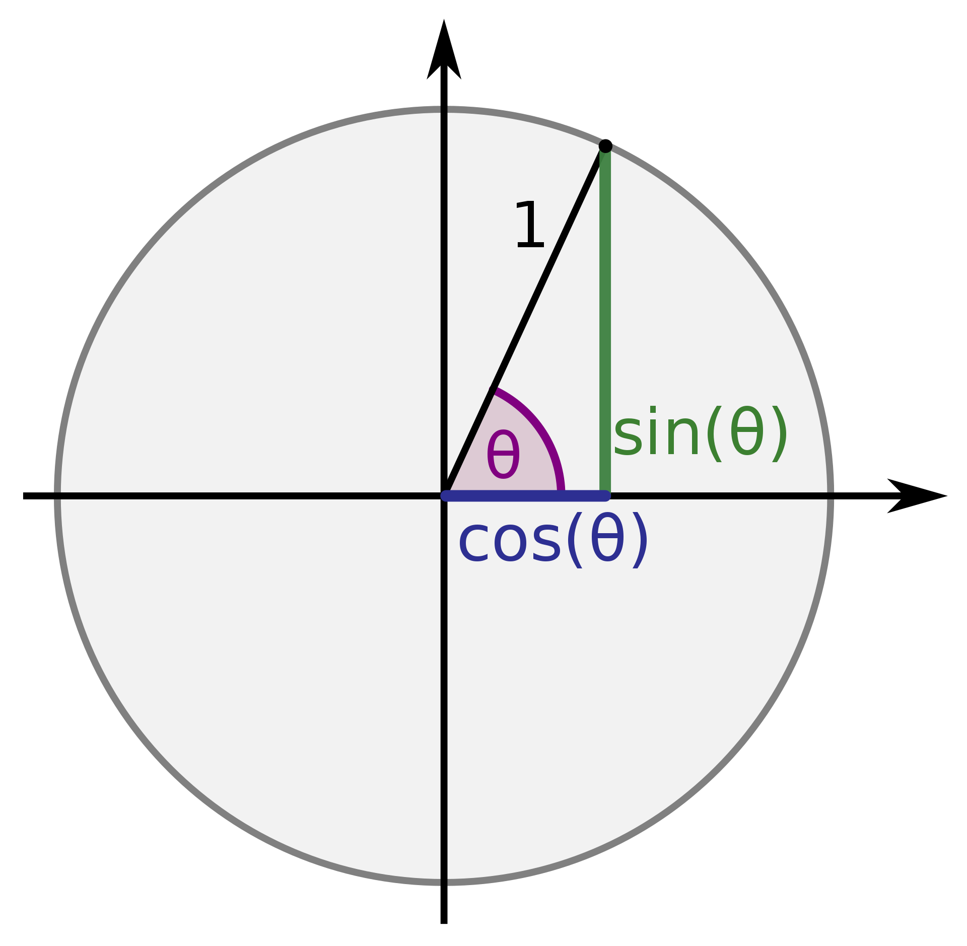
sin for vertical, cos for horizontal
Tween-driven state changes for animation
We used onClick={explode} to trigger the animation. Here’s what that looks like
const explode = () => {
  const elastic = d3.easeElasticOut;
  elastic.amplitude(5);
  elastic.period(-0.3);

  d3.selection()
    .transition('radius-boom')
    .ease(elastic)
    .duration(1000)
    .tween('radius', () => {
      const radiusInt = d3.interpolate(radius, radius > 10 ? 10 : 60);
      return t => setRadius(radiusInt(t));
    });
};
explode starts by creating a new easing function – elastic . Elastic easing is built into D3 and you can tweak its amplitude and period . Try different values to see what happens.
We start a new virtual d3.selection() . Doesn’t select anything, lets us run a transition. Gotta give it a name though – radius-boom .
Then we specify the easing function, the duration, and create a custom tween.
.tween("radius", () => {
    const radiusInt = d3.interpolate(radius, radius > 10 ? 10 : 60);
    return t => setRadius(radiusInt(t));
});
Our tween operates on the radius , which isn’t even an SVG property. That’s just a logical name we use.
The tween itself uses an interpolator that goes from current radius – that’s the state – to either 10 or 60 . Small or large. That way we can use the same tween both for growing and shrinking the circle.
We return a parametrized function that takes a t parameter and calls setRadius with a value from our interpolator.
setRadius is the set state function we defined earlier with useState , which means we update state on every tick of the transition animation. Update state, component re-renders, you get smooth animation.
Works great

s29e142 - You’re the best
Conclusion
You finished the book! You’re my new favorite person \o/
You’ve built a really big interactive data visualization, a few silly animations, learned the basics of Redux and MobX, looked into rendering your stuff on canvas, and considered React alternatives.
Right now you might be thinking “How the hell does this all fit together to help me build interactive graphs and charts?” You’ve learned the building blocks!
First, you learned the basics. How to make React and D3 like each other, how to approach rendering, what to do with state. Then you built a big project to see how it fits together.
Then you learned animation basics. How to approach updating components with fine grained control and how to do transitions. You learned that tricks from the gaming industry work here, too.
You’re an expert React slinger now! I think that’s awesome.
Even if you didn’t build the projects, you still learned the theory. When the right problem presents itself, you’ll think of this book and remember what to do. Or at least know where to look to find a solution.
At the very least, you know where to look to find a solution. This book is yours forever.
I hope you have enjoyed this book. Tweet @Swizec and tell me what you’re building. 
Questions? Poke me on twitter. I’m @Swizec. Or send me an email to hi@swizec.com. I read every email and reply on a best effort basis.
s30e143 - Intro to cookbook area
 this section started as a month-long series of almost daily data visualizations. Originally structured as a challenge+solution, I warmly recommend you approach it that way as well.
Look at each section, get the data, try to build it yourself. Then look at my solution. Each comes with a recording of a livestream I did while figuring out how to solve the problem
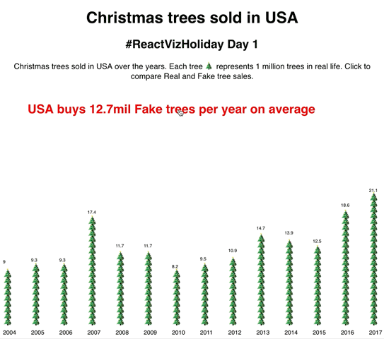
s30e144 - Christmas trees sold in USA - an emoji barchart
Challenge
Every year americans buy a bunch of christmas trees. Use the dataset to compare real and fake sales with two bar charts.
My Solution
Christmas trees sold in USA is an example of a simple barchart built with React and D3. More React than D3 really. 
We used the simplified full integration approach because the data never changes. Neither do any of the other props like width and height . Means we don’t have to worry about updating D3’s internal state. Plopping D3 stuff into class field properties works great.
We converted our dataset from xlsx into a tab separated values file. Easy copy paste job with this tiny dataset. That goes in /public/data.tsv .
To load the dataset we use d3.tsv inside componentDidMount .
  componentDidMount() {
    d3.tsv("/data.tsv", ({ year, real_trees, fake_trees }) => ({
      year: Number(year),
      real_trees: Number(real_trees),
      fake_trees: Number(fake_trees)
    })).then(data => this.setState({ data }));
  }
When the <App> component first loads, it makes a fetch() request for our data file. D3 parses the file as a list of tab separated values and passes each line through our data parsing function. That turns it into a nicely formatted object with real numbers.
.then we update component state with our data.
Inside the render method we use a conditional. When data is present, we render a <Barchart> component with a title. When there’s no data, we render nothing.
No need for a loading screen with a dataset this small. Loads and parses super fast.
Render the emoji barchart
Switchable emoji christmas tree barchart
We created a <Barchart> component that takes:
-
data, our entire dataset -
value, the key name we’re displaying -
y, the vertical position
Final version doesn’t need that vertical positioning param, but it’s nice to have. You never know.
The Barchart uses a horizontal scaleBand to handle each column’s positioning. Scale bands are a type of ordinal scale. They automatically handle spacing, padding, and making sure our columns neatly fit into a given width.
There’s no height axis because we want each christmas tree emoji  to represent a million real life trees.
We loop over the data and render a TreeBar and a text label for each entry.
<g transform={`translate(0, ${y})`}>
  {data.map(d => (
    <React.Fragment>
      <TreeBar x={this.xScale(d.year)} y={480} count={d[this.props.value]} />
      <text
        x={this.xScale(d.year)}
        y={500}
        style={{ strike: 'black', fontSize: '12px' }}
        textAnchor="center"
      >
        {d.year}
      </text>
    </React.Fragment>
  ))}
</g>
A grouping element holds everything in place and creates a common coordinate system to work off of. It’s like a div. We position it with a transform=translate and elements inside position relatively to the group.
For each iteration of our data , we render a <TreeBar> and a <text> . Text goes at the bottom and displays the year. That’s our label.
<TreeBar> gets a horizontal position through our xScale , a vertical position which is static, and a count of how many trees to show. We use this.props.value to dynamically fetch the correct part of each data object.
A of emojis
Now here’s a silly little fun part: Instead of an SVG rectangle, we build each bar from a bunch of emoji text elements.
const TreeBar = ({ x, y, count }) => (
  <g transform={`translate(${x}, ${y})`}>
    {d3.range(count).map(i => (
      <text x={0} y={-i * 12} style={{ fontSize: '20px' }}>
        🎄
      </text>
    ))}
    <text
      x={0}
      y={-(count + 1) * 12 - 5}
      style={{ fontSize: '9px' }}
      textAnchor="center"
    >
      {count}
    </text>
  </g>
);
Once more we start with a grouping element. That holds everything together.
Then we create a fake array with d3.range and iterate. For each index in the array, we return a text element positioned at a 12px offset from the previous element, a fontSize of 20px , and a christmas tree emoji for content.
We found the values through experiment. Keeping emojis spaced to their full height created bars that were too hard to read. An overlap works great. Keeps the bars readable and the emojis recognizable.
That final little text shows how many million trees we drew in each bar. Makes our chart easier to read than counting tres
What you learned 
Today you learned:
- D3 band scales
- D3 range for creating iteration arrays
- using class field values for D3 objects
- a simple full integration approach
React for rendering. D3 to help calculate props.
s30e145 - Money spent on Christmas - a line chart
Challenge
Christmas can be very expensive. Plot a line of how much americans think they’re spending on Christmas gifts over the years.
My Solution
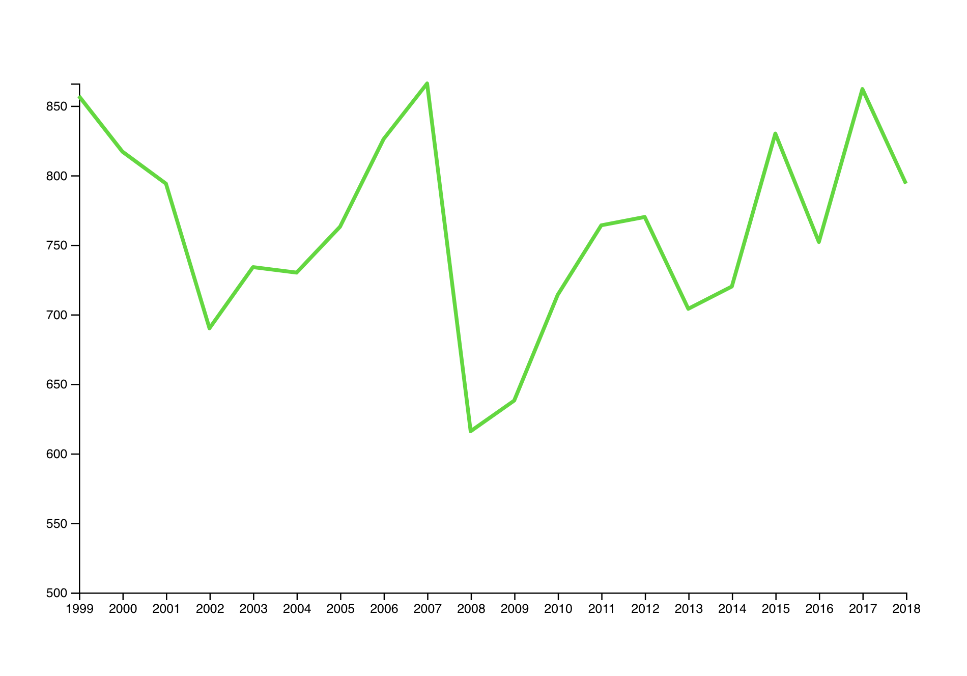
Today we built a little line chart with two axes and emoji datapoints. Hover an emoji, get a line highlighting where it falls on the axis. Makes it easy to see what happened when.
It’s interesting to see how Christmas spending was on the rise and reached a peak in 2007. Crashed in 2008 then started rising again. Great insight into the US economy.
When times are good, people buy gifts. When times are bad, people don’t.
To build this linechart we used the same insight as yesterday:
Our data is static and never changes. We don’t expect to change positions and size of our chart. That means we can cut some corners.
Once again we load data in componentDidMount using d3.tsv to parse a tab separated values file. We feed the result array of objects into a <Linechart> component.
The basic linechart
Rendering a basic linechart was pretty quick: D3’s got a line generator 
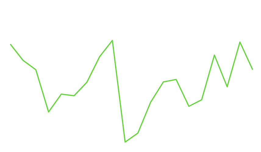
Just the line
That’s an SVG <path> using d3.line to create the d shape attribute. Wrapped into a React component it looks like this:
class Linechart extends React.Component {
  x = d3
    .scalePoint()
    .domain(this.props.data.map(d => d.year))
    .range([0, this.props.width]);
  y = d3
    .scaleLinear()
    .domain([500, d3.max(this.props.data, d => d.avg_spend)])
    .range([this.props.height, 0]);

  line = d3
    .line()
    .x(d => this.x(d.year))
    .y(d => this.y(d.avg_spend));

  render() {
    const { x, y, data } = this.props;

    return (
      <g transform={`translate(${x}, ${y})`}>
        <Line d={this.line(data)} />
      </g>
    );
  }
}
We define two scales, x and y to help us translate between datapoints and coordinates on the screen. Without those year 2018 would render 2018 pixels to the right and that’s too much.
x is a point scale, which like yesterday’s band scale neatly arranges datapoints along a axis. Unlike a band scale it places them in points at the middle of each ragne.
y is a boring old liear scale. Americans spend so much on gifts that we cut off the domain at $500. Makes the graph more readable and less tall.
Then we have the line generator. We define it with d3.line , tell it how to get x and y coordinates with our scales and leave the rest as defaults.
Rendering is a matter of creating a wrapping <g> element to position our graph and group all future additions. Inside, we render a styled <Line> component and feed data into the line generator. That handles the rest.
You have to style lines or they come out invisible.
const Line = styled.path`
  stroke-width: 3px;
  stroke: ${d3.color('green').brighter(1.5)};
  fill: none;
  stroke-linejoin: round;
`;
Give it a nice thickness, some light green color, remove the default black fill, and make edges round. Lovely.
Note the d3.color('green').brighter(1.5) trick. We can use D3 to manipulate colors 
The axes
Line with axes
Because axes are a tricky best to build, we used a trick from React for Data Visualization - blackbox rendering.
That’s when you take pure D3 code, wrap it in a React component, and let D3 handle the rendering. It’s less efficient and doesn’t scale as well, but perfect for little things like this.
You can use my d3blackbox library or make your own. I used the lib 
const BottomAxis = d3blackbox((anchor, props) => {
  const axis = d3.axisBottom().scale(props.scale);
  d3.select(anchor.current).call(axis);
});

const LeftAxis = d3blackbox((anchor, props) => {
  const axis = d3.axisLeft().scale(props.scale);
  d3.select(anchor.current).call(axis);
});
BottomAxis and LeftAxis are both tiny. Two lines of code is all you need to render a axis with D3.
- Define the axis generator and give it a scale. We took it from props.
- Select the element you want to render into and call your generator
d3blackbox handles the rest.
It’s a higher order component (hook version called useD3 is also in the package). Takes your render function whatever it is, renders an anchor element, positions it with x and y props, and makes sure to call your render function on any update.
Quickest way to slap some D3 into some React
The  money emojis
How do you make a linechart more fun? You add money-flying-away emojis.
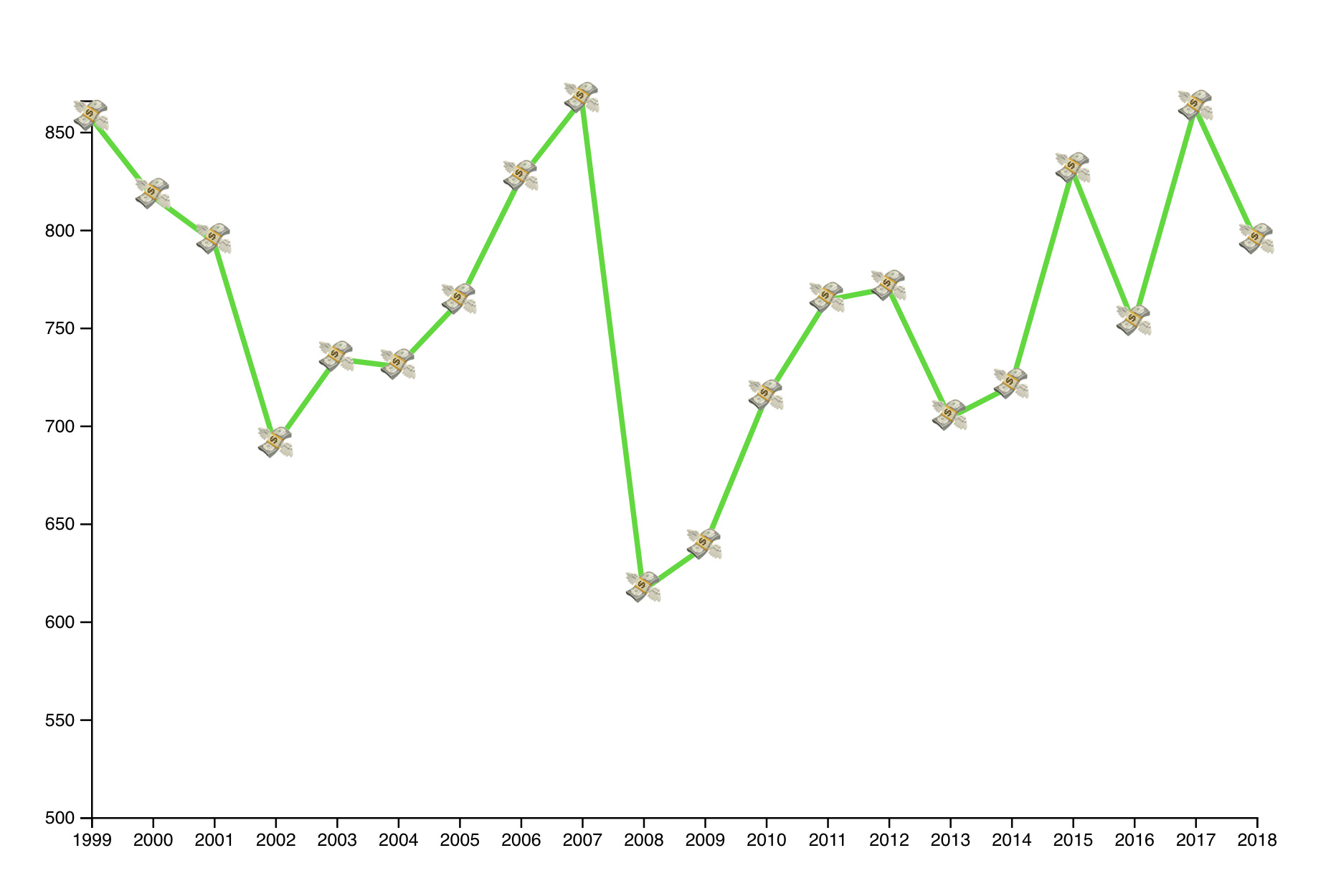
Line with emojis
Interactive points on each edge of a linechart are pretty common after all. Makes it easier to spot where the line breaks and shows actual data and where it’s just a line.
Adding emojis happens in a loop:
{
  data.map(d => (
    <Money x={this.x(d.year)} y={this.y(d.avg_spend)}>
      💸
      <title>${d.avg_spend}</title>
    </Money>
  ));
}
Iterate through our data and render a styled text component called Money for each datapoint. Using the same scales as we did for the linechart gives us correct positioning out of the box.
One of the many benefits of scales 
Styling deals with setting emoji font size and centering text on the (x, y) anchor point.
const Money = styled.text`
  font-size: 20px;
  cursor: pointer;
  text-anchor: middle;
  alignment-baseline: central;
`;
Oh and adding a <title> tag to our text creates a default browser tooltip. Hover over an emoji for a few seconds and it shows some extra info.
A highlight for easy reading
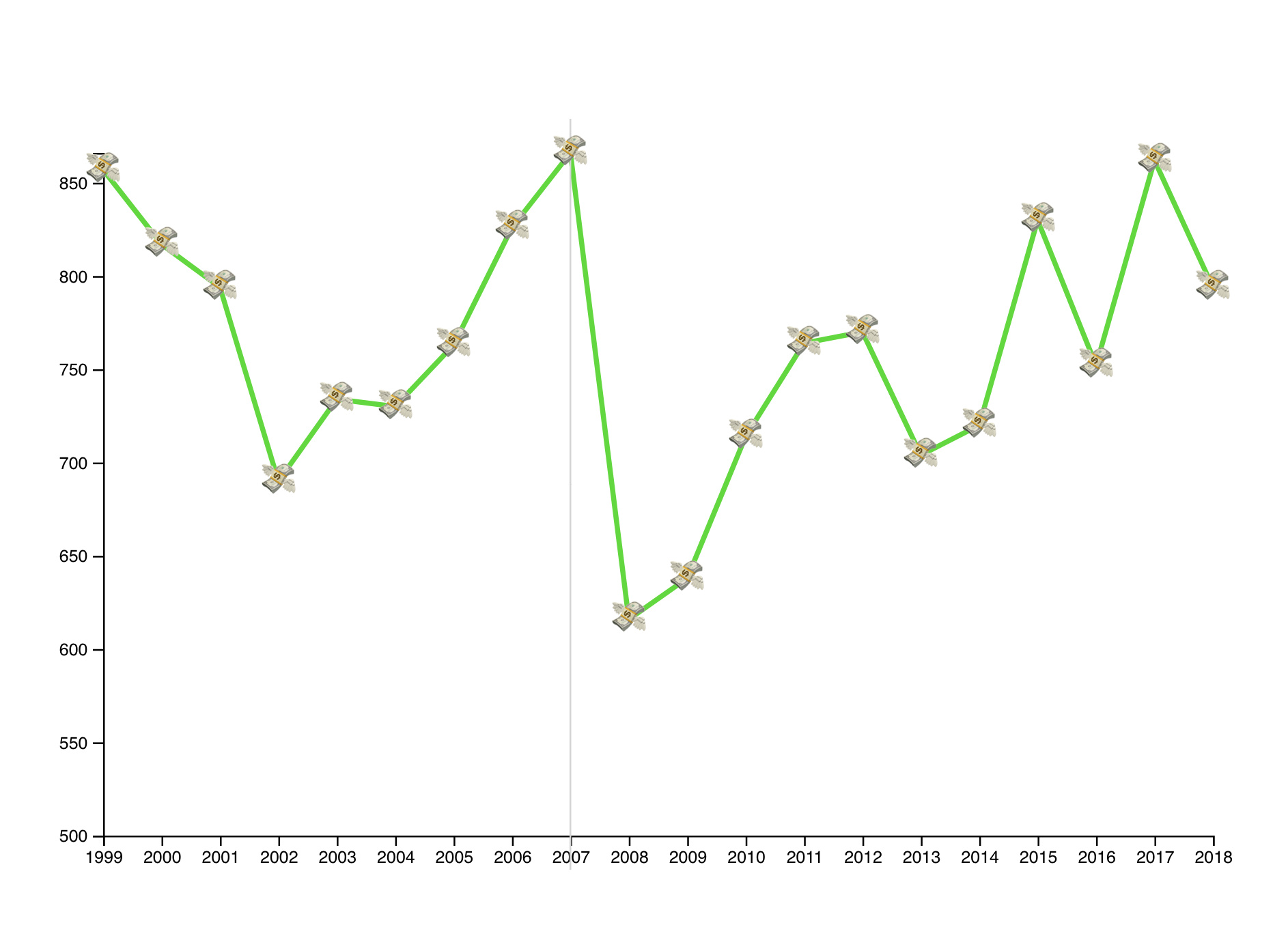
A highlight to make life easier
Linecharts can be hard to read. With datapoints so far from the axes it can be hard to see how everything lines up.
So we added a line to help our users out.
We keep track of what’s currently highlighted in component state. When a value exists, we use it to render a vertical line.
class Linechart extends React.Component {
  state = {
    highlightYear: null
  };

  // ...

  highlight = year => this.setState({ highlightYear: year });
  unhighlight = () => this.setState({ highlightYear: null });

  // ...

  {highlightYear ? (
    <Highlight
      x1={this.x(highlightYear)}
      y1={-20}
      x2={this.x(highlightYear)}
      y2={height + 20}
    />
  ) : null}

  // ...

  <Money
    x={this.x(d.year)}
    y={this.y(d.avg_spend)}
    onMouseOver={() => this.highlight(d.year)}
    onMouseOut={this.unhighlight}
  >
Nothing too crazy.
We have a highlightYear state. This gets set on onMouseOver in the <Money> emoji. On onMouseOut , we reset the highlight year back to null .
In the render method we then check whether highlightYear is set. If it is, we render a vertical line that’s styled to be thin and lightgrey. If it isn’t, we don’t.
There’s a lot we could do with that highlight to make it look smoother, but time was up and this is good enough.
What you learned
Today you learned:
- D3 point scales
- using class field values for D3 objects
- d3blackbox for simple D3 integrations
- the
<title>trick on text tags - using D3 axes
- adding a little interactivity
Enjoy