s30e146 - Christmas movies at the box office - horizontal bar chart
Challenge
Christmas movies are the best movies. How much do they make at the box office? Show the power distribution curve with a vertical barchart.
My Solution
We built this one with React hooks because we can. Not a class-based component in sight 
Styled components for styling, D3 for scales and data loading and parsing, hooks to hook it all together.
Loading data with React hooks
I looked around for a good data loading hook. None could be found. So we made our own 
Not that hard as it turns out. You need a dash of useState to save the data you load, a bit of useEffect to run data loading on component mount aaaand … that’s it. Goes in your App function.
function App() {
  const [data, setData] = useState(null);

  useEffect(
    () => {
      d3.tsv("/data.tsv", d => {
        const year = Number(d.movie.match(/\((\d+)\)/)[1]);
        return {
          movie: d.movie.replace(/\(\d+\)/, ""),
          year: year,
          per_year: Number(d.box_office) / (2018 - year),
          box_office: Number(d.box_office)
        };
      }).then(setData);
    },
    [!data]
  );
The useState hook takes a default value, and always returns current state - data - and a setter - setData .
useEffect runs our function on every component render. After committing to the DOM, I believe. We use d3.tsv to load and parse our christmas movie dataset, use a parsing function to transform each row into an object with all the info we need, then call setData when he have it.
Each datapoint holds
- a
moviename - the
yeara movie was produced parsed from the movie name with a regex - the
per_yearrevenue of the movie as a fraction - the total
box_officerevenue
Switch display modes with React hooks
Movie box office revenue follows a pretty clear power law distribution. The highest grossing movie or two make a lot more than the next best. Which makes way more than next one down the list, etc.
But how does age factor into this?
Home Alone has had 28 years to make its revenue. Daddy’s Home 2 is only a year old.
I decided to add a button to switch modes. From total box_office to per_year revenue. And boy does it change the story. Altho maybe I’m being unfair because how long are theater runs anyway? 
Driving that logic with React hooks looks like this 
const [perYear, setPerYear] = useState(false)
const valueFunction = perYear ? d => d.per_year : d => d.box_office

// ...

<Button onClick={() => setPerYear(!perYear)}>
  {perYear ? "Show Total Box Office" : "Show Box Office Per Year"}
</Button>
A useState hook gives us current state and a setter. We use the state, perYear , to define a value accessor function, and a butto’s onClick method to toggle the value.
We’re going to use that value accessor to render our graph. Makes the switch feel seamless.
Render
First you need this bit in your App function. It renders <VerticalBarchart> in an SVG, if data exists.
<Svg width="800" height="600" showKevin={perYear}>
  {data && (
    <VerticalBarchart
      data={data}
      width={600}
      height={600}
      value={valueFunction}
    />
  )}
</Svg>
That data && ... is a common trick. The return value of true && something is something, return value of false && something is nothing. Means when data is defined, we render, otherwise we don’t.
Oh and Svg is a styled SVG component. Gets a nice gif background when showKevin is set to true 
The VerticalBarchart itself is a functional component. We said no classes right?
const VerticalBarchart = ({ data, width, height, value }) => {
  const yScale = d3
    .scaleBand()
    .paddingInner(0.1)
    .domain(data.map(d => d.movie))
    .range([0, height]);
  const widthScale = d3
    .scaleLinear()
    .domain([0, d3.max(data, value)])
    .range([0, width]);

  return (
    <g>
      {data.map(d => (
        <React.Fragment key={d.movie}>
          <Bar
            x={0}
            y={yScale(d.movie)}
            height={yScale.bandwidth()}
            width={widthScale(value(d))}
          />
          <Label x={10} y={yScale(d.movie) + yScale.bandwidth() / 2}>
            {d.movie}
          </Label>
        </React.Fragment>
      ))}
    </g>
  );
};
We can define our D3 scales right in the render function. Means we re-define them from scratch on every render and sometimes that’s okay. Particularly when data is small and calculating domains and ranges is easy.
Once we have a scaleBand for the vertical axis and a scaleLinear for widths, it’s a matter of iterating over our data and rendering styled <Bar> and <Label> components.
Notice that we use the value accessor function every time we need the value of a datapoint. To find the max value for our domain and to grab each individual width.
Makes our chart automatically adapt to flicking that perYear toggle 
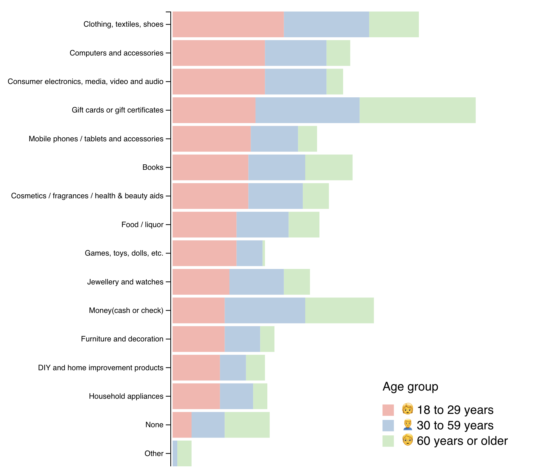
s30e147 - What Americans want for Christmas - horizontal stack chart
Challenge
Different ages want different things. Create a horizontal stack chart showing what everyone wants for Christmas.
My Solution
Today’s challenge is a perfect example of how chroma-js automatically makes your dataviz beautiful. Best magic trick I ever learned from Shirley Wu.
We used Susie Lu’s d3-legend for the color legend, D3’s stack layout to calculate coordinates for stacking those bar charts, D3 axis for the axis, and the rest was React. Similar code to the bar chart in Christmas movies at the box office.
Load the data
We begin once more by loading the data. If you’ve been following along so far, this code will look familiar.
  componentDidMount() {
    d3.tsv("/data.tsv", d => ({
      category: d.category,
      young: Number(d.young),
      mid: Number(d.mid),
      old: Number(d.old)
    })).then(data => this.setState({ data }));
  }
d3.tsv loads our tab separated values file with data, a parsing function turns each line into nice objects we can use, and then we save it into component local state.
An axis and a legend
Building axes and legends from scratch is not hard, but it is fiddly and time consuming and fraught with tiny little traps for you to fall into. No time for that on a daily challenge!
d3blackbox to the rescue!
const VerticalAxis = d3blackbox((anchor, props) => {
  const axis = d3.axisLeft().scale(props.scale);
  d3.select(anchor.current).call(axis);
});

const Legend = d3blackbox((anchor, props) => {
  d3.select(anchor.current).call(
    legend
      .legendColor()
      .scale(props.scale)
      .title('Age group')
  );
});
Here you can see just how flexible the blackbox rendering approach I teach in React for Data Visualization can be. You can take just about any D3 code and turn it into a React component.
Means you don’t have to write your own fiddly stuff
d3blackbox ensures our render functions are called on every component render and creates a positionable grouping, <g> , SVG element for us to move around.
Each category’s barchart
You can think a stacked bar chart as a series of barcharts. Each category gets its own.
const BarChart = ({ entries, y, width, marginLeft, color }) => (
  <React.Fragment>
    {entries.map(([min, max], i) => (
      <rect
        x={marginLeft + width(min)}
        width={width(max) - width(min)}
        y={y(y.domain()[i])}
        height={y.bandwidth()}
        key={y.domain()[i]}
        fill={color}
      >
        <title>
          {min}, {max}
        </title>
      </rect>
    ))}
  </React.Fragment>
);
These barchart subcomponents are fully controled components. They help us clean up the rendering and don’t need any logic of their own.
Takes a list of entries to render, a y scale for vertical positioning, a width scale to calculate widths, some margin on the left for the big axis, and a color to use.
Renders a React Fragment with a bunch of rectangles. Loop over the entries, return a positioned rectangle for each.
Our entries are pairs of min and max values as calculated by the stack layout. We use them to decide the horizontal, x position of our rectangle, and its width. Using the width scale both times. That takes care of proper sizing for us.
That key prop is a little funny though.
The y scale is an ordinal scale. Its domain is a list of categories, which means we can get the name of each bar’s category by picking the right index out of that array. Perfect for identifying our elements 
A stack chart built with React and D3
Here’s how all of that ties together
class StackChart extends React.Component {
y = d3
.scaleBand()
.domain(this.props.data.map(d => d.category))
.range([0, this.props.height])
.paddingInner(0.1);
stack = d3.stack().keys(['young', 'mid', 'old']);
color = chroma.brewer.pastel1;
colorScale = d3
.scaleOrdinal()
.domain(['🧒 18 to 29 years', '🙍♂️ 30 to 59 years', '🧓 60 years or older'])
.range(this.color);
render() {
const { data } = this.props;
const stack = this.stack(data);
const width = d3
.scaleLinear()
.domain([0, d3.max(stack[2], d => d[1])])
.range([0, 400]);
return (
<g>
<VerticalAxis scale={this.y} x={220} y={0} />
{this.stack(data).map((entries, i) => (
<BarChart
entries={entries}
y={this.y}
key={i}
marginLeft={223}
color={this.color[i]}
width={width}
/>
))}
<Legend scale={this.colorScale} x={500} y={this.props.height - 100} />
</g>
);
}
}
Okay that’s a longer code snippet 
D3 setup
In the beginning, we have some D3 objects.
- A
yband scale. Handles vertical positioning, sizing, spacing, and all - A
stackgenerator with hardcoded keys. We know what we want and there’s no need to be fancy - A
colorlist. Chroma’sbrewer.pastel1looked Best - A
colorScalewith a more verbose domain and our list of colors as the range
Having a separate list of colors and color scale is important. Our individual bars want a specific color, our legend wants a color scale. They use different domains and unifying them would be fiddly. Easier to keep apart.
render
We do a little cheating in our render method. That stack should be generated in a componentDidUpdate of some sort and so should the width linear scale.
But our data is small so it’s okay to recalculate all this every time.
The stack generator creates a list of lists of entries. 3 lists, one for each category (age group). Each list contains pairs of numbers representing how they should stack.
Like this
[
  [[0, 5], [0, 10]],
  [[5, 7], [10, 16]],
  [[13, 20], [26, 31]]
]
Entries in the first list all begin at 0 . Second list begins where the previous list ends. Third list begins where the second list ended. Stacking up as far as you need.
Your job is then to take these numbers, feed them into some sort of scale to help with sizing, and render.
That was our <BarChart> sub component up above. It takes each list, feeds its values into a width scale, and renders.
Making sure we render 3 of them, one for each age group, is this part:
return (
  <g>
    <VerticalAxis scale={this.y} x={220} y={0} />
    {stack.map((entries, i) => (
      <BarChart
        entries={entries}
        y={this.y}
        key={i}
        marginLeft={223}
        color={this.color[i]}
        width={width}
      />
    ))}
    <Legend scale={this.colorScale} x={500} y={this.props.height - 100} />
  </g>
);
Starts by rendering an axis, followed by a loop through our stack, rendering a <BarChart> for each, and then the <Legend> component neatly positioned to look good.
A beautiful chart pops out.
Beautiful chart
Today you learned 
- chroma-js exist and is amazing
- d3-legend for easy legends
- d3blackbox still saving the day
- D3 stack generator

s30e148 - Christmas carols and their words - a word cloud
Challenge
Christmas carols are a time honored tradition. Draw a heatmap of their most popular words.
My Solution
Building these word clouds kicked my ass. Even had to ask the three wise men for help.
So apparently combining useState and useMemo and promises makes your JavaScript crash hard.
What am I doing wrong? @ryanflorence @kentcdodds @dan_abramov ? I thought useMemo was supposed to only run once and not infinite loop on me pic.twitter.com/29OVRXxhuz
— Swizec Teller (@Swizec) December 8, 2018
Turns out that even though useMemo is for memoizing heavy computation, this does not apply when said computation is asynchronous. You have to use useEffect .
At least until suspense and async comes in early 2019.
Something about always returning the same Promise, which confuses useMemo and causes an infinite loop when it calls setState on every render. That was fun.
There’s some computation that goes into this one to prepare the dataset. Let’s start with that.
Preparing word cloud data
Our data begins life as a flat text file.
Angels From The Realm Of Glory

Angels from the realms of glory
Wing your flight over all the earth
Ye, who sang creations story
Now proclaim Messiah's birth
Come and worship, come and worship
Worship Christ the newborn King
Shepherds in the fields abiding
Watching over your flocks by night
God with man is now residing
And so on. Each carol begins with a title and an empty line. Then there’s a bunch of lines followed by an empty line.
We load this file with d3.text , pass it into parseText , and save it to a carols variable.
const [carols, setCarols] = useState(null);

useEffect(() => {
  d3.text('/carols.txt')
    .then(parseText)
    .then(setCarols);
}, [!carols]);
Typical useEffect / useState dance. We run the effect if state isn’t set, the effect fetches some data, sets the state.
Parsing that text into individual carols looks like this
function takeUntilEmptyLine(text) {
  let result = [];

  for (
    let row = text.shift();
    row && row.trim().length > 0;
    row = text.shift()
  ) {
    result.push(row.trim());
  }

  return result;
}

export default function parseText(text) {
  text = text.split('\n');

  let carols = { 'All carols': [] };

  while (text.length > 0) {
    const title = takeUntilEmptyLine(text)[0];
    const carol = takeUntilEmptyLine(text);

    carols[title] = carol;
    carols['All carols'] = [...carols['All carols'], ...carol];
  }

  return carols;
}
Our algorithm is based on a takeUntil function. It takes lines from our text until some condition is met.
Basically:
- Split text into lines
- Run algorithm until you run out of lines
- Take lines until you encounter an empty line
- Assume the first line is a title
- Take lines until you encounter an empty line
- This is your carol
- Save title and carol in a dictionary
- Splat carrol into the
All carolsblob as well
We’ll use that last one for a joint word cloud of all Christmas carols.
Calculating word clouds with d3-cloud
With our carols in hand, we can build a word cloud. We’ll use the wonderful d3-cloud library to handle layouting for us. Our job is to feed it data with counted word frequencies.
Easiest way to count words is with a loop
function count(words) {
  let counts = {};

  for (let w in words) {
    counts[words[w]] = (counts[words[w]] || 0) + 1;
  }

  return counts;
}
Goes over a list of words, collects them in a dictionary, and does +1 every time.
We use that to feed data into d3-cloud .
function createCloud({ words, width, height }) {
  return new Promise(resolve => {
    const counts = count(words);

    const fontSize = d3
      .scaleLog()
      .domain(d3.extent(Object.values(counts)))
      .range([5, 75]);

    const layout = d3Cloud()
      .size([width, height])
      .words(
        Object.keys(counts)
          .filter(w => counts[w] > 1)
          .map(word => ({ word }))
      )
      .padding(5)
      .font('Impact')
      .fontSize(d => fontSize(counts[d.word]))
      .text(d => d.word)
      .on('end', resolve);

    layout.start();
  });
}
Our createCloud function gets a list of words, a width, and a height. Returns a promise because d3-cloud is asynchronous. Something about how long it might take to iteratively come up with a good layout for all those words. It’s a hard problem. 
(that’s why we’re not solving it ourselves)
We get the counts, create a fontSize logarithmic scale for sicing, and invoke the D3 cloud.
That takes a size , a list of words without single occurrences turned into { word: 'bla' } objects, some padding, a font size method using our fontSize scale, a helper to get the word and when it’s all done the end event resolves our promise.
When that’s set up we start the layouting process with layout.start()
Animating words
Great. We’ve done the hard computation, time to start rendering.
We’ll need a self-animating <Word> componenent that transitions itself into a new position and angle. CSS transitions can’t do that for us, so we’ll have to use D3 transitions.
class Word extends React.Component {
  ref = React.createRef();
  state = { transform: this.props.transform };

  componentDidUpdate() {
    const { transform } = this.props;
    d3.select(this.ref.current)
      .transition()
      .duration(500)
      .attr('transform', this.props.transform)
      .on('end', () => this.setState({ transform }));
  }

  render() {
    const { style, children } = this.props,
      { transform } = this.state;

    return (
      <text
        transform={transform}
        textAnchor="middle"
        style={style}
        ref={this.ref}
      >
        {children}
      </text>
    );
  }
}
We’re using my Declarative D3 transitions with React approach to make it work. You can read about it in detail on my main blog.
In a nutshell:
- Store the transitioning property in state
- State becomes a sort of staging area
- Take control of rendering in
componentDidUpdateand run a transition - Update state after transition extends
- Render
textfrom state
The result are words that declaratively transition into their new positions. Try it out.
Putting it all together
Last step in the puzzle is that <WordCloud> component that was giving me so much trouble and kept hanging my browser. It looks like this
export default function WordCloud({ words, forCarol, width, height }) {
  const [cloud, setCloud] = useState(null);
  useEffect(() => {
    createCloud({ words, width, height }).then(setCloud);
  }, [forCarol, width, height]);

  const colors = chroma.brewer.dark2;

  return (
    cloud && (
      <g transform={`translate(${width / 2}, ${height / 2})`}>
        {cloud.map((w, i) => (
          <Word
            transform={`translate(${w.x}, ${w.y}) rotate(${w.rotate})`}
            style={{
              fontSize: w.size,
              fontFamily: 'impact',
              fill: colors[i % colors.length],
            }}
            key={w.word}
          >
            {w.word}
          </Word>
        ))}
      </g>
    )
  );
}
A combination of useState and useEffect makes sure we run the cloud generating algorithm every time we pick a different carol to show, or change the size of our word cloud. When the effect runs, it sets state in the cloud constant.
This triggers a render and returns a grouping element with its center in the center of the page. d3-cloud creates coordinates spiraling around a center.
Loop through the cloud data, render a <Word> component for each word. Set a transform, a bit of style, the word itself.
And voila, a declaratively animated word cloud with React and D3
With your powers combined I got it working! Thanks guys
— Swizec Teller (@Swizec) December 8, 2018
Original data from Drew Conway
s30e149 - Will you buy a christmas tree? - a pie chart
Challenge
Not everyone buys a Christmas tree.  Draw a donut chart of people’s thoughts.
My Solution
This donut chart build was short and sweet. D3 has all the ingredients we need, Chroma’s got the colors, d3-svg-legend has nice legend stuff. Oh and we used it as an excuse to update my d3blackbox library so it actually exports the hooks version.
Thought it did, had it in the docs, published version didn’t have it. 20 day old issue report on GitHub. Oops
You can see data loading in the Codesandbox above. Here’s the fun stuff
React and D3 pie chart tutorial with React hooks
Pie charts and donut charts are the same. If there’s a hole in the middle it’s a donut, otherwise it’s a pie. You should always make donuts because donuts are delicious and easier to read due to intricacies around area size perception.
Our code fits in a functional React component
const TreeDonut = ({ data, x, y, r }) => {};
Takes data , x,y coordinates for positioning, and r for the total radius.
We begin with a bunch of D3 objects. Scales, pie generators, things like that.
const pie = d3.pie().value(d => d.percentage);
const arc = d3
  .arc()
  .innerRadius(90)
  .outerRadius(r)
  .padAngle(0.01);
const color = chroma.brewer.set1;
const colorScale = d3
  .scaleOrdinal()
  .domain(data.map(d => d.answer))
  .range(color);
Here’s what they do:
- The
d3.pie()generator takes data and returns everything you need to create a pie chart. Start and end angles of each slice and a few extras. - The
d3.arc()generator creates path definitions for pie slices. We define inner and outer radiuses and add some padding. - We take the
colorlist from one of Chroma’s pre-defined colors. - We’ll use
colorScalefor the legend. Maps answers from our dataset to their colors
Next thing we need is some state for the overlay effect. It says which slice is currently selected.
const [selected, setSelected] = useState(null);
Hooks make this way too easy. We’ll use setSelected to set the value and store it in selected .
Then we render it all with a loop.
return (
  <g transform={`translate(${x}, ${y})`}>
    {pie(data).map(d => (
      <path
        d={arc
          .outerRadius(selected === d.index ? r + 10 : r)
          .innerRadius(selected === d.index ? 85 : 90)(d)}
        fill={color[d.index]}
        onMouseOver={() => setSelected(d.index)}
        onMouseOut={() => setSelected(null)}
      />
    ))}
    <Legend x={r} y={r} colorScale={colorScale} />
  </g>
);
A grouping element positions our piechart from the center out.
Inside that group, we iterate over the output of our pie() generator and render a <path> for each entry. Its shape comes from the arc generator.
We update inner and outer radius on the fly depending on whether the current slice is highlighted. This creates the become-bigger-on-mouse-over effect. We drive it with mouse event callbacks and the setSelected method.
setSelected stores the current selected index in selected . This triggers a re-render. The selected slice shows as bigger.
Perfect
PS: The legend component with hooks is a piece of cake
d3-svg-legend does it all for us. We use useD3 from my d3blackbox to make it work.
const Legend = function({ x, y, colorScale }) {
  const ref = useD3(anchor => {
    d3.select(anchor).call(d3legend.legendColor().scale(colorScale));
  });

  return <g transform={`translate(${x}, ${y})`} ref={ref} />;
};
Lets us render any D3 code into an anchor element and wrap it in a React component. Behind the scenes useD3 is a combination of useRef and useEffect .
Enjoy
s30e150 - What goes in Chrstmas stockings - a piechart with tooltips
Challenge
Ever seen Christmas stockings? They get stuffed with all sorts of stuff. Build a donut chart of what’s what and add a mouse hover effect that shows what a slice represents.
My Solution
Tooltips … tooltips are hard. So simple in theory yet organizing it into sensible code will wreck your mind.
Your goal is to build this:
- A tooltip component
- Some way to store tooltip position and content
- Ability to change that on mouse over
Mousing over a thing - slice of the donut chart in this case - updates positioning and content. This triggers a tooltip re-render. Tooltip shows up where you need saying what you want.
So how do you organize that in a way that makes sense?
You can watch me flounder around trying different solutions in the stream above. In the end we went with a combination of state in the App component and React Context shared between everyone else.
We’re using React hooks because hooks are the hot new kid on the block and learning new coding paradigms is fun.
Managing and sharing tooltip state
const [tooltip, setTooltip] = useState({
  show: false,
  x: 0,
  y: 0,
  content: '',
  orientLeft: false,
});
Our tooltip state holds a show flag, tooltip coordinates, and content . orientLeft is the nascent beginnings of a fuller tooltip API. The tooltip component is going to consume this context and use it to render itself.
To make changing this state easier, we sneakily include setTooltip in the object passed into React Context itself.
<TooltipContext.Provider value={{ ...tooltip, setTooltip }}>
Now any consumer can change values in context. Whoa

The component
Our <Tooltip> component doesn’t do much on its own. It’s a wrapper that handles positioning, visibility, and supports a nascent orientation API. We can use orientLeft to align our tooltip left or right. A fuller API would also have top/bottom and a bunch of similar features.
const Tooltip = ({ width, height, children }) => {
  const { x, y, show, orientLeft } = useContext(TooltipContext);

  return (
    <g
      transform={`translate(${orientLeft ? x - width : x}, ${y})`}
      style={{ visibility: show ? 'visible' : 'hidden' }}
    >
      <foreignObject width={width} height={height}>
        {children}
      </foreignObject>
    </g>
  );
};
useContext takes the TooltipContext object and returns its current value on every render. We use destructuring to get at the parts we need: coordinates, show flag, orientation.
Tooltip then renders a <g> grouping element with positioning based on the orientation, and visibility based on the flag. Inside it wraps children in a sized foreignObject element. This allows us to embed HTML inside SVG.
HTML is better for tooltip content than SVG because HTML supports text automatic layouting. Set a width and the browser will figure out what to do with long strings. Don’t get that with SVG.
The Tooltip.js file also exports a React Context.
const TooltipContext = React.createContext({
  show: false,
  x: 0,
  y: 0,
  orientLeft: false,
  content: '',
});

// ...
export default Tooltip;
export { TooltipContext };
Makes it easier to share the same context between different consumers.
Render Tooltip in App
Rendering our tooltip happens in the main App component. It also holds tooltip state that gets passed into React Context.
import Tooltip, { TooltipContext } from "./Tooltip";

// ...

function App() {
  const [tooltip, setTooltip] = useState({
    show: false,
    x: 0,
    y: 0,
    content: "",
    orientLeft: false
  });

  return (
      <TooltipContext.Provider value={{ ...tooltip, setTooltip }}>
        <svg width="800" height="600">
          {* // where you put tooltip triggerers *}

          <Tooltip width={150} height={60}>
            <TooltipP>{tooltip.content}</TooltipP>
          </Tooltip>
        </svg>
      </TooltipContext.Provider>
  );
}
We import tooltip and its context, then useState to create a local tooltip state and its setter. Pass both of those in a common object into a <TooltipContext.Provider .
That part took me a while to figure out. Yes with React hooks you still need to render Providers. Hooks are consumer side.
Render our Tooltip as a sibling to all the other SVG stuff. Any components that want to render a tooltip will share the same one. That’s how it usually works.
<TooltipP> is a styled component by the way.
const TooltipP = styled.p`
  background: ${chroma('green')
    .brighten()
    .hex()};
  border-radius: 3px;
  padding: 1em;
`;
Nice green background, rounded corners, and a bit of padding.
I am no designer
I am no designer
Trigger tooltips from donuts
Donut code itself is based on code we built for the Will you buy a Christmas tree? donut chart.
We split it into the main donut component and a component for each slice, or <Arc> . Makes it easier to calculate coordinates for tooltips. Means we ca handle slice highlighted state locally in its own component.
const Arc = ({ d, r, color, offsetX, offsetY }) => {
  const [selected, setSelected] = useState(false);
  const tooltipContext = useContext(TooltipContext);

  const arc = d3
    .arc()
    .outerRadius(selected ? r + 10 : r)
    .innerRadius(selected ? r - 80 : r - 75)
    .padAngle(0.01);

  const mouseOver = () => {
    const [x, y] = arc.centroid(d);

    setSelected(true);
    tooltipContext.setTooltip({
      show: d.index !== null,
      x: x + offsetX + 30,
      y: y + offsetY + 30,
      content: d.data.stuffer,
      orientLeft: offsetX < 0,
    });
  };

  const mouseOut = () => {
    setSelected(null);
    tooltipContext.setTooltip({ show: false });
  };

  return (
    <path
      d={arc(d)}
      fill={color}
      onMouseOver={mouseOver}
      onMouseOut={mouseOut}
      style={{ cursor: 'pointer' }}
    />
  );
};
Here you can see a downside of hooks: They can lead to pretty sizeable functions if you aren’t careful.
We create a selected flag and its setter with a useState hook and we hook into our tooltip context with useContext . We’ll be able to use that setTooltip method we added to show a tooltip.
Then we’ve got that const arc stuff. It creates an arc path shape generator. Radius depends on selected status.
All that is followed by our mouse eve handling fucntions.
const mouseOver = () => {
  const [x, y] = arc.centroid(d);

  setSelected(true);
  tooltipContext.setTooltip({
    show: d.index !== null,
    x: x + offsetX + 30,
    y: y + offsetY + 30,
    content: d.data.stuffer,
    orientLeft: offsetX < 0,
  });
};
mouseOver is the active function. Mouse over an arc and it calculates its center, sets the arc to selected , and pushes necessary info into tooltip state. This triggers a re-render of the tooltip component and makes it show up.
Technically it triggers a re-render of our whole app because it’s tied to App state. You could split that out in a bigger app. Or rely on React being smart enough to figure out the smallest possible re-render.
Deselecting the arc happens in a mouseOut function
const mouseOut = () => {
  setSelected(false);
  tooltipContext.setTooltip({ show: false });
};
Set selected to falls and hide the tooltip.
With all that defined, rendering our arc is a matter of returning a path with some attributes.
return (
  <path
    d={arc(d)}
    fill={color}
    onMouseOver={mouseOver}
    onMouseOut={mouseOut}
    style={{ cursor: 'pointer' }}
  />
);
Use the arc generator to create the shape, fill it with color, set up mouse events, add a dash of styling.
Render a donut 
We did all the complicated state and tooltip stuff in individual arcs. The donut component uses a pie generator and renders them in a loop.
const StockingDonut = ({ data, x, y, r }) => {
  const pie = d3.pie().value(d => d.percentage);

  const color = chroma.brewer.set3;
  return (
    <g transform={`translate(${x}, ${y})`}>
      {pie(data).map(d => (
        <Arc
          d={d}
          color={color[d.index]}
          r={r}
          key={d.index}
          offsetX={x}
          offsetY={y}
        />
      ))}
    </g>
  );
};
d3.pie takes our data and returns all the info you need to build a donut. Start angles, end angles, stuff like that.
Render a grouping element that centers our donut on (x, y) coordiantes, render <Arc> s in a loop.
Make sure to pass offsetX and offsetY into each arc. Arcs are positioned relatively to our donut center, which means they don’t know their absolute position to pass into the tooltip context. Offsets help with that.
And that’s how you make tooltips in SVG with React hooks. Same concepts and complications apply if you’re using normal React state or even Redux or something.
You need a global way to store info about the tooltip and some way to trigger it from sibling components.

PS: A neat way to useData
Yeah I’ve been doing that pattern a lot.
const [state, setState] = useState(null)
useEffect(() => doStuff().then(setState), [!state])— Swizec Teller (@Swizec) December 8, 2018
Got tired of the useState / useEffect dance when loading data with hooks. Built a new hook called useData . That’s a neat feature of hooks; you can make new ones.
function useData(loadData) {
  const [data, setData] = useState(null);

  useEffect(() => {
    loadData(setData);
  }, [!data]);

  return data;
}
Takes a loadData function, sets up useState for the data, uses an effect to load it, gives you setData so you can return the value, and returns the final value to your component.
You use it like this
function App() {
  const data = useData(setData =>
    d3
      .tsv("/data.tsv", d => ({
        stuffer: d.stuffer,
        percentage: Number(d.percentage)
      }))
      .then(setData)
  );
Much cleaner I think
Might be cleaner to take a promise and handle setData internally. Hmm …
Thinking I might open source this, but it needs a few more iterations.
s30e151 - When Americans buy Christmas presents - a curved line chart
Challenge
My girlfriend likes to buy her presents early, I wait until the last minute. What do other people do? Create a way to visualize the last few weeks of the year and rank them by popularity.
My Solution
Well that was fun. What do you when you have a sparse dataset? A dataset with so few data points positioned so weirdly that it’s almost certain to hide important trends?
You try to fix it.
With science! Math! Code!
Or … well … you can try. We tried a few things until we were forced to admit defeat in the face of mathematics beyond our station. Or at least beyond mine.
Our dataset and what’s wrong with it
We’re visualizing results of a poll asking people When do you start christmas shopping? . The poll had over 4000 responses. We get just the result.
Before October end  39
November before Thanksgiving    21
November after Thanksgiving 27
December    11
Janaury 2
February    0
39% start shopping before October ends, 21% in November before thanksgiving, 27% right after thanksgiving, and so on.
You can imagine these are long timespans. Ranging from basically a whole year to just a week in length. That’s a problem for us because it makes the datapoints hard to compare.
Of course Before October end is overrepresented: It’s got almost four times as long to accumulate its result as the rest of the time periods combined.
A simple presentation
We start exploring with a line chart. Borrowing a lot of code from the Money spent on Christmas challenge.
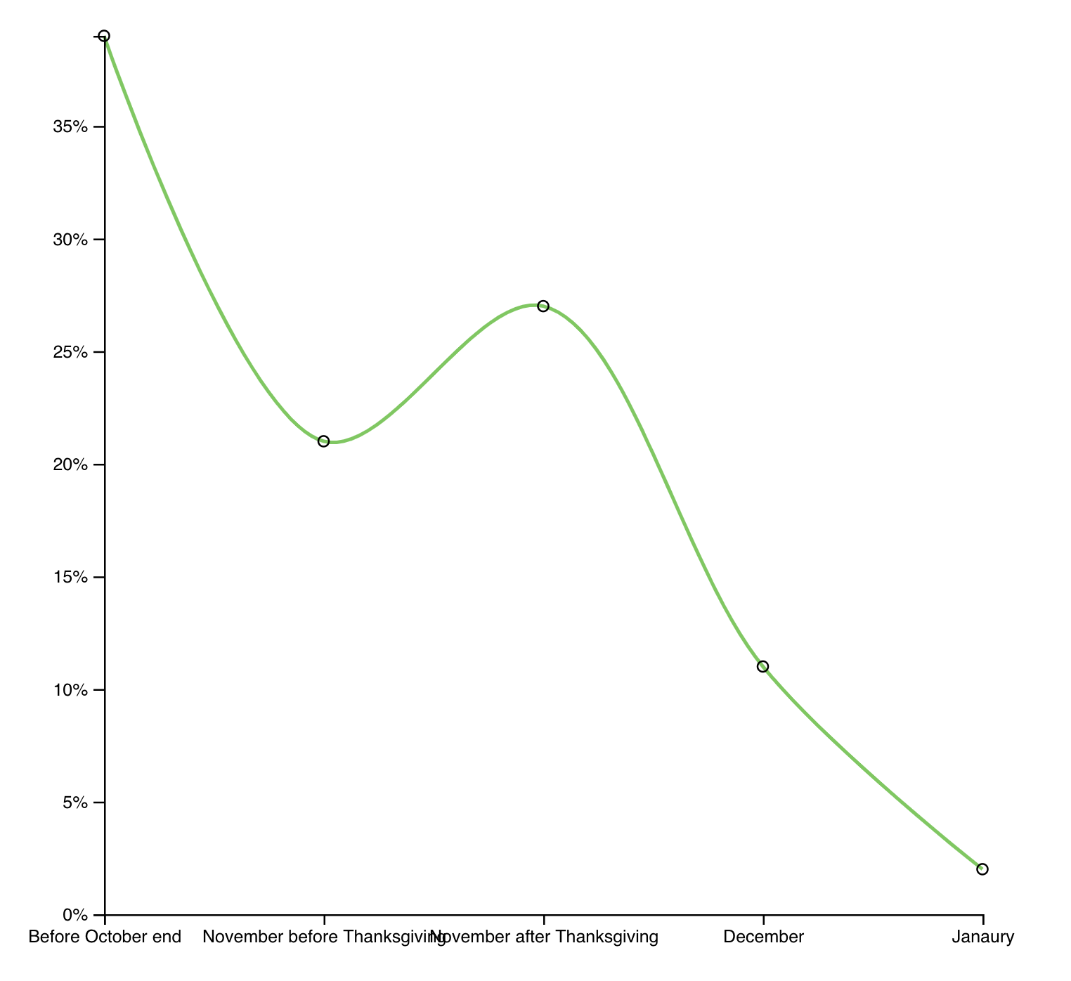
That’s our data plotted as a curved line. Circles represent the actual datapoints we’ve got. Curves are a a good first approach to show that our data might not be all that exact.
We borrow axis implementation from Money spent on Christmas using my d3blackbox library.
const BottomAxis = d3blackbox((anchor, props) => {
  const axis = d3.axisBottom().scale(props.scale);
  d3.select(anchor.current).call(axis);
});

const LeftAxis = d3blackbox((anchor, props) => {
  const axis = d3
    .axisLeft()
    .scale(props.scale)
    .tickFormat(d => `${d}%`);
  d3.select(anchor.current).call(axis);
});
Each axis implementation renders an anchor element and injects a pure D3 rendered axis on every update. No need to fiddle with building our own.
A <Datapoints> component keeps our main code cleaner. Renders those tiny little circles.
const Circle = styled.circle`
  fill: none;
  stroke: black;
  r: 3px;
`;

const Datapoints = ({ data, x, y }) => (
  <g>
    {data.map(d => (
      <Circle cx={x(d.descriptor)} cy={y(d.percentage)}>
        <title>{d.descriptor}</title>
      </Circle>
    ))}
  </g>
);
Takes data, an x scale and a y scale. Walks through data in a loop, renders circles with a title. Makes it so you can mouse over a circle and if you do it just right a browser native tooltip appears.
The LineChart component brings all of this together and uses a D3 line generator for a single path definition.
const Line = styled.path`
  fill: none;
  stroke: ${chroma("green").brighten(1.5)};
  stroke-width: 2px;
`;

class LineChart extends React.Component {
  height = 500

  x = d3.scalePoint()
    .domain(this.props.data.map(d => d.descriptor)
    .range([0, 600]),
  y = d3
    .scaleLinear()
    .domain([0, d3.max(this.props.data, d => d.percentage)])
    .range([this.height, 0])

  line = d3
    .line()
    .x(d => this.x(d.percentage))
    .y(d => this.y(d.descriptor))
    .curve(d3.curveCatmullRom.alpha(0.5))

  render() {
    const { data, x, y } = this.props;

    return (
      <g transform={`translate(${x}, ${y})`}>
        <Line d={this.line(data)} />
        <Datapoints data={data} x={this.x} y={this.y} />
        <BottomAxis scale={this.x} x={0} y={this.height} />
        <LeftAxis scale={this.y} x={0} y={0} />
      </g>
    )
  }
}
Sets up a horizontal x point scale, a vertical y scale with an inverted range, a line generator with a curve, then renders it all.
Nothing too crazy going on here. You’ve seen it all before. If not, the Money spent on Christmas article focuses more on the line chart part.
Is it realistic?
So how realistic does this chart look to you? Does it represent the true experience?
Yes according to the data most people start shopping before the end of October. And it’s true, very many start some time in November, with a moderate spike around Black Friday and Cyber Monday.
Does the variation in time period hide important truths?
Making an approximation
All of the above is true. And yet it hides an important fact.
39% before October end is a huge percentage. But it might mean August, last day of October, or even March. Who knows? The data sure don’t tell us.
And that week after thanksgiving? It’s got more starting shoppers than all of the rest of November combined. Even though it’s just 1 week versus 3 weeks.
We can tease out these truths  normalize our data by week.

Assume each datapoint spreads uniformly over its entire period, and a different picture comes out.
October doesn’t look so hot anymore, November looks better, January is chilly, but then that Black Friday and Cyber Monday. Hot damn. Now that is a spike in shopping activity!
See how much stronger that spike looks when you normalize data by time period? Wow.
You can do it with a little elbow grease
We have to construct a fake dataset with extra points in between the original data. Because our dataset is small, we could do this manually with just a bit of maths.
Goes in getDerivedStateFromProps
static getDerivedStateFromProps(props, state) {
    // Basic goal:
    // Split "Before October end" into 4 weekly datapoints
    // split "November before Thanksgiving" into 3 weekly datapoints
    // split "November after Thanksgiving" into 1 weekly datapoint
    // split "December" into 4 weekly datapoints
    // split "January" into 4 weekly datapoints
    const { data } = props,
      { x, xDescriptive } = state;

    const approximateData = [
      ...d3.range(4).map(_ => data[1].percentage / 4),
      ...d3.range(3).map(_ => data[1].percentage / 3),
      ...d3.range(1).map(_ => data[2].percentage / 1),
      ...d3.range(4).map(_ => data[3].percentage / 4),
      ...d3.range(4).map(_ => data[4].percentage / 4)
    ];

    x.domain(d3.range(approximateData.length));
    // Manually define range to match number of fake datapoints in approximateData
    xDescriptive.range([
      x(0),
      x(4),
      x(4 + 3),
      x(4 + 3 + 1),
      x(4 + 3 + 1 + 4),
      x(4 + 3 + 1 + 4 + 4 - 1)
    ]);

    return {
      approximateData,
      x,
      xDescriptive
    };
  }
We take props and state , then split every datapoint into its appropriate number of weeks. Our approach is roughly based on the idea of a running average. You could make a more generalized algorithm for this, but for a small dataset it’s easier to just do it like this.
So the whole of October, that first datapoint, becomes 4 entries with a fourth of the value each. November turns into 3 with thirds. And so on.
Since we want to keep the original labeled axis and datapoints, we have to use two different horizontal scales. One for the approximate dataset, one for the original.
We put them in state so we can set them up in getDerivedStateFromProps .
state = {
  x: d3.scalePoint().range([0, 600]),
  xDescriptive: d3
    .scaleOrdinal()
    .domain(this.props.data.map(d => d.descriptor)),
};
x is a point scale with a range. Its domain comes from our approximate dataset. One for each entry based on the index.
xDescriptive works much like our old horizontal point scale. But because we have to spread it over more datapoints that it never receives, it needs to be an ordinal scale.
Ordinal scales map inputs directly into outputs. Like a dictionary. Our domain becomes every descriptor from the dataset, the range we define manually to line up with output from the x scale.
Rendering is still the same, we just gotta be careful which scale we pass into which element.
render() {
    const { data, x, y } = this.props,
      { approximateData } = this.state;

    return (
      <g transform={`translate(${x}, ${y})`}>
        <Line d={this.line(approximateData)} />
        <Datapoints data={data} x={this.state.xDescriptive} y={this.y} />
        <BottomAxis scale={this.state.xDescriptive} x={0} y={this.height} />
        <LeftAxis scale={this.y} x={0} y={0} />
      </g>
    );
  }
<Line> gets the approximate data set, <Datapoints> gets the original dataset with the descriptive horizontal scale. The <BottomAxis> gets the descriptive scale, and the <LeftAxis> stays the same.
End result is a chart that tells a more accurate story overlayed with the original data.
Attempting a more sophisticated solution
One thing still bothers me though. I bet you those weekly distributions aren’t uniform.
You’re less likely to start Christmas shopping in the first week of October than you are in the last week of October. Just like you’re less likely to start at the beginning of November than towards the end.
December should be the inverse. You’re more likely to start in the first week than you are the day before Christmas.
Know what I mean?
It just doesn’t seem to fit real world experience that those weeks would have even probabilities.
And that’s our clue for next steps: You can fit a probability distribution over your weeks, then generate random datapoints that fit the distribition to make a nice smooth curve.
A sort of Monte Carlo approach. Commonly used for integration, fitting complex lines to probabilities, and stuff like that.
Monte Carlo methods (or Monte Carlo experiments) are a broad class of computational algorithms that rely on repeated random sampling to obtain numerical results. Their essential idea is using randomness to solve problems that might be deterministic in principle. They are often used in physical and mathematical problems and are most useful when it is difficult or impossible to use other approaches.
Is it difficult or impossible to use other approaches? I’m not sure.
There’s different ways to fit a polygon to a set of known numbers. Our curve approach did that actually.
Not sure we can do more than that with normal mathematics.
Unfortunately we were unable to implement a monte carlo method to approximate more datapoints. We tried. It didn’t produce good results.
The line kept being random, my math wasn’t good enough to fit those random numbers to a probability distribution and it was just a mess. But a promising mess.
Basic idea goes something like this:
- Define a probability distribution (less likely week 1, more likely week 4)
- Pick random numbers
- Keep going until the sum of your points adds up to the known value
- Voila, in theory
You can watch me flounder around with this before I finally gave up in the stream above.
See you tomorrow
s30e152 - When people buy candy - animated barchart with easing
Challenge
Candy is delicious. When do people buy it most? Visualize the data in a fun way
My Solution
Did you know Americans buy Eight hundred million dollars worth of candy on Easter? That’s crazy. Absolutely bonkers. Even the normal baseline of $300,000,000 /week throughout the year is just staggering. 
What better way to visualize it than candy falling from the sky into the shape of a bar chart?

The basic idea behind that visualization goes like this:
- Load and parse data
- Scale for horizontal position
- Scale for vertical height
- Render each bar in a loop
- Divide height by
12 - Render that many emojis
- Create a custom tween transition to independently animate horizontal and vertical positionioning in a declarative and visually pleasing way
The basics
Let’s start with the basics and get them out of the way. Bottom up in the Codesandbox above.
const FallingCandy = ({ data, x = 0, y = 0, width = 600, height = 600 }) => {
  const xScale = d3
    .scalePoint()
    .domain(data.map(d => d.week))
    .range([0, width]);
  const yScale = d3
    .scaleLinear()
    .domain([250, d3.max(data, d => d.sales)])
    .range([height, 0]);

  return (
    <g transform={`translate(${x}, ${y})`}>
      {data.map(d => (
        <CandyJar
          x={xScale(d.week)}
          y={height}
          height={height - yScale(d.sales)}
          delay={d.week * Math.random() * 100}
          type={d.special}
          key={d.week}
        />
      ))}
      <BottomAxis scale={xScale} x={0} y={height} />
      <LeftAxis scale={yScale} x={0} y={0} />
    </g>
  );
};
The <FallingCandy> component takes data, positioning, and sizing props. Creates two scales: A point scale for horizontal positioning of each column, a vertical scale for heights.
Render a grouping element to position everything, walk through the data and render a <CandyJar> component for each entry. Candy jars need coordinates, a height, some delay for staggered animations, and a type.
Type tells them which emoji to render. Makes it so we can have special harts on Valentine’s day, bunnies on Easter, jack-o-lanterns on Halloween, and Christmas trees on Christmas.
I know this works because when my girlfriend saw it this morning she was like “Whaaat why so much candy on Easter?” . Didn’t even have to tell her what the emojis mean
We’ll talk about the animation staggering later. I’ll explain why it has to be random as well.
The axes
Using our standard approach for axes: use d3blackbox to render an anchor element, then take over with D3 and use an axis generator.
const BottomAxis = d3blackbox((anchor, props) => {
  const scale = props.scale;
  scale.domain(scale.domain().filter((_, i) => i % 5 === 0));

  const axis = d3
    .axisBottom()
    .scale(props.scale)
    .tickFormat(d => `wk ${d}`);
  d3.select(anchor.current).call(axis);
});

const LeftAxis = d3blackbox((anchor, props) => {
  const axis = d3
    .axisLeft()
    .scale(props.scale)
    .tickFormat(d => `${d} million`);
  d3.select(anchor.current).call(axis);
});
We have to filter the scale’s domain for <BottomAxis> because point scales are ordinal. That means there’s no generalized way to interpolate values in between other values, so the axis renders everything.
That looks terrible. Instead, we render every 5th tick.
Both axes get a custom tickFormat so they’re easier to read.
The
Candy jars are just columns of emojis. There’s not much logic here.
const CandyJar = ({ x, y, height, delay, type }) =>
  d3
    .range(height / 12)
    .map(i => (
      <Candy
        x={x}
        y={y - i * 12}
        type={type}
        delay={delay + i * Math.random() * 100}
        key={i}
      />
    ));
Yes, we could have done this in the main <FallingCandy> component. Code feels cleaner this way.
Create a counting array from zero to height/12 , the number of emojis we need, walk through the array and render <Candy> components for each entry. At this point we add some more random delay. I’ll tell you why in a bit.
The animated component
All that animation happens in the Candy component. Parent components are blissfully unaware and other than passing a delay prop never have to worry about the details of rendering and animation.
That’s the beauty of declarative code.
Our plan is based on my Declarative D3 transitions with React 16.3+ approach:
- Move coordinates into state
- Render emoji from state
- Run transition on
componentDidMount - Update state when transition ends
We use component state as a sort of staging area for transitionable props. D3 helps us with what it does best - transitions - and React almost always knows what’s going on so it doesn’t get confused.
Have had issues in the past with manipulating the DOM and React freaking out at me.
class Candy extends React.Component {
  state = {
    x: Math.random() * 600,
    y: Math.random() * -50,
  };
  candyRef = React.createRef();

  componentDidMount() {
    const { delay } = this.props;

    const node = d3.select(this.candyRef.current);

    node
      .transition()
      .duration(1500)
      .delay(delay)
      .ease(d3.easeLinear)
      .attrTween('y', candyYTween(this.state.y, this.props.y))
      .attr('x', this.props.x)
      .on('end', () => this.setState({ y: this.props.y }));
  }

  get emoji() {
    // return emoji based on this.props.type
  }

  render() {
    const { x, y } = this.state;

    return (
      <text x={x} y={y} style={{ fontSize: '12px' }} ref={this.candyRef}>
        {this.emoji}
      </text>
    );
  }
}
We initate the <Candy> component in a random location off screen. Too high up to be seen, somewhere on the visualization horizontally. Doesn’t matter where.
I’ll show you why random soon.
We create a ref as well. D3 will need that to get access to the DOM node.
Then we have componentDidMount which is where the transition happens.
Separate, yet parallel, transitions for each axis
  componentDidMount() {
    const { delay } = this.props

    const node = d3.select(this.candyRef.current)

    node
      .transition()
      .duration(1500)
      .delay(delay)
      .ease(d3.easeLinear)
      .attrTween('y', candyYTween(this.state.y, this.props.y))
      .attr('x', this.props.x)
      .on('end', () => this.setState({ y: this.props.y }))
  }
Key logic here is that we d3.select() the candy node, start a transition on it, define a duration, pass the delay from our props, disable easing functions, and specify what’s transitioning.
The tricky bit was figuring out how to run two different transitions in parallel.
D3 doesn’t do concurrent transitions, you see. You have to run a transition, then the next one. Or you have to cancel the first transition and start a new one.
Of course you can run concurrent transitions on multiple attributes. But only if they’re both the same transition.
In our case we wanted to have candy bounce vertically and fly linearly in the horizontal direction. This was tricky.
I mean I guess it’s okay with a bounce in both directions?
No that’s weird.
You can do it with a tween
First you have to understand some basics of how transitions and easing functions work.
They’re based on interpolators. An interpolator is a function that calculates in-between values between a start and end value based on a t argument. When t😮 , you get the initial value. When t=1 you get the end value.
const interpolate = d3.interpolate(0, 100);

interpolate(0); // 0
interpolate(0.5); // 50
interpolate(1); // 1
Something like that in a nutshell. D3 supports much more complex interpolations than that, but numbers are all we need right now.
Easing functions manipulate how that t parameter behaves. Does it go from 0 to 1 linearly? Does it bounce around? Does it accelerate and slow down?
When you start a transition with easeLinear and attr('x', this.props.😆 you are essentially creating an interpolator from the current value of x to your desired value, and the t parameter changes by an equal amount on every tick of the transition.
If you have 1500 milliseconds to finish the transition (your duration), that’s 90 frames at 60fps. Means your t adds 0.01 on every tick of the animation.
We can use that to create a custom tween for the vertical coordinate, y .
function candyYTween(oldY, newY) {
  const interpolator = d3.interpolate(oldY, newY);
  return function() {
    return function(t) {
      return interpolator(d3.easeBounceOut(t));
    };
  };
}
candyYTween takes the initial and new coordinates, creates an interpolator, and returns a function. This function returns a parametrized function that drives our transition. For every t we return the value of our interpolator after passing it through the easeBounceOut easing function.
We’re basically taking a linear parameter, turning it into a bouncy paramater, and passing that into our interpolator. This creates a bouncy effect without affecting the x coordinate in the other transition.
I don’t know why we need the double function wrap, but it didn’t work otherwise.
So why all the randomness?
Randomness makes our visualization look better. More natural.
Here’s what it looks like without any Math.random()
Here’s why adding randomness to your animations matters
This chart of candy buying habits in the US is not random at all. Delay based purely on array index. pic.twitter.com/pTTWxovaSp
— Swizec Teller (@Swizec) December 13, 2018
Randomness on the CandyJar level.
Here we add randomness to the column delay. pic.twitter.com/ZPfQzInXvi
— Swizec Teller (@Swizec) December 13, 2018
Randomness on the CandyJar and Candy level.
Adding a random delay to each individual emoji makes it even better
— Swizec Teller (@Swizec) December 13, 2018
Randomness in the start position as well.
And when you add a random start point as well, that’s when you unlock true beauty
Check it out here— Swizec Teller (@Swizec) December 13, 2018
You decide which looks best
s30e153 - A responsive stack chart of smartphone market share
Challenge
Smartphones, magnificent little things. But there’s only 4 kinds. Draw a responsive stackchart of their marketshare.
My Solution
We’ve built stackcharts before, on the What do Americans want for Christmas day. That means we can focus on teh responsive part today.
Although I still had to build the full stack chart from scratch and my jetlagged brain struggled. Sorry viewers. You might want to skip the first several minutes of the stream
How to make a responsive chart with React and D3
There’s two parts to making responsive charts and data visualizations:
- Build your chart so it conforms to a width and height
- Use CSS to resize your SVG based on viewport size
- React to window size changes
- Read SVG size
- Pass it into your chart
We’ll go from the outside-in.
Dynamically sized SVG
There’s a few ways you can render your SVG so it resizes based on available space. Flexbox, css grid, old school CSS tricks.
The easist is a 100% width.
<svg width="100%" height="400" ref={this.svgRef}>
  {data && (
    <ResponsiveStackChart
      data={data}
      keys={['android', 'ios', 'blackberry', 'microsoft']}
      width={width}
      height={height}
    />
  )}
</svg>
Our SVG always occupies the full width of its parent div - the whole page in our case. It contains a <ResponsiveStackChart> that accepts width, height, and data.
Those four come from state.
const { data, width, height } = this.state;
You could track different widths for different charts, do some layouting, things like that. We don’t need those complications because this is a small example.
Listen to window size changes
Now that we have a dynamic SVG, we have to read its size every time the window size changes. That happens when users resize their browser (never), or when they turn their phone (sometimes).
In reality this part almost never happens. People rarely resize their browsers and only turn their phones if you give them a reason to. But it’s a nice touch when we’re talking about responsive
We add a listener to the resize window event in componentDidMount and remove it in componentWillUnmount . Both in the main App componenet.
componentDidMount() {
    // data loading

    this.measureSVG();
    window.addEventListener("resize", this.measureSVG);
}

componentWillUnmount() {
    window.removeEventListener("resize", this.measureSVG);
}
measureSVG is where the next bit happens.
Measure SVG element size
A useful DOM method engineers often forget exists is getBoundingClientRect . Tells you the exact size of a DOM node. Great for stuff like this
measureSVG = () => {
  const { width, height } = this.svgRef.current.getBoundingClientRect();

  this.setState({
    width,
    height,
  });
};
Take the bounding client rect of our SVG element, read out its width and height, save it to state. This triggers a re-render of our app, passes new sizing props into the chart, and the chart resizes itself.

A chart that listens to its width and height
Now that we’ve got dynamic always accurate width and height, we have to listen to them.
Best way to do that is with D3 scales that you keep up to date. We use the dynamic full integration approach from my React for Data Visualization course.
That means:
- Scales go into state
- Scales update their domain and range in
getDerivedStateFromProps
class ResponsiveStackChart extends React.Component {
  state = {
    xScale: d3
      .scaleBand()
      .domain(this.props.data.map(d => d.date))
      .range([0, 600]),
    yScale: d3.scaleLinear().range([0, 600])
  };
  stack = d3.stack().keys(this.props.keys);
  color = chroma.brewer.Paired;

  static getDerivedStateFromProps(props, state) {
    let { xScale, yScale } = state;

    xScale.domain(props.data.map(d => d.date)).range([0, props.width]);
    yScale.range([0, props.height - 50]);

    return {
      ...state,
      xScale,
      yScale
    };
  }
We define default state for our xScale and yScale . Both assume the chart is going to be 600x600 pixels. xScale has a domain with every identifier in our dataset, the month/year, and yScale will get its domain in the render function. I’ll explain why.
getDerivedStateFromProps runs every time our component updates for any reason. A good place to update our scales so they fit any new into from props.
We redefine their ranges to match the width and height props. If we are careful to always rely on scales to position and size elements on our chart, the chart will automatically resize.
The stack layout
To avoid calculating the stack layout multiple times, we do it in the render method. Need its data for rendering and for the yScale domain.
render() {
    const { data, height } = this.props,
      { yScale, xScale } = this.state;
    const stack = this.stack(data);

    yScale.domain([0, d3.max(stack[stack.length - 1].map(d => d[1]))]);
The stack generator returns an array of arrays. At the top level we have an array for every key in our dataset. Inside is an array of tuples for each datapoint. The touples hold a min and max value that tells us where a datapoint starts and ends.
We use d3.max to find the highest value in the stack data and feed it into yScale’s domain so it can proportionally size everything when we render.
An axis with dynamic number of tricks
The last step is making our axis look good at every size. We have to make sure ticks don’t overlap and their number adapts to available space.
const BottomAxis = d3blackbox((anchor, props) => {
  const scale = props.scale,
    tickWidth = 60,
    width = scale.range()[1],
    tickN = Math.floor(width / tickWidth),
    keepEveryNth = Math.floor(scale.domain().length / tickN);

  scale.domain(scale.domain().filter((_, i) => i % keepEveryNth === 0));

  const timeFormat = d3.timeFormat('%b %Y');
  const axis = d3
    .axisBottom()
    .scale(props.scale)
    .tickFormat(timeFormat);
  d3.select(anchor.current).call(axis);
});
This is quite mathsy. The idea works like this:
- Decide how much room you want for each tick -
tickWidth - Read the width from scale.range -
width - Use division to decide how many ticks fit -
tickN - Some more division to decide every Nth tick you can keep -
keepEveryNth
Then we filter the scale’s domain and keep only every keepEveryNth element.
Only reason we need this is because we’re using a band scale, which is an ordinal scale. Means D3 can’t easily interpolate datapoints and figure these things out on its own.
The result is a perfectly responsive chart
A responsive #react and #d3 stackchart. #ReactVizHoliday 10
— Swizec Teller (@Swizec) December 16, 2018