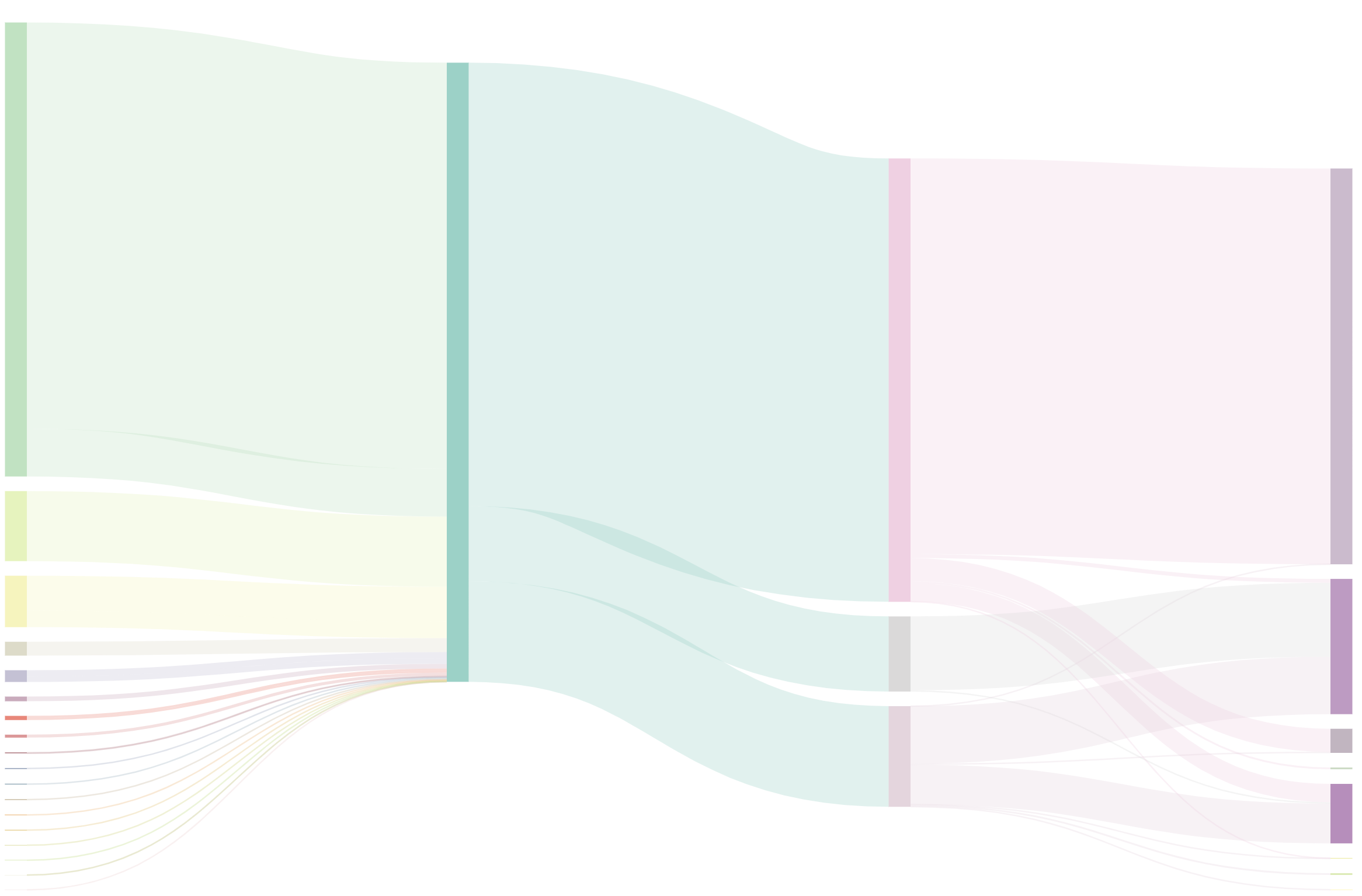
s30e154 - A Sankey diagram
Challenge
Have you ever tried making a sankey diagram with d3+react, I can’t seem to make it work for some reason.
Emil
No Emil, I have not. Let’s give it a shot! Thanks for finding us a dataset that fits 
My Solution
What is a Sankey diagram?
Sankey diagrams are flow diagrams. They’re often used to show flows of money and other resources between different parts of an organization. Or between different organizations. Sankey originally designed them to show energy flows in factories.
Vertical rectangles represent nodes in the flow, lines connecting the rectangles show how each node contributes to the inputs of the next node. Line thickness correlates to flow magnitude.
One of the most famous Sankey diagrams in history is this visualization of Napoleon’s invasion into Russia.
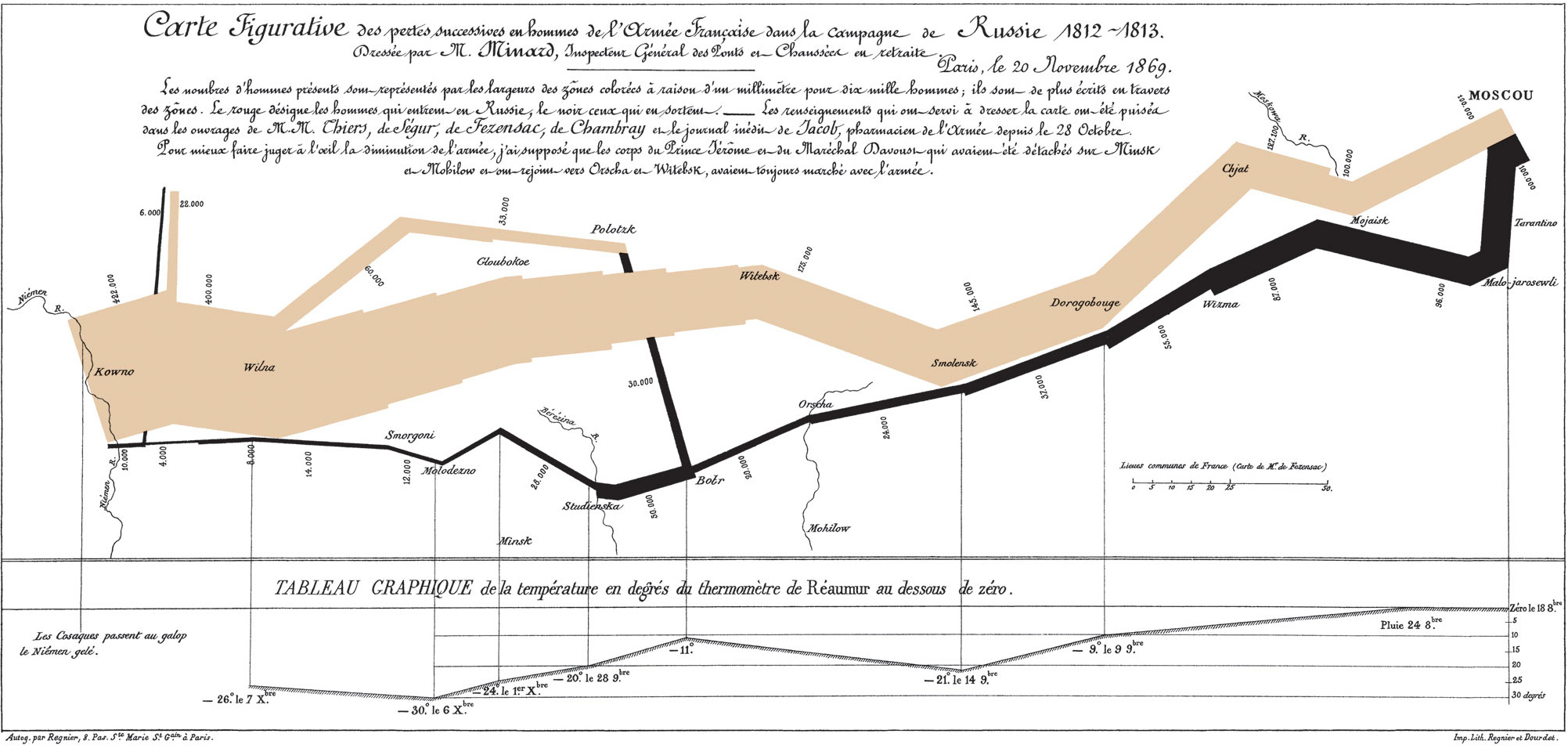
No I’m not quite sure how to read that either. But it’s cool and it’s old 
How do you make a sankey with React and D3?
Turns out building a Sankey diagram with React and D3 isn’t terribly difficult. A D3 extension library called d3-sankey provides a generator for them. Your job is to fill it with data, then render.
The dataset Emil found for us was specifically designed for Sankey diagrams so that was awesome. Thanks Emil. 
I don’t know what our data represents, but you gotta wrangle yours into nodes and links .
-
nodesare an array of representative keys, names in our case -
linksare an array of objects mapping asourceinex to atargetindex with a numericvalue
{
  "nodes": [
    {
      "name": "Universidad de Granada"
    },
    {
      "name": "De Comunidades Autónomas"
    },
   //...
  ],
  "links": [
    {
      "source": 19,
      "target": 26,
      "value": 1150000
    },
    {
      "source": 0,
      "target": 19,
      "value": 283175993
    },
    //...
}
Turn data into a Sankey layout
We can keep things simple with a functional component that calculates the Sankey layout on the fly with every render. We’ll need some color stuff too. That was actually the hardest, lol.
import { sankey, sankeyLinkHorizontal } from "d3-sankey";
//...

const MysteriousSankey = ({ data, width, height }) => {
  const { nodes, links } = sankey()
    .nodeWidth(15)
    .nodePadding(10)
    .extent([[1, 1], [width - 1, height - 5]])(data);
  const color = chroma.scale("Set3").classes(nodes.length);
  const colorScale = d3
    .scaleLinear()
    .domain([0, nodes.length])
    .range([0, 1]);
It’s called MysteriousSankey because I don’t know what our dataset represents. Takes a width, a height, and a data prop.
We get the sankey generator from d3-sankey , initialize a new generator with sankey() , define a width for our nodes and give them some vertical padding. Extent defines the size of our diagram with 2 coordinates: the top left and bottom right corner.
Colors are a little trickier. We use chroma to define a color scale based on the predefined Set3 brewer category. We split it up into nodes.length worth of colors - one for each node. But this expects inputs like 0.01 , 0.1 etc.
To make that easier we define a colorScale as well. It takes indexes of our nodes and translates them into those 0 to 1 numbers. Feed that into the color thingy and it returns a color for each node.
Render your Sankey
A good approach to render your Sankey diagram is using two components:
-
<SankeyNode>for each node -
<SankeyLink>for each link between them
You use them in two loops in the main <MysteriousSankey> component.
return (
  <g style={{ mixBlendMode: 'multiply' }}>
    {nodes.map((node, i) => (
      <SankeyNode
        {...node}
        color={color(colorScale(i)).hex()}
        key={node.name}
      />
    ))}
    {links.map((link, i) => (
      <SankeyLink
        link={link}
        color={color(colorScale(link.source.index)).hex()}
      />
    ))}
  </g>
);
Here you can see a case of inconsistent API design. SankeyNode gets node data splatted into props, SankeyLink prefers a single prop for all the link info. There’s a reason for that and you might want to keep to the same approach in both anyway.
Both also get a color prop with the messiness of translating a node index into a [0, 1] number passed into the chroma color scale, translated into a hex string. Mess.
const SankeyNode = ({ name, x0, x1, y0, y1, color }) => (
  <rect x={x0} y={y0} width={x1 - x0} height={y1 - y0} fill={color}>
    <title>{name}</title>
  </rect>
);
SankeyNode s are rectangles with a title. We take top left and bottom right coordinates from the sankey generator and feed them into rect SVG elements. Color comes form the color prop.
const SankeyLink = ({ link, color }) => (
  <path
    d={sankeyLinkHorizontal()(link)}
    style={{
      fill: 'none',
      strokeOpacity: '.3',
      stroke: color,
      strokeWidth: Math.max(1, link.width),
    }}
  />
);
SankeyLink s are paths. We initialze a sankeyLinkHorizontal path generator instance, feed it link info and that creates the path shape for us. This is why it was easier to get everything in a single link prop. No idea which arguments the generator actually uses.
Styling is tricky too.
Sankey links are lines. They don’t look like lines, but that’s what they are. You want to make sure fill is set to nothing, and use strokeWidth to get that nice volume going.
The rest is just colors and opacities to make it look prettier.
A sankey diagram comes out 
You can make it betterer with some interaction on the nodes or even links. They’re components so the world is your oyster. Anything you can do with components, you can do with these.
s30e155 - Try Uber’s WebGL dataviz library
Challenge
Uber has built a cool suite of data visualization tools for WebGL. Let’s explore
My Solution
Today was not a great success so tomorrow’s gonna be part two.
We explored Uber’s suite of WebGL-based data visualization libraries from vis.gl. There’s a couple:
-
deck.glis for layering data visualization layers on top of maps -
luma.glis the base library that everything else uses -
react-map-glis a React-based base layer for maps, you then use deck.gl to add layers -
react-visis Uber’s take on the “react abstraction for charts” class of libraries. Renders to SVG
Trying out luma.gl seemed like the best way to get started. It powers everything else and if we’re gonna build custom stuff … well.
Implementing this example of wandering triangles seemed like a good idea.
s30e156 - Real-time WebGL map of all airplanes in the world
Challenge
Uber has built a cool suite of data visualization tools for WebGL. Let’s explore with a real-time dataset of global airplane positions.
My Solution
Giving up on luma.gl as too low level, we tried something else: Deck.gl. Same suite of WebGL React tools from Uber but higher level and therefore more fun.
Of course Deck.gl is built for maps so we had to make a map. What better way to have fun with a map than drawing live positions of all airplanes in the sky?
All six thousand of them. Sixty times per second.
Yes we can! 
This is the plan:
- Fetch data from OpenSky
- Render map with react-map-gl
- Overlay a Deck.gl IconLayer
- Predict each airplane’s position on the next Fetch
- Interpolate positions 60 times per second
- Update and redraw
Out goal is to create a faux live map of airplane positions. We can fetch real positions every 10 seconds per OpenSky usage policy.
You can see the full code on GitHub. No Codesandbox today because it makes my computer struggle when WebGL is involved.
<TweetEmbed id=“1076067452038115328” options={{ conversation: ‘none’ }} />
See the airplanes in your browser  click me
Fetch data from OpenSky
OpenSky is a receiver network which continuously collects air traffic surveillance data. They keep it for forever and make it available via an API.
As an anon user you can get real-time data of all the world’s airplanes current positions every 10 seconds. With some finnagling you can get historic data, super real-time stuff, and so on. We don’t need any of that.
We fetchData in componentDidMount . Parse each entry into an object, update local state, and start the animation. Also schedule the next fetch.
componentDidMount() {
    this.fetchData();
}

fetchData = () => {
    d3.json("https://opensky-network.org/api/states/all").then(
        ({ states }) =>
            this.setState(
                {
                    // from https://opensky-network.org/apidoc/rest.html#response
                    airplanes: states.map(d => ({
                        callsign: d[1],
                        longitude: d[5],
                        latitude: d[6],
                        velocity: d[9],
                        altitude: d[13],
                        origin_country: d[2],
                        true_track: -d[10],
                        interpolatePos: d3.geoInterpolate(
                            [d[5], d[6]],
                            destinationPoint(
                                d[5],
                                d[6],
                                d[9] * this.fetchEverySeconds,
                                d[10]
                            )
                        )
                    }))
                },
                () => {
                    this.startAnimation();
                    setTimeout(
                        this.fetchData,
                        this.fetchEverySeconds * 1000
                    );
                }
            )
    );
};
d3.json fetches JSON data from a URL, returns a promise. We map through the data and assign indexes to representative object keys. Makes the other code easier to read.
In the setState callback, we start the animation and use a setTimeout to call fetchData again in 10 seconds. More about teh animation in a bit.
Render map with react-map-gl
Turns out rendering a map with Uber’s react-map-gl is really easy. The library does everything for you.
import { StaticMap } from 'react-map-gl'
import DeckGL, { IconLayer } from "deck.gl";

// Set your mapbox access token here
const MAPBOX_ACCESS_TOKEN = '<your token>'

// Initial viewport settings
const initialViewState = {
  longitude: -122.41669,
  latitude: 37.7853,
  zoom: 5,
  pitch: 0,
  bearing: 0,
}

// ...

<DeckGL
    initialViewState={initialViewState}
    controller={true}
    layers={layers}
>
    <StaticMap mapboxApiAccessToken={MAPBOX_ACCESS_TOKEN} />
</DeckGL>
That is all.
You need to create a Mapbox account and get your token, the initialViewState I copied from Uber’s docs. It points to San Francisco.
In the render method you then return <DeckGL which sets up the layering stuff, and plop a <StaticMap> inside. This gives you pan and zoom behavior out of the box. I’m sure with some twiddling you could get cool views and rotations and all sorts of 3D stuff.
I say that because I’ve seen pics in Uber docs 
Overlay a Deck.gl IconLayer
That layers prop needs a list of layers. You’re meant to create a new copy on every render, but internally Deck.gl promises to keep things memoized and figure out a minimal set of changes necessary. How they do that I don’t know and as long as it works it doesn’t really matter how.
We configure the icon layer like this:
import Airplane from './airplane-icon.jpg';

const layers = [
  new IconLayer({
    id: 'airplanes',
    data: this.state.airplanes,
    pickable: false,
    iconAtlas: Airplane,
    iconMapping: {
      airplane: {
        x: 0,
        y: 0,
        width: 512,
        height: 512,
      },
    },
    sizeScale: 20,
    getPosition: d => [d.longitude, d.latitude],
    getIcon: d => 'airplane',
    getAngle: d => 45 + (d.true_track * 180) / Math.PI,
  }),
];
We name it airplanes because it’s showing airplanes, pass in our data, and define the airplane icon. iconAtlas is a sprite and the mapping specifies which parts of the image map to which name. With just one icon in the image that’s pretty quick.
We use getPosition to fetch longitude and latitude from each airplane and pass it to the drawing layer. getIcon specifies that we’re rendering the airplane icon and getAngle rotates everything first by 45 degrees because our icon is weird, and then by the direction of the airplane from our data.
true_track is the airplane’s bearing in radians so we transform it to degrees with some math.
![]()
Predict airplanes’ next position
Predicting each airplane’s position 10 seconds from now is … mathsy. Positions are in latitudes and longitudes, velocities are in meters per second.
I’m not so great with spherical euclidean maths so I borrowed the solution from StackOverflow and made some adjustments to fit our arguments.
We use that to create a d3.geoInterpolate interpolator between the start and end point. That enables us to feed in numbers between 0 and 1 and get airplane positions at specific moments in time.
interpolatePos: d3.geoInterpolate(
  [d[5], d[6]],
  destinationPoint(d[5], d[6], d[9] * this.fetchEverySeconds, d[10])
);
Gobbledygook. Almost as bad as the destinationPoint function code
Interpolate and redraw
With that interpolator in hand, we can start our animation.
currentFrame = null;
timer = null;

startAnimation = () => {
  if (this.timer) {
    this.timer.stop();
  }
  this.currentFrame = 0;
  this.timer = d3.timer(this.animationFrame);
};

animationFrame = () => {
  let { airplanes } = this.state;
  airplanes = airplanes.map(d => {
    const [longitude, latitude] = d.interpolatePos(
      this.currentFrame / this.framesPerFetch
    );
    return {
      ...d,
      longitude,
      latitude,
    };
  });
  this.currentFrame += 1;
  this.setState({ airplanes });
};
We use a d3.timer to run our animationFrame function 60 times per second. Or every requestAnimationFrame . That’s all internal and D3 figures out the best option.
Also gotta make sure to stop any existing timers when running a new one
The animationFrame method itself maps through the airplanes and creates a new list. On each iteration we copy over the whole datapoint and use the interpolator we defined earlier to calculate the new position.
To get numbers from 0 to 1 we try to predict how many frames we’re gonna render and keep track of which frame we’re at. So 0/60 gives 0, 10/60 gives 0.16, 60/60 gives 1 etc. The interpolator takes this and returns geospatial positions along that path.
Of course this can’t take into account any changes in direction the airplane might make.
Updating component state triggers a re-render.
And that’s cool
What I find really cool about all this is that even though we’re copying and recreating and recalculating and ultimately redrawing some 6000 airplanes it works smoothly. Because WebGL is more performant than I ever dreamed possible.
We could improve performance further by moving this animation out of React state and redraw into vertex shaders but that’s hard and turns out we don’t have to.
Look at those little WebGL airplanes go!
— Swizec Teller (@Swizec) December 21, 2018
s30e157 - A compound arc chart
Challenge
Kiran has a problem. He’s working on a project and doesn’t know how. Let’s help
My Solution
Kiran wants to build a “circle with arcs” chart, but he’s having trouble. He asked for help so here we are
I livecoded this one from the Paris airport so there’s no sound in the video. I was too shy to narrate my actions in the middle of a busy Starbucks. Maybe next time.
Anyway, to build an arc circle like this, we can take many cues from how you would build a piechart. Arcs are still arcs: They’re round, have an inner and outer radius, and represent a datapoint. We can layer them on top of each other with a band scale feeding into radiuses.
Like this
First you need a dataset
We fake the dataset because Kiran didn’t provide one.
// 5 percentages represent our dataset
const data = d3.range(5).map(_ => ({
  name: Faker.hacker.verb(),
  percentage: 75 * Math.random(),
}));
5 datapoints, fake name with faker, and a random chunk out of 75%. Tried going full 100 at first and it didn’t look great at all.
Then you need a parent component
const CircleArcs = ({ data, maxR }) => {
  const rScale = d3
    .scaleBand()
    .paddingInner(0.4)
    .paddingOuter(1)
    .domain(d3.range(data.length))
    .range([0, maxR]);

  return (
    <g>
      <Circle cx={0} cy={0} r={maxR} />
      {data.map((d, i) => (
        <Arc d={d} r={rScale(i)} width={rScale.bandwidth()} key={i} />
      ))}
    </g>
  );
};
A functional component will do. Create a band scale for the radiuses. Those cut up a given space into equal bands and let you define padding. Same scale you’d use for a barchart to position the bars.
The band scale is ordinal so our domain has to match the number of inputs, d3.range takes care of that. For our dataset that sets the domain to [0,1,2,3,4] .
Scale range goes from zero to max radius.
Render a <Circle> which is a styled circle component, loop through the data and render an <Arc> component for each entry. The arc takes data in the d prop, call rScale to get the radius, and use rScale.bandwidth() to define the width. Band scales calculate optimal widths on their own.
We can use index for keys because we know arcs will never re-order.
The parent component needs arcs
That’s what it’s rendering. They look like this
const Arc = ({ d, r, width }) => {
  const arc = d3
    .arc()
    .innerRadius(r)
    .outerRadius(r + width)
    .startAngle(0)
    .endAngle((d.percentage / 100) * (Math.PI * 2));

  return (
    <g>
      <Label y={-r} x={-10}>
        {d.name}
      </Label>
      <ArcPath d={arc()} />
    </g>
  );
};
A D3 arc generator defines the path shape of our arcs. Inner radius comes from the r prop, outer radius is r+width . Unlike a traditional pie chart, every arc starts at angle zero.
The end angle makes our arcs communicate their value. A percentage of full circle.
Each arc also comes with a label at its start. We position those at the beginning of the arc using the x and y props. Setting their anchor point as end automatically makes them end at that point.
const ArcPath = styled.path`
  fill: white;
`;

const Label = styled.text`
  fill: white;
  text-anchor: end;
`;
Styled components work great for setting pretty much any SVG prop 
And the result is a circle arc chart thing. Wonderful.
For #ReactVizHoliday Day 14 we solved the @kiran_gaurang challenge: How do you build a arc circle chart thing
Solved live from the Paris airport because free wifi in France gets 3000kb/s upload
— Swizec Teller (@Swizec) December 22, 2018
s30e158 - Which emails sparked joy – an animated timeline
Which emails sparked joy?
Ever wondered if the emails you send spark joy? You can ask!
About a year ago I started adding a little “Did you like this?” form at the bottom of emails sent to some 9,000 readers every week. The results have been wonderful 
I now know what lands and what doesn’t with my audience and it’s made me a better writer. Here’s an example where I wrote the same message in 2 different ways, sent to the same audience.
What a difference writing can make!
You know what makes data like this even better? A data visualization. With hearts and emojis and transitions and stuff!
So I fired up the monthly dataviz stream and built one
An entire dataviz from scratch. Data collection and all. Doing one of these epic streams every last Sunday of the month.
Article coming soon pic.twitter.com/nZdWJPdyQt
— Swizec Teller (@Swizec) July 30, 2019
Watch the stream here
It’s a little long. Just over 5 hours. You might want to fast-forward a few times, read this article instead. Think of it as a recap and full featured tutorial.
Next lastish-Sunday-of-the-month you can join live. It’s great fun
Here’s how we approached this data visualization on the stream:
- Collect data
- See what we find
- Design a visualization
- Build with React & D3
I’m not so good at design methodology so we’re going to focus on building and data collection. Design happened through trial and error and a few ideas in my head.
You can try it out live, here
Full code on GitHub
Collecting data
Our data comes from 2 sources:
- ConvertKit for subscribers, emails, open rates, etc.
- TypeForm for sentiment about each email sent
We never ended up using ConvertKit subscriber data so I’m not gonna talk about downloading and anonymizing that. You can see it in the stream.
ConvertKit and TypeForm APIs worked great for everything else.
ConvertKit broadcasts/emails
ConvertKit calls the emails that you manually send to your subscribers broadcasts. There’s no built-in export for broadcast data so we used the API.
Since there’s no ConvertKit library I could find, we built our own following the docs. A few fetch() calls and some JavaScript glue code.
const fetch = require('node-fetch');
const { CK_KEY } = require('./secrets.json');
const fs = require('fs');

async function getBroadcasts() {
  const page1 = await fetch(
    `https://api.convertkit.com/v3/broadcasts?page=1&api_secret=${CK_KEY}`
  ).then(res => res.json());
  const page2 = await fetch(
    `https://api.convertkit.com/v3/broadcasts?page=2&api_secret=${CK_KEY}`
  ).then(res => res.json());

  const broadcasts = [...page1.broadcasts, ...page2.broadcasts];

  const result = [];

  for (let broadcast of broadcasts) {
    const stats = await fetch(
      `https://api.convertkit.com/v3/broadcasts/${
        broadcast.id
      }/stats?api_secret=${CK_KEY}`
    ).then(res => res.json());

    result.push({
      ...broadcast,
      ...stats.broadcast.stats,
    });
  }

  fs.writeFileSync('public/data/broadcasts.json', JSON.stringify(result));
}

getBroadcasts();
We make two API calls to get both pages of data. 50 results per page, just over 60 results in total. A real API wrapper would use some sort of loop here, but for a quick hack this is fine.
Then we take the list of broadcasts and fetch stats for each. API gives us the subject line, number of sends, opens, clicks, stuff like that.
We end up with a JSON file that contains all the email meta data we need for our visualization.
[{
    "id": 2005225,
    "created_at": "2019-01-14T18:17:04.000Z",
    "subject": "A bunch of cool things and neat little tips",
    "recipients": 10060,
    "open_rate": 22.24652087475149,
    "click_rate": 4.473161033797217,
    "unsubscribes": 32,
    "total_clicks": 993,
    "show_total_clicks": true,
    "status": "completed",
    "progress": 100
},
TypeForm
TypeForm data is best scraped with their API. They support CSV exports but those work one by one. Manually going through all 60-some forms would take too long.
Scraping was pretty easy though – there’s an official JavaScript API client
// scrape_typeform.js

const { createClient } = require("@typeform/api-client");
const fs = require("fs");

const typeformAPI = createClient({
    token: <API token>
});
Those few lines of code give us an API client. Documentation is a little weird and you have to guess some naming conventions from the actual API docs, but we made it work.
Fetching data happens in 3 steps:
- Get list of workspaces, that’s what TypeForm calls groups of forms
- Get forms from all workspaces
- Get responses to each form
// scrape_typeform.js

async function scrapeData() {
  // fetches workspaces and filters the 2 we need
  const workspaces = await typeformAPI.workspaces
    .list({
      pageSize: 200,
    })
    .then(res =>
      res.items.filter(({ name }) => ['Post Emails', 'Emails'].includes(name))
    );

  // fires parallel requests to fetch forms for each workspace
  // Promise.all waits for every request to finish
  const allForms = await Promise.all(
    workspaces.map(({ id }) =>
      typeformAPI.forms
        .list({ workspaceId: id, pageSize: 200 })
        .then(forms => forms.items)
    )
  );

  // flatten list of lists of forms into a single list
  // remove any forms that are older than my first ConvertKit email
  const forms = allForms
    .reduce((acc, arr) => [...acc, ...arr], []) // node 10 doesn't have .flat
    .filter(f => new Date(f.last_updated_at) > START_DATE);

  // use the same Promise.all trick to fire parallel response requests
  const responses = await Promise.all(
    forms.map(form =>
      typeformAPI.responses
        .list({ pageSize: 200, uid: form.id })
        .then(res => ({ form: form.id, responses: res.items }))
    )
  );

  // write forms and responses as JSON files
  fs.writeFileSync('public/data/forms.json', JSON.stringify(forms));
  fs.writeFileSync('public/data/responses.json', JSON.stringify(responses));
}
A GraphQL API would make this much easier
Again, this isn’t the prettiest code but it’s meant to run once so no need to make it perfect. If you wanted to maintain this long-term, I’d recommend breaking each step into its own function.
We end up with two JSON files containing all our sentiment data. The first question, “Did you like this?” , is numeric and easy to interpret. The rest contain words so we won’t use them for our dataviz … altho it would be cool to figure something out.
Setup the React app
Ok now we’ve got our data, time to fire up a new create-react-app, load the data, and start exploring.
$ create-react-app newsletter-dataviz
$ cd newsletter-dataviz
$ yarn add d3 react-use-dimensions styled-components
We can work with a basic CRA app, no special requirements. Couple of dependencies though:
-
d3gives us simple data loading functions and helpers for calculating dataviz props -
react-use-dimensionsoruseDimensionfor short helps us make our dataviz responsive -
styled-componentsis my favorite way to use CSS in React apps
On the stream we did this part before scraping data so we had somewhere to install dev dependencies. 
Load data in the app
We want to load our dataset asynchronously on component mount. Helps our app load fast, tell the user data is loading, and make sure all the data is ready before we start drawing.
D3 comes with helpers for loading both CSV and JSON data so we don’t have to worry about parsing.
A custom useDataset hook helps us keep our code clean.
// src/App.js

function useDataset() {
  const [broadcasts, setBroadcasts] = useState([]);

  useEffect(() => {
    (async function() {
      // data loading and parsing stuff
    })();
  }, []);

  return { broadcasts };
}
The useDataset hook keeps one state variable: broadcasts . We’re going to load all our data and combine it into a single data tree. Helps keep the rest of our code simple.
Loading happens in that useEffect , which runs our async function immediately on component mount.
Load broadcasts
// src/App.js
function useDataset() {
    // ...
    const broadcasts = await d3
        .json("data/broadcasts.json")
        .then(data =>
            data
                .map(d => ({
                    ...d,
                    created_at: new Date(d.created_at)
                }))
                .filter(d => d.recipients > 1000)
                .filter(d => d.status === "completed")
                .sort((a, b) => a.created_at - b.created_at)
        );
Inside the effect we start with broadcasts data.
Use d3.json to make a fetch request and parse JSON data into a JavaScript object. .then we iterate through the data and:
- change
created_atstrings intoDateobjects -
filterout any broadcasts smaller than 1000 recipients -
filterout any incomplete broadcasts -
sortbycreated_at
Always a good idea to perform all your data cleanup on load. Makes your other code cleaner and you don’t have to deal with strange edge cases.
Load forms
// src/App.js

function useDataset() {
    // ...
    let forms = await d3.json("data/forms.json");

    // associate forms with their respective email
    const dateId = Object.fromEntries(
        broadcasts.map(d => [dateFormat(d.created_at), d.id])
    );

    forms = Object.fromEntries(
        forms.map(form => [
            form.id,
            dateId[dateFormat(new Date(form.last_updated_at))]
        ])
    );
Then we load the forms data using d3.json again.
This time we want to associate each form with its respective email based on date. This approach works because I usually create the email and the form on the same day.
We make heavy use of the fromEntries method. It takes lists [key, value] pairs and turns them into key: value objects.
We end up with an object like this
{
    dtnMgo: 2710510,
    G72ihG: 2694018,
    M6iSEQ: 2685890
        // ...
Form id mapping to email id.
Load responses
// src/App.js

function useDataset() {
    // ...
    let responses = await d3.json("data/responses.json");
    responses = responses
        .map(row => ({
            ...row,
            broadcast_id: forms[row.form]
        }))
        .filter(d => d.broadcast_id !== undefined);

    setBroadcasts(
        broadcasts.map(d => ({
            ...d,
            responses: responses.find(r => r.broadcast_id === d.id)
        }))
    );
Finally we load our sentiment data – responses.json .
Use d3.json to get all responses, add a broadcast_id to each based on the forms object, filter out anything with an undefined broadcast. Guess the “email and broadcast on the same day” rule isn’t perfect. 
While saving data in local state with setBroadcasts , we also map through every entry and .find relevant responses. When we’re done React re-renders our app.
Simplest way to show a Loading screen
Since we don’t want users to stare at a blank screen while data loads, we create the simplest of loading screens.
// src/App.js

function App() {
    const { broadcasts } = useDataset();

    if (broadcasts.length < 1) {
        return <p>Loading data ...</p>;
    }

    // ...
Fire up the useDataset hook, take broadcasts data out, see if there’s anything yet. If there isn’t render a Loading data ... text.
That is all
Since we’re using a return, we’ll have to make sure we add all hooks before this part of the function. Otherwise you fall into conditional rendering and hooks get confused. They have to be in the same order, always.
Responsively render emails on a timeline

We render emails on a timeline with a combination of D3 scales and React rendering loops. Each 💌 emoji represents a single email. Its size shows the open rate.
Responsiveness comes from dynamically recalculating D3 scales based on the size of our SVG element with the useDimensions hook.
function App() {
    const { broadcasts } = useDataset();
    const [ref, { width, height }] = useDimensions();

    // ...

    const xScale = d3
        .scaleTime()
        .domain(d3.extent(broadcasts, d => d.created_at))
        .range([30, width - 30]);

    const sizeScale = d3
        .scaleLinear()
        .domain(d3.extent(broadcasts, d => d.open_rate))
        .range([2, 25]);

    return (
        <svg ref={ref} width="99vw" height="99vh">
            {width &&
                height &&
                broadcasts
                    .map((d, i) => (
                        <Broadcast
                            key={d.id}
                            x={xScale(d.created_at)}
                            y={height / 2}
                            size={sizeScale(d.open_rate)}
                            data={d}
                        />
                    ))}
        </svg>
A couple steps going on here
- Get
ref,width, andheight, fromuseDimensions. The ref we’ll use to specify what we’re measuring. Width and height will update dynamically as the element’s size changes on scroll or screen resize. -
xScaleis a D3 scale that mapscreated_atdates from our dataset to pixel values between30andwidth-30 -
sizeScalemaps open rates from our dataset to pixel values between2and25 - Render an
<svg>element with thereffrom useDimensions. Use width and height properties to make it full screen. When the browser resizes, this element will resize, useDimensions will pick up on that, update ourwidthandheight, trigger a re-render, and our dataviz becomes responsive
- When all values are available
.mapthrough broadcast data and render a<Broadcast>component for each
component
The <Broadcast> component takes care of rendering and styling each letter emoji on our visualization. Later it’s going to deal with dropping hearts as well.
We start with a <CenteredText> styled component.
const CenteredText = styled.text`
  text-anchor: middle;
  dominant-baseline: central;
`;
Takes care of centering SVG text elements horizontally and vertically. Makes positioning much easier.
Right now the <Broadcast> component just renders that.
const Broadcast = ({ x, y, size, data }) => {
  return (
    <g transform={`translate(${x}, ${y})`} style={{ cursor: 'pointer' }}>
      <CenteredText x={0} y={0} fontSize={`${size}pt`}>
        💌
      </CenteredText>
    </g>
  );
};
Render a grouping element, <g> , use an SVG transform to position at (x, y) coordinates, and render a <CenteredText> with a 💌 emoji using the size prop for font size.
The result is a responsive timeline.

Animate the timeline
Animating the timeline is a sort of trick change N of rendered emails over time and you get an animation.
We create a useRevealAnimation React hook to help us out.
// src/App.js

function useRevealAnimation({ duration, broadcasts }) {
  const [N, setN] = useState(0);

  useEffect(() => {
    if (broadcasts.length > 1) {
      d3.selection()
        .transition('data-reveal')
        .duration(duration * 1000)
        .tween('Nvisible', () => {
          const interpolate = d3.interpolate(0, broadcasts.length);
          return t => setN(Math.round(interpolate(t)));
        });
    }
  }, [broadcasts.length]);

  return N;
}
We’ve got a local state for N and a useEffect to start the animation. The effect starts a new D3 transition, sets up a custom tween with an interpolator from 0 to broadcasts.length and runs setN with a new number on every tick of the animation.
D3 handles the heavy lifting of figuring out exactly how to change N to create a nice smooth animation.
I teach this approach in more detail as hybrid animation in my React for DataViz course.
The useRevealAnimation hook goes in our App component like this
// src/App.js

function App() {
    const { broadcasts } = useDataset();
    const [ref, { width, height }] = useDimensions();
    const N = useRevealAnimation({ broadcasts, duration: 10 });

    // ...

            {width &&
                height &&
                broadcasts
                    .slice(0, N)
                    .map((d, i) => (
                        <Broadcast
N updates as the animation runs and broadcasts.slice ensures we render only the first N elements of our data. React’s diffing engine figures out the rest so existing items don’t re-render.
This avoid-re-rendering part is very important to create a smooth animation of dropping hearts.
Add dropping hearts
Each <Broadcast> handles its own dropping hearts.
// src/Broadcast.js

const Broadcast = ({ x, y, size, data, onMouseOver }) => {
  const responses = data.responses ? data.responses.responses : [];

  // ratings > 3 are a heart, probably
  const hearts = responses
    .map(r => (r.answers ? r.answers.filter(a => a.type === 'number') : []))
    .flat()
    .filter(({ number }) => number > 3).length;

  return (
    <g
      transform={`translate(${x}, ${y})`}
      onMouseOver={onMouseOver}
      style={{ cursor: 'pointer' }}
    >
      // ..
      <Hearts hearts={hearts} bid={data.id} height={y - 10} />
    </g>
  );
};
Get a list of responses out of data associated with each broadcast, flatten into a simple array, and filter out any votes below 3 on the 0, 1, 2, 3, 4, 5 scale. Assuming high numbers mean “I liked this” .
Render with a <Hearts> component.
component
The <Hearts> component is a simple loop.
// src/Broadcast.js

const Hearts = ({ bid, hearts, height }) => {
  return (
    <>
      {d3.range(0, hearts).map(i => (
        <Heart
          key={i}
          index={i}
          id={`${bid}-${i}`}
          height={height - i * 10}
          dropDuration={3}
        />
      ))}
    </>
  );
};
Create a counting array with d3.range , iterate over it, and render a <Heart> for each. The <Heart> component declaratively takes care of rendering itself so it drops into the right place.
component
const Heart = ({ index, height, id, dropDuration }) => {
  const y = useDropAnimation({
    id,
    duration: dropDuration,
    height: height,
    delay: index * 100 + Math.random() * 75,
  });

  return (
    <CenteredText x={0} y={y} fontSize="12px">
      ❤️
    </CenteredText>
  );
};
Look at that, another animation hook. Hooks really simplify our code 
The animation hook gives us a y coordinate. When that changes, the component re-renders, and re-positions itself on the page.
That’s because y is handled as a React state.
// src/Broadcast.js

function useDropAnimation({ duration, height, id, delay }) {
  const [y, sety] = useState(0);

  useEffect(() => {
    d3.selection()
      .transition(`drop-anim-${id}`)
      .ease(d3.easeCubicInOut)
      .duration(duration * 1000)
      .delay(delay)
      .tween(`drop-tween-${id}`, () => {
        const interpolate = d3.interpolate(0, height);
        return t => sety(interpolate(t));
      });
  }, []);

  return y;
}
We’re using the same hybrid animation trick as before except now we added an easing function to our D3 transition so it looks better.
The result are hearts dropping from an animated timeline.
Add helpful titles
Last feature that makes our visualization useful are the titles. They create context and tell users what they’re looking at.

No dataviz trickery here, just helpful info in text form
const Heading = styled.text`
  font-size: 1.5em;
  font-weight: bold;
  text-anchor: middle;
`;

const MetaData = ({ broadcast, x }) => {
  if (!broadcast) return null;

  // count likes
  // math the ratios for opens, clicks, etc

  return (
    <>
      <Heading x={x} y={50}>
        {broadcast ? dateFormat(broadcast.created_at) : null}
      </Heading>
      <Heading x={x} y={75}>
        {broadcast ? broadcast.subject : null}
      </Heading>
      <text x={x} y={100} textAnchor="middle">
        ❤️ {heartRatio.toFixed(0)}% likes 📖 {broadcast.open_rate.toFixed(0)}%
        reads 👆 {broadcast.click_rate.toFixed(0)}% clicks 😢{' '}
        {unsubRatio.toFixed(2)}% unsubs
      </text>
    </>
  );
};
We use some middle school maths to calculate the ratios we’re showing, then render a <Heading> styled component twice and a <text> component once.
Headings show the email date and title, text shows meta info about open rates and such. Nothing fancy, but it makes the data visualization a lot better I think.
And so we end up with a nice dataviz full of hearts and emojis and transitions and animation. Great way to see which emails sparked joy 
Next step could be some sort of text analysis and figuring out which topics or words correlate to more enjoyment. Could be fun but I don’t think we have a big enough dataset for proper sentiment analysis.
Maybe 
Thanks for reading,
~Swizec
s30e159 - A barchart race visualizing Moore’s Law
Moore’s Law states that the number of transistors on a chip roughly doubles every two years. But how does that stack up against reality?
I was inspired by this data visualization of Moore’s law from @datagrapha going viral on Twitter and decided to replicate it in React and D3.
Some data bugs break it down in the end and there’s something funky with Voodoo Rush, but those transitions came out wonderful
You can watch me build it from scratch, here
First 30min eaten by a technical glitch 
Try it live in your browser, here https://moores-law-swizec.swizec-react-dataviz.now.sh
And here’s the full source code on GitHub.
you can Read this online
How it works
At its core Moore’s Law in React & D3 is a bar chart flipped on its side.
We started with fake data and a React component that renders a bar chart. Then we made the data go through time and looped through. The bar chart jumped around.
So our next step was to add transitions. Made the bar chart look smooth.
Then we made our data gain an entry each year and created an enter transition to each bar. Makes it smoother to see how new entries fly in.
At this point we had the building blocks and it was time to use real data. We used wikitable2csv to download data from Wikipedia’s Transistor Count page and fed it into our dataviz.
Pretty much everything worked right away
Start with fake data
Data visualization projects are best started with fake date. This approach lets you focus on the visualization itself. Build the components, the transitions, make it all fit together … all without worrying about the exact shape of your data.
Of course it’s best if your fake data looks like your final dataset will. Array, object, grouped by year, that sort of thing.
Plus you save time when you aren’t waiting for large datasets to parse
Here’s the fake data generator we used:
// src/App.js

const useData = () => {
  const [data, setData] = useState(null);

  // Replace this with actual data loading
  useEffect(() => {
    // Create 5 imaginary processors
    const processors = d3.range(10).map(i => `CPU ${i}`),
      random = d3.randomUniform(1000, 50000);

    let N = 1;

    // create random transistor counts for each year
    const data = d3.range(1970, 2026).map(year => {
      if (year % 5 === 0 && N < 10) {
        N += 1;
      }

      return d3.range(N).map(i => ({
        year: year,
        name: processors[i],
        transistors: Math.round(random()),
      }));
    });

    setData(data);
  }, []);

  return data;
};
Create 5 imaginary processors, iterate over the years, and give them random transistor counts. Every 5 years we increase the total N of processors in our visualization.
We create data inside a useEffect to simulate that data loads asynchronously.
Driving animation through the years
A large part of visualizing Moore’s Law is showing its progression over the years. Transistor counts increased as new CPUs and GPUs entered the market.
Best way to drive that progress animation is with a useEffect and a D3 timer. We do that in our App component.
// src/App.js

function App() {
    const data = useData();
    const [currentYear, setCurrentYear] = useState(1970);

    const yearIndex = d3
        .scaleOrdinal()
        .domain(d3.range(1970, 2025))
        .range(d3.range(0, 2025 - 1970));

    // Drives the main animation progressing through the years
    // It's actually a simple counter 😛
    useEffect(() => {
        const interval = d3.interval(() => {
            setCurrentYear(year => {
                if (year + 1 > 2025) {
                    interval.stop();
                }

                return year + 1;
            });
        }, 2000);

        return () => interval.stop();
    }, []);
useData() runs our data generation custom hook. We useState for the current year. A linear scale helps us translate from meaningful 1970 to 2026 numbers to indexes in our data array.
The useEffect starts a d3.interval , which is like a setInterval but more reliable. We update current year state in the interval callback.
Remember that state setters accept a function that gets current state as an argument. Useful trick in this case where we don’t want to restart the effect on every year change.
We return interval.stop() as our cleanup function so React stops the loop when our component unmounts.
The basic render
Our main component renders a <Barchart> inside an <Svg> . Using styled components for size and some layout.
// src/App.js

return (
    <Svg>
        <Title x={"50%"} y={30}>
            Moore's law vs. actual transistor count in React & D3
        </Title>
        {data ? (
            <Barchart
                data={data[yearIndex(currentYear)]}
                x={100}
                y={50}
                barThickness={20}
                width={500}
            />
        ) : null}
        <Year x={"95%"} y={"95%"}>
            {currentYear}
        </Year>
    </Svg>
Our Svg is styled to take up the entire viewport and the Year component is a big text.
The <Barchart> is where our dataviz work happens. From the outside it’s a component that takes “current data” and handles the rest. Positioning and sizing props make it more reusable.
A smoothly transitioning Barchart
Our goal with the Barchart component was to:
- always render current state
- have smooth transitions on changes
- follow React-y principles
- easy to use from the outside
You can watch the video to see how it evolved. Here I explain the final state
The component
The Barchart component takes in data, sets up vertical and horizontal D3 scales, and loops through data to render individual bars.
// src/Barchart.js

// Draws the barchart for a single year
const Barchart = ({ data, x, y, barThickness, width }) => {
    const yScale = useMemo(
        () =>
            d3
                .scaleBand()
                .domain(d3.range(0, data.length))
                .paddingInner(0.2)
                .range([data.length * barThickness, 0]),
        [data.length, barThickness]
    );

    // not worth memoizing because data changes every time
    const xScale = d3
        .scaleLinear()
        .domain([0, d3.max(data, d => d.transistors)])
        .range([0, width]);

    const formatter = xScale.tickFormat();
D3 scales help us translate between datapoints and pixels on a screen. I like to memoize them when it makes sense.
Memoizing is particularly important with large datasets. You don’t want to waste time looking for the max in 100,000 elements on every render.
We were able to memoize yScale because data.length and barThickness don’t change every time.
xScale on the other hand made no sense to memoize since we know <Barchart> gets a new data object for every render. At least in theory.
We borrow xScale’s tick formatter to help us render 10000 as 10,000 . Built into D3
Rendering our Barchart component looks like this:
// src/Barchart.js

return (
  <g transform={`translate(${x}, ${y})`}>
    {data
      .sort((a, b) => a.transistors - b.transistors)
      .map((d, index) => (
        <Bar
          data={d}
          key={d.name}
          y={yScale(index)}
          width={xScale(d.transistors)}
          endLabel={formatter(d.transistors)}
          thickness={yScale.bandwidth()}
        />
      ))}
  </g>
);
A grouping element holds our bars together and moves them into place. Using a group element changes the internal coordinate system so individual bars don’t have to know about overall positioning.
Just like in HTML when you position a div and its children don’t need to know
We sort data by transistor count and render a <Bar> element for each. Individual bars get all needed info via props.
The component
Individual <Bar> components render a rectangle flanked on each side by a label.
return (
  <g transform={`translate(${renderX}, ${renderY})`}>
    <rect x={10} y={0} width={renderWidth} height={thickness} fill={color} />
    <Label y={thickness / 2}>{data.name}</Label>
    <EndLabel y={thickness / 2} x={renderWidth + 15}>
      {data.designer === 'Moore'
        ? formatter(Math.round(transistors))
        : formatter(data.transistors)}
    </EndLabel>
  </g>
);
A grouping element groups the 3 elements, styled components style the labels, and a rect SVG element creates the rectangle. Simple React markup stuff
Where the <Bar> component gets interesting is the positioning. We use renderX and renderY even though the vertical position comes from props as y and x is static.
That’s got to do with transitions.
Transitions
The <Bar> component uses the hybrid animation approach from my React For DataViz course.
A key insight is that we use independent transitions on each axis to create a coordinated transition. Both for entering into the chart and for moving around later.
Special case for the Moore's Law bar itself where we also transition the label so it looks like it’s counting.
We created a useTransition custom hook to make our code easier to understand and cleaner to read.
useTransition
The useTransition custom hook helps us move values from props to state. State becomes the staging area and props are the target we want to reach.
To run a transition we create an effect and set up a D3 transition. On each tick of the animation we update state proportionately to time spent animating.
const useTransition = ({ targetValue, name, startValue, easing }) => {
  const [renderValue, setRenderValue] = useState(startValue || targetValue);

  useEffect(() => {
    d3.selection()
      .transition(name)
      .duration(2000)
      .ease(easing || d3.easeLinear)
      .tween(name, () => {
        const interpolate = d3.interpolate(renderValue, targetValue);
        return t => setRenderValue(interpolate(t));
      });
  }, [targetValue]);

  return renderValue;
};
State update happens inside that custom .tween method. We interpolate between the current value and the target value.
D3 handles the rest.
Using useTransition
We can reuse that same transition approach for each independent axis we want to animate. D3 makes sure all transitions start at the same time and run at the same pace. Any dropped frames or browser slow downs are handled for us.
// src/Bar.js
const Bar = ({ data, y, width, thickness, formatter, color }) => {
    const renderWidth = useTransition({
        targetValue: width,
        name: `width-${data.name}`,
        easing: data.designer === "Moore" ? d3.easeLinear : d3.easeCubicInOut
    });
    const renderY = useTransition({
        targetValue: y,
        name: `y-${data.name}`,
        startValue: -500 + Math.random() * 200,
        easing: d3.easeCubicInOut
    });
    const renderX = useTransition({
        targetValue: 0,
        name: `x-${data.name}`,
        startValue: 1000 + Math.random() * 200,
        easing: d3.easeCubicInOut
    });
    const transistors = useTransition({
        targetValue: data.transistors,
        name: `trans-${data.name}`,
        easing: d3.easeLinear
    });
Each transition returns the current value for the transitioned axis. renderWidth , renderX , renderY , and even transistors .
When a transition updates, its internal useState setter runs. That triggers a re-render and updates the value in our <Bar> component, which then re-renders.
Because D3 transitions run at 60fps, we get a smooth animation
Yes that’s a lot of state updates for each frame of animation. At least 4 per frame per datapoint. About 460298 = 71,520 per second at max.
And React can handle it all. At least on my machine, I haven’t tested elsewhere yet
Conclusion
And that’s how you can combine React & D3 to get a smoothly transitioning barchart visualizing Moore’s Law through the years.
Key takeaways:
- React for rendering
- D3 for data loading
- D3 runs and coordinates transitions
- state updates drive re-rendering animation
- build custom hooks for common setup
Cheers,
~Swizec
s30e160 - Building a Piet Mondrian art generator with treemaps
“lol you can become a famous artist by just painting colorful squares”
Yeah turns out generative art is really hard. And Mondrian did it manually.
Piet Mondrian was a Dutch painter famous for his style of grids with basic squares and black lines. So famous in fact, Google finds him as “squares art guy”.
The signature style grew out of his earlier cubist works seeking a universal beauty understood by a all humans.
I believe it is possible that, through horizontal and vertical lines constructed with awareness, but not with calculation, led by high intuition, and brought to harmony and rhythm, these basic forms of beauty, supplemented if necessary by other direct lines or curves, can become a work of art, as strong as it is true.

An early cubist work by Piet Mondrian
So I figured what better way to experiment with D3 treemaps than to pay an homage to this great artist.
You can watch the full live stream here:
GitHub link here Swizec/mondrian-generator
And try it out in your browser
It’s not as good as Mondrian originals, but we learned a lot 
You can read this article online at reactfordataviz.com/articles/mondrian-art-generator/
What is a treemap anyway?
Introduced by Ben Shneiderman in 1991, a treemap recursively subdivides area into rectangles according to each node’s associated value.
In other words, a treemap takes a rectangle and packs it with smaller rectangles based on a tiling algorithm. Each rectangle’s area is proportional to the value it represents.
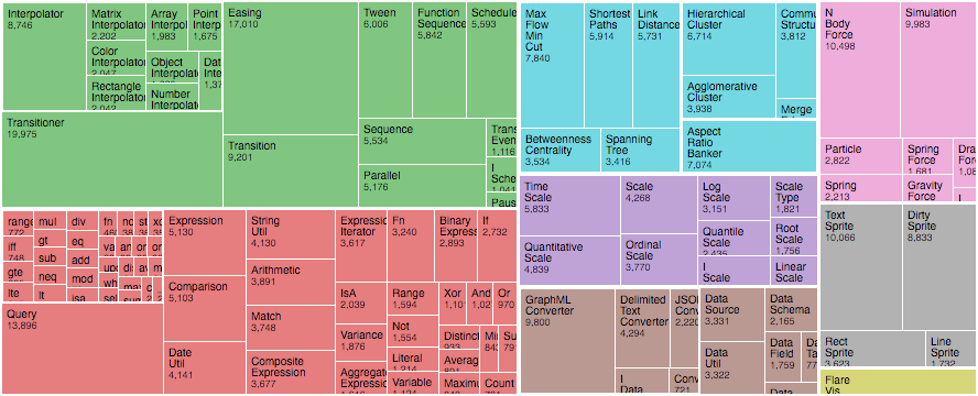
Treemaps are most often used for presenting budgets and other relative sizes. Like in this interactive example of a government budget from 2016.
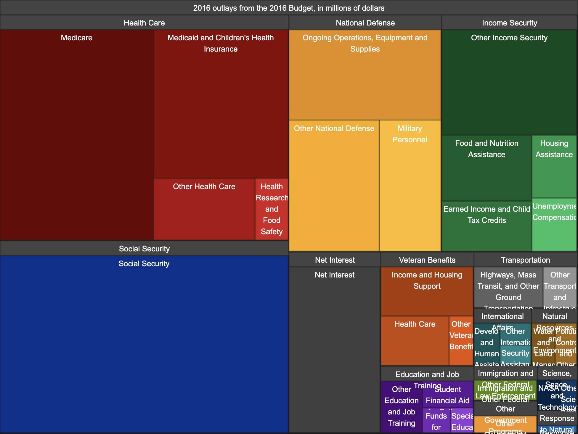
You can see at a glance most of the money goes to social security, then health care, which is split between medicaid, children’s health, etc.
Treemaps are great for recursive data like that.
Using a D3 treemap to generate art with React
We wanted to play with treemaps per a reader’s request, but couldn’t find an interesting dataset to visualize. Generating data was the solution. Parametrizing it with sliders, pure icing on the cake.
Also I was curious how close we can get
3 pieces have to work together to produce an interactive piece of art:
- A recursive rendering component
- A function that generates treemappable data
- Sliders that control inputs to the function
A recursive rendering component
Treemaps are recursive square subdivisions. They come with a bunch of tiling algorithms, the most visually stunning of which is the squarified treemaps algorithm described in 2000 by Dutch researchers.
What is it with Dutch people and neat squares
While beautiful, the squarified treemaps algorithm did not look like a Mondrian.
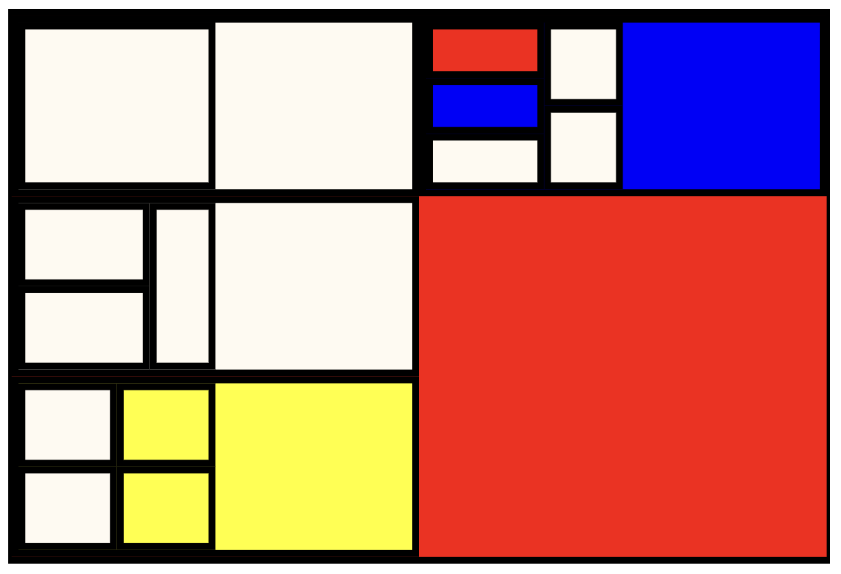
Squarified treemap of our Mondrian function
Subtle difference, I know, but squarified treemaps are based on the golden ratio and Piet Mondrian’s art does not look like that. We used the d3.treemapBinary algorithm instead. It aims to create a balanced binary tree.
main <Mondrian> component
// src/Mondrian.js

const Mondrian = ({ x, y, width, height, data }) => {
  const treemap = d3
    .treemap()
    .size([width, height])
    .padding(5)
    .tile(d3.treemapBinary);

  const root = treemap(
    hierarchy(data)
      .sum(d => d.value)
      .sort((a, b) => 0.5 - Math.random())
  );

  return (
    <g transform={`translate(${x}, ${y})`}>
      <MondrianRectangle node={root} />
    </g>
  );
};
The <Mondrian> component takes some props and instantiates a new treemap generator. We could’ve wrapped this in a useMemo call for better performance, but it seemed fast enough.
We set the treemap’s size() from width and height props, a guessed padding() of 5 pixels, and a tiling algorithm.
This creates a treemap() generator – a method that takes data and returns that same data transformed with values used for rendering.
The generator takes a d3-hierarchy, which is a particular data format shared by all hierarchical rendering generators in the D3 suite. Rather than build it ourselves, we feed our source data into the hierarchy() method. That cleans it up for us
We need the sum() method to tell the hierarchy how to sum up the values of our squares, and we use random sorting because that produced nicer results.
a <MondrianRectangle> component for each square
We render each level of the resulting treemap with a <MondrianRectangle> component.
// src/Mondrian.js

const MondrianRectangle = ({ node }) => {
  const { x0, y0, x1, y1, children } = node,
    width = x1 - x0,
    height = y1 - y0;

  return (
    <>
      <rect
        x={x0}
        y={y0}
        width={width}
        height={height}
        style={
          fill: node.data.color,
          stroke: "black",
          strokeWidth: 5
        }
        onClick={() => alert(`This node is ${node.data.color}`)}
      />
      {children &&
        children.map((node, i) => <MondrianRectangle node={node} key={i} />😉}
    </>
  );
};
Each rectangle gets a node prop with a bunch of useful properties.
-
x0, y0defines the top left corner -
x1, y1is the bottom right corner -
childrenare the child nodes from our hierarchy
We render an SVG <rect> component as the square representing this node. Its children we render by looping through the children array and recursively rendering a <MondrianRectangle> component for each.
The onClick is there just to show how you might make these interactive
You can use this same principle to render any data with a treemap.
A Mondrian data generator method
We moved the generative art piece into a custom useMondrianGenerator hook. Keeps our code cleaner 
// src/App.js

let mondrian = useMondrianGenerator({
  redRatio,
  yellowRatio,
  blueRatio,
  blackRatio,
  subdivisions,
  maxDepth,
});
The method takes a bunch of arguments that act as weights on randomly generated parameters. Ideally we’d create a stable method that always produces the same result for the same inputs, but that proved difficult.
As mentioned earlier, generative art is hard so this method is gnarly.
Weighed random color generator
We start with a weighed random generator.
// src/useMondrianGenerator.js

// Create weighted probability distribution to pick a random color for a square
const createColor = ({ redRatio, blueRatio, yellowRatio, blackRatio }) => {
  const probabilitySpace = [
    ...new Array(redRatio * 10).fill('red'),
    ...new Array(blueRatio * 10).fill('blue'),
    ...new Array(yellowRatio * 10).fill('yellow'),
    ...new Array(blackRatio * 10).fill('black'),
    ...new Array(
      redRatio * 10 + blueRatio * 10 + yellowRatio * 10 + blackRatio * 10
    ).fill('#fffaf1'),
  ];

  return d3.shuffle(probabilitySpace)[0];
};
createColor picks a color to use for each square. It takes desired ratios of different colors and uses a trick I discovered in college. There are probably better ways to create a [weighed random method, but this works well and is something I can understand.
You create an array with the amount of values proportional to the probabilities you want. If you want red to be twice as likely as blue , you’d use an array like [red, red, blue] .
Pick a random element from that array and you get values based on probabilities.
The result is a createColor method that returns colors in the correct ratio without knowing context of what’s already been picked and what hasn’t.
generating mondrians
The useMondrianGenerator hook itself is pretty long. I’ll explain in code comments so it’s easier to follow along
// src/useMondrianGenerator.js

// Takes inputs and spits out mondrians
function useMondrianGenerator({
  redRatio,
  yellowRatio,
  blueRatio,
  blackRatio,
  subdivisions,
  maxDepth,
}) {
  // useMemo helps us avoid recalculating this all the time
  // saves computing resources and makes the art look more stable
  let mondrian = useMemo(() => {
    // calculation is wrapped in a method so we can use recursion
    // each level gets the current "value" that is evenly split amongst children
    // we use depth to decide when to stop
    const generateMondrian = ({ value, depth = 0 }) => {
      // each level gets a random number of children based on the subdivisions argument
      const N = Math.round(1 + Math.random() * (subdivisions * 10 - depth));

      // each node contains:
      // its value, used by treemaps for layouting
      // its color, used by <MondrianRectangle> for the color
      // its children, recursively generated based on the number of children
      return {
        value,
        color: createColor({
          redRatio,
          yellowRatio,
          blueRatio,
          blackRatio,
        }),
        children:
          // this check helps us stop when we need to
          // d3.range generates an empty array of length N that we map over to create children
          depth < maxDepth * 5
            ? d3.range(N).map(_ =>
                generateMondrian({
                  value: value / N,
                  depth: depth + 1,
                })
              )
            : null,
      };
    };

    // kick off the recursive process with a value of 100
    return generateMondrian({
      value: 100,
    });
    // regenerate the base data when max depth or rate of subdivisions change
  }, [maxDepth, subdivisions]);

  // Iterate through all children and update colors when called
  const updateColors = node => ({
    ...node,
    color: createColor({
      redRatio,
      yellowRatio,
      blueRatio,
      blackRatio,
    }),
    children: node.children ? node.children.map(updateColors) : null,
  });

  // useMemo again helps with stability
  // We update colors in our dataset whenever those ratios change
  // depending on subdivisions and maxDepth allows the data update from that earlier useMemo to propagate
  mondrian = useMemo(() => updateColors(mondrian), [
    redRatio,
    yellowRatio,
    blueRatio,
    blackRatio,
    subdivisions,
    maxDepth,
  ]);

  return mondrian;
}
And that creates mondrian datasets based on inputs. Now we just need the inputs.
Sliders for function inputs
Thanks to React Hooks, our sliders were pretty easy to implement. Each controls a ratio for a certain value fed into a random data generation method.
Take the slider that controls the ratio of red squares for example.
It starts life as a piece of state in the <App> component.
// src/App.js

const [redRatio, setRedRatio] = useState(0.2);
redRatio is the value, setRedRatio is the value setter, 0.2 is the initial value.
Render the slider as a <Range> component.
// src/App.js

<Range name="red" value={redRatio} onChange={setRedRatio} />
Value comes from our state, update state on change.
The <Range> component itself looks like this:
// src/App.js

const Range = ({ name, value, onChange }) => {
  return (
    <div style={ display: "inline-block" }>
      {name}
      <br />
      <input
        type="range"
        name={name}
        min={0}
        max={1}
        step={0.1}
        value={value}
        onChange={event => onChange(Number(event.target.value))}
      />
    </div>
  );
};
HTML has built-in sliders so we don’t have to reinvent the wheel. Render an input, give it a type="range" , set value from our prop, and parse the event value in onChange before feeding it back to setRedRange with our callback.
Now each time you move that slider, it triggers a re-render, which generates a new Mondrian from the data.
Conclusion
In conclusion: generative art is hard, Piet Mondrian was brillianter than he seems, and D3 treemaps are great fun.
Hope you enjoyed this as much as I did
Cheers,
~Swizec