MODULE 8 INTRODUCTION
We’ve spent a decent amount of time working with some of React’s core Hooks. We’ve seen how the useState , useEffect , and useReducer Hooks work. We’ve even created our custom Hooks as well - useQuery and useMutation . Though our custom Hooks work well, there’s probably a more robust way to conduct GraphQL requests.
Going forward, we’ll be using Apollo Client to manage our GraphQL API requests. Apollo Client has intelligent caching and is being used in production applications today. React Apollo is the React implementation of Apollo Client.
In this module, we’ll:
- Create our own Apollo Client with the help of the
apollo-boostpackage. - Use the
useQueryanduseMutationHooks fromreact-apollo. - Autogenerate type definitions from our GraphQL Schema with the help of the Apollo CLI.
CREATING OUR APOLLO CLIENT
React Apollo v3 introduces a new modular structure where individual packages can be installed to use React Apollo which helps reduce bundle size when compared with installing the entire
react-apollopackage.In the current and upcoming videos, we install and use the entire
react-apolloumbrella library. In the documentation for this lesson, upcoming lessons, and for part 2 of the course - we’ll install and use the Hooks variation ofreact-apollo-@apollo/react-hooks.
We aim to create our Apollo client, install React Apollo, and use React Apollo’s Hooks to mutate and query data.
To create and use an Apollo client in React, Apollo expects us to install a few separate libraries. There are two separate approaches with setting up our Apollo Client - the simple approach and the more advanced approach.
The more advanced approach requires us to install certain specific libraries, such as the apollo-client library that provides access to the ApolloClient function constructor responsible in initializing the Apollo Client, a library to help with implementing caching, another library to help construct how we want to perform data fetching, and so on. Though we’re able to do this, Apollo encourages us to go through the more simple approach unless we need more unique customization.
The simple approach to setting up an Apollo client is using the Apollo Boost package which comes with pre-built configuration for caching, state management, and error handling. To get started, we’ll install three libraries:
-
apollo-boost: The configuration package that contains everything we need to set up an Apollo Client. -
@apollo/react-hooks: The Hooks specific library of React Apollo to be used in React to help interact with our GraphQL API. -
graphql: The GraphQL JavaScript library which will be needed to help parse our GraphQL queries.
npm install apollo-boost @apollo/react-hooks graphql
React Apollo v3 introduces a new modular structure where individual packages can be installed to use React Apollo. Since in our case, we’re only interested in using the new Hooks variation of React Apollo, we recommend installing
@apollo/react-hooks. You can read more about the different modular packages that React Apollo provides in React Apollo’s documentation.
apollo-boost and React Apollo are TypeScript libraries themselves so we won’t have to install additional type declaration files for them. For graphql however, we’ll need to install the accompanying types definitions.
npm install @types/graphql --save
APOLLOCLIENT
We’ll create our Apollo client in the root src/index.tsx file which will allow us to connect our client with the entire React application. In our src/index.tsx file, we’ll import the ApolloClient constructor from the apollo-boost library.
client/src/index.tsx
import ApolloClient from "apollo-boost";
We’ll create a new Apollo client with the ApolloClient constructor and assign it to a client const variable.
import React from "react";
import { render } from "react-dom";
import ApolloClient from "apollo-boost";
import { Listings } from "./sections";
import * as serviceWorker from "./serviceWorker";

const client = new ApolloClient();

render(
  <Listings title="The Listings Section Component!" />,
  document.getElementById("root")
);

// If you want your app to work offline and load faster, you can change
// unregister() to register() below. Note this comes with some pitfalls.
// Learn more about service workers: https://bit.ly/CRA-PWA
serviceWorker.unregister();
The ApolloClient constructor takes a configuration object where we can specify or apply some changes to the already pre-built configuration Apollo Boost provides. Currently, the only thing we need to specify is a uri field which is the reference to the GraphQL API endpoint we want to interact with. We’ll specify the uri field and give a value of the target location of our api - http://localhost:9000/api .
If we recall, we’ve already set up a proxy in our React application to proxy URLs like http://localhost:9000/api to /api , so we’ll simply provide a value of /api in the uri field of our ApolloClient constructor.
import React from "react";
import { render } from "react-dom";
import ApolloClient from "apollo-boost";
import { Listings } from "./sections";
import * as serviceWorker from "./serviceWorker";

const client = new ApolloClient({
  uri: "/api"
});

render(
  <Listings title="The Listings Section Component!" />,
  document.getElementById("root")
);

// If you want your app to work offline and load faster, you can change
// unregister() to register() below. Note this comes with some pitfalls.
// Learn more about service workers: https://bit.ly/CRA-PWA
serviceWorker.unregister();
That’s all it takes to create an Apollo client with Apollo Boost.
APOLLOPROVIDER
We’ll now need to connect our Apollo client with our React application. This is where we’ll need to import the ApolloProvider component from @apollo/react-hooks .
client/src/index.tsx
import { ApolloProvider } from "@apollo/react-hooks";
ApolloProvider can wrap our React app and make our Apollo client available as context everywhere in our app. In our instance, we’ll wrap the only component we have, <Listings> , with <ApolloProvider> .
We’ll pass our Apollo client to the client prop the <ApolloProvider> component expects.
client/src/index.tsx
import React from "react";
import { render } from "react-dom";
import ApolloClient from "apollo-boost";
import { ApolloProvider } from "@apollo/react-hooks";
import { Listings } from "./sections";
import * as serviceWorker from "./serviceWorker";

const client = new ApolloClient({
  uri: "/api"
});

render(
  <ApolloProvider client={client}>
    <Listings title="TinyHouse Listings" />
  </ApolloProvider>,
  document.getElementById("root")
);

// If you want your app to work offline and load faster, you can change
// unregister() to register() below. Note this comes with some pitfalls.
// Learn more about service workers: https://bit.ly/CRA-PWA
serviceWorker.unregister();
Our application is now prepared to start using React Apollo to make our GraphQL Requests!
REACT APOLLO HOOKS
We have the Apollo client created and available everywhere in our app. Let’s see how we can import and use the Hooks from React Apollo in our <Listings> component.
In the <Listings> component, we’ll now import the useQuery and useMutation Hooks from the React Apollo library instead of our own local src/lib/ folder.
client/src/sections/Listings/Listings.tsx
import { useQuery, useMutation } from "@apollo/react-hooks";
We’ll observe that the use of useQuery and useMutation in the <Listings> component doesn’t throw any errors except for perhaps in how we pass in the GraphQL document nodes. That is because we’ve built our custom useQuery and useMutation Hooks to resemble very closely with how the Hooks from React Apollo work!
Here’s a summary of how React Apollo’s useQuery and useMutation Hooks behave.
- The
useQueryanduseMutationHooks take two arguments, the query or mutation in question and anoptionsobject. - The
useQueryanduseMutationHooks accept two type variables, one to represent the shape of data to be returned and the other to represent the shape of variables that can be passed in. - The
useQueryHook returns a series of fields within an object recognized as theQueryResult.data,loading,error, and arefetch()function are some of the fields within theQueryResult. TheQueryResultobject also returns a bunch of other fields like the Apolloclientitself, thenetworkStatusof the request, afetchMore()function, and so on. - The
useMutationHook returns a tuple of two values. The first value being the mutation function itself and the second value being the mutation result values which are similar to the result returned inuseQuery.
Though the way we’ve used our custom useQuery and useMutation Hooks mimic that of React Apollo, there are still a few changes we’ll need to make.
GQL
The first change we’ll make is how we pass in the GraphQL document nodes to our query and mutation requests. With our simple server.fetch() function, we were able to construct and use GraphQL documents that are strings. The Hooks in React Apollo expect our GraphQL documents to be constructed as trees.
We can have our GraphQL documents be created as abstract trees with the help of the gql template tag just like we’ve seen in our Node server application. The gql template tag is available to us from the apollo-boost package.
We’ll import the gql tag from the apollo-boost package in the Listings.tsx file.
client/src/sections/Listings/Listings.tsx
import { gql } from "apollo-boost";
In our GraphQL query documents, we’ll use the gql tag function to have our strings be parsed as GraphQL Abstract Syntax Trees.
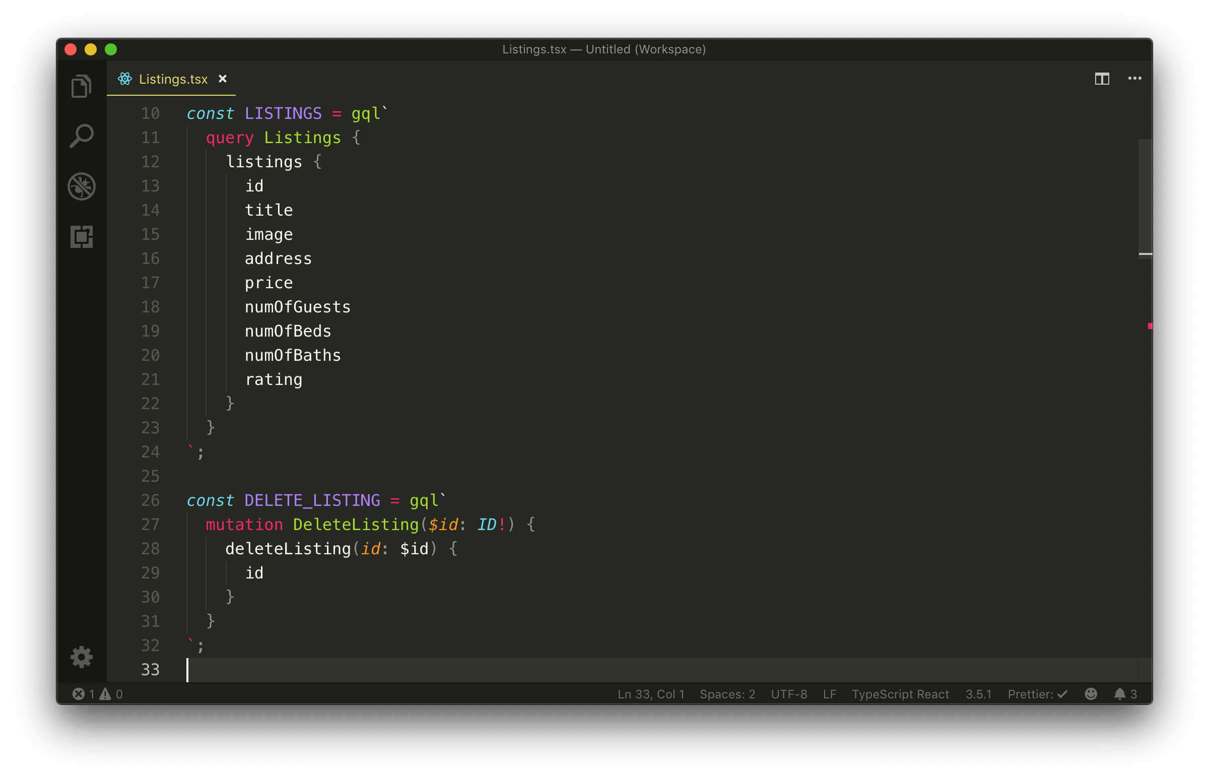
client/src/sections/Listings/Listings.tsx
const LISTINGS = gql`
  query Listings {
    listings {
      id
      title
      image
      address
      price
      numOfGuests
      numOfBeds
      numOfBaths
      rating
    }
  }
`;

const DELETE_LISTING = gql`
  mutation DeleteListing($id: ID!) {
    deleteListing(id: $id) {
      id
    }
  }
`;
With VSCode’s Apollo GraphQL extension, we’ll now get appropriate syntax highlighting for all our GraphQL documents created with the gql tag!
VARIABLES
The next change we’ll make is how we pass in variables to the request function returned from the useMutation Hook. Before, we simply provided an object of key/value pairs for every field. For the Hooks in React Apollo, we’ll need to specify an options object that has a variables field within that contains the variables needed in the request. This is because variables is just one option that can be accepted by the useQuery and useMutation Hooks.
client/src/sections/Listings/Listings.tsx
  const handleDeleteListing = async (id: string) => {
    await deleteListing({ variables: { id } });
    refetch();
  };
With the changes made, our Listings.tsx file will look like the following:
client/src/sections/Listings/Listings.tsx
import React from "react";
import { gql } from "apollo-boost";
import { useQuery, useMutation } from "@apollo/react-hooks";
import {
DeleteListingData,
DeleteListingVariables,
ListingsData
} from "./types";
const LISTINGS = gql`
query Listings {
listings {
id
title
image
address
price
numOfGuests
numOfBeds
numOfBaths
rating
}
}
`;
const DELETE_LISTING = gql`
mutation DeleteListing($id: ID!) {
deleteListing(id: $id) {
id
}
}
`;
interface Props {
title: string;
}
export const Listings = ({ title }: Props) => {
const { data, loading, error, refetch } = useQuery<ListingsData>(LISTINGS);
const [
deleteListing,
{ loading: deleteListingLoading, error: deleteListingError }
] = useMutation<DeleteListingData, DeleteListingVariables>(DELETE_LISTING);
const handleDeleteListing = async (id: string) => {
await deleteListing({ variables: { id } });
refetch();
};
const listings = data ? data.listings : null;
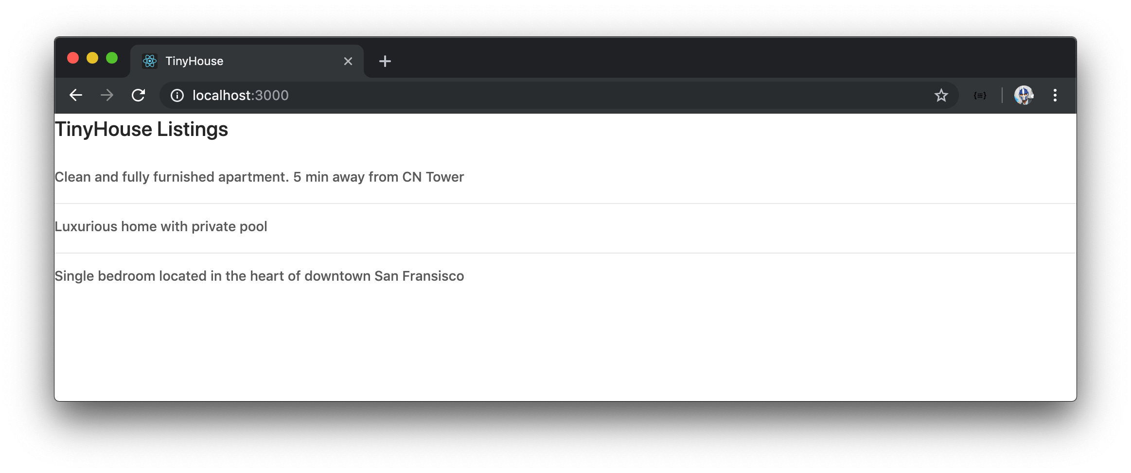
const listingsList = listings ? (
<ul>
{listings.map(listing => {
return (
<li key={listing.id}>
{listing.title}{" "}
<button onClick={() => handleDeleteListing(listing.id)}>
Delete
</button>
</li>
);
})}
</ul>
) : null;
if (loading) {
return <h2>Loading...</h2>;
}
if (error) {
return <h2>Uh oh! Something went wrong - please try again later :(</h2>;
}
const deleteListingLoadingMessage = deleteListingLoading ? (
<h4>Deletion in progress...</h4>
) : null;
const deleteListingErrorMessage = deleteListingError ? (
<h4>
Uh oh! Something went wrong with deleting :(. Please try again soon.
</h4>
) : null;
return (
<div>
<h2>{title}</h2>
{listingsList}
{deleteListingLoadingMessage}
{deleteListingErrorMessage}
</div>
);
};
That’s it! The useQuery Hook for React Apollo allows us to query listings on page load.

The useMutation Hook allows us to delete a listing from the list of listings. By using the refetch() function given to us by the useQuery Hook, we’re able to refetch the listings query after a deletion is made.
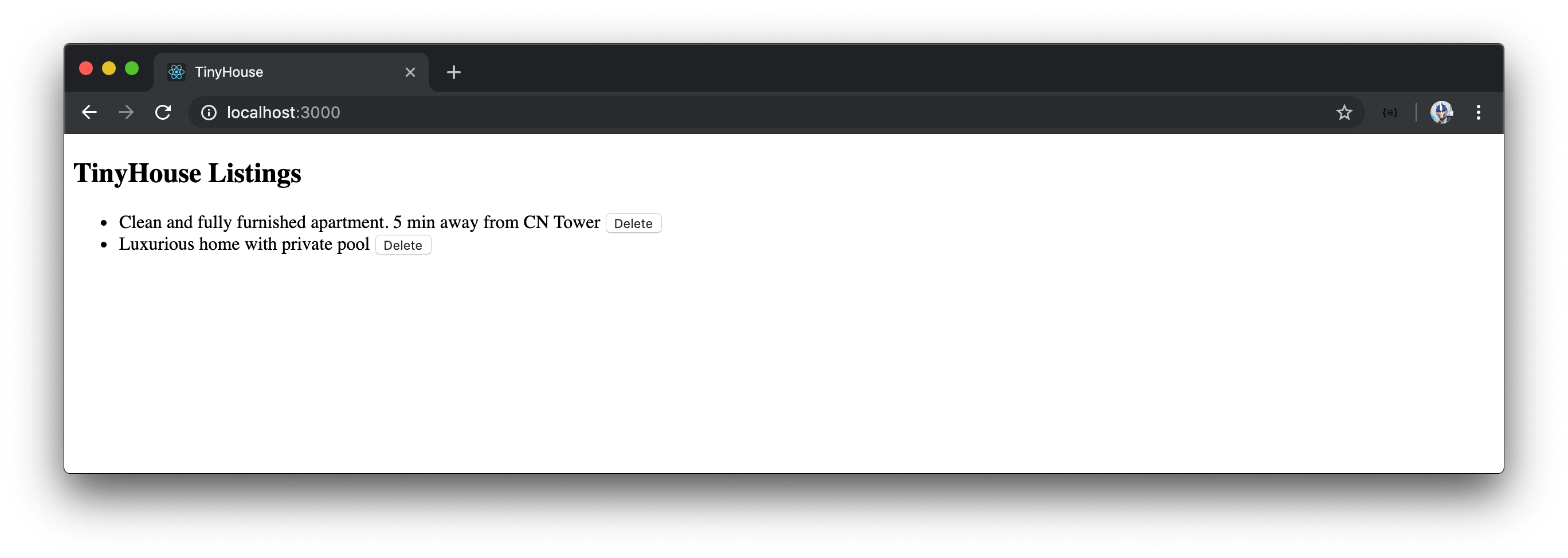
The loading and error fields we receive from our Hooks dictate how we show information in the UI.
Since we’re using the official React Apollo library, we can now remove the entire src/lib/ folder that contained the custom server.fetch() function, the custom useQuery Hook, and the custom useMutation Hook that we don’t plan to use any longer.
AUTOGENERATED TYPES WITH APOLLO CLI
In the current and last module, we’ve come to recognize how powerful Hooks can be when it comes to making GraphQL queries and mutations. In this module, we’ve brought in React Apollo and used React Apollo’s useQuery and useMutation Hooks. With either the custom Hooks or React Apollo Hooks, we’ve passed in custom type definitions we’ve created to help shape the type of data and variables we are to receive and use in our GraphQL requests.
We’ve created the custom typings for our requests in a types.ts file located within the src/sections/Listings folder.
export interface Listing {
  id: string;
  title: string;
  image: string;
  address: string;
  price: number;
  numOfGuests: number;
  numOfBeds: number;
  numOfBaths: number;
  rating: number;
}

export type ListingsData = {
  listings: Listing[];
};

export interface DeleteListingData {
  deleteListing: Listing;
}

export interface DeleteListingVariables {
  id: string;
}
In the Listings/types.ts file, we’ve created custom type definitions for our listings query and deleteListing mutation by surveying the GraphQL API and schema.
In a large scale production application, we could have dozens and dozens of GraphQL documents for all the GraphQL requests we might have in an app. First off, it’ll be a little tedious having to create the typings for all of these documents. Second, a breaking change in the server will make finding and updating our client types a little difficult. If we think about it, our GraphQL API already has it’s own types . Wouldn’t be cool if we can just leverage those types automatically?
We can with the help of code generators! The community has created plenty GraphQL code generators aimed at addressing this point. To name a few, there is the:
Though these tools have differences, they all allow for generating client-side types from a GraphQL schema.
Among generating client-side types, GraphQL Code Generator allows for generating other code like server-side types, client-side components, etc.
GraphQL Code Generator and the Apollo CLI can help generate client-side types for many different languages like TypeScript, Swift, Java, C#, etc.
APOLLO CLI
The Apollo CLI is a robust command line interface that allows for a variety of different things such as schema validation, server compatibility checks, and the ability to generate static types. We’ll use the official Apollo CLI to generate static types from our GraphQL API.
To use the Apollo CLI, we’re able to install the apollo tooling globally or as an application dependency. What we’ll like to do instead is set up scripts in the package.json file of our app and run the apollo tooling commands with the npx command.
There are two commands we’ll need to run to be able to generate static types from our schema.
- We first need to download our GraphQL schema and save it in our project for the Apollo CLI to be able to generate types.
- We can then generate the static types of our requests from our schema.
We’ll set up both of these steps as two separate script commands in our application’s package.json file. We’ll label these scripts codegen:schema and codegen:generate .
{
  // ...
  "scripts": {
    // ...
    "codegen:schema": "",
    "codegen:generate": ""
  }
  // ...
}
To download the schema, we’ll need to run the apollo client:download-schema command and specify the options we would want. In our case, we’ll specify the single minimum option we need - the endpoint and pass in the value of our local GraphQL endpoint ( http://localhost:9000/api ).
{
  // ...
  "scripts": {
    // ...
    "codegen:schema": "npx apollo client:download-schema --endpoint=http://localhost:9000/api",
    "codegen:generate": ""
  }
  // ...
}
For more detail in all the different
apolloCLI commands and options, be sure to check out the Apollo CLI README.md.
We’ll run the newly created codegen:schema script in our command line.
client $: npm run codegen:schema
After a brief period, we’ll notice success messages that state Loading Apollo Project and Saving schema to schema.json .
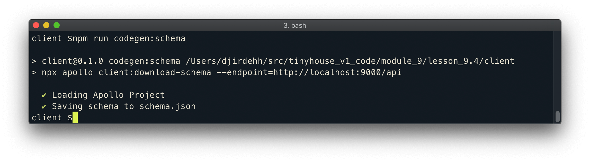
If we look at the root of our client/ project directory, we’ll notice a schema.json file be generated that represents our entire GraphQL schema!
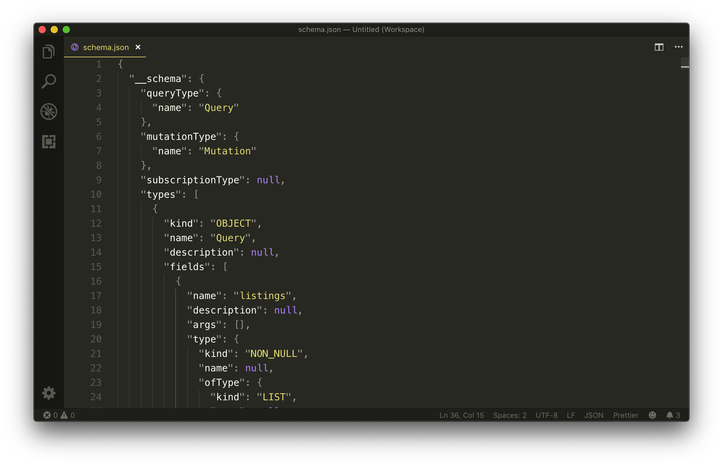
With the GraphQL schema available in our app, we can now look to generate the static types for the listings query and deleteListing mutation in our GraphQL API. This can be done with the Apollo CLI client:codegen command.
apollo client:codegen
We’ll specify a few options as we set up the script to run the client:codegen command.
The first option we’ll add is the --localSchemaFile option, which is used to specify the path to the schema file in our client/ directory. Since the schema.json file is in the root of our project, the value for the --localSchemaFile option will be schema.json .
apollo client:codegen --localSchemaFile=schema.json
The second option we’ll specify is the --includes option which is used to state the files that contain the GraphQL operations we’ll want to generate static types for. Since all of our GraphQL requests live in TypeScript files within our src/ folder, we’ll want to declare a search for TypeScript files in the src/ folder. Here we’ll specify a value of src/**/*.tsx which entails looking through our entire src/ folder and for any files that have the .tsx file extension.
The search value in the
--includesoption uses the Glob pattern to match the intended file paths.
apollo client:codegen --localSchemaFile=schema.json --includes=src/**/*.tsx
The final option we’ll specify is the —-target option which is required and allows us to specify which code generator we’d like to use. swift , flow , scala are all different options but in our case we’re interested in the typescript option.
apollo client:codegen --localSchemaFile=schema.json --includes=src/**/*.tsx --target=typescript
We’ll have the above apollo command as part of the codegen:generate script command in our application.
{
  // ...
  "scripts": {
    // ...
    "codegen:schema": "npx apollo client:download-schema --endpoint=http://localhost:9000/api",
    "codegen:generate": "npx apollo client:codegen --localSchemaFile=schema.json --includes=src/**/*.tsx --target=typescript"
  }
  // ...
}
We can now run the newly created codegen:generate command in our terminal.
client $: npm run codegen:generate
Upon success, we’ll see the Loading Apollo Project message followed by Generating query files with 'typescript' target - wrote 3 files .

By default, the Apollo code generator creates static typings for the GraphQL documents it finds in a __generated__/ folder located within the module (i.e. folder) it found those documents. If we take a look at the autogenerated src/sections/Listings/__generated__/ folder, we can notice files were created for each GraphQL request - DeleteListing.ts and Listings.ts .
client/
  src/
    sections
      Listings/
        __generated__/
          DeleteListing.ts
          Listings.ts
      // ...
    // ...
In the Listings/__generated__/DeleteListing.ts file, we can see interfaces for the data the deleteListing mutation is expected to return and the variables the deleteListing mutation can accept!
client/src/sections/Listings/**generated**/DeleteListing.ts
/* tslint:disable */
/* eslint-disable */
// This file was automatically generated and should not be edited.

// ====================================================
// GraphQL mutation operation: DeleteListing
// ====================================================

export interface DeleteListing_deleteListing {
  __typename: "Listing";
  id: string;
}

export interface DeleteListing {
  deleteListing: DeleteListing_deleteListing;
}

export interface DeleteListingVariables {
  id: string;
}
Similarly, in the Listings/__generated__/Listing.ts file, we can see the interface for the data the listings query is expected to return.
client/src/sections/Listings/**generated**/Listings.ts
/* tslint:disable */
/* eslint-disable */
// This file was automatically generated and should not be edited.

// ====================================================
// GraphQL query operation: Listings
// ====================================================

export interface Listings_listings {
  __typename: "Listing";
  id: string;
  title: string;
  image: string;
  address: string;
  price: number;
  numOfGuests: number;
  numOfBeds: number;
  numOfBaths: number;
  rating: number;
}

export interface Listings {
  listings: Listings_listings[];
}
Let’s begin to use the Apollo generated types. In our Listings.tsx component file, we’ll import the appropriate types from each generated file. Since the Listings namespace is used to represent the component, we’ll import the Listings data interface as ListingsData to prevent any naming conflict. For consistency, we’ll do the same for the DeleteListing data interface as well. We’ll also remove the imports being made from our locally created types.ts file.
client/src/sections/Listings/Listings.tsx
import { Listings as ListingsData } from "./__generated__/Listings";
import {
  DeleteListing as DeleteListingData,
  DeleteListingVariables
} from "./__generated__/DeleteListing";
Our Hooks are already consuming type variables with the same names as the ones that have been imported so there’s nothing else left for us to do. Our app now works just as before.

Since we’re using the autogenerated types the Apollo CLI gives us, we can remove the custom types.ts file we created before in the Listings/ folder.
If our server was to ever change the schema, all we’ll need to do is regenerate the schema.json file that is to be kept in our application and then regenerate the static type definitions for our GraphQL requests. Amazing!
We’ll note two things before we close this lesson.
For the Apollo code generator to pick up the GraphQL documents and make static types that reference them, it requires us to name all our GraphQL requests . If we attempt to run our static type generation command without naming our documents, Apollo Codegen will throw an error.
// named query - okay
const LISTINGS = gql`
  query Listings {
    listings {
      id
    }
  }
`;

// unnamed query - error
const LISTINGS = gql`
  query {
    listings {
      id
    }
  }
`;
In addition to creating static type definitions for each GraphQL document, Apollo Codegen also creates a globalTypes.ts file kept in the root of the project under a __generated__/ folder of its own. The globalTypes.ts file keeps a reference of all enum and input object types that can exist in our GraphQL API. Since we don’t have any in our existing application, our globalTypes.ts file at this moment is empty.
client/**generated**/globalTypes.ts
/* tslint:disable */
/* eslint-disable */
// This file was automatically generated and should not be edited.

//==============================================================
// START Enums and Input Objects
//==============================================================

//==============================================================
// END Enums and Input Objects
//==============================================================
And that’s it! The useQuery and useMutation Hooks in our app now uses the statically generated types that Apollo Codegen has generated. We won’t be making any more changes to how our component makes our GraphQL requests which concludes this module. In the next module, we’ll be taking a look at a React UI framework to help make presentable UI changes in our app.
MODULE 8 SUMMARY
In this module, we’ve introduced Apollo Client in our application and utilized the useQuery and useMutation Hooks available to us from the React Apollo library.
SRC/INDEX.TS
In the src/index.ts file, we create a new Apollo client with the ApolloClient constructor given to us from the apollo-boost package. apollo-boost the approach to setting up an Apollo client with a predefined configuration and setup.
The only option we specify in the ApolloClient constructor is the uri option where we define the URL endpoint of our GraphQL API. We import the <ApolloProvider> component wrapper from React Apollo and wrap our <Listings> component with <ApolloProvider> . This helps us pass the Apollo client as the client prop of ApolloProvider which provides the Apollo client in our <Listings> component as part of context.
client/src/index.tsx
import React from "react";
import { render } from "react-dom";
import ApolloClient from "apollo-boost";
import { ApolloProvider } from "@apollo/react-hooks";
import { Listings } from "./sections";
import * as serviceWorker from "./serviceWorker";

const client = new ApolloClient({
  uri: "/api"
});

render(
  <ApolloProvider client={client}>
    <Listings title="TinyHouse Listings" />
  </ApolloProvider>,
  document.getElementById("root")
);

// If you want your app to work offline and load faster, you can change
// unregister() to register() below. Note this comes with some pitfalls.
// Learn more about service workers: https://bit.ly/CRA-PWA
serviceWorker.unregister();
<LISTINGS>
In the <Listings> component, we’ve imported the useQuery and useMutation Hooks from React Apollo.
client/src/sections/Listings/Listings.tsx
import { useQuery, useMutation } from "@apollo/react-hooks";
The functionality of how we use React Apollo’s useQuery and useMutation Hooks is similar to how we’ve done in the use of our custom useQuery and useMutation Hooks.
The other significant change we’ve made is instead of creating and using custom types to describe the shape of data and variables in our GraphQL requests, we use the Apollo CLI tooling to auto-generate these types from our GraphQL Schema. In the package.json file, we’ve created the codegen:schema and codegen:generate commands:
client/package.json
    "codegen:schema": "npx apollo client:download-schema --endpoint=http://localhost:9000/api",
    "codegen:generate": "npx apollo client:codegen --localSchemaFile=schema.json --includes=src/**/*.tsx --target=typescript"
- The
codegen:schemacommand creates aschema.jsonfile that describes the shape of our GraphQL schema and places it in the root of our client project. - The
codegen:generatecommand autogenerates the types of our GraphQL requests and places them in a__generated__/folder within the folder the requests live.
We reference the autogenerated types in our <Listings> component and use them for each of our GraphQL requests.
MOVING FORWARD
Despite all the work we’ve done, we haven’t made any presentable UI improvements to our <Listings> component. To make our application look better, we’ll be introducing and using a React UI framework in the next module.
MODULE 9 INTRODUCTION
We’ve almost finished Part I of the course. Amazing! In this module, we’ll see how we can make our app look a little bit nicer.
In particular, we’ll:
- Talk about UI and CSS Frameworks and see how they can help us build a presentable UI.
- Introduce and use the Ant Design UI framework to make our client look a lot nicer.
UI FRAMEWORKS AND ANT DESIGN
You may have noticed that though our app functionally works well, it doesn’t look great. This is due to us not introducing any styling (CSS) whatsoever. Though we could style our app purely through custom means, we’ll employ and use a UI framework to help us achieve this.
UI/CSS FRAMEWORK
Writing, creating, and producing robust CSS code for large applications take a lot of work . Presentation, appearance, responsiveness, accessibility, and structure are a lot of things that need to be kept in mind when building front-end code.
This is where UI/CSS frameworks often come in. UI/CSS Frameworks are packages containing pre-written, standardized, and often well-tested template and CSS code. They help speed up development, often-times provide a grid layout, and help enforce good web design. With that said, there are some disadvantages to using them. UI/CSS frameworks restrict the ability for us to customize and edit prepared styles and set-up, increase bundle size of an application by introducing a lot more code, and often requires a little time for one to get used to.
Examples of popular CSS/UI frameworks are:
Though the above libraries do a great job, their native structure is simple HTML and CSS. If we wanted to use some of this prepared code, we would essentially look to create our own React components that can be reused elsewhere.
With that said, React UI frameworks now exist that achieves this for us. For example, we could use libraries like:
- https://react-bootstrap.github.io/
- https://www.npmjs.com/package/react-bulma-components
- https://react.semantic-ui.com/
The benefits of these libraries are that a large number of components have already been prepared for us. When the library is available in our app, we can simply import these components and use them directly.
ANT DESIGN
In this course, we’ll be using a React UI framework known as Ant Design. Ant Design is a robust UI framework with practically every component we can think of needing/or using in an application. We love Ant Design’s styling and aesthetics and every component we’ve come across looks and appears beautiful. From simple components like menus, badges, alerts, buttons to more complicated components like date pickers, tables, image uploaders and so on, it’s an incredibly well polished library!
There are some issues with working with Ant Design.
- The library is opinionated and though customizations can be done, it’s a little tedious at times.
- Ant Design’s bundle size, when introduced and used in an application, is fairly large.
- There are a few components that aren’t the best suited for accessibility.
Bundle size and accessibility are both areas to be improved for Ant Design’s next official update - v4.
If you’re interested in picking a UI framework for a large production app, we encourage you to take some time to look through some of the pros and cons of many different options before making a choice.
For proof of concepts and what we intend to do, Ant Design works perfectly. With that said, a lot of the things we demonstrate when it comes to importing and using components from Ant Design can be relayed to any React UI framework you might like to use .
In the next lesson, we’ll install Ant Design and use some of their components to make our app appear more presentable.
STYLING WITH ANT DESIGN
In this lesson, we’ll introduce the Ant Design React UI framework and use some of the components from the Ant Design framework to make our client application look more presentable. The objective of this lesson isn’t to convey what certain components given to us by Ant Design are but more to convey how we can use a React UI framework to help improve the presentation of what we’ve built.
First and foremost, we’ll install the antd library into our client application.
client $: npm install antd
The antd library is built with TypeScript so we won’t have to install any additional type declaration files. When installed, we can begin to use the components that Ant Design provides.
The Ant Design documentation provides a detailed overview of all the different components Ant Design provides as well as the
propsthey accept and examples of their use. In this lesson, we’ll simply highlight and use a few certain components.
<LIST>
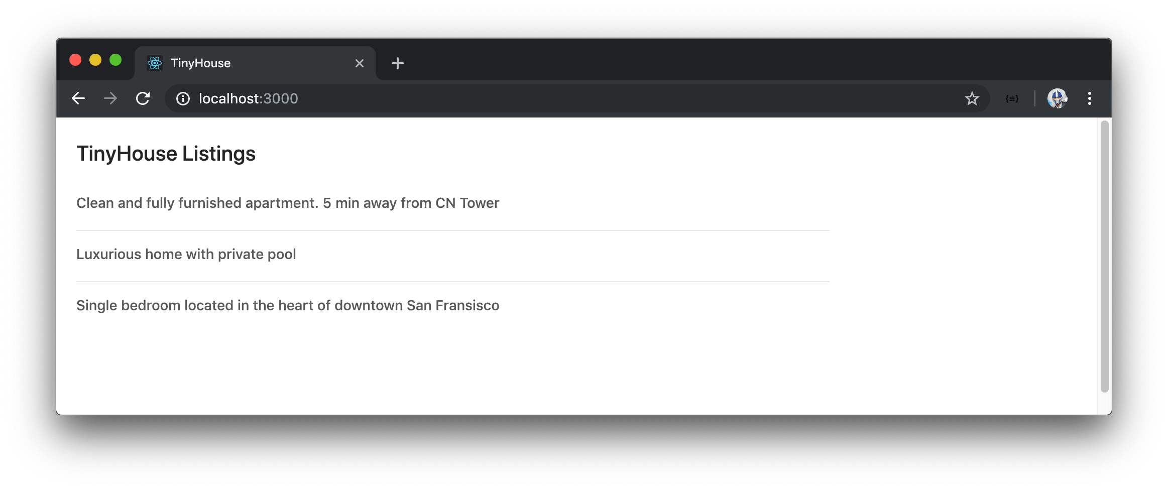
The first component we’ll use is Ant Design’s <List> component. We’ll use the <List> component to first render a list of titles from the listings data we retrieve from our GraphQL API.
We’ll import the List component module in our Listings.tsx file.
import { List } from "antd";
We’ll modify the listingsList constant variable we had before to now use Ant Design’s <List> component to render a list of elements. As we render the <List> component, we’ll use the component’s itemLayout , dataSource , and renderItem props.
Our listingsList constant in our <Listings> component will look like the following:
const listingsList = listings ? (
  <List
    itemLayout="horizontal"
    dataSource={listings}
    renderItem={listing => (
      <List.Item>
        <List.Item.Meta title={listing.title} />
      </List.Item>
    )}
  />
) : null;
- The
itemLayoutprop dictates the layout of how we want each list item to be rendered with which we’ve given a value of"horizontal". -
dataSourcetakes an array or collection of data that’ll help prepare the list. - The
renderItemprop is an example of the render props pattern that dictates how each list item is to be rendered. We’re using the child<List.Item>and<List.Item.Meta>components to render the title of each iterated listing.
The <Listings> component handleDeleteListing() method isn’t currently being used but we’ll use it again shortly.
Though at this moment we’ll be rendering the markup from Ant Design, we won’t see any CSS that Ant Design gives us. If we take a look at the "use in create-react-app " section of the Ant Design documentation we can that Ant Design expects us to import an accompanying CSS file from the installed antd library.
We’ll create an index.css file in a styles/ folder at the root of the src/ folder.
client/
  src/
    styles/
      index.css
    // ...
  // ...
In the index.css file, we’ll add the following @import to import the Ant Design stylesheet into our index.css file.
client/src/styles/index.css
@import "~antd/dist/antd.css";
In our src/index.tsx file, we can tell our index.tsx file to use the index.css file by simply importing it.
client/src/index.tsx
import "./styles/index.css";
The ability to simply import our stylesheet in our components can be done thanks to Webpack and the configuration made in create-react-app . This is an incredibly useful feature that allows us to create blocks of stylesheets for respective components. Since index.tsx is the root level “component”, applying styles here is applied to all children components as well.
The Ant Design documentation does also show the capability of ejecting the
create-react-appconfiguration and using the Ant Design’sbabel-plugin-importlibrary to allow for the importing of components with reduced CSS bundle sizes.In this course, we’ll keep things simple and introduce components from Ant Design just like we’ve done for the
<List>component.
Though we’re not there yet, when taking a look at our browser - we’ll see the markup and styling Ant Design’s <List> component gives us!
We’ll look to add some custom padding to our list of Listings before we further update the <List> component. We’ll create a styles/Listings.css file in the Listings/ folder to act as the stylesheet for the <Listings> component.
client/
  src/
    sections/
      Listings/
        styles/
          Listings.css
          //...
In the Listings.css file, we’ll introduce a .listings class and give it a margin of 20px as well as a max-width of 750px .
client/src/sections/Listings/styles/Listings.css
.listings {
  margin: 20px;
  max-width: 750px;
}
In our <Listings> component, we’ll import the newly created Listings.css stylesheet and specify the .listings class in the root <div> element of the component.
// ...
import "./styles/Listings.css";

// ...

export const Listings = ({ title }: Props) => {
  // ...

  return (
    <div className="listings">
      <h2>{title}</h2>
      {listingsList}
      {deleteListingLoadingMessage}
      {deleteListingErrorMessage}
    </div>
  );
};
If we take a look at our app, we can see the margin and max-width be applied to our list.
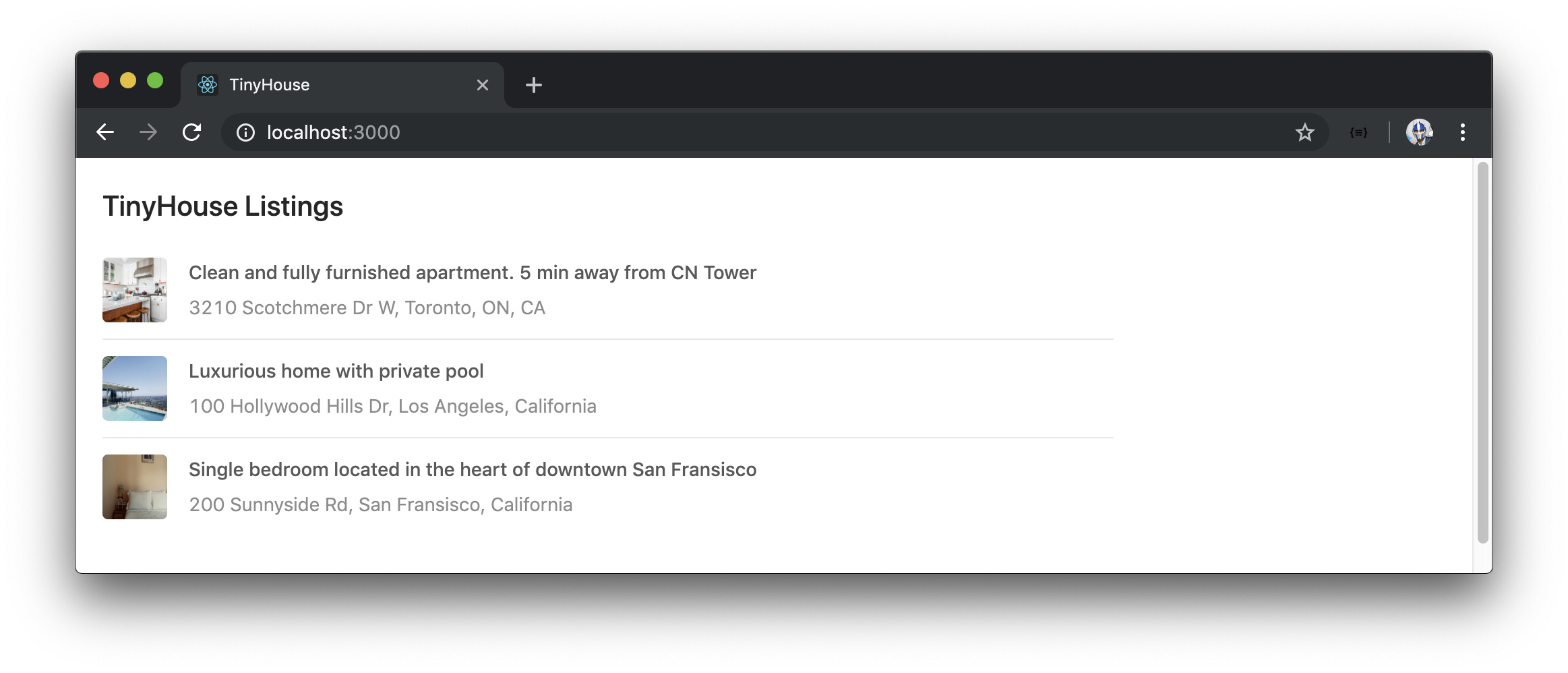
We’ll now look to populate our list a little more. The <List.Item.Meta> component can take an avatar and description prop. For the description prop, we’ll specify a value of the listing address. For the avatar prop, we’ll import and use the <Avatar> component that Ant Design provides. We’ll import and use the <Avatar> component from antd and provide a src of listing.image . The <Avatar> component also takes a shape and size prop with which we’ll provide a shape of "square" and a size of 48 .
Our listingsList constant variable will now look like the following:
// ...
import { Avatar, List } from "antd";

// ...

export const Listings = ({ title }: Props) => {
  // ...

  const listingsList = listings ? (
    <List
      itemLayout="horizontal"
      dataSource={listings}
      renderItem={listing => (
        <List.Item>
          <List.Item.Meta
            title={listing.title}
            description={listing.address}
            avatar={<Avatar src={listing.image} shape="square" size={48} />}
          />
        </List.Item>
      )}
    />
  ) : null;

  // ...
};
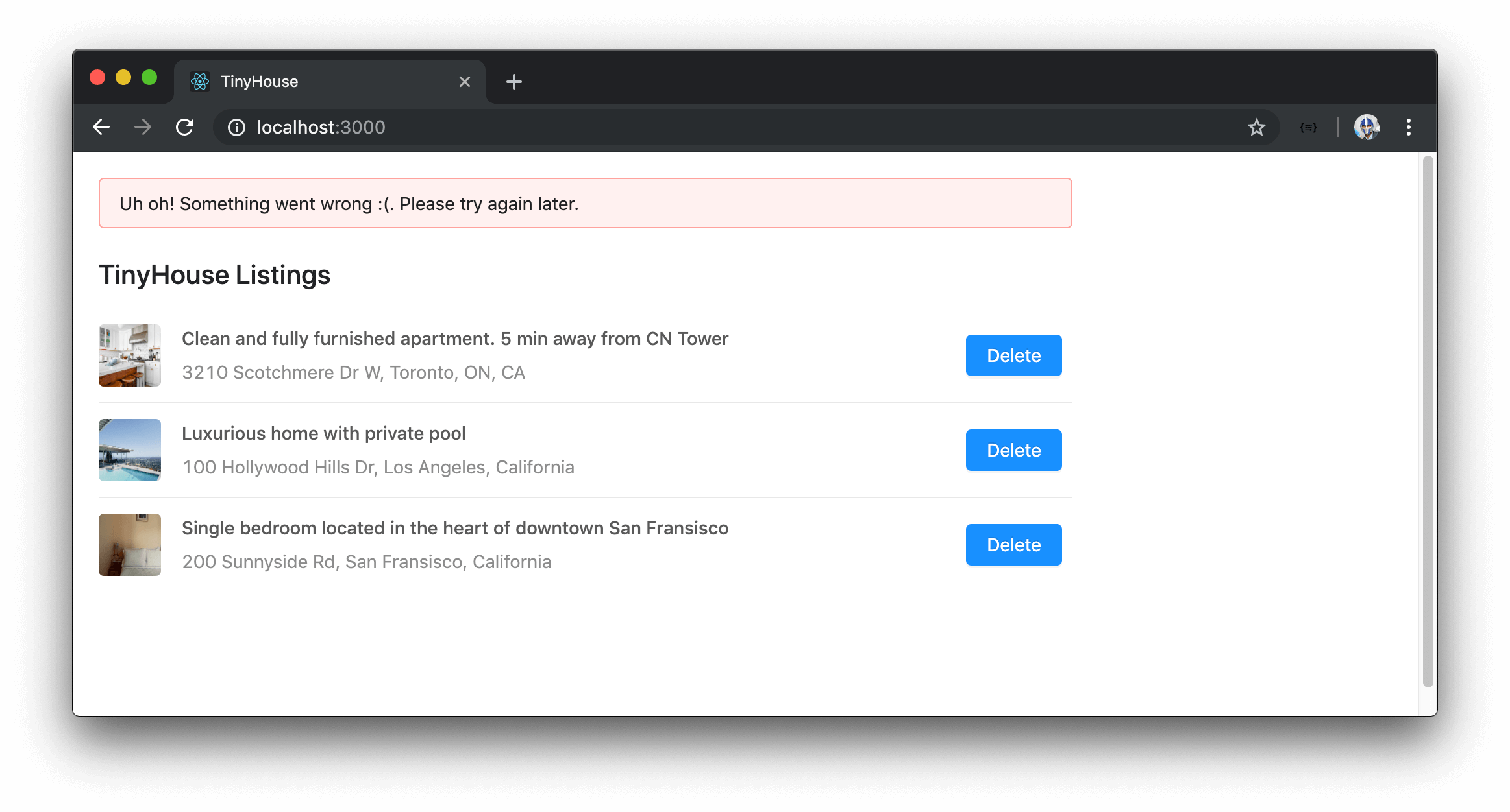
Just from those changes alone, we’ll now have avatars and address descriptions for each of our listing items!
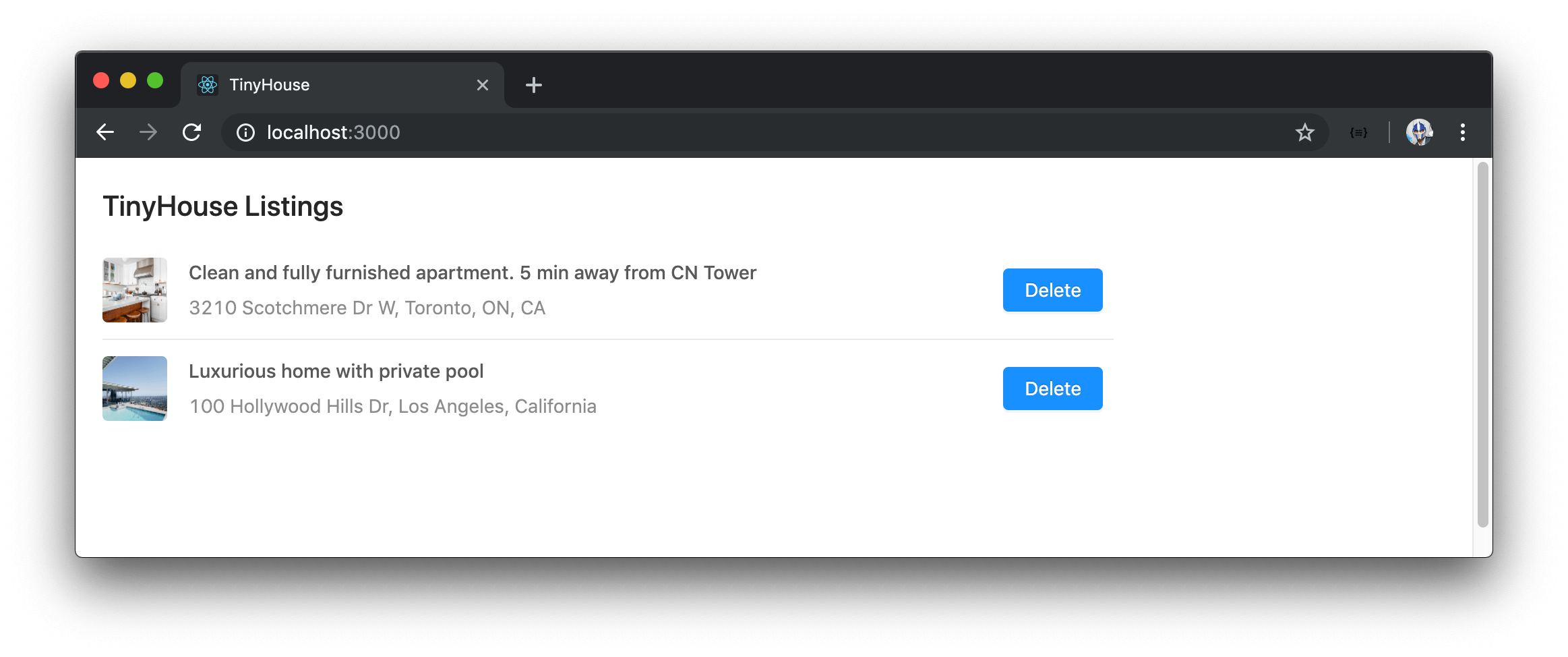
We’re still missing the ability to delete a listing. The <List.Item> component can take an actions prop which can be an array of JSX elements that represent the actions that can be taken for a certain list item. We’ll introduce this actions prop and attempt to place a single element value. Our element will be the <Button> component from Ant Design.
We’ll import the <Button> component and place it as the first item in our array in the actions prop. The <Button> component will have an onClick prop that will have the button trigger the component handleDeleteListing() method when clicked. Ant Design’s <Button> component also takes a type prop to control how the button is to appear. To get the primary blue color, we’ll apply the value of "primary" to the type prop.
// ...
import { Avatar, Button, List } from "antd";

// ...

export const Listings = ({ title }: Props) => {
  // ...

  const listingsList = listings ? (
    <List
      itemLayout="horizontal"
      dataSource={listings}
      renderItem={listing => (
        <List.Item
          actions={[
            <Button type="primary" onClick={() => handleDeleteListing(listing.id)}>
              Delete
            </Button>
          ]}
        >
          <List.Item.Meta
            title={listing.title}
            description={listing.address}
            avatar={<Avatar src={listing.image} shape="square" size={48} />}
          />
        </List.Item>
      )}
    />
  ) : null;

  // ...
};
A Delete button will now appear in each list item, and clicking it will allow us to delete the listing from the list!
We won’t make any more changes to the <List> component but look to optimize the other parts of our list.
<SPIN>
When we delete a listing, we’re still presented with a Deletion in progress... header element at the bottom of our list. We can probably look to use a better loading indicator from Ant Design.
Ant Design offers a component labeled <Spin> that helps display the loading state of a page or a section.
In the Listings.tsx component file, we’ll import the Spin component module and wrap the inner contents of our component markup with the <Spin> component. To control when the <Spin> component is visible, we’ll set its spinning prop to the value of deleteListingLoading which is the value that represents the loading state of our mutation request. We can also remove the deleteListingLoadingMessage element we’ve created before.
// ...
import { Avatar, Button, List, Spin } from "antd";

// ...

export const Listings = ({ title }: Props) => {
  // ...

  return (
    <div className="listings">
      <Spin spinning={deleteListingLoading}>
        <h2>{title}</h2>
        {listingsList}
        {deleteListingErrorMessage}
      </Spin>
    </div>
  );
};
When deletion is in progress, we’ll now be presented with a loading spinner.

<SKELETON>
When our parent listings query is being made, we have a simple Loading... message be shown. Let’s look to display a skeleton UI instead. Ant Design has a <Skeleton> component that can be used in multiple different ways. We’ll stick with a simple approach by looking to render a custom component that uses the <Skeleton> element when the query is loading.
We’ll keep our new component in a components/ folder within the Listings/ module to represent that it’s a child component of <Listings> . We’ll create the components/ folder and a ListingsSkeleton/ folder within that will contain a ListingsSkeleton.tsx file and an index.ts file.
client/
  src/
    sections/
      Listings/
        components/
          ListingsSkeleton/
            index.ts
            ListingsSkeleton.tsx
            // ...
In the ListingsSkeleton.tsx file, we’ll import React as well as the <Skeleton> component from Ant Design. To get us started, we’ll simply have the <ListingsSkeleton> component render the Ant Design <Skeleton> component directly.
import React from "react";
import { Skeleton } from "antd";

export const ListingsSkeleton = () => {
  return <Skeleton />;
};
In the ListingsSkeleton/index.ts file, we’ll re-export the <ListingsSkeleton> component.
client/src/sections/Listings/components/ListingsSkeleton/index.ts
export * from "./ListingsSkeleton";
We’ll also add an index.ts file in the components/ folder and export the <ListingsSkeleton> component.
client/src/sections/Listings/components/index.ts
export * from "./ListingsSkeleton";
In the <Listings> component, we’ll import the newly created ListingsSkeleton component module from the child components/ folder. When our query is in the loading state, we’ll render the <ListingsSkeleton> component directly.
// ...
import { ListingsSkeleton } from "./components";

// ...

export const Listings = ({ title }: Props) => {
  // ...

  if (loading) {
    return <ListingsSkeleton />;
  }

  // ...
};
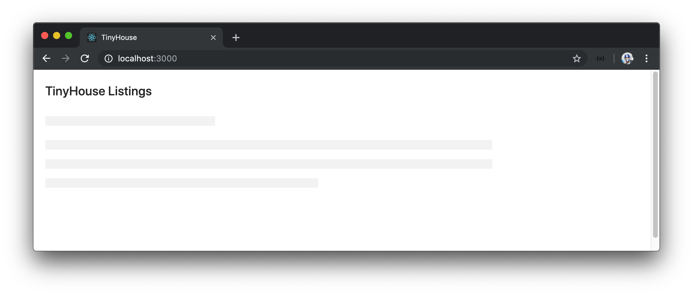
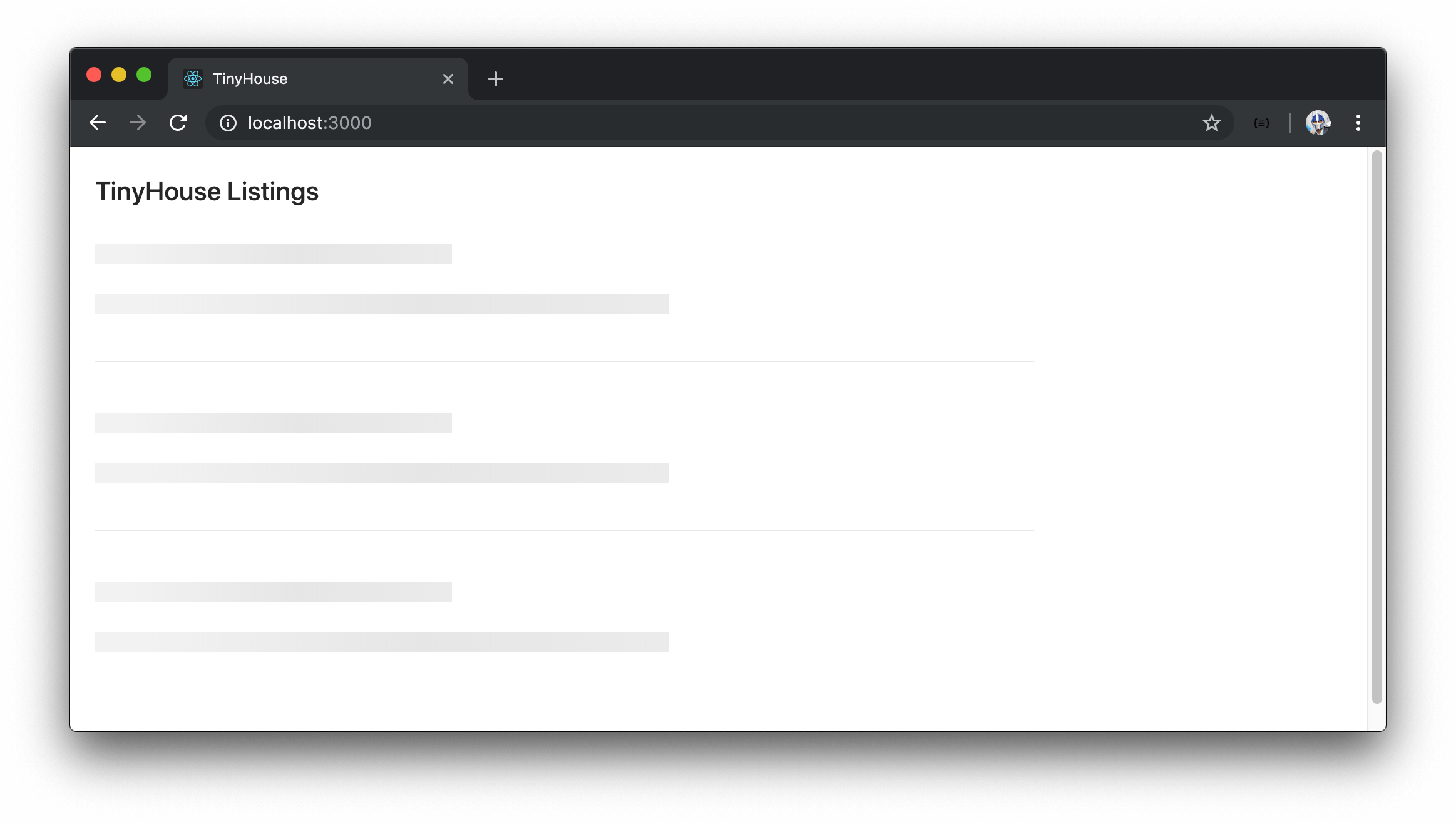
When we head back to the browser and make a refresh to request the listings query, we’ll see the <ListingsSkeleton> component be briefly rendered.
We’ll add some margin and width constraints to the <ListingsSkeleton> component. To do so, we’ll have the rendering of the <ListingsSkeleton> component in <Listings> be also wrapped with a div that has a class of .listings .
// ...
import { ListingsSkeleton } from "./components";

// ...

export const Listings = ({ title }: Props) => {
  // ...

  if (loading) {
    return (
      <div className="listings">
        <ListingsSkeleton />
      </div>
    );
  }

  // ...
};
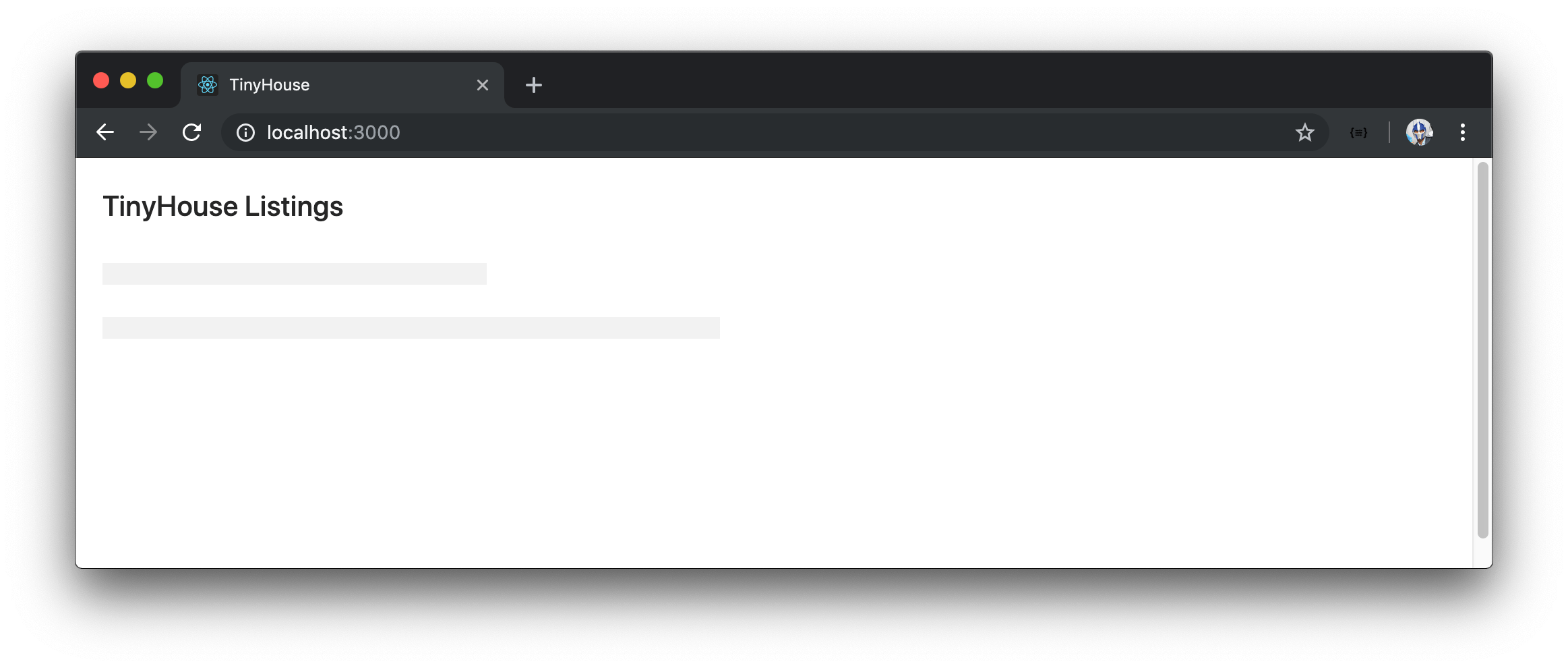
We’ll now see that the skeleton UI is positioned more accordingly.
Let’s now look to add the static title that we also see in the <Listings> component. We’ll pass in the title available in <Listing> as a prop to <ListingsSkeleton> to ensure the title stays the same between them.
// ...
import { ListingsSkeleton } from "./components";

// ...

export const Listings = ({ title }: Props) => {
  // ...

  if (loading) {
    return (
      <div className="listings">
        <ListingsSkeleton title={title} />
      </div>
    );
  }

  // ...
};
In the ListingsSkeleton.tsx file, we’ll create a Props interface for the <ListingsSkeleton> component since we’ll expect a title prop of type string . We’ll use the title prop in a <h2> tag and wrap our return statement with a parent <div> element.
import React from "react";
import { Skeleton } from "antd";

interface Props {
  title: string;
}

export const ListingsSkeleton = ({ title }: Props) => {
  return (
    <div>
      <h2>{title}</h2>
      <Skeleton />
    </div>
  );
};
We’ll now be presented with a title at the top of our skeleton UI.
Let’s make our <ListingsSkeleton> component resemble more of the list we intend to render. Ant Design’s <Skeleton> component has a paragraph prop that takes an object and can help control the number of rows being displayed.
We’ll edit the <Skeleton> component being rendered in <ListingsSkeleton> and specify a single row for paragraph . We’ll also add the active prop to give our <Skeleton> the active blinking state.
import React from "react";
import { Skeleton } from "antd";

interface Props {
  title: string;
}

export const ListingsSkeleton = ({ title }: Props) => {
  return (
    <div>
      <h2>{title}</h2>
      <Skeleton active paragraph={{ rows: 1 }} />
    </div>
  );
};
Our rendered <Skeleton> will now have single row after the header row.
To mimic a list of three list items, we’ll render two more identical <Skeleton> components in <ListingsSkeleton> .
import React from "react";
import { Skeleton } from "antd";

interface Props {
  title: string;
}

export const ListingsSkeleton = ({ title }: Props) => {
  return (
    <div>
      <h2>{title}</h2>
      <Skeleton active paragraph={{ rows: 1 }} />
      <Skeleton active paragraph={{ rows: 1 }} />
      <Skeleton active paragraph={{ rows: 1 }} />
    </div>
  );
};
Ant Design provides a <Divider> component that helps in displaying a divider between sections and text. In our ListingsSkeleton.tsx file, we’ll import the Divider component module and place the <Divider> component between each <Skeleton> component.
import React from "react";
import { Divider, Skeleton } from "antd";

interface Props {
  title: string;
}

export const ListingsSkeleton = ({ title }: Props) => {
  return (
    <div>
      <h2>{title}</h2>
      <Skeleton active paragraph={{ rows: 1 }} />
      <Divider />
      <Skeleton active paragraph={{ rows: 1 }} />
      <Divider />
      <Skeleton active paragraph={{ rows: 1 }} />
    </div>
  );
};
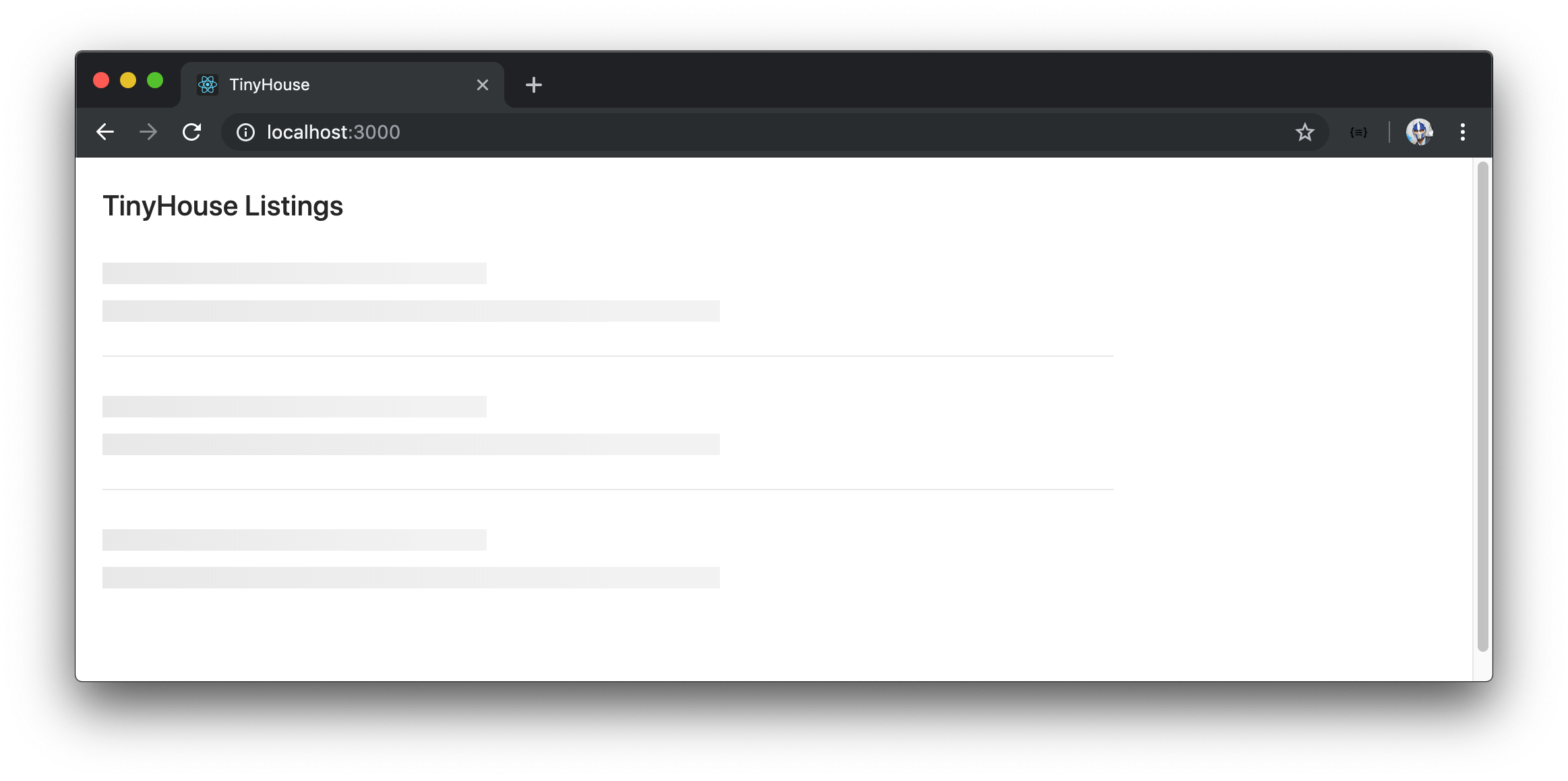
We’ll now see a neat separation between each skeleton portion.
We can see that each skeleton paragraph portion adds a margin perhaps slightly larger than what we need to mimic our existing list. We can modify the styles Ant Design provides us directly if we want to. To see an example of this, we’ll introduce a ListingsSkeleton.css file in a styles/ folder within the ListingsSkeleton/ folder.
client/
  src/
    sections/
      Listings/
        components/
          ListingsSkeleton/
            styles
              ListingsSkeleton.css
              // ...
In the ListingsSkeleton.css file, we’ll directly modify the .ant-divider-horizontal class of our <Divider> component by providing a margin of 12px 0 .
client/src/sections/Listings/components/ListingsSkeleton/styles/ListingsSkeleton.css
.listings-skeleton .ant-divider-horizontal {
  margin: 12px 0;
}
We’ll further modify the .ant-skeleton-paragraph class generated by the <Skeleton> component to reduce the margin around the <Skeleton> paragraphs.
client/src/sections/Listings/components/ListingsSkeleton/styles/ListingsSkeleton.css
.listings-skeleton
  .ant-skeleton-content
  .ant-skeleton-title
  + .ant-skeleton-paragraph {
  margin-top: 12px;
}

.listings-skeleton .ant-divider-horizontal {
  margin: 12px 0;
}
In the ListingsSkeleton.tsx file, we’ll import the ListingsSkeleton.css file and apply the .listings-skeleton class in the parent rendered element of <ListingsSkeleton> .
import React from "react";
import { Divider, Skeleton } from "antd";
import "./styles/ListingsSkeleton.css";

interface Props {
  title: string;
}

export const ListingsSkeleton = ({ title }: Props) => {
  return (
    <div className="listings-skeleton">
      <h2>{title}</h2>
      <Skeleton active paragraph={{ rows: 1 }} />
      <Divider />
      <Skeleton active paragraph={{ rows: 1 }} />
      <Divider />
      <Skeleton active paragraph={{ rows: 1 }} />
    </div>
  );
};
We’ll now have the <ListingsSkeleton> component be a good resemblance to how our list will appear when data is available and three listing items are expected to be shown.
It’s important to note that modifying styles through custom means affects the intended styles brought forth by the Ant Design framework. There are also more sustainable ways to modify component styles in a global matter with which Ant Design provides documentation for.
There are numerous different ways we could look to customize and create the skeleton layout of our list (e.g. the
<List>component has aloadingprop that shows a loading indicator while the contents of the list are being fetched). We’ve gone with this custom approach to get exposure to rendering child UI components and directly customizing the styles from Ant Design.
<ALERT>
listings query error
When our listings query fails, we’ve resorted to presenting a header tag that says Uh oh! Something went wrong - please try again later :( . Let’s look to display this message within an alert banner of sorts. Ant Design provides an <Alert> component to do just this.
We’ll look to have this alert banner be shown at the top of the skeleton loading UI if our listings query ever fails. As a result, we’ll slightly modify our <ListingsSkeleton> component to accept an error prop of type boolean with which we’ll give a default parameter value of false . We’ll import the Alert component module and conditionally show the <Alert> component when the error prop is true. Our <Alert /> component will have the type prop given a value of "error" as well as the appropriate message prop.
import React from "react";
import { Alert, Divider, Skeleton } from "antd";
import "./styles/ListingsSkeleton.css";

interface Props {
  title: string;
  error?: boolean;
}

export const ListingsSkeleton = ({ title, error = false }: Props) => {
  const errorAlert = error ? (
    <Alert
      type="error"
      message="Uh oh! Something went wrong :(. Please try again later."
    />
  ) : null;

  return (
    <div className="listings-skeleton">
      {errorAlert}
      <h2>{title}</h2>
      <Skeleton active paragraph={{ rows: 1 }} />
      <Divider />
      <Skeleton active paragraph={{ rows: 1 }} />
      <Divider />
      <Skeleton active paragraph={{ rows: 1 }} />
    </div>
  );
};
We’ll introduce a .listings-skeleton__alert class in the ListingsSkeleton.css file to add a little margin below the rendered alert component.
client/src/sections/Listings/components/ListingsSkeleton/styles/ListingsSkeleton.css
.listings-skeleton .listings-skeleton__alert {
  margin-bottom: 20px;
}
We’ll apply the .listings-skeleton__alert class to the rendered <Alert> component in <ListingsSkeleton> .
The ListingsSkeleton.tsx file in its final state will look like the following:
client/src/sections/Listings/components/ListingsSkeleton/ListingsSkeleton.tsx
import React from "react";
import { Alert, Divider, Skeleton } from "antd";
import "./styles/ListingsSkeleton.css";

interface Props {
  title: string;
  error?: boolean;
}

export const ListingsSkeleton = ({ title, error = false }: Props) => {
  const errorAlert = error ? (
    <Alert
      type="error"
      message="Uh oh! Something went wrong :(. Please try again later."
      className="listings-skeleton__alert"
    />
  ) : null;

  return (
    <div className="listings-skeleton">
      {errorAlert}
      <h2>{title}</h2>
      <Skeleton active paragraph={{ rows: 1 }} />
      <Divider />
      <Skeleton active paragraph={{ rows: 1 }} />
      <Divider />
      <Skeleton active paragraph={{ rows: 1 }} />
    </div>
  );
};
In the Listings.tsx file, we’ll render the <ListingsSkeleton> component with the error prop set to true when the query error property is true .
// ...
import { ListingsSkeleton } from "./components";

// ...

export const Listings = ({ title }: Props) => {
  // ...

  if (error) {
    return (
      <div className="listings">
        <ListingsSkeleton title={title} error />
      </div>
    );
  }

  // ...
};
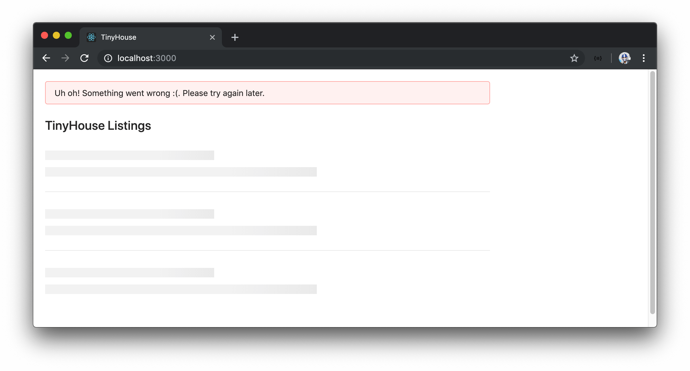
If our listings query ever fails, we’ll now see an alert banner be shown at the top of our skeleton UI.
deleteListing mutation error
We’ll attempt to show the <Alert> component if the deleteListing mutation ever fails. In this case, we’ll look to have the <Alert> component be shown at the top of the rendered list in the <Listings> component.
In the Listings.tsx file, we’ll import the Alert component module. We’ll remove the deleteListingErrorMessage const variable we had before and instead have a deleteListingErrorAlert const variable that is assigned a value of the <Alert> component when the mutation has failed. We’ll also add a .listings__alert class to the <Alert> component that is to be rendered.
// ...
import { Alert, Avatar, Button, List, Spin } from "antd";

// ...

export const Listings = ({ title }: Props) => {
  // ...

  const deleteListingErrorAlert = deleteListingError ? (
    <Alert
      type="error"
      message="Uh oh! Something went wrong :(. Please try again later."
      className="listings__alert"
    />
  ) : null;

  return (
    <div className="listings">
      {deleteListingErrorAlert}
      <Spin spinning={deleteListingLoading}>
        <h2>{title}</h2>
        {listingsList}
      </Spin>
    </div>
  );
};
Our Listings.tsx file in its final state will look like the following:
client/src/sections/Listings/Listings.tsx
import React from "react";
import { gql } from "apollo-boost";
import { useQuery, useMutation } from "@apollo/react-hooks";
import { Alert, Avatar, Button, List, Spin } from "antd";
import { Listings as ListingsData } from "./__generated__/Listings";
import { ListingsSkeleton } from "./components";
import {
  DeleteListing as DeleteListingData,
  DeleteListingVariables
} from "./__generated__/DeleteListing";
import "./styles/Listings.css";

const LISTINGS = gql`
  query Listings {
    listings {
      id
      title
      image
      address
      price
      numOfGuests
      numOfBeds
      numOfBaths
      rating
    }
  }
`;

const DELETE_LISTING = gql`
  mutation DeleteListing($id: ID!) {
    deleteListing(id: $id) {
      id
    }
  }
`;

interface Props {
  title: string;
}

export const Listings = ({ title }: Props) => {
  const { data, loading, error, refetch } = useQuery<ListingsData>(LISTINGS);

  const [
    deleteListing,
    { loading: deleteListingLoading, error: deleteListingError }
  ] = useMutation<DeleteListingData, DeleteListingVariables>(DELETE_LISTING);

  const handleDeleteListing = async (id: string) => {
    await deleteListing({ variables: { id } });
    refetch();
  };

  const listings = data ? data.listings : null;

  const listingsList = listings ? (
    <List
      itemLayout="horizontal"
      dataSource={listings}
      renderItem={listing => (
        <List.Item
          actions={[
            <Button
              type="primary"
              onClick={() => handleDeleteListing(listing.id)}
            >
              Delete
            </Button>
          ]}
        >
          <List.Item.Meta
            title={listing.title}
            description={listing.address}
            avatar={<Avatar src={listing.image} shape="square" size={48} />}
          />
        </List.Item>
      )}
    />
  ) : null;

  if (loading) {
    return (
      <div className="listings">
        <ListingsSkeleton title={title} />
      </div>
    );
  }

  if (error) {
    return (
      <div className="listings">
        <ListingsSkeleton title={title} error />
      </div>
    );
  }

  const deleteListingErrorAlert = deleteListingError ? (
    <Alert
      type="error"
      message="Uh oh! Something went wrong :(. Please try again later."
      className="listings__alert"
    />
  ) : null;

  return (
    <div className="listings">
      {deleteListingErrorAlert}
      <Spin spinning={deleteListingLoading}>
        <h2>{title}</h2>
        {listingsList}
      </Spin>
    </div>
  );
};
In the Listings.css file, we’ll add a margin-bottom property to the .listings__alert class.
client/src/sections/Listings/styles/Listings.css
.listings .listings__alert {
  margin-bottom: 20px;
}
When we now delete a listing and if it ever fails, we’ll receive an error alert at the top of our list.
Notice how we’ve maintained a similar pattern to how we handle query and mutation errors? When the query fails, we have no data to display so we simply display an error alert above the skeleton UI. Since we already have information be presented in the UI when the mutation fails, we resort to displaying an error alert above the existing list for a mutation error.
This brings us to the end of the lesson. By using Ant Design, we were able to leverage many different components from the framework to style and make our application more presentable!
Our application’s core behavior is the same as what we had in the previous lesson.
- We make our query and mutation.
- We display a loading indicator of sorts when the query or mutation is in flight.
- We display an error alert when either the query or mutation fails.
We’ve been able to leverage Ant Design and utilize the styles and components Ant Design provides for each of the above scenarios. There are numerous different components we can use and it is up to the developer, the development team, and/or designers to discuss and address the intended UI behavior.
This officially concludes the development needed in Part I of this course! Bravo!
PART ONE CONCLUSION
Congratulations! You’ve just finished Part I of this MasterClass. In Part I, we’ve introduced a series of core technologies to build a full-stack web app. We’ve introduced Node, TypeScript, GraphQL, Apollo, MongoDB, React, and even discussed React Hooks. We’ve also seen how a UI framework can help make our React UI look more presentable.
In Part II of the course, we’ll take everything we’ve learned so far and build a production-ready application. See you there!