BUILDING THE UI OF THE HOST PAGE
We’ll now begin to work on the form on the client app where a user can create (i.e. host) a new listing. The form we’ll build will essentially be the UI of the /host route of our application.
The form isn’t going to be very difficult to establish. We’ll essentially provide different form inputs that represent the information we’ll want the user to provide for their new listing. The entire form will be part of a single component called the <Host /> component.
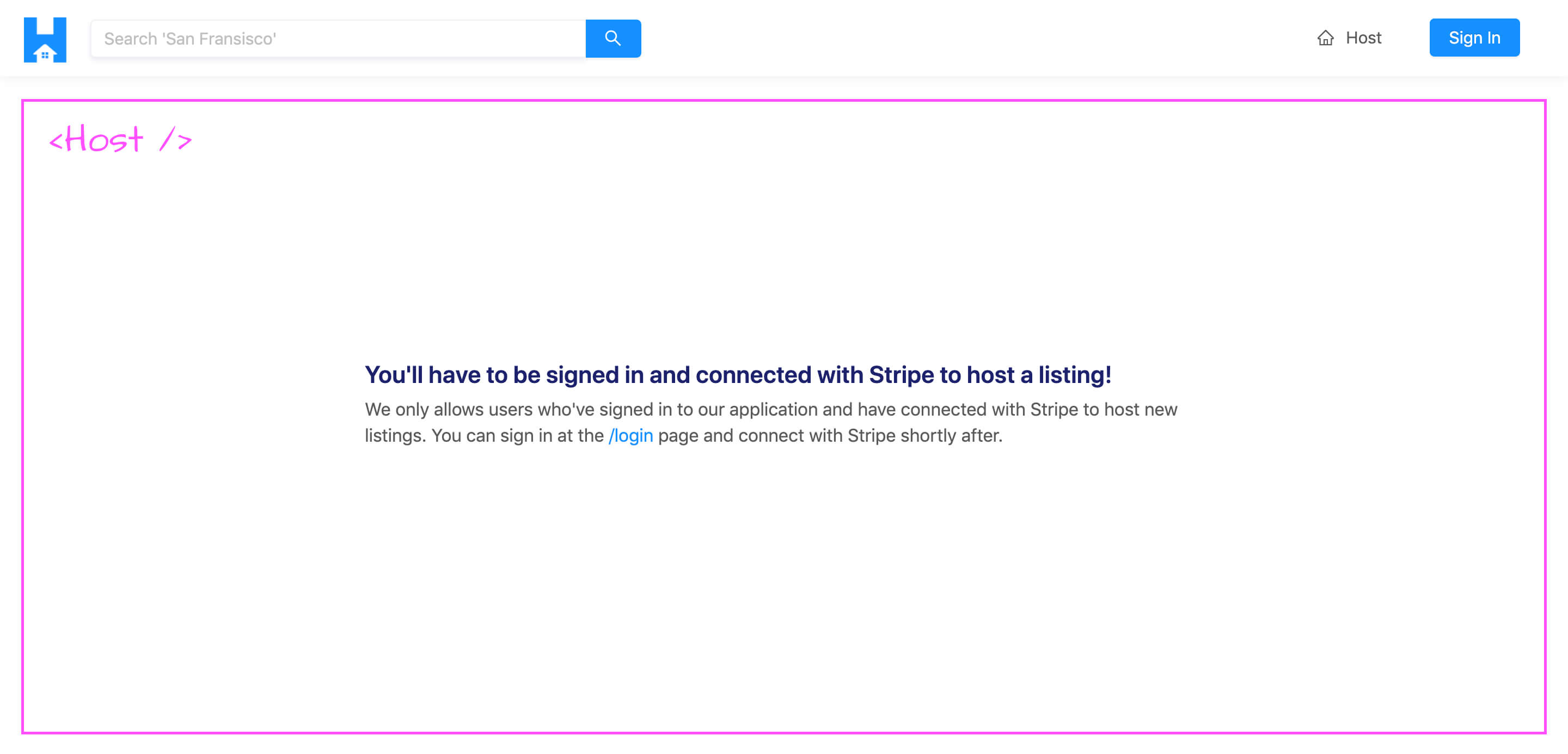
If a user is either not signed in to our application or hasn’t connected with Stripe, they’ll be unable to see the form and instead will be told that they’ll need to sign and connect with Stripe to create a listing.
In this lesson, we’ll begin by establishing the UI of the entire /host page before we plan to introduce the hostListing mutation and the capability to run the mutation.
<HOST />
In the <Host /> component within the src/sections/Host/index.tsx file, let’s import the first few Ant Design components we’ll need. We’ll import the <Layout /> and <Typography /> components. We’ll destruct the <Content /> sub-component from <Layout /> and we’ll destruct the <Text /> and <Title /> sub-components from <Typography /> .
import React from "react";
import { Layout, Typography } from "antd";

const { Content } = Layout;
const { Text, Title } = Typography;
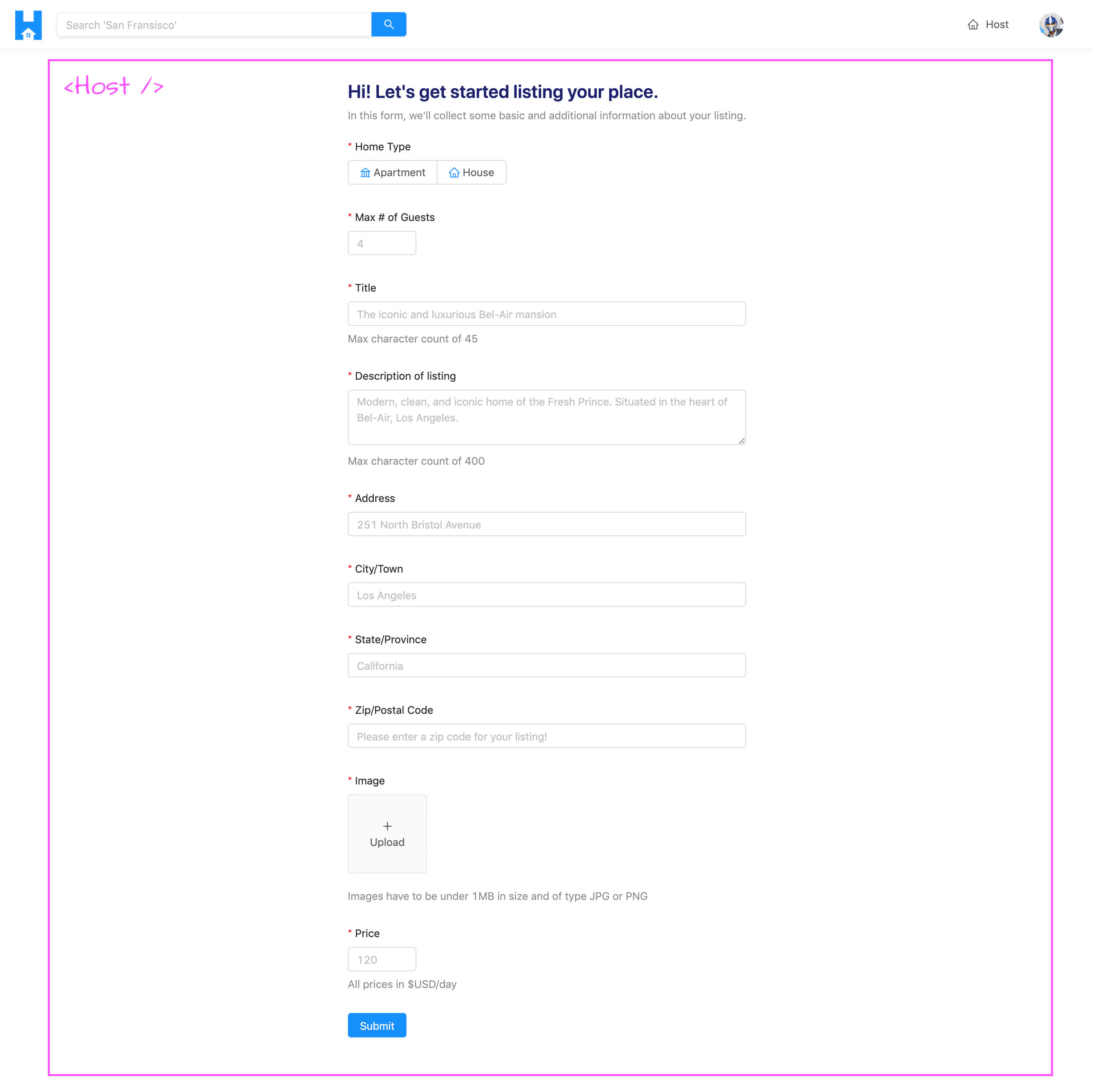
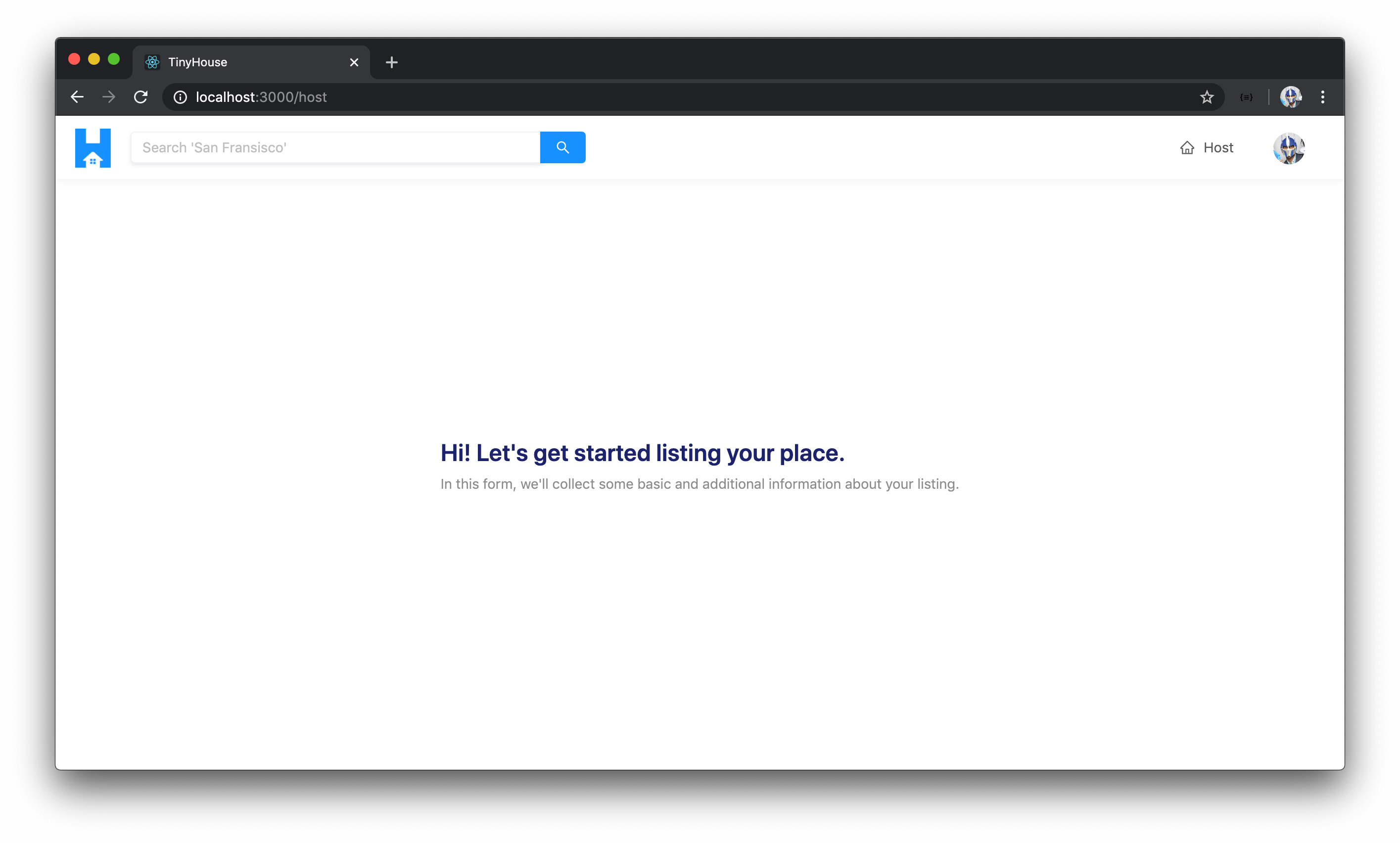
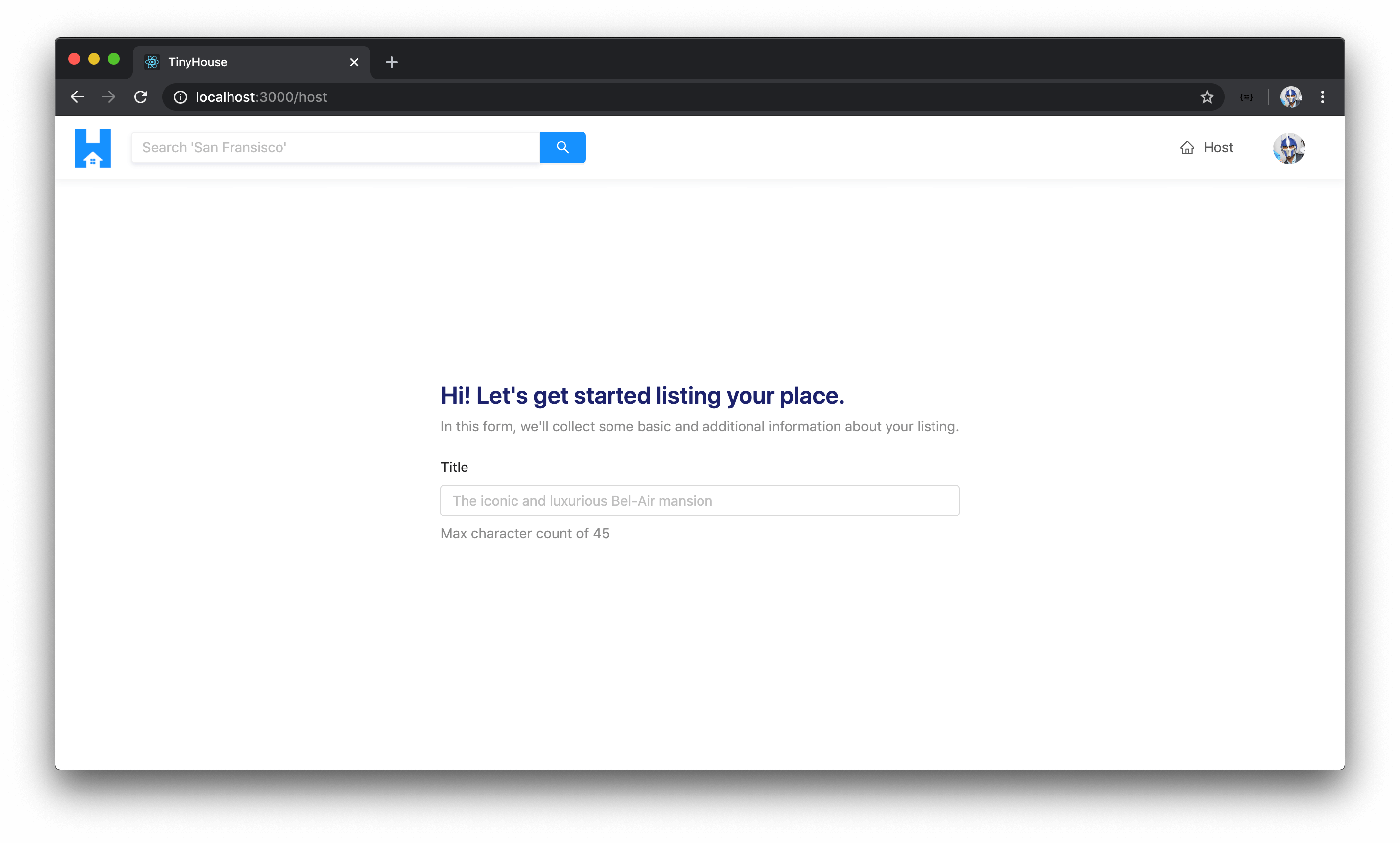
In the <Host /> component return statement, we’ll return the <Content /> component that is to contain a <div /> element that further contains a <Title /> that says "Hi! Let's get started listing your place." We’ll add some secondary text right below it that says "In this form, we'll collect some basic and additional information about your listing" .
import React from "react";
import { Layout, Typography } from "antd";

const { Content } = Layout;
const { Text, Title } = Typography;

export const Host = () => {
  return (
    <Content className="host-content">
      <div className="host__form-header">
        <Title level={3} className="host__form-title">
          Hi! Let's get started listing your place.
        </Title>
        <Text type="secondary">
          In this form, we'll collect some basic and additional information about your
          listing.
        </Text>
      </div>
    </Content>
  );
};
If we were to take a look at our app now, we’ll see the title section we’ll want to show for this page.
As we mentioned, we only want the user to create a listing in this /host page when they’re logged in our application and connected with Stripe . The viewer state object we have in the parent <App /> instance has information for both of these cases. If the viewer is not logged in, there won’t be a viewer.id field (or any other field in the viewer object). If the viewer is not connected with Stripe, the hasWallet field in the viewer object will return false . With that said, let’s pass this viewer object down as props to the <Host /> component rendered in the /host route from the parent <App /> component.
We’ll employ the render props pattern to render the <Host/> component and we’ll pass the viewer state object down.
client/src/index.tsx
          <Route
            exact
            path="/host"
            render={props => <Host {...props} viewer={viewer} />}
          />
In the <Host /> component file, we’ll declare that the viewer prop is expected to be passed in. We’ll import the Viewer interface from the src/lib/types.ts file to describe the shape of the viewer object prop.
import { Viewer } from "../../lib/types";

interface Props {
  viewer: Viewer;
}

// ...

export const Host = ({ viewer }: Props) => {
  // ...
};
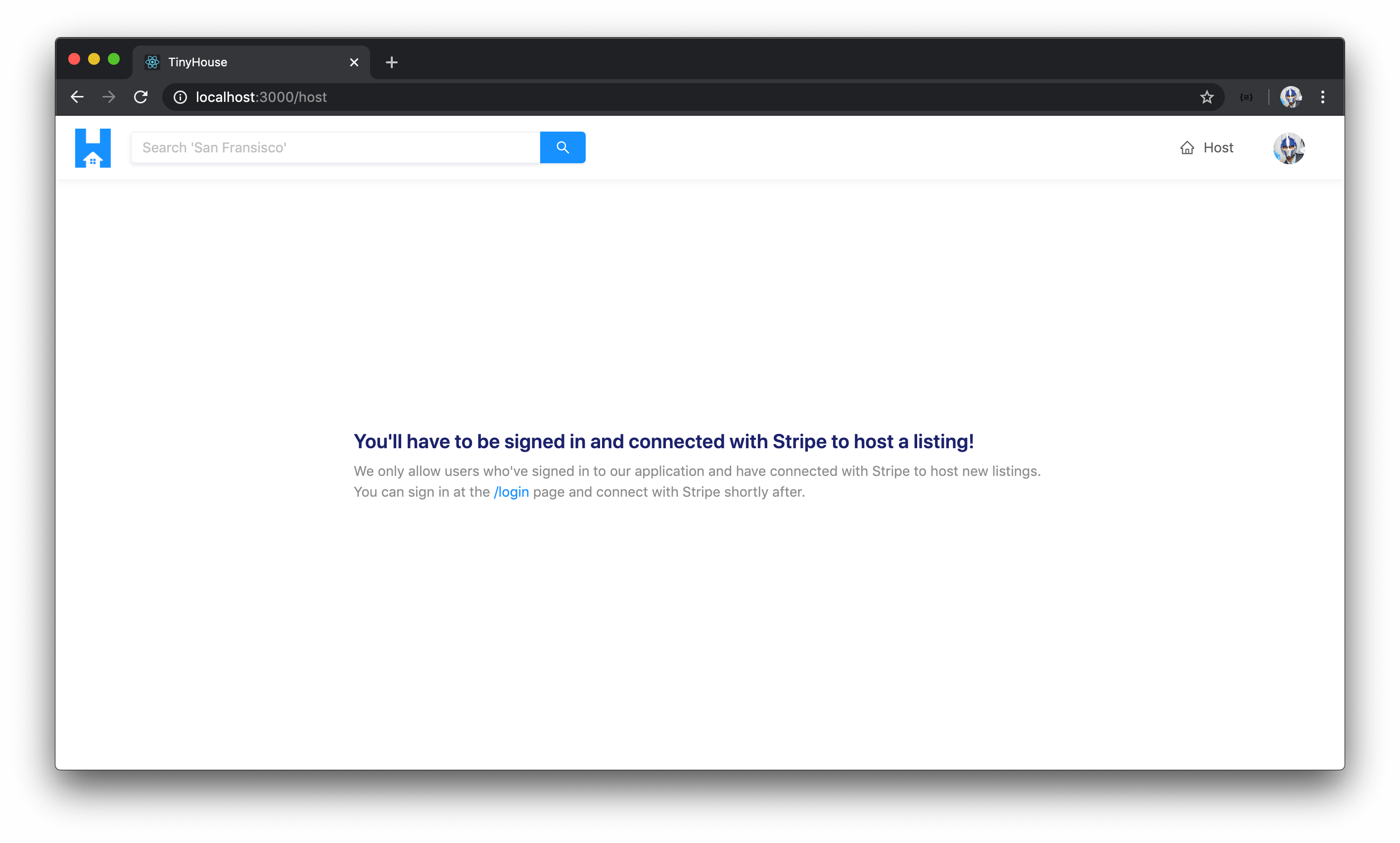
In the <Host /> component, we’ll check if the viewer.id doesn’t exist or the viewer.hasWallet field isn’t true . If either of these conditions is met, we’ll have our component return a <Title /> that says "You'll have to be signed in and connected with Stripe to host a listing!" and some secondary text that says "We only allow users who've signed in to our application and have connected with Stripe to host new listings" . We’ll also provide a link to the /login route of our app to tell the user that they can log-in from the login page. To provide a link to the /login page, we’ll be sure to import the <Link /> component from react-router-dom .
// ...
import { Link } from "react-router-dom";
// ...

// ...

export const Host = ({ viewer }: Props) => {
  if (!viewer.id || !viewer.hasWallet) {
    return (
      <Content className="host-content">
        <div className="host__form-header">
          <Title level={4} className="host__form-title">
            You'll have to be signed in and connected with Stripe to host a listing!
          </Title>
          <Text type="secondary">
            We only allow users who've signed in to our application and have connected
            with Stripe to host new listings. You can sign in at the{" "}
            <Link to="/login">/login</Link> page and connect with Stripe shortly after.
          </Text>
        </div>
      </Content>
    );
  }

  return (
    <Content className="host-content">
      <div className="host__form-header">
        <Title level={3} className="host__form-title">
          Hi! Let's get started listing your place.
        </Title>
        <Text type="secondary">
          In this form, we'll collect some basic and additional information about your
          listing.
        </Text>
      </div>
    </Content>
  );
};
If we were either not logged in OR not connected with Stripe, we’ll see the title and text notifying us that we’ll need to log-in and connect with Stripe.
We want the user to be logged in since every listing that is created needs to be attached to a certain user in our application. We want users to be connected with Stripe since this is the only way users can receive payments for their listings. However, we can’t prevent them from disconnecting from Stripe after they’ve already created their listing which is why later on when we build out the booking capability, we’ll look to prevent a user from booking a listing where the host has pulled away their Stripe information.
HOST FORM
We’ll now set up the UI for the form we want to show in the /host page. Forms and form validations in client-side applications are an interesting topic. Often, they begin through very simple means but can become very complicated, very quickly. This is exacerbated when it comes to thinking about how we want to deal with form-level and/or field-level validations within forms.
We’re going to utilize an important advantage thanks to a pretty powerful component Ant Design gives us, called the <Form /> component. The <Form /> component from Ant Design doesn’t necessarily give us the UI for certain form elements, like a radio input or a checkbox since other components exist for this, but it provides the capability to validate fields with certain rules AND to collect information.
The <Form /> component from Ant Design provides a useful <Item /> sub-component that helps display a form label, help text, etc. As of the current version of Ant Design, v3, when this lesson was being screencast, the <Form /> component also contains a function, labeled Form.create() that acts as a Higher Order Component Function that receives a component and produces another component where a form prop object is provided. This form object provides the capability to introduce validations on form fields and capture values from the form fields.
Let’s look to see how this <Form /> component can help us. We’ll first import the <Form /> component from Ant Design and wrap the uppermost <div /> element in the <Host /> component return statement (i.e. the template shown to the user when they’ve logged in and connected with Stripe). We’ll specify in the layout prop for the <Form /> component that the form is going to be in the "vertical" layout.
We’ll also destruct an Item sub-component from the Form component.
import React from "react";
import { Link } from "react-router-dom";
import { Form, Layout, Typography } from "antd";
import { Viewer } from "../../lib/types";

const { Content } = Layout;
const { Text, Title } = Typography;
const { Item } = Form;

export const Host = () => {
  // ...

  return (
    <Content className="host-content">
      <Form layout="vertical">
        <div className="host__form-header">
          <Title level={3} className="host__form-title">
            Hi! Let's get started listing your place.
          </Title>
          <Text type="secondary">
            In this form, we'll collect some basic and additional information about your
            listing.
          </Text>
        </div>
      </Form>
    </Content>
  );
};
Title Input
The <Form /> component from Ant Design doesn’t provide the actual UI elements we’ll show, like inputs or radio buttons, and those are to come from different components we’ll import and use. We’ll import and use the <Input /> component to capture the title of the listing.
We’ll place the <Input /> component and provide a placeholder of an example of a title, something like "The iconic and luxurious Bel-Air mansion". Remember on the server, we added a server-side validation where the title can only have a maximum number of 100 characters. The server-side validation acts as a safeguard and on the client, we’ll be more restrictive and add a maxlength of 45 characters for the title input. We’ll then use the <Item /> sub-component from the form to provide a label to this form element saying Title and some extra help text that says " Max character count of 45 ".
// ...
import { Form, Input, Layout, Typography } from "antd";
// ...

export const Host = () => {
  // ...

  return (
    <Content className="host-content">
      <Form layout="vertical">
        <div className="host__form-header">
          <Title level={3} className="host__form-title">
            Hi! Let's get started listing your place.
          </Title>
          <Text type="secondary">
            In this form, we'll collect some basic and additional information about your
            listing.
          </Text>
        </div>

        <Item label="Title" extra="Max character count of 45">
          <Input maxLength={45} placeholder="The iconic and luxurious Bel-Air mansion" />
        </Item>
      </Form>
    </Content>
  );
};
If we take a look at our page now, we’ll see the form input and we’ll see the form label and extra help text shown along with it.
Description TextArea
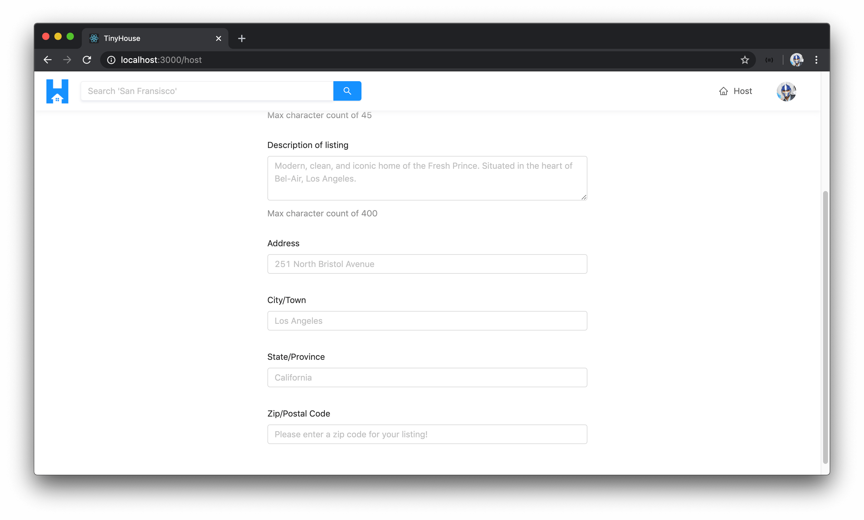
We’ll display another input but this time we’ll display the <TextArea /> sub-component within <Input /> to have a textarea be shown to capture more text for the description of the listing. We can declare the number of rows in this textarea to be 3 and we’ll provide a max length of 400 characters (less than the server-side guard of 5000 characters). For the description input, we’ll state a placeholder of an example description of a listing - something like "Modern, clean, and iconic home of the Fresh Prince. Situated in the heart of Bel-Air, Los Angeles." .
We’ll wrap this <Input.TextArea /> with the <Item /> form component which is to have a title that says "Description of listing" and we’ll provide extra help text of "Max character count of 400" .
// ...
import { Form, Input, Layout, Typography } from "antd";
// ...

export const Host = () => {
  // ...

  return (
    <Content className="host-content">
      <Form layout="vertical">
        <div className="host__form-header">
          <Title level={3} className="host__form-title">
            Hi! Let's get started listing your place.
          </Title>
          <Text type="secondary">
            In this form, we'll collect some basic and additional information about your
            listing.
          </Text>
        </div>

        <Item label="Title" extra="Max character count of 45">
          <Input maxLength={45} placeholder="The iconic and luxurious Bel-Air mansion" />
        </Item>

        <Item label="Description of listing" extra="Max character count of 400">
          <Input.TextArea
            rows={3}
            maxLength={400}
            placeholder={`
              Modern, clean, and iconic home of the Fresh Prince.
              Situated in the heart of Bel-Air, Los Angeles.
            `}
          />
        </Item>
      </Form>
    </Content>
  );
};
Address, City, State, Postal Code Inputs
We’ll look to display a series of other text inputs:
- One to capture the direct address of the listing. We’ll provide a placeholder here that says
"251 North Bristol Avenue"and the the<Item />label will be"Address". - Another to capture the city (or town). We’ll provide a label of
"City/Town"and an input placeholder of"Los Angeles". - An input to capture the state (or province). We’ll provide a label of
"State/Province"and an input placeholder of"California". - An input to capture the zip/postal code . We’ll provide a label of
"Zip/Postal Code"and an input placeholder of"Please enter a zip code for your listing!".
export const Host = () => {
  // ...

  return (
    <Content className="host-content">
      <Form layout="vertical">
        <div className="host__form-header">
          <Title level={3} className="host__form-title">
            Hi! Let's get started listing your place.
          </Title>
          <Text type="secondary">
            In this form, we'll collect some basic and additional information about your
            listing.
          </Text>
        </div>

        <Item label="Title" extra="Max character count of 45">
          <Input maxLength={45} placeholder="The iconic and luxurious Bel-Air mansion" />
        </Item>

        <Item label="Description of listing" extra="Max character count of 400">
          <Input.TextArea
            rows={3}
            maxLength={400}
            placeholder={`
              Modern, clean, and iconic home of the Fresh Prince.
              Situated in the heart of Bel-Air, Los Angeles.
            `}
          />
        </Item>

        <Item label="Address">
          <Input placeholder="251 North Bristol Avenue" />
        </Item>

        <Item label="City/Town">
          <Input placeholder="Los Angeles" />
        </Item>

        <Item label="State/Province">
          <Input placeholder="California" />
        </Item>

        <Item label="Zip/Postal Code">
          <Input placeholder="Please enter a zip code for your listing!" />
        </Item>
      </Form>
    </Content>
  );
};
If we were to take a look at the /host page at this moment, we’ll see the form inputs we’ve created presented and available to us. Great!
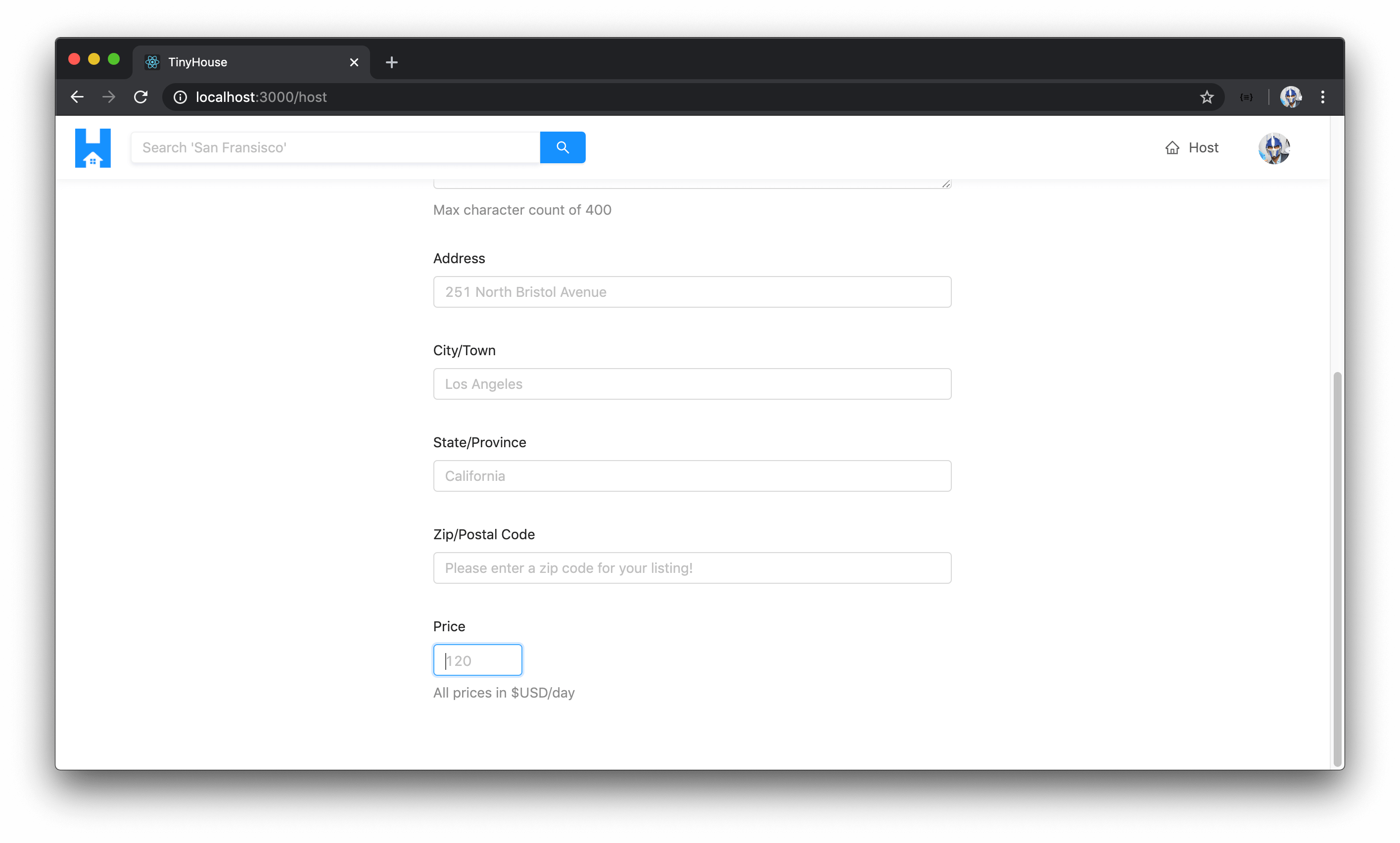
Price Input
There are a few other inputs that are to be in our form that aren’t direct text inputs. We’ll look to capture the price value of the listing through an input but where the user is to only provide a value of a number.
With Ant Design, we can create a number input by using the <InputNumber /> component which can be used to help capture numbers between certain ranges. We’ll import the <InputNumber /> component and use it to capture the price of the listing. We’ll specify a minimum value of 0 and provide a placeholder of "120" . In the form item label we’ll say "Price" and for the extra help text we’ll state "All prices in $USD/day" .
// ...
import { Form, Input, InputNumber, Layout, Typography } from "antd";
// ...

export const Host = () => {
  // ...

  return (
    <Content className="host-content">
      <Form layout="vertical">
        <div className="host__form-header">
          <Title level={3} className="host__form-title">
            Hi! Let's get started listing your place.
          </Title>
          <Text type="secondary">
            In this form, we'll collect some basic and additional information about your
            listing.
          </Text>
        </div>

        <Item label="Title" extra="Max character count of 45">
          <Input maxLength={45} placeholder="The iconic and luxurious Bel-Air mansion" />
        </Item>

        <Item label="Description of listing" extra="Max character count of 400">
          <Input.TextArea
            rows={3}
            maxLength={400}
            placeholder={`
              Modern, clean, and iconic home of the Fresh Prince.
              Situated in the heart of Bel-Air, Los Angeles.
            `}
          />
        </Item>

        <Item label="Address">
          <Input placeholder="251 North Bristol Avenue" />
        </Item>

        <Item label="City/Town">
          <Input placeholder="Los Angeles" />
        </Item>

        <Item label="State/Province">
          <Input placeholder="California" />
        </Item>

        <Item label="Zip/Postal Code">
          <Input placeholder="Please enter a zip code for your listing!" />
        </Item>

        <Item label="Price" extra="All prices in $USD/day">
          <InputNumber min={0} placeholder="120" />
        </Item>
      </Form>
    </Content>
  );
};
If we took a look at the /host page now, we’ll see a number input shown to us. If we type a negative number and click elsewhere, it’ll be incremented to the minimum value of 0.
ListingType Radio Buttons
When it comes to having the user decide between a listing type of a house or an apartment, we can leverage Ant Designs <Radio /> component to provide the user with radio inputs to pick one of two values for the listing type. We’ll have these radio buttons be displayed right above the title input in the form.
// ...
import { Form, Input, InputNumber, Layout, Radio, Typography } from "antd";
// ...

export const Host = () => {
  // ...

  return (
    <Content className="host-content">
      <Form layout="vertical">
        <div className="host__form-header">
          <Title level={3} className="host__form-title">
            Hi! Let's get started listing your place.
          </Title>
          <Text type="secondary">
            In this form, we'll collect some basic and additional information about your
            listing.
          </Text>
        </div>

        <Item label="Home Type">
          <Radio.Group>
            <Radio.Button>
              <span>Apartment</span>
            </Radio.Button>
            <Radio.Button>
              <span>House</span>
            </Radio.Button>
          </Radio.Group>
        </Item>

        <Item label="Title" extra="Max character count of 45">
          <Input maxLength={45} placeholder="The iconic and luxurious Bel-Air mansion" />
        </Item>

        <Item label="Description of listing" extra="Max character count of 400">
          <Input.TextArea
            rows={3}
            maxLength={400}
            placeholder={`
              Modern, clean, and iconic home of the Fresh Prince.
              Situated in the heart of Bel-Air, Los Angeles.
            `}
          />
        </Item>

        <Item label="Address">
          <Input placeholder="251 North Bristol Avenue" />
        </Item>

        <Item label="City/Town">
          <Input placeholder="Los Angeles" />
        </Item>

        <Item label="State/Province">
          <Input placeholder="California" />
        </Item>

        <Item label="Zip/Postal Code">
          <Input placeholder="Please enter a zip code for your listing!" />
        </Item>

        <Item label="Price" extra="All prices in $USD/day">
          <InputNumber min={0} placeholder="120" />
        </Item>
      </Form>
    </Content>
  );
};
Radio inputs don’t have an inherent value so we’ll have to provide concrete values for what each of these radio inputs will refer to when clicked. The two different listing types we have in our app are "APARTMENT" and "HOUSE" . Instead of specifying these values directly, we can perhaps use the ListingType Enum available as a global type from our autogenerated TypeScript definitions. By using the ListingType Enum, it’ll ensure we’re providing a value that matches one of the available two.
We’ll import the ListingType Enum from the globalTypes.ts file kept in our src/lib/graphql/ folder. We’ll also provide icons to each Radio Button for presentational purposes. We’ll import the <Icon /> component from Ant Design, and we’ll import the iconColor constant we have in our src/lib/utils/ folder.
import { Form, Icon, Input, InputNumber, Layout, Radio, Typography } from "antd";
// ...
import { ListingType } from "../../lib/graphql/globalTypes";
import { iconColor } from "../../lib/utils";
We’ll use the ListingType Enum to declare the values of each radio button and we’ll place a "bank" icon for the apartment option and a "home" icon for the house option.
client/src/sections/Host/index.tsx
        <Item label="Home Type">
          <Radio.Group>
            <Radio.Button value={ListingType.APARTMENT}>
              <Icon type="bank" style={{ color: iconColor }} /> <span>Apartment</span>
            </Radio.Button>
            <Radio.Button value={ListingType.HOUSE}>
              <Icon type="home" style={{ color: iconColor }} /> <span>House</span>
            </Radio.Button>
          </Radio.Group>
        </Item>
If we take a look at our app now, we’ll see the two radio buttons presented to us each having an icon. If we clicked one, Ant Design will give us the selected styling around it indicating which one we’ve selected.
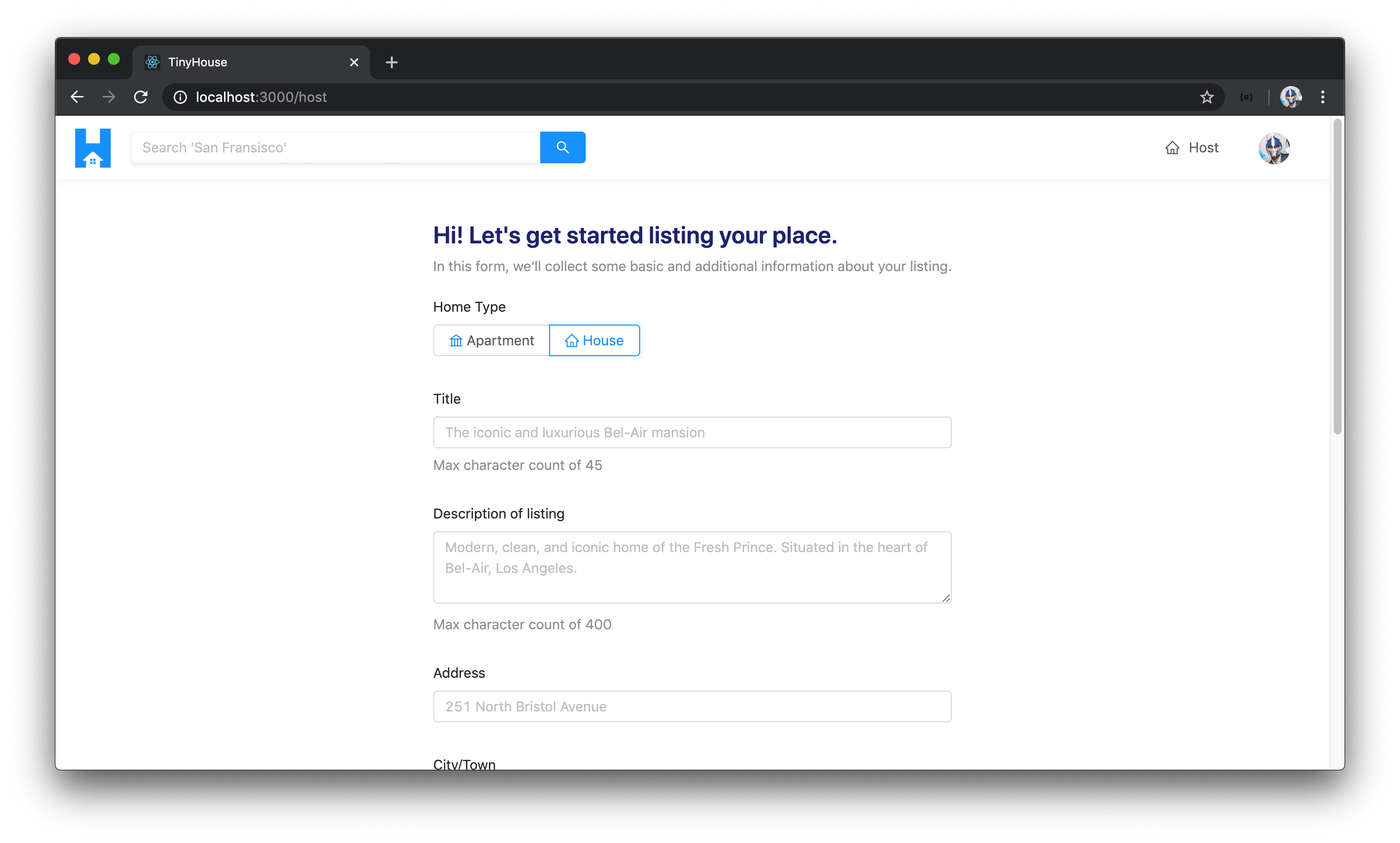
IMAGE UPLOAD & BASE64 ENCODING
The image upload capability we’ll build will mimic very close to the
Avatarexample shown in the Ant Design documentation for the<Upload>component. A code example of the implementation we’ll mimic can be seen - here.
There’s one other form item we’re interested in capturing and that is to be the image of a listing. This would be more complicated to capture so we’ll spend a little more time here. Ant Design provides a fairly powerful <Upload /> component that helps facilitate the uploading of files from the client.
There are a few different variations of how the <Upload /> component can be used but we’ll be interested in using the Avatar example/variation shown in the Ant Design documentation.
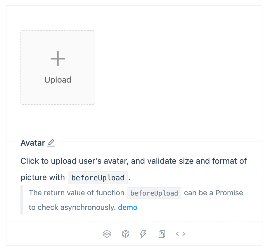
In the example shown above, when an image is uploaded through the <Upload /> component, our machine’s file navigator will open and when we select an image, a preview of the image is then shown.
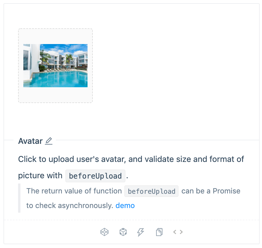
How is this image being uploaded where a preview is then shown to us? In this example, the Ant Design <Upload /> component takes the image uploaded from the file navigator and prepares the image in base64 encoded format .
Base64 encoding is essentially a way to convert data into simple printable characters. Base64 is often used when data needs to be stored and transferred over a medium that expects textual based data . The image for a new listing in the /host page is a good example of this. We can’t transfer this listing image as an image file from our client to our server through our GraphQL API. Instead, we can convert it to base64 encoded format which is a string representation of the data where we’re then able to send it to the server through the GraphQL API!
Let’s prepare the image upload component in our /host form. We’ll prepare the entire image uploader element with all the accompanying functions and we’ll explain things as we go.
The first thing we’ll do is import the <Upload /> component from Ant Design.
import { Upload } from "antd";
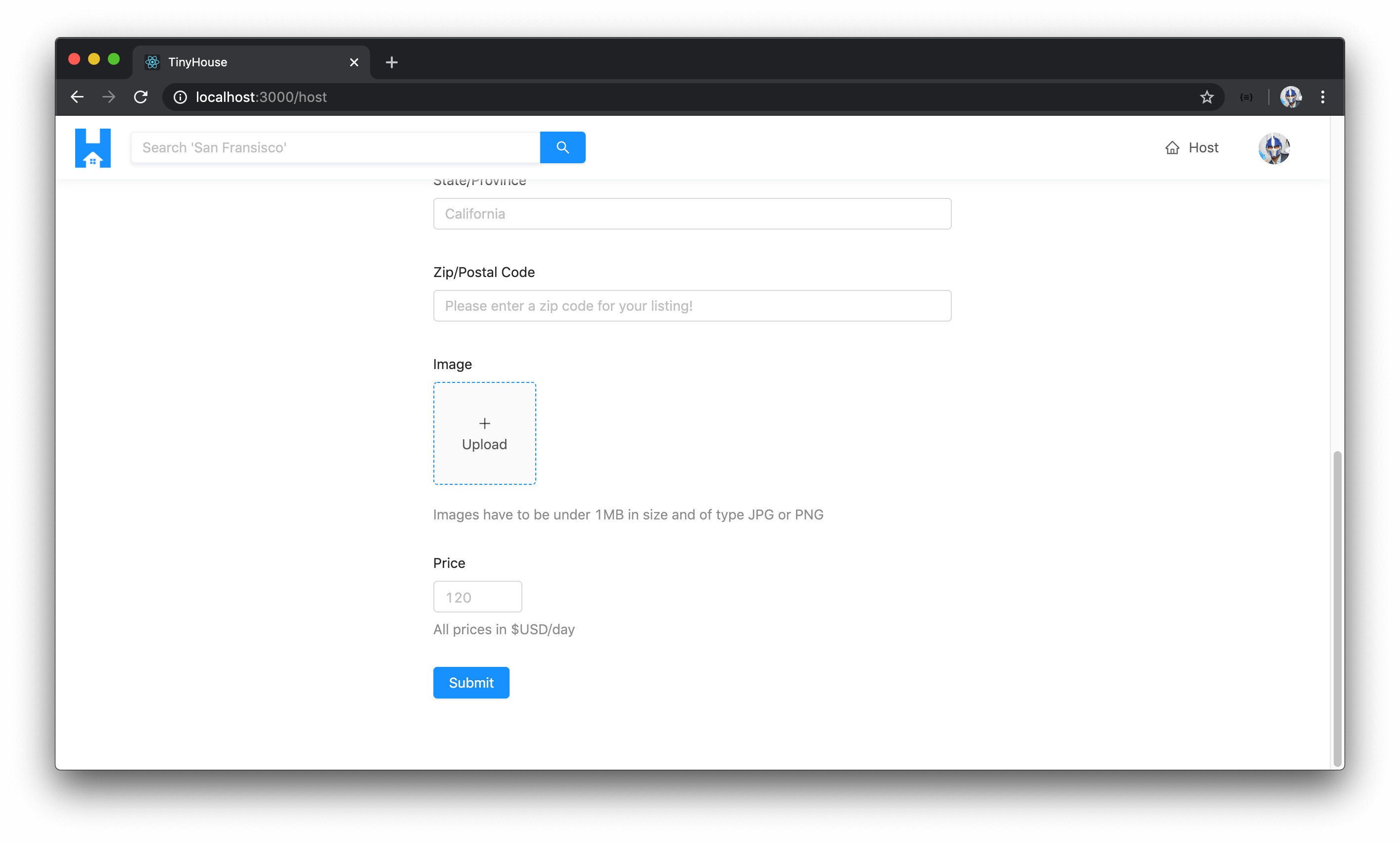
We’ll prepare another form item just before the price form item in our form with a label of "Image" . We’ll have a few restrictions here so we’ll have the form item extra help text state "Images have to be under 1MB in size and of type JPG or PNG" . We’ll place the <Upload /> component within a <div /> element in the form item.
export const Host = () => {
  // ...

  return (
    <Content className="host-content">
      <Form layout="vertical">
        <div className="host__form-header">
          <Title level={3} className="host__form-title">
            Hi! Let's get started listing your place.
          </Title>
          <Text type="secondary">
            In this form, we'll collect some basic and additional information about your
            listing.
          </Text>
        </div>

        <Item label="Home Type">
          <Radio.Group>
            <Radio.Button>
              <span>Apartment</span>
            </Radio.Button>
            <Radio.Button>
              <span>House</span>
            </Radio.Button>
          </Radio.Group>
        </Item>

        <Item label="Title" extra="Max character count of 45">
          <Input maxLength={45} placeholder="The iconic and luxurious Bel-Air mansion" />
        </Item>

        <Item label="Description of listing" extra="Max character count of 400">
          <Input.TextArea
            rows={3}
            maxLength={400}
            placeholder={`
              Modern, clean, and iconic home of the Fresh Prince.
              Situated in the heart of Bel-Air, Los Angeles.
            `}
          />
        </Item>

        <Item label="Address">
          <Input placeholder="251 North Bristol Avenue" />
        </Item>

        <Item label="City/Town">
          <Input placeholder="Los Angeles" />
        </Item>

        <Item label="State/Province">
          <Input placeholder="California" />
        </Item>

        <Item label="Zip/Postal Code">
          <Input placeholder="Please enter a zip code for your listing!" />
        </Item>

        <Item
          label="Image"
          extra="Images have to be under 1MB in size and of type JPG or PNG"
        >
          <div className="host__form-image-upload">
            <Upload name="image" />
          </div>
        </Item>

        <Item label="Price" extra="All prices in $USD/day">
          <InputNumber min={0} placeholder="120" />
        </Item>
      </Form>
    </Content>
  );
};
The <Upload /> component from Ant Design has a listType prop which helps dictate the style of the uploader. We’ll provide a value of "picture-card" for this prop which is the style of the example we saw in the documentation. The showUploadList prop dictates whether we want to show some list related UI where actions like remove/delete or preview the image is presented. We’re not interested in this so we’ll state a value of false for the showUploadList prop.
<Item label="Image" extra="Images have to be under 1MB in size and of type JPG or PNG">
  <div className="host__form-image-upload">
    <Upload name="image" listType="picture-card" showUploadList={false} />
  </div>
</Item>
Ant Design’s <Upload /> component contains an action prop where an AJAX upload request that is declared here is to be fired the moment the upload is made. We don’t want to fire an AJAX request the moment the image is uploaded. We simply want the preview to be shown and capture the base64 value of the image which will only be sent to the server after the entire form is submitted .
The unfortunate thing is this action prop is required to preview the image which is a little unfortunate. We can do something a little hacky here and bypass this action by placing a mock HTTP response to mock the fact that an image was uploaded as part of an actual request. This same set-up is also made in the Ant Design documentation for the <Upload /> component.
<Item label="Image" extra="Images have to be under 1MB in size and of type JPG or PNG">
  <div className="host__form-image-upload">
    <Upload
      name="image"
      listType="picture-card"
      showUploadList={false}
      action="https://www.mocky.io/v2/5cc8019d300000980a055e76"
    />
  </div>
</Item>
beforeUpload()
There are two additional callback function props we’ll use - beforeUpload() and onChange() . beforeUpload() is a function that will execute just before the upload has been made and it’s where we can check if the image is of a valid type (i.e. if the image file is either jpeg or png and is less than 1MB in size). We’ll use the beforeUpload() prop and have it call a function we’ll shortly create labeled beforeImageUpload() .
<Item label="Image" extra="Images have to be under 1MB in size and of type JPG or PNG">
  <div className="host__form-image-upload">
    <Upload
      name="image"
      listType="picture-card"
      showUploadList={false}
      action="https://www.mocky.io/v2/5cc8019d300000980a055e76"
      beforeUpload={beforeImageUpload}
    />
  </div>
</Item>
We can have the beforeImageUpload() function be created outside of our component function since it’ll have no need to access or affect anything within the component, it’ll simply receive the image file from the callback function and return a boolean. The type of the file component will be the File interface that’s available within the scope of TypeScript in general. The File interface provides information about files and will allow us to access their content.
const beforeImageUpload = (file: File) => {};
In the beforeImageUpload() function, we’ll first check if the file type is either jpeg or png . We’ll create a constant to represent this called fileIsValidImage and we can check for the type of the file from the type field of the file object.
const beforeImageUpload = (file: File) => {
  const fileIsValidImage = file.type === "image/jpeg" || file.type === "image/png";
};
Next, we can check if the file size is less than 1MB. We can do this with the file.size property and we’ll check for its size in a constant called fileIsValidSize . The file.size property is in bytes. To have it in MB in binary form, we can divide the bytes by 1024 twice.
const beforeImageUpload = (file: File) => {
  const fileIsValidImage = file.type === "image/jpeg" || file.type === "image/png";
  const fileIsValidSize = file.size / 1024 / 1024 < 1;
};
If the file is not a valid image or not a valid size, we can return false otherwise return both properties which will be true .
const beforeImageUpload = (file: File) => {
  const fileIsValidImage = file.type === "image/jpeg" || file.type === "image/png";
  const fileIsValidSize = file.size / 1024 / 1024 < 1;

  if (!fileIsValidImage) {
    return false;
  }

  if (!fileIsValidSize) {
    return false;
  }

  return fileIsValidImage && fileIsValidSize;
};
Instead of only returning false if one of these isn’t satisfied, we can look to display an error message to the user to notify them of the issue. To do this we can first import the displayErrorMessage() function from our src/lib/utils/ folder.
client/src/sections/Host/index.tsx
import { iconColor, displayErrorMessage } from "../../lib/utils";
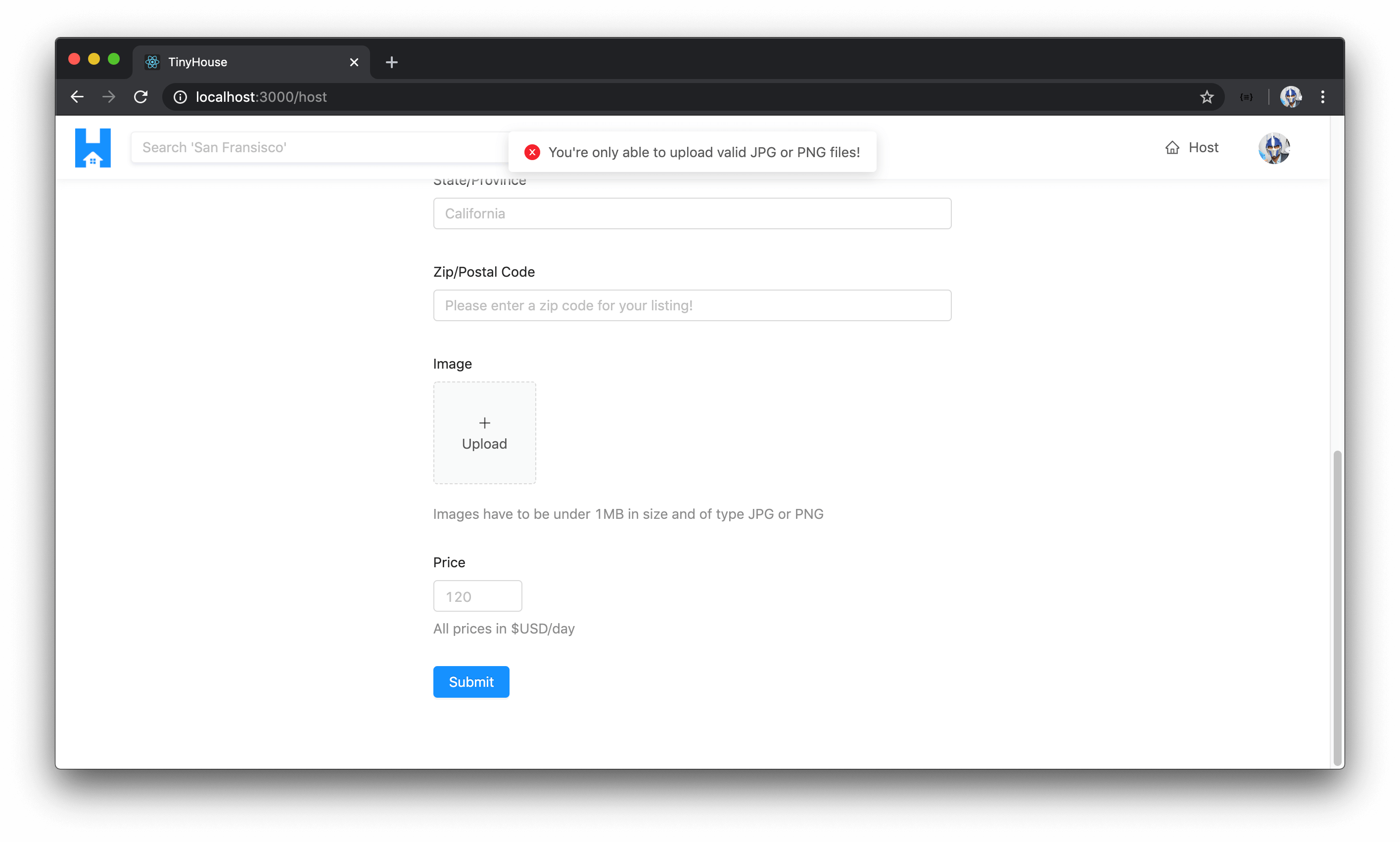
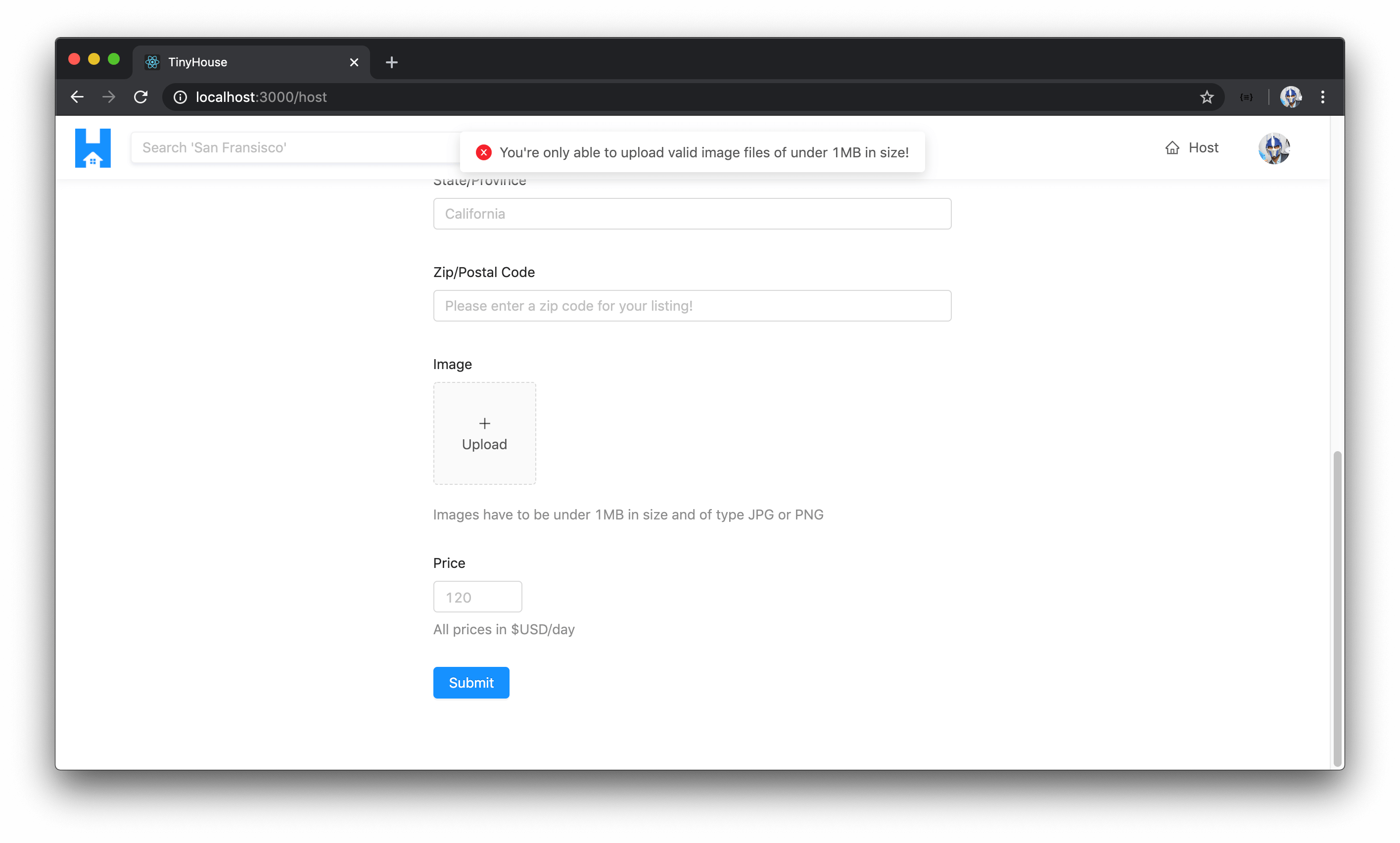
For each of the invalid file cases, we can look to display an error. If the file is not a valid image, we’ll fire an error message of "You're only able to upload valid JPG or PNG files!" . If the file is not a valid size, we’ll fire an error message of "You're only able to upload valid images files of under 1MB in size!" .
client/src/sections/Host/index.tsx
const beforeImageUpload = (file: File) => {
  const fileIsValidImage = file.type === "image/jpeg" || file.type === "image/png";
  const fileIsValidSize = file.size / 1024 / 1024 < 1;

  if (!fileIsValidImage) {
    displayErrorMessage("You're only able to upload valid JPG or PNG files!");
    return false;
  }

  if (!fileIsValidSize) {
    displayErrorMessage(
      "You're only able to upload valid image files of under 1MB in size!"
    );
    return false;
  }

  return fileIsValidImage && fileIsValidSize;
};
onChange()
With our validation check performed in the beforeUpload() callback function of the <Upload /> component, let’s prepare what will happen when the upload is made successfully with the callback function to be applied to the onChange() prop. Keep in mind that this onChange() function will trigger when a change is made which means it’ll trigger when the image is first uploaded and when the image upload is complete.
We’ll have it call another function we’ll create labeled handleImageUpload() which we’ll keep in the component function since we’ll need to modify some component state.
export const Host = () => {
  const handleImageUpload = () => {};

  return (
    <Content className="host-content">
      <Form layout="vertical">
        {/* ... */}

        <Item
          label="Image"
          extra="Images have to be under 1MB in size and of type JPG or PNG"
        >
          <div className="host__form-image-upload">
            <Upload
              name="image"
              listType="picture-card"
              showUploadList={false}
              action="https://www.mocky.io/v2/5cc8019d300000980a055e76"
              beforeUpload={beforeImageUpload}
              onChange={handleImageUpload}
            />
          </div>
        </Item>

        {/* ... */}
      </Form>
    </Content>
  );
};
There’s going to be two state values we’ll want to track in the <Host /> component so let’s import the useState Hook from React.
client/src/sections/Host/index.tsx
import React, { useState } from "react";
One state property value we’ll want to track is when the image upload is loading which will help us show some UI to the user. We’ll call this state property imageLoading and the function responsible for updating this property setImageLoading() and we’ll initialize it with a value of false .
We’ll also want to be able to track the actual base64 value of the image that is to be uploaded so we’ll create a state property called imageBase64Value and the function responsible for updating it setImageBase64Value() . We’ll initialize the value as null and we’ll state the type of this state property to either be a string or null .
export const Host = () => {
  const [imageLoading, setImageLoading] = useState(false);
  const [imageBase64Value, setImageBase64Value] = useState<string | null>(null);

  const handleImageUpload = () => {};

  // ...

  return (
    <Content className="host-content">
      <Form layout="vertical">
        {/* ... */}

        <Item
          label="Image"
          extra="Images have to be under 1MB in size and of type JPG or PNG"
        >
          <div className="host__form-image-upload">
            <Upload
              name="image"
              listType="picture-card"
              showUploadList={false}
              action="https://www.mocky.io/v2/5cc8019d300000980a055e76"
              beforeUpload={beforeImageUpload}
              onChange={handleImageUpload}
            />
          </div>
        </Item>

        {/* ... */}
      </Form>
    </Content>
  );
};
When the handleImageUpload() function gets called, the <Upload /> component will pass an info object that contains information about the upload as well as information about the file that’s been uploaded. We can declare the type of this info object by importing an interface called UploadChangeParam directly from the <Upload /> component type definitions file from Ant Design.
// ...
import { UploadChangeParam } from "antd/lib/upload";
// ...

export const Host = () => {
  const [imageLoading, setImageLoading] = useState(false);
  const [imageBase64Value, setImageBase64Value] = useState<string | null>(null);

  const handleImageUpload = (info: UploadChangeParam) => {};

  // ...

  return (
    <Content className="host-content">
      <Form layout="vertical">
        {/* ... */}

        <Item
          label="Image"
          extra="Images have to be under 1MB in size and of type JPG or PNG"
        >
          <div className="host__form-image-upload">
            <Upload
              name="image"
              listType="picture-card"
              showUploadList={false}
              action="https://www.mocky.io/v2/5cc8019d300000980a055e76"
              beforeUpload={beforeImageUpload}
              onChange={handleImageUpload}
            />
          </div>
        </Item>

        {/* ... */}
      </Form>
    </Content>
  );
};
From the info argument passed into the handleImageUpload() function, we can destruct and retrieve the file object.
const handleImageUpload = (info: UploadChangeParam) => {
  const { file } = info;
};
The file object we’ve destructured here doesn’t just represent the file that’s been uploaded from our file navigator. It is of a particular type from the <Upload /> component that gives us information about the status of the file being uploaded. We can check the status property of the file to see if the file is "uploading" . If so, this would mean that our <Upload /> element should be in the loading state so we’ll call the setImageLoading() function and pass a value of true and we’ll return early.
const handleImageUpload = (info: UploadChangeParam) => {
  const { file } = info;

  if (file.status === "uploading") {
    setImageLoading(true);
    return;
  }
};
If the file.status is "done" , we can determine and see if this file object contains another property called originFileObj . The originFileObj property is what the <Upload /> component tells us is the actual original file object. When the originFileObj property from the file is available, we can have another function be called that we’ll create labeled getBase64Value() . The first argument will be the originFileObj itself and for the second argument we can pass in a callback function that would receive a parameter and when available will simply run the setImageBase64Value() function and pass that parameter along. We’ll also then ensure we set the image loading state back to false .
client/src/sections/Host/index.tsx
  const handleImageUpload = (info: UploadChangeParam) => {
    const { file } = info;

    if (file.status === "uploading") {
      setImageLoading(true);
      return;
    }

    if (file.status === "done" && file.originFileObj) {
      getBase64Value(file.originFileObj, imageBase64Value => {
        setImageBase64Value(imageBase64Value);
        setImageLoading(false);
      });
    }
  };
This might make more sense when we create the getBase64Value() function so let’s go ahead and create it. We’ll create it outside of our component function since it’ll have no need to do anything with regards to properties in our component.
const getBase64Value = () => {};
The first argument will be the image file itself. We’ve mentioned it can be of type File which is a reference to the File interface available in Typescript. However, with the way the <Upload /> component works, this item from the file object can be a Blob as well. A Blob is essentially a file-like object which has minor differences to what a traditional File object is. This isn’t a big deal on our part since whether it’s a File or a Blob , we’ll be able to get the base64 value with the same means.
The second argument is the callback function where the actual base64 value of the image is expected to be passed in and void is to be returned.
const getBase64Value = (
  img: File | Blob,
  callback: (imageBase64Value: string) => void
) => {};
In the getBase64Value() function, let’s try and get the base64 value of the image and then trigger the callback function to update the state property we have in our <Host /> component.
To get the base64 value, we can use the FileReader constructor in JavaScript. The FileReader object allows us to read the contents of a File or Blob . We’ll run the FileReader object function and pass the result to a constant we’ll call reader .
We can then run the readAsDataURL function available from the FileReader to read the contents of the file.
const getBase64Value = (
  img: File | Blob,
  callback: (imageBase64Value: string) => void
) => {
  const reader = new FileReader();
  reader.readAsDataURL(img);
};
The FileReader has an onload property that has an event handler that is executed when the ‘load’ event is fired and this happens when the file has been read, which in our case will be done from the function readAsDataURL() . When this is triggered, this means the file has been read and we can call our callback function and pass the result of the reader which at this moment should be the base64 value.
const getBase64Value = (
  img: File | Blob,
  callback: (imageBase64Value: string) => void
) => {
  const reader = new FileReader();
  reader.readAsDataURL(img);
  reader.onload = () => {
    callback(reader.result);
  };
};
This is where we’ll do another small hack to get by. The FileReader API tells us that the result of the reader can either be a string (which is what we want) or an ArrayBuffer type or null . From what I’ve gathered, this result should be a string and it’s unlikely to be either null or an ArrayBuffer if the image is of a valid type that was uploaded properly. As a result, we’ll use type assertion and simply assert the type of the reader.result as a string.
client/src/sections/Host/index.tsx
const getBase64Value = (
  img: File | Blob,
  callback: (imageBase64Value: string) => void
) => {
  const reader = new FileReader();
  reader.readAsDataURL(img);
  reader.onload = () => {
    callback(reader.result as string);
  };
};
Notice the use of our own callback function? Callback functions are just functions that are passed to other functions as arguments . We’ve passed a function that will call
setImageBase64Value()with the base64 result from theFileReaderand will also callsetImageLoadingto reset the loading status tofalse. We executed this callback function only when the base64 result was available from theFileReader.
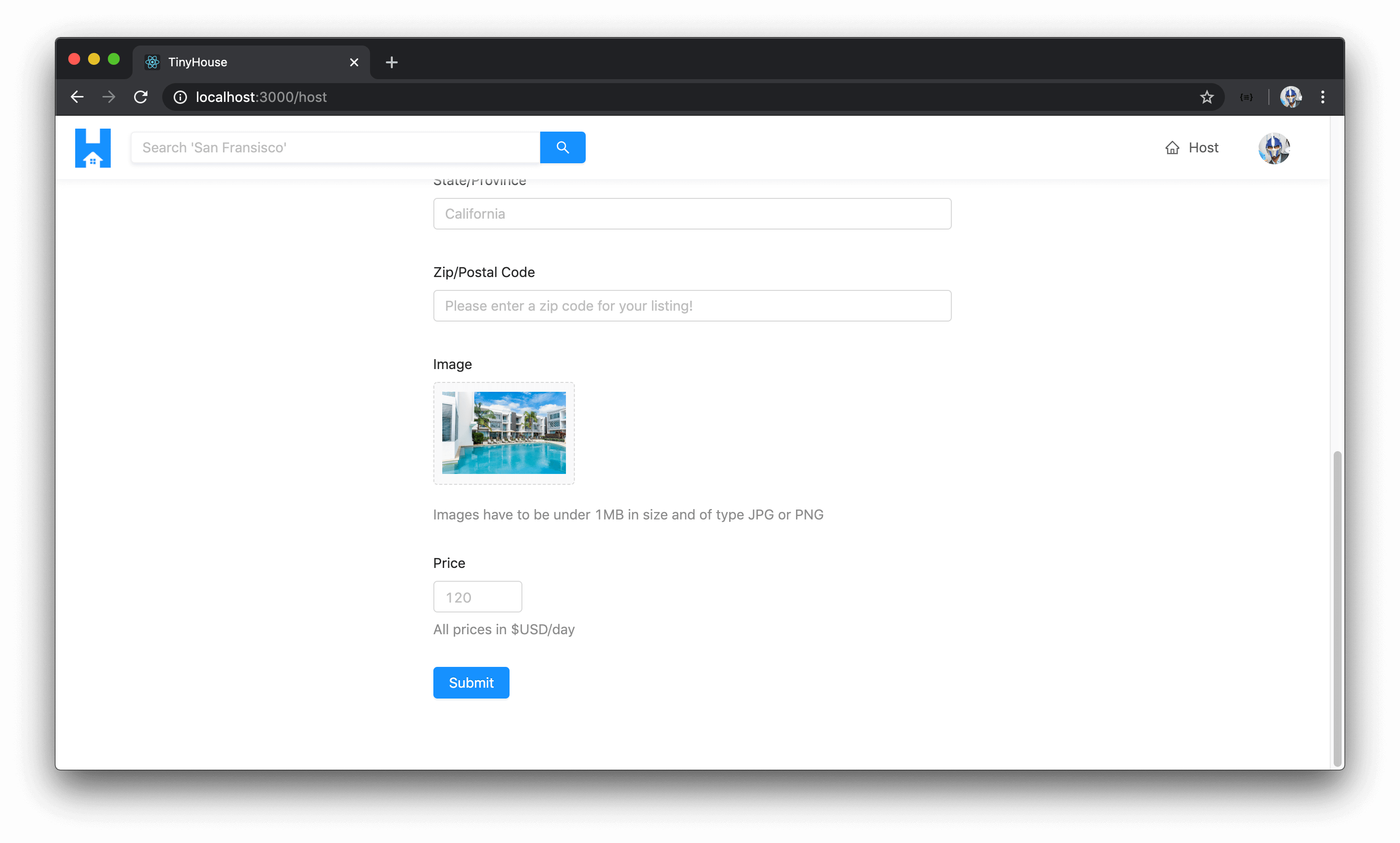
With our beforeUpload() and onChange() functions prepared, let’s now use the loading and base64 state values in our <Upload /> component. In the <Upload /> component, we’ll use a conditional statement and say if the imageBase64 value exists, display an img element within where the src is the imageBase64 value. If it doesn’t exist, we’ll look to display a <div /> element that is to have an <Icon /> and some text that says "Upload" .
For the <Icon /> , we can control the type of the icon depending on whether our upload is in the loading state. If it’s loading, we’ll use the "loading" icon type. If it’s not, we’ll show the "plus" icon type. We’ll use the imageLoading state property to determine this.
// ...
import {
  Button,
  Form,
  Icon,
  Input,
  InputNumber,
  Layout,
  Radio,
  Typography,
  Upload
} from "antd";
// ...

export const Host = () => {
  // ...

  return (
    <Content className="host-content">
      <Form layout="vertical">
        {/* ... */}

        <Item
          label="Image"
          extra="Images have to be under 1MB in size and of type JPG or PNG"
        >
          <div className="host__form-image-upload">
            <Upload
              name="image"
              listType="picture-card"
              showUploadList={false}
              action="https://www.mocky.io/v2/5cc8019d300000980a055e76"
              beforeUpload={beforeImageUpload}
              onChange={handleImageUpload}
            >
              {imageBase64Value ? (
                <img src={imageBase64Value} alt="Listing" />
              ) : (
                <div>
                  <Icon type={imageLoading ? "loading" : "plus"} />
                  <div className="ant-upload-text">Upload</div>
                </div>
              )}
            </Upload>
          </div>
        </Item>

        {/* ... */}
      </Form>
    </Content>
  );
};
When we now take a look at the /host page, we’ll notice a new form item that has the upload element shown.
If we were to upload an image and while the image is being uploaded, we’ll see the loading indicator in the <Upload /> component.

When the image is uploaded, a preview of the image is shown!
If we were to upload a file that isn’t of a valid jpeg or png format, we’ll get an error message displayed to us that says "You're only able to upload valid JPG or PNG files!" .
If we were to upload an image over the 1MB limit, we’ll get the error message that states "You're only able to upload valid images files of under 1MB in size!" .
At this moment, we can see we’ve created a state property in the <Host /> component to capture the base64 value of the image uploaded but we haven’t created state properties to capture values for the other form elements (title, description, address, etc). In the next lesson, we’re going to see how Ant Design’s <Form /> component will allow us to collect information without the need for us to explicitly define the state for each form element. We’ve only specified a state property for the image input because we’ve done a little bit of custom work to capture the base64 value.
The last thing we’ll do in this lesson is look to display a button that the user would use to submit the form. We’ll import the <Button /> component from Ant Design and we’ll place an <Item /> at the end of the form that contains the Button element of type "primary" and will have text that says "Submit" . With this change and all the changes we’ve made for the <Host /> component, the src/sections/Host/index.tsx will look like the following:
client/src/sections/Host/index.tsx
import React, { useState } from "react";
import { Link } from "react-router-dom";
import {
  Button,
  Form,
  Icon,
  Input,
  InputNumber,
  Layout,
  Radio,
  Typography,
  Upload
} from "antd";
import { UploadChangeParam } from "antd/lib/upload";
import { ListingType } from "../../lib/graphql/globalTypes";
import { iconColor, displayErrorMessage } from "../../lib/utils";
import { Viewer } from "../../lib/types";

interface Props {
  viewer: Viewer;
}

const { Content } = Layout;
const { Text, Title } = Typography;
const { Item } = Form;

export const Host = ({ viewer }: Props) => {
  const [imageLoading, setImageLoading] = useState(false);
  const [imageBase64Value, setImageBase64Value] = useState<string | null>(null);

  const handleImageUpload = (info: UploadChangeParam) => {
    const { file } = info;

    if (file.status === "uploading") {
      setImageLoading(true);
      return;
    }

    if (file.status === "done" && file.originFileObj) {
      getBase64Value(file.originFileObj, imageBase64Value => {
        setImageBase64Value(imageBase64Value);
        setImageLoading(false);
      });
    }
  };

  if (!viewer.id || !viewer.hasWallet) {
    return (
      <Content className="host-content">
        <div className="host__form-header">
          <Title level={4} className="host__form-title">
            You'll have to be signed in and connected with Stripe to host a listing!
          </Title>
          <Text type="secondary">
            We only allow users who've signed in to our application and have connected
            with Stripe to host new listings. You can sign in at the{" "}
            <Link to="/login">/login</Link> page and connect with Stripe shortly after.
          </Text>
        </div>
      </Content>
    );
  }

  return (
    <Content className="host-content">
      <Form layout="vertical">
        <div className="host__form-header">
          <Title level={3} className="host__form-title">
            Hi! Let's get started listing your place.
          </Title>
          <Text type="secondary">
            In this form, we'll collect some basic and additional information about your
            listing.
          </Text>
        </div>

        <Item label="Home Type">
          <Radio.Group>
            <Radio.Button value={ListingType.APARTMENT}>
              <Icon type="bank" style={{ color: iconColor }} /> <span>Apartment</span>
            </Radio.Button>
            <Radio.Button value={ListingType.HOUSE}>
              <Icon type="home" style={{ color: iconColor }} /> <span>House</span>
            </Radio.Button>
          </Radio.Group>
        </Item>

        <Item label="Title" extra="Max character count of 45">
          <Input maxLength={45} placeholder="The iconic and luxurious Bel-Air mansion" />
        </Item>

        <Item label="Description of listing" extra="Max character count of 400">
          <Input.TextArea
            rows={3}
            maxLength={400}
            placeholder={`
              Modern, clean, and iconic home of the Fresh Prince.
              Situated in the heart of Bel-Air, Los Angeles.
            `}
          />
        </Item>

        <Item label="Address">
          <Input placeholder="251 North Bristol Avenue" />
        </Item>

        <Item label="City/Town">
          <Input placeholder="Los Angeles" />
        </Item>

        <Item label="State/Province">
          <Input placeholder="California" />
        </Item>

        <Item label="Zip/Postal Code">
          <Input placeholder="Please enter a zip code for your listing!" />
        </Item>

        <Item
          label="Image"
          extra="Images have to be under 1MB in size and of type JPG or PNG"
        >
          <div className="host__form-image-upload">
            <Upload
              name="image"
              listType="picture-card"
              showUploadList={false}
              action="https://www.mocky.io/v2/5cc8019d300000980a055e76"
              beforeUpload={beforeImageUpload}
              onChange={handleImageUpload}
            >
              {imageBase64Value ? (
                <img src={imageBase64Value} alt="Listing" />
              ) : (
                <div>
                  <Icon type={imageLoading ? "loading" : "plus"} />
                  <div className="ant-upload-text">Upload</div>
                </div>
              )}
            </Upload>
          </div>
        </Item>

        <Item label="Price" extra="All prices in $USD/day">
          <InputNumber min={0} placeholder="120" />
        </Item>

        <Item>
          <Button type="primary">Submit</Button>
        </Item>
      </Form>
    </Content>
  );
};

const beforeImageUpload = (file: File) => {
  const fileIsValidImage = file.type === "image/jpeg" || file.type === "image/png";
  const fileIsValidSize = file.size / 1024 / 1024 < 1;

  if (!fileIsValidImage) {
    displayErrorMessage("You're only able to upload valid JPG or PNG files!");
    return false;
  }

  if (!fileIsValidSize) {
    displayErrorMessage(
      "You're only able to upload valid image files of under 1MB in size!"
    );
    return false;
  }

  return fileIsValidImage && fileIsValidSize;
};

const getBase64Value = (
  img: File | Blob,
  callback: (imageBase64Value: string) => void
) => {
  const reader = new FileReader();
  reader.readAsDataURL(img);
  reader.onload = () => {
    callback(reader.result as string);
  };
};
In the next lesson, we’ll continue what we’ve done here to trigger the hostListing mutation when the form is submitted!
EXECUTING THE HOSTLISTING MUTATION
The majority of the work we’ve needed to do for the form shown in the /host page was completed in the last lesson. In this lesson, we need to collect the values a user is to enter in the form and when the user decides to submit the form, we’ll trigger the hostListing mutation we have in our API and pass the relevant input along.
HOSTLISTING
The first thing we’ll do is ensure we have the GraphQL mutation document for the hostListing mutation. In the src/lib/graphql/mutations/ folder for our client, we’ll create another folder to contain an index.ts file that will have the hostListing mutation document.
client/
  src/
    lib/
      graphql/
        mutations/
          // ...
          HostListing/
            index.ts
          // ...
        // ...
    // ...
  // ...
In the src/lib/graphql/mutations/index.ts file, we’ll re-export the soon to be created hostListing mutation document.
client/src/lib/graphql/mutations/index.ts
export * from "./HostListing";
In the src/lib/graphql/mutations/HostListing/index.ts file, we’ll import the gql tag from apollo-boost and construct the mutation document HOST_LISTING . We’ll specify the mutation and the input that it is to expect and we’ll pass that input to the hostListing mutation field. If we recall, the hostListing mutation will return the Listing object itself that is created and added to the "listings" collection in our database. The only thing we’ll need from the returned listing object is the listing id .
client/src/lib/graphql/mutations/HostListing/index.ts
import { gql } from "apollo-boost";

export const HOST_LISTING = gql`
  mutation HostListing($input: HostListingInput!) {
    hostListing(input: $input) {
      id
    }
  }
`;
In our terminal, we’ll run the codegen:schema command to ensure the schema.json file in our client application is up to date.
npm run codegen:schema
When complete, we’ll run the codegen:generate command to generate the typings for our GraphQL documents.
npm run codegen:generate
FORM.CREATE()
We’ll then head over to the <Host /> component kept in the src/sections/Host/index.tsx file. Before we import and use the hostListing mutation, let’s see how we can access the values from the form. We mentioned in the previous lesson how the <Form /> component from Ant Design contains a function that acts as a higher-order function that allows us to produce another component where the form data object is to be available. We’ll want this higher component prepared and exported.
At the bottom of the <Host /> component file, we’ll create another component constant called WrappedHost to represent the <Host /> component that is to be wrapped with form specific functionality. We can use the Form.create() function available in the imported Form component that takes an options object with which we’ll only provide a value for the name property of host_form .
export const WrappedHost = Form.create({
  name: "host_form"
});
The Form.create() function receives an options object and returns a function to wrap our <Host /> component. Instead of assigning the returned function to another variable and running it, we can do this in one step by simply just concatenating the second function arguments right beside the first one.
export const WrappedHost = Form.create({
  name: "host_form"
})(Host);
Form.create() is a generic that is intended to receive the props of the form as well the component being wrapped. We already have a Props interface created for the viewer prop that is passed into the <Host /> component. We’ll import the FormComponentProps interface from the type definitions of the Form component in Ant Design.
client/src/sections/Host/index.tsx
import { FormComponentProps } from "antd/lib/form";
In the Form.create() function, we’ll pass in the generic of an intersection type of our component Props and the FormComponentProps .
client/src/sections/Host/index.tsx
export const WrappedHost = Form.create<Props & FormComponentProps>({
  name: "host_form"
})(Host);
In our <Host /> component function, we can now access the form object available from the higher-order function. We’ll also specify that the type of the prop argument of the <Host /> component function is to be an intersection of the Props and FormComponentProps interfaces.
export const Host = ({ viewer, form }: Props & FormComponentProps) => {
  // ...
};
This form object contains a series of functions and properties where we can validate our form and collect information, etc.
getFieldDecorator() - ListingType
We can use the getFieldDecorator() function available in this form object to decorate our form items and provide field-level validations to them. Let’s see how this can work. In the <Host /> component function, we’ll destruct the getFieldDecorator() function from the form object.
client/src/sections/Host/index.tsx
const { getFieldDecorator } = form;
Within our first form item (for capturing the listing type), we can call the getFieldDecorator() function within the form item. getFieldDecorator() receives a few arguments and returns a function that accepts a React Node with which it decorates.
<Item label="Home Type">
  {getFieldDecorator()(
    <Radio.Group>
      <Radio.Button value={ListingType.APARTMENT}>
        <Icon type="bank" style={{ color: iconColor }} /> <span>Apartment</span>
      </Radio.Button>
      <Radio.Button value={ListingType.HOUSE}>
        <Icon type="home" style={{ color: iconColor }} /> <span>House</span>
      </Radio.Button>
    </Radio.Group>
  )}
</Item>
The syntax here might appear strange but it’s similar to how we used the Form.create() function. In the first brackets, we intend to pass in the parameters the getFieldDecorator() function is to accept. This getFieldDecorator() function will return another function that expects a React Node so we’ll pass the entire radio group in as the second argument.
There are many things we can do here to decorate our form fields but the only thing we’ll do within our form items is to validate that the user filled out all the required information. The first argument to the decorator is a unique identifier to what each form item is to represent. For the listing type form item, we’ll say the id is "type" to convey that it is the listing type.
In the second argument of the getFieldDecorator() function for the listing type section, we can specify an options object. Within these options, we’ll only declare a rules array to dictate that this field is required and a warning message will be shown if the user doesn’t fill it in of "Please select a home type!" .
<Item label="Home Type">
  {getFieldDecorator("type", {
      rules: [
        {
          required: true,
          message: "Please select a home type!"
        }
      ]
    })(
      <Radio.Group>
        <Radio.Button value={ListingType.APARTMENT}>
          <Icon type="bank" style={{ color: iconColor }} /> <span>Apartment</span>
        </Radio.Button>
        <Radio.Button value={ListingType.HOUSE}>
          <Icon type="home" style={{ color: iconColor }} /> <span>House</span>
        </Radio.Button>
      </Radio.Group>
    );
  }
</Item>
getFieldDecorator() - Max # of Guests
We’ll specify a similar decorator for every input in our form to say that they’re all required. In the last lesson, we forgot to add a form input intended to capture the maximum number of guests.
We’ll create this input right after the listing type radio group with an item label of Max # of Guests and a minimum value for the input number of 1 .
<Item label="Max # of Guests">
  <InputNumber min={1} placeholder="4" />
</Item>
We’ll then specify a form decorator to dictate that this field is required with a warning message of "Please enter the max number of guests!" . We’ll say the id of this decorator is "numOfGuests" .
<Item label="Max # of Guests">
  {getFieldDecorator("numOfGuests", {
    rules: [
      {
        required: true,
        message: "Please enter the max number of guests!"
      }
    ]
  })(<InputNumber min={1} placeholder="4" />)}
</Item>
getFieldDecorator() - Title
For the title input, we’ll have a decorator to make sure it’s required and a warning message of "Please enter a title for your listing!" .
<Item label="Title" extra="Max character count of 45">
  {getFieldDecorator("title", {
    rules: [
      {
        required: true,
        message: "Please enter a title for your listing!"
      }
    ]
  })(<Input maxLength={45} placeholder="The iconic and luxurious Bel-Air mansion" />)}
</Item>
getFieldDecorator() - Description
For the description input, we’ll add a decorator to say it’s required with a validation message of "Please enter a description for your listing!" .
<Item label="Description of listing" extra="Max character count of 400">
  {getFieldDecorator("description", {
    rules: [
      {
        required: true,
        message: "Please enter a description for your listing!"
      }
    ]
  })(
    <Input.TextArea
      rows={3}
      maxLength={400}
      placeholder={`
        Modern, clean, and iconic home of the Fresh Prince.
        Situated in the heart of Bel-Air, Los Angeles.
      `}
    />
  )}
</Item>
getFieldDecorator() - Address, City, State, & Postal Code
For the address, city (or town), state (or province), and zip/postal code inputs, they’ll have decorators referencing their fields. They’ll all be required and they’ll have warning messages accordingly if the user attempts to submit the form without providing the necessary values.
<Item label="Address">
  {getFieldDecorator("address", {
    rules: [
      {
        required: true,
        message: "Please enter an address for your listing!"
      }
    ]
  })(<Input placeholder="251 North Bristol Avenue" />)}
</Item>

<Item label="City/Town">
  {getFieldDecorator("city", {
    rules: [
      {
        required: true,
        message: "Please enter a city (or region) for your listing!"
      }
    ]
  })(<Input placeholder="Los Angeles" />)}
</Item>

<Item label="State/Province">
  {getFieldDecorator("state", {
    rules: [
      {
        required: true,
        message: "Please enter a state for your listing!"
      }
    ]
  })(<Input placeholder="California" />)}
</Item>

<Item label="Zip/Postal Code">
  {getFieldDecorator("postalCode", {
    rules: [
      {
        required: true,
        message: "Please enter a zip code for your listing!"
      }
    ]
  })(<Input placeholder="Please enter a zip code for your listing!" />)}
</Item>
getFieldDecorator() - Image
Similarly, we’ll add a decorator to the image upload input with a warning message of something along the lines of "Please provide an image for your listing!" .
<Item label="Image" extra="Images have to be under 1MB in size and of type JPG or PNG">
  <div className="host__form-image-upload">
    {getFieldDecorator("image", {
      rules: [
        {
          required: true,
          message: "Please enter provide an image for your listing!"
        }
      ]
    })(<Upload>// ...</Upload>)}
  </div>
</Item>
getFieldDecorator() - Price
Finally, we’ll have a field decorator for the price input to say that a price is also required.
<Item label="Price" extra="All prices in $USD/day">
  {getFieldDecorator("price", {
    rules: [
      {
        required: true,
        message: "Please enter a price for your listing!"
      }
    ]
  })(<InputNumber min={0} placeholder="120" />)}
</Item>
Let’s see how these changes would currently behave. We’ll need to ensure we’re importing the higher-order <Host /> component so in the src/index.tsx file, we’ll import WrappedHost instead of Host and we’ll alias it as Host .
client/src/index.tsx
import {
  AppHeader,
  Home,
  WrappedHost as Host,
  Listing,
  Listings,
  Login,
  NotFound,
  Stripe,
  User
} from "./sections";
If we take a look at the /host page now, we’ll see the form inputs appear as expected however we’ll also see small star symbols along with each form item label which is a tell that the inputs are to be required. At this moment, the submit button of our form doesn’t really do anything. However, if we attempted to type something in an input, erase it, and click elsewhere - we’ll see the warning message of that form item be shown!

Great! However, when the form is submitted, we’ll want to see the field level validations for all the form inputs that haven’t been provided. We’ll want to trigger a form submit event when the "Submit" button at the bottom of our form is clicked. This can often be done in normal form elements in HTML by attaching a type attribute of submit and attaching an onSubmit() attribute to the form element.
With the Ant Design <Button /> element, we can do this with the available htmlType prop attribute with which we’ll provide a value of submit . In the <Form /> element, we’ll attach an onSubmit prop that will trigger a function we’ll set up called handleHostListing() .
export const Host = () => {
  // ...

  return (
    <Content className="host-content">
      <Form layout="vertical" onSubmit={handleHostListing}>
        {/* ... */}

        {/* ... */}

        {/* ... */}

        <Item>
          <Button type="primary" htmlType="submit">
            Submit
          </Button>
        </Item>
      </Form>
    </Content>
  );
};
We’ll create this handleHostListing() function in the component and it will expect an evt object that is to be passed in from the form submit event. We can declare the type of a form event in React by the FormEvent interface we can import from the React library.
client/src/sections/Host/index.tsx
import React, { useState, FormEvent } from "react";
When a form is submitted, it makes a request and reloads the page by default. We don’t want that. We want the event to be triggered where we can capture the form values and call our mutation. With that said, we’ll run the preventDefault() function of the event object to prevent the default situation of making an actual request.
export const Host = () => {
  // ...

  const handleHostListing = (evt: FormEvent) => {
    evt.preventDefault();
  };

  return (
    <Content className="host-content">
      <Form layout="vertical" onSubmit={handleHostListing}>
        {/* ... */}

        {/* ... */}

        {/* ... */}

        <Item>
          <Button type="primary" htmlType="submit">
            Submit
          </Button>
        </Item>
      </Form>
    </Content>
  );
};
In the handleHostListing() function, we’ll want to capture the values from the form and verify if all form information has been provided. We can achieve this by running the validateFields() method from the form prop object with which the first argument is an error property that determines if any errors are to exist in the form. The second argument is the actual values of the form.
const handleHostListing = async (evt: FormEvent) => {
  evt.preventDefault();

  form.validateFields((err, values) => {});
};
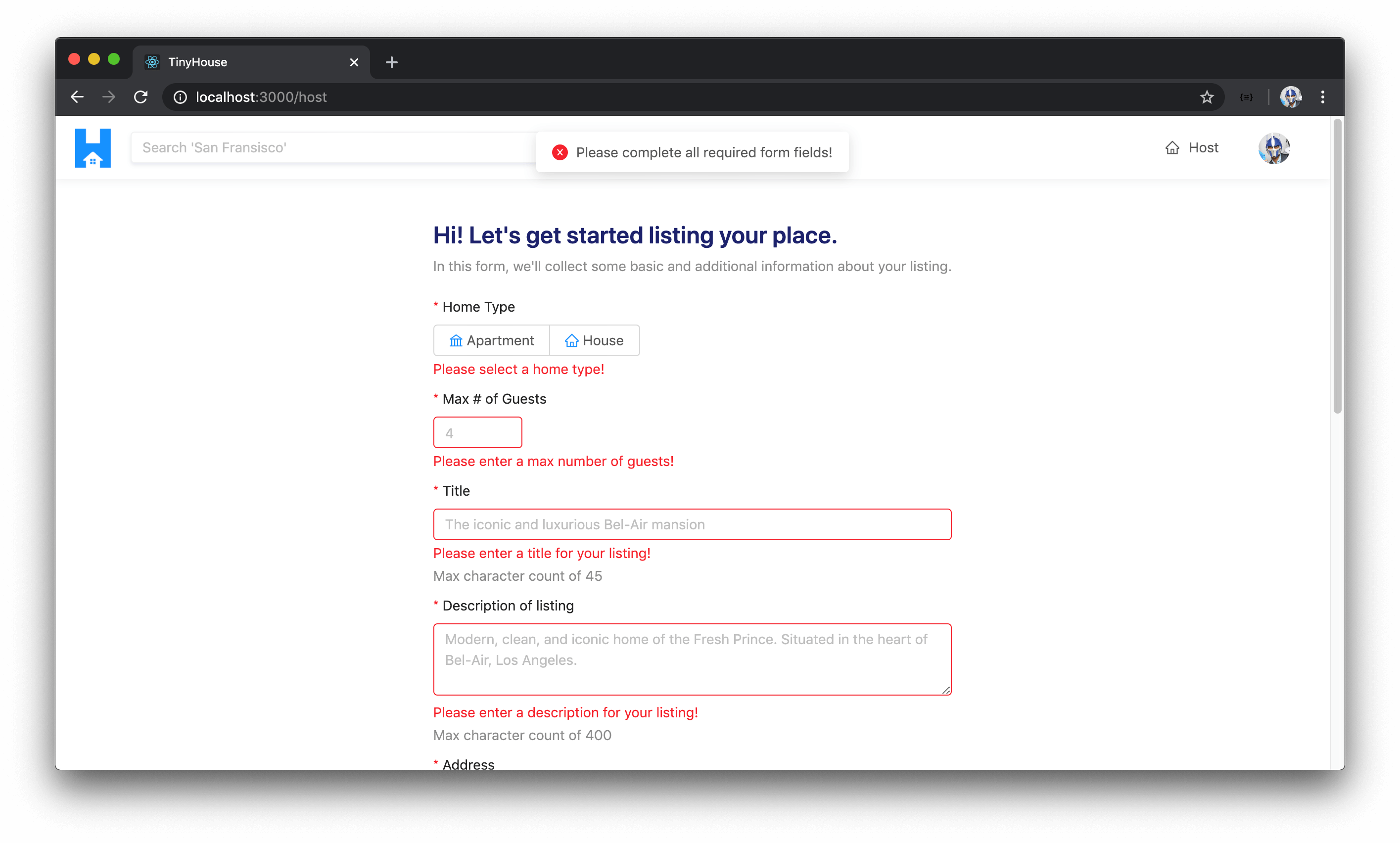
Errors from the validateFields() method will be present if any of the form inputs that are required haven’t been given a value. We can check and say if the err parameter exists, we’ll display an error message that tells the user "Please complete all required form fields!" and we’ll return early.
const handleHostListing = async (evt: FormEvent) => {
  evt.preventDefault();

  form.validateFields((err, values) => {
    if (err) {
      displayErrorMessage("Please complete all required form fields!");
      return;
    }
  });
};
If we head back to the /host page and try and click the "Submit" button right away, the form submit event will be fired, the handleHostListing() function will be called, and the validateFields() method of the form object is triggered. All field-level validation errors are shown and we have the page-level error message shown to us that says "Please complete all required form fields" .
HOSTLISTING()
At this moment, we’ve been able to provide some decent field and form level validations on the client and we’re able to capture the values in the form. We now need to prepare our data and trigger the hostListing mutation and pass the input data along. With that said, let’s import the useMutation Hook from React Apollo, the HOST_LISTING mutation document, and the corresponding type definitions.
import { useMutation } from "@apollo/react-hooks";
import { HOST_LISTING } from "../../lib/graphql/mutations";
import {
  HostListing as HostListingData,
  HostListingVariables
} from "../../lib/graphql/mutations/HostListing/__generated__/HostListing";
At the beginning of our <Host /> component function, we’ll use the useMutation Hook to construct our hostListing mutation. We’ll pass in the TypeScript data and variables of the mutation and the mutation document itself. We’ll destruct the mutation function as hostListing() and the loading and data properties of the mutation result.
export const Host = () => {
  // ...

  const [hostListing, { loading, data }] = useMutation<
    HostListingData,
    HostListingVariables
  >(HOST_LISTING);

  return (
    // ...
  );
};
In our handleHostListing() function, let’s prepare the form data and trigger the mutation function.
We mentioned earlier that we’re going to pass a single address field in the input object that will be a concatenation of all the address information provided in the form. Let’s prepare this address field. In the handleHostListing() function, we’ll create a constant called fullAddress and will simply be a string that contains the address , city , state , and postalCode fields from the values object of the form prop (which is the values captured in the form).
const handleHostListing = async (evt: FormEvent) => {
  evt.preventDefault();

  form.validateFields((err, values) => {
    if (err) {
      displayErrorMessage("Please complete all required form fields!");
      return;
    }

    const fullAddress = `${values.address}, ${values.city}, ${values.state}, ${values.postalCode}`;
  });
};
We’ll then prepare an input constant object for the input expected for the hostListing mutation. We’ll use the spread operator to pass all the fields in form values along to the input . We’ll make some changes to some additional fields within the input object we intend to prepare and send to the server:
- We’ll specify the
addressof the input to be thefullAddressvalue we’ve constructed. - We’ll update the
imagefield of the input to be of the base64 value we are to track in theimageBase64Valuestate property. - For the
pricefield we’ll make a small change since we’ve asked the user to provide the value in dollars. On the server, we store monetary values as cents so we’ll multiply thevalue.pricevalue by 100.
const handleHostListing = async (evt: FormEvent) => {
  evt.preventDefault();

  form.validateFields((err, values) => {
    if (err) {
      displayErrorMessage("Please complete all required form fields!");
      return;
    }

    const fullAddress = `${values.address}, ${values.city}, ${values.state}, ${values.postalCode}`;

    const input = {
      ...values,
      address: fullAddress,
      image: imageBase64Value,
      price: values.price * 100
    };
  });
};
The input object we’ve established has all the fields the mutation expects. However, it also contains a few additional fields like the city , state , and postalCode information captured in the form. We don’t need these since we are only expected to pass a single address field onto the server. As a result, we’ll use the JavaScript delete operator to simply delete the city , state , and postalCode fields from the input object.
We’ll then call the hostListing mutation function and pass the input as a variable.
client/src/sections/Host/index.tsx
  const handleHostListing = (evt: FormEvent) => {
    evt.preventDefault();

    form.validateFields((err, values) => {
      if (err) {
        displayErrorMessage("Please complete all required form fields!");
        return;
      }

      const fullAddress = `${values.address}, ${values.city}, ${values.state}, ${values.postalCode}`;

      const input = {
        ...values,
        address: fullAddress,
        image: imageBase64Value,
        price: values.price * 100
      };
      delete input.city;
      delete input.state;
      delete input.postalCode;

      hostListing({
        variables: {
          input
        }
      });
    });
  };
This is pretty much how we’ll want the hostListing mutation to be triggered by the <Host /> component. How would we want to handle the loading, success, and error states of this mutation?
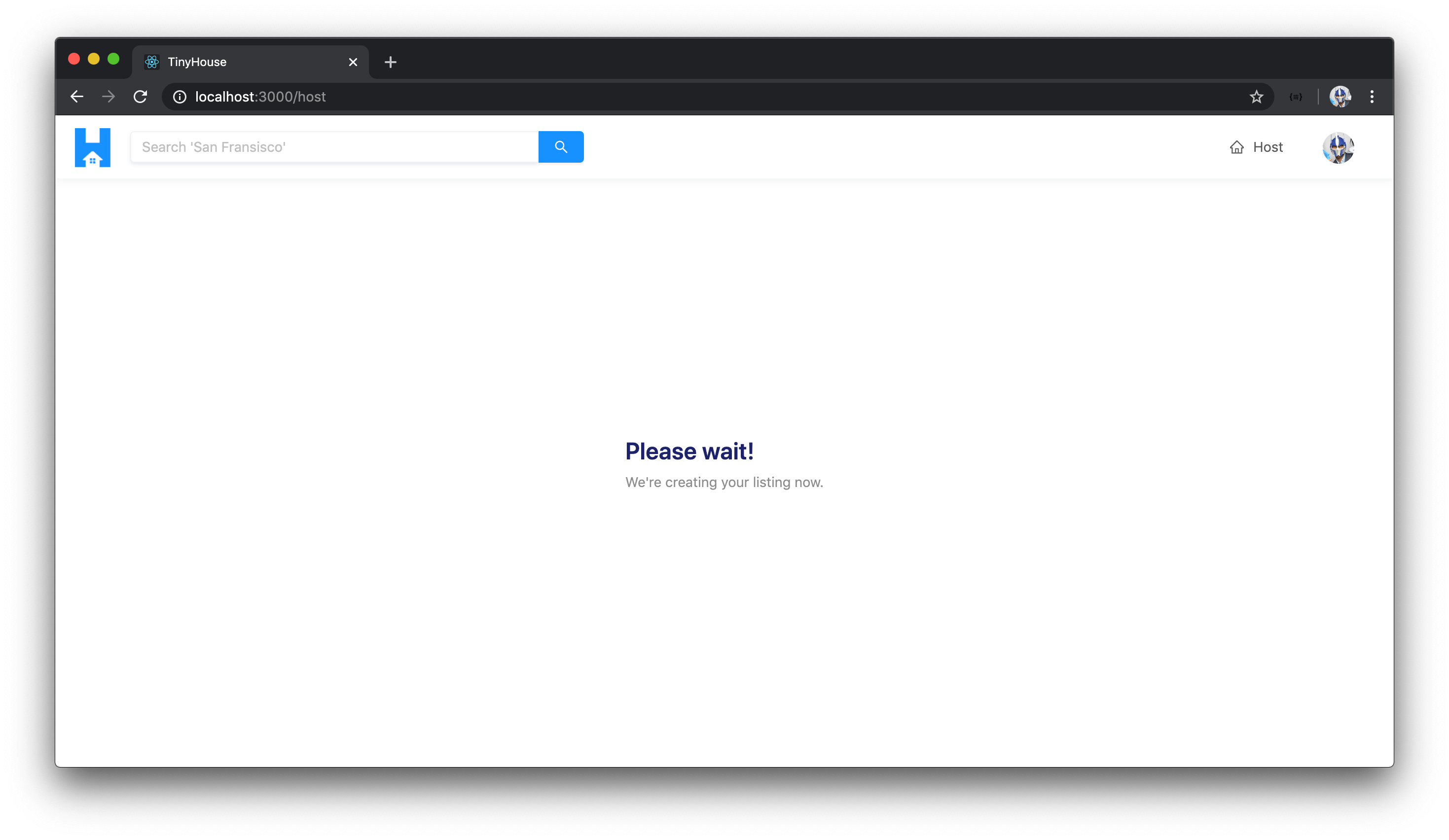
hostListing() - Loading
When the hostListing() mutation request is loading, we’ll simply have a <Title /> and <Text /> shown that says "Please Wait!" and "We're creating your listing now!" respectively.
export const Host = () => {
  // ...

  if (loading) {
    return (
      <Content className="host-content">
        <div className="host__form-header">
          <Title level={3} className="host__form-title">
            Please wait!
          </Title>
          <Text type="secondary">We're creating your listing now.</Text>
        </div>
      </Content>
    );
  }

  return (
    // ...
  );
};
hostListing() - Error
If our mutation ever errors, we’ll use the onError() callback result of our useMutation Hook to display an error message that says "Sorry, we weren't able to create your listing."
const [hostListing, { loading, data }] = useMutation<
  HostListingData,
  HostListingVariables
>(HOST_LISTING, {
  onError: () => {
    displayErrorMessage(
      "Sorry! We weren't able to create your listing. Please try again later."
    );
  }
});
hostListing() - Success
When the hostListing mutation is successful, we’ll do one of two things.
We’ll import and use the displaySuccessNotification() function in the onCompleted() callback of the useMutation Hook to show a success message that says "You've successfully created your listing!" .
client/src/sections/Host/index.tsx
import {
  iconColor,
  displaySuccessNotification,
  displayErrorMessage
} from "../../lib/utils";
client/src/sections/Host/index.tsx
  const [hostListing, { loading, data }] = useMutation<
    HostListingData,
    HostListingVariables
  >(HOST_LISTING, {
    onCompleted: () => {
      displaySuccessNotification("You've successfully created your listing!");
    },
    onError: () => {
      displayErrorMessage(
        "Sorry! We weren't able to create your listing. Please try again later."
      );
    }
  });
The other thing we’re going to do is take the user away from the /host page the moment the listing has successfully been created. We’ll like to take the user directly to the /listing/:id page of the recently created listing. To help make this redirect, we can import and use the <Redirect /> component from react-router-dom .
client/src/sections/Host/index.tsx
import { Link, Redirect } from "react-router-dom";
In our <Host /> component function, we can check that when data and the hostListing object within data is available, we’ll redirect the user to the /listing/:id route. The /listing/:id route accepts a URL parameter of the listing id itself. In the HOST_LISTING mutation document, we’ve specified the hostListing mutation is to return the id of the created listing when successful. We’ll use the returned id as the URL parameter of the redirect target route path.
export const Host = () => {
  // ...

  if (data && data.hostListing) {
    return <Redirect to={`/listing/${data.hostListing.id}`} />;
  }

  return (
    // ...
  );
};
At this moment, if we were to visit the /host page and attempt to create a listing, we’ll get an error. If we open the network logs, it tells us that the request entity was too large.
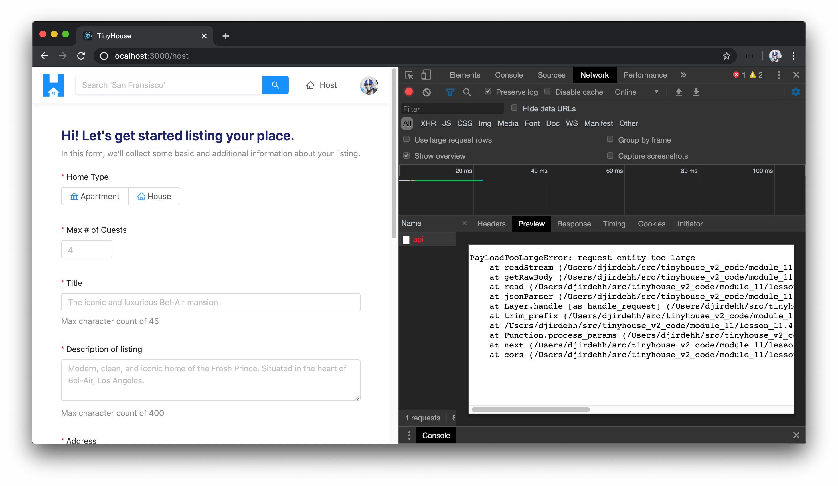
Why is this happening? The default HTTP request body json size in our server is 1MB. Base64 representation of the image increases the size of the image itself due to how base64 encoding works. What’s most likely happening is that our entire request exceeds 1MB even if our image file was less than 1MB in size.
What we can do, in our server project, is simply increase the body size limit of our requests. We’ll head over to our server project and import the bodyParser package in the root src/index.ts file. If we don’t have the bodyParser package in our server project, we can install it as a dependency with npm i body-parser .
server/src/index.ts
import bodyParser from "body-parser";
Right before we instantiate our ApolloServer instance, we’ll apply middleware to our express app and in the middleware specify a limit of our request body size as 2MB. We can do this with the bodyParser.json() function.
server/src/index.ts
require("dotenv").config();

import express, { Application } from "express";
import bodyParser from "body-parser";
import cookieParser from "cookie-parser";
import { ApolloServer } from "apollo-server-express";
import { connectDatabase } from "./database";
import { typeDefs, resolvers } from "./graphql";

const mount = async (app: Application) => {
  const db = await connectDatabase();

  app.use(bodyParser.json({ limit: "2mb" }));
  app.use(cookieParser(process.env.SECRET));

  const server = new ApolloServer({
    typeDefs,
    resolvers,
    context: ({ req, res }) => ({ db, req, res })
  });

  server.applyMiddleware({ app, path: "/api" });
  app.listen(process.env.PORT);

  console.log(`[app] : http://localhost:${process.env.PORT}`);
};

mount(express());
With our server changes saved, let’s now see how our application would behave. We’ll head back to the /host route of our client application, fill out all the form items in the host form, and click the "Submit" button.
We’ll first see the loading information in the /host page that tells us the listing is being created.
When the hostListing mutation is successful, we’re taken to the /listing/:id page of the newly created listing and a success notification message will be shown notifying us that we’ve successfully created our listing!

We’ve already built the /listing/:id page before so all we needed to do was direct a user who’s successfully created a new listing to the /listing/:id page and provide the appropriate id parameter.
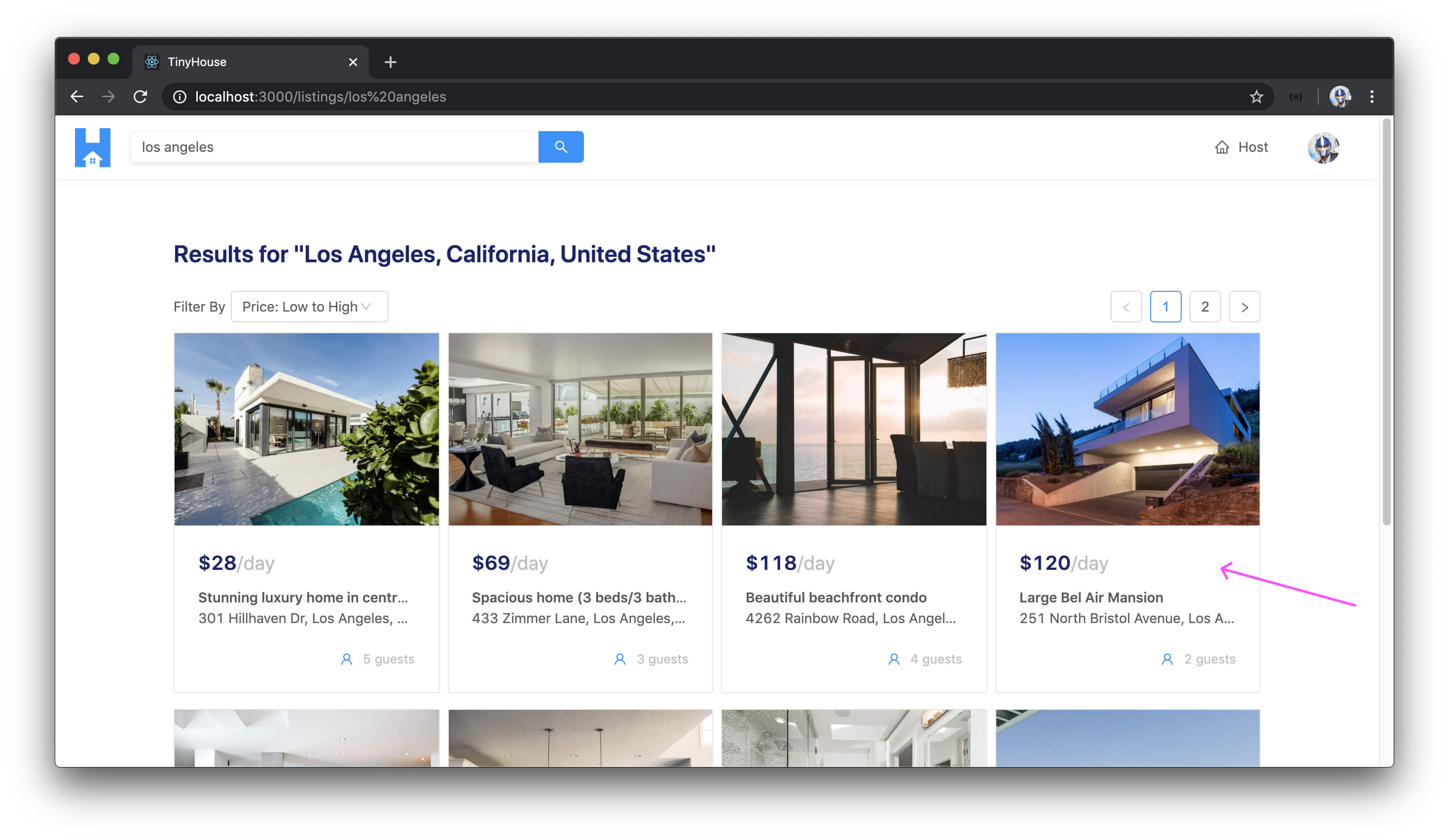
If we were to search for the city of the listing that has just been created, we’ll notice the listing as part of the search results.
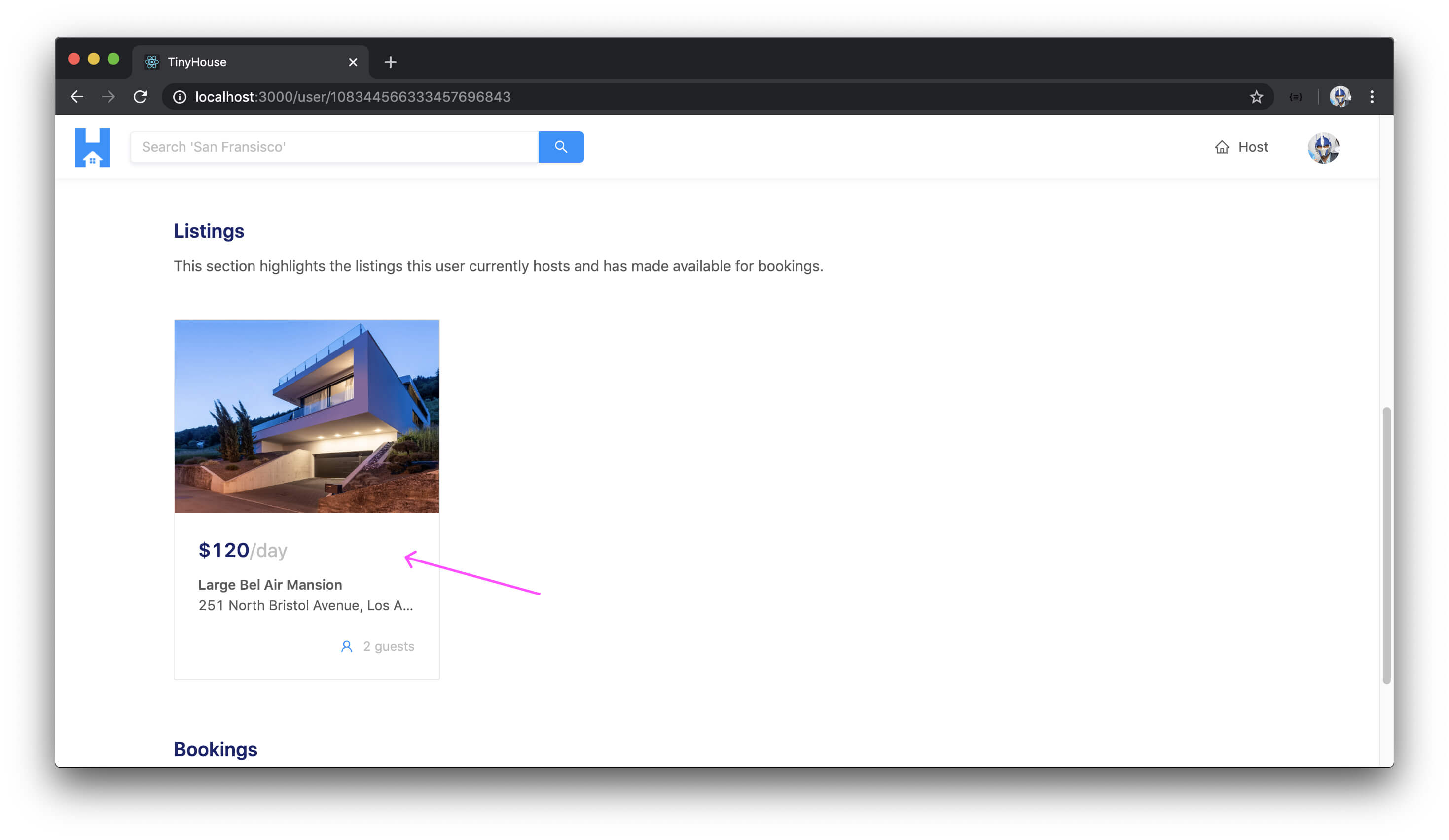
If we were to visit our own /user/:id page, we’ll see the listing we’ve created as part of the listings section shown on the user page!
Amazing work so far! In the next module, we’ll talk a bit more about listing images and see if there’s a better way of storing these images in our database.
MODULE 11 SUMMARY
In this module, we’ve worked on the functionality to have users host (i.e. create) listings in the TinyHouse application.
SERVER PROJECT
SRC/GRAPHQL/TYPEDEFS.TS
In our GraphQL API type definitions of our server project, we introduced one new root-level mutation field labeled hostListing .
server/src/graphql/typeDefs.ts
  type Mutation {
    logIn(input: LogInInput): Viewer!
    logOut: Viewer!
    connectStripe(input: ConnectStripeInput!): Viewer!
    disconnectStripe: Viewer!
    hostListing(input: HostListingInput!): Listing!
  }
The hostListing mutation accepts an input that is to have an object type of HostListingInput . The input is to contain a series of fields and field values that describe the listing that is to be created.
server/src/graphql/typeDefs.ts
  input HostListingInput {
    title: String!
    description: String!
    image: String!
    type: ListingType!
    address: String!
    price: Int!
    numOfGuests: Int!
  }
SRC/GRAPHQL/RESOLVERS/LISTING/INDEX.TS
We’ve constructed the resolver function for the hostListing mutation in the listingResolvers map within the src/graphql/resolvers/Listing/index.ts file. The hostListing() resolver function at first calls a utility function labeled verifyHostListingInput() that provides simple server-side validations to ensure the information in the input is valid.
server/src/graphql/resolvers/Listing/index.ts
const verifyHostListingInput = ({
  title,
  description,
  type,
  price
}: HostListingInput) => {
  if (title.length > 100) {
    throw new Error("listing title must be under 100 characters");
  }
  if (description.length > 5000) {
    throw new Error("listing description must be under 5000 characters");
  }
  if (type !== ListingType.Apartment && type !== ListingType.House) {
    throw new Error("listing type must be either an apartment or house");
  }
  if (price < 0) {
    throw new Error("price must be greater than 0");
  }
};
In the hostListing() resolver, when the information in the input is valid, we then authorize the viewer making the request. We retrieve the country , admin , and city information for the location of the listing being created. Finally, we insert a new listing document to the "listings" collection and update the listings field for the user document of the viewer creating the listing.
server/src/graphql/resolvers/Listing/index.ts
export const listingResolvers: IResolvers = {    hostListing: async (
      _root: undefined,
      { input }: HostListingArgs,
      { db, req }: { db: Database; req: Request }
    ): Promise<Listing> => {
      verifyHostListingInput(input);

      let viewer = await authorize(db, req);
      if (!viewer) {
        throw new Error("viewer cannot be found");
      }

      const { country, admin, city } = await Google.geocode(input.address);
      if (!country || !admin || !city) {
        throw new Error("invalid address input");
      }

      const insertResult = await db.listings.insertOne({
        _id: new ObjectId(),
        ...input,
        bookings: [],
        bookingsIndex: {},
        country,
        admin,
        city,
        host: viewer._id
      });

      const insertedListing: Listing = insertResult.ops[0];

      await db.users.updateOne(
        { _id: viewer._id },
        { $push: { listings: insertedListing._id } }
      );

      return insertedListing;
    }};
CLIENT PROJECT
SRC/LIB/GRAPHQL/MUTATIONS/HOSTLISTING/INDEX.TS
On the client project, we create the GraphQL document for the new root-level mutation fields - hostListing . When the hostListing mutation is to be executed successfully, we simply return the value of the id of the new listing that has been created.
client/src/lib/graphql/mutations/HostListing/index.ts
import { gql } from "apollo-boost";

export const HOST_LISTING = gql`
  mutation HostListing($input: HostListingInput!) {
    hostListing(input: $input) {
      id
    }
  }
`;
SRC/SECTIONS/HOST/INDEX.TSX
In the <Host /> component that is to be rendered in the /host route of our app, we create the form where the user can provide the necessary information for a new listing. When the form is submitted, the hostListing mutation is triggered and when successful, the user is redirected to the /listing/:id route of the newly created listing.
For building the form, we leverage Ant Design’s <Form /> component to help validate fields in the form with certain rules and to collect information provided by the user. When an image is uploaded for a new listing, we encode the image to base64 format before sending it as part of the input the server expects.
client/src/sections/Host/index.tsx
export const Host = ({ viewer, form }: Props & FormComponentProps) => {
  const [imageLoading, setImageLoading] = useState(false);
  const [imageBase64Value, setImageBase64Value] = useState<string | null>(null);

  const [hostListing, { loading, data }] = useMutation<
    HostListingData,
    HostListingVariables
  >(HOST_LISTING, {
    onCompleted: () => {
      displaySuccessNotification("You've successfully created your listing!");
    },
    onError: () => {
      displayErrorMessage(
        "Sorry! We weren't able to create your listing. Please try again later."
      );
    }
  });

  const handleImageUpload = (info: UploadChangeParam) => {
    const { file } = info;

    if (file.status === "uploading") {
      setImageLoading(true);
      return;
    }

    if (file.status === "done" && file.originFileObj) {
      getBase64Value(file.originFileObj, imageBase64Value => {
        setImageBase64Value(imageBase64Value);
        setImageLoading(false);
      });
    }
  };

  const handleHostListing = (evt: FormEvent) => {
    evt.preventDefault();

    form.validateFields((err, values) => {
      if (err) {
        displayErrorMessage("Please complete all required form fields!");
        return;
      }

      const fullAddress = `${values.address}, ${values.city}, ${values.state}, ${values.postalCode}`;

      const input = {
        ...values,
        address: fullAddress,
        image: imageBase64Value,
        price: values.price * 100
      };
      delete input.city;
      delete input.state;
      delete input.postalCode;

      hostListing({
        variables: {
          input
        }
      });
    });
  };

  if (!viewer.id || !viewer.hasWallet) {
    return (
      <Content className="host-content">
        <div className="host__form-header">
          <Title level={4} className="host__form-title">
            You'll have to be signed in and connected with Stripe to host a listing!
          </Title>
          <Text type="secondary">
            We only allow users who've signed in to our application and have connected
            with Stripe to host new listings. You can sign in at the{" "}
            <Link to="/login">/login</Link> page and connect with Stripe shortly after.
          </Text>
        </div>
      </Content>
    );
  }

  if (loading) {
    return (
      <Content className="host-content">
        <div className="host__form-header">
          <Title level={3} className="host__form-title">
            Please wait!
          </Title>
          <Text type="secondary">We're creating your listing now.</Text>
        </div>
      </Content>
    );
  }

  if (data && data.hostListing) {
    return <Redirect to={`/listing/${data.hostListing.id}`} />;
  }

  const { getFieldDecorator } = form;

  return (
    <Content className="host-content">
      <Form layout="vertical" onSubmit={handleHostListing}>
        <div className="host__form-header">
          <Title level={3} className="host__form-title">
            Hi! Let's get started listing your place.
          </Title>
          <Text type="secondary">
            In this form, we'll collect some basic and additional information about your
            listing.
          </Text>
        </div>

        <Item label="Home Type">
          {getFieldDecorator("type", {
            rules: [
              {
                required: true,
                message: "Please select a home type!"
              }
            ]
          })(
            <Radio.Group>
              <Radio.Button value={ListingType.APARTMENT}>
                <Icon type="bank" style={{ color: iconColor }} /> <span>Apartment</span>
              </Radio.Button>
              <Radio.Button value={ListingType.HOUSE}>
                <Icon type="home" style={{ color: iconColor }} /> <span>House</span>
              </Radio.Button>
            </Radio.Group>
          )}
        </Item>

        <Item label="Max # of Guests">
          {getFieldDecorator("numOfGuests", {
            rules: [
              {
                required: true,
                message: "Please enter a max number of guests!"
              }
            ]
          })(<InputNumber min={1} placeholder="4" />)}
        </Item>

        <Item label="Title" extra="Max character count of 45">
          {getFieldDecorator("title", {
            rules: [
              {
                required: true,
                message: "Please enter a title for your listing!"
              }
            ]
          })(
            <Input
              maxLength={45}
              placeholder="The iconic and luxurious Bel-Air mansion"
            />
          )}
        </Item>

        <Item label="Description of listing" extra="Max character count of 400">
          {getFieldDecorator("description", {
            rules: [
              {
                required: true,
                message: "Please enter a description for your listing!"
              }
            ]
          })(
            <Input.TextArea
              rows={3}
              maxLength={400}
              placeholder="Modern, clean, and iconic home of the Fresh Prince. Situated in the heart of Bel-Air, Los Angeles."
            />
          )}
        </Item>

        <Item label="Address">
          {getFieldDecorator("address", {
            rules: [
              {
                required: true,
                message: "Please enter a address for your listing!"
              }
            ]
          })(<Input placeholder="251 North Bristol Avenue" />)}
        </Item>

        <Item label="City/Town">
          {getFieldDecorator("city", {
            rules: [
              {
                required: true,
                message: "Please enter a city (or region) for your listing!"
              }
            ]
          })(<Input placeholder="Los Angeles" />)}
        </Item>

        <Item label="State/Province">
          {getFieldDecorator("state", {
            rules: [
              {
                required: true,
                message: "Please enter a state (or province) for your listing!"
              }
            ]
          })(<Input placeholder="California" />)}
        </Item>

        <Item label="Zip/Postal Code">
          {getFieldDecorator("postalCode", {
            rules: [
              {
                required: true,
                message: "Please enter a zip (or postal) code for your listing!"
              }
            ]
          })(<Input placeholder="Please enter a zip code for your listing!" />)}
        </Item>

        <Item
          label="Image"
          extra="Images have to be under 1MB in size and of type JPG or PNG"
        >
          <div className="host__form-image-upload">
            {getFieldDecorator("image", {
              rules: [
                {
                  required: true,
                  message: "Please provide an image for your listing!"
                }
              ]
            })(
              <Upload
                name="image"
                listType="picture-card"
                showUploadList={false}
                action="https://www.mocky.io/v2/5cc8019d300000980a055e76"
                beforeUpload={beforeImageUpload}
                onChange={handleImageUpload}
              >
                {imageBase64Value ? (
                  <img src={imageBase64Value} alt="Listing" />
                ) : (
                  <div>
                    <Icon type={imageLoading ? "loading" : "plus"} />
                    <div className="ant-upload-text">Upload</div>
                  </div>
                )}
              </Upload>
            )}
          </div>
        </Item>

        <Item label="Price" extra="All prices in $USD/day">
          {getFieldDecorator("price", {
            rules: [
              {
                required: true,
                message: "Please enter a price for your listing!"
              }
            ]
          })(<InputNumber min={0} placeholder="120" />)}
        </Item>

        <Item>
          <Button type="primary" htmlType="submit">
            Submit
          </Button>
        </Item>
      </Form>
    </Content>
  );
};
MOVING FORWARD
In the next module, we’ll investigate to see if there’s a better way of storing the newly created images for listings in our database.
MODULE 12 INTRODUCTION
In the last module, we were able to build the functionality to allow a user to host a new listing of their choice by providing the necessary information for a listing. When it comes to having an image be provided for a new listing, the server receives the image and stores it in the database as a base64 encoded string. Storing images this way takes a lot of space in our database.
In this module, we’ll
- Discuss our existing approach to storing images of new listings.
- See how we can leverage Cloudinary , a cloud-based image (and video) management service, to store images for new listings on the cloud .