QUERYING FOR LISTING DATA
Our GraphQL API is now prepared to have us query the listing field to get information for a certain listing. With that said, we’ll begin working on our React client application and create the listing page for when a user visits the /listing/:id route of our app.
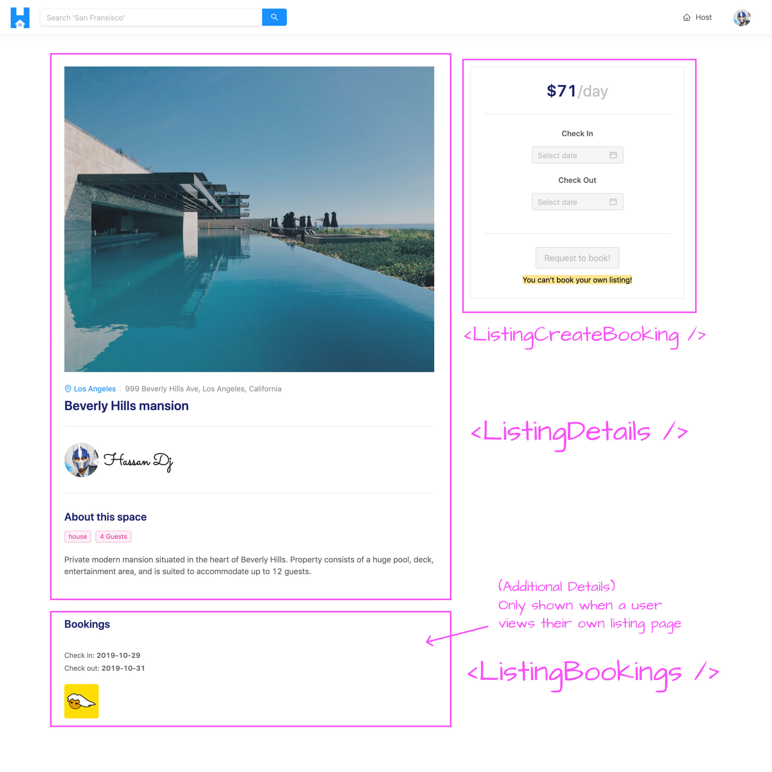
The listing page is to show details for a certain listing as well as provide the capability for a user to book the listing within certain dates. The user is to see details of a listing which consist of the listing image, location, title, host, description. For a viewer that views one of their own listings, they’ll be able to also see the bookings that have been made for the listing.
The component breakdown of the /listing/:id page is as follows:
- The UI that encompasses the details of the listing is to be a component labeled
<ListingDetails />. - The
<ListingBookings />component is to show a paginated list of bookings for the listing. The<ListingBookings />component will only be shown to a user that is viewing their own listing. - The capability to create a booking will be part of the
<ListingCreateBooking />component. When the user selects dates in this component and clicks the Request to Book button, a modal will be shown where the user can confirm their booking and provide payment information. We’ll create this modal at a later point in the course.
Here’s how we’ll want the UI for the page shown in the /listing/:id route to look.
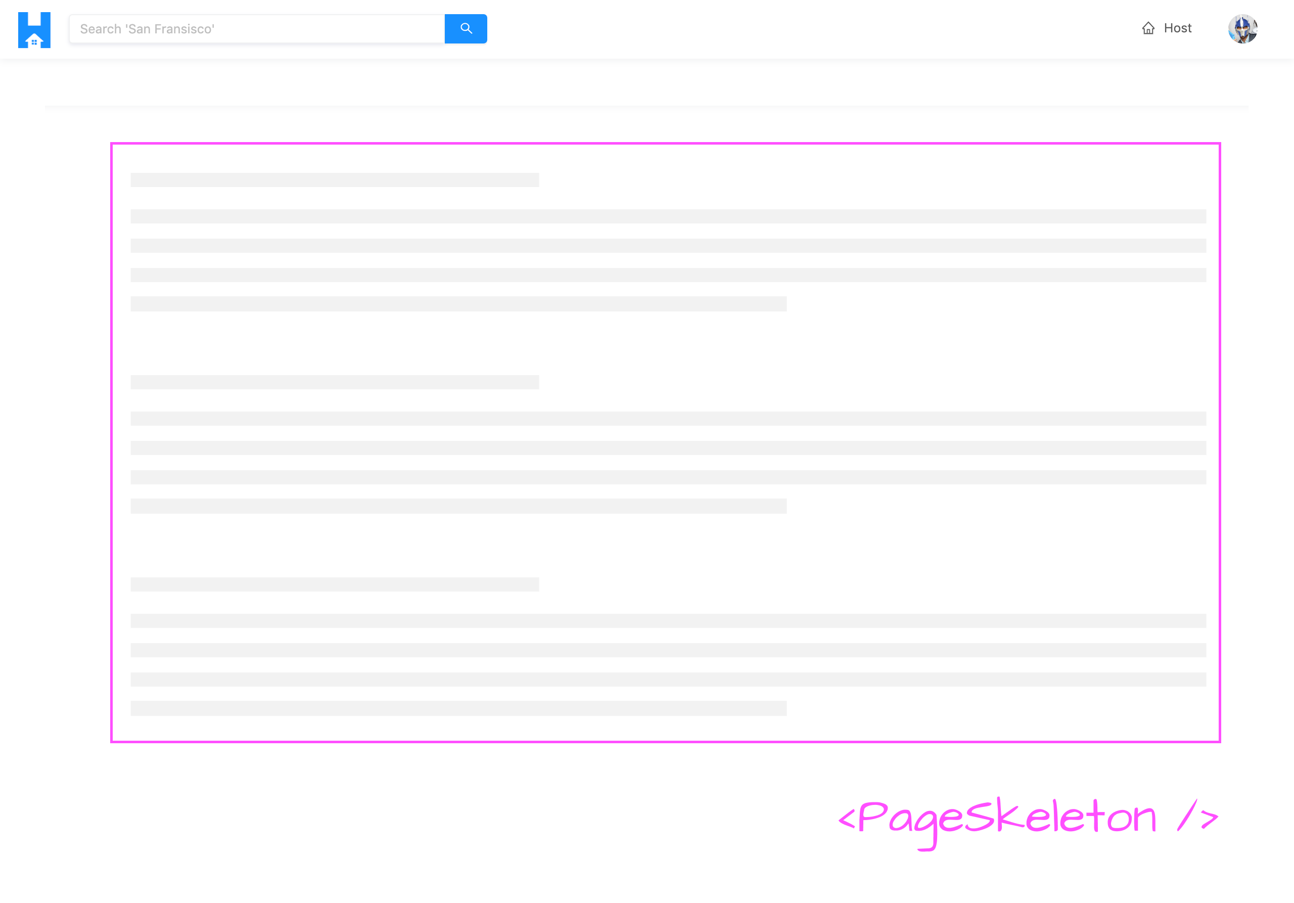
When the query for listing information is in the loading state, the <PageSkeleton /> component (which we’ve created before) will be shown.
LISTING QUERY
To begin, we’ll first create the GraphQL query document for the root-level listing field in our API. We’ll create an index.ts file within a Listing/ folder under the src/lib/graphql/queries/ folder.
client/
  src/
    lib/
      graphql/
        queries/
          // ...
          Listing/
            index.ts
        // ...
    // ...
We’ll export the soon to be created LISTING GraphQL const document in the src/lib/graphql/queries/index.ts file.
client/src/lib/graphql/queries/index.ts
export * from "./Listing";
In the src/lib/graphql/queries/Listing/index.ts file, we’ll set-up the LISTING GraphQL const document. The Listing query function will accept an id argument of the listing that is to be queried, a bookingsPage argument to reference the page the user is viewing for their bookings list, and a limit argument to constitute the amount of booking objects to be shown for a single page.
We’ll query for every possible field within the Listing GraphQL object in our API.
client/src/lib/graphql/queries/Listing/index.ts
import { gql } from "apollo-boost";

export const LISTING = gql`
  query Listing($id: ID!, $bookingsPage: Int!, $limit: Int!) {
    listing(id: $id) {
      id
      title
      description
      image
      host {
        id
        name
        avatar
        hasWallet
      }
      type
      address
      city
      bookings(limit: $limit, page: $bookingsPage) {
        total
        result {
          id
          tenant {
            id
            name
            avatar
          }
          checkIn
          checkOut
        }
      }
      bookingsIndex
      price
      numOfGuests
    }
  }
`;
With the GraphQL listing query defined in our client, we’ll auto-generate the corresponding TypeScript definitions of the variables and data related to our new query.
We’ll first run the codegen:schema script to re-generate the schema.json file in our client app.
npm run codegen:schema
We’ll then run the codegen:generate script to re-generate the TypeScript definitions for our GraphQL queries and mutations.
npm run codegen:generate
MAKING THE LISTING QUERY
We’ll now build the /listing/:id page in our app. The <Listing /> section component is the component that’s shown in the /listing/:id route. Within the <Listing /> component, we’ll make the query for listing information similar to how we made the query for user information in the /user/:id page.
In the src/sections/Listing/index.tsx file, we’ll import the useQuery Hook from React Apollo. We’ll import the LISTING GraphQL document from the src/lib/graphql/queries/ folder. We’ll also import the autogenerated TypeScript definitions for the data and variables for the LISTING GraphQL document.
import React from "react";
import { useQuery } from "@apollo/react-hooks";
import { LISTING } from "../../lib/graphql/queries";
import {
  Listing as ListingData,
  ListingVariables
} from "../../lib/graphql/queries/Listing/__generated__/Listing";

export const Listing = () => {
  return <h2>Listing</h2>;
};
We’ll run the listing query when the <Listing /> component first mounts with the useQuery Hook and attempt to return the loading , data , and error states of our query result. We’ll also pass in the autogenerated type definitions for the data to be returned from the query and the variables that are expected to be passed in.
import React from "react";
import { useQuery } from "@apollo/react-hooks";
import { LISTING } from "../../lib/graphql/queries";
import {
  Listing as ListingData,
  ListingVariables
} from "../../lib/graphql/queries/Listing/__generated__/Listing";

export const Listing = () => {
  const { loading, data, error } = useQuery<ListingData, ListingVariables>(LISTING);

  return <h2>Listing</h2>;
};
The listing query we make here expects us to pass a few variables such as the id of the listing that is to be queried, the bookingsPage the user is viewing, and the number of bookings to be returned in a page (in other words the limit of our pagination in the bookings list).
The value of the id variable will come from the route that the user accesses. We’ll get the id param from the route from the match prop available in this component since this component is rendered from React Router’s <Route /> component.
We’ll import the RouteComponentProps interface from react-router-dom . We’ll declare the interface for the params in our route as MatchParams which will consist of an id of type string . We’ll access the match prop available in the <Listing /> component and set the id variable of our query as match.params.id .
import React from "react";
import { RouteComponentProps } from "react-router-dom";
import { useQuery } from "@apollo/react-hooks";
import { LISTING } from "../../lib/graphql/queries";
import {
  Listing as ListingData,
  ListingVariables
} from "../../lib/graphql/queries/Listing/__generated__/Listing";

interface MatchParams {
  id: string;
}

export const Listing = ({ match }: RouteComponentProps<MatchParams>) => {
  const { loading, data, error } = useQuery<ListingData, ListingVariables>(LISTING, {
    variables: {
      id: match.params.id
    }
  });

  return <h2>Listing</h2>;
};
React Router has now introduced Hooks! Be sure to check out the React Router Hooks video in Module 15 of the course to highlight how the above can be done with Hooks.
When the <Listing /> component renders for the first time, the page number for the bookings list should be 1 (i.e. should be on the first page of results). To instantiate this value and have it tracked as component state, we’ll import the useState Hook from React. We’ll use the useState Hook at the top of the <Listing /> component function and destruct a bookingsPage state value and a setBookingsPage() function we’ll use to update the bookingsPage state value. We’ll initialize the state bookingsPage value as 1 and declare it as the value of the bookingsPage variable in our query.
import React, { useState } from "react";
import { RouteComponentProps } from "react-router-dom";
import { useQuery } from "@apollo/react-hooks";
import { LISTING } from "../../lib/graphql/queries";
import {
  Listing as ListingData,
  ListingVariables
} from "../../lib/graphql/queries/Listing/__generated__/Listing";

interface MatchParams {
  id: string;
}

export const Listing = ({ match }: RouteComponentProps<MatchParams>) => {
  const [bookingsPage, setBookingsPage] = useState(1);

  const { loading, data, error } = useQuery<ListingData, ListingVariables>(LISTING, {
    variables: {
      id: match.params.id,
      bookingsPage
    }
  });

  return <h2>Listing</h2>;
};
The limit variable in our query is how many bookings we’ll want to be limited for a certain page. We’ll want to have a maximum of three bookings to show for a single page so we’ll define a constant above our <Listing /> component labeled PAGE_LIMIT and provide it a value of 3 . We’ll then declare the value of the limit variable in our query to be PAGE_LIMIT .
import React, { useState } from "react";
import { RouteComponentProps } from "react-router-dom";
import { useQuery } from "@apollo/react-hooks";
import { LISTING } from "../../lib/graphql/queries";
import {
  Listing as ListingData,
  ListingVariables
} from "../../lib/graphql/queries/Listing/__generated__/Listing";

interface MatchParams {
  id: string;
}

const PAGE_LIMIT = 3;

export const Listing = ({ match }: RouteComponentProps<MatchParams>) => {
  const [bookingsPage, setBookingsPage] = useState(1);

  const { loading, data, error } = useQuery<ListingData, ListingVariables>(LISTING, {
    variables: {
      id: match.params.id,
      bookingsPage,
      limit: PAGE_LIMIT
    }
  });

  return <h2>Listing</h2>;
};
While our listing query is in flight (i.e. the query is in the loading state), we’ll want to show the shared <PageSkeleton /> component we’ve set up before. We’ll import the <PageSkeleton /> component from the src/lib/components/ folder and we’ll say that when the listing query is loading, we’ll want the <PageSkeleton /> component to show. We’ll wrap the rendered <PageSkeleton /> component with Ant Design’s <Content /> component from <Layout /> so we’ll be sure to import the <Layout /> component from Ant Design and destruct <Content /> from it.
import React, { useState } from "react";
import { RouteComponentProps } from "react-router-dom";
import { useQuery } from "@apollo/react-hooks";
import { Layout } from "antd";
import { PageSkeleton } from "../../lib/components";
import { LISTING } from "../../lib/graphql/queries";
import {
  Listing as ListingData,
  ListingVariables
} from "../../lib/graphql/queries/Listing/__generated__/Listing";

interface MatchParams {
  id: string;
}

const { Content } = Layout;
const PAGE_LIMIT = 3;

export const Listing = ({ match }: RouteComponentProps<MatchParams>) => {
  const [bookingsPage, setBookingsPage] = useState(1);

  const { loading, data, error } = useQuery<ListingData, ListingVariables>(LISTING, {
    variables: {
      id: match.params.id,
      bookingsPage,
      limit: PAGE_LIMIT
    }
  });

  if (loading) {
    return (
      <Content className="listings">
        <PageSkeleton />
      </Content>
    );
  }

  return <h2>Listing</h2>;
};
If our listing query was to error, we’ll want to show the <PageSkeleton /> component with an error banner placed above. With that said, we’ll import the shared <ErrorBanner /> component we have in the src/lib/components/ folder and render it in addition to <PageSkeleton /> if our query was to ever error.
We’ll place a description of the error along the lines of "This listing may not exist or we've encountered an error. Please try again soon."
import React, { useState } from "react";
import { RouteComponentProps } from "react-router-dom";
import { useQuery } from "@apollo/react-hooks";
import { Layout } from "antd";
import { ErrorBanner, PageSkeleton } from "../../lib/components";
import { LISTING } from "../../lib/graphql/queries";
import {
  Listing as ListingData,
  ListingVariables
} from "../../lib/graphql/queries/Listing/__generated__/Listing";

interface MatchParams {
  id: string;
}

const { Content } = Layout;
const PAGE_LIMIT = 3;

export const Listing = ({ match }: RouteComponentProps<MatchParams>) => {
  const [bookingsPage, setBookingsPage] = useState(1);

  const { loading, data, error } = useQuery<ListingData, ListingVariables>(LISTING, {
    variables: {
      id: match.params.id,
      bookingsPage,
      limit: PAGE_LIMIT
    }
  });

  if (loading) {
    return (
      <Content className="listings">
        <PageSkeleton />
      </Content>
    );
  }

  if (error) {
    return (
      <Content className="listing">
        <ErrorBanner description="This listing may not exist or we've encountered an error. Please try again soon." />
        <PageSkeleton />
      </Content>
    );
  }

  return <h2>Listing</h2>;
};
If our listing query was to finish loading and no error arises, this would mean our query has resolved and data should now be available. At this point, we’ll get the listing object from data and the bookings object from listing .
import React, { useState } from "react";
import { RouteComponentProps } from "react-router-dom";
import { useQuery } from "@apollo/react-hooks";
import { Layout } from "antd";
import { ErrorBanner, PageSkeleton } from "../../lib/components";
import { LISTING } from "../../lib/graphql/queries";
import {
  Listing as ListingData,
  ListingVariables
} from "../../lib/graphql/queries/Listing/__generated__/Listing";

interface MatchParams {
  id: string;
}

const { Content } = Layout;
const PAGE_LIMIT = 3;

export const Listing = ({ match }: RouteComponentProps<MatchParams>) => {
  const [bookingsPage, setBookingsPage] = useState(1);

  const { loading, data, error } = useQuery<ListingData, ListingVariables>(LISTING, {
    variables: {
      id: match.params.id,
      bookingsPage,
      limit: PAGE_LIMIT
    }
  });

  if (loading) {
    return (
      <Content className="listings">
        <PageSkeleton />
      </Content>
    );
  }

  if (error) {
    return (
      <Content className="listings">
        <ErrorBanner description="This listing may not exist or we've encountered an error. Please try again soon!" />
        <PageSkeleton />
      </Content>
    );
  }

  const listing = data ? data.listing : null;
  const listingBookings = listing ? listing.bookings : null;

  return <h2>Listing</h2>;
};
With the expected data available when our query resolves successfully, we can begin to build the child components in our UI and surface the information we want. In the next lesson, we’ll build out the child <ListingDetails /> and <ListingBookings /> components and render it in this parent <Listing /> component.
LISTINGDETAILS & LISTINGBOOKINGS
A sample of the mock
listingBookingsobject used in this lesson can be found - here.
With the <Listing /> section component now prepared in making our GraphQL query for listing information, we can begin building the UI we want to show in the <Listing /> component.
<LISTINGDETAILS />
We’ll first look to build the <ListingDetails /> component responsible in surfacing listing information to the user viewing the page. We’ll create this <ListingDetails /> component within a folder kept in the components/ folder of the src/sections/Listing/ directory.
client/
  // ...
  src/
    sections/
      // ...
      Listing/
        components/
          ListingDetails/
            index.tsx
        index.ts
      // ...
    // ...
  // ...
Within the src/sections/Listing/components/index.ts file, we’ll export the <ListingDetails /> component we’ll shortly create.
client/src/sections/Listing/components/index.ts
export * from "./ListingDetails";
In the <ListingDetails /> component file, we’ll import a few things we’ll need.
- We’ll import the
Reactlibrary. - We’ll import the
<Link />component from React Router. - We’ll import all the components we’ll need from Ant Design -
<Avatar />,<Divider />,<Icon />,<Tag />, and<Typography />. - We’ll import the autogenerated typescript definitions of the data that is to be returned from the
listingquery. - We’ll import the
iconColorconstant we have in thesrc/lib/utils/folder of our client project.
import React from "react";
import { Link } from "react-router-dom";
import { Avatar, Divider, Icon, Tag, Typography } from "antd";
import { Listing as ListingData } from "../../../../lib/graphql/queries/Listing/__generated__/Listing";
import { iconColor } from "../../../../lib/utils";
We’ve seen most of these Ant Design components before.
-
<Avatar />helps display an avatar image. -
<Divider />is an element that can help divide sections. -
<Icon />gives us the ability to use one of the many Ant Design Icons. -
<Typography />helps allow us to use theText,Title, andParagraphelements from Ant Design. - We haven’t used the
<Tag />component before. The<Tag />component is an element that can help display tags to categorize information or for presentational purposes.
We’re importing the autogenerated Listing data typescript definition of our listing query since we’ll use it to type check the prop we expect this <ListingDetails /> component is to receive. We expect this component to receive the listing object from the data returned from the query since we’ll use it to display the listing information in our UI. As a result, we’ll define the Props interface for the <ListingDetails /> component and state that this component is to receive a listing prop. The type of the listing prop will be the type of the listing object from the GraphQL data returned and we’ll use Typescript’s capability of indexed access types (i.e. lookup types) to achieve this.
import React from "react";
import { Link } from "react-router-dom";
import { Avatar, Divider, Icon, Tag, Typography } from "antd";
import { Listing as ListingData } from "../../../../lib/graphql/queries/Listing/__generated__/Listing";
import { iconColor } from "../../../../lib/utils";

interface Props {
  listing: ListingData["listing"];
}
We can then begin building the UI for the <ListingDetails /> component. First, we’ll destruct the <Paragraph /> and <Title /> components from <Typography /> . We’ll construct the function for the <ListingDetails /> component and state that it expects a listing prop. At the beginning of our component function, we’ll destruct all the properties we’ll need from the listing prop - title , description , image , type , address , city , numOfGuests , and host .
import React from "react";
import { Link } from "react-router-dom";
import { Avatar, Divider, Icon, Tag, Typography } from "antd";
import { Listing as ListingData } from "../../../../lib/graphql/queries/Listing/__generated__/Listing";
import { iconColor } from "../../../../lib/utils";

interface Props {
  listing: ListingData["listing"];
}

const { Paragraph, Title } = Typography;

export const ListingDetails = ({ listing }: Props) => {
  const { title, description, image, type, address, city, numOfGuests, host } = listing;
};
We’ll now build the template of the <ListingDetails /> component. The template will have:
- A
<div />element with abackground-imagestyle applied to it that is to display the listing image. - A
<Paragraph />section to display the listingcity,address, andtitle. - A section to display the host
avatarandname. - Finally, we’ll have a section to highlight the listing
type, thenumOfGueststhe listing can have, and thedescriptionof the listing.
We’ll be sure to use the iconColor constant we have imported to color the one <Icon /> element we have in <ListingDetails /> .
For the section that displays host information, we’ll wrap the section with React Router’s <Link /> component and make it have a target path of /user/${host.id} - which will be the user page of the host.
With all this implemented, the <ListingDetails /> component file will look like the following:
client/src/sections/Listing/components/ListingDetails/index.tsx
import React from "react";
import { Link } from "react-router-dom";
import { Avatar, Divider, Icon, Tag, Typography } from "antd";
import { Listing as ListingData } from "../../../../lib/graphql/queries/Listing/__generated__/Listing";
import { iconColor } from "../../../../lib/utils";

interface Props {
  listing: ListingData["listing"];
}

const { Paragraph, Title } = Typography;

export const ListingDetails = ({ listing }: Props) => {
  const { title, description, image, type, address, city, numOfGuests, host } = listing;

  return (
    <div className="listing-details">
      <div
        style={{ backgroundImage: `url(${image})` }}
        className="listing-details__image"
      />

      <div className="listing-details__information">
        <Paragraph type="secondary" ellipsis className="listing-details__city-address">
          <Link to={`/listings/${city}`}>
            <Icon type="environment" style={{ color: iconColor }} /> {city}
          </Link>
          <Divider type="vertical" />
          {address}
        </Paragraph>
        <Title level={3} className="listing-details__title">
          {title}
        </Title>
      </div>

      <Divider />

      <div className="listing-details__section">
        <Link to={`/user/${host.id}`}>
          <Avatar src={host.avatar} size={64} />
          <Title level={2} className="listing-details__host-name">
            {host.name}
          </Title>
        </Link>
      </div>

      <Divider />

      <div className="listing-details__section">
        <Title level={4}>About this space</Title>
        <div className="listing-details__about-items">
          <Tag color="magenta">{type}</Tag>
          <Tag color="magenta">{numOfGuests} Guests</Tag>
        </div>
        <Paragraph ellipsis={{ rows: 3, expandable: true }}>{description}</Paragraph>
      </div>
    </div>
  );
};
The markup and actual styling of how we build our UI isn’t the important takeaway here. You’re welcome to build the presentation UI as you please and this is the setting/styling we’ve come up with. The key takeaway is how we receive the necessary data from the parent component and display it in
<ListingDetails />.
Let’s now render the <ListingDetails /> component in the <Listing /> component. In the <Listing /> section component file, we’ll import the child <ListingDetails /> component from the adjacent components/ folder.
import { ListingDetails } from "./components";
We’ll also import the <Col /> and <Row /> components from Ant Design with which we’ll use to help structure how our child components will appear in <Listing /> .
client/src/sections/Listing/index.tsx
import { Col, Layout, Row } from "antd";
We’ll construct an element labeled listingDetailsElement that is to be the <ListingDetails /> component if listing information from GraphQL data is available. Otherwise, listingDetailsElement will be null .
// ...

export const Listing = ({ match }: RouteComponentProps<MatchParams>) => {
  const [bookingsPage, setBookingsPage] = useState(1);

  const { loading, data, error } = useQuery<ListingData, ListingVariables>(LISTING, {
    variables: {
      id: match.params.id,
      bookingsPage,
      limit: PAGE_LIMIT
    }
  });

  // ...

  const listing = data ? data.listing : null;
  const listingBookings = listing ? listing.bookings : null;

  const listingDetailsElement = listing ? <ListingDetails listing={listing} /> : null;

  return <h2>Listing</h2>;
};
We’ll have the return() statement of the <Listing /> component return the <Content /> component as a wrapper. Within, we’ll use the <Row /> element from Ant Design to constitute that we’re to display a row of columns and apply some gutter spacing. We’ll construct a column that’ll take the entire width in extra-small viewports and a little more than half the width from large viewports (and upwards), and display the listingDetailsElement .
// ...

export const Listing = ({ match }: RouteComponentProps<MatchParams>) => {
  const [bookingsPage, setBookingsPage] = useState(1);

  const { loading, data, error } = useQuery<ListingData, ListingVariables>(LISTING, {
    variables: {
      id: match.params.id,
      bookingsPage,
      limit: PAGE_LIMIT
    }
  });

  // ...

  const listing = data ? data.listing : null;
  const listingBookings = listing ? listing.bookings : null;

  const listingDetailsElement = listing ? <ListingDetails listing={listing} /> : null;

  return (
    <Content className="listings">
      <Row gutter={24} type="flex" justify="space-between">
        <Col xs={24} lg={14}>
          {listingDetailsElement}
        </Col>
      </Row>
    </Content>
  );
};
Ant Design’s grid column structure work with 24 columns. By specifying an
xsvalue of24for a column, we’ll want the element within to take the entire width of the viewport (i.e. all the columns). By specifying algvalue of14for a column, we say we want thelistingDetailsElementto take a little more than half the viewport spacing.
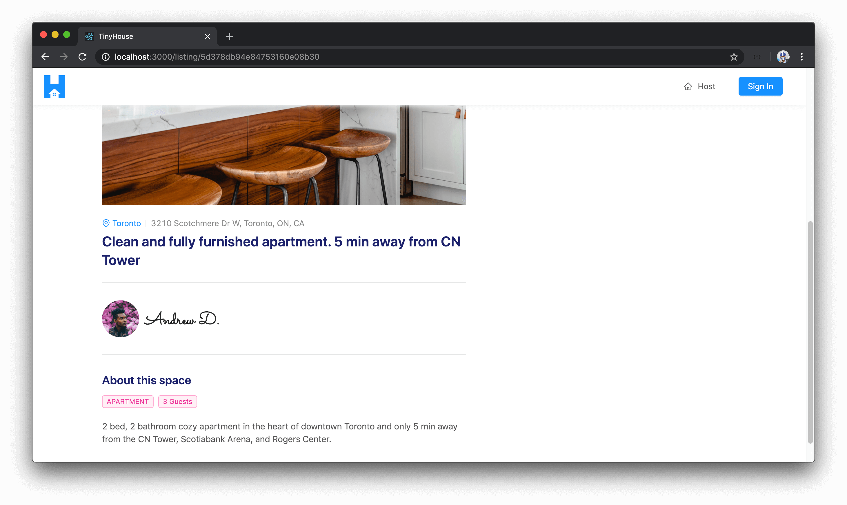
With our server and client Webpack server running, let’s launch our app in the browser and navigate to a valid /listing/:id route.
http://localhost:3000/listing/5d378db94e84753160e08b48
# id of mock listing is 5d378db94e84753160e08b48
We’ll see the <ListingDetails /> component which presents information about the listing image, the city the listing is located in, its address, the title, the host information, and so on.
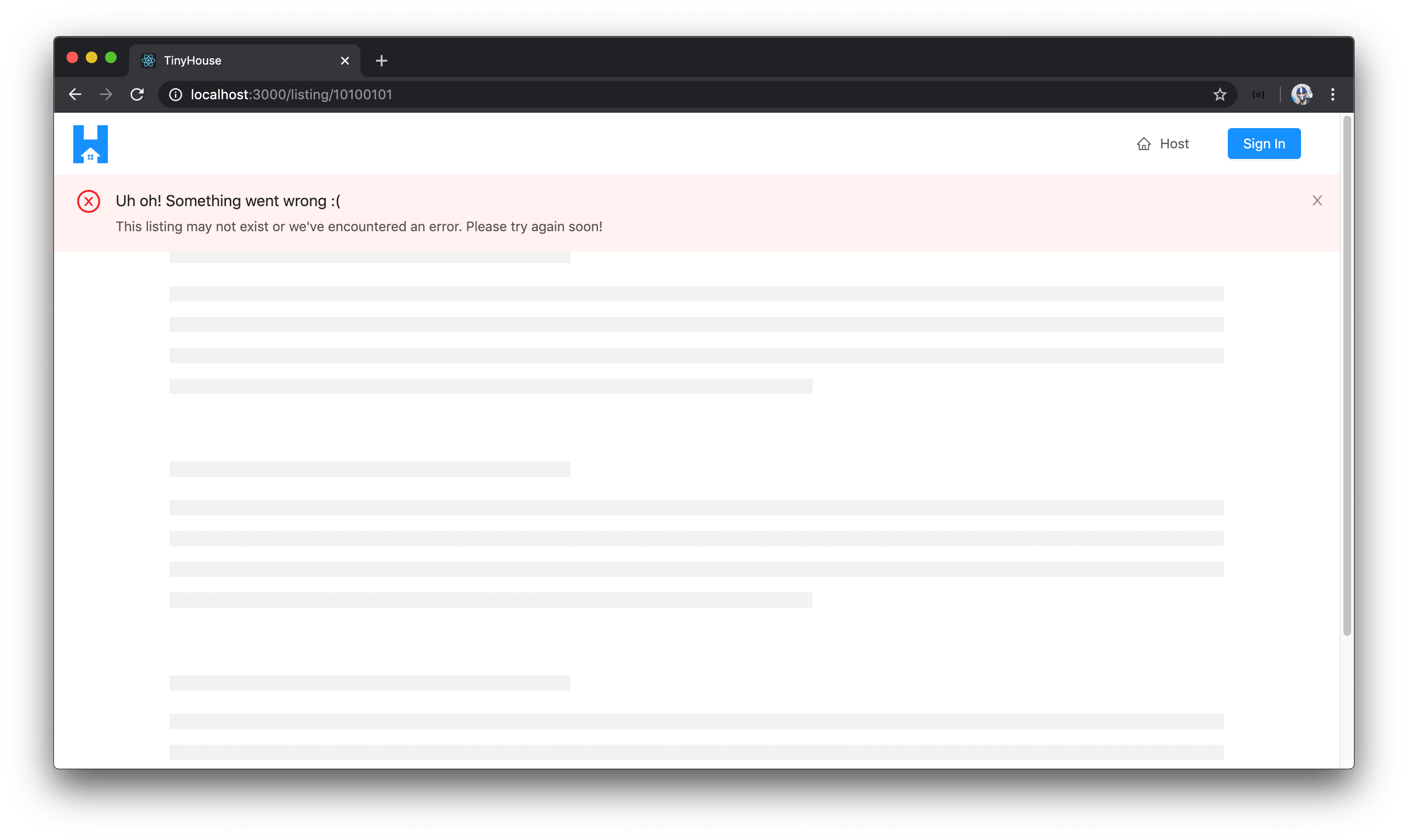
If we try to navigate to a certain /listing/:id route in which the listing id is invalid (i.e. doesn’t really exist), the query would fail and we’re notified of this in our UI.
Great!
<LISTINGBOOKINGS />
Since this section involves copying code over from the
<UserBookings />component and making changes after, it might be easier to follow along by watching the lesson video for this section first.
With the listing details prepared and shown in the /listing/:id page, we’ll now set up the small component that’s responsible for displaying a paginated list of bookings that exist within a listing. The bookings section to be shown in the /listing/:id page will be very similar to the bookings or listings section shown in the /user/:id page. As a result, we won’t spend as much time building the paginated list of bookings but look to replicate what was done in the /user/:id page.
First, we’ll create a ListingBookings/ folder that is to have an index.tsx file in the src/sections/Listing/components/ folder.
client/
  // ...
  src/
    sections/
      // ...
      Listing/
        components/
          ListingBookings/
            index.tsx
          // ...
        index.ts
      // ...
    // ...
  // ...
In the src/sections/Listing/components/index.ts file, we’ll have the soon to be created <ListingBookings /> component exported from the adjacent ListingBookings/ folder.
client/src/sections/Listing/components/index.ts
export * from "./ListingBookings";
In the src/sections/Listing/components/ListingBookings/index.tsx file, we’ll copy over the contents of the <UserBookings /> component (from the src/sections/User/components/UserBookings/index.tsx file) and make the necessary changes.
We’ll import some other components we’ll need from Ant Design such as the <Avatar /> and <Divider /> components.
client/src/sections/Listing/components/ListingBookings/index.tsx
import { Avatar, Divider, List, Typography } from "antd";
We’ll remove the import of the <ListingCard /> component since we don’t intend for it to be shown within the <ListingBookings /> component.
We’ll import the Listing data TypeScript definition for the listing field query.
client/src/sections/Listing/components/ListingBookings/index.tsx
import { Listing } from "../../../../lib/graphql/queries/Listing/__generated__/Listing";
We’ll expect <ListingBookings /> to receive mostly all the same props as <UserBookings /> . However, the main prop change is that the <ListingBookings /> component should expect the bookings from the listing object queried from GraphQL (not the user object). So we’ll update the first prop to be passed down to the <ListingBookings /> component to be listingBookings and we’ll say its type is the bookings object within the listing object from our GraphQL data.
client/src/sections/Listing/components/ListingBookings/index.tsx
interface Props {
  listingBookings: Listing["listing"]["bookings"];
  bookingsPage: number;
  limit: number;
  setBookingsPage: (page: number) => void;
}
We’ll remove the import of the <Paragraph /> component from <Typography /> since we won’t need it.
client/src/sections/Listing/components/ListingBookings/index.tsx
const { Text, Title } = Typography;
We’ll update the name of the component function here to be ListingBookings and the first prop should be listingBookings . We’ll get the total and result from the listingBookings prop object and we’ll rename any reference to userBookings to now be listingBookings .
export const ListingBookings = ({
  listingBookings,
  bookingsPage,
  limit,
  setBookingsPage
}: Props) => {
  const total = listingBookings ? listingBookings.total : null;
  const result = listingBookings ? listingBookings.result : null;
};
We’ll remove the <Paragraph /> section in the final element we want to be displayed. We’ll add a <Divider /> between the top of the parent <div /> element and wrap the rest within a <div /> section, and we’ll update the classes accordingly.
// ...

export const ListingBookings = ({
  listingBookings,
  bookingsPage,
  limit,
  setBookingsPage
}: Props) => {
  // ...

  const listingBookingsElement = listingBookingsList ? (
    <div className="listing-bookings">
      <Divider />
      <div className="listing-bookings__section">
        <Title level={4}>Bookings</Title>
      </div>
      {listingBookingsList}
    </div>
  ) : null;

  return listingBookingsElement;
};
client/src/sections/Listing/components/ListingBookings/index.tsx
  const listingBookingsElement = listingBookingsList ? (
    <div className="listing-bookings">
      <Divider />
      <div className="listing-bookings__section">
        <Title level={4}>Bookings</Title>
      </div>
      {listingBookingsList}
    </div>
  ) : null;
We’ll remove the listing card that’s to be shown for each rendered list item, and instead for every rendered item within the list , we’ll intend to show an avatar of the tenant who’s made the booking below the bookingHistory dates. We’ll import the <Link /> component from react-router-dom and make the avatar of the tenant within each list item a link to that tenant’s user page.
// ...
import { Link } from "react-router-dom";
// ...

export const ListingBookings = ({
  listingBookings,
  bookingsPage,
  limit,
  setBookingsPage
}: Props) => {
  const total = listingBookings ? listingBookings.total : null;
  const result = listingBookings ? listingBookings.result : null;

  const listingBookingsList = listingBookings ? (
    <List
      // ...
      renderItem={listingBooking => {
        const bookingHistory = (
          <div className="listing-bookings__history">
            <div>
              Check in: <Text strong>{listingBooking.checkIn}</Text>
            </div>
            <div>
              Check out: <Text strong>{listingBooking.checkOut}</Text>
            </div>
          </div>
        );

        return (
          <List.Item className="listing-bookings__item">
            {bookingHistory}
            <Link to={`/user/${listingBooking.tenant.id}`}>
              <Avatar src={listingBooking.tenant.avatar} size={64} shape="square" />
            </Link>
          </List.Item>
        );
      }}
    />
  ) : null;

  // ...
};
The rest of the <List /> element will be practically the same. The only changes we’ll make is that we’ll remove the positioning at the top that we’ve done for the list in the <UserBookings /> section and we’ll update the empty text if shown to be "No bookings have been made yet!" . Finally, we’ll update the grid layout for large viewports to be 3 elements to show at a time.
Ensuring all our variables are to now reference bookings within a listing as opposed to a user (e.g. listingBookings instead of userBookings ) and our element className 's have all been updated, our <ListingBookings /> component file will look like the following:
client/src/sections/Listing/components/ListingBookings/index.tsx
import React from "react";
import { Link } from "react-router-dom";
import { Avatar, Divider, List, Typography } from "antd";
import { Listing } from "../../../../lib/graphql/queries/Listing/__generated__/Listing";

interface Props {
  listingBookings: Listing["listing"]["bookings"];
  bookingsPage: number;
  limit: number;
  setBookingsPage: (page: number) => void;
}

const { Text, Title } = Typography;

export const ListingBookings = ({
  listingBookings,
  bookingsPage,
  limit,
  setBookingsPage
}: Props) => {
  const total = listingBookings ? listingBookings.total : null;
  const result = listingBookings ? listingBookings.result : null;

  const listingBookingsList = listingBookings ? (
    <List
      grid={{
        gutter: 8,
        xs: 1,
        sm: 2,
        lg: 3
      }}
      dataSource={result ? result : undefined}
      locale={{ emptyText: "No bookings have been made yet!" }}
      pagination={{
        current: bookingsPage,
        total: total ? total : undefined,
        defaultPageSize: limit,
        hideOnSinglePage: true,
        showLessItems: true,
        onChange: (page: number) => setBookingsPage(page)
      }}
      renderItem={listingBooking => {
        const bookingHistory = (
          <div className="listing-bookings__history">
            <div>
              Check in: <Text strong>{listingBooking.checkIn}</Text>
            </div>
            <div>
              Check out: <Text strong>{listingBooking.checkOut}</Text>
            </div>
          </div>
        );

        return (
          <List.Item className="listing-bookings__item">
            {bookingHistory}
            <Link to={`/user/${listingBooking.tenant.id}`}>
              <Avatar src={listingBooking.tenant.avatar} size={64} shape="square" />
            </Link>
          </List.Item>
        );
      }}
    />
  ) : null;

  const listingBookingsElement = listingBookingsList ? (
    <div className="listing-bookings">
      <Divider />
      <div className="listing-bookings__section">
        <Title level={4}>Bookings</Title>
      </div>
      {listingBookingsList}
    </div>
  ) : null;

  return listingBookingsElement;
};
We’ve now updated the <ListingBookings /> component to behave as we expect it to for the listing bookings list we want to show in the /listing/:id page. Let’s now have the parent <Listing /> component render <ListingBookings /> as a child component when bookings are available. In the <Listing /> component file, we’ll first import the <ListingBookings /> component from the adjacent components/ folder.
client/src/sections/Listing/index.tsx
import { ListingBookings, ListingDetails } from "./components";
In the <Listing /> component, we’ll create a listingBookingsElement constant that will be the <ListingBookings /> component when listing bookings exist. In the rendered <ListingBookings /> component, we’ll pass in the listingBookings prop, the page prop, the limit prop, and the setBookingsPage() function prop.
// ...

export const Listing = ({ match }: RouteComponentProps<MatchParams>) => {
  const [bookingsPage, setBookingsPage] = useState(1);

  const { loading, data, error } = useQuery<ListingData, ListingVariables>(LISTING, {
    variables: {
      id: match.params.id,
      bookingsPage,
      limit: PAGE_LIMIT
    }
  });

  // ...

  const listing = data ? data.listing : null;
  const listingBookings = listing ? listing.bookings : null;

  const listingDetailsElement = listing ? <ListingDetails listing={listing} /> : null;

  const listingBookingsElement = listingBookings ? (
    <ListingBookings
      listingBookings={listingBookings}
      bookingsPage={bookingsPage}
      limit={PAGE_LIMIT}
      setBookingsPage={setBookingsPage}
    />
  ) : null;

  return (
    <Content className="listings">
      <Row gutter={24} type="flex" justify="space-between">
        <Col xs={24} lg={14}>
          {listingDetailsElement}
        </Col>
      </Row>
    </Content>
  );
};
We’ll then look to render listingBookingsElement right below the listingDetailsElement in the return() statement of the <Listing /> component. With all these changes made, the src/sections/Listing/index.tsx file in the complete state will look like the following:
client/src/sections/Listing/index.tsx
import React, { useState } from "react";
import { RouteComponentProps } from "react-router-dom";
import { useQuery } from "@apollo/react-hooks";
import { Col, Layout, Row } from "antd";
import { ErrorBanner, PageSkeleton } from "../../lib/components";
import { LISTING } from "../../lib/graphql/queries";
import {
  Listing as ListingData,
  ListingVariables
} from "../../lib/graphql/queries/Listing/__generated__/Listing";
import { ListingBookings, ListingDetails } from "./components";

interface MatchParams {
  id: string;
}

const { Content } = Layout;
const PAGE_LIMIT = 3;

export const Listing = ({ match }: RouteComponentProps<MatchParams>) => {
  const [bookingsPage, setBookingsPage] = useState(1);

  const { loading, data, error } = useQuery<ListingData, ListingVariables>(LISTING, {
    variables: {
      id: match.params.id,
      bookingsPage,
      limit: PAGE_LIMIT
    }
  });

  if (loading) {
    return (
      <Content className="listings">
        <PageSkeleton />
      </Content>
    );
  }

  if (error) {
    return (
      <Content className="listings">
        <ErrorBanner description="This listing may not exist or we've encountered an error. Please try again soon!" />
        <PageSkeleton />
      </Content>
    );
  }

  const listing = data ? data.listing : null;
  const listingBookings = listing ? listing.bookings : null;

  const listingDetailsElement = listing ? <ListingDetails listing={listing} /> : null;

  const listingBookingsElement = listingBookings ? (
    <ListingBookings
      listingBookings={listingBookings}
      bookingsPage={bookingsPage}
      limit={PAGE_LIMIT}
      setBookingsPage={setBookingsPage}
    />
  ) : null;

  return (
    <Content className="listings">
      <Row gutter={24} type="flex" justify="space-between">
        <Col xs={24} lg={14}>
          {listingDetailsElement}
          {listingBookingsElement}
        </Col>
      </Row>
    </Content>
  );
};
Our <Listing /> component should now be rendering the <ListingBookings /> component when bookings exist within the listing object queried from our API.
SURVEYING <LISTINGBOOKINGS />
When we look at the listing of any other user than ourselves, we won’t see any bookings information. In the server, we’ve only authorized the bookings field within the listing object to return information if bookings exist for the listing and the viewer is viewing their own listing page .
We don’t have any bookings created within our application and we’re unable to create them just yet. To observe how the bookings section in the <Listing /> page is to behave, we can try to mock the existence of bookings in our client just for this use case.
What we’ll do is take a mock data object we’ve prepared (shown below) and we can say the listingBookings constant in the <Listing /> component is to have this value.
const listingBookings = {
  total: 4,
  result: [
    {
      id: "5daa530eefc64b001767247c",
      tenant: {
        id: "117422637055829818290",
        name: "User X",
        avatar:
          "https://lh3.googleusercontent.com/a-/AAuE7mBL9NpzsFA6mGSC8xIIJfeK4oTeOJpYvL-gAyaB=s100",
        __typename: "User"
      },
      checkIn: "2019-10-29",
      checkOut: "2019-10-31",
      __typename: "Booking"
    },
    {
      id: "5daa530eefc64b001767247d",
      tenant: {
        id: "117422637055829818290",
        name: "User X",
        avatar:
          "https://lh3.googleusercontent.com/a-/AAuE7mBL9NpzsFA6mGSC8xIIJfeK4oTeOJpYvL-gAyaB=s100",
        __typename: "User"
      },
      checkIn: "2019-11-01",
      checkOut: "2019-11-03",
      __typename: "Booking"
    },
    {
      id: "5daa530eefc64b001767247g",
      tenant: {
        id: "117422637055829818290",
        name: "User X",
        avatar:
          "https://lh3.googleusercontent.com/a-/AAuE7mBL9NpzsFA6mGSC8xIIJfeK4oTeOJpYvL-gAyaB=s100",
        __typename: "User"
      },
      checkIn: "2019-11-05",
      checkOut: "2019-11-09",
      __typename: "Booking"
    },
    {
      id: "5daa530eefc64b001767247f",
      tenant: {
        id: "117422637055829818290",
        name: "User X",
        avatar:
          "https://lh3.googleusercontent.com/a-/AAuE7mBL9NpzsFA6mGSC8xIIJfeK4oTeOJpYvL-gAyaB=s100",
        __typename: "User"
      },
      checkIn: "2019-11-10",
      checkOut: "2019-11-11",
      __typename: "Booking"
    }
  ]
} as any;
When we temporarily save the changes made in the <Listing /> component, head back to the /listing/:id page in our client application and scroll to the bottom - we’ll now see the bookings section.
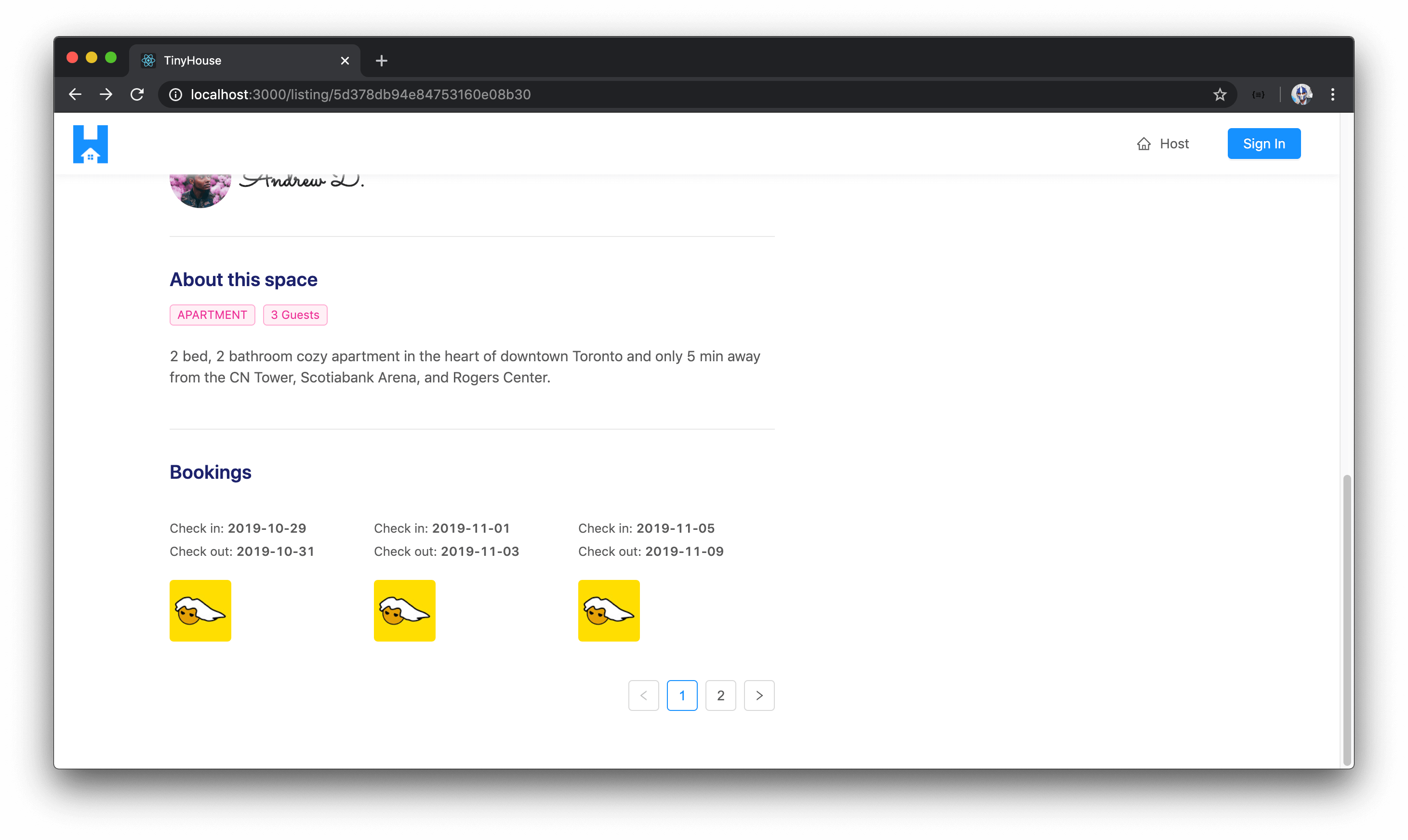
Each of the iterated items shown within the bookings list shows the check-in and check-out dates of the booking as well as an avatar of the actual tenant. The list is also a paginated list where if we were to click to navigate to another page, a new set of bookings will be shown.
Great! That will be it for this particular lesson. Before we close, we’ll go back to the <Listing /> component and ensure we’re trying to access the bookings field within the queried listing object and not use the mock data array we’ve just placed to test the appearance of <ListingBookings /> .
THE LISTINGCREATEBOOKING REACT COMPONENT
In the last few lessons, we managed to create the GraphQL query to retrieve information for a single listing in the /listing/:id page of our client. With listing information available, we built the accompanying UI in the /listing/:id page to display listing information ( <ListingDetails /> ) and the bookings that have been made for the listing ( <ListingBookings /> ).
In this lesson, we’re going to build the initial UI of the calendar and date-picker portion of the listing page. We’ll create this section as the <ListingCreateBooking /> component which will be the component responsible in allowing a user to begin the booking creation process.
ANT DESIGN’S <DATEPICKER />
The <ListingCreateBooking /> component will be fairly straightforward except for how we attempt to build and set-up the datepickers in the component. In the <ListingCreateBooking /> component, we would want to have two datepickers shown.
- In the first datepicker, the user would be able to pick the date of check-in for the booking.
- In the second datepicker, the user would be able to pick the date of check-out for the booking.
Building the datepickers from scratch would be a little bit of a difficult task (from a UI perspective) since there are a lot of things we’ll have to keep in mind. Fortunately, the UI framework we’re using (Ant Design) gives us a robust datepicker component that can help us quite a bit.

The one thing we’ll have to do to comply with Ant Design’s <DatePicker /> component is provide date values from the moment.js library. moment.js is a fantastic JavaScript library that provides an incredible amount of utility functions that allow us to parse, validate, manipulate, and display dates and times. We’ll primarily use the moment.js library in our client application to comply with how date values can be captured in Ant Design’s <DatePicker /> components.
When we eventually run the mutation to book a listing, we’ll convert the date object values captured from the datepickers to string values before we send it to the server.
Before we begin to build the datepickers, let’s first install the moment.js library as an application dependency on our client.
npm i moment
The moment npm library already has static typing associated with it so we won’t have to install an additional type definitions file.
<LISTINGCREATEBOOKING />
The next thing we’ll do is create a file for the new component that we intend to create. We’ll create a folder called ListingCreateBooking/ that is to have an index.tsx file within the src/sections/Listing/components/ folder.
client/
  src/
    // ...
    sections/
      // ...
      Listing/
        components/
          ListingCreateBooking/
            index.tsx
      // ...
  // ...
In the index file of the src/sections/Listing/components/ folder, we’ll re-export the <ListingCreateBooking /> component we’ll soon create.
client/src/sections/Listing/components/index.ts
export * from "./ListingCreateBooking";
<ListingCreateBooking /> - Initial UI
Before we focus on building the datepicker elements, we’ll first look to build the basic UI of the <ListingCreateBooking /> component which consists of the card, the card titles, and the primary button action. In the <ListingCreateBooking /> component file, we’ll import the React library and we’ll import some of the components we’ll need from Ant Design - <Button /> , <Card /> , <Divider /> , and <Typography /> . We’ll also import the utility formatListingPrice() function from the src/lib/utils/ folder that we’ll use to format the listing price shown in this component.
import React from "react";
import { Button, Card, Divider, Typography } from "antd";
import { formatListingPrice } from "../../../../lib/utils";
We’ll destruct the <Paragraph /> and <Title /> components from <Typography /> .
import React from "react";
import { Button, Card, Divider, Typography } from "antd";
import { formatListingPrice } from "../../../../lib/utils";

const { Paragraph, Title } = Typography;
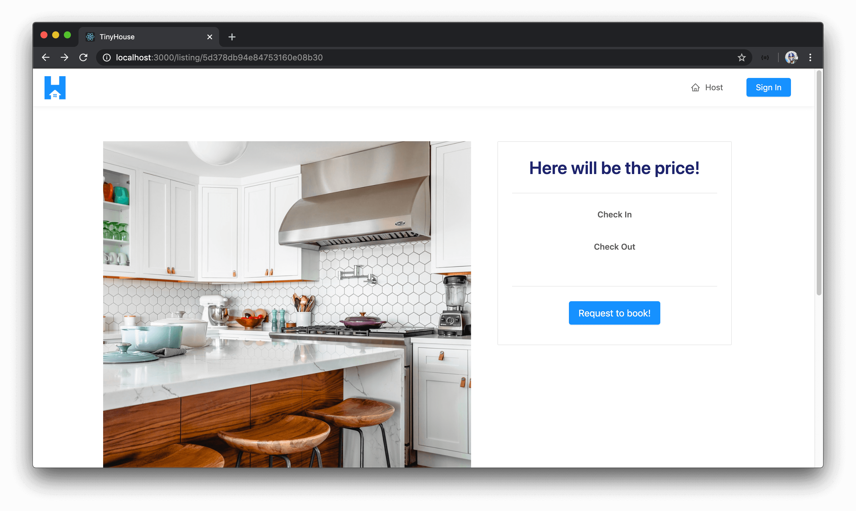
We’ll create and export the <ListingCreateBooking /> component function. In the return() statement of the component function, we’ll render the <Card/> component which will have a <Paragraph /> at the top responsible for showing the price of the listing (before we show the price, we’ll show a message that says Here will be the price! ). Within the <Card /> component, we’ll also have two other <Paragraph /> elements that will be responsible in showing the check-in and check-out datepickers. We’ll finally show a <Button/> element with the title of Request to book! that the user will eventually use to confirm the booking.
import React from "react";
import { Button, Card, Divider, Typography } from "antd";
import { formatListingPrice } from "../../../../lib/utils";

const { Paragraph, Title } = Typography;

export const ListingCreateBooking = () => {
  return (
    <div className="listing-booking">
      <Card className="listing-booking__card">
        <div>
          <Paragraph>
            <Title level={2} className="listing-booking__card-title">
              Here will be the price!
            </Title>
          </Paragraph>
          <Divider />
          <div className="listing-booking__card-date-picker">
            <Paragraph strong>Check In</Paragraph>
          </div>
          <div className="listing-booking__card-date-picker">
            <Paragraph strong>Check Out</Paragraph>
          </div>
        </div>
        <Divider />
        <Button size="large" type="primary" className="listing-booking__card-cta">
          Request to book!
        </Button>
      </Card>
    </div>
  );
};
We’ll now want to render the <ListingCreateBooking /> component in the parent <Listing /> component. In the <Listing /> component file, we’ll first import the <ListingCreateBooking /> component from the adjacent components/ folder.
client/src/sections/Listing/index.tsx
import { ListingCreateBooking, ListingBookings, ListingDetails } from "./components";
In the <Listing /> component, we’ll have a constant named listingCreateBookingElement that will be the <ListingCreateBooking /> component. In the <Listing /> component’s return() statement, we’ll create a new column in the presented row that’ll take the entire window in xs viewports and will take slightly less width in lg viewports and will contain the <ListingCreateBooking /> component.
export const Listing = ({ match }: RouteComponentProps<MatchParams>) => {
  // ...
  // ...

  // ...

  const listingCreateBookingElement = <ListingCreateBooking />;

  return (
    <Content className="listings">
      <Row gutter={24} type="flex" justify="space-between">
        <Col xs={24} lg={14}>
          {listingDetailsElement}
          {listingBookingsElement}
        </Col>
        <Col xs={24} lg={10}>
          {listingCreateBookingElement}
        </Col>
      </Row>
    </Content>
  );
};
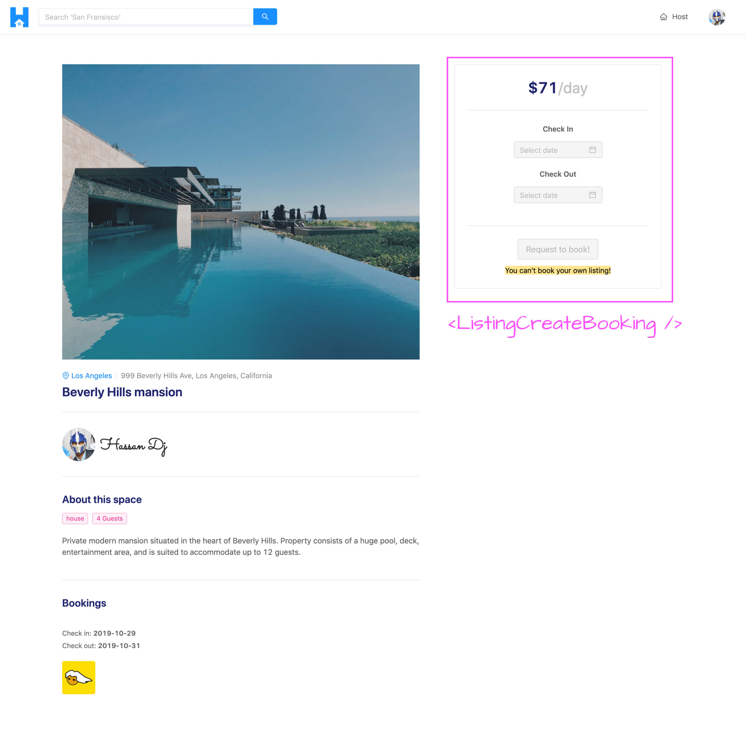
With our changes saved, if we were to take a look at a valid /listing/:id page in our browser, we’ll see the <ListingCreateBooking /> component we’ve prepared.
We’ll now try and get the price of the listing shown within the <ListingCreateBooking /> component. In the parent <Listing /> component, we have the listing data object available to us from the GraphQL query which contains a price field that determines the price of the listing. We’ll check to see if the listing object is present, and if so, pass in a price prop to the <ListingCreateBooking /> component with a value of listing.price . If the listing object doesn’t exist, we’ll have the element be null .
export const Listing = ({ match }: RouteComponentProps<MatchParams>) => {
  // ...
  // ...

  // ...

  const listingCreateBookingElement = listing ? (
    <ListingCreateBooking price={listing.price} />
  ) : null;

  return (
    <Content className="listings">
      <Row gutter={24} type="flex" justify="space-between">
        <Col xs={24} lg={14}>
          {listingDetailsElement}
          {listingBookingsElement}
        </Col>
        <Col xs={24} lg={10}>
          {listingCreateBookingElement}
        </Col>
      </Row>
    </Content>
  );
};
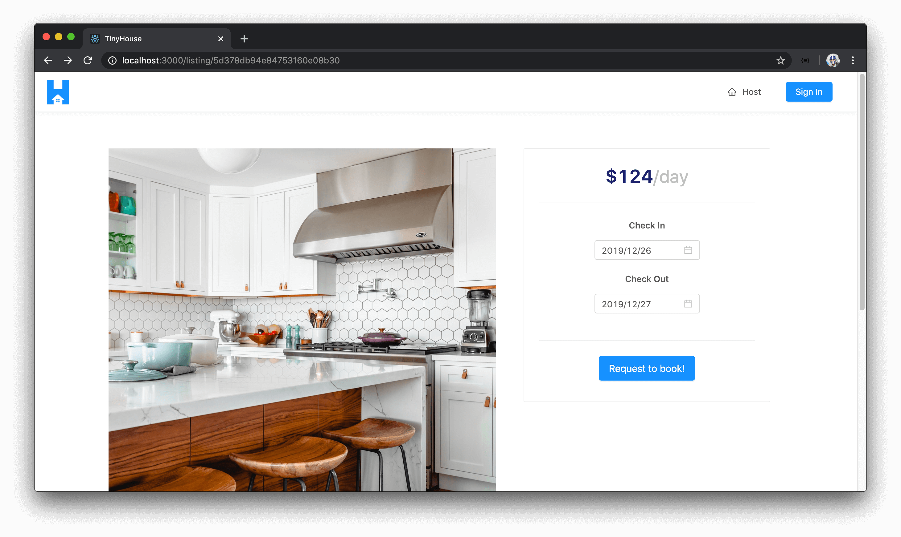
In the <ListingCreateBooking /> component, we’ll say it expects a price prop of type number and we’ll display the price prop value in the <Title /> section with the help of the formatListingPrice() utility function. We’ll make sure to say the price is /day .
import React from "react";
import { Button, Card, Divider, Typography } from "antd";
import { formatListingPrice } from "../../../../lib/utils";

const { Paragraph, Title } = Typography;

interface Props {
  price: number;
}

export const ListingCreateBooking = ({ price }: Props) => {
  return (
    <div className="listing-booking">
      <Card className="listing-booking__card">
        <div>
          <Paragraph>
            <Title level={2} className="listing-booking__card-title">
              {formatListingPrice(price)}
              <span>/day</span>
            </Title>
          </Paragraph>
          <Divider />
          <div className="listing-booking__card-date-picker">
            <Paragraph strong>Check In</Paragraph>
          </div>
          <div className="listing-booking__card-date-picker">
            <Paragraph strong>Check Out</Paragraph>
          </div>
        </div>
        <Divider />
        <Button size="large" type="primary" className="listing-booking__card-cta">
          Request to book!
        </Button>
      </Card>
    </div>
  );
};
If we take a look at the <ListingCreateBooking /> card in our /listing/:id page, we’ll now see the formatted price of the listing shown.
<ListingCreateBooking /> - Datepickers
We’ll now look to use the <DatePicker /> components from Ant Design and create the check-in and check-out date picker inputs.
In the <ListingCreateBooking /> component file, we’ll first import the <DatePicker /> component from the Ant Design library.
client/src/sections/Listing/components/ListingCreateBooking/index.tsx
import { Button, Card, DatePicker, Divider, Typography } from "antd";
We’ll then place a <DatePicker /> element below each of the "Check In" and "Check Out" <Paragraph /> elements.
import React from "react";
import { Button, Card, Divider, Typography } from "antd";
import { formatListingPrice } from "../../../../lib/utils";

const { Paragraph, Title } = Typography;

interface Props {
  price: number;
}

export const ListingCreateBooking = ({ price }: Props) => {
  return (
    <div className="listing-booking">
      <Card className="listing-booking__card">
        <div>
          <Paragraph>
            <Title level={2} className="listing-booking__card-title">
              {formatListingPrice(price)}
              <span>/day</span>
            </Title>
          </Paragraph>
          <Divider />
          <div className="listing-booking__card-date-picker">
            <Paragraph strong>Check In</Paragraph>
            <DatePicker />
          </div>
          <div className="listing-booking__card-date-picker">
            <Paragraph strong>Check Out</Paragraph>
            <DatePicker />
          </div>
        </div>
        <Divider />
        <Button size="large" type="primary" className="listing-booking__card-cta">
          Request to book!
        </Button>
      </Card>
    </div>
  );
};
Just by doing that alone, when we take a look at our page - we’ll see two <DatePicker /> component elements be presented to us!

Though the initial UI work for the datepickers is prepared for us, the datepickers don’t behave exactly the way we want it too. There are certain things we’ll want to handle with our date pickers - some we’ll handle now, and some we’ll handle later when we start to allow users to book listings.
<DatePicker /> Values
The first thing we’ll do is look to track the values of the check-in and check-out dates that the user is to select with the separate datepickers. We could track the states for the check-in and check-out dates within the <ListingCreateBooking /> component however we’ll create these state values in the parent <Listing /> component instead. The reason being is once the user is to click the "Request to book!" button in the <ListingCreateBooking /> component, we’ll surface a modal that we’ll build later that tells the user the dates they’ve picked as well as the price of the booking. When we build this modal, we’ll create it as a child of the <Listing /> component. As a result, we’ll have the check-in and check-out date related state values be created in the parent <Listing /> component and pass them down to both the <ListingCreateBooking /> component and the modal component we’ll create later.
With that said, in the <Listing /> component we’ll use the useState Hook to create two new state properties. We’ll create the state properties checkInDate and checkOutDate and the setter functions responsible in updating these state values - setCheckInDate() and setCheckOutDate() . We’ll define the initial values of the checkInDate and checkOutDate state properties as null . We’ll need to convey that these state properties will be either of a Moment date object or a null value. In the <Listing /> component file, we’ll import the Moment interface from the moment library and use it to help define the type of the checkIn and checkOut state properties as either a Moment date object or null .
// ...
import { Moment } from "moment";
// ...

export const Listing = ({ match }: RouteComponentProps<MatchParams>) => {
  // ...
  const [checkInDate, setCheckInDate] = useState<Moment | null>(null);
  const [checkOutDate, setCheckOutDate] = useState<Moment | null>(null);

  // ...
  // ...

  return (
    // ...
  )
}
As to where the <ListingCreateBooking /> component is being set-up in the <Listing /> component, we’ll pass in the newly created state properties and the functions responsible in updating these states as props - checkInDate , checkOutDate , setCheckInDate() , and setCheckOutDate() .
// ...
import { Moment } from "moment";
// ...

export const Listing = ({ match }: RouteComponentProps<MatchParams>) => {
  // ...
  const [checkInDate, setCheckInDate] = useState<Moment | null>(null);
  const [checkOutDate, setCheckOutDate] = useState<Moment | null>(null);

  const listingCreateBookingElement = listing ? (
    <ListingCreateBooking
      price={listing.price}
      checkInDate={checkInDate}
      checkOutDate={checkOutDate}
      setCheckInDate={setCheckInDate}
      setCheckOutDate={setCheckOutDate}
    />
  ) : null;

  return (
    // ...
  );
}
In the <ListingCreateBooking /> component, we’ll specify that the component is to now expect the new props passed in. We’ll first import the Moment interface from the moment library that we’ll use to define the shape of the props that might be passed in.
import React from "react";
import { Button, Card, DatePicker, Divider, Typography } from "antd";
import { Moment } from "moment";
import { displayErrorMessage, formatListingPrice } from "../../../../lib/utils";

// ...
We’ll state that the checkIn and checkOut props can either be of type Moment or null. The setCheckIn() and setCheckOut() function props will either accept the checkIn and checkOut date values of type Moment | null and will return void .
client/src/sections/Listing/components/ListingCreateBooking/index.tsx
interface Props {
  price: number;
  checkInDate: Moment | null;
  checkOutDate: Moment | null;
  setCheckInDate: (checkInDate: Moment | null) => void;
  setCheckOutDate: (checkOutDate: Moment | null) => void;
}
We’ll destruct these new props from our <ListingCreateBooking /> component function.
// ...

export const ListingCreateBooking = ({
  price,
  checkInDate,
  checkOutDate,
  setCheckInDate,
  setCheckOutDate
}: Props) => {
  // ...
};
In the <DatePicker /> components being rendered within <ListingCreateBooking /> , we’ll now use the new props that are passed in to help capture the values the user may select. The <DatePicker /> components have a value prop that conveys the date value being captured. With that said, we’ll state the value of the first <DatePicker /> as the checkInDate prop and the value of the second <DatePicker /> as the checkOutDate prop.
export const ListingCreateBooking = ({
  price,
  checkInDate,
  checkOutDate,
  setCheckInDate,
  setCheckOutDate
}: Props) => {
  return (
    <div className="listing-booking">
      {/* ... */}
      {/* ... */}
      <div className="listing-booking__card-date-picker">
        <Paragraph strong>Check In</Paragraph>
        <DatePicker value={checkInDate} />
      </div>
      <div className="listing-booking__card-date-picker">
        <Paragraph strong>Check Out</Paragraph>
        <DatePicker value={checkOutDate} />
      </div>
      {/* ... */}
      {/* ... */}
    </div>
  );
};
Ant Design’s <DatePicker /> components seem to only accept values of a Moment date object or undefined . So we’ll use a ternary statement to convey that if the date state properties don’t exist - we’ll pass in a value of undefined .
export const ListingCreateBooking = ({
  price,
  checkInDate,
  checkOutDate,
  setCheckInDate,
  setCheckOutDate
}: Props) => {
  return (
    <div className="listing-booking">
      {/* ... */}
      {/* ... */}
      <div className="listing-booking__card-date-picker">
        <Paragraph strong>Check In</Paragraph>
        <DatePicker value={checkInDate ? checkInDate : undefined} />
      </div>
      <div className="listing-booking__card-date-picker">
        <Paragraph strong>Check Out</Paragraph>
        <DatePicker value={checkOutDate ? checkOutDate : undefined} />
      </div>
      {/* ... */}
      {/* ... */}
    </div>
  );
};
The <DatePicker /> components also have an onChange() function prop that gets triggered whenever a change is made in the datepicker. This onChange() function prop receives the value of the date the user selected with which we can pass along to the appropriate state setter functions to update the date state values.
For the first datepicker, we’ll say that when a change is made we’ll trigger the setCheckInDate() function to update the checkInDate state property in the parent. For the second date picker, we’ll say that when a change is made - it’ll update the checkOutDate state property in the parent.
export const ListingCreateBooking = ({
  price,
  checkInDate,
  checkOutDate,
  setCheckInDate,
  setCheckOutDate
}: Props) => {
  return (
    <div className="listing-booking">
      {/* ... */}
      {/* ... */}
      <div className="listing-booking__card-date-picker">
        <Paragraph strong>Check In</Paragraph>
        <DatePicker
          value={checkInDate ? checkInDate : undefined}
          onChange={dateValue => setCheckInDate(dateValue)}
        />
      </div>
      <div className="listing-booking__card-date-picker">
        <Paragraph strong>Check Out</Paragraph>
        <DatePicker
          value={checkOutDate ? checkOutDate : undefined}
          onChange={dateValue => setCheckOutDate(dateValue)}
        />
      </div>
      {/* ... */}
      {/* ... */}
    </div>
  );
};
At this moment, the values conveyed in our datepickers are the state values being tracked in the parent <Listing /> component. When a change is made, it’ll update those state values.
<DatePicker /> Format
The <DatePicker /> components also accept a format prop that allows us to format our date strings so we’ll have them as YYYY/MM/DD .
export const ListingCreateBooking = ({
  price,
  checkInDate,
  checkOutDate,
  setCheckInDate,
  setCheckOutDate
}: Props) => {
  return (
    <div className="listing-booking">
      {/* ... */}
      {/* ... */}
      <div className="listing-booking__card-date-picker">
        <Paragraph strong>Check In</Paragraph>
        <DatePicker
          value={checkInDate ? checkInDate : undefined}
          format={"YYYY/MM/DD"}
          onChange={dateValue => setCheckInDate(dateValue)}
        />
      </div>
      <div className="listing-booking__card-date-picker">
        <Paragraph strong>Check Out</Paragraph>
        <DatePicker
          value={checkOutDate ? checkOutDate : undefined}
          format={"YYYY/MM/DD"}
          onChange={dateValue => setCheckOutDate(dateValue)}
        />
      </div>
      {/* ... */}
      {/* ... */}
    </div>
  );
};
If we take a look at the datepickers at this moment, we’ll see selected dates now in the format we’ve stated "YYYY/MM/DD" .
<DatePicker /> Disabled Date
There are a few other things we’ll want to handle from a client perspective that’ll make the UI more intuitive to the user. The first thing we need to think about is the fact that a user should not be able to select a date before today for either checking in or for checking out. No one can travel back in time!
With that said, we’ll look to disable dates before the current day’s date (i.e. today’s date). Ant Design’s <DatePicker /> components provide a disabledDate() prop which is a function prop that receives the current date and allows us to return a boolean . The disabledDate() prop function runs for every date element within a visible date grid and when it returns a value of true - the iterated date item in the grid is disabled.
We can give this a try. We can add the disabledDate prop to the first <DatePicker /> element and in the function, place a console.log() to verify when this function runs and have it return true .
export const ListingCreateBooking = ({
  price,
  checkInDate,
  checkOutDate,
  setCheckInDate,
  setCheckOutDate
}: Props) => {
  return (
    <div className="listing-booking">
      {/* ... */}
      {/* ... */}
      <div className="listing-booking__card-date-picker">
        <Paragraph strong>Check In</Paragraph>
        <DatePicker
          value={checkInDate ? checkInDate : undefined}
          format={"YYYY/MM/DD"}
          disabledDate={() => {
            console.log("hello");
            return true;
          }}
          onChange={dateValue => setCheckInDate(dateValue)}
        />
      </div>
      <div className="listing-booking__card-date-picker">
        <Paragraph strong>Check Out</Paragraph>
        <DatePicker
          value={checkOutDate ? checkOutDate : undefined}
          format={"YYYY/MM/DD"}
          onChange={dateValue => setCheckOutDate(dateValue)}
        />
      </div>
      {/* ... */}
      {/* ... */}
    </div>
  );
};
If we take a look at the UI when we open the check-in date picker, we’ll see a console message for every date element shown at a certain grid.
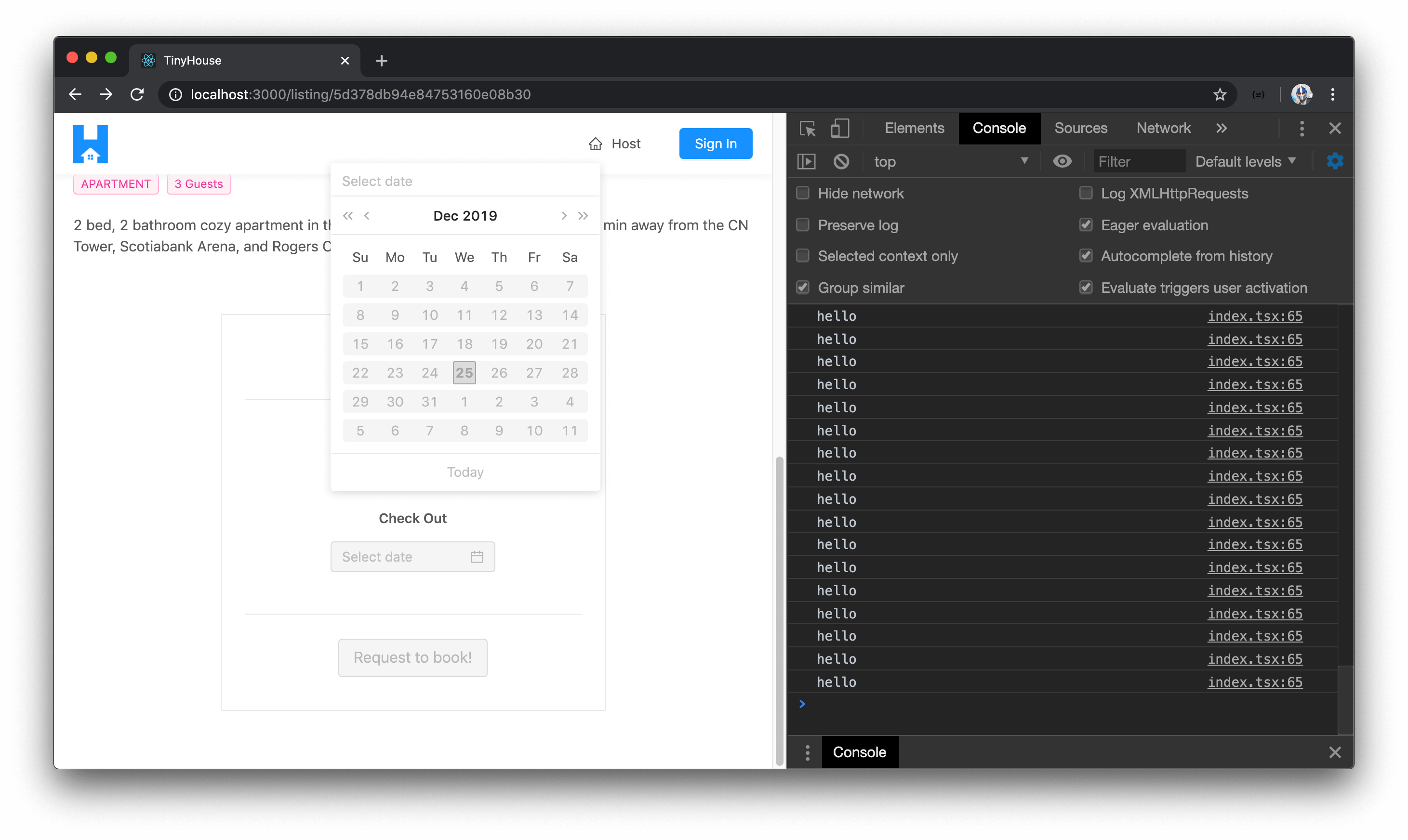
All the date elements we see are disabled because we have the disabledDate() function return true in all cases.
With the disabledDate() function available to us, let’s prepare the case where the dates before today are to be disabled. We’ll have the disabledDate() function prop call a function in the component of the same name. We’ll specify currentDate as the expected parameter to our component function that will be passed along that could be undefined or of the Moment date object. We’ll have the disabledDate() prop call the disabledDate() component function in both of our <DatePicker /> elements.
export const ListingCreateBooking = ({
  price,
  checkInDate,
  checkOutDate,
  setCheckInDate,
  setCheckOutDate
}: Props) => {
  const disabledDate = (currentDate?: Moment) => {};

  return (
    <div className="listing-booking">
      {/* ... */}
      {/* ... */}
      <div className="listing-booking__card-date-picker">
        <Paragraph strong>Check In</Paragraph>
        <DatePicker
          value={checkInDate ? checkInDate : undefined}
          format={"YYYY/MM/DD"}
          disabledDate={disabledDate}
          onChange={dateValue => setCheckInDate(dateValue)}
        />
      </div>
      <div className="listing-booking__card-date-picker">
        <Paragraph strong>Check Out</Paragraph>
        <DatePicker
          value={checkOutDate ? checkOutDate : undefined}
          format={"YYYY/MM/DD"}
          disabledDate={disabledDate}
          onChange={dateValue => setCheckOutDate(dateValue)}
        />
      </div>
      {/* ... */}
      {/* ... */}
    </div>
  );
};
If the currentDate value for some reason or another doesn’t exist (i.e. is undefined ), we’ll have our component disabledDate() function return false .
export const ListingCreateBooking = ({
  price,
  checkInDate,
  checkOutDate,
  setCheckInDate,
  setCheckOutDate
}: Props) => {
  const disabledDate = (currentDate?: Moment) => {
    if (currentDate) {
    } else {
      return false;
    }
  };

  return (
    <div className="listing-booking">
      {/* ... */}
      {/* ... */}
      <div className="listing-booking__card-date-picker">
        <Paragraph strong>Check In</Paragraph>
        <DatePicker
          value={checkInDate ? checkInDate : undefined}
          format={"YYYY/MM/DD"}
          disabledDate={disabledDate}
          onChange={dateValue => setCheckInDate(dateValue)}
        />
      </div>
      <div className="listing-booking__card-date-picker">
        <Paragraph strong>Check Out</Paragraph>
        <DatePicker
          value={checkOutDate ? checkOutDate : undefined}
          format={"YYYY/MM/DD"}
          disabledDate={disabledDate}
          onChange={dateValue => setCheckOutDate(dateValue)}
        />
      </div>
      {/* ... */}
      {/* ... */}
    </div>
  );
};
If the currentDate value exists, we’ll look to determine at what conditions will the function return true . If the currentDate value is ever a day before today, we’ll want this function to return true (i.e. be disabled). This is where the moment.js library shines because it makes date comparisons really easy . First, we’ll import the actual moment function from the moment library.
client/src/sections/Listing/components/ListingCreateBooking/index.tsx
import moment, { Moment } from "moment";
In our component disabledDate() function, we’ll create a const value called dateIsBeforeEndOfDay that’ll be a boolean to dictate if the currentDate being assessed is before the end of today. We can check for this by using the isBefore() function from moment.js to check if the currentDate value is before today’s date (which we can get by simply running the moment() function). We’ll then return the value for the dateIsBeforeEndOfDay constant.
export const ListingCreateBooking = ({
  price,
  checkInDate,
  checkOutDate,
  setCheckInDate,
  setCheckOutDate
}: Props) => {
  const disabledDate = (currentDate?: Moment) => {
    if (currentDate) {
      const dateIsBeforeEndOfDay = currentDate.isBefore(moment());

      return dateIsBeforeEndOfDay;
    } else {
      return false;
    }
  };

  return (
    <div className="listing-booking">
      {/* ... */}
      {/* ... */}
      <div className="listing-booking__card-date-picker">
        <Paragraph strong>Check In</Paragraph>
        <DatePicker
          value={checkInDate ? checkInDate : undefined}
          format={"YYYY/MM/DD"}
          disabledDate={disabledDate}
          onChange={dateValue => setCheckInDate(dateValue)}
        />
      </div>
      <div className="listing-booking__card-date-picker">
        <Paragraph strong>Check Out</Paragraph>
        <DatePicker
          value={checkOutDate ? checkOutDate : undefined}
          format={"YYYY/MM/DD"}
          disabledDate={disabledDate}
          onChange={dateValue => setCheckOutDate(dateValue)}
        />
      </div>
      {/* ... */}
      {/* ... */}
    </div>
  );
};
If we take a look at the datepickers in our UI, we’ll see every date before the current date and the current date (i.e. today) included is disabled!

Great! The current date (i.e. today) might also be disabled because of how the time values between the currentDate value passed in and today’s date differs. We’ll want to confirm that today can never be booked and only the day starting tomorrow will be the first day able to be booked. To do this, we’ll compare the currentDate with today’s date and we’ll append .endOf('day') which says we want this date object to represent the end of today .
export const ListingCreateBooking = ({
  price,
  checkInDate,
  checkOutDate,
  setCheckInDate,
  setCheckOutDate
}: Props) => {
  const disabledDate = (currentDate?: Moment) => {
    if (currentDate) {
      const dateIsBeforeEndOfDay = currentDate.isBefore(moment().endOf("day"));

      return dateIsBeforeEndOfDay;
    } else {
      return false;
    }
  };

  return (
    <div className="listing-booking">
      {/* ... */}
      {/* ... */}
      <div className="listing-booking__card-date-picker">
        <Paragraph strong>Check In</Paragraph>
        <DatePicker
          value={checkInDate ? checkInDate : undefined}
          format={"YYYY/MM/DD"}
          disabledDate={disabledDate}
          onChange={dateValue => setCheckInDate(dateValue)}
        />
      </div>
      <div className="listing-booking__card-date-picker">
        <Paragraph strong>Check Out</Paragraph>
        <DatePicker
          value={checkOutDate ? checkOutDate : undefined}
          format={"YYYY/MM/DD"}
          disabledDate={disabledDate}
          onChange={dateValue => setCheckOutDate(dateValue)}
        />
      </div>
      {/* ... */}
      {/* ... */}
    </div>
  );
};
Now, regardless of what time the currentDate object is, if it falls on today’s date - it’ll still probably be before the end of day which we’ll prevent the user from booking.
Another limitation one could add is how far the user can book into the future. For example, we can say users can only book within a certain year, or within a certain month, or only within a certain week.
We won’t handle this but if you were interested in adding the client-side guard, it’ll be added here where we can check to see if the iterated date objects are after today’s date by a certain margin (e.g. disable all dates a year after today’s date).
<DatePicker /> Verify Check-Out Date
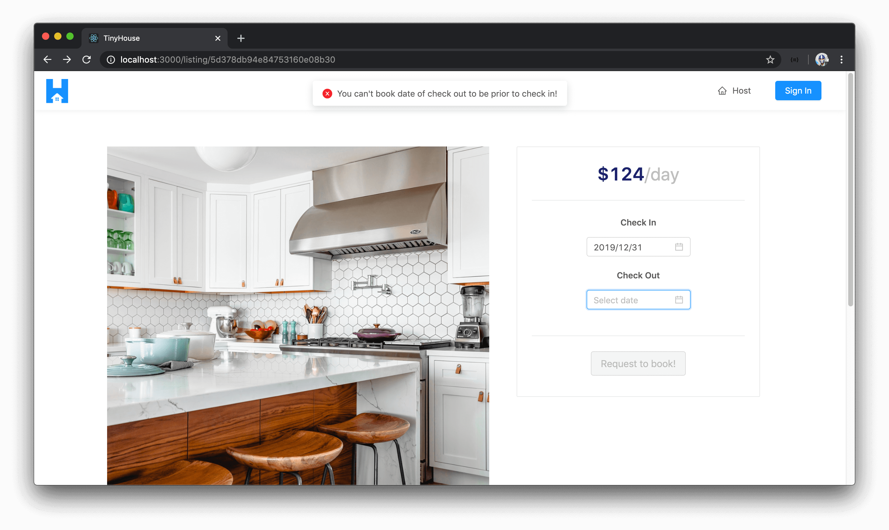
We’ll add a few more UI tweaks before we close this lesson. One important thing we’ll need to do is prevent the user from picking a check-out date that is before the check-in date since this wouldn’t make any sense at all (i.e. user can’t book a check-out time before the day they check-in).
The way we can handle this is by giving the user the capability to do so in the UI but showing an error message and preventing them from setting the state in the check-out value if they were ever to select a check-out date before check-in. And we’ll make this check primarily in the check-out datepicker element.
For the <DatePicker /> displayed to capture the check-out date, we’ll update the onChange() prop function to call another function from our component that we’ll label as verifyAndSetCheckOutDate() . The verifyAndSetCheckOutDate() function will receive the selected checkOutDate value or null from the check-out datepicker element.
export const ListingCreateBooking = ({
  price,
  checkInDate,
  checkOutDate,
  setCheckInDate,
  setCheckOutDate
}: Props) => {
  const disabledDate = (currentDate?: Moment) => {
    if (currentDate) {
      const dateIsBeforeEndOfDay = currentDate.isBefore(moment().endOf("day"));

      return dateIsBeforeEndOfDay;
    } else {
      return false;
    }
  };

  const verifyAndSetCheckOutDate = (selectedCheckOutDate: Moment | null) => {};

  return (
    <div className="listing-booking">
      {/* ... */}
      {/* ... */}
      <div className="listing-booking__card-date-picker">
        <Paragraph strong>Check In</Paragraph>
        <DatePicker
          value={checkInDate ? checkInDate : undefined}
          format={"YYYY/MM/DD"}
          disabledDate={disabledDate}
          onChange={dateValue => setCheckInDate(dateValue)}
        />
      </div>
      <div className="listing-booking__card-date-picker">
        <Paragraph strong>Check Out</Paragraph>
        <DatePicker
          value={checkOutDate ? checkOutDate : undefined}
          disabledDate={disabledDate}
          format={"YYYY/MM/DD"}
          onChange={dateValue => verifyAndSetCheckOutDate(dateValue)}
        />
      </div>
      {/* ... */}
      {/* ... */}
    </div>
  );
};
We have a displayErrorMessage() utility function we’ve created before that helps display an error message in our UI. With that said, we’ll import this function from the src/lib/utils file.
client/src/sections/Listing/components/ListingCreateBooking/index.tsx
import { displayErrorMessage, formatListingPrice } from "../../../../lib/utils";
In the verifyAndSetCheckOutDate() function of our component, we’ll check if the checkOutDate value selected is before the checkInDate state property. If so, we’ll return early and prevent the update of the checkOutDate state property as well as display an error message that says "You can't book date of check out to be prior to check in!" . If the checkOutDate date selected is after the checkInDate state property, we’ll simply call the setCheckOutDate() function and pass the selected date along.
This will look something like the following:
export const ListingCreateBooking = ({
  price,
  checkInDate,
  checkOutDate,
  setCheckInDate,
  setCheckOutDate
}: Props) => {
  const disabledDate = (currentDate?: Moment) => {
    if (currentDate) {
      const dateIsBeforeEndOfDay = currentDate.isBefore(moment().endOf("day"));

      return dateIsBeforeEndOfDay;
    } else {
      return false;
    }
  };

  const verifyAndSetCheckOutDate = (selectedCheckOutDate: Moment | null) => {
    if (checkInDate && selectedCheckOutDate) {
      if (moment(selectedCheckOutDate).isBefore(checkInDate, "days")) {
        return displayErrorMessage(
          `You can't book date of check out to be prior to check in!`
        );
      }
    }

    setCheckOutDate(selectedCheckOutDate);
  };

  return (
    <div className="listing-booking">
      {/* ... */}
      {/* ... */}
      <div className="listing-booking__card-date-picker">
        <Paragraph strong>Check In</Paragraph>
        <DatePicker
          value={checkInDate ? checkInDate : undefined}
          format={"YYYY/MM/DD"}
          disabledDate={disabledDate}
          onChange={dateValue => setCheckInDate(dateValue)}
        />
      </div>
      <div className="listing-booking__card-date-picker">
        <Paragraph strong>Check Out</Paragraph>
        <DatePicker
          value={checkOutDate ? checkOutDate : undefined}
          disabledDate={disabledDate}
          format={"YYYY/MM/DD"}
          onChange={dateValue => verifyAndSetCheckOutDate(dateValue)}
        />
      </div>
      {/* ... */}
      {/* ... */}
    </div>
  );
};
In the verifyAndSetCheckOutDate() function, we check to see if the selectedCheckOutDate value is before the checkInDate state property by a period of days and we do this with the moment.js isBefore() function. If the selected check-out date is before the captured check-in date, we display an error message and we return early. If not - we simply set the check out date as the state value in the parent component.
If we now tried to book a check-out date that is before the check-in date, we’ll get the error message and the state value for our check-out date input will not be updated!
<DatePicker /> - showToday
This is mostly where we’ll end for this lesson. We’ll add a few more UI tweaks before we close.
First, we won’t want to see the Today tag that’s shown at the footer of each opened datepicker by default. We can prevent them from showing by stating the showToday prop is given a value of false for both of our <DatePickers /> .
export const ListingCreateBooking = ({
  price,
  checkInDate,
  checkOutDate,
  setCheckInDate,
  setCheckOutDate
}: Props) => {
  // ...

  // ...

  return (
    <div className="listing-booking">
      {/* ... */}
      {/* ... */}
      <div className="listing-booking__card-date-picker">
        <Paragraph strong>Check In</Paragraph>
        <DatePicker
          value={checkInDate ? checkInDate : undefined}
          disabledDate={disabledDate}
          format={"YYYY/MM/DD"}
          showToday={false}
          onChange={dateValue => setCheckInDate(dateValue)}
        />
      </div>
      <div className="listing-booking__card-date-picker">
        <Paragraph strong>Check Out</Paragraph>
        <DatePicker
          value={checkOutDate ? checkOutDate : undefined}
          disabledDate={disabledDate}
          format={"YYYY/MM/DD"}
          showToday={false}
          onChange={dateValue => verifyAndSetCheckOutDate(dateValue)}
        />
      </div>
      {/* ... */}
      {/* ... */}
    </div>
  );
};
<DatePicker /> - Disable/enable confirmation
Another thing we’ll want is to have the check-out datepicker input be disabled only until a check-in date is selected. We’ll also want the primary button action ( "Request to book!" ) to be disabled only until the check-in and check-out dates have both been selected.
The date pickers have a disabled prop with which we can use for the check-out datepicker and say it’s disabled if the check-in state property is undefined or null .
We’ll dictate a checkOutInputDisabled property that’ll dictate when the check-out datepicker should be disabled. As of now, it’ll only be disabled when the checkInDate state property doesn’t have a value. We’ll place the checkOutInputDisabled property as the value of the disabled prop in our check-out datepicker.
export const ListingCreateBooking = ({
  price,
  checkInDate,
  checkOutDate,
  setCheckInDate,
  setCheckOutDate
}: Props) => {
  // ...

  // ...

  const checkOutInputDisabled = !checkInDate;

  return (
    <div className="listing-booking">
      {/* ... */}
      {/* ... */}
      <div className="listing-booking__card-date-picker">
        <Paragraph strong>Check In</Paragraph>
        <DatePicker
          value={checkInDate ? checkInDate : undefined}
          disabledDate={disabledDate}
          format={"YYYY/MM/DD"}
          showToday={false}
          onChange={dateValue => setCheckInDate(dateValue)}
        />
      </div>
      <div className="listing-booking__card-date-picker">
        <Paragraph strong>Check Out</Paragraph>
        <DatePicker
          value={checkOutDate ? checkOutDate : undefined}
          disabledDate={disabledDate}
          format={"YYYY/MM/DD"}
          showToday={false}
          disabled={checkOutInputDisabled}
          onChange={dateValue => verifyAndSetCheckOutDate(dateValue)}
        />
      </div>
      {/* ... */}
      {/* ... */}
    </div>
  );
};
Similarly, we’ll have a buttonDisabled constant that’ll be true when either the checkIn or checkOut dates aren’t defined. We’ll place this buttonDisabled constant as the value of the "Request to book!" button's disabled` status.
export const ListingCreateBooking = ({
  price,
  checkInDate,
  checkOutDate,
  setCheckInDate,
  setCheckOutDate
}: Props) => {
  // ...

  // ...

  const checkOutInputDisabled = !checkInDate;
  const buttonDisabled = !checkInDate || !checkOutDate;

  return (
    <div className="listing-booking">
      {/* ... */}
      {/* ... */}
      <div className="listing-booking__card-date-picker">
        <Paragraph strong>Check In</Paragraph>
        <DatePicker
          value={checkInDate ? checkInDate : undefined}
          disabledDate={disabledDate}
          format={"YYYY/MM/DD"}
          showToday={false}
          onChange={dateValue => setCheckInDate(dateValue)}
        />
      </div>
      <div className="listing-booking__card-date-picker">
        <Paragraph strong>Check Out</Paragraph>
        <DatePicker
          value={checkOutDate ? checkOutDate : undefined}
          disabledDate={disabledDate}
          format={"YYYY/MM/DD"}
          showToday={false}
          disabled={checkOutInputDisabled}
          onChange={dateValue => verifyAndSetCheckOutDate(dateValue)}
        />
      </div>
      <Divider />
      <Button
        disabled={buttonDisabled}
        size="large"
        type="primary"
        className="listing-booking__card-cta"
      >
        Request to book!
      </Button>
    </div>
  );
};
If we now check our UI - we’ll notice the check-out date picker is disabled until a check-in date is provided AND the button is disabled until both the check-in and check-out dates are provided. Great!
<DatePicker /> - onOpenChange()
One small UI bug exists at this moment and can be seen if we move the date of check-in to be after the check-out date when a check-out date has been already set . To prevent this bug, the minute the user ever opens the check-in datepicker, we can automatically reset the check-out date picker state value back to null .
We can achieve this by using the onOpenChange() callback function available as a prop to the <DatePicker /> component. The onOpenChange() callback function gets called the moment the datepicker gets opened. For our check-in datepicker, we can use the onOpenChange() callback function and when the check-in datepicker ever gets open, we’ll call the setCheckOutDate() function and set the check-out date state value to null automatically.
With this change and all the changes made to implement the <ListingCreateBooking /> component, the src/sections/Listing/components/ListingCreateBooking/index.tsx will look like the following.
client/src/sections/Listing/components/ListingCreateBooking/index.tsx
import React from "react";
import { Button, Card, DatePicker, Divider, Typography } from "antd";
import moment, { Moment } from "moment";
import { displayErrorMessage, formatListingPrice } from "../../../../lib/utils";

const { Paragraph, Title } = Typography;

interface Props {
  price: number;
  checkInDate: Moment | null;
  checkOutDate: Moment | null;
  setCheckInDate: (checkInDate: Moment | null) => void;
  setCheckOutDate: (checkOutDate: Moment | null) => void;
}

export const ListingCreateBooking = ({
  price,
  checkInDate,
  checkOutDate,
  setCheckInDate,
  setCheckOutDate
}: Props) => {
  const disabledDate = (currentDate?: Moment) => {
    if (currentDate) {
      const dateIsBeforeEndOfDay = currentDate.isBefore(moment().endOf("day"));

      return dateIsBeforeEndOfDay;
    } else {
      return false;
    }
  };

  const verifyAndSetCheckOutDate = (selectedCheckOutDate: Moment | null) => {
    if (checkInDate && selectedCheckOutDate) {
      if (moment(selectedCheckOutDate).isBefore(checkInDate, "days")) {
        return displayErrorMessage(
          `You can't book date of check out to be prior to check in!`
        );
      }
    }

    setCheckOutDate(selectedCheckOutDate);
  };

  const checkOutInputDisabled = !checkInDate;
  const buttonDisabled = !checkInDate || !checkOutDate;

  return (
    <div className="listing-booking">
      <Card className="listing-booking__card">
        <div>
          <Paragraph>
            <Title level={2} className="listing-booking__card-title">
              {formatListingPrice(price)}
              <span>/day</span>
            </Title>
          </Paragraph>
          <Divider />
          <div className="listing-booking__card-date-picker">
            <Paragraph strong>Check In</Paragraph>
            <DatePicker
              value={checkInDate ? checkInDate : undefined}
              format={"YYYY/MM/DD"}
              showToday={false}
              disabledDate={disabledDate}
              onChange={dateValue => setCheckInDate(dateValue)}
              onOpenChange={() => setCheckOutDate(null)}
            />
          </div>
          <div className="listing-booking__card-date-picker">
            <Paragraph strong>Check Out</Paragraph>
            <DatePicker
              value={checkOutDate ? checkOutDate : undefined}
              format={"YYYY/MM/DD"}
              showToday={false}
              disabled={checkOutInputDisabled}
              disabledDate={disabledDate}
              onChange={dateValue => verifyAndSetCheckOutDate(dateValue)}
            />
          </div>
        </div>
        <Divider />
        <Button
          disabled={buttonDisabled}
          size="large"
          type="primary"
          className="listing-booking__card-cta"
        >
          Request to book!
        </Button>
      </Card>
    </div>
  );
};
Great! We’ll stop here for now! What we’ve done could have appeared complicated but is fairly straightforward. In summary,
- We declare the
checkInDateandcheckOutDatestate properties in the parent<Listing />component and pass it down to the<ListingCreateBooking />component. - We render two datepickers for where the user will pick a check-in date and a check-out date to book a listing.
- We prevent users from picking dates before today and we’ve added an extra guard to prevent folks from picking a check-out date before check-in.
- We enable the check-out datepicker and the
"Request to book!"button only after the previous information is provided.
Great job so far! In the next coming module, we’ll focus on setting up the home index page ( / ) of our TinyHouse application.