Scoped Slots & Render Props
As you make your components more reusable across your application there are two patterns that can help you make your components more flexible, maintainable, and less brittle: Scoped Slots and Render Props. In this lesson we’ll be going over the use-case, and understanding both techniques.
Our Starting Code
    <div id="app">
      <products-list :products="products"></products-list>
    </div>

    <script src="vue.js"></script>
    <script>
      Vue.component('products-list', {
        props: {
          products: {
            type: Array,
            required: true
          }
        },
        template: `
        <ul>
          <li v-for="product in products">
            {{ product.name }}
          </li>
        </ul>
      `
      })
      new Vue({
        el: '#app',
        data: {
          products: [{
            name: 'Magnifying Glass',
            image: 'magnify.png'
          }, {
            name: 'Light Bulb',
            image: 'bulb.png'
          }]
        }
      })
    </script>
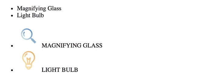
As you might expect, this will display each product name:
Problem: Extending the Component
What happens when we want a products-list component that has the option to also show the image? We might extend the code like so:
    <div id="app">
      <products-list :products="products"></products-list>
      <products-list :products="products" :show-image="true"></products-list>
    </div>

    <script src="vue.js"></script>
    <script>
      Vue.component('products-list', {
        props: {
          products: {
            type: Array,
            required: true
          },
          showImage: {
            type: Boolean,
            default: false
          }
        },
        template: `
        <ul>
          <li v-for="product in products">
            <img v-show="showImage" :src="product.image" />
            {{ product.name }}
          </li>
        </ul>
      `
      })
      new Vue({ // ... Same as above ...})
    </script>
Notice how we’re using a new prop called showImage , which if true shows the product image. This would display:
The Problem with this Implementation
What happens when sometimes we need our products-list component to also sometimes display price, sale price, add to cart buttons, different styles, or different bullets? What might result is a very brittle component full of v-ifs and v-shows. There has to be a better way!
The First Solution: Scoped Slots
Scoped slots provide us with an alternative way to solve this problem. Speaking of the problem let’s make it a little more difficult. How might we start with the original code above, and this time show the products image AND uppercase the product’s name?
Here’s how we could solve it using scoped slots:
    <div id="app">
      <products-list :products="products"></products-list>
      <products-list :products="products">
        <template slot="product" slot-scope="slotProps">
          <img :src="slotProps.product.image" /> {{ slotProps.product.name.toUpperCase() }}
        </template>
      </products-list>
    </div>
    <script src="vue.js"></script>
    <script>
      Vue.component('products-list', {
        props: {
          products: {
            type: Array,
            required: true
          }
        },
        template: `
        <ul>
          <li v-for="product in products">
            <slot name="product" :product="product" >
                {{ product.name }}
            </slot>
          </li>
        </ul>`
      })
      new Vue({ ... Same as above ... })
    </script>
First notice <slot name="product" :product="product" > , this is being created like a normal slot, but it also has product as a slotProp . This slotProp can get accessed by the parent if the parent wants to override what gets displayed by default in the slot, which in this case is {{ product.name }} .
The parent can write out markup to get displayed inside the slot by writing <template slot="product" slot-scope="slotProps"> . Inside the slotProps parameter the value is first { "product": { "name": "Magnifying Glass", "image": "magnify.png" } } and then it is { "product": { "name": "Light Bulb", "image": "bulb.png" } } , the two values inside the products array. As you might expect, this displays:
Destructuring
It’s worth noting at this point that we can use destructuring to make using slotProps a little more readable. So instead of writing:
    <template slot="product" slot-scope="slotProps">
      <img :src="slotProps.product.image" /> {{ slotProps.product.name.toUpperCase() }}
    </template>
We can simplify this to:
    <template slot="product" slot-scope="{{ product }}">
      <img :src="product.image" /> {{ product.name.toUpperCase() }}
    </template>
and we get the same result.
Using Scoped Slots in the Wild
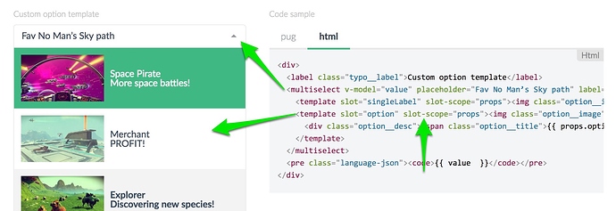
Scoped Slots can often be found in reusable component libraries like Damian Dulish’s Vue-multiselect library. In the dropdown below we can customize the way the options are displayed by using slot-scope in our parent:
As you can see, this sort of pattern can be used for all sorts of reusable functionality.
The Second Solution: Render Props
In order to use render props to solve this problem, we will need to convert our template in our example code into a render function, like so:
    <div id="app">
      <products-list :products="products"></products-list>
    </div>
    <script src="vue.js"></script>
    <script>
      Vue.component('products-list', {
        props: {
          products: {
            type: Array,
            required: true
          }
        },
        render(h) {  // <-- Notice our render function
          return h('ul', [
            this.products.map(product =>
              h('li', [product.name])
            )
          ])
        }
      })
      new Vue({ ... Same as above ... })
    </script>
If you’re not familiar with render functions yet, I highly recommend you go watch lesson 4 of this course where we explain template compilation.
To use Render props as a technique to solve our problem, we will be literally sending in a render function as a prop into our component. See below:
    <div id="app">
      <products-list :products="products"></products-list>
      <products-list :products="products" :product-renderer="imageRenderer"></products-list>
    </div>
    <script src="vue.js"></script>
    <script>
      Vue.component('products-list', {
        props: {
          products: {
            type: Array,
            required: true
          },
          productRenderer: {  // <-- Here's our new prop
            type: Function,
            default (h, product) { // <-- By default just print the name
              return product.name
            }
          }
        },
        render(h) {
          return h('ul', [
            this.products.map(product =>
              h('li', [this.productRenderer(h, product)]) // use our new prop
            )
          ])
        }
      })
      new Vue({
        el: '#app',
        data: {
          products: [{
            name: 'Magnifying Glass',
            image: 'magnify.png'
          }, {
            name: 'Light Bulb',
            image: 'bulb.png'
          }],
          imageRenderer(h, product) { // <-- The imageRenderer I'm passing in
            return [
              h('img', {
                attrs: {
                  src: product.image
                }
              }),
              ' ',
              product.name.toUpperCase()
            ]
          }
        }
      })
    </script>
Notice my comments above, and then notice how I call the component: <products-list :products="products" :product-renderer="imageRenderer"></products-list> . Here I’m passing in the imageRenderer that I declare in the root element.
If I wanted to clean this up a little I could use the JSX babel plugin, which would allow me to write JSX inside of my render functions. It’ll feel much more React like, if that’s something you enjoy. 
Using Render Props in the Wild
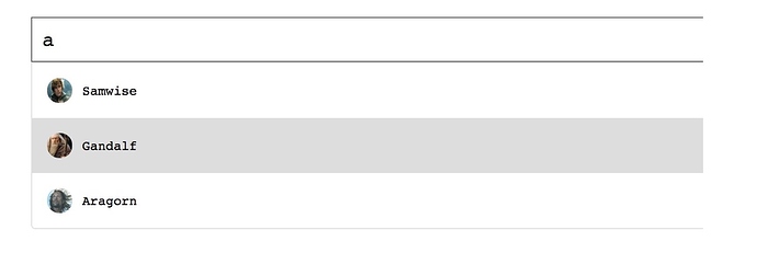
Just like with Scoped Slots we can find component libraries that use this pattern, like the Vue-Auosuggest library from Darren Jennings. There are times when we might want to customize the drop-down list of autosuggestions, like you see below, with the picture next to the suggestion.
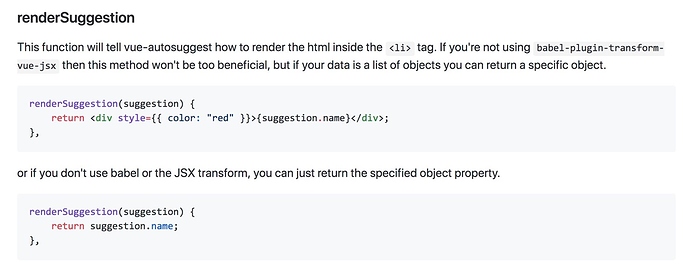
If we look inside the readme, we find that we can pass in a renderSuggestion method to this component library to specify the way your suggestions are displayed. It even shows you the JSX syntax:
Let’s ReVue
If you’ve never seen either of these patterns before, you might be wondering why you wouldn’t always use Scoped Slots. In my opinion (and Evan You’s) Scoped Slots is definitely the more Vue friendly solution. However, I’m sure there are some cases where you may need the extra power of Render Props, or if you’re using JSX with render functions.
Both Scoped Slots and Render Props allow the parent component to control how the child’s data is displayed, which can help you create reusable and maintainable components.
Next Lesson
On our next lesson we’ll be talking with Evan You, the creator of Vue.js, about advanced Vue.js components.


