Code
lesson1
- Starting Code
-
Finished Code
lesson2 - Starting Code
-
Finished Code
lesson3 - Starting Code
-
Finished Code
lesson4 - Starting Code
-
Finished Code
lesson5 - Starting Code
- Finished Code
Coding Challenge
Getting Started with Vuetify
Introduction
In today’s world of beautifully designed software, having a site that only works functionally without any design is no longer acceptable. Most users these days expect a certain level polish when they visit a site. So when you are starting a new website, in addition to making sure everything works properly, how do you make sure that it has:
- an attractive visual design
- the best user experience possible
The answer is Design Systems, which are a set of guidelines established to provide consistent design and user experience.
Some of the popular ones you may have heard of include:
- Bootstrap
- Bulma
- Material Design
Material Design is a design system popularized by Google which encapsulates their design principles and guidelines.
And while getting started with Material Design may seem as simply as downloading a CSS file and including it inside your application, this method is often unable to fully take advantage of component design patterns that allow your application to sustainably scale.
Presenting Vuetify!
Lucky for us, John Leider created Vuetify, which is a Vue component library that is built according to the Material Design specifications so you can rapidly build well designed applications. And while choosing a component library can be a difficult decision, Vuetify is a great choice because:
- It is easy and intuitive to use
- Has one of the most vibrant and active communities in the Vue ecosystem
- With regularly scheduled patches, you can feel confident knowing your application will be supported and updated as fixes and new features are pushed
- And you won’t have to worry whether the components are accessible or supported across the various browsers. Vuetify has you covered.
With that said, let’s build something with Vuetify!
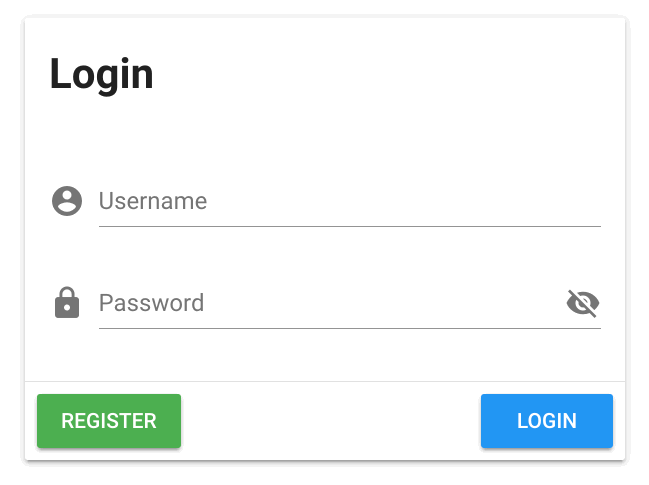
For this lesson, we are going to show you how powerful Vuetify is by building a common module that most applications have: a login module.

A login module typically consists of:
- Text heading
- Username input field
- Password input field
- Login button
- Register button
Sounds simple enough. Let’s dive into some code!
Installing Vuetify on Your App
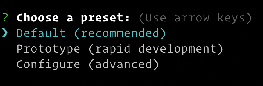
To get started, we will scaffold a new Vue app with Vue CLI 3 called vuetify-dashboard with the default preset.
Next, we will change into our project directory so we can add Vuetify to our app. With Vue CLI’s plugin system, adding Vuetify to our project is easy. All you have to do is run:
vue add vuetify
Then you select the Default preset which is great for most setups.
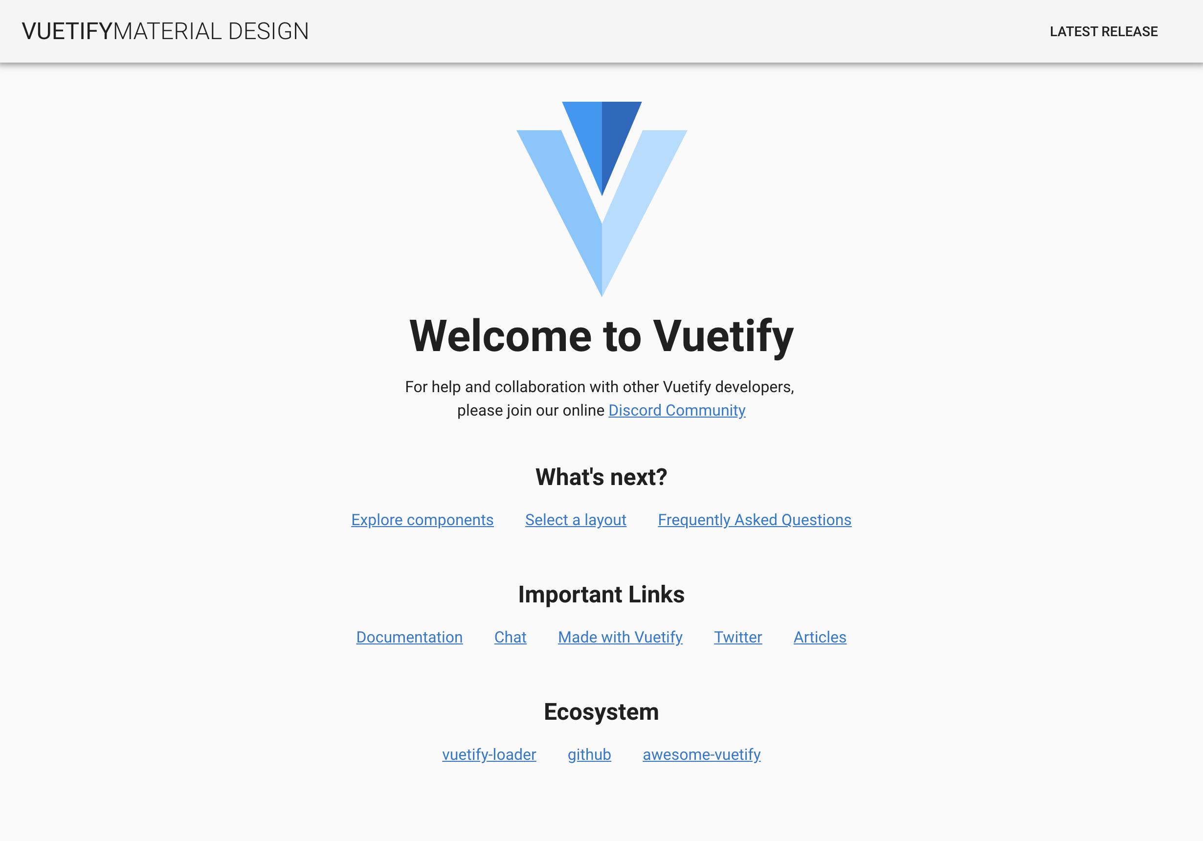
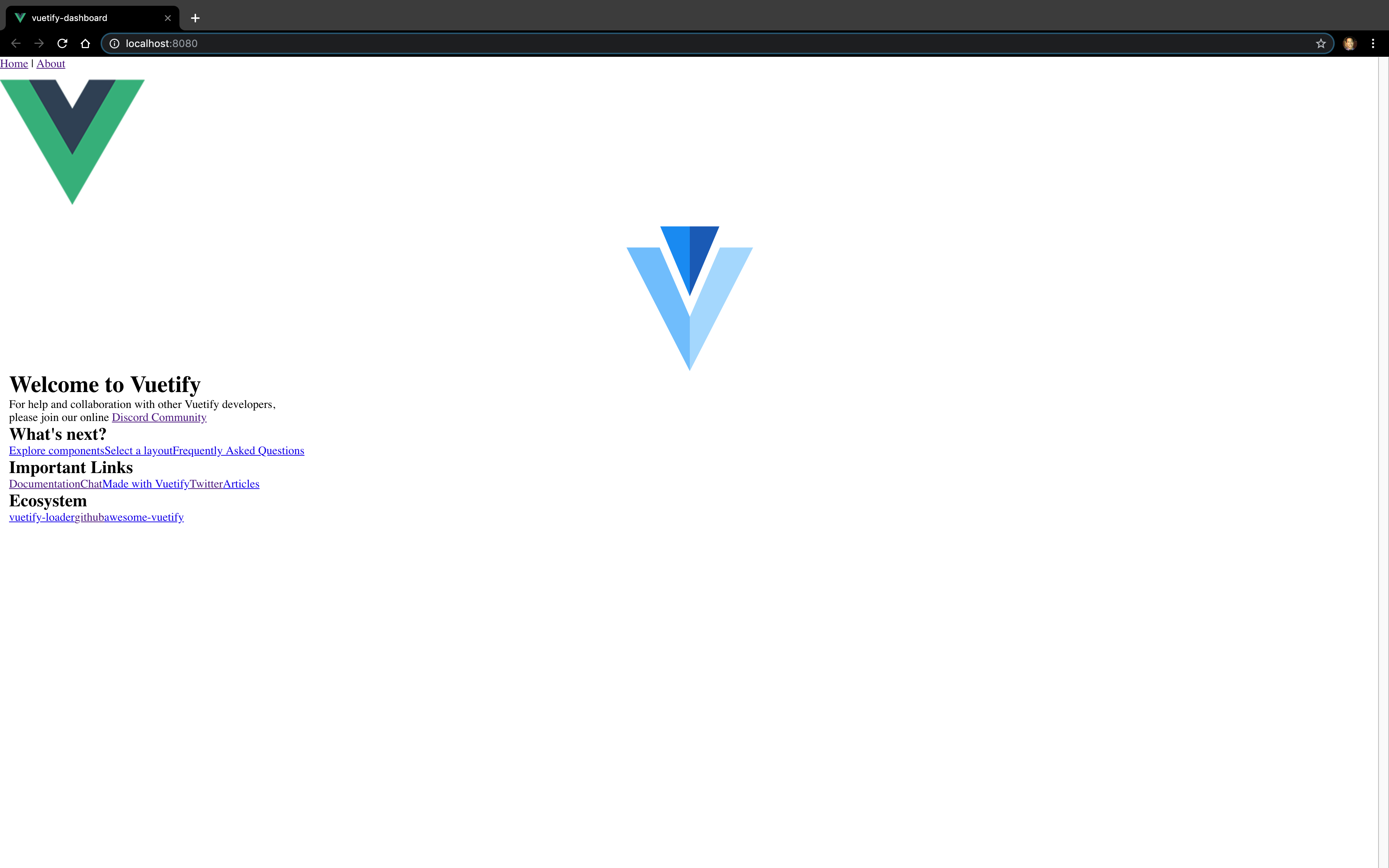
Once the installation is complete, you will see that Vuetify has added and updated some files to make sure your app is properly configured. To make sure everything is running properly, let’s start up our local dev server. When we visit http://localhost:8080 , you will see that Vuetify has replaced the standard boilerplate home page with its own.
Exploring the Project Directory
Once you open up the project in VS Code, one of the things you’ll notice in the src/App.vue is that there a lot of components prefixed with v- . Similar to how Vue uses the prefix to indicate Vue-specific directives, this is how Vuetify indicates that these components are part of its library.
This might seem like a lot to take in at first, but let’s unbox one of these components. If we take a look at what <v-spacer> outputs to, you’ll see that it is a simple wrapper of a div that has the material design CSS for spacer attached to it.
This is one of the simplest examples and it can get far more complicated than this (i.e., colors, size, themes, etc.), but know that these are no different than any other Vue component you would build yourself. The only difference is that they account for Material Design styles (i.e., colors, sizes and other configurations) and are intelligently designed to be composable and reusable.
Now let’s clear out the boilerplate so we can start with a fresh page.
<template>
  <v-app>

  </v-app>
</template>

<script>
export default {
  name: 'App',
  data () {
    return {
      //
    }
  }
}
</script>
Building the Login Module
First we will start by adding a v-card component to our page which will serve as our container for the login module and dropping in a h1 to make sure everything is rendering correctly.
<template>
  <v-app>
    <v-card>
      <h1>Login</h1>
    </v-card>
  </v-app>
</template>

<script>
export default {
  name: 'App',
  data () {
    return {
      //
    }
  }
}
</script>
Now we will add a sub-component called v-card-title which provides standard spacing and positioning for the card header.
<template>
  <v-app>
    <v-card>
      <v-card-title>
        <h1>Login</h1>
      </v-card-title>
    </v-card>
  </v-app>
</template>
Next we will add the v-card-text sub-component which acts as the wrapper for the body content in the v-card . And since we need to add some input fields, we’ll start by adding a v-form wrapper. Since we need text inputs, we will add a v-text-field component. We will then configure the labels by adding a prop of label with the value of “Username.”
<template>
  <v-app>
    <v-card>
      <v-card-title>
        <h1>Login</h1>
      </v-card-title>
      <v-card-text>
        <v-form>
          <v-text-field label="Username" />
        </v-form>
      </v-card-text>
    </v-card>
  </v-app>
</template>
When you click in the input field, the text input follows Material Design specs by changing positions of the label when focused and unfocused if no value is present.
Next, we will add a v-text-field for the password input field. As we can see here, the v-text-field defaults to text so we will need to define the type as password.
<template>
  <v-app>
    <v-card>
      <v-card-title>
        <h1>Login</h1>
      </v-card-title>
      <v-card-text>
        <v-form>
          <v-text-field label="Username" />
          <v-text-field
            type="Password"
            label="Password"
          />
        </v-form>
      </v-card-text>
    </v-card>
  </v-app>
</template>
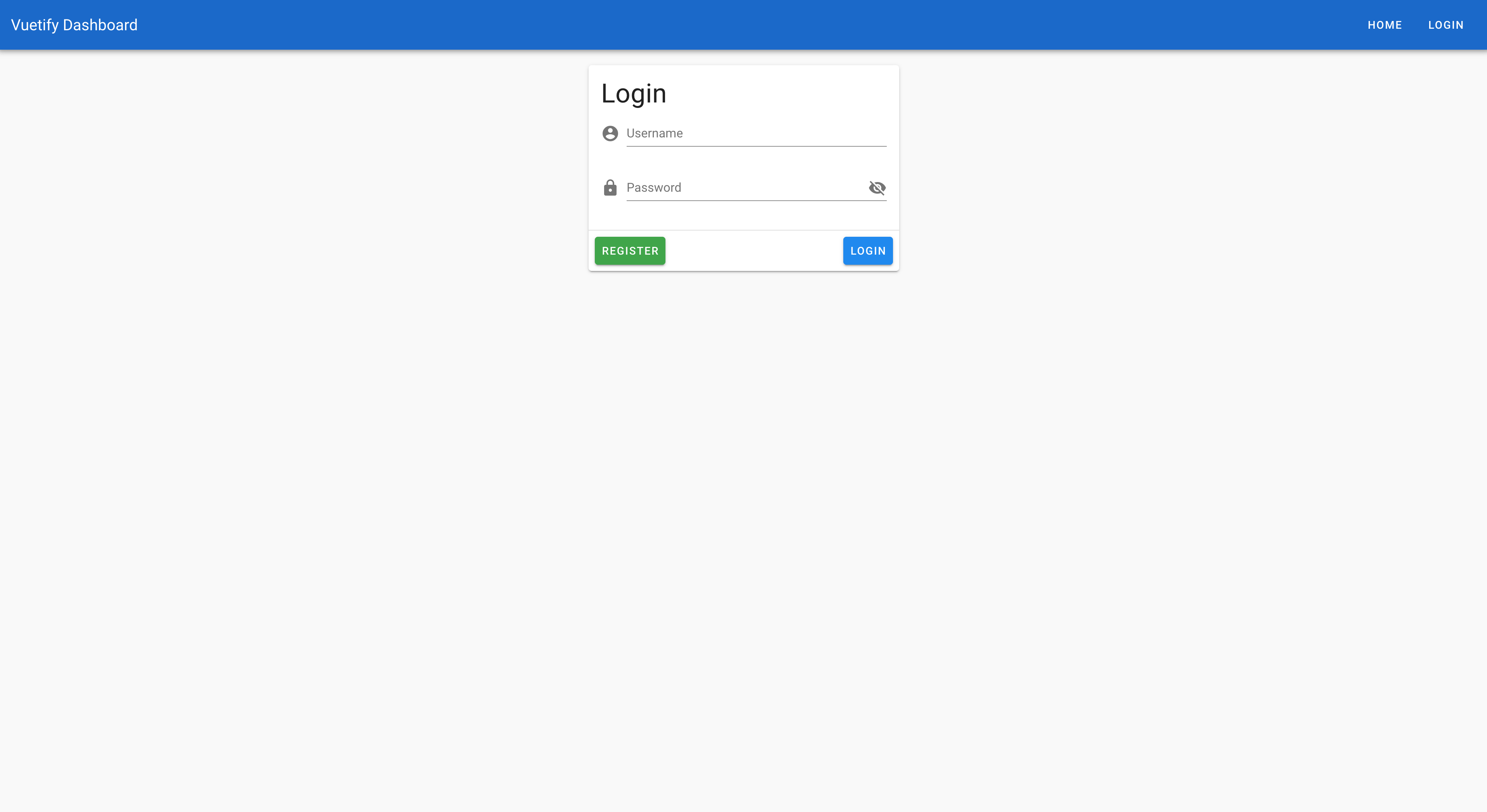
And now, the input is now hidden. We still need to add our buttons. Luckily for us, v-card has another sub-component called v-card-actions which serves as the container for our buttons. Then we add our buttons, we use the v-btn component for Register and Login.
<template>
  <v-app>
    <v-card>
      <v-card-title>
        <h1>Login</h1>
      </v-card-title>
      <v-card-text>
        <v-form>
          <v-text-field label="Username" />
          <v-text-field
            type="Password"
            label="Password"
          />
        </v-form>
      </v-card-text>
      <v-card-actions>
        <v-btn>Register</v-btn>
        <v-btn>Login</v-btn>
      </v-card-actions>
    </v-card>
  </v-app>
</template>
Now that we have the main parts for our login module, we can now style to make it look even better!
Styling Our Login Module
Let’s start by adding an icons to our text inputs. This can easily be done with the prop prepend-icon . As you can see here, this automatically adds a properly spaced icon before the text input. In addition, another great thing about Vuetify is that it comes with a standard icon library that is already configured and ready for use. For a list of all the available icons, check out the docs.
So for the username, we will prepend it with the icon mdi-account-circle . And for the password input field, let’s add prepend it with a lock icon
<template>
  <v-app>
    <v-card>
      <v-card-title>
        <h1>Login</h1>
      </v-card-title>
      <v-card-text>
        <v-form>
          <v-text-field
            label="Username"
            prepend-icon="mdi-account-circle"
          />
          <v-text-field
            type="Password"
            label="Password"
            prepend-icon="mdi-lock"
          />
        </v-form>
      </v-card-text>
      <v-card-actions>
        <v-btn>Register</v-btn>
        <v-btn>Login</v-btn>
      </v-card-actions>
    </v-card>
  </v-app>
</template>
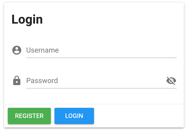
We’ll also need to add an icon at the end of the password input to inform users on whether the password is visible or not. As you might guess, Vuetify makes that easy for us with the append-icon prop that we will supply with the mdi-eye-off value.
<template>
  <v-app>
    <v-card>
      <v-card-title>
        <h1>Login</h1>
      </v-card-title>
      <v-card-text>
        <v-form>
          <v-text-field
            label="Username"
            prepend-icon="mdi-account-circle"
          />
          <v-text-field
            type="Password"
            label="Password"
            prepend-icon="mdi-lock"
            append-icon="mdi-eye-off"
          />
        </v-form>
      </v-card-text>
      <v-card-actions>
        <v-btn>Register</v-btn>
        <v-btn>Login</v-btn>
      </v-card-actions>
    </v-card>
  </v-app>
</template>
Next, these buttons could use some color, so let’s use the “success” colors for Register and “info” colors for Login.
<template>
  <v-app>
    <v-card>
      <v-card-title>
        <h1>Login</h1>
      </v-card-title>
      <v-card-text>
        <v-form>
          <v-text-field
            label="Username"
            prepend-icon="mdi-account-circle"
          />
          <v-text-field
            type="Password"
            label="Password"
            prepend-icon="mdi-lock"
            append-icon="mdi-eye-off"
          />
        </v-form>
      </v-card-text>
      <v-card-actions>
        <v-btn color="success">Register</v-btn>
        <v-btn color="info">Login</v-btn>
      </v-card-actions>
    </v-card>
  </v-app>
</template>
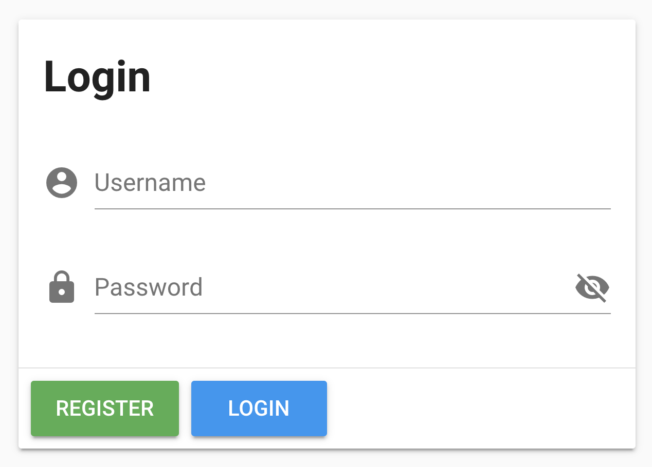
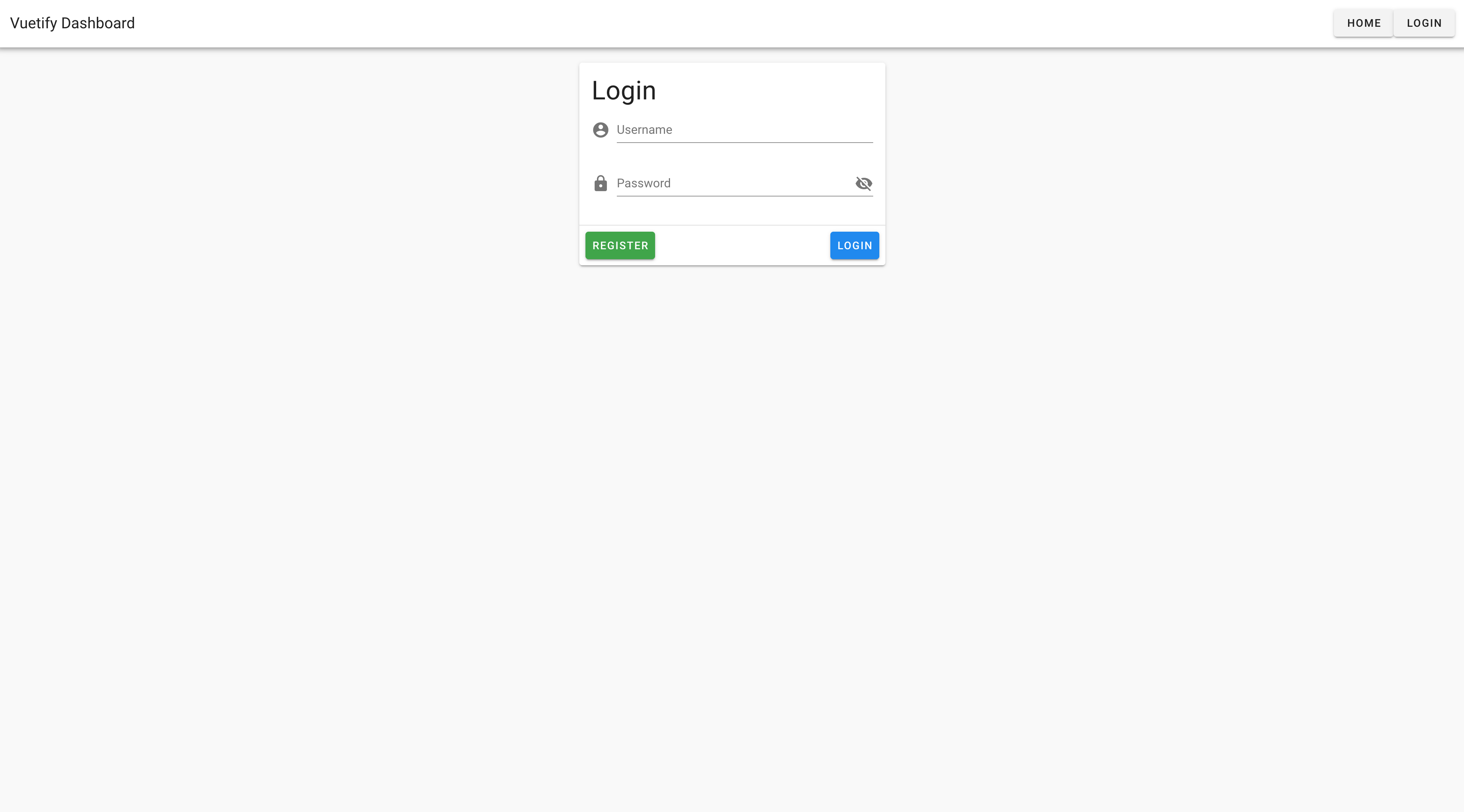
Finally, let’s clean up the layout of the card. The login module is a little wide, so let’s give our card a width of 400px , add spacing to the top and centering it Vuetify CSS utility classes mt-5 (i.e., margin top 5 units) and mx-a (i.e., horizontal margin auto). The spacing between login and the username input is also a little large. Luckily Vuetify provides us with utility classes like pb-0 which removes the bottom padding
<template>
  <v-app>
    <v-card width="400px" class="mt-5 mx-a">
      <v-card-title class="pb-0>
        <h1>Login</h1>
      </v-card-title>
      <v-card-text>
        <v-form>
          <v-text-field
            label="Username"
            prepend-icon="mdi-account-circle"
          />
          <v-text-field
            type="Password"
            label="Password"
            prepend-icon="mdi-lock"
            append-icon="mdi-eye-off"
          />
        </v-form>
      </v-card-text>
      <v-card-actions>
        <v-btn color="success">Register</v-btn>
        <v-btn color="info">Login</v-btn>
      </v-card-actions>
    </v-card>
  </v-app>
</template>
Next, let’s add a v-divider to add visually separate the “card-actions” from the “card-text”
<template>
  <v-app>
    <v-card>
      <v-card-title>
        <h1>Login</h1>
      </v-card-title>
      <v-card-text>
        <v-form>
          <v-text-field
            label="Username"
            prepend-icon="mdi-account-circle"
          />
          <v-text-field
            type="Password"
            label="Password"
            prepend-icon="mdi-lock"
            append-icon="mdi-eye-off"
          />
        </v-form>
      </v-card-text>
      <v-divider></v-divider>
      <v-card-actions>
        <v-btn color="success">Register</v-btn>
        <v-btn color="info">Login</v-btn>
      </v-card-actions>
    </v-card>
  </v-app>
</template>
And finally, to add some space between the buttons, we add v-spacer and then we’re good to go!
<template>
  <v-app>
    <v-card>
      <v-card-title>
        <h1>Login</h1>
      </v-card-title>
      <v-card-text>
        <v-form>
          <v-text-field
            label="Username"
            prepend-icon="mdi-account-circle"
          />
          <v-text-field
            type="Password"
            label="Password"
            prepend-icon="mdi-lock"
            append-icon="mdi-eye-off"
          />
        </v-form>
      </v-card-text>
      <v-divider></v-divider>
      <v-card-actions>
        <v-btn color="success">Register</v-btn>
        <v-spacer></v-spacer>
        <v-btn color="info">Login</v-btn>
      </v-card-actions>
    </v-card>
  </v-app>
</template>
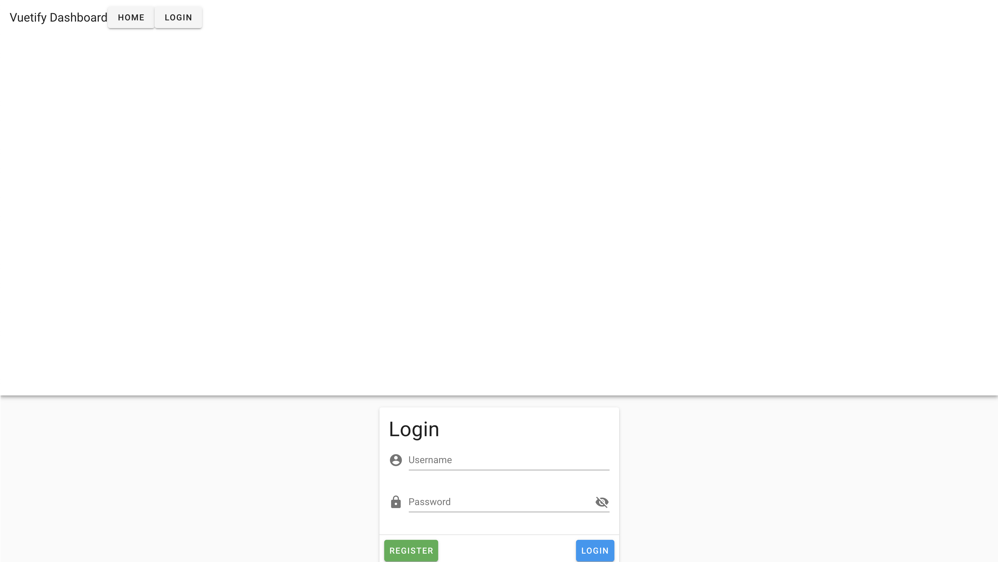
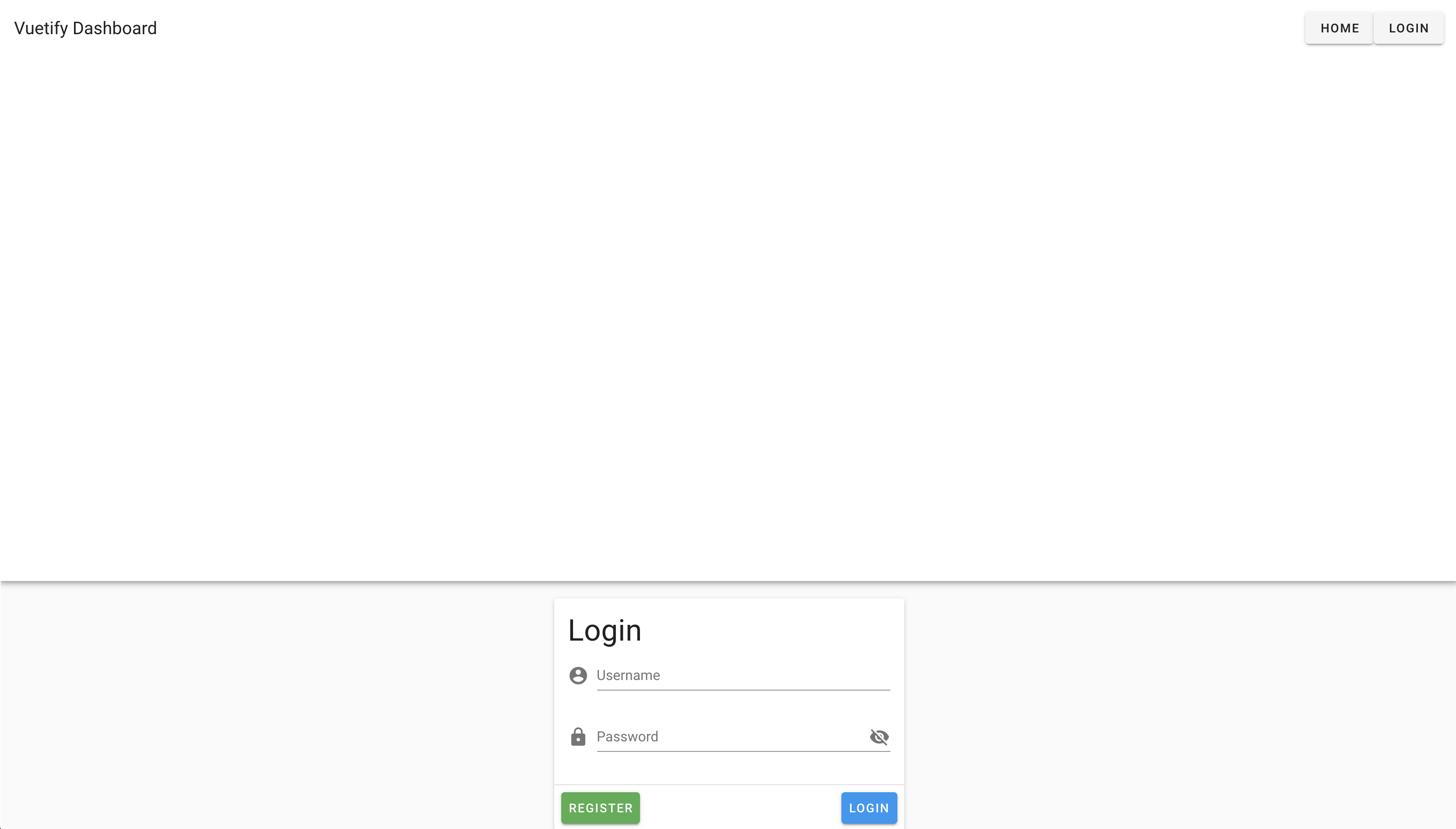
However, as you might notice, at the moment users cannot toggle the password visibility. So let’s build that functionality next!
Toggle Password Visibility
To start, we are going to add a data property of showPassword that will have a default boolean value of false .
<script>
export default {
  name: 'App',
  data () {
    return {
      showPassword: false
    }
  }
}
</script>
To toggle visibility, we will use the v-bind directive to determine whether the type of the field will be text or password.
<template>
  <v-app>
    <v-card width="400" class="mx-auto mt-5">
      <v-card-title class="pb-0">
        <h1>Login</h1>
      </v-card-title>
      <v-card-text>
        <v-form>
          <v-text-field
            label="Username"
            prepend-icon="mdi-account-circle"
          />
          <v-text-field
            :type="showPassword ? 'text' : 'password'"
            label="Password"
            prepend-icon="mdi-lock"
            append-icon="mdi-eye-off"
          />
        </v-form>
      </v-card-text>
      <v-divider></v-divider>
      <v-card-actions>
        <v-btn color="success">Register</v-btn>
        <v-btn color="info">Login</v-btn>
      </v-card-actions>
    </v-card>
  </v-app>
</template>
Since we want to allow users to toggle password visibility by clicking on the visibility icon, we will need to add a click event to the icon. Lucky for us, Vuetify already thought of this by allowing us to target our appended-icon by passing the target append as an argument to the click handler. With this, we can now write the JavaScript we need to toggle the value of showPassword .
<template>
  <v-app>
    <v-card width="400" class="mx-auto mt-5">
      <v-card-title class="pb-0">
        <h1>Login</h1>
      </v-card-title>
      <v-card-text>
        <v-form>
          <v-text-field
            label="Username"
            prepend-icon="mdi-account-circle"
          />
          <v-text-field
            :type="showPassword ? 'text' : 'password'"
            label="Password"
            prepend-icon="mdi-lock"
            append-icon="mdi-eye-off"
            @click:append="showPassword = !showPassword"
          />
        </v-form>
      </v-card-text>
      <v-divider></v-divider>
      <v-card-actions>
        <v-btn color="success">Register</v-btn>
        <v-btn color="info">Login</v-btn>
      </v-card-actions>
    </v-card>
  </v-app>
</template>
Now when we click on our eye icon, you can see that it toggles the password visibility! However, this is still not quite right because the password is visible while the mdi-eye-off icon is still showing. To fix this, we use the v-bind directive again to write a ternary statement that will show a mdi-eye icon when showPassword is true and mdi-eye-off when showPassword is false.
<template>
  <v-app>
    <v-card width="400" class="mx-auto mt-5">
      <v-card-title class="pb-0">
        <h1>Login</h1>
      </v-card-title>
      <v-card-text>
        <v-form>
          <v-text-field
            label="Username"
            prepend-icon="mdi-account-circle"
          />
          <v-text-field
            :type="showPassword ? 'text' : 'password'"
            label="Password"
            prepend-icon="mdi-lock"
            :append-icon="showPassword ? 'mdi-eye' : 'mdi-eye-off'"
            @click:append="showPassword = !showPassword"
          />
        </v-form>
      </v-card-text>
      <v-divider></v-divider>
      <v-card-actions>
        <v-btn color="success">Register</v-btn>
        <v-btn color="info">Login</v-btn>
      </v-card-actions>
    </v-card>
  </v-app>
</template>
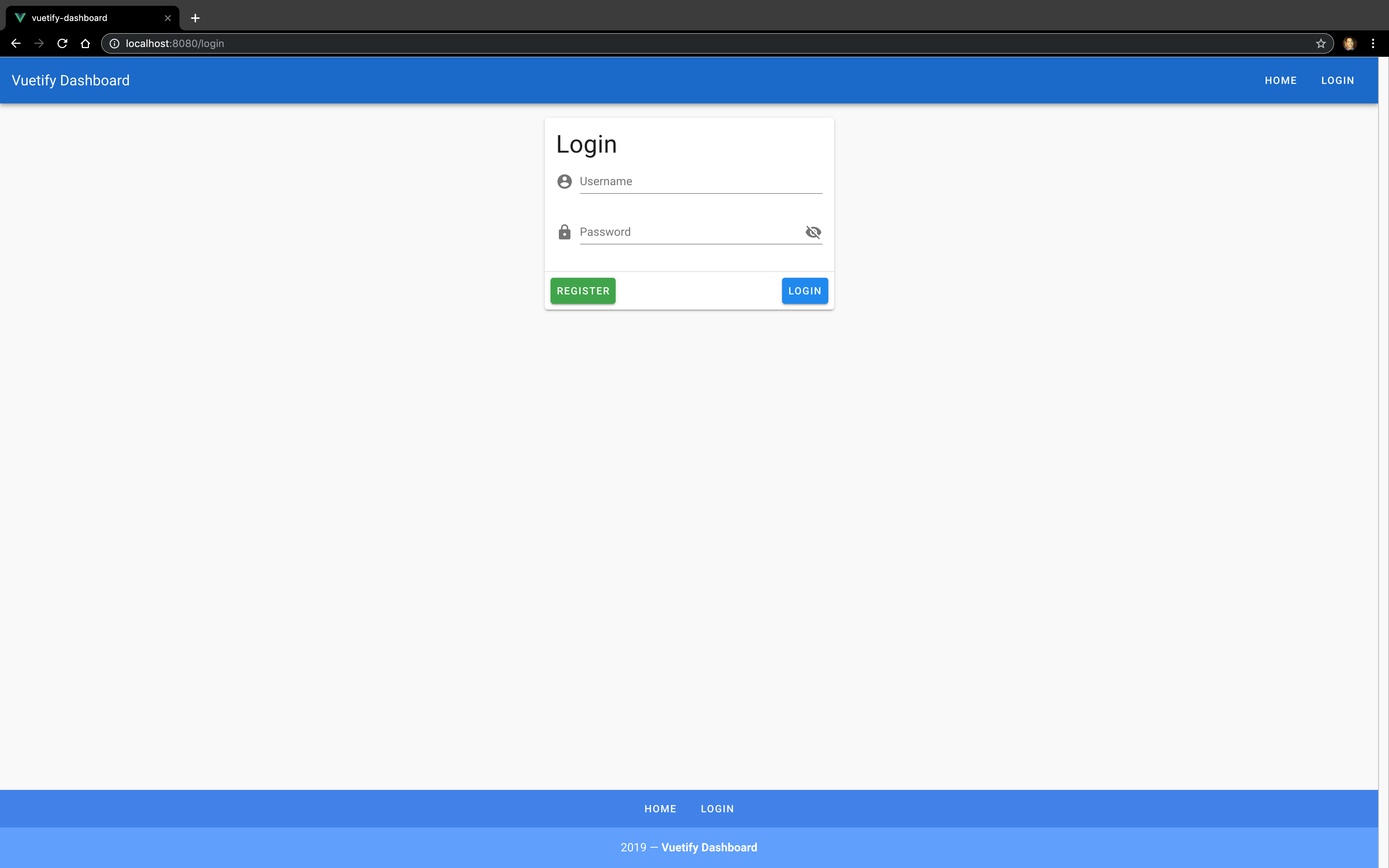
Everything works and looks great now!
Conclusion
So far you’ve seen a preview of how helpful Vuetify can be for creating beautiful web applications.
In the rest of the course, we’ll cover everything you need to know to start confidently using Vuetify in your own projects.
Components (Pt. 1)
In the first lesson of this course, we built a Login module for our Vuetify Dashboard app. In this lesson, we will learn how to:
- find the right component for your app
- navigate documentation for a component
- leverage existing design patterns so that you can be more productive
Let’s get started!
Our first Vuetify Component
Practically every app has one component in common: a global navigation bar. We need to add this to our Vuetify Dashboard app. To get started, let’s head over to the Vuetify docs and we will look at how find the component we need.
As we scan the left hand navigation, there is a “UI Components” section that looks like what we are searching for.
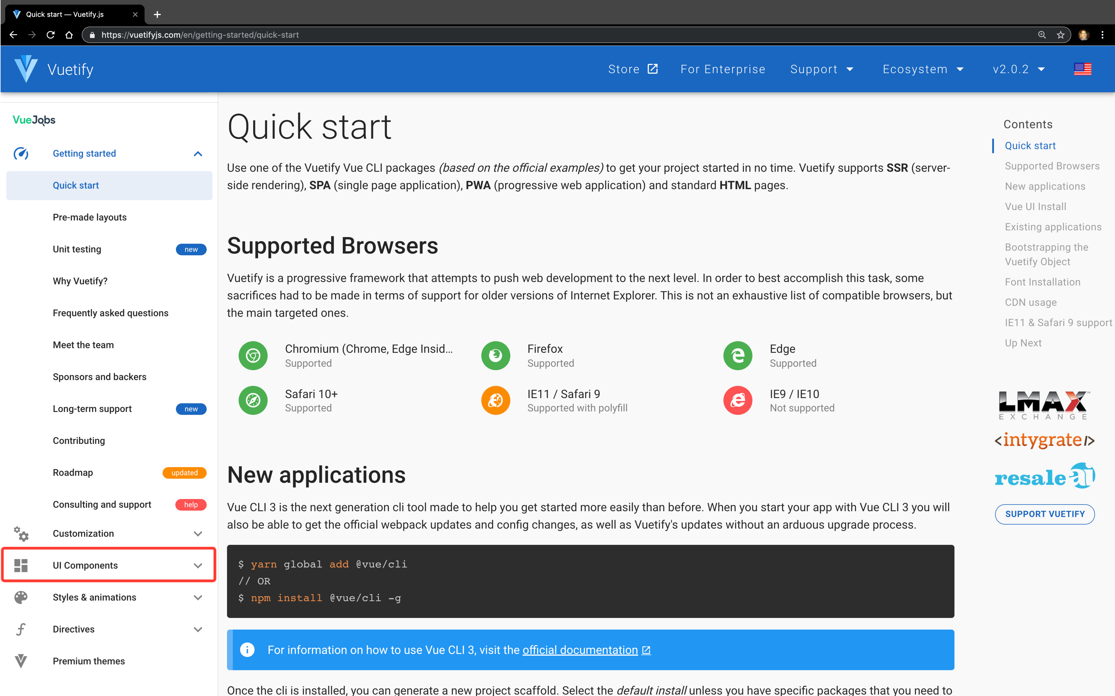
Once we expand this section, you will see a lot of components that Vuetify has built for us. Since we’re looking for a navigation bar, this section here called Bars looks promising.
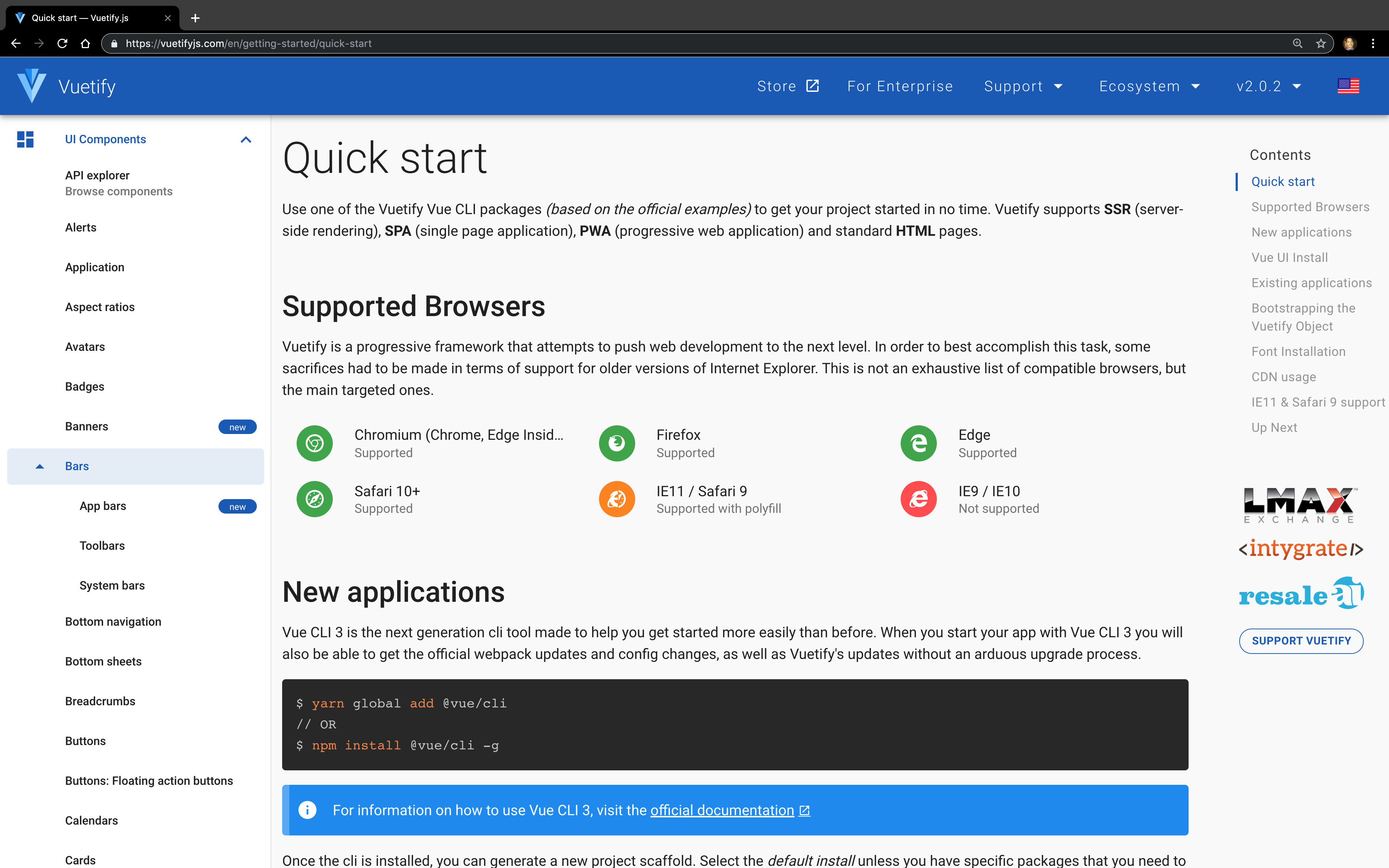
When we expand this section, there is no navigation bar; but there is a component called “App bars” that sounds like a good fit because it indicates that it is meant for global use throughout the app. Let’s dive into the docs to make sure it can do what we want before adding it to our app.
Exploring the Vuetify docs
When working with Vuetify components, there is no better place to learn how a component works than its docs page. The section you’ll see on most componets is the Introduction.
Introduction
The introduction is a paragraph that covers the purpose of the component. Although you are welcome to use the component however you see fit, this section provides some guidance about common usages and patterns to consider.
Usage
This section is the Usage section, which describes the core functionality of the component and how it should be used. Some details you may find here include:
- basic specifications (i.e., responsive design sizes)
- sub-components that are generally used within the context of the component
In addition, it is always paired with a module that will make all the difference in your developer experience: the demo module.
Demo Module

The purpose of the demo module is to allow users to interact with a live demo of the component while also providing code samples. There are four primary functions that come with every example module:
- Dark / Light Theme Toggle - This allows you to toggle what the component looks like in dark or light themes
- CodePen - Opens a new tab with a new CodePen under your account to experiment and save for future reference if desired
- GitHub - Opens a new tab with a code sample that’s version controlled in GitHub
-
Code - This toggles a code block that allows you to see the code for the component directly on the page. This is probably the feature you will be using the most. As you’ll notice, the code block has section headers to show different sections of the code. In this particular example, there is only a
Templatesection, but another common section you’ll see in other components isScript, which contains the JavaScript that’s required for the demo to work properly when copying and pasting.
The example we see in the Usage section has the primary structure we want. So when we open up the code tab to see how it is built, it looks like these are the components that fulfill our requirements:
-
v-app-bar- The wrapper for our component -
v-toolbar-title- Allows us to define the title text for the component -
v-btn- Provides a call to action that the user can click on
Let’s add those component into our app to see how it looks!
/src/App.vue
<template>
  <div id="app">
    <v-app>
      <v-app-bar>
        <v-toolbar-title>Vuetify Dashboard</v-toolbar-title>
        <v-btn>Home</v-btn>
        <v-btn>Login</v-btn>
      </v-app-bar>
      <!-- Login Module -->
      <v-card width="400" class="mx-auto mt-5">...</v-card>
    </v-app>
  </div>
</template>
Our navigation items looks odd since it is bumped up next to our toolbar title. We will go ahead and use the v-spacer component that we used in the Login module. Like it sounds, this component is used for making space between two components within a flex container. We’ll cover this more in the Layout lesson. For now, let’s add it in.
/src/App.vue
<template>
  <div id="app">
    <v-app>
      <v-app-bar>
        <v-toolbar-title>Vuetify Dashboard</v-toolbar-title>
        <v-spacer></v-spacer>
        <v-btn>Home</v-btn>
        <v-btn>Login</v-btn>
      </v-app-bar>
      <!-- Login Module -->
      <v-card width="400" class="mx-auto mt-5">...</v-card>
    </v-app>
  </div>
</template>
However, the App Bar component is overly large and requires additional modifications to look correctly. It’s time we learned about how to configure the App Bar so it works and looks the way we want!
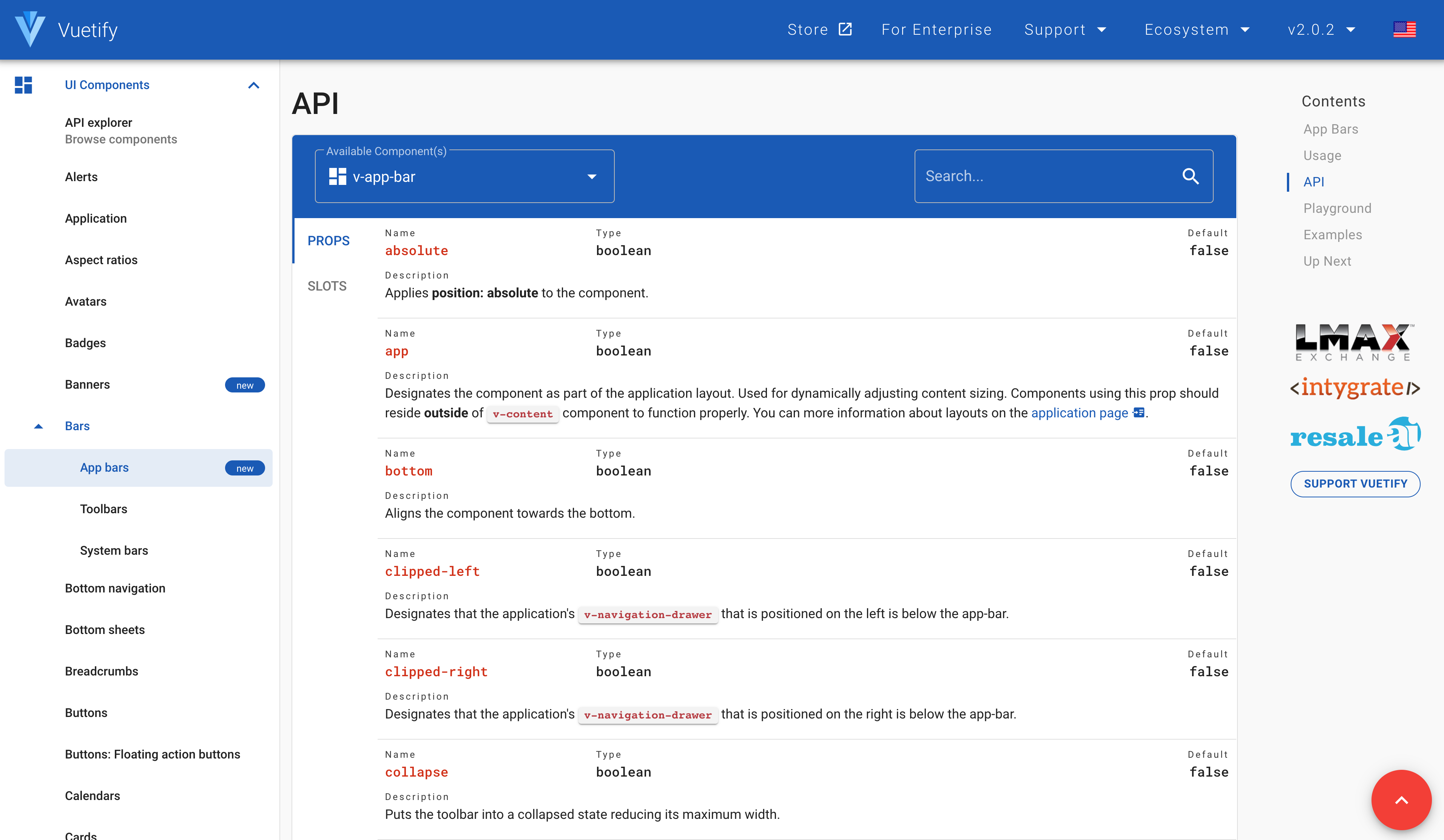
API
This section contains an exhaustive list of all the APIs that we can use to configure aspects of the component. As you can see in this table, it has tabs to show all of the aspects available for reference.
The first thing we need to fix is the size of our app bar. Luckily for us, Vuetify has a prop that does exactly what we need: app , which helps us fix the size of our App Bar by properly adjusting it to the layout.
/src/App.vue
<template>
  <div id="app">
    <v-app>
      <v-app-bar app>
        <v-toolbar-title>Vuetify Dashboard</v-toolbar-title>
        <v-spacer></v-spacer>
        <v-btn>Home</v-btn>
        <v-btn>Login</v-btn>
      </v-app-bar>
      <!-- Login Module -->
      <v-card width="400" class="mx-auto mt-5">...</v-card>
    </v-app>
  </div>
</template>
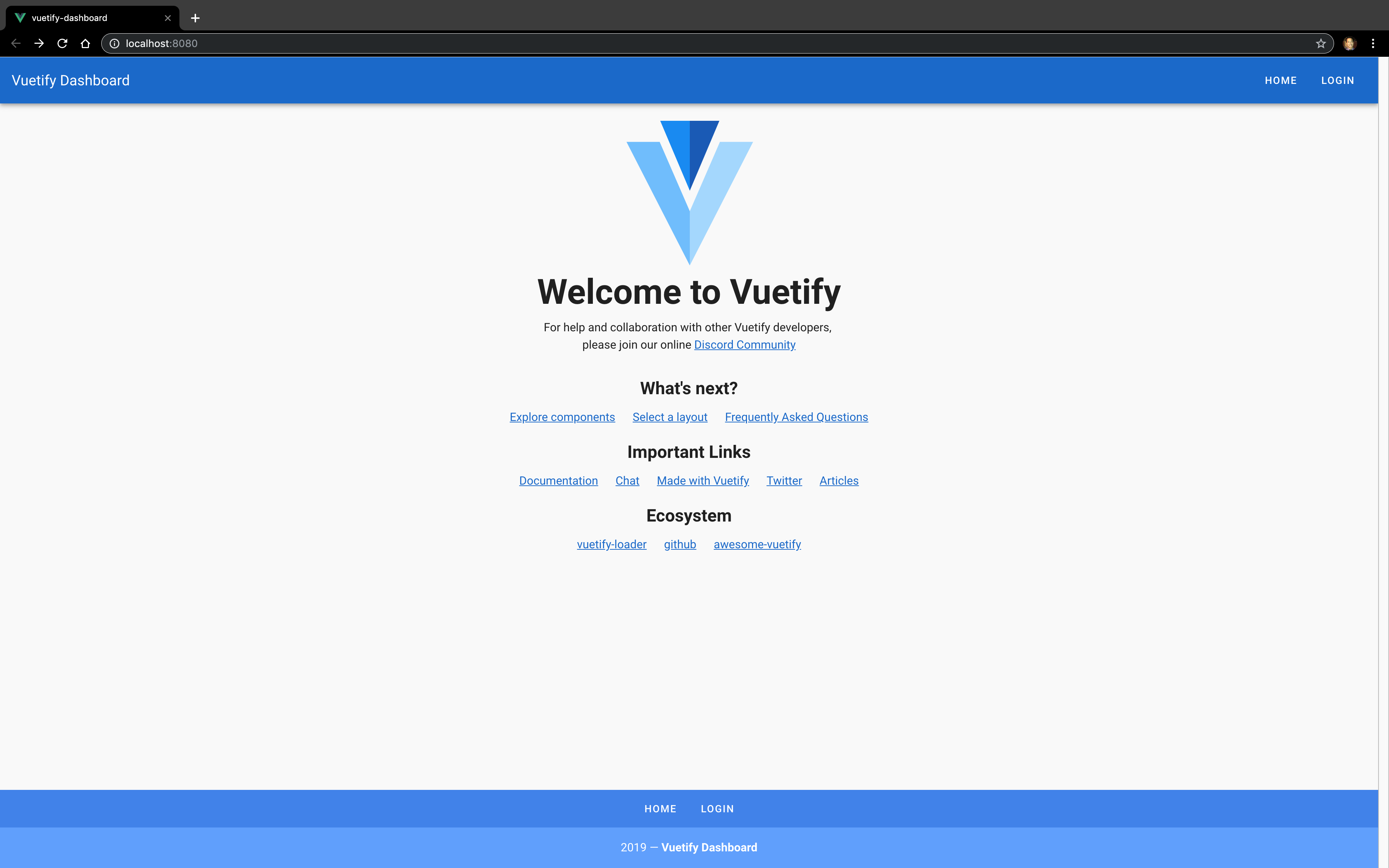
Now that our App Bar is sized correctly, our toolbar is looking a little bland, so let’s add some color. In order to configure the color, we add a prop of color that takes the name of a material color or CSS color. Let’s use the material color “primary” to give our app bar a nice blue.
/src/App.vue
<template>
  <div id="app">
    <v-app>
      <v-app-bar app color="primary">
        <v-toolbar-title>Vuetify Dashboard</v-toolbar-title>
        <v-spacer></v-spacer>
        <v-btn>Home</v-btn>
        <v-btn>Login</v-btn>
      </v-app-bar>
      <!-- Login Module -->
      <v-card width="400" class="mx-auto mt-5">...</v-card>
    </v-app>
  </div>
</template>
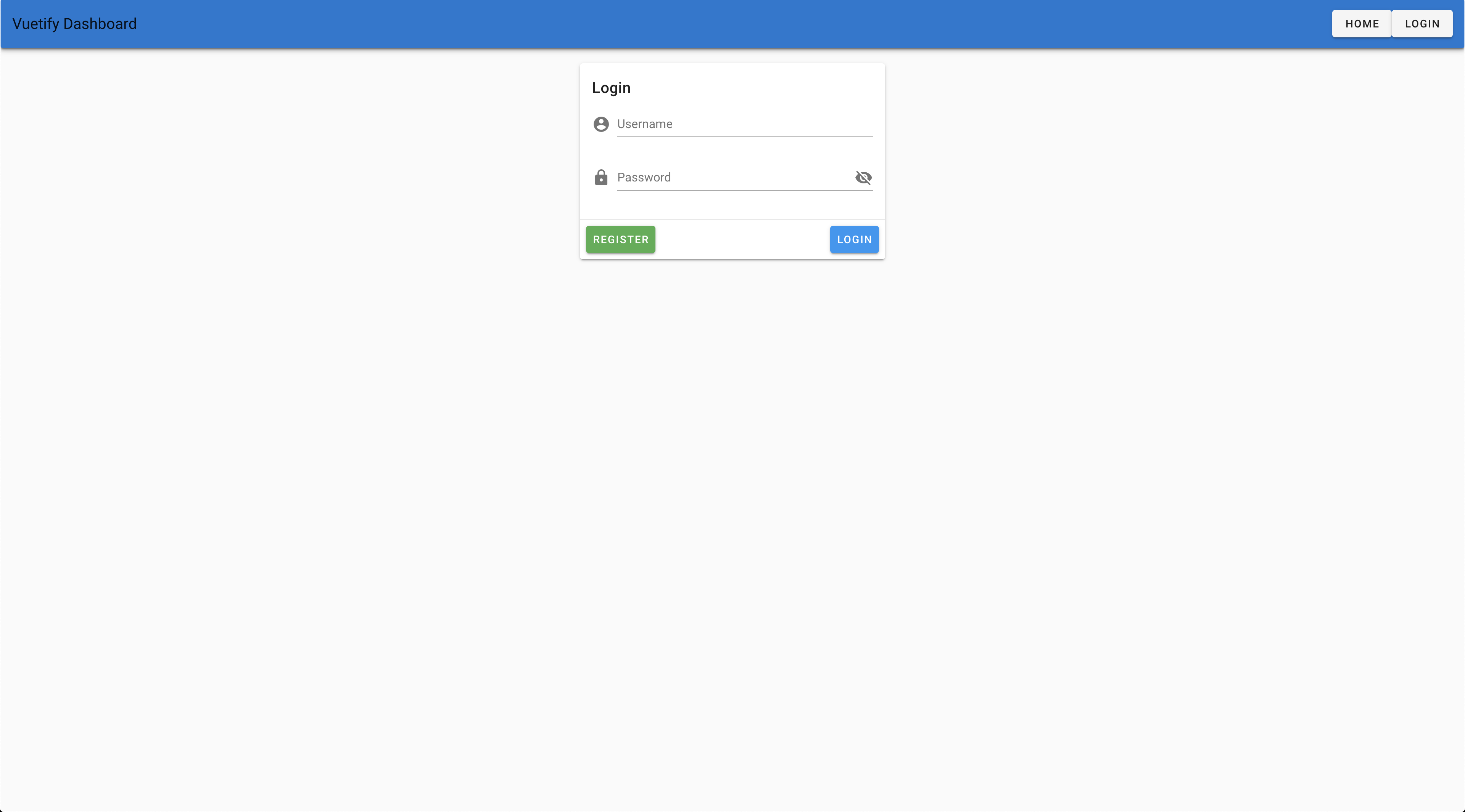
The typography is looking a little hard to read against the blue background, so let’s add the dark prop to make the text color more accessible by applying the dark theme variant.
/src/App.vue
<template>
  <div id="app">
    <v-app>
      <v-app-bar app color="primary" dark>
        <v-toolbar-title>Vuetify Dashboard</v-toolbar-title>
        <v-spacer></v-spacer>
        <v-btn>Home</v-btn>
        <v-btn>Login</v-btn>
      </v-app-bar>
      <!-- Login Module -->
      <v-card width="400" class="mx-auto mt-5">...</v-card>
    </v-app>
  </div>
</template>

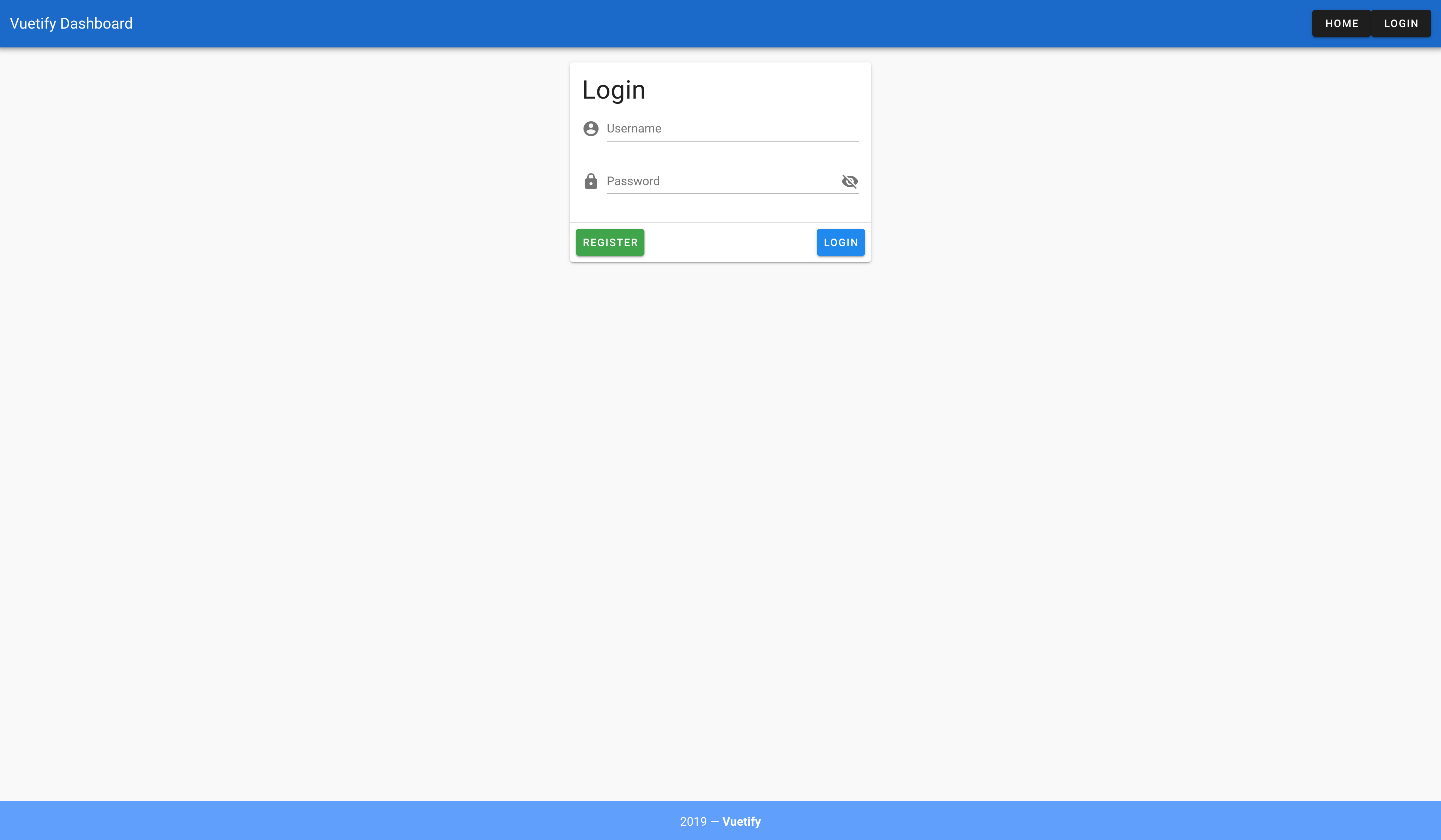
Much better. However, the Login module is still overlapping with the App Bar. In order to fix this, let’s visit the docs for the Application component which documents core components you will commonly see in Vuetify apps. For example, the v-app that wraps our application is required for all applications.
When we read the introduction, we learn about a key component: v-content . This component helps to bootstrap our application by ensuring there is proper sizing around the content. Let’s add that to our app by wrapping our Login module with it.
/src/App.vue
<template>
  <div id="app">
    <v-app>
      <v-app-bar app color="primary" dark>
        <v-toolbar-title>Vuetify Dashboard</v-toolbar-title>
        <v-spacer></v-spacer>
        <v-btn>Home</v-btn>
        <v-btn>Login</v-btn>
      </v-app-bar>
      <v-content>
        <!-- Login Module -->
        <v-card width="400" class="mx-auto mt-5">...</v-card>
      </v-content>
    </v-app>
  </div>
</template>
Now that everything looks great on the screen. Let’s add a footer to our app. Rather than build one from scratch though, let’s learn about a useful section of the component docs: Examples.
Examples
The Examples section contains a series of common use cases of how a component might be used. This is extremely helpful since it allows us to see common scenarios depicting how the component can be used. Our app needs a footer which needs to display:
- Links for navigation:
- Home
- Login
- The current year
- The app name
Let’s check out the docs to see if there’s an example we can reuse!
The Company Footer example looks perfect. Let’s copy it into our App.vue file and see what happens.
/src/App.vue
<template>
  <v-app>
    <v-app-bar app color="primary" dark>...</v-app-bar>
    <!-- Login Module -->
    <v-card width="400" class="mx-auto mt-5">
      ...
    </v-card>
    <v-footer color="primary lighten-1" padless>
      <v-layout justify-center wrap>
        <v-btn
          v-for="link in links"
          :key="link"
          color="white"
          text
          rounded
          class="my-2"
        >
          {{ link }}
        </v-btn>
        <v-flex primary lighten-2 py-4 text-center white--text xs12>
          {{ new Date().getFullYear() }} — <strong>Vuetify</strong>
        </v-flex>
      </v-layout>
    </v-footer>
  </v-app>
</template>

<script>
export default {
  name: 'App',
  data() {
    return {
      showPassword: false
    }
  }
}
</script>
In this code sample, we need to:
- add a data property of
linksin order for it to work properly - Update the app name
src/App.vue
<template>
  <v-app>
    <v-app-bar app color="primary" dark>...</v-app-bar>
    <!-- Login Module -->
    <v-card width="400" class="mx-auto mt-5">
      ...
    </v-card>
    <v-footer color="primary lighten-1" padless>
      <v-layout justify-center wrap>
        <v-btn
          v-for="link in links"
          :key="link"
          color="white"
          text
          rounded
          class="my-2"
        >
          {{ link }}
        </v-btn>
        <v-flex primary lighten-2 py-4 text-center white--text xs12>
          {{ new Date().getFullYear() }} — <strong>Vuetify Dashboard</strong>
        </v-flex>
      </v-layout>
    </v-footer>
  </v-app>
</template>

<script>
export default {
  name: 'App',
  data() {
    return {
      showPassword: false,
      links: [
        'Home',
        'Login'
      ]
    }
  }
}
</script>
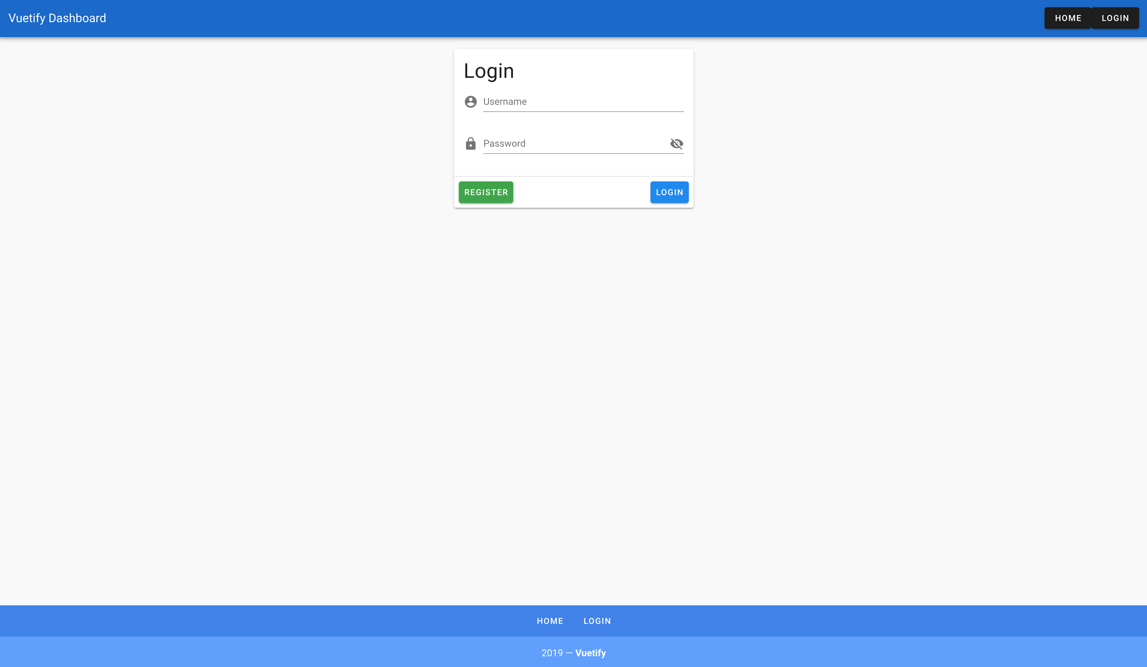
Looks great! However, our styles for the links look differently for the header and footer even though they are both Vuetify button. Upon closer inspection, you’ll see that there are two props on the footer buttons that we are not using in the App Bar: text and rounded . To figure out what they do, let’s go to the docs for buttons and find out what they do.
Using the API search functionality, we can find that the:
-
textprop makes the background transparent - and the
roundedprop applies a large border radius on the button, which we can see when we hover over the button
Let’s go ahead and add those same props to our App Bar buttons so our app is consistent
/src/App.vue
<template>
  <v-app>
    <v-app-bar app color="primary">
      <v-toolbar-title>Vuetify Dashboard</v-toolbar-title>
      <v-spacer></v-spacer>
      <v-btn text rounded>Home</v-btn>
      <v-btn text rounded>Login</v-btn>
    </v-app-bar>
    <v-card width="400" class="mx-auto mt-5">
      ...
    </v-card>
    <v-footer color="primary lighten-1" padless>
      ...
    </v-footer>
  </v-app>
</template>

That was easy!
Let’s ReVue
We have reached the end of Part 1 on Vuetify Components. To review, we have learned how to:
- Find the right component for your app
- Navigate documentation for a component
- Reuse common design patterns to maximize productivity
In the next lesson, we will explore some more complex components as we enhance our Vuetify Dashboard app. See you there!
Components (Pt. 2)
In the last lesson, Vuetify Components Part 1, we started learning how to use Vuetify components by adding a global header and footer. In this lesson, we are going to take our app to the next level with
- multi-page navigation
- take a deeper dive into components docs
- learn how to use more complex component
Managing navigation with Vuetify is no different than any other Vue app since all we need is Vue Router. In this lesson, I’ll go through the basic steps to use Vue Router, but for an in-depth exploration of Vue Router, make sure to check out our Real World Vue course where we teach you about Vue Router.
Let’s get started by opening up our project in our terminal.
Adding Navigation to Our App
Once we open up our project in the terminal, we will start by adding Vue Router into our app with Vue CLI by using the following command:
vue add router
When prompted for history mode, we’ll go ahead and enable it in order to have standard URLs rather than hash URLs.

Once it finishes installing, let’s fire up our local web server to see what it looks like with:
yarn serve
 Oh no! It looks like everything has been wiped out!
Well do not fear. Version control can save the day. So let’s dive into our Source Control tab in VS Code to see what happened.
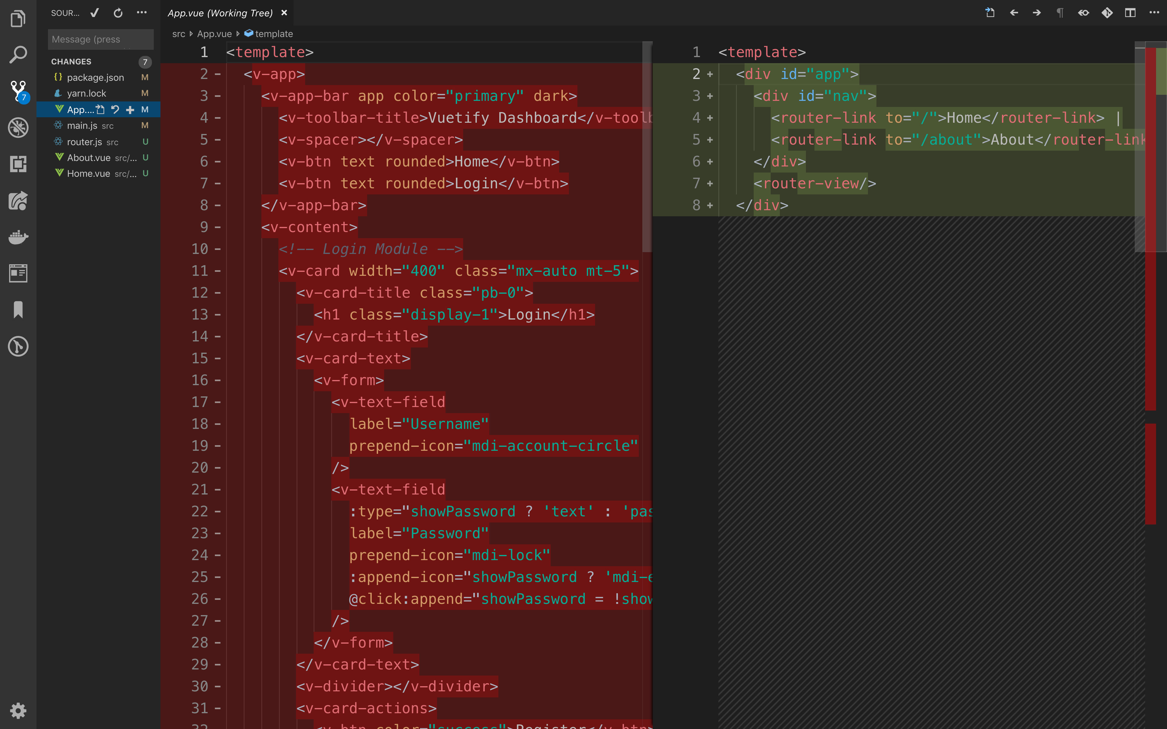
Based on the diff between the past and current App.vue file, it becomes clear that vue-router installation process overwrote the file with a boilerplate file. So all we have to do is revert the change by discarding the current changes.
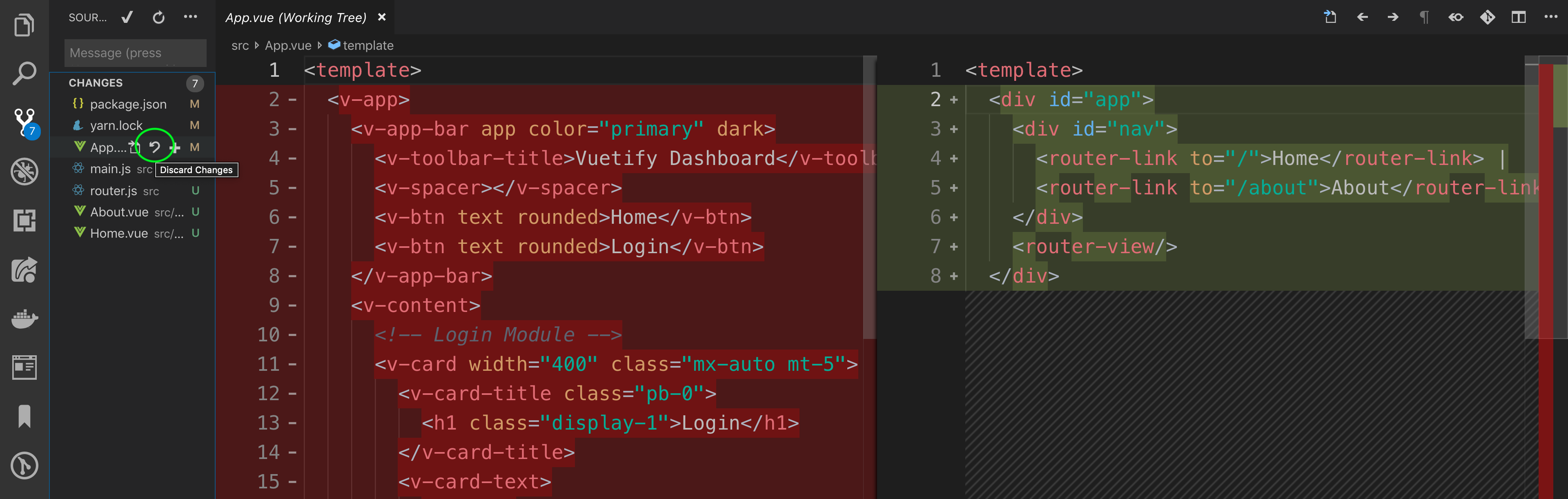
Once we discard the changes, everything is back to normal. 
Next, let’s go ahead and refactor our App.vue file so that our Login module lives in its own page. To do this, we will need to:
- Create a new file in the
src/viewsdirectory calledLogin.vue - Cut and paste the login module from
App.vueintoLogin.vue - Move the
showPassworddata property intoLogin.vue
src/views/Login.vue
<template>
  <v-card width="400" class="mx-auto mt-5">
    <v-card-title class="pb-0">
      <h1 class="display-1">Login</h1>
    </v-card-title>
    <v-card-text>
      <v-form>
        <v-text-field
          label="Username"
          prepend-icon="mdi-account-circle"
        />
        <v-text-field
          :type="showPassword ? 'text' : 'password'"
          label="Password"
          prepend-icon="mdi-lock"
          :append-icon="showPassword ? 'mdi-eye' : 'mdi-eye-off'"
          @click:append="showPassword = !showPassword"
        />
      </v-form>
    </v-card-text>
    <v-divider></v-divider>
    <v-card-actions>
      <v-btn color="success">Register</v-btn>
      <v-spacer></v-spacer>
      <v-btn color="info">Login</v-btn>
    </v-card-actions>
  </v-card>
</template>

<script>
export default {
  name: 'Login',
  data() {
    return {
      showPassword: false
    }
  }
}
</script>
src/App.vue
<template>
  <v-app>
    <v-app-bar app color="primary" dark>
      <v-toolbar-title>Vuetify Dashboard</v-toolbar-title>
      <v-spacer></v-spacer>
      <v-btn text rounded>Home</v-btn>
      <v-btn text rounded>Login</v-btn>
    </v-app-bar>
    <v-content>

    </v-content>
    <v-footer color="primary lighten-1" padless>
      <v-layout justify-center wrap>
        <v-btn
          v-for="link in links"
          :key="link"
          color="white"
          text
          rounded
          class="my-2"
        >
          {{ link }}
        </v-btn>
        <v-flex primary lighten-2 py-4 text-center white--text xs12>
          {{ new Date().getFullYear() }} — <strong>Vuetify Dashboard</strong>
        </v-flex>
      </v-layout>
    </v-footer>
  </v-app>
</template>

<script>
export default {
  name: 'App',
  data () {
    return {
      links: [
        'Home',
        'Login'
      ]
    }
  }
}
</script>
- Add a new route for the
/logininrouter.js.
src/router.js
import Vue from 'vue'
import Router from 'vue-router'
import Home from './views/Home.vue'

Vue.use(Router)

export default new Router({
  mode: 'history',
  base: process.env.BASE_URL,
  routes: [
    {
      path: '/',
      name: 'home',
      component: Home
    },
    {
      path: '/about',
      name: 'about',
      // route level code-splitting
      // this generates a separate chunk (about.[hash].js) for this route
      // which is lazy-loaded when the route is visited.
      component: () => import(/* webpackChunkName: "about" */ './views/About.vue')
    },
    {
      path: '/login',
      name: 'login',
      component: () => import('./views/Login.vue')
    }
  ]
})
- Add a
router-viewelement toApp.vueso that the correct page is displayed
src/App.vue
<template>
  <v-app>
    <v-app-bar app color="primary" dark>
      <v-toolbar-title>Vuetify Dashboard</v-toolbar-title>
      <v-spacer></v-spacer>
      <v-btn text rounded>Home</v-btn>
      <v-btn text rounded>Login</v-btn>
    </v-app-bar>
    <v-content>

    </v-content>
    <v-footer color="primary lighten-1" padless>
      <v-layout justify-center wrap>
        <v-btn
          v-for="link in links"
          :key="link"
          color="white"
          text
          rounded
          class="my-2"
        >
          {{ link }}
        </v-btn>
        <v-flex primary lighten-2 py-4 text-center white--text xs12>
          {{ new Date().getFullYear() }} — <strong>Vuetify Dashboard</strong>
        </v-flex>
      </v-layout>
    </v-footer>
  </v-app>
</template>

<script>
export default {
  name: 'App',
  data () {
    return {
      links: [
        'Home',
        'Login'
      ]
    }
  }
}
</script>
- Delete the Vue logo from
Home.vueon line 3.
src/views/Home.vue
<template>
  <div class="home">
    <HelloWorld msg="Welcome to Your Vue.js App"/>
  </div>
</template>

<script>
// @ is an alias to /src
import HelloWorld from '@/components/HelloWorld.vue'

export default {
  name: 'home',
  components: {
    HelloWorld
  }
}
</script>
With this refactor, now our app has two pages!
Home - /
Login - /login
While we have proper routes now, currently our Vuetify buttons in the global navigation and footer do not do anything. In addition, while these components may look like buttons visually, the final rendered HTML should change according to its semantic usage (i.e., an anchor tag for a link).
If we look at the Button component API documentation, there are two different props worth noting:
-
href- Anyv-btnconfigured with this prop will be rendered as a normal anchor element -
to- This converts it to arouter-linkelement, which means you can also use any properties defined from the Vue Router API. Just what we are looking for!
Let’s go ahead and configure our v-btn s in our App Bar so that it can route to the pages we just setup.
src/App.vue
<template>
  <v-app>
    <v-app-bar app color="primary" dark>
      <v-toolbar-title>Vuetify Dashboard</v-toolbar-title>
      <v-spacer></v-spacer>
      **** <v-btn text rounded to="/">Home</v-btn>
      <v-btn text rounded to="/login">Login</v-btn>
    </v-app-bar>
    <v-content>
      <router-view></router-view>
    </v-content>
    <v-footer color="primary lighten-1" padless>
      <v-layout justify-center wrap>
        <v-btn
          v-for="link in links"
          :key="link"
          color="white"
          text
          rounded
          class="my-2"
        >
          {{ link }}
        </v-btn>
        <v-flex primary lighten-2 py-4 text-center white--text xs12>
          {{ new Date().getFullYear() }} — <strong>Vuetify Dashboard</strong>
        </v-flex>
      </v-layout>
    </v-footer>
  </v-app>
</template>

<script>
export default {
  name: 'App',
  data () {
    return {
      links: [
        'Home',
        'Login'
      ]
    }
  }
}
</script>
Now when you click on the buttons, they properly route you to the correct page. And as an added bonus, it even tracks what page the user is currently on and automatically applies the correct style. Sweet! 
However, it looks like our Footer buttons are still not functional. In addition, any future navigation changes will require changing the code in two places. So rather than configuring the links twice, let’s refactor our code so that the App Bar buttons and Footer buttons use the same data property.
- Convert
linksdata property to be an array of objects that has alabelproperty for what is displayed to users and aurlproperty for routing purposes - Update the following propertes of
v-btnin the footer:
- Key
- To
- Displayed Text
- Update the
v-btnin the App Bar to use thev-fordirective to loop through thelinksdata property and update the following properties:
- Key
- To
- Displayed Text
src/App.vue
<template>
  <v-app>
    <v-app-bar app color="primary" dark>
      <v-toolbar-title>Vuetify Dashboard</v-toolbar-title>
      <v-spacer></v-spacer>
      **<v-btn
        v-for="link in links"
        :key="`${link.label}-header-link`"
        text
        rounded
        :to="link.url"
      >
        {{ link.label }}
      </v-btn>**
    </v-app-bar>
    <v-content>
      <router-view></router-view>
    </v-content>
    <v-footer color="primary lighten-1" padless>
      <v-layout justify-center wrap>
        **<v-btn
          v-for="link in links"
          :key="`${link.label}-footer-link`"
          color="white"
          text
          rounded
          class="my-2"
          :to="link.url"
        >
          {{ link.label }}
        </v-btn>**
        <v-flex primary lighten-2 py-4 text-center white--text xs12>
          {{ new Date().getFullYear() }} — <strong>Vuetify Dashboard</strong>
        </v-flex>
      </v-layout>
    </v-footer>
  </v-app>
</template>

<script>
export default {
  name: 'App',
  data () {
    return {
      links: [
        {
          label: 'Home',
          url: '/'
        },
        {
          label: 'Login',
          url: '/login'
        }
      ]
    }
  }
}
</script>
Awesome! We could take this refactor a step further and create a component like NavLink to further simplify our code, but I’ll leave that one to you for extra credit.
Now that we have navigation working propertly in our app, it’s time to create the main page that our app desperately needs: the dashboard page!
Creating Our Dashboard Page
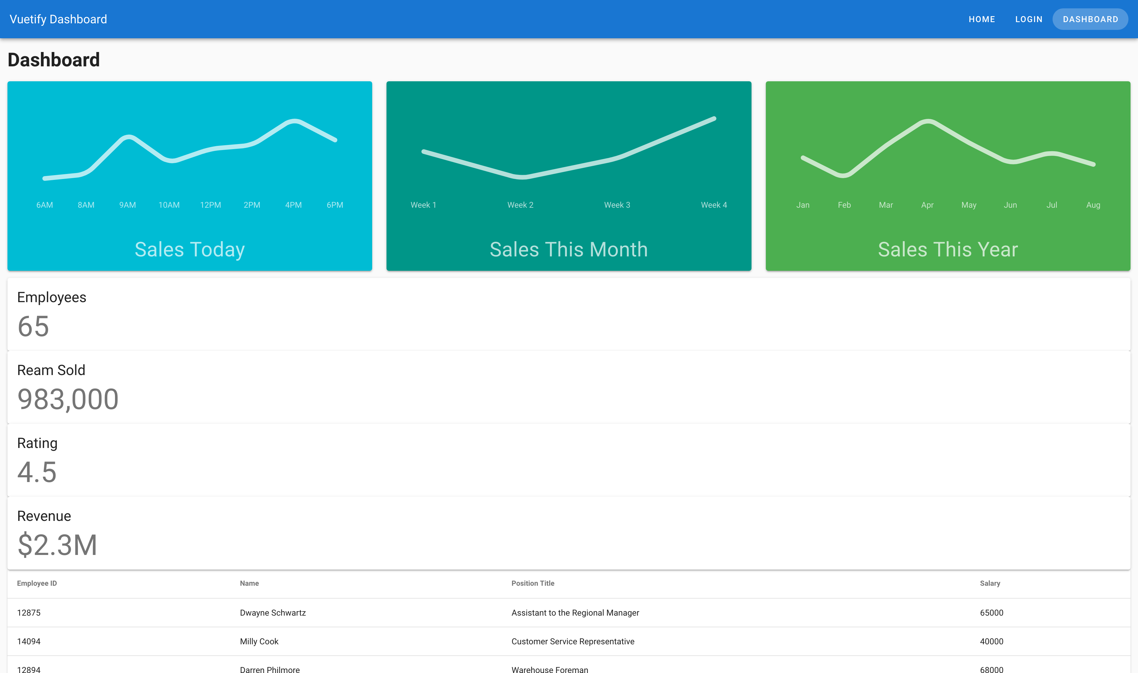
With a project named vuetify-dashboard , it’s about time that we created a dashboard page to give the app some life. To get us started, we need to:
- Create a new page
src/views/Dashboard.vue - Create a new route for
/dashboard - Update our navigation on
src/App.vue
src/views/Dashboard.vue
<template>
  <div>
    <h1>Dashboard</h1>
  </div>
</template>

<script>
export default {
  name: 'DashboardPage'
}
</script>
src/router.js
import Vue from 'vue'
import Router from 'vue-router'
import Home from './views/Home.vue'

Vue.use(Router)

export default new Router({
  mode: 'history',
  base: process.env.BASE_URL,
  routes: [
    {
      path: '/',
      name: 'home',
      component: Home
    },
    {
      path: '/about',
      name: 'about',
      // route level code-splitting
      // this generates a separate chunk (about.[hash].js) for this route
      // which is lazy-loaded when the route is visited.
      component: () => import(/* webpackChunkName: "about" */ './views/About.vue')
    },
    {
      path: '/login',
      name: 'login',
      component: () => import('./views/Login.vue')
    },
    {
      path: '/dashboard',
      name: 'dashboard',
      component: () => import('./views/Dashboard.vue')
    }
  ]
})
src/App.vue
<template>
  <v-app>
    <v-app-bar app color="primary" dark>
      <v-toolbar-title>Vuetify Dashboard</v-toolbar-title>
      <v-spacer></v-spacer>
      <v-btn
        v-for="link in links"
        :key="`${link.label}-header-link`"
        text
        rounded
        :to="link.url"
      >
        {{ link.label }}
      </v-btn>
    </v-app-bar>
    <v-content>
      <router-view></router-view>
    </v-content>
    <v-footer color="primary lighten-1" padless>
      <v-layout justify-center wrap>
        <v-btn
          v-for="link in links"
          :key="`${link.label}-footer-link`"
          color="white"
          text
          rounded
          class="my-2"
          :to="link.url"
        >
          {{ link.label }}
        </v-btn>
        <v-flex primary lighten-2 py-4 text-center white--text xs12>
          {{ new Date().getFullYear() }} — <strong>Vuetify Dashboard</strong>
        </v-flex>
      </v-layout>
    </v-footer>
  </v-app>
</template>

<script>
export default {
  name: 'App',
  data () {
    return {
      links: [
        {
          label: 'Home',
          url: '/'
        },
        {
          label: 'Login',
          url: '/login'
        },
        {
          label: 'Dashboard',
          url: '/dashboard'
        }
      ]
    }
  }
}
</script>
Display a Table of Data on the Dashboard
Now that we have our page up and running. We need to fulfill the following requirements:
- User needs to display a table of data
- User can sort the data in the table
- User can determine how much data to display
- User can paginate through data list
- User should be notified when they click on a row in the table
If we had to build this from scratch, this would be quite a bit of work! Since we’re working with Vuetify though, let’s see if they have what we need by visiting the official docs.
When we scroll through the UI components section, we’ll find a Tables section. When we expand the section, you’ll see that there are a few types of table components in here. After checkingn each out, it looks like Data Tables covers most of the requirements.
It is able to:
- Display data
- Sort data by column
- Change the number of rows displayed
- Paginate through data
And since the Usage demo looks good for our needs, let’s copy it into our app.
When we open up the Source Code tab, you’ll notice that this Usage demo has two blocks: (1) Template and (2) Script. We’ll need to copy both of these into our app in order to get a functioning prototype.
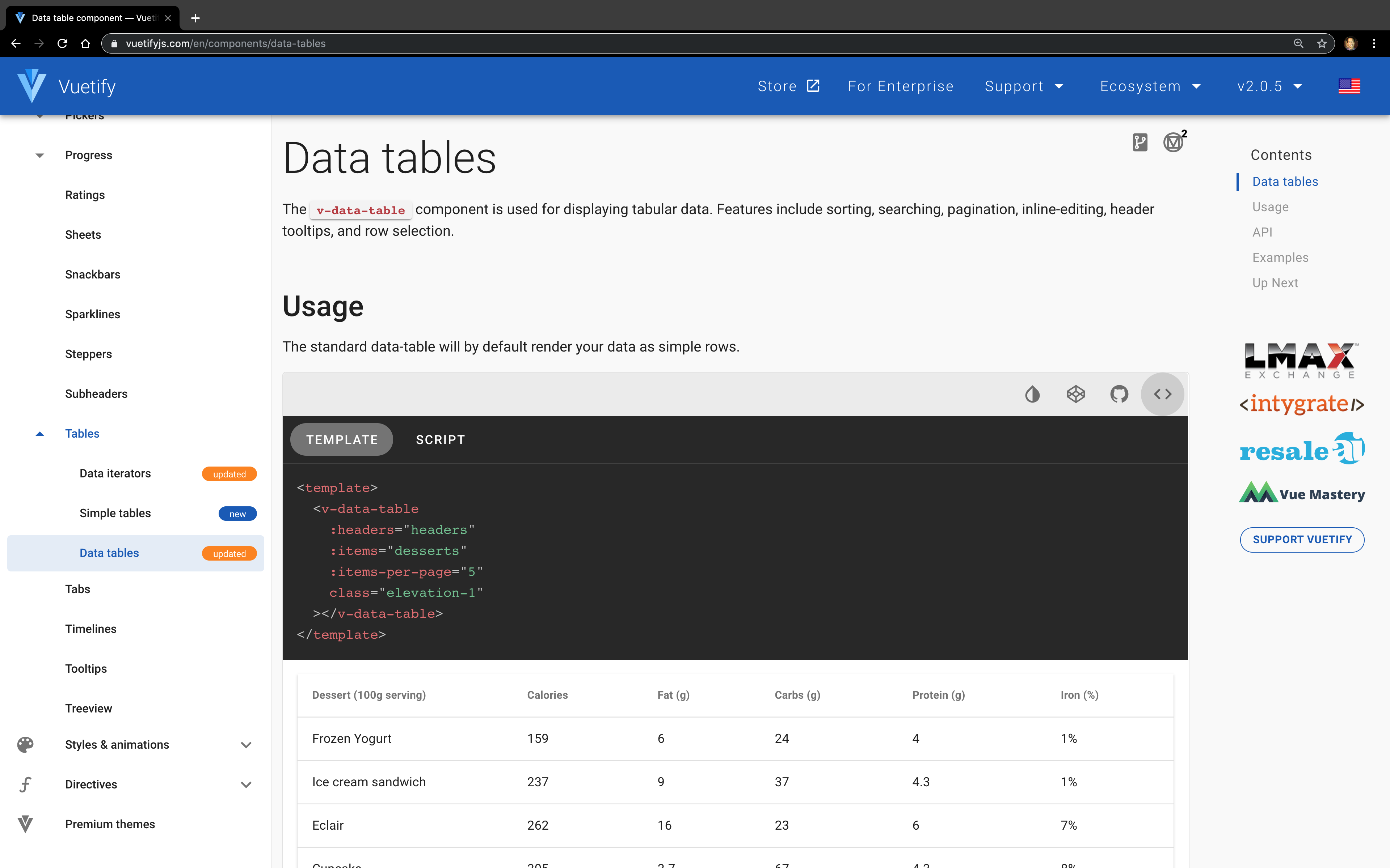
src/views/Dashboard.vue
<template>
  <div>
    <h1>Dashboard</h1>
    <v-data-table
      :headers="headers"
      :items="desserts"
      :items-per-page="5"
      class="elevation-1"
    ></v-data-table>
  </div>
</template>

<script>
  export default {
    name: 'DashboardPage',
    data () {
      return {
        headers: [
          {
            text: 'Dessert (100g serving)',
            align: 'left',
            sortable: false,
            value: 'name',
          },
          { text: 'Calories', value: 'calories' },
          { text: 'Fat (g)', value: 'fat' },
          { text: 'Carbs (g)', value: 'carbs' },
          { text: 'Protein (g)', value: 'protein' },
          { text: 'Iron (%)', value: 'iron' },
        ],
        desserts: [
          {
            name: 'Frozen Yogurt',
            calories: 159,
            fat: 6.0,
            carbs: 24,
            protein: 4.0,
            iron: '1%',
          },
          {
            name: 'Ice cream sandwich',
            calories: 237,
            fat: 9.0,
            carbs: 37,
            protein: 4.3,
            iron: '1%',
          },
          // The rest of the data was removed
          // to shorten the length of the code sample
          // in this article
        ],
      }
    },
  }
</script>
Looks great! Now that we have our data table in our page. Let’s talk a closer look at how everything works.
Headers Prop
This allows us to define the table headers. It takes an array that is made up of objects that can contain the following properties:
-
text(String) - What is displayed on the user side -
value(String) - The value assigned to v-model for data tracking -
align(String) (optional) - Allows the user to align text by ‘left’ | ‘center’ | ‘right’. (Text is aligned left by default) -
sortable(Boolean) (optional) - Allows the user to sort the column. (It istrueby default)
For more information, search for “headers” in the API section of the Data Table docs.
Items Prop
The item prop takes an array of objects that will determine the data that will be displayed in the table. The key-value pair should match the headers to ensure that everything is displayed properly.
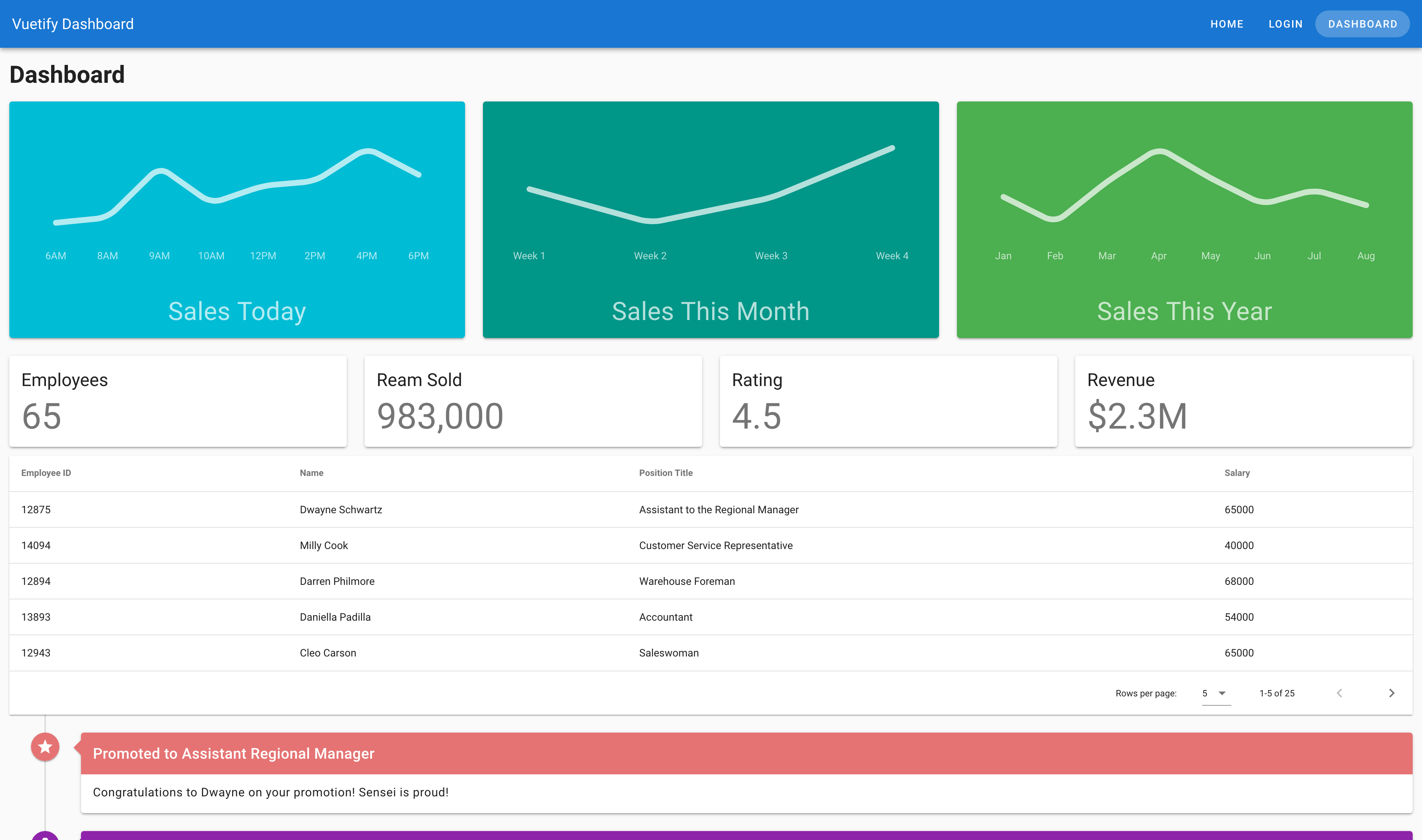
Notify the Users of Interaction
Before we wrap up this lesson, we have one more requirement to fill:
- User should be notified when they click on a row in the table
There are many ways to approach this, but for this lesson, I’m going to introduce you to the Snackbars component. This component allows us to trigger a small bar to appear on the bottom of the screen in response to an element.
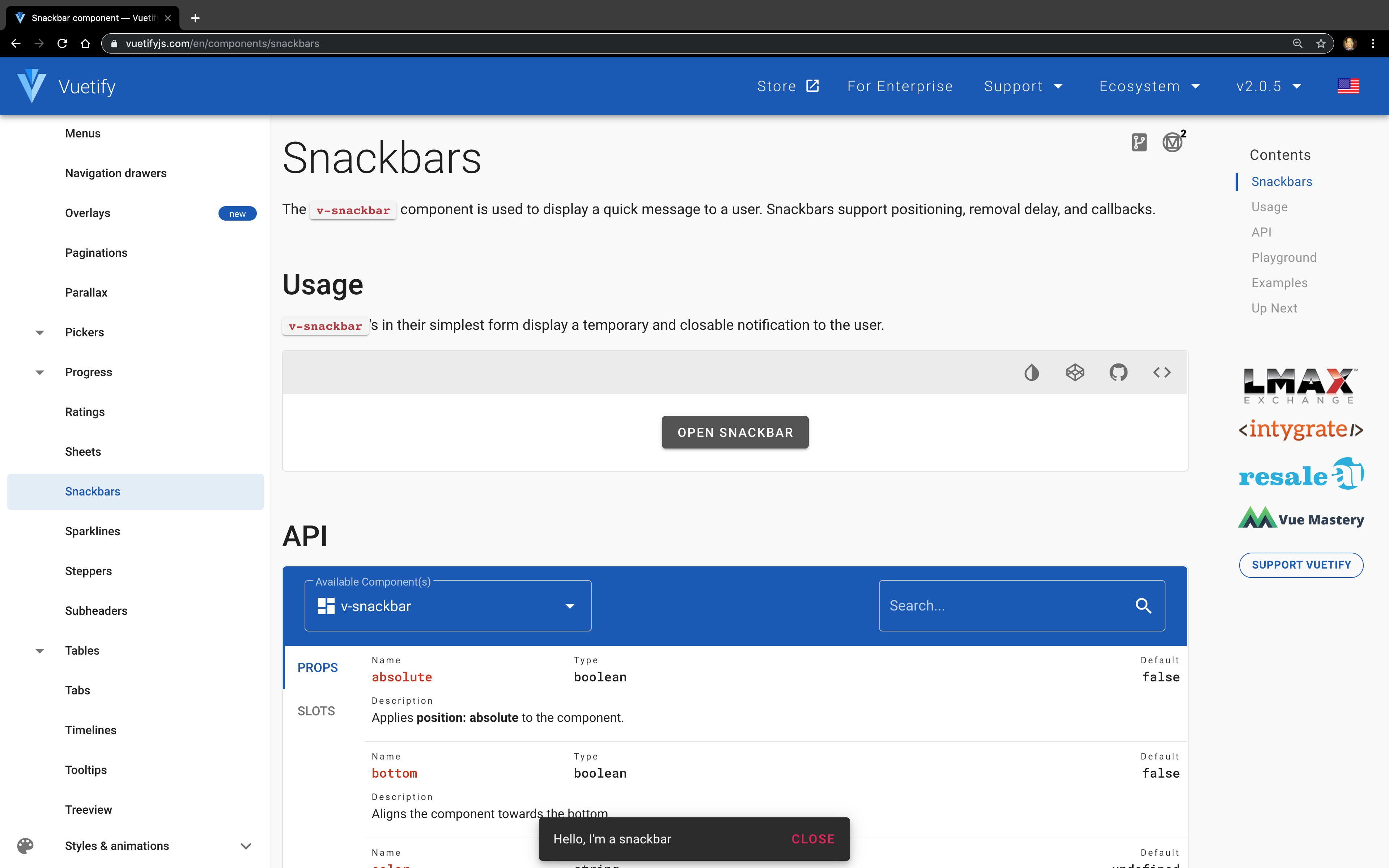
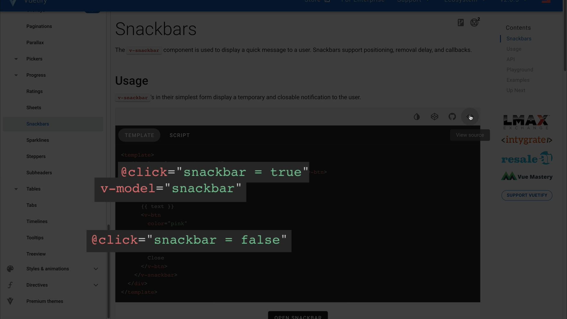
When we look at the Source Code tab for the Usage demo, we can see that the visibility of the snackbar is determined by this snackbar property, and then we need to simply define the text being displayed.
Let’s go ahead and copy this over to our app!
src/views/Dashboard.vue
<template>
  <div>
    <h1>Dashboard</h1>
    <v-data-table
      :headers="headers"
      :items="desserts"
      :items-per-page="5"
      class="elevation-1"
    ></v-data-table>
    <v-snackbar
      v-model="snackbar"
    >
      {{ text }}
      <v-btn
        color="pink"
        text
        @click="snackbar = false"
      >
        Close
      </v-btn>
    </v-snackbar>
  </div>
</template>

<script>
  export default {
    name: 'DashboardPage',
    data () {
      return {
        snackbar: false,
        headers: [
          {
            text: 'Dessert (100g serving)',
            align: 'left',
            sortable: false,
            value: 'name',
          },
          { text: 'Calories', value: 'calories' },
          { text: 'Fat (g)', value: 'fat' },
          { text: 'Carbs (g)', value: 'carbs' },
          { text: 'Protein (g)', value: 'protein' },
          { text: 'Iron (%)', value: 'iron' },
        ],
        desserts: [
          {
            name: 'Frozen Yogurt',
            calories: 159,
            fat: 6.0,
            carbs: 24,
            protein: 4.0,
            iron: '1%',
          },
          {
            name: 'Ice cream sandwich',
            calories: 237,
            fat: 9.0,
            carbs: 37,
            protein: 4.3,
            iron: '1%',
          },
          // The rest of the data was removed
          // to shorten the length of the code sample
          // in this article
        ],
      }
    },
  }
</script>
In order to trigger the snackbar appearing though, we will need an event that fires when the user clicks on the table. Let’s dive back into the Data Tables docs to see if we can find what we need.
In the API section, we have been primarily focused on the API section, but as you can see here, there are other sections that are available to us as well (i.e., Slots and Events). For our current purposes, the Events sounds like what we need!
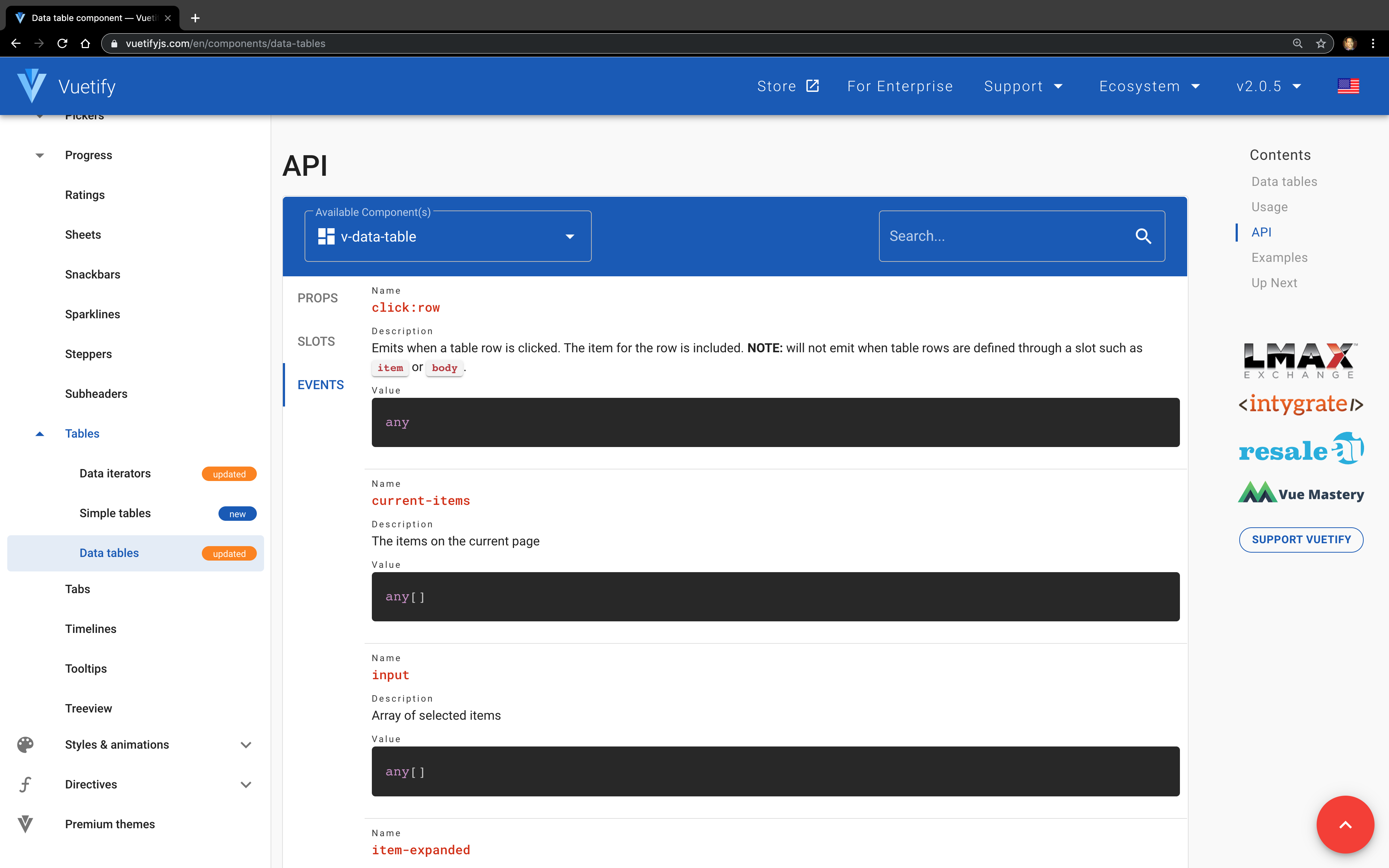
And immediately we’re greeted by the event that we need, which is click:row . Let’s go ahead and add it to our code!
src/views/Dashboard.vue
<template>
  <div>
    <h1>Dashboard</h1>
    <v-data-table
      :headers="headers"
      :items="desserts"
      :items-per-page="5"
      class="elevation-1"
      @click:row="selectRow"
    ></v-data-table>
    <v-snackbar
      v-model="snackbar"
    >
      {{ text }}
      <v-btn
        color="pink"
        text
        @click="snackbar = false"
      >
        Close
      </v-btn>
    </v-snackbar>
  </div>
</template>

<script>
  export default {
    name: 'DashboardPage',
    data () {
      return {
        snackbar: false,
        headers: [
          // Data hidden for brevity
        ],
        desserts: [
          // Data hidden for brevity
        ],
      }
    },
    methods: {
      selectRow() {
        this.snackbar = true
      }
    }
  }
</script>
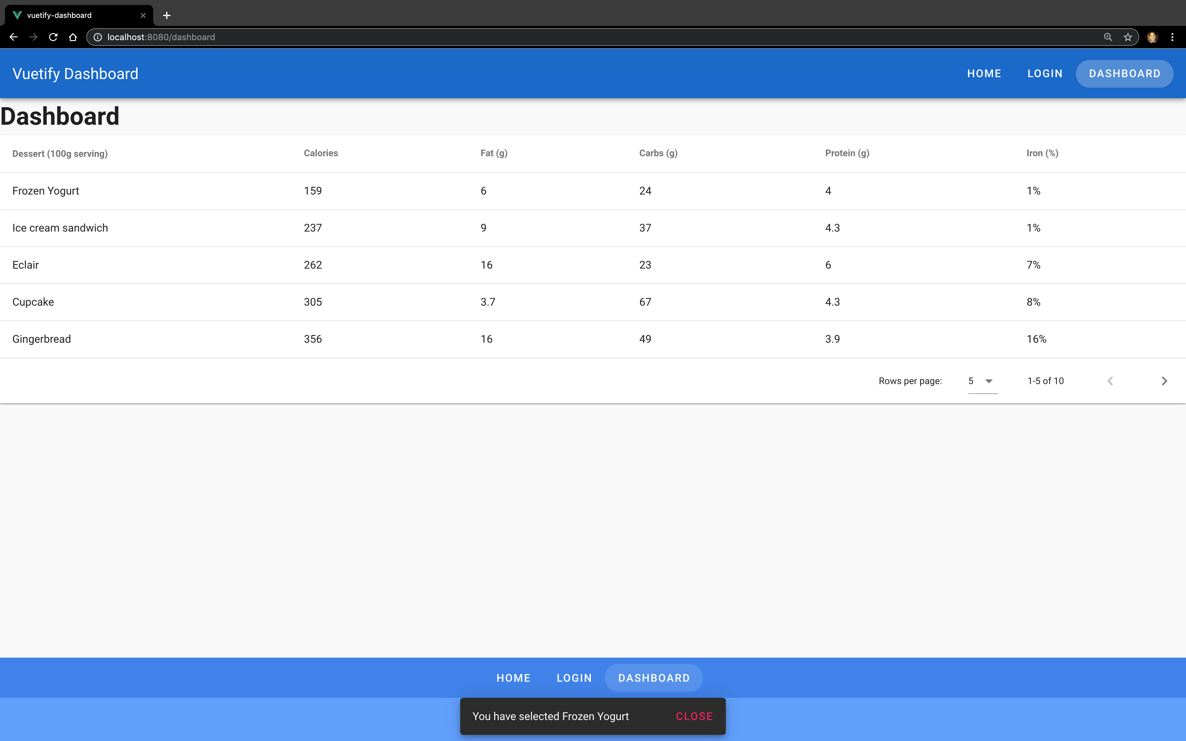
Great! Now we can open a modal, we need to be to inform users what they selected. As with any event in JavaScript, we are passed the event details. And since Vuetify automatically includes the item for the row with the event, configuring the snackbar is as simple as:
src/views/Dashboard.vue
<template>
  <div>
    <h1>Dashboard</h1>
    <v-data-table
      :headers="headers"
      :items="desserts"
      :items-per-page="5"
      class="elevation-1"
      @click:row="selectRow"
    ></v-data-table>
    <v-snackbar
      v-model="snackbar"
    >
      You have selected {{ currentItem }}
      <v-btn
        color="pink"
        text
        @click="snackbar = false"
      >
        Close
      </v-btn>
    </v-snackbar>
  </div>
</template>

<script>
  export default {
    name: 'DashboardPage',
    data () {
      return {
        currentItem: '',
        snackbar: false,
        headers: [
          // Data hidden for brevity
        ],
        desserts: [
          // Data hidden for brevity
        ]
      }
    },
    methods: {
      selectRow(event) {
        this.snackbar = true
        this.currentItem = event.name
      }
    }
  }
</script>
And with that, we’ve fulfilled all of our requirements. Hooray!
Let’s ReVue
In this lesson, we have:
- Configured routing in our app
- Dove deeper into more advanced aspects of documentation
- How to use more complex components
For our next lesson, we are going to talk about a critical aspect to making any application more visual depth and allow for a better user experience: layout!
Coding Challenge
For this lesson’s coding challenge:
- Download the repo for this course
- Use
src/data/employees.jsonas the data source for the data table component - Add multi-column sorting on the data table
- Update Snackbar to display Employee Name and Title
Good luck!
Layouts: Grid System
In the last lesson, we learned about how components work and how we can leverage them in order to maximize our productivity. It’s time we learned about another critical aspect of any application’s design and user experience: layout.
In this lesson, we will be learning about:
- How to use grid system components
- How the grid system works
- How to integrate the grid system into our dashboard app
Fast Forward to More Content
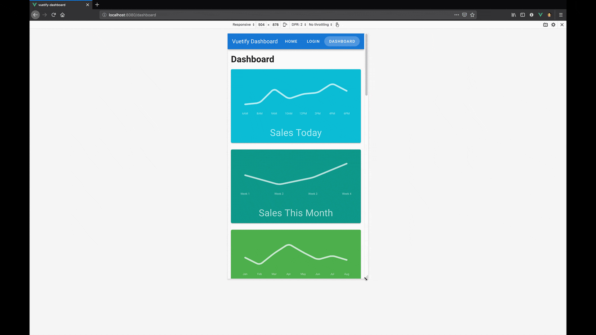
After Lesson 3, our dashboard didn’t require much layout since it only contained a single component. In order to simulate a more realistic dashboard, we’re going to provide some filler content to our dashboard page.
If you are coding along, please make sure to clone the repo on the Lesson-4-BEGIN branch to have the correct code.
When we start up our application, we should see the following:
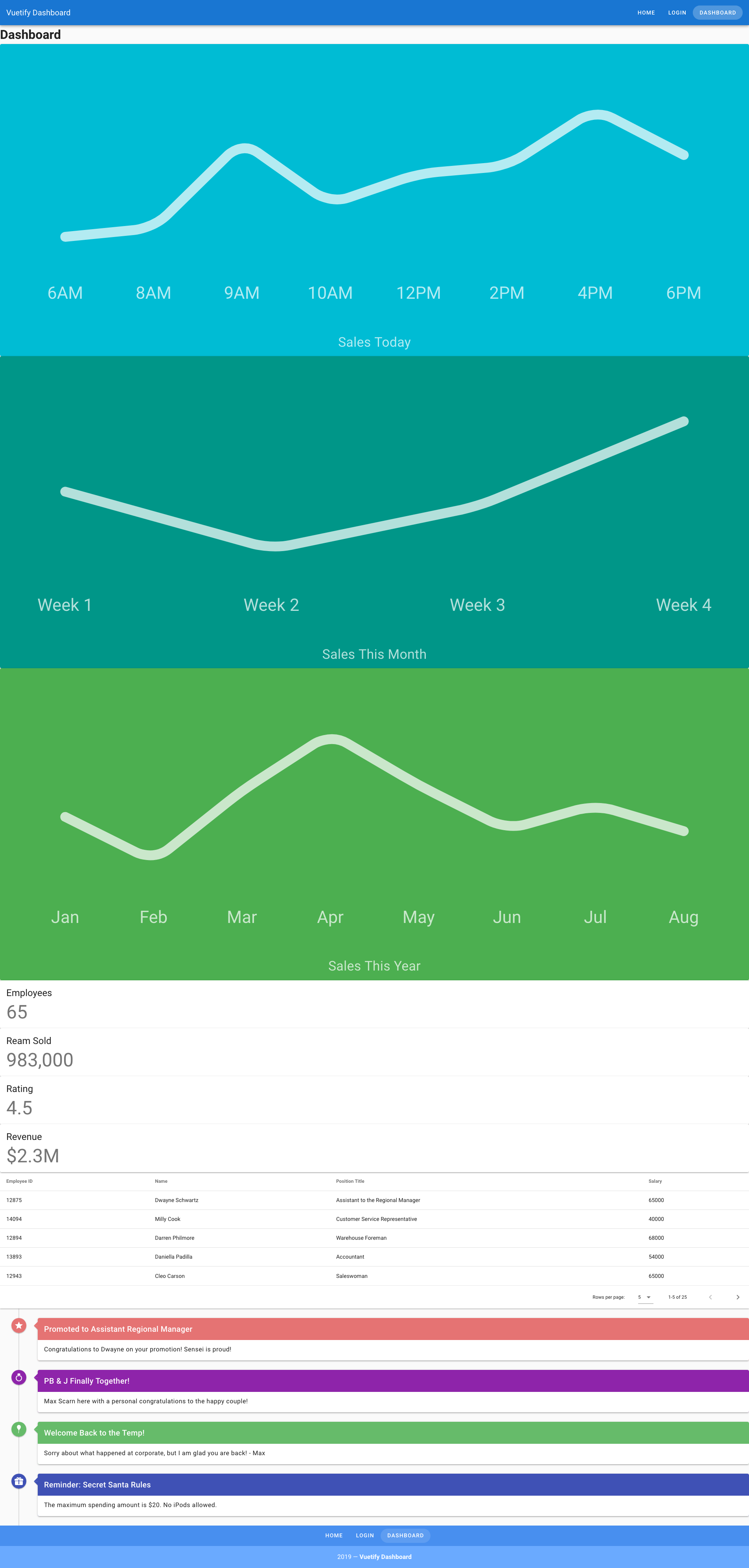
What has changed?
In the Component Pt. 2, we only had a single data table component. In this updated Dashboard, I’ve gone ahead and updated our code with new and refactored components to simplify our Dashboard page. If you’re curious, feel free to take a look at how they work, but it is not necessary for this lesson.
- The existing data table component has been refactored to
EmployeesTable.vue - A new
EventTimeline.vuecomponent which makes use of Timelines which is a component used for stylistically displaying chronological information - A new
SalesGraph.vuecomponent which makes use of Sparklines , which is a component for generating simple graphs - A new
StatisticCard.vuewhich uses the Card component we already know how to use - Data sources for components
-
src/data/employees.json- A list of employees that populates the EmployeesTable component -
src/data/sales.json- A list of sales data that will populate the graphs in the SalesGraph component -
src/data/statistics.json- A list of statistics used to populate the StatisticCard component -
src/data/timeline.json- A list of events used to populate the EventTimeline component
-
While there are two new components being used, the knowledge you acquired from Components - Pt. 1 and Component Pt. 2 have made you more than capable to explore how they work on your own.
As you can see, while there is a lot of useful information here for users, we have some work to do before it’s a good user experience. So let’s start with Vuetify’s Grid system!
Vuetify’s Grid System
The primary foundation for layout with Vuetify is its grid system. Inspired by Bootstrap’s grid system, Vuetify’s grid system is built with flexbox and consists of four primary components:
-
Container (
v-container) - This is the base wrapper for creating any grid layout on your page. By default, it will provide default max-width behavior to ensure your content is accessible at larger device sizes -
Row (
v-row) - This is the wrapper component around columns and should be a direct child ofv-container -
Column (
v-col) - The wrapper around content, which must be a direct child ofv-row -
Spacer (
v-spacer) - A useful component for filling available space or making space between two components
These comprise of the fundamental building blocks for laying out and aligning content on the page. So to get started, let’s start by switching out the wrapper div on Dashboard for v-container .
src/views/Dashboard.vue
<template>
  <v-container>
    <h1>Dashboard</h1>
    <!-- Excluding the rest for brevity -->
  </v-container>
</template>

<script>
export default {
  // Excluded for brevity
}
</script>
If you are on a larger screen size, you should see that our content is now centered on the page!
Layout with columns of equal sizes
Next, we need to layout our SalesGraph and StatisticCard components. The requirements are as follows for desktop devices and larger:
- SalesGraphs are displayed in a single row
- SalesGraphs should be 33.33% width
- StatisticCard are displayed in a single row
- StatisticCard should be 25% width
So, we start by wrapping our content in v-row and give each individual SalesGraph component its own column. We then move the v-for directive onto the v-col to ensure that we are generating new columns for each new SalesGraph.
src/views/Dashboard.vue
<template>
  <v-container>
    <h1>Dashboard</h1>
    <v-row>
      <v-col v-for="(graph, index) in sales" :key="`${graph.title}-${index}`">
        <SalesGraph
          :title="graph.title"
          :sales="graph.sales"
          :color="graph.color"
          :labels="graph.labels"
        ></SalesGraph>
      </v-col>
    </v-row>
    <!-- Excluding the rest for brevity -->
  </v-container>
</template>

<script>
export default {
  // Excluded for brevity
}
</script>
Since Vuetify is using Flexbox, we don’t need any additonal configuration required since the space is automatically distributed between each column. That was easy!
Let’s go ahead and layout our StatisticCards!
src/views/Dashboard.vue
<template>
  <v-container>
    <h1>Dashboard</h1>

    <v-row>
      <v-col v-for="sale in sales" :key="`${sale.title}`">
        <SalesGraph :sale="sale" />
      </v-col>
    </v-row>

    <v-row>
      <v-col v-for="statistic in statistics" :key="`${statistic.title}`">
        <StatisticCard :statistic="statistic" />
      </v-col>
    </v-row>

    <!-- Excluding the rest for brevity -->
  </v-container>
</template>

<script>
export default {
  // Excluded for brevity
}
</script>
With that, you now know how to layout content in evenly sized columns!
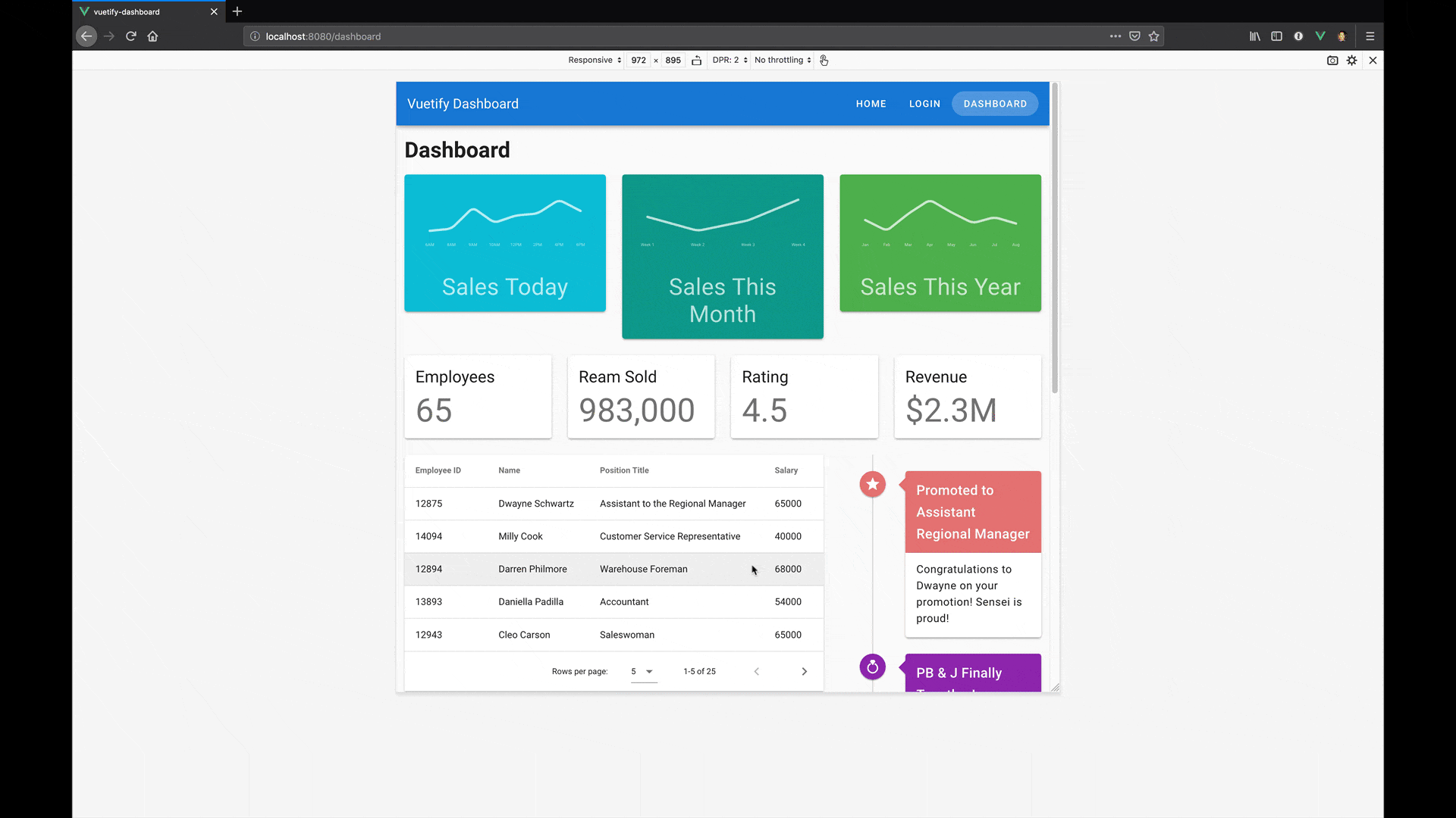
Layout with columns of different sizes
Next, our designer would like us to layout our data table component and timeline component with the following requirement on desktop devices and larger
- EmployeesTable and EventTimeline will exist in the same row
- EmployeesTable should be two-third (i.e., 66.67%) of the row width
- EventTimeline should be a third (i.e., 33.33%) of the row width
Rather than write custom CSS, Vuetify makes it easy for us to define column widths. Vuetify is built on a 12 column grid system. As a result, defining a v-col width is as simple as passing in a cols prop with the number of columns desired. Here are some sample calculations:
- 25% width - 3 columns / 12 max columns
- 50% width - 6 columns / 12 max columns
- 66.67% width - 8 columns / 12 max columns
- 100% width - 12 columns / 12 max columns
With that knowledge, let’s layout our EmployeesTable and EventTimeline !
src/views/Dashboard.vue
<template>
  <v-container>
    <h1>Dashboard</h1>

    <v-row>
      <v-col v-for="sale in sales" :key="`${sale.title}`">
        <SalesGraph :sale="sale" />
      </v-col>
    </v-row>

    <v-row>
      <v-col v-for="statistic in statistics" :key="`${statistic.title}`">
        <StatisticCard :statistic="statistic" />
      </v-col>
    </v-row>

    <v-row>
      <v-col cols="8">
        <EmployeesTable :employees="employees" @select-employee="setEmployee" />
      </v-col>
      <v-col cols="4">
        <EventTimeline :timeline="timeline" />
      </v-col>
    </v-row>

    <v-snackbar v-model="snackbar">
      You have selected {{ selectedEmployee.name }},
      {{ selectedEmployee.title }}
      <v-btn color="pink" text @click="snackbar = false">
        Close
      </v-btn>
    </v-snackbar>
  </v-container>
</template>

<script>
export default {
  // Excluded for brevity
}
</script>
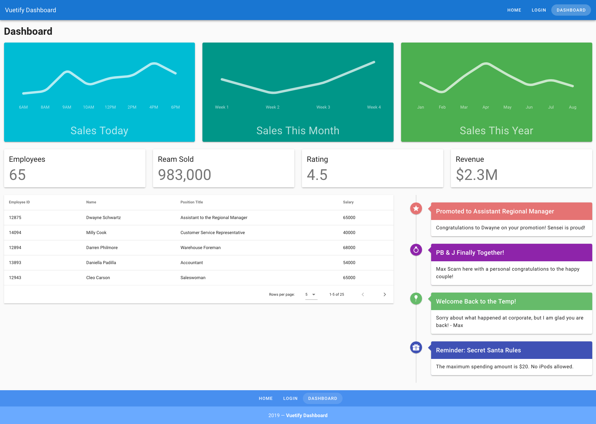
And with that, our Dashboard app is looking much better!
Conclusion
In this lesson, we have learned about:
- Grid system components
- How the grid system works
- How to integrate the grid system into our Dashboard app
Now, you may be wondering, “What about the rest of the devices? Didn’t we only layout the desktop?” And you would be absolutely right. That’s why in the next lesson, we will take a look at how to handle responsive design with Vuetify. See you there!
Layouts: Responsive Design
Introduction
In the last lesson, we learned how to layout our Dashboard page on desktop devices; but we still need to learn how to handle other device sizes.
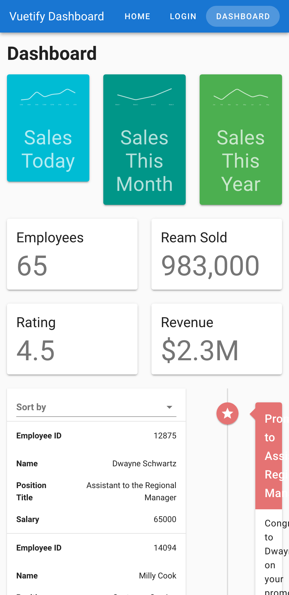
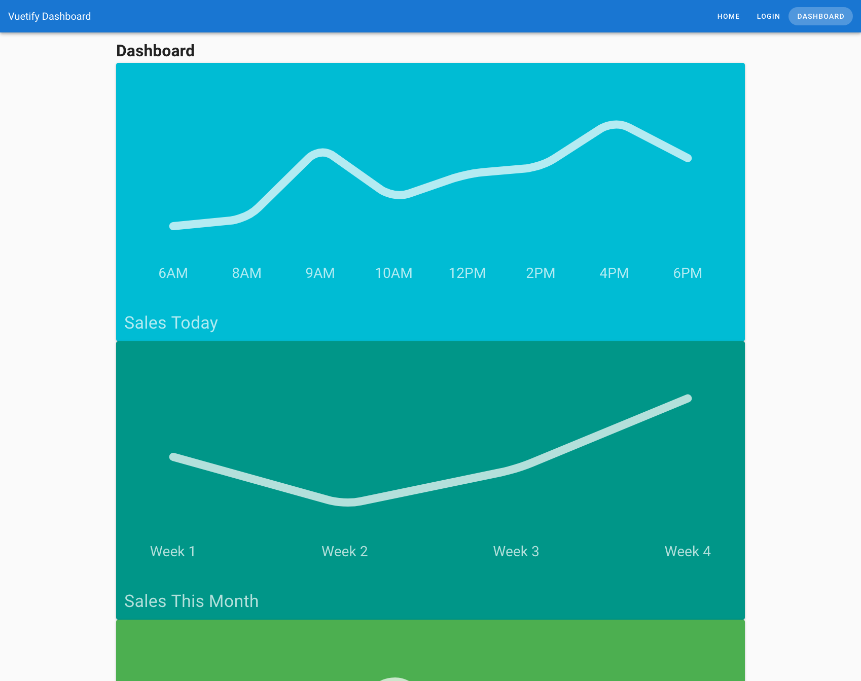
As you can see in the screen capture above, our Dashboard page isn’t so great when viewing on smaller devices. So it’s time that we learned how to support other device sizes by creating responsive designs with Vuetify.
In this lesson, we will be learning about:
- What Vuetify’s breakpoints are
- How to create responsive layouts with grid components
- How to programmatically use Vuetify breakpoints to toggle styles and/or functionality based on a user’s device size.
What are Vuetify breakpoints?
Like any responsive design system, Vuetify has breakpoints that allow you to control the layout of your application depending on the size of the window and/or device. Out of the box, there are five predefined breakpoints in Vuetify which allow you to easily designate behavior and styles in Vuetify.
- Extra small (
xs) - For small devices like mobile devices - Small (
sm) - For small to medium tablets - Medium (
md) - For large tablet to desktop - Large (
lg) - For desktop - Extra Large (
xl) - For 4k and ultra-wide devices
Be sure to pay special attention to the two letter codes for each breakpoint, as they are used throughout Vuetify to refer to the various breakpoints.
And for those wondering, you can even define your own breakpoints if needed. To learn more, check out the Breakpoint Usage docs for more information.
So for our Dashboard page, we’ll need to fulfill the following requirements:
- On mobile devices, SaleGraphs will be 100% wide
- On tablet devices and larger, SalesGraph will be 33.33% wide
- On desktop devices and larger, the Snackbar will be positioned to the left
Building mobile first with Vuetify
When it comes to applying our breakpoints with our app, the best way to approach this with Vuetify is mobile first . In other words, we start with the smallest device as a base layout and layer on as we go. Let’s take the SalesGraph component as an example.
When we defined the layout for SalesGraph components with the cols property, the key thing to understand here is that it defines the default layout at the smallest device. In other words, it will be overridden by any breakpoint defined.
Let’s start by setting our SalesGraphs to be 100% wide by default.
src/views/Dashboard.vue
<template>
  <v-container>
    <h1>Dashboard</h1>

    <v-row>
      <v-col v-for="sale in sales" :key="`${sale.title}`" cols="12">
        <SalesGraph :sale="sale" />
      </v-col>
    </v-row>

    <v-row>
      <v-col
        v-for="statistic in statistics"
        :key="`${statistic.title}`"
      >
        <StatisticCard :statistic="statistic" />
      </v-col>
    </v-row>

    <v-row>
      <v-col cols="8">
        <EmployeesTable :employees="employees" @select-employee="setEmployee" />
      </v-col>
      <v-col cols="4">
        <EventTimeline :timeline="timeline" />
      </v-col>
    </v-row>

    <v-snackbar v-model="snackbar">
      You have selected {{ selectedEmployee.name }},
      {{ selectedEmployee.title }}
      <v-btn color="pink" text @click="snackbar = false">
        Close
      </v-btn>
    </v-snackbar>
  </v-container>
</template>

<script>
export default {
  // Excluded for brevity
}
</script>
While our SalesGraphs now look great on mobile, it looks like our three column layout for desktop is gone! No need to fret though, this is where breakpoints come in. All we need to do is set the columns when the devices are tablet size or larger. And we will do this with the md breakpoint.
src/views/Dashboard.vue
<template>
  <v-container>
    <h1>Dashboard</h1>

    <v-row>
      <v-col v-for="sale in sales" :key="`${sale.title}`" cols="12" md="4">
        <SalesGraph :sale="sale" />
      </v-col>
    </v-row>

    <v-row>
      <v-col
        v-for="statistic in statistics"
        :key="`${statistic.title}`"
      >
        <StatisticCard :statistic="statistic" />
      </v-col>
    </v-row>

    <v-row>
      <v-col cols="8">
        <EmployeesTable :employees="employees" @select-employee="setEmployee" />
      </v-col>
      <v-col cols="4">
        <EventTimeline :timeline="timeline" />
      </v-col>
    </v-row>

    <v-snackbar v-model="snackbar">
      You have selected {{ selectedEmployee.name }},
      {{ selectedEmployee.title }}
      <v-btn color="pink" text @click="snackbar = false">
        Close
      </v-btn>
    </v-snackbar>
  </v-container>
</template>

<script>
export default {
  // Excluded for brevity
}
</script>
And with that, our SalesGraph looks great!
Using breakpoints programatically
Before we can wrap up this lessons, we still have one more requirement to fulfill though:
- On desktop devices and larger, the Snackbar will be positioned to the left
In the Snackbar API docs, we find that there is a left prop that allows us to position our Snackbar component to the left as desired and takes a value of true or false. If we were to write the code required to detect a user’s device size, it might look something as follows:
<!— Theoretical Vue SFC Component —>
<script>
  export default {
    data: () => ({
      // Create a reactive data property to track
      // whether the user is on a mobile device
      isMobile: false,
    }),

    beforeDestroy () {
      if (typeof window !== 'undefined') {
        // Remove the resize event when the component is destroyed
        window.removeEventListener('resize', this.onResize, { passive: true })
      }
    },

    mounted () {
      // Check whether the user's device is mobile or not
      this.onResize()
      // Create resize event to check for mobile device
      window.addEventListener('resize', this.onResize, { passive: true })
    },

    methods: {
      onResize () {
        // Set reactive data property to true
        // if device is less than 600 pixels
        this.isMobile = window.innerWidth < 600
      },
    },
  }
</script>
That’s quite a lot of boilerplate code just to check if a user is on a device of a certain screen size.  Wouldn’t it be great if we could have an easy to call function that did all this work for us? Well we are in luck, because Vuetify has done just that with
 $vuetify.breakpoinnt .
One of the properties available to you when calling $vuetify is breakpoint , which gives you access to all of the breakpoints currently available on that instance of Vuetify. Here are some examples:
-
md- Returns a Boolean for whether the device is between 960px and 1264px* -
mdAndUp- Returns a Boolean for whether the device is greater than or equal to 960px -
mdAndDown- Retursn a Boolean for whether the device is less than or equal to 960px
Since we need to only set the left prop for desktop devices or larger, we need to track lgAndUp . So our code should look something like this:
src/views/Dashboard.vue
<template>
  <v-container>
    <h1>Dashboard</h1>

    <v-row>
      <v-col v-for="sale in sales" :key="`${sale.title}`" cols="12" md="4">
        <SalesGraph :sale="sale" />
      </v-col>
    </v-row>

    <v-row>
      <v-col
        v-for="statistic in statistics"
        :key="`${statistic.title}`"
      >
        <StatisticCard :statistic="statistic" />
      </v-col>
    </v-row>

    <v-row>
      <v-col cols="8">
        <EmployeesTable :employees="employees" @select-employee="setEmployee" />
      </v-col>
      <v-col cols="4">
        <EventTimeline :timeline="timeline" />
      </v-col>
    </v-row>

    <v-snackbar v-model="snackbar" :left="$vuetify.breakpoint.lgAndUp">
      You have selected {{ selectedEmployee.name }},
      {{ selectedEmployee.title }}
      <v-btn color="pink" text @click="snackbar = false">
        Close
      </v-btn>
    </v-snackbar>
  </v-container>
</template>

<script>
export default {
  // Excluded for brevity
}
</script>
And with that, we have fulfilled the first part of the responnsive design requirements. Great work!
Conclusion
In this lesson, we have learned about:
- What Vuetify breakpoints are
- How to create responsive layouts with grid components
- How to programmatically use Vuetify breakpoints
For this lesson’s coding challenge, here are the remaining responsive design requirements:
- On mobile devices:
- All components should have a width of 100%
- On tablet devices and larger:
- Each StatisticCard should have a width of 50%
- EmployeesTable should have a width of 66.67%
- EventTimeline should have a width of 33.33%
- On desktop devices and larger:
- Each StatisticCard should have a width of 25% on large devices and up
Congratulations on finishing this part of the course! You have acquired the skills and knowledge needed to create beautiful layouts on devices on all sizes. Good luck on the code challenge and see you in the next lesson!
Forms: Fundamentals
Introduction
Forms are one of the most integral parts to any web applications since they allow the user to provide input back to an application.
In this lesson, we will be building a Signup page for our app while learning about:
- How to create forms in Vuetify
- Common input types you should know about
- What pickers are and how we can use them to enhance the user experience of our forms
Let’s jump right in!
Creating a form with Vuetify
When you need to create a form with Vuetify, just like you would in standard HTML, you start by creating a root v-form element.
<!-- Standard HTML -->
<form>
  ...
</form>

<!-- Vuetify -->
<v-form>
  ...
</v-form>
Of course, the real question that you may be wondering is: What about the form inputs?
Well, in standard HTML, a normal text input would look like this:
<!-- Standard HTML input -->
<label for="name">Name</label>
<input type="text" id="name" />
Even with a simple text field input, this is comprised of quite a few parts parts:
- Separate elements
- Label name
- Input type
- Input
idattribute to pair with labelforattribute
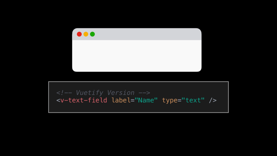
With Vuetify though, a text input can be condensed into a single line of code.
<!-- Vuetify text input -->
<v-text-field label="Name" type="text" />
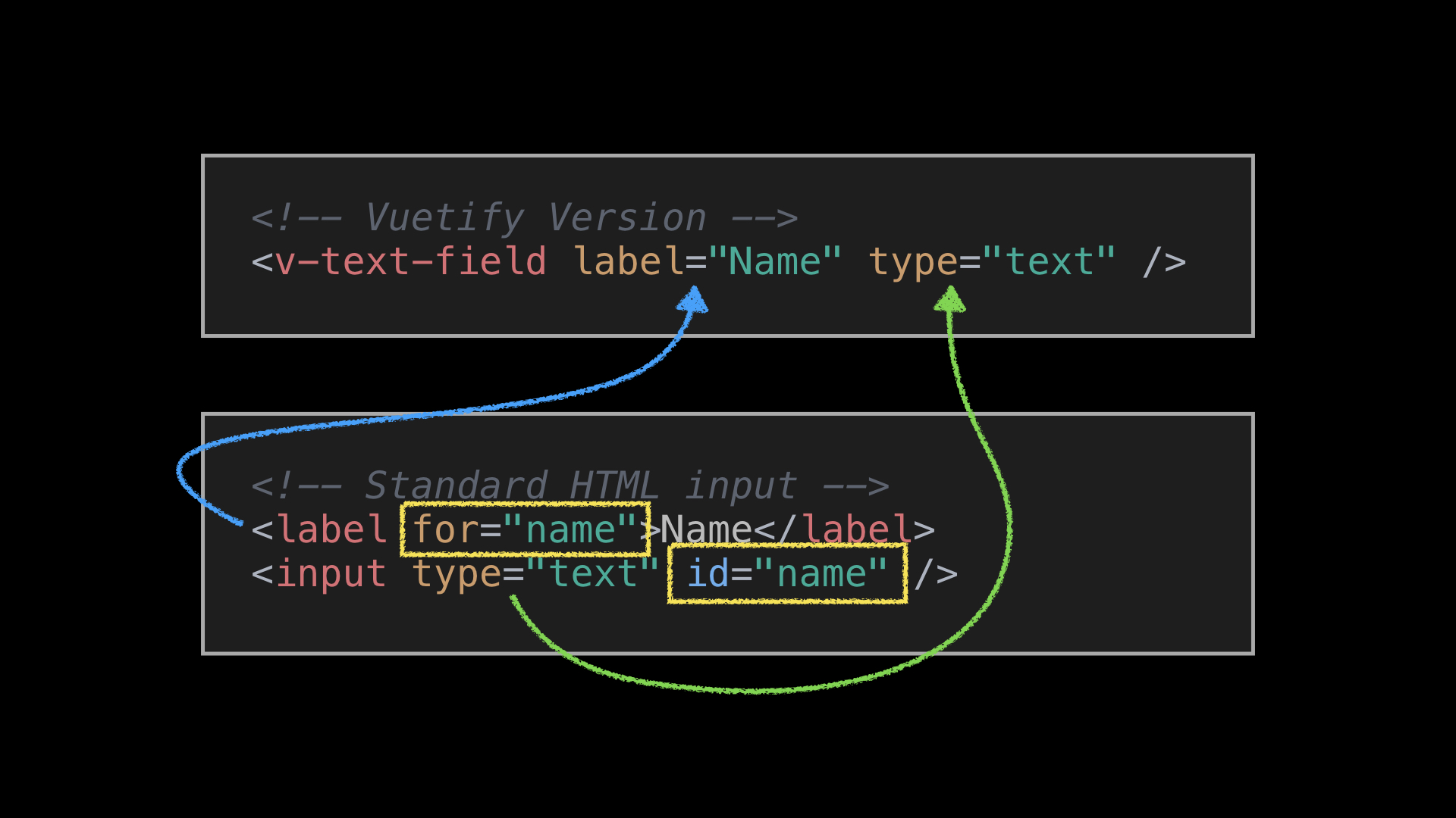
This allows you to focus on what is important (i.e., defining proper labels and types). And we no longer have to ensure that the label and input elements are paired via the correct attributes since Vuetify takes care of that for us.
And thus, with a single line of code, we get a beautiful text input with the proper labels.
With that, it’s time to build our Signup page!
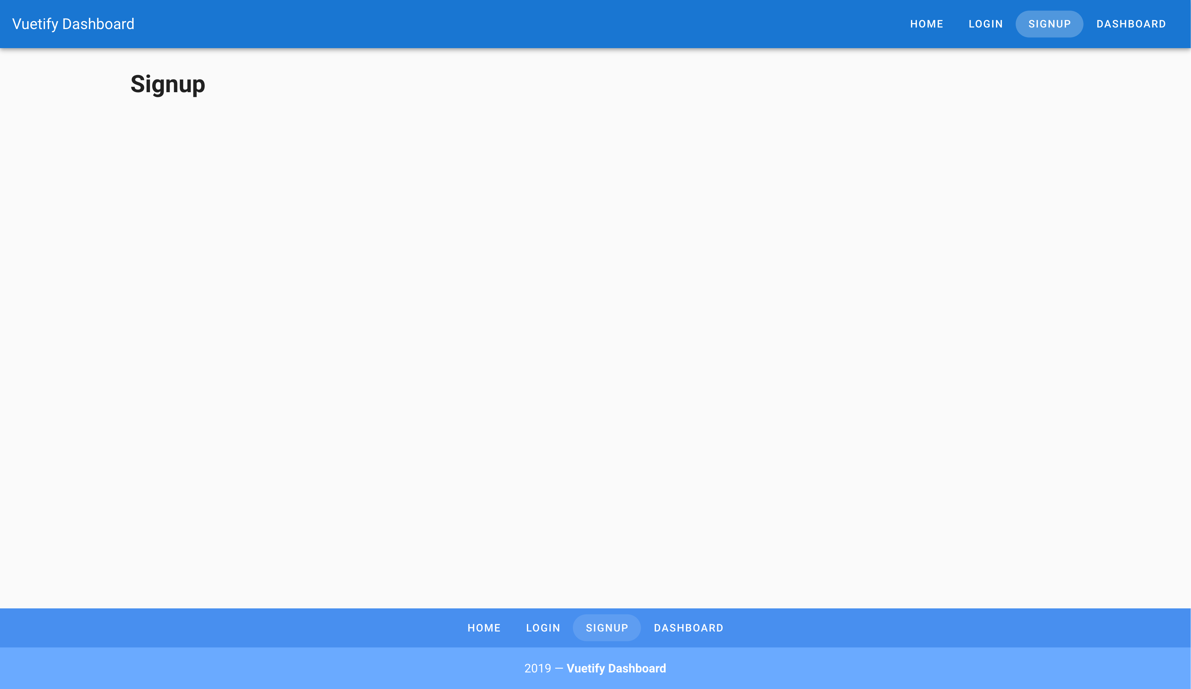
Building Our Signup Page
We will start by adding a Signup route to router.js .
src/router.js
Vue.use(Router)

export default new Router({
  ...
  routes: [
    ...
    {
      path: '/signup',
      name: 'signup',
      component: () => import('./views/Signup.vue')
    }
  ]
})
Next, we need to create our Signup.vue file with a little grid layout help that we learned about earlier this course!
src/views/Signup.vue
<template>
  <v-container>
    <v-row>
      <v-col>
        <h1>Signup Page</h1>
      </v-col>
    </v-row>
  </v-container>
</template>
After that, it’s time for us to create our Signup form!
Signup Form Requirements
For our Signup form, we have the following requirements:
A user should be able to:
- Enter their email address
- Select which browser they use
- Attach their profile photo
- Input their birthday
- Agree to terms and conditions
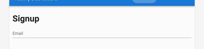
A user should be able to enter their email address
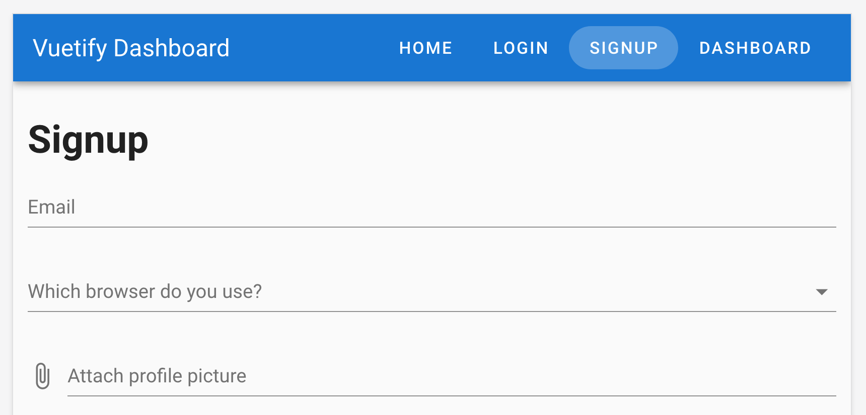
To get started, all we need to do is add our root element v-form with a v-text-field component with a type of email and a label of Email .
src/views/Signup.vue
<template>
  <v-container>
    <v-row>
      <v-col>
        <h1>Signup Page</h1>
        <v-form>
          <v-text-field label="Email" type="email" />
        </v-form>
      </v-col>
    </v-row>
  </v-container>
</template>
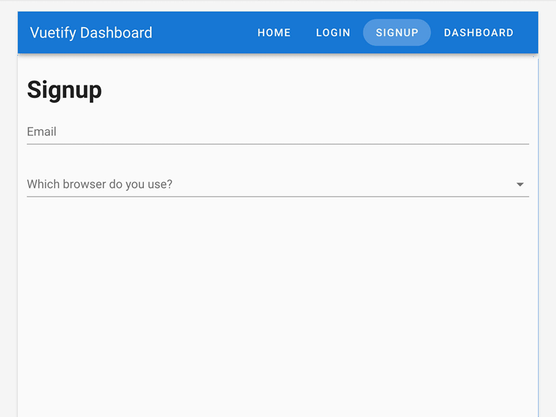
A user should be able to select which browser they use
When we look at the documentation for form inputs in Vuetify, one might be tempted to use the standard select menu. However, I would like to introduce you to a more complex component that many developers can attest is quite difficult to build from scratch: autocomplete.
The autocomplete component is fantastic enhancement on the standard select menu since it allows users to type their selection and use partial match to filter down results. This makes for a phenomenal user experience when there are many options to choose from. More importantly, if users prefer the standard scrolling and clicking experience of a select menu, it still works as desired.
And while the code for an autocomplete can be fairly complex, using Vuetify’s autocomplete component is pretty much as simple as the text-field input. All you need to do is provide it:
- Label
- Array of items that you want to populate it with
src/views/Signup.vue
<template>
  <v-container>
    <v-row>
      <v-col>
        <h1>Signup Page</h1>
        <v-form>
          <v-text-field label="Email" type="email" />
          <v-autocomplete label="Which browser do you use?" :items="browsers" />
        </v-form>
      </v-col>
    </v-row>
  </v-container>
</template>
<script>
export default {
  data: () => ({
    browsers: ['Chrome', 'Firefox', 'Safari', 'Edge', 'Brave']
  })
}
</script>
And that’s it! It works like magic! 
A user should be able to attach their profile photo
When it comes to attaching files, those familiar with HTML might be inclined to use <v-text-field type="file" /> . However, Vuetify makes your life even easier by including the file input component which provides a well designed input that makes it obvious to users they are about to attach a file.
src/views/Signup.vue
<template>
  <v-container>
    <v-row>
      <v-col>
        <h1>Signup Page</h1>
        <v-form>
          <v-text-field label="Email" type="email" />
          <v-autocomplete label="Which browser do you use?" :items="browsers" />
          <v-file-input label="Attach profile picture" />
        </v-form>
      </v-col>
    </v-row>
  </v-container>
</template>
<script>
export default {
  data: () => ({
    browsers: ['Chrome', 'Firefox', 'Safari', 'Edge', 'Brave']
  })
}
</script>
A user should be able to input their birthday
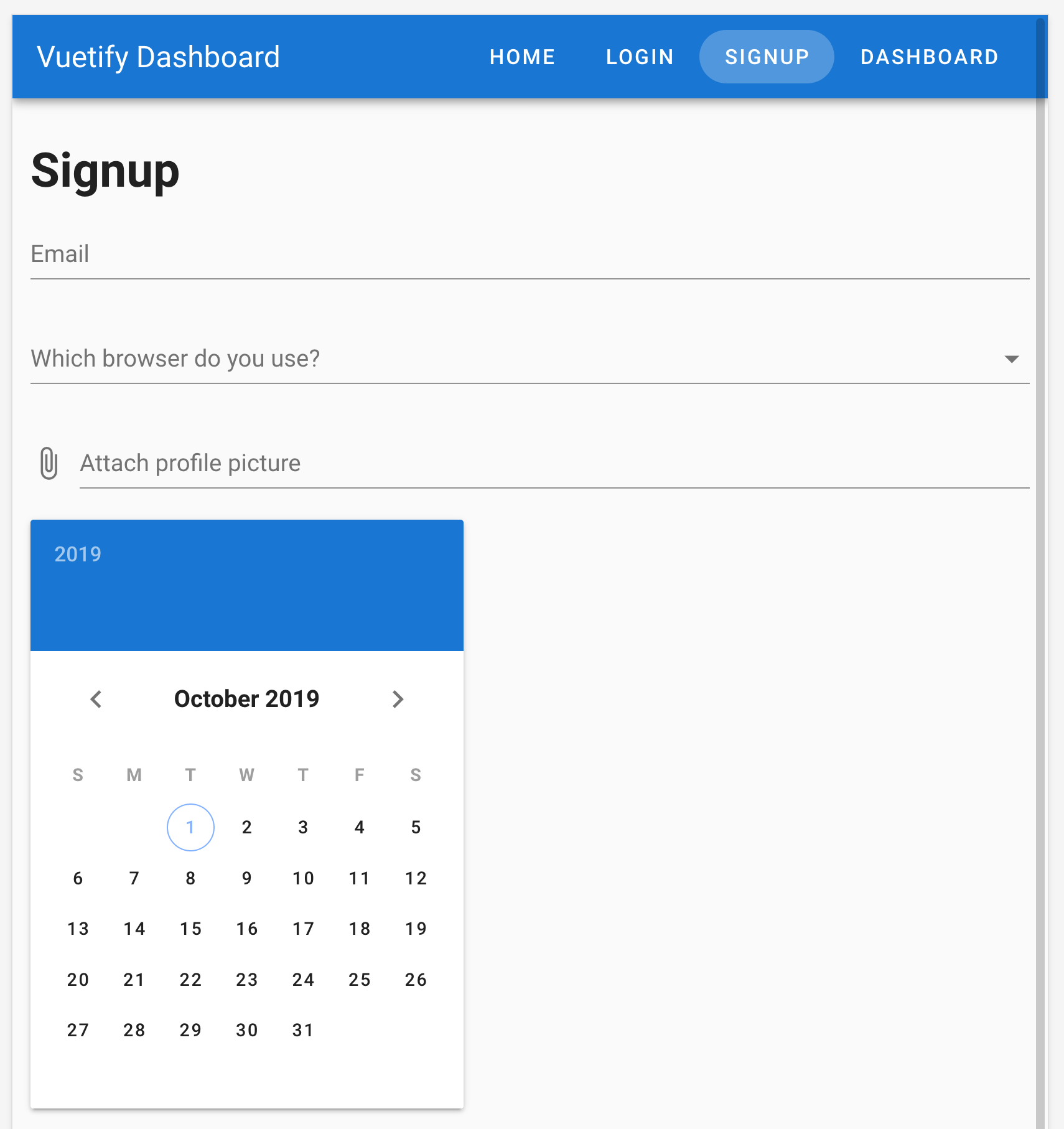
When it comes to date inputs, this is one of the hardest form inputs that most developers encounter in their careers. While the built-in browser date picker is already quite powerful, stakeholders often want something with a sleek design. As a result, it’s time to introduce you to Vuetify Pickers, which are a series of components that enhance the user experience of your forms by providing your users with rich user interfaces for things such as choosing color, choosing a time, or picking a date.
As you might suspect, using Vuetify’s datepicker is no harder than a single line of code!
src/views/Signup.vue
<template>
  <v-container>
    <v-row>
      <v-col>
        <h1>Signup Page</h1>
        <v-form>
          <v-text-field label="Email" type="email" />
          <v-autocomplete label="Which browser do you use?" :items="browsers" />
          <v-file-input label="Attach profile picture" />
          <v-date-picker />
        </v-form>
      </v-col>
    </v-row>
  </v-container>
</template>
<script>
export default {
  data: () => ({
    browsers: ['Chrome', 'Firefox', 'Safari', 'Edge', 'Brave']
  })
}
</script>
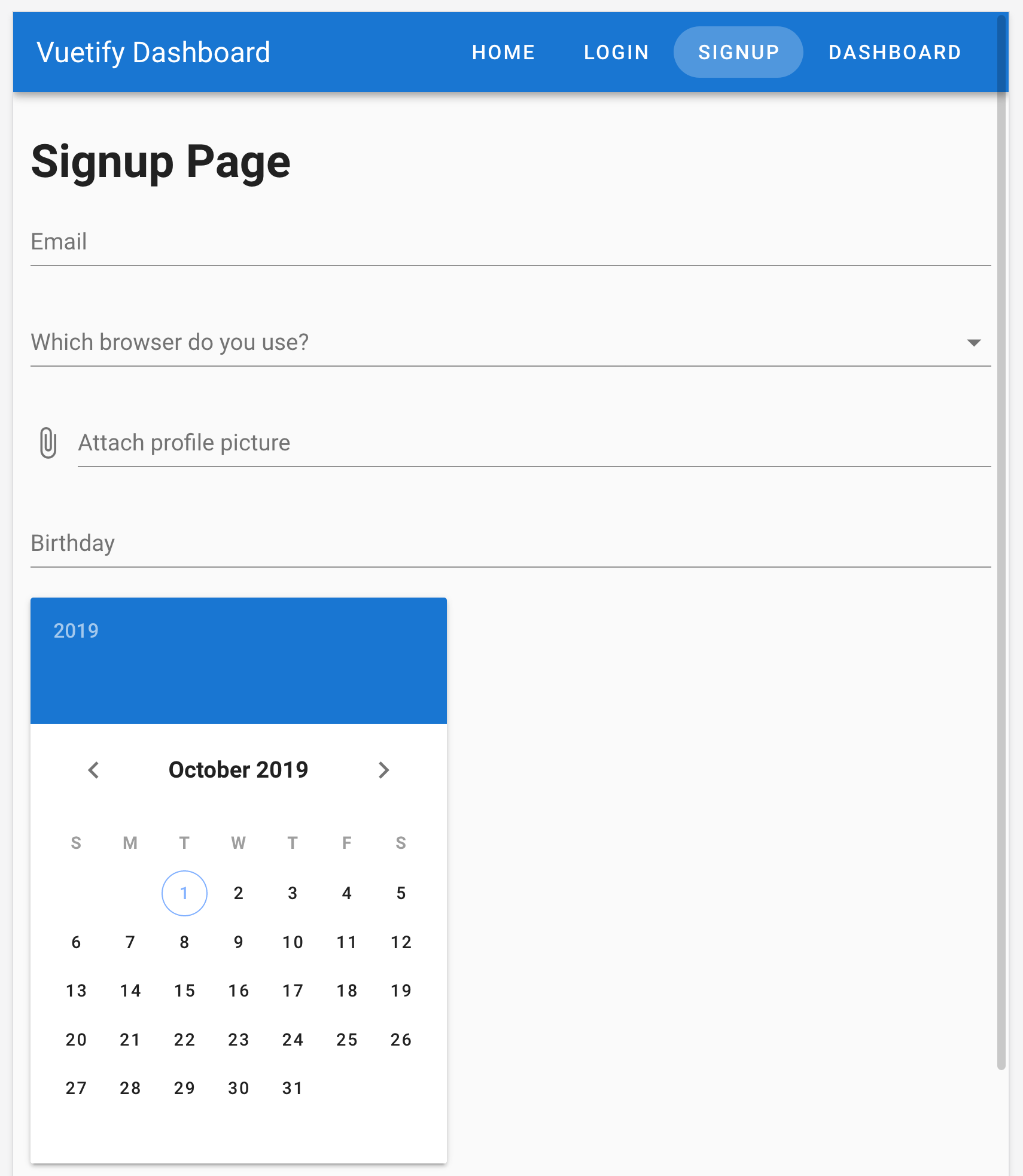
While the date picker looks great in our form, this doesn’t inform users that the date picker should be used for their birthday. So what we need to do is:
- Add a text-field component with a label of birthday
- Attach the same
v-modeldata property to the text-field and date-picker component - Add a
readonlyproperty to the text-field so users are encouraged to use the date-picker
src/views/Signup.vue
<template>
  <v-container>
    <v-row>
      <v-col>
        <h1>Signup Page</h1>
        <v-form>
          <v-text-field label="Email" type="email" />
          <v-autocomplete label="Which browser do you use?" :items="browsers" />
          <v-file-input label="Attach profile picture" />
          <v-text-field label="Birthday" v-model="birthday" readonly />
          <v-date-picker v-model="birthday" />
        </v-form>
      </v-col>
    </v-row>
  </v-container>
</template>
<script>
export default {
  data: () => ({
    birthday: '',
    browsers: ['Chrome', 'Firefox', 'Safari', 'Edge', 'Brave']
  })
}
</script>
Now, you may be wondering how we should toggle the visibility of the date picker based on whether the user is focused on the text input. You would be correct in this instinct since the date picker takes up a lot of room on the page.
In order to achieve this in a way that ensures the form inputs are accessible to all users, the required code goes beyond the scope of this course since it requires advanced knowledge of Vue. However, you can find an example of how this should be done in the Examples section of the date picker docs under “Date pickers - In dialog and menu.”
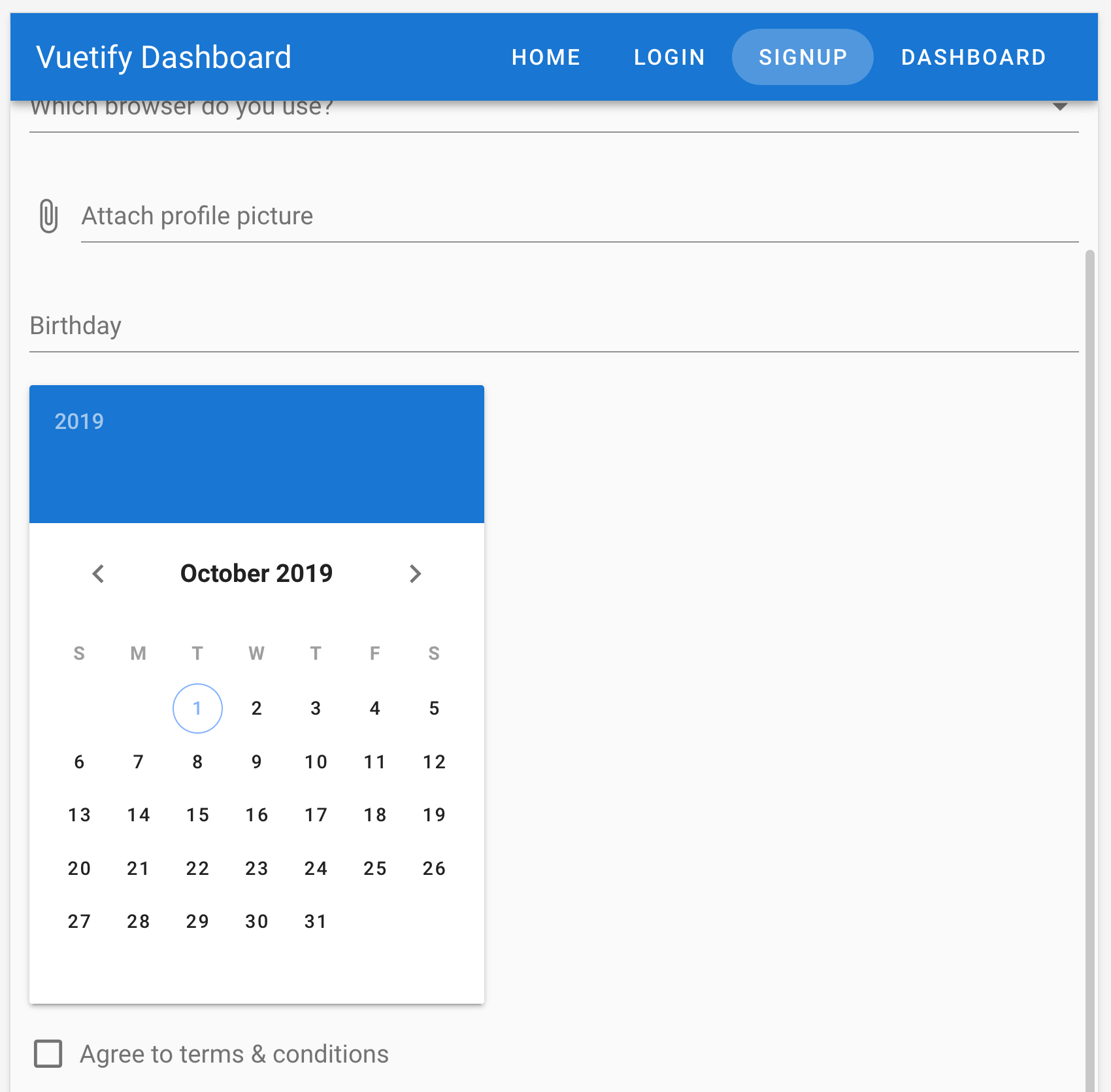
A user should be able to agree to terms and conditions
Finally, to wrap up our form, all we need is a checkbox for users to agree to the terms and conditions. And while you may think this is accomplished using the type="checkbox" HTML prop, Vuetify makes it even easier for you with the checkbox component!
src/views/Signup.vue
<template>
  <v-container>
    <v-row>
      <v-col>
        <h1>Signup Page</h1>
        <v-form>
          <v-text-field label="Email" type="email" />
          <v-autocomplete label="Which browser do you use?" :items="browsers" />
          <v-file-input label="Attach profile picture" />
          <v-text-field label="Birthday" v-model="birthday" readonly />
          <v-date-picker v-model="birthday" />
          <v-checkbox label="Agree to terms & conditions" />
        </v-form>
      </v-col>
    </v-row>
  </v-container>
</template>
<script>
export default {
  data: () => ({
    birthday: '',
    browsers: ['Chrome', 'Firefox', 'Safari', 'Edge', 'Brave']
  })
}
</script>
And for those who love the switch design pattern:
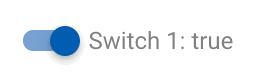
You could easily swap out the v-checkbox component for v-switch ! However, since the checkbox is more standard for this type of question, we will leave it as is.
Final touches
Now that we have completed our user requirements, we just need to add a submit button to our form. After all, how else will our users submit their request otherwise?
src/views/Signup.vue
<template>
  <v-container>
    <v-row>
      <v-col>
        <h1>Signup Page</h1>
        <v-form>
          <v-text-field label="Email" type="email" />
          <v-autocomplete label="Which browser do you use?" :items="browsers" />
          <v-file-input label="Attach profile picture" />
          <v-text-field label="Birthday" v-model="birthday" readonly />
          <v-date-picker v-model="birthday" />
          <v-checkbox label="Agree to terms & conditions" />
          <v-btn type="submit" color="primary">Submit</v-btn>
        </v-form>
      </v-col>
    </v-row>
  </v-container>
</template>
<script>
export default {
  data: () => ({
    birthday: '',
    browsers: ['Chrome', 'Firefox', 'Safari', 'Edge', 'Brave']
  })
}
</script>
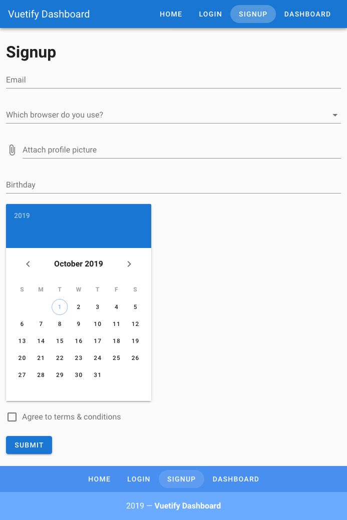
And with that, our Signup form is complete!
Let’s ReVue
In this lesson, we learned about:
- The basics for creating forms with Vuetify
- Common input types that you should know about
- What picker components are and how to use them to make your form experience awesome for your users
While we have only used a few of the form input types that Vuetify offers us, I hope you caught a glimpse of how easy forms can be when you use Vuetify.
In the next lesson, we will be covering another important aspect of forms: validations. See you there!