lesson7
lesson 8
lesson 9
Forms: Validation
Form Validation
One of the key features of a good form is the ability to validate your user’s input. After all, this helps to ensure that they are providing the required information in the correct format. And while all form inputs should use HTML attributes as a starting point for validation, there typically comes a point where you need custom rules along with custom validation methods. This is where Vuetify is here to help.
Rules
By wrapping our form in a v-form component, this enables us to use the rules prop on any Vuetify input component. The rules prop takes an array of functions that allow us to define when the value being passed in is valid or not.
All form input components in Vuetify have a rules prop that takes an array of functions that allow you to specify the conditions for whether the value is valid or not. Each function inside of the array is its own individual rule. As a result, if any of the functions inside the array return false or a String, which is typically the error message you want to display to the user, then the input is considered invalid.
In our Vuetify Dashboard’s Signup page, we have some form fields that are required in order for the user to create their account:
- Agree to terms and conditions
Creating validation for agree to terms and conditions
When creating a rule in the rules prop array, each rule is an anonymous function that provides the value of the input.
value => {
  // Check if the value has at least 1 character
  if (value.length > 0) {
    // Since this is true, we can return true
    return true
  } else {
    // If it is false, then display the returned String
    return 'Error message to display to user'
  }
}
However, it is typically written in a shorthand version:
value => value > 0 || 'Error message to display to user'
Since the “Agree to terms and conditions” is required, we need to attach a v-model to our checkbox and add a rules prop that checks whether it is true or not.
src/views/Signup.vue
<template>
  <v-container>
    <v-row>
      <v-col>
        <h1>Signup</h1>
        <v-form>
          <!-- Other form elements hidden for brevity -->
          ...
          <v-checkbox
            label="Agree to terms & conditions"
            v-model="agreeToTerms"
            :rules="agreeToTermsRules"
            required
          ></v-checkbox>
          <v-btn type="submit" color="primary">Submit</v-btn>
        </v-form>
      </v-col>
    </v-row>
  </v-container>
</template>
<script>
export default {
  data: () => ({
    agreeToTerms: false,
    agreeToTermsRules: [
      value =>
        !!value ||
        'You must agree to the terms and conditions to sign up for an account.'
    ],
    // Other data hidden for brevity
    ...
  })
}
</script>
And with that, we have error validation on the “Agree to terms and conditions” checkbox!
Creating validation for our email input
For our email input validation, it is a little bit more complicated. While there are many ways to validate for proper email inputs, we will use the following criteria:
- Email is required
- Email should have a username of at least 1 character
- Email should contain an @ symbol
- Email should contain a domain name with at least one character, a period, and at least two letter extension
When creating an array of rules for an input, each rule will be show to the user in order. As a result, it’s important to consider the proper order that users should see error messages.
src/views/Signup.vue
<template>
  <v-container>
    <v-row>
      <v-col>
        <h1>Signup</h1>
        <v-form>
          <v-text-field
            label="Email"
            type="email"
            v-model="email"
            :rules="emailRules"
          ></v-text-field>
          <!-- Other form elements hidden for brevity -->
          ...
        </v-form>
      </v-col>
    </v-row>
  </v-container>
</template>
<script>
export default {
  data: () => ({
    // Other data hidden for brevity...
    email: '',
    emailRules: [
      value => value.indexOf('@') !== 0 || 'Email should have a username.',
      value => value.includes('@') || 'Email should include an @ symbol.',
      value =>
        value.indexOf('.') - value.indexOf('@') > 1 ||
        'Email should contain a valid domain.',
      value => value.includes('.') || 'Email should include a period symbol.',
      value =>
        value.indexOf('.') <= value.length - 3 ||
        'Email should contain a valid domain extension.'
    ]
  })
}
</script>
How to Reset Forms
There are two types of resets when it comes to forms:
-
reset()- Resetting only the validation of the form -
resetValidation()- Resetting the entirety of the form (including the form input values)
However, we need to be able to refer to the form that we want to trigger it on. In order to do this, we assign our v-form element with a ref prop that is specific to Vue and allows you to reference a specific HTML element. So in our form example, let’s give our form a ref of loginForm .
Once we assign the ref , it can now be programmatically referred to using the $refs object, which contains any ref s that have been defined. As a result, we can now create two buttons:
- One to reset the validation on our form
- Another to reset the entirety of our form
src/views/Signup.vue
<template>
  <v-container>
    <v-row>
      <v-col>
        <h1>Signup</h1>
        <v-form ref="signUpForm">
          <!-- Form input elements hidden for brevity -->
          ...
          <v-btn type="submit" color="primary" class="mr-4">
            Submit
          </v-btn>
          <v-btn color="warning" class="mr-4" @click="resetValidation">
            Reset Validation
          </v-btn>
          <v-btn color="error" @click="resetForm">Reset</v-btn>
        </v-form>
      </v-col>
    </v-row>
  </v-container>
</template>
<script>
export default {
  data: () => ({
    // Data store hidden for brevity
    ...
  }),
  methods: {
    resetForm() {
      this.$refs.signUpForm.reset()
    },
    resetValidation() {
      this.$refs.signUpForm.resetValidation()
    }
  }
}
</script>
Validate
When it comes to checking whether or not our form is valid, this is typically done at the time of submission. However, there will be times when you need to programmatically check whether or not a form is valid in order to perform other actions (i.e., trigger notifications, disable buttons, etc.). Vuetify makes this easy for us by providing us two ways for checking:
- Every
v-formhas avalueprop which tracks whether or not it is valid - And it has a
validatefunction to trigger a manual check on whether the form is valid or not.
For our Signup form, let’s go ahead and disable our Submit button until the form is valid.
src/views/Signup.vue
<template>
  <v-container>
    <v-row>
      <v-col>
        <h1>Signup</h1>
        <v-form ref="signUpForm" v-model="formValidity">
          <!-- Other form input elements hidden for brevity -->
          ...
          <v-btn
            type="submit"
            color="primary"
            class="mr-4"
            :disabled="!formValidity"
          >
            Submit
          </v-btn>
          ...
        </v-form>
      </v-col>
    </v-row>
  </v-container>
</template>
<script>
export default {
  data: () => ({
    // Other data hidden for brevity
    ...
    formValidity: false
  }),
  methods: {
    // Methods hidden for brevity
    ...
  }
}
</script>
Finally, let’s add a button for the user to manully validate the form. Just like the reset and resetValidation function, it can be triggered by referencing the form via its ref property.
src/views/Signup.vue
<template>
  <v-container>
    <v-row>
      <v-col>
        <h1>Signup</h1>
        <v-form ref="signUpForm" v-model="formValidity">
          <!-- Other form elements hidden for brevity -->
          ...
          <v-btn color="success" class="mr-4" @click="validateForm">
            Validate Form
          </v-btn>
          <v-btn color="warning" class="mr-4" @click="resetValidation">
            Reset Validation
          </v-btn>
          <v-btn color="error" @click="resetForm">Reset</v-btn>
        </v-form>
      </v-col>
    </v-row>
  </v-container>
</template>
<script>
export default {
  data: () => ({
    // Data store hidden for brevity
    ...
  }),
  methods: {
    resetForm() {
      this.$refs.signUpForm.reset()
    },
    resetValidation() {
      this.$refs.signUpForm.resetValidation()
    },
    validateForm() {
      this.$refs.signUpForm.validate()
    }
  }
}
</script>
And with that, our Signup form is complete with form validation!
Final Thoughts
Congratulations, you now possess all of the fundamental knowledge you need to succesfully build forms with custom validations.
For those who want to use other validation libraries like Vuelidate and Vee-validate, you can find examples for how to do so in the:
See you in the next lesson!
Directives
Introduction
One of the great things about Vue.js is that it provides us with directives such as:
- v-if / v-show: for toggling the display of an element
- v-on: for listening to events on an element
And while these built-in directives cover many common use cases, the Vuetify team has included some useful directives in order to enhance your development workflow.
In this lesson, we will be learning about:
- What Vuetify directives are
- Exploring the v-intersect in depth
Let’s get started!
Vuetify Directives
To get started using Vuetify directives, there’s no better place to start than the docs. On the docs home page, you can find the Directives dropdown which contains a comprehensive list of all of the current directives in the latest version of Vuetify.
For our first directive, let’s take a look at the resizing directive:
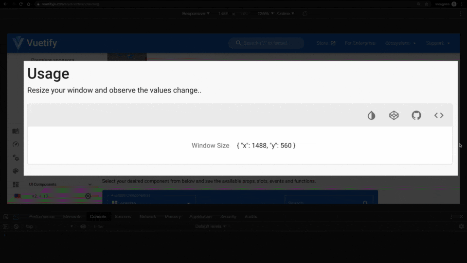
The resize directive allows you to detect when the window resizes so that you can respond accordingly. And using it is as simple as applying v-resize to an element with the callback function defined as the value.
<template>
	<div v-resize="onResize">
		<!-- content -->
	</div>
</template>
<script>
export default {
	methods: {
		onResize() {
			console.log('This window size is changing!')
		}
	}
}
</script>
Another fun directive is the ripple directive, which allows you to add a ripple animation to an HTML element in order to make it easier for users to detect when they interact with an element (i.e., clicking).
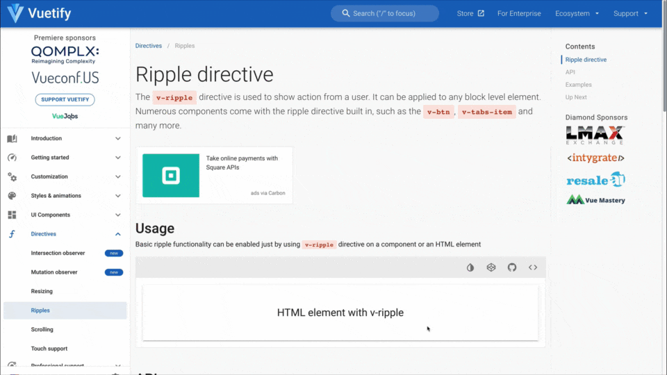
Using the ripple directive is even simpler since all you have to do it apply if on the desired HTML element.
<template>
	<div v-ripple>
		<p>HTML element with v-ripple applied</p>
	</div>
</template>
The Loading Problem
One scenario that is often overlooked in the user experience is the loading state. Whether it’s communicating to users that something is happening rather than simply displaying a blank canvas, or whether it is delaying a component from loading because it hasn’t come into the viewport yet, it’s a critical part of most application’s user experience.
Oftentimes, we send more information than necessary to users.
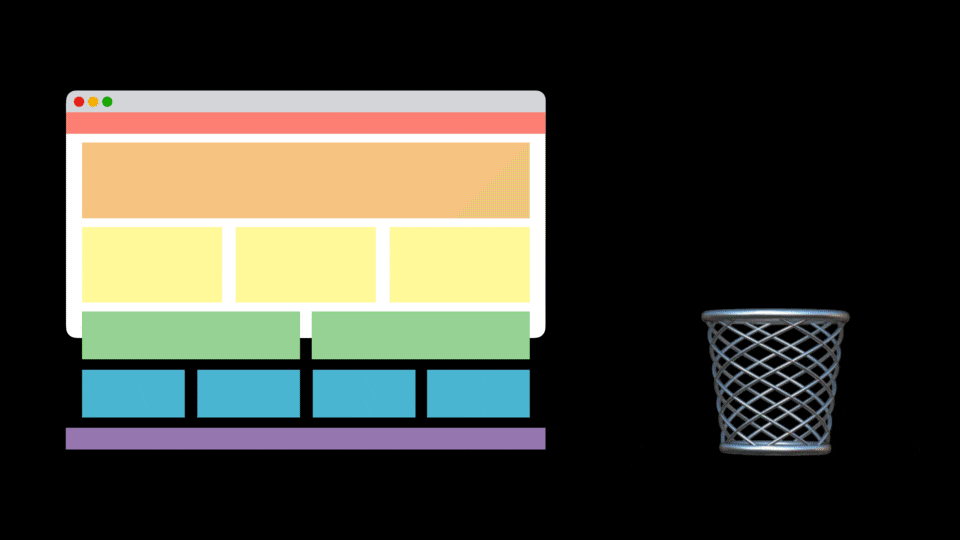
As a result, users have larger download size which slows down performance and creates a sub-optimal user experience. Wouldn’t it be great if we could detect when a user has hit a certain point on the web page (i.e., below the fold) and then trigger additional content to load?
To help you with this, Vuetify 2.1+ introduced the [v-intersect directive](https://vuetifyjs.com/en/directives/intersect).
The purpose v-intersect directive is to provide an easy way to detect whether elements are visible within the user’s viewport. This allows us to do things like delay loading of elements which improves the performance of our app since users are only downloading what they need.
In our Vuetify Dashboard app, let’s apply this to our Dashboard page. Assuming you’ve fetched the latest from the Lesson-8-BEGIN branch, you’ll notice that I’ve added more content to the page in order to give the page a longer scroll range.
 src/views/Dashboard.vue
<template>
  <v-container>
    <!-- More content above -->
		<v-row>
	    <v-col cols="12" md="8">
	      <EmployeesTable :employees="employees" @select-employee="setEmployee" />
	    </v-col>
	    <v-col cols="12" md="4">
	      <EventTimeline :timeline="timeline" />
	    </v-col>
	  </v-row>

	  <v-row id="below-the-fold">
	    <v-col cols="12" md="8">
	      <EmployeesTable :employees="employees" @select-employee="setEmployee" />
	    </v-col>
	    <v-col cols="12" md="4">
	      <EventTimeline :timeline="timeline" />
	    </v-col>
	  </v-row>

	  <v-row id="more-content">
	    <v-col>
	      <v-skeleton-loader
	        ref="skeleton"
	        type="table"
	        class="mx-auto"
	      ></v-skeleton-loader>
	    </v-col>
	  </v-row>
  </v-container>
</template>
You might also notice a new component that is being used at the very bottom:
This is the new skeleton loader component which Vuetify introduced in v2.1+. This allows you to scaffold a contextual loading state for users, which is much more useful to users than a generic spinner.
However, we only want this to be visible once the user scrolls past the #below-the-fold element. So, let’s start by configuring our skeleton loader to only appear based on a reactive data property: loadNewContent .
src/views/Dashboard.vue
<template>
  <v-container>
    <h1>Dashboard</h1>

		<!-- Hide content for easier readability -->

    <v-row id="below-the-fold">
      <v-col cols="12" md="8">
        <EmployeesTable :employees="employees" @select-employee="setEmployee" />
      </v-col>
      <v-col cols="12" md="4">
        <EventTimeline :timeline="timeline" />
      </v-col>
    </v-row>

    <v-row v-if="loadNewContent" id="more-content">
      <v-col>
        <v-skeleton-loader
          ref="skeleton"
          type="table"
          class="mx-auto"
        ></v-skeleton-loader>
      </v-col>
    </v-row>

    <!-- Hide snackbar for easier readability -->
  </v-container>
</template>
<script>
export default {
	data() {
		return {
			loadNewContent: false,
			...
		}
	},
	...
}
</script>
Now we need to dynamically toggle the skeleton loader based on whether the #below-the-fold element is intersected on the page. As mentioned before, we will use the v-intersect directive to help us with this. To get started, we will apply the v-intersect directive on our element and pass it a method named showMoreContent .
src/views/Dashboard.vue
<template>
  <v-container>
    <h1>Dashboard</h1>

		<!-- Hide content for easier readability -->

    <v-row id="below-the-fold" v-intersect="showMoreContent>
      <v-col cols="12" md="8">
        <EmployeesTable :employees="employees" @select-employee="setEmployee" />
      </v-col>
      <v-col cols="12" md="4">
        <EventTimeline :timeline="timeline" />
      </v-col>
    </v-row>

    <v-row v-if="loadNewContent" id="more-content">
      <v-col>
        <v-skeleton-loader
          ref="skeleton"
          type="table"
          class="mx-auto"
        ></v-skeleton-loader>
      </v-col>
    </v-row>

    <!-- Hide snackbar for easier readability -->
  </v-container>
</template>
<script>
export default {
	data() {
		return {
			loadNewContent: false,
			...
		}
	},
	methods: {
		showMoreContent(entries) { },
		...
	},
	...
}
</script>
You might have noticed that I’m including an entries argument to the function. This is because underneath the hood, v-intersect utilizes the standard Intersection Observer API, which provides an array of elements being observed as one of the default parameters. And for each observer entry, it has a property called isIntersecting which returns a boolean based on whether the observed entry is in currently intersecting or not.
As a result, making our skeleton loader component load dynamically is as simple as reassigning the loadNewContent data property to the isIntersecting property for our entry.
src/views/Dashboard.vue
<template>
  <v-container>
    <h1>Dashboard</h1>

		<!-- Hide content for easier readability -->

    <v-row id="below-the-fold" v-intersect="showMoreContent>
      <v-col cols="12" md="8">
        <EmployeesTable :employees="employees" @select-employee="setEmployee" />
      </v-col>
      <v-col cols="12" md="4">
        <EventTimeline :timeline="timeline" />
      </v-col>
    </v-row>

    <v-row v-if="loadNewContent" id="more-content">
      <v-col>
        <v-skeleton-loader
          ref="skeleton"
          type="table"
          class="mx-auto"
        ></v-skeleton-loader>
      </v-col>
    </v-row>

    <!-- Hide snackbar for easier readability -->
  </v-container>
</template>
<script>
export default {
	data() {
		return {
			loadNewContent: false,
			...
		}
	},
	methods: {
		showMoreContent(entries) {
			this.loadNewContent = entries[0].isIntersecting
	  },
		...
	},
	...
}
</script>
And with that, our skeleton element component only loads once the user goes past the #below-the-fold row! 
To learn about other useful components related to the Intersection API, be sure to check out the v-lazy and v-img component!
As a small word of caution, you will need a polyfill for IE11 and Safari. For more details and how it all works under hood, be sure to check out the browser compatibility table in the official Intersection Observer API docs.
Other Directives to Know About
Before we wrap up, there are a few more directives that you should know about:
- Mutation observer - Uses the Mutation Observer API to detect when elements are updated on the page. Particularly useful if you need to detect change on elements that are not within Vue’s control
- Scrolling - For detecting when the window or a specific element is being scrolled on
- Touch support - For detecting swipe gestures
Conclusion
In this lesson, we learned about various directives in the Vuetify library, while also taking a closer look at the v-intersect directive. For more information on how to use each directive, be sure to check out the docs. In addition, don’t forget that this is not a fixed list! The team is always looking for ways to improve the developer experience and will be updating these as time goes on.
Themes
Introduction
While component libraries can make our lives much easier, one common downside is that every website you build will look the same. As a result, it’s critical for us to be able to customize the theme so we can utilize the power of component libraries while creating unique designs.
In this lesson, we will be learning about:
- Basics behind Vuetify themes
- How to toggle between light and dark themes
- And how to customize theme variables
The Basic of Themes
For most websites, they often display using a light theme:
However, as many developers know, being able to choose your theme can greatly impact the readability and overall experience. For example, many developers prefer writing code in the dark theme.
When working with themes in Vuetify, as you might expect, there is no better place to get started than the Vuetify theme docs. And for those who are interested in paid themes, be sure to check out their Premium themes marketplace!
Toggling Light and Dark Themes
In our Vuetify Dashboard app, let’s start by configuring our Vuetify theme to use the dark theme. To do this, we configure out Vuetify configuration object with the theme property and pass it a key value pair of: dark: true .
vuetify.js
import Vue from 'vue'
import Vuetify from 'vuetify/lib'

Vue.use(Vuetify)

export default new Vuetify({
  icons: {
    iconfont: 'mdi'
  },
  theme: {
    dark: true
  }
})
While this is a fairly straightforward change, it would be more helpful to our users if we gave them the ability to choose which theme they preferred. As a result, let’s go ahead and add a button in the navigation bar that allows them to do that:
App.vue
<template>
  <v-app>
    <v-app-bar app color="primary" dark>
      <v-toolbar-title>Vuetify Dashboard</v-toolbar-title>
      <v-spacer></v-spacer>
      <v-btn
        v-for="link in links"
        :key="`${link.label}-header-link`"
        text
        rounded
        :to="link.url"
      >
        {{ link.label }}
      </v-btn>
      <v-btn @click="toggleTheme" text rounded>
        Toggle Theme
      </v-btn>
    </v-app-bar>
    ...
  </v-app>
</template>
Now we need to create our toggleTheme method that will allow users to update the theme. And to do this, we refer to our global $vuetify object and toggle the property theme.dark which takes a Boolean value.
App.vue
<script>
export default {
  name: 'App',
  data() {
    return {
      ...
    }
  },
  methods: {
    toggleTheme() {
      this.$vuetify.theme.dark = !this.$vuetify.theme.dark
    }
  }
}
</script>
And with that, your users can now toggle the theme!
Applying Custom Colors to a Theme
In order to apply custom color palettes to our theme, we can configure this globally by passing defining the themes property in the theme property:
vuetify.js
import Vue from 'vue'
import Vuetify from 'vuetify/lib'

Vue.use(Vuetify)

export default new Vuetify({
  icons: {
    iconfont: 'mdi'
  },
  theme: {
    themes: {
      light: {
        primary: '#41B883'
      },
      dark: {
        primary: '#34495E'
      }
    }
  }
})
For a list of all the various color properties in a theme, you can find them in the Theme: Customizing section of the docs.
However, one thing you may have noticed is that our links in the dark theme are hard to read. One way we can fix this is to define the colors for anchor in our theme configuration.
vuetify.js
import Vue from 'vue'
import Vuetify from 'vuetify/lib'

Vue.use(Vuetify)

export default new Vuetify({
  icons: {
    iconfont: 'mdi'
  },
  theme: {
    themes: {
      light: {
        primary: '#41B883'
      },
      dark: {
        primary: '#34495E',
        anchor: '#fff'
      }
    }
  }
})
However, for the purposes of demonstrating how you can programmatically and dynamically set the colors of themes. Let’s do this inside of our toggleTheme method.
App.vue
<script>
export default {
  name: 'App',
  data() {
    return {
      ...
    }
  },
  methods: {
    toggleTheme() {
      this.$vuetify.theme.themes.dark.anchor = '#41B883'
      this.$vuetify.theme.dark = !this.$vuetify.theme.dark
    }
  }
}
</script>
Just like before, we can refer to the global $vuetify object in order to dynamically change the value of the theme color. And with just one line of code, our links look great in the dark theme now!
Defining Custom Typography
While the Roboto font family looks great, it is common for designers to want custom typography for their website. And while it is not as easy as defining properties inside the Vuetify configuration object, we can still accomplish it with a couple of configurations.
To start, let’s swap out the Google Font import for Roboto in index.html for another font pair: Fira Sans and Merriweather.
public/index.html
<!DOCTYPE html>
<html lang="en">
  <head>
    <meta charset="utf-8" />
    <meta http-equiv="X-UA-Compatible" content="IE=edge" />
    <meta name="viewport" content="width=device-width,initial-scale=1.0" />
    <link rel="icon" href="<%= BASE_URL %>favicon.ico" />
    <title>vuetify-dashboard</title>
    <link href="https://fonts.googleapis.com/css?family=Fira+Sans:700|Merriweather&display=swap" rel="stylesheet">
    <link
      rel="stylesheet"
      href="https://cdn.jsdelivr.net/npm/@mdi/font@latest/css/materialdesignicons.min.css"
    />
  </head>
  <body>
    <noscript>
      <strong
        >We're sorry but vuetify-dashboard doesn't work properly without
        JavaScript enabled. Please enable it to continue.</strong
      >
    </noscript>
    <div id="app"></div>
    <!-- built files will be auto injected -->
  </body>
</html>
Now that we have our our new font families imported, we need to access Vuetify’s Sass variables. To do this, we start by creating our own scss/variables.scss file in our src directory.
src / scss/variables.scss
$body-font-family: 'Fira Sans';
$heading-font-family: 'Merriweather';
Once we restart our local server, Vuetify will rebuild the styles according to these new variables. And for those wondering where the variable names are coming from, they were derived from the [variables.scss file in the Vuetify source code](https://github.com/vuetifyjs/vuetify/blob/master/packages/vuetify/src/styles/settings/_variables.scss).
For more information, you can learn more about how Sass variables work on their docs.
Conclusion
And with that, you now know the basics of configuring your own theme with Vuetify. You are now ready to leverage the power of Vuetify’s component library while creating unique designs!