Introduction
One of the best things that modern JavaScript frameworks like Vue allow us to do is break down our websites and applications into manageable components. However, as our sites and apps get bigger and scale, it is easy to fall into certain pitfalls that will make managing your components difficult.
In this course, I will be showing you a variety of best practices and techniques that will help you:
- Create components that are easier to use and maintain
- Avoid common mistakes that make components more prone to bugs
- Feel empowered to make architectural decisions that are best for your app.
In this course, I will be sharing a variety of best practices and techniques for helping you manage your components. However, before we progress any farther, there are three things I need you to understand before you progress through this course.
- These are guidelines. Not rules.
- Your opinion and experience matter too.
- Choose what works best for you and your team.
In other words, if you feel like you have good reason to believe a best practice or technique is not a good fit for your app, then you should trust your instincts and move forward with your solution. Sometimes a technique or best practice that might work well in many contexts can actually be an anti-pattern given another context.
As a result, the important thing is that you understand the potential trade-offs so you can make the best decision possible for your application.
With that said, I look forward to sharing this knowledge with you. See you inside the course!
Props: Fundamentals
Introduction
When it comes to passing information down from one component to another, props are the first technique that most Vue developers encounter. By defining a props property on a component, it can then receive data.
Defining Props: Best Practices
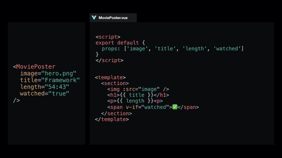
The Array Syntax
When defining props, many developers are initially exposed to the Array syntax.
<script>
export default {
  name: 'Movie',
  props: ['title', 'length', 'watched']
}
</script>
<template>
	<section>
		<h1>{{ title }}</h1>
		<p>{{ length }} <span v-if="watched">✅</span><p>
	</section>
</template>
While there is nothing wrong with this definition and will work in production, there are some pitfalls that exists with this method:
- Although the prop names may seem intuitive based on its meaning, it leaves it open for interpretation which can often lead to bugs
- For example, what happens when a developer forgets to include a prop that is technically required for the component to render properly? A Movie component without a title would look rather silly wouldn’t it?
- Another issue that arises is that the definition of each prop is vague. In the example we have above, should
lengthbe a number? Should it be a formatted string (i.e.,1:28)? But then which format should it be (i.e.,1 hr 28 min) - And when registering whether the movie has been watched before, what’s the proper way to tell it’s been watched (e.g., Yes? Y? Watched? true?)
Let’s not forget that this component is only responsible for rendering the props. Can you imagine what kind of bugs would show up if more complex logic was involved? 
The Object Syntax
Instead, for most scenarios, we should define our props using the Object syntax. This allows us to define three key prop attributes that allow you to answer three fundamental questions:
-
type: What data type(s) can be expected? -
required: Is the prop is required or not -
default: Is there default content that accounts for most scenarios so we don’t have to repeat ourselves multiple time?
<script>
export default {
	props: {
		length: {
			type: Number,
			required: true,
			default: 90
		}
	}
}
</script>
While you are probably aware of some of the basic JavaScript data types:
- String
- Number
- Boolean
- Array
- Object
There are a few more that you should know about!
- Date
- Function
- Symbols
And if you want to define multiple data types, it’s as simple as using an Array syntax!
<script>
export default {
	props: {
		length: {
			type: [Number, String],
			required: true,
			default: 90
		}
	}
}
</script>
Some of you might also be thinking, “If there is a default property defined, is a required property really needed?” And you’d be right! The reality is that when you have a default prop, you don’t need the required prop.
<script>
export default {
	props: {
		length: {
			type: Number,
			default: 90
		}
	}
}
</script>
Conclusion
To review, the Array syntax methodology can be prone to bugs as the application scales, but this is a completely valid method that can be very useful when prototyping and such. However, whenever possible, it’s considered a best practice to define your props using the Object syntax.
Finally, when defining your props, remember to answer the three fundamental questions:
- What data type(s) can be expected?
- Is the prop required?
- Can you provide default data to account for most scenario?
Remember that props are useful for providing detailed specifications on how to use a component, but this is also it’s downside as this does not allow flexibility on the developer’s part.
Props: Custom Validation
The Shortcomings of Most Prop Definitions
In the last lesson, we learned how to create props that were well documented and helped to prevent common bugs. However, after cleaning up our props in the last lesson, you might have noticed that our image prop is a little bit lacking.
 BaseBanner.vue
export default {
  props: {
    image: {
      type; String,
      default: '/images/placeholder.png'
    }
  }
}
While we have a default placeholder image that will help us when movie poster images are missing, the simple data-type-checking of String doesn’t quite cover it when it comes to validation. Simply passing any string won’t suffice; a simple error would result in a broken image.
/images/movie-poster.pn/imagesmovie-poster.pngimages/movie-poster.png
For our MoviePoster component, beyond simply enforcing that the image prop is a String , let’s assume that we want to make sure that:
- Images live in the
/imagesdirectory - Images can only be PNG or JPEG format
When given these requirements, the first instinct might be to create a computed property that checks for these things and generates an error message if it fails. However, what if we could validate our props earlier than that? Let’s explore how we can do this with custom validations!
Custom Validation for Props
While creating custom validations for props sounds complicated initially, Vue makes it quite easy for us to do so by providing the validator property. Here are the basics behind how it works:
MoviePoster.vue
export default {
  props: {
    image: {
      type: String,
      default: '/images/placeholder.png',
      // Validator takes an anonymous function
      // that receives the passed-down value
      // as its first argument
      validator: propValue => {
        // Return a Boolean that will serve as your validation
        const propExists = propValue.length > 0

	return propExists
      }
    }
  }
}
Equipped with this knowledge, let’s apply this to our images prop from our MoviePoster scenario!
MoviePoster.vue
export default {
  props: {
    image: {
      type: String,
      default: '/images/placeholder.png'
    }
  }
}
Requirement 1: Verify that all images come from the /images directory
Our first step is to setup a validator property that takes an anonymous function that receives the prop value as its sole argument.
MoviePoster.vue
export default {
  props: {
    image: {
      type; String,
      default: '/images/placeholder.png'
      validator: propValue => {}
    }
  }
}
Next, we want to create a validation rule to verify that the value being passed down contains the images directory. We can do this using the standard JavaScript String method indexOf , which allows us to check whether or not a string of characters exists on a given string by returning the index where it exists. If it doesn’t exist, it will return -1 .
MoviePoster.vue
export default {
  props: {
    image: {
      type; String,
      default: '/images/placeholder.png'
      validator: propValue => {
        const hasImagesDirectory = propValue.indexOf('/images/') > -1
      }
    }
  }
}
Now that we have our validation rule, all we need to do is return it to validate our prop.
MoviePoster.vue
export default {
  props: {
    image: {
      type; String,
      default: '/images/placeholder.png'
      validator: propValue => {
         const hasImagesDirectory = propValue.indexOf('/images/') > -1

	 return hasImagesDirectory
      }
    }
  }
}
And with that, our prop will now throw an error if it doesn’t contain the image directory!
Requirement 2: Image must either be PNG or JPEG format
Now that we have our validator set up, all we need to do for this requirement is setup another validation rule in our validator property. And to do this, we will utilize a helpful String method endsWith to check whether our URL path contains the correct extension.
MoviePoster.vue
export default {
  props: {
    image: {
      type; String,
      default: '/images/placeholder.png'
      validator: propValue => {
         const hasImagesDirectory = propValue.indexOf('/images/') > -1
	 const isPNG = propValue.endsWith('.png')
	 const isJPEG = propValue.endsWith('.jpeg') || propValue.endsWith('.jpg')
	 const hasValidExtension = isPNG || isJPEG

	 return hasImagesDirectory
       }
     }
  }
}
Finally, we need to add these new validation rules to our return value.
MoviePoster.vue
export default {
  props: {
    image: {
      type; String,
      default: '/images/placeholder.png'
      validator: propValue => {
         const hasImagesDirectory = propValue.indexOf('/images/') > -1
	 const isPNG = propValue.endsWith('.png')
	 const isJPEG = propValue.endsWith('.jpeg') || propValue.endsWith('.jpg')
	 const hasValidExtension = isPNG || isJPEG

	 return hasImagesDirectory && hasValidExtension
       }
     }
  }
}
Our image prop on our MoviePoster component is now good to go!
Let’s ReVue
Custom prop validators can be extremely useful in providing additional guidance to developers when a prop has requiremets beyond simple data types. And with that, you are now empowered to create even better messaging for how component props should be used in your application!
The Problem with Props
Introduction
Props are an incredibly useful technique when it comes to passing data down to child components. However, as an application scales and components get bigger, relying solely on props can often end up creating more problems than one might realize. In this lesson, you will learn the trade-offs that often come with a props heavy component and get a glimpse into an alternative technique every Vue developer should have in their toolkit.
Scenario: A “Simple” Button Component
A “button” component is universal amongst all applications. At first glance, most developers would probably say that buttons are incredibly simple, as far as components go.
Let’s put that to the test by playing a little mental puzzle game, originally designed by core team member Damian Dulisz, where we build a base button component from scratch. The rules of the game are simple:
- You will be given a new requirement each round that builds on the past one(s)
- Imagine what the template block will look like in BaseButton.vue and App.vue
- All styles are provided by a separately defined CSS classes (i.e.,
.button,.icon, etc.)
Ready to play? Let’s start!
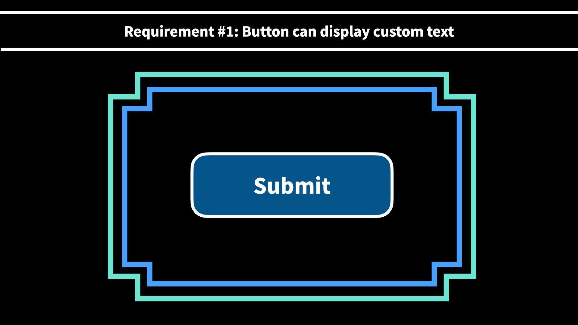
Requirement #1: Display Custom Text
To start, the button needs to be able to display any custom text specified by the parent component.
.
.
.
Got it? Good. Next round!
Requirement #2: Display Icon to the Right
For this round, in addition to the custom text from the parent component, you can assume that you have a <app-icon :icon="iconName" /> component that you can use inside of your base button component.
.
.
.
.
.
Feeling good? Let’s keep going!
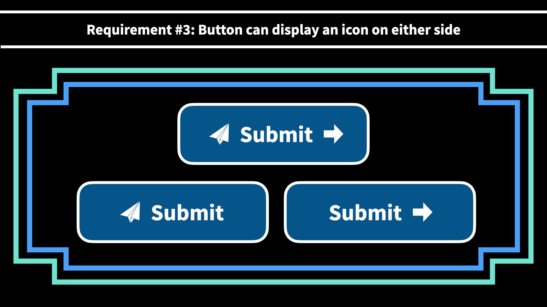
Round #3: Display Icons on Either Side
Rather than solely displaying the icon on the right side of the text, the button must also account for:
- Icon on the left side
- Icon on the right side
- Icon on both sides
.
.
.
.
.
.
.
Starting to have a little trouble holding it in your head? Hang in there. Only a couple more to go!
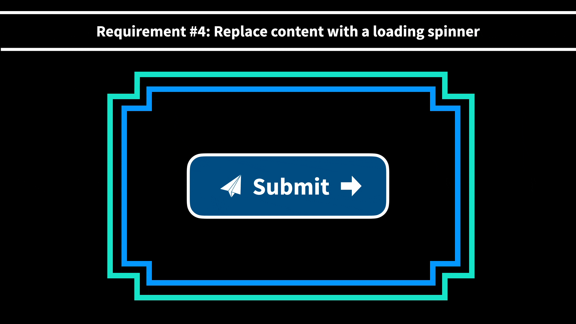
Requirement #4: Replace Content with a Loading Spinner
When a user clicks a button, it sometimes needs to fetch data from an external API service and needs to inform the user that it’s in the process of retrieving that data.
Assuming you have a <LoadingSpinner /> component, the button now also needs to be able to replace the entire content of the button with the loading spinner based on its state.
.
.
.
.
.
.
.
.
.
We’re almost there! Just one more!
Requirement #5: Only Replace Icon with a Loading Spinner
On some pages, the designer would prefer to switch out the button text to “Loading” and swap out the icon with the <LoadingSpinner /> component in order to provide more context to the user.

.
.
.
.
.
.
.
.
.
.
.
And that’s it! You’re all done now. Whew!
A Common Descent into Props Madness
When you first started the exercise, you (and most developers) most likely started with a simple solution resembling something as follows:
App.vue
<template>
  <h1>My App</h1>
  <BaseButton text="Submit" />
</template>
BaseButton.vue
<template>
  <button class="button">
    {{ text }}
  </button>
</template>
<script>
export default {
  props: {
    text: {
      type: String,
      required: true
    }
  }
}
</script>
However, as each requirement continued to build on one another, it wasn’t long before it looked something like this instead:
App.vue
<template>
  <h1>My App</h1>
  <BaseButton
    text="Submit"
    :isLoading="loading"
    iconLeftName="left-arrow"
    iconRightName="right-arrow"
    :isLoadingLeft="loadingLeft"
    :isLoadingRight="loadingRight"
  />
</template>
BaseButton.vue
<template>
  <button type="button" class=“nice-button“>
    <LoadingSpinner v-if="isLoading" />
    <template v-else>
      <template v-if="iconLeftName">
        <LoadingSpinner v-if="isLoadingLeft" />
        <AppIcon v-else :icon=“iconLeftName” />
      </template>
      {{ text }}
      <template v-if="iconRightName">
        <LoadingSpinner v-if="isLoadingRight" />
        <AppIcon v-else :icon=“iconRightName” />
      </template>
    </template>
  </button>
</template>
<script>
export default {
  // Props shortened to Array syntax for brevity
  props: [
    'text',
    'iconLeftName',
    'iconRightName',
    'isLoading',
    'isLoadingLeft',
    'isLoadingRight'
  ]
}
</script>
 I don’t know about you, but I got pretty dizzy trying to hold all of that in my head!
The Problem with Props-Based Solutions
The solution I just showed is what one might call a “props-based solution.” In other words, the strategy for solving each new requirement is simply to layer on a new prop that controls the desired behavior and layer it into the existing template and data model. Is it inherently wrong? Absolutely not. It solves the requirements and works as expected for the user.
However, as you might have noticed, it doesn’t take long before the code becomes rather difficult to read and could become very difficult to maintain as time goes on (and more requirements inevitably get added).
As a result, some of the common issues that teams see with props-based solutions are:
- New developers who have no prior experience with the component are forced to navigate a complex maze of conditionals to add any new feature or debug the code.
- Components lose their ability to be intuitive since components with numerous props essentially gain their own unique configurations that often require extensive onboarding or explanation just to understand how everything works. And that’s assuming the props are documented well!
- Complex components that become hard to maintain often lead to developers creating alternate components since deadlines take precedent over good coding practices, which fragments the application’s ecosystem.
So the question becomes: “Is there a better way?” And the answer is absolutely yes.
A Simpler and Cleaner Solution
Instead of relying solely on props, it’s time to reach for our next component design technique: slots.
App.vue
<template>
  <h1>My App</h1>
  <BaseButton>Submit <AppIcon name="arrow-right" /></BaseButton>
</template>
BaseButton.vue
<template>
  <button class="button">
    <slot />
  </button>
</template>
Believe it or not, using a single slot element checks off all of our boxes for our requirements without changing a single line of code in the component!
Let’s ReVue
Props are an incredibly powerful technique for defining conventions that enforce a level of consistency in your components. However, when relied on too heavily for enhancing component features, it can increase complexity and create inflexible components. As long as you’re aware of those trade-offs, you’re ready for the next step in our journey.
In the next lesson, we’ll take a look at core fundamental concepts that will empower you to create more flexible components with slots. See you there!