Form Validation with Vuelidate Pt. 2
In our previous lesson, we started working with Vuelidate to validate a Vue form. In this lesson, we’ll continue working with Vuelidate and add validations to our example application’s form, which is composed of our reusable form components.
 Problem
Inside our EventCreate component, we have a form that is currently able to be submitted with blank fields. We don’t want users to be able to create an event without filling out all the fields for the information an event needs.
 Solution: Vuelidate EventCreate
We can use Vuelidate to validate each field of our EventCreate form so that it can only be submitted if the user has input the information the form needs. Since we already installed Vuelidate in the previous lesson and imported it within our main.js file, we can start validating our EventCreate form.
Let’s import the required validator into this file from Vuelidate’s library of validators.
 src/views/EventCreate.vue
import { required } from 'vuelidate/lib/validators'
Then we can add a validations option to this component, below its data.
src/views/EventCreate.vue
validations: {},
What are we validating? We need to validate everything the user enters when they create an event, which includes these properties on our event data: category , title , description , location , date , and time . Specifically, these all need to be required .
Since these properties are all nested within event , we can add them to the validations option and make them required like so:
src/views/EventCreate.vue
    validations: {
      event: {
        category: { required },
        title: { required },
        description: { required },
        location: { required },
        date: { required },
        time: { required }
      }
    },
Validating Each Field
We can now start adding the necessary code to validate each field. For each field (which will be composed by our BaseSelect and BaseInput components), we’ll need to do the following:
- Add an error message that can be conditionally displayed when that field is not filled in
- Listen for a
blurevent, which triggers Vuelidate’s$touchmethod, giving us an$errorstate we can use. - Use the
$errorstate to conditionally show the div that contains our error message (from step 1). - Add error styling to our field and its error message
Now that we know what needs to be done, let’s start validating our first field.
Validating Category
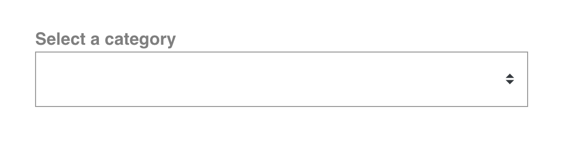
To start validating our category field, which is composed with our BaseSelect component, we’ll create an error message that will be conditionally displayed if our category field is not filled out ( !$v.event.category.required ).
src/views/EventCreate.vue
    <BaseSelect
      label="Select a category"
      :options="categories"
      v-model="event.category"
    />
    <p v-if="!$v.event.category.required" class="errorMessage">Category is required.</p>
So far so good, but remember from the last lesson: we don’t want to display this error message until the user has already interacted with the field, and left it blank.
So we can be listening for the blur event on BaseSelect , which will trigger Vuelidate’s $touch method. This will turn the category field’s $dirty state to true .
src/views/EventCreate.vue
    <BaseSelect
      label="Select a category"
      :options="categories"
      v-model="event.category"
      @blur="$v.event.category.$touch()" <!-- triggers dirty status -->
    />
As we learned in the last lesson, if a Vuelidate field is both $dirty and $invalid , then it has an $error state of true . So when our field is touched and left blank, it will be both $dirty and $invalid , giving us an $error state of true. We can use this $error state to conditionally display a container that contains our error message.
src/views/EventCreate.vue
    <BaseSelect
      label="Select a category"
      :options="categories"
      v-model="event.category"
      @blur="$v.event.category.$touch()"
    />
    <template v-if="$v.event.category.$error"> <!-- displays when error is true -->
      <p v-if="!$v.event.category.required" class="errorMessage">Category is required.</p>
    </template>
We’ll also want to color our input field red, so we’ll add a class to that field with class binding, using that same $error state.
src/views/EventCreate.vue
    <BaseSelect
      label="Select a category"
      :options="categories"
      v-model="event.category"
      :class="{ error: $v.event.category.$error}" <!-- add class when $error is true -->
      @blur="$v.event.category.$touch()"
    />
    <template v-if="$v.event.category.$error">
      <p v-if="!$v.event.category.required" class="errorMessage">Category is required.</p>
    </template>
Now this all should work, right? Let’s check the browser to make sure. We’ll focus on the the category field, then click away from it (blur), and our error message and styling should appear.
But wait… nothing is happening. The error message isn’t showing up. What’s going on here?
Well, we’ve added that blur event listener to BaseSelect, but we haven’t given the native select element inside of BaseSelect the ability to inherit that event listener. Fortunately this is an easy fix.
Remember when we created our BaseButton in a previous lesson? We added v-on="$listeners" to the native button element within it so that it could inherit the event listeners added in the parent scope. We can do the same thing and add v-on="$listeners" to our BaseSelect component’s select element so it can inherit the blur event listener.
src/components/BaseSelect.vue
    <template>
      <div>
        <label v-if="label">{{ label }}</label>
        <select :value="value" v-on="$listeners" @change="updateValue" v-bind="$attrs"> <!-- now inheriting event listeners here -->
          <option
            v-for="option in options"
            :value="option"
            :key="option.id"
            :selected="option === value"
          >{{ option }}</option>
        </select>
      </div>
    </template>
Now if we save and check this out in the browser, we should be seeing the error message show up.

Great it’s working. While we’re validating this select field, let’s validate the other field that is using our BaseSelect component: the times field.
Validating Times
To validate our times field, everything will stay the same conceptually. And since we already added the $listeners fix that our BaseSelect component needed, we just need to replicate what we did in EventCreate for the category field, like so:
src/views/EventCreate.vue
    <BaseSelect
      label="Select a time"
      :options="times"
      v-model.trim="event.time"
      class="field"
      :class="{ error: $v.event.time.$error}"
      @blur="$v.event.time.$touch()"
    />
    <template v-if="$v.event.time.$error">
      <p v-if="!$v.event.time.required" class="errorMessage">Time is required.</p>
    </template>
Now let’s continue down the form and start validating our first text input field.
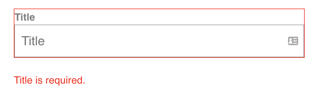
Validating Title
To validate our title field, we’re going to repeat the same steps we just did above and end up with:
src/views/EventCreate.vue
    <BaseInput
      label="Title"
      placeholder="Title"
      type="text"
      class="field"
      :class="{ error: $v.event.title.$error }"
      v-model.trim="event.title"
      @blur="$v.event.title.$touch()"
    />
    <template v-if="$v.event.title.$error">
      <p v-if="!$v.event.title.required" class="errorMessage">Title is required.</p>
    </template>
We’ll also make sure to inherit the blur event listener and all other potential listeners on the input element of BaseInput, just like we did with BaseSelect ’s select element.
src/components/BaseInput.vue
    <template>
      <div>
        <label v-if="label">{{ label }}</label>
        <input :value="value" v-bind="$attrs" v-on="$listeners" @input="updateValue">
      </div>
    </template>
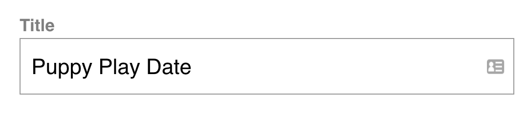
Now let’s test this out in the browser. We’ll focus on the field, then click away from it, which should trigger our error message and styling.
Great it’s working so far. But when we actually try to input a title here, we get this weird [object InputEvent] showing up.

Oh geez… what’s going on here? The reason for this strange behavior is a bit complicated to grasp, so let’s tackle this piece by piece.
We have v-model on our BaseInput:
src/views/EventCreate.vue
    <BaseInput
      label="Title"
      placeholder="Title"
      type="text"
      class="field"
      :class="{ error: $v.event.title.$error }"
      v-model="event.title" <!-- right here -->
      @blur="$v.event.title.$touch()"
    />
As we covered in our lesson where we built BaseInput , v-model is really just syntactic sugar. In this case, v-model=``"``event.title``" translates to:
    :value="event.title"
    @input="(value) => { event.title = value }"
Why is this important? Well, this means we have a listener here for the input event. And since we just added v-on=``"``$listeners``" that means we are inheriting that input event listener onto our BaseInput’s input element.
<input :value="value" v-bind="$attrs" @input="updateValue" v-on="$listeners">
And why is that important? Well, look again at what’s on that element. We’ve also got @input="updateValue" . That means we have two input event listeners. One that is triggering the updateValue method, and one that we’re inheriting from the parent scope, which is hidden under the sugar-coating of our v-model . This means we have a conflict, and the second input (the one from the v-model ) is taking precedence.
Okay so we know what caused this funky behavior. But how do we fix it? Take a few deep breaths, because the solution to this problem is as convoluted as the issue that caused it. 
 ♂
♂
Resolving Our Conflict
If two people are in conflict about something, what’s a good way to resolve that? How about they shake hands and compromise? What does this have to do with our code? Well, that’s basically what we’re about to implement: a compromise. We can encapsulate that compromise within a computed property, which we’ll call listeners .
src/components/BaseInput.vue
    computed: {
      listeners() {
        return {
          ...this.$listeners,
          input: this.updateValue
        }
      }
    }
Since both of our input events want to exist but they’re currently messing with each other, the compromise is: they can both exist alongside each other within a listeners object, which our computed property returns. Notice how we’re using the object spread operator to merge the inherited $listeners into this object (i.e. the input event listener hidden in v-model ), and below that is a property for our input event that triggers the updateValue method.
Since there are now two input definitions on this object. Because of the way JavaScript objects work, the one that is defined last will take precedence. In this case, the input event that triggers our updateValue method takes precedence, which solves our issue!
Now, in the template, we can simply add our computed listeners to the input element.
src/components/BaseInput.vue
<input :value="value" v-bind="$attrs" v-on="listeners">
Now we should have everything working. Let’s check it out in the browser.
Phew!  It works. I promise the next couple fields will be a lot easier. Let’s keep going.
Validating Description & Location
To validate the description and location fields, all we need to do is replicate what we’ve been doing: add an error message that shows up on blur when the field is invalid , with proper error styling.
For description :
src/views/EventCreate.vue
    <BaseInput
      label="Description"
      type="text"
      placeholder="Description"
      class="field"
      :class="{ error: $v.event.description.$error}"
      v-model.trim="event.description"
      @blur="$v.event.description.$touch()"
    />
    <template v-if="$v.event.description.$error">
      <p v-if="!$v.event.description.required" class="errorMessage">Description is required.</p>
    </template>
For location :
src/views/EventCreate.vue
    <BaseInput
      label="Location"
      v-model.trim="event.location"
      type="text"
      placeholder="Location"
      class="field"
      :class="{ error: $v.event.location.$error }"
      @blur="$v.event.location.$touch()"
    />
    <template v-if="$v.event.location.$error">
      <p v-if="!$v.event.location.required" class="errorMessage">Location is required.</p>
    </template>
Perfect. Now let’s validate our final field.
Validating Date
We’ve reached our final field that needs to be validated, which is our date . This one is a bit special since we’re using vuejs-datepicker, a third-party Vue component. But the steps we’ll take are the same.
We’ll add an error message and wrap it in a conditionally displayed template:
src/views/EventCreate.vue
    <template v-if="$v.event.date.$error">
      <p v-if="!$v.event.date.required" class="errorMessage">Date is required.</p>
    </template>
But instead of triggering Vuelidate’s $touch method on blur , since that won’t be available to us due to the way this component is written, we’ll instead use vuejs-datepicker’s opened event listener.
src/views/EventCreate.vue
    <div class="field">
      <label>Date</label>
      <datepicker
        placeholder="Select a date"
        v-model="event.date"
        @opened="$v.event.date.$touch()" <!-- triggering $touch on opened -->
      />
    </div>
    <template v-if="$v.event.date.$error">
      <p v-if="!$v.event.date.required" class="errorMessage">Date is required.</p>
    </template>
This will give us essentially the same behavior as our blur did. When a user opens this component, $v.event.date will be touched and therefor $dirty . By “open”, we’re referring to when a user clicks on the component and the box opens, allowing for a date to be selected.
Great. Now the last step is to add some dynamic error class binding to this field. This is also a bit unique. Instead of binding to the actual class attribute, we’ll bind to input-class , which is a prop provided to us by vuejs-datepicker.
src/views/EventCreate.vue
    <div class="field">
      <label>Date</label>
      <datepicker
        placeholder="Select a date"
        v-model="event.date"
        @opened="$v.event.date.$touch()"
        :input-class="{ error: $v.event.date.$error }" <!-- binding error class -->
      />
    </div>
    <template v-if="$v.event.date.$error">
      <p v-if="!$v.event.date.required" class="errorMessage">Date is required.</p>
    </template>
Now let’s test this out in the browser by opening the component, but not selecting a date.

Awesome - it’s working. We’re getting the appropriate error styling on our date field.
If you continue using this datepicker component and need to manipulate it in ways we haven’t covered yet, check out the docs, as they are pretty helpful for figuring out what unique code might be needed to achieve your implementation. As you’ll see in the “Events” section, there is also a “closed” event. That would have been even closer to replicating the blur event; however, when we tried using that, it didn’t work for us and we discovered there’s an ongoing issue with it. So we are going with opened instead, which works for our needs.
Now that all of our individual fields are being validating, we can think through what should happen which this form is submitted.
Validating On Submit
In the previous lesson, we didn’t want the user to click the submit button on an error-ridden form. That same rule applies here. So we can prevent users from submitting our EventCreate form by disabling the button whenever there are any validation errors.
src/views/EventCreate.vue
    <BaseButton
      type="submit"
      buttonClass="-fill-gradient"
      :disabled="$v.$anyError" <!-- disable button when error(s) -->
    >Submit</BaseButton>
Now, if a user tries to submit the form while it has errors, they’ll be met with a disabled button and error messages. We can also add an error message below the button, telling them to fill out the required field(s).
src/views/EventCreate.vue
<p v-if="$v.$anyError" class="errorMessage">Please fill out the required field(s).</p>
Finally, in our methods below, we’ll be calling $touch() at the top of our createEvent method, which is what runs the logic that submits the form. This will ensure that all fields are turned $dirty so that any $errors can be found (and displayed).
src/views/EventCreate.vue
    createEvent() {
      this.$v.$touch() // "touching" all fields to turn them "dirty"
      if (!this.$v.$invalid) { // submit form only when all fields are valid
        NProgress.start()
        this.$store
          .dispatch('event/createEvent', this.event)
          .then(() => {
            this.$router.push({
              name: 'event-show',
              params: { id: this.event.id }
            })
            this.event = this.createFreshEventObject()
          })
          .catch(() => {
            NProgress.done()
          })
      }
Great! Now our user can’t submit the form until every required field has been filled out, and our users will receive helpful error messages related to the fields they still need to complete.
Let’s ReVue
We did it! Now our EventCreate form is guaranteed to only be submitted when it has the information it needs. Hopefully you now feel more comfortable with the concept of form validation, and can start using Vuelidate to empower your Vue apps.
The Complete Code
In case you need it, here’s the full EventCreate.vue code:
src/views/EventCreate.vue
    <template>
      <div>
        <h1>Create an Event</h1>
        <form @submit.prevent="createEvent">
          <BaseSelect
            label="Select a category"
            :options="categories"
            v-model="event.category"
            :class="{ error: $v.event.category.$error}"
            @blur="$v.event.category.$touch()"
          />
          <template v-if="$v.event.category.$error">
            <p v-if="!$v.event.category.required" class="errorMessage">Category is required.</p>
          </template>

          <h3>Name & describe your event</h3>
          <BaseInput
            label="Title"
            placeholder="Title"
            type="text"
            class="field"
            :class="{ error: $v.event.title.$error}"
            v-model.trim="event.title"
            @blur="$v.event.title.$touch()"
          />
          <template v-if="$v.event.title.$error">
            <p v-if="!$v.event.title.required" class="errorMessage">Title is required.</p>
          </template>
          <BaseInput
            label="Description"
            type="text"
            placeholder="Description"
            class="field"
            :class="{ error: $v.event.description.$error}"
            v-model.trim="event.description"
            @blur="$v.event.description.$touch()"
          />
          <template v-if="$v.event.description.$error">
            <p v-if="!$v.event.description.required" class="errorMessage">Description is required.</p>
          </template>

          <h3>Where is your event?</h3>
          <BaseInput
            label="Location"
            v-model.trim="event.location"
            type="text"
            placeholder="Location"
            class="field"
            :class="{ error: $v.event.location.$error }"
            @blur="$v.event.location.$touch()"
          />
          <template v-if="$v.event.location.$error">
            <p v-if="!$v.event.location.required" class="errorMessage">Location is required.</p>
          </template>

          <h3>When is your event?</h3>
          <div class="field">
            <label>Date</label>
            <datepicker
              placeholder="Select a date"
              v-model="event.date"
              @opened="$v.event.date.$touch()"
              :input-class="{ error: $v.event.date.$error }"
            />
          </div>
          <template v-if="$v.event.date.$error">
            <p v-if="!$v.event.date.required" class="errorMessage">Date is required.</p>
          </template>

          <BaseSelect
            label="Select a time"
            :options="times"
            v-model="event.time"
            class="field"
            :class="{ error: $v.event.time.$error}"
            @blur="$v.event.time.$touch()"
          />
          <template v-if="$v.event.time.$error">
            <p v-if="!$v.event.time.required" class="errorMessage">Time is required.</p>
          </template>

          <BaseButton type="submit" buttonClass="-fill-gradient" :disabled="$v.$anyError">Submit</BaseButton>
          <p v-if="$v.$anyError" class="errorMessage">Please fill out the required field(s).</p>
        </form>
      </div>
    </template>

    <script>
    import Datepicker from 'vuejs-datepicker'
    import NProgress from 'nprogress'
    import { required } from 'vuelidate/lib/validators'
    export default {
      components: {
        Datepicker
      },
      data() {
        const times = []
        for (let i = 1; i <= 24; i++) {
          times.push(i + ':00')
        }
        return {
          times,
          categories: this.$store.state.categories,
          event: this.createFreshEventObject()
        }
      },
      validations: {
        event: {
          category: { required },
          title: { required },
          description: { required },
          location: { required },
          date: { required },
          time: { required }
        }
      },
      methods: {
        createEvent() {
          this.$v.$touch()
          if (!this.$v.$invalid) {
            NProgress.start()
            this.$store
              .dispatch('event/createEvent', this.event)
              .then(() => {
                this.$router.push({
                  name: 'event-show',
                  params: { id: this.event.id }
                })
                this.event = this.createFreshEventObject()
              })
              .catch(() => {
                NProgress.done()
              })
          }
        },
        createFreshEventObject() {
          const user = this.$store.state.user.user
          const id = Math.floor(Math.random() * 10000000)
          return {
            id: id,
            user: user,
            category: '',
            organizer: user,
            title: '',
            description: '',
            location: '',
            date: '',
            time: '',
            attendees: []
          }
        }
      }
    }
    </script>
What’s next?
In the next lesson, we’ll be learning about Mixins, a handy way to reuse code across our apps.
Mixins
It’s common when developing an application full of components to reach a point where you have two components that contain very similar functionality. The question then is: do we fuse those two components into one? Or do we keep them separate since there’s enough different about each of them that combining them would cause more problems than it would solve?
Fortunately, Vue gives us a third option: Mixins . Mixins are a useful way to encapsulate a small piece of functionality that can be reused across multiple components. In this tutorial, we’ll be learning how to create and efficiently make use of this handy tool.
A Simple Example
To start getting familiar with Mixins, let’s look at a simple example.
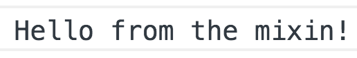
exampleMixin.js
    export const exampleMixin = {
      created() {
        console.log('Hello from the mixin!')
      }
    }
As you can see, we’ve created a new .js file that exports our exampleMixin , which just logs a message to the console when the component is created .
Now we can import this mixin into an example component and list it on that component’s mixins option in order to extend that component’s functionality.
Example.vue
    <script>
    import { exampleMixin } from '../mixins/exampleMixin.js'
      export default {
        mixins: [exampleMixin]
      }
    </script>
Now, when our Example component is created , we should see the console.log from our exampleMixin appear.
Great. So far so good.
Order of Operations
The way that mixins are handled, the mixin code is run prior to the component code. To see this in action, let’s look at how this code will run:
If we have this same mixin:
exampleMixin.js
    export const exampleMixin = {
      created() {
        console.log('Hello from the mixin!')
      }
    }
And this component:
Example.vue
    <script>
    import { exampleMixin } from '../mixins/exampleMixin.js'
    export default {
      mixins: [exampleMixin],
      created() {
        console.log('Hey from the component.')
      }
    }
    </script>
Now our component itself is also supposed to be logging a message to the console when it is created . So what do you think we’ll see in the console? In what order do you expect to see the logs?
If we check the console, we see:
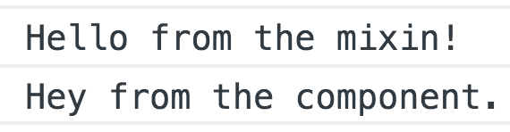
Indeed, our mixin code was run just before our component’s code, as we can see by the order of our console logs. Under the hood, both of our created hook functions were merged into an array, with the mixin’s hook being the first element in that array and our component’s hook being the second. Then they were run in that order, hence the order in which we see the console logs.
Mixing in More
Now what if needed to mix-in more than just a simple lifecycle hook? We aren’t limited to just hooks, we can mix-in any component option, such as methods, data, props, etc.
For example, we might have a mixin that looks like this:
exampleMixin.js
    export const exampleMixin = {
      created() {
        this.logMessage()
      },
      data() {
        return {
          message: 'I am such a nice mixin.'
        }
      },
      methods: {
        logMessage() {
          console.log(this.message)
        }
      }
    }
Now if we imported this into a component, it would run the logMessage method when it was created , printing the message data to the console. However, that is assuming none of what is on this mixin conflicts with what is on our component. Fortunately, the way Vue handles mixins helps us automatically avoid conflicts when they arise. Let’s look at how that works.
Mixing in Data
In cases where we want to mix-in data, data objects undergo a recursive merge. If there are conflicts, the component’s data takes priority. Let’s look at an example.
If we had this mixin:
exampleMixin.js
    export const exampleMixin = {
      data() { return { message: 'I am secondary.' } }
    }
And this component:
Example.vue
    <script>
    import { exampleMixin } from '../mixins/exampleMixin.js'
    export default {
      mixins: [exampleMixin],
      data() {
        return {
          message: 'I take priority.'
        }
      },
      created() {
        console.log(this.message)
      }
    }
    </script>
Which message do you think will show up in the console? Looking in the console, we’ll see that the component’s data won out.
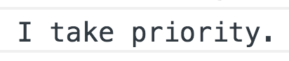
Vue recognized there was a conflict between the mixin’s message data and the component’s message data, so it chose to use the component’s own code. Again, the component’s code will always take priority in conflicts like this.
Merging Object Options
Now that we understand how hooks and data are merged, what about options that expect an object such as our methods or props option? As we might expect by now, the component’s options will take priority when there are conflicting keys in those merged objects.
For example, if we had this mixin, which has a hello method:
exampleMixin.js
    export const exampleMixin = {
      methods: {
        hello() {
          console.log('Hello from the mixin!')
        }
      }
    }
And this component, which has its own hello method:
Example.vue
    <script>
    import { exampleMixin } from '../mixins/exampleMixin.js'
    export default {
      mixins: [exampleMixin],
      methods: {
        hello() {
          console.log('Hello from the component.')
        }
      }
    }
    </script>
What will we see in the console?
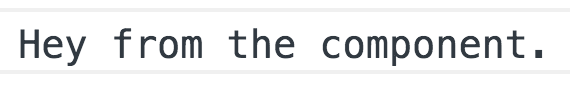
That’s right - we’d see the output of our component’s hello method since that took priority over the conflicting hello method from our mixin.
Global Mixins
It’s also worth noting that we are able to create global mixins, which would be applied to each and every component within our application.
In a Vue CLI-generated project, we’d create a global mixin in our main.js file, just above the main Vue instance.
main.js
    Vue.mixin({
      mounted() {
        console.log('I am mixed into every component.')
      }
    })

    new Vue({
      ...
    })
However, the use cases for a global mixin are rare and it is highly recommended that you use global mixins with extreme caution or simply avoid using them at all since they will be affecting literally every component at every level of your app.
A Next-Level Mixin
Now that we understand the basics of how mixins work to extend the functionality of our components, let’s look at an example that’s more… Next-Level.
Specifically, if we look at how we’ve written our BaseSelect and BaseInput components, we’ll notice that we’re repeating some code within each of them.
BaseSelect.vue
    <template>
      <div>
        <label v-if="label">{{ label }}</label>
        <select :value="value" @change="updateValue" v-bind="$attrs" v-on="$listeners">
          <option
            v-for="option in options"
            :value="option"
            :key="option.id"
            :selected="option === value"
          >{{ option }}</option>
        </select>
      </div>
    </template>
    <script>
    export default {
      inheritAttrs: false,
      props: {
        options: {
          type: Array,
          required: true
        },
        value: [String, Number],
        label: String
      },
      methods: {
        updateValue(event) {
          this.$emit('input', event.target.value)
        }
      }
    }
    </script>
BaseInput.vue
    <template>
      <div>
        <label v-if="label">{{ label }}</label>
        <input :value="value" @input="updateValue" v-bind="$attrs">
      </div>
    </template>
    <script>
    export default {
      inheritAttrs: false,
      props: {
        label: {
          type: String,
          default: ''
        },
        value: [String, Number]
      },
      methods: {
        updateValue(event) {
          this.$emit('input', event.target.value)
        }
      }
    }
    </script>
Both components contain inheritAttrs: false, along with a label and value prop and an updateValue method. We can encapsulate this repetitive code into its own mixin that both form components can then use.
Creating our Mixin
Before we create our mixin, we’ll add a mixins folder within our src folder to keep things organized. Inside of our mixins folder, we’ll create a .js file for our new mixin.
src/mixins/formFieldMixin.js
    export const formFieldMixin = {
      inheritAttrs: false,
      props: {
        label: {
          type: String,
          default: ''
        },
         value: [String, Number]
      },
      methods: {
        updateValue(event) {
          this.$emit('input', event.target.value)
        }
      }
    }
As you can see, we’ve added all of the code that was repeated between the two components.
Using the Mixin
Since we have now encapsulated that repeated code within a new formFieldMixin , we can import it into our BaseInput and BaseSelect components, and delete the code that the mixin replaces.
src/components/BaseInput.vue
    <template>
      <div>
        <label v-if="label">{{ label }}</label>
        <input :value="value" @input="updateValue" v-bind="$attrs" v-on="listeners">
      </div>
    </template>
    <script>
    import { formFieldMixin } from '../mixins/formFieldMixin' // import mixin
    export default {
      mixins: [formFieldMixin], // register mixin
      props: {
        value: [String, Number]
      },
      computed: {
        listeners() {
          return {
            ...this.$listeners,
            input: this.updateValue
          }
        }
      }
    }
    </script>
src/components/BaseSelect.vue
    <template>
      <div>
        <label v-if="label">{{ label }}</label>
        <select :value="value" @change="updateValue" v-bind="$attrs" v-on="$listeners">
          <option
            v-for="option in options"
            :value="option"
            :key="option.id"
            :selected="option === value"
          >{{ option }}</option>
        </select>
      </div>
    </template>
    <script>
    import { formFieldMixin } from '../mixins/formFieldMixin' // import mixin
    export default {
      mixins: [formFieldMixin], // register mixin
      props: {
        options: {
          type: Array,
          required: true
        },
        value: [String, Number]
      }
    }
    </script>
Great. Now these form components appear even leaner and both rely on the same shared functionality of our formFieldMixin , making our code more DRY.
Let’s Revue
Mixins are a handy way to reuse code across our components to share behavior, making our codebase less repetitive and more modular. We looked at the order of operations of mixins, and we learned how mixin code is run prior to the component’s own code and how that helps automatically resolve conflicts that may emerge with things such as duplicated method names. We then saw how easy it can be to encapsulate code that is repeated within two places into a single mixin instead.
What’s next?
In the next lesson, we’ll take a look at ways to effectively filter within our components.