Video
Links
- Lesson 1
- Lesson 2
- Lesson 3
- Lesson 4
- Lesson 5
- Lesson 6
- Lesson 7
- Lesson 8
- Lesson 9
- Lesson 10
- Lesson 11
- Lesson 12
- Starting Code
-
Ending Code
Lesson 13
- Starting Code
- Ending Code
Next-Level Vue: Orientation
Welcome to Next-Level Vue. Prerequisites for this course include knowledge of:
- Vue CLI
- Vue Router
- Single File .vue Components
- API Calls with Axios
- Vuex
In this video, we’ll be getting our example app running and then touring the code. If you’ve been following along with our Real World Vue and Mastering Vuex courses, you can probably skip ahead to the next lesson. But if you’re just joining us, let’s take a look at the example application we’ll be using throughout this course.
Downloading the App
The starting code for our app is located on github here. Please download it to your computer so you can follow along.
Getting the app up and running
If you navigate to the project from your terminal, you can run npm install to install all of the project’s dependencies.
Since our app will be making API calls, we’ll be using json-server. This is a full fake REST API, which allows us to perform API calls that pull from a mock database. You’ll need to install the library if you haven’t already. To do so, run this command in your terminal: npm install -g json-server . We then need to run the command json-server --watch db.json , which turns on json-server and tells it to watch our db.json file, which is our mock database.
Finally, we’ll need to make sure a third-party datepicker library we’re using is installed, with: npm install --save vuejs-datepicker
Now, to get our app running live, we’ll run the command: npm run serve . Our terminal will let us know which localhost port our app is running on.
Exploring the app in the browser
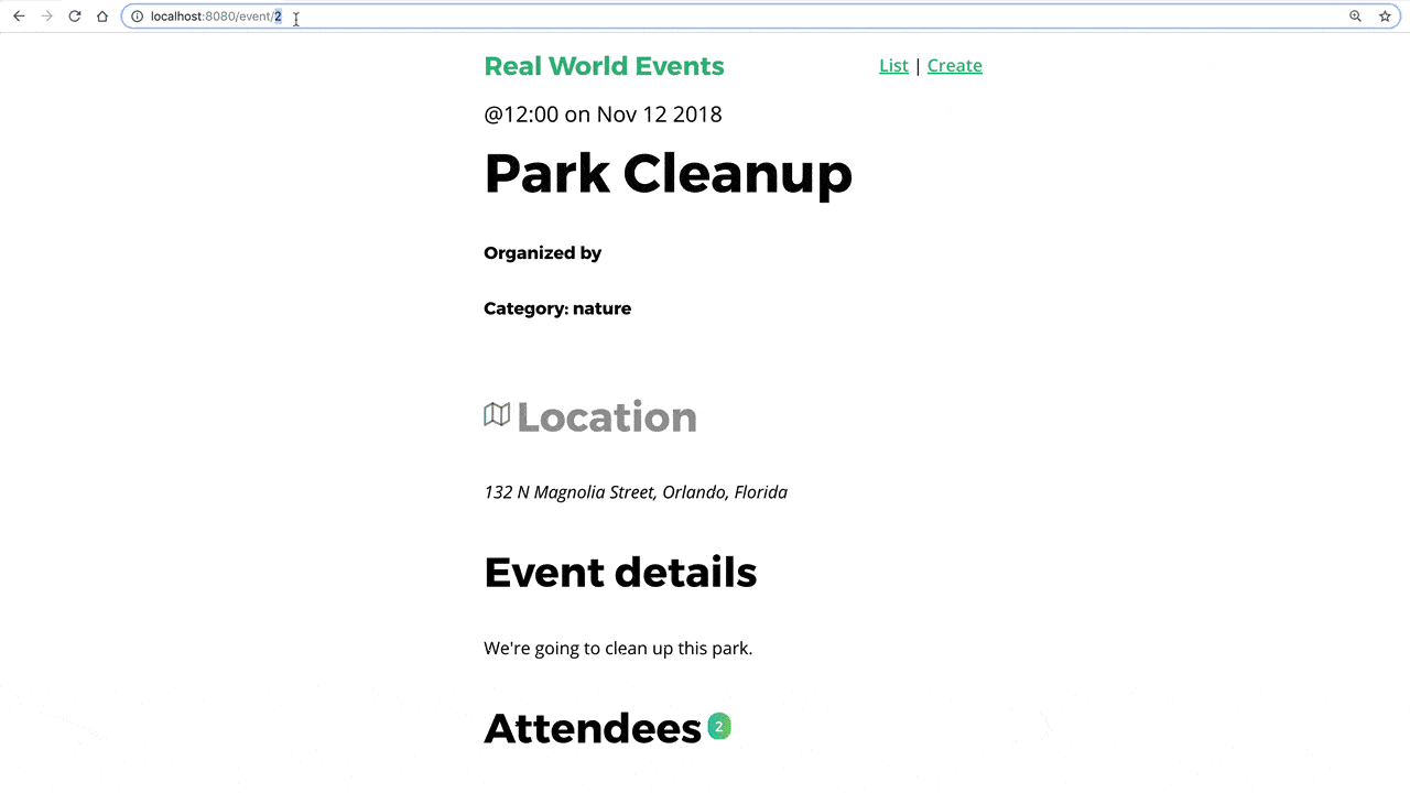
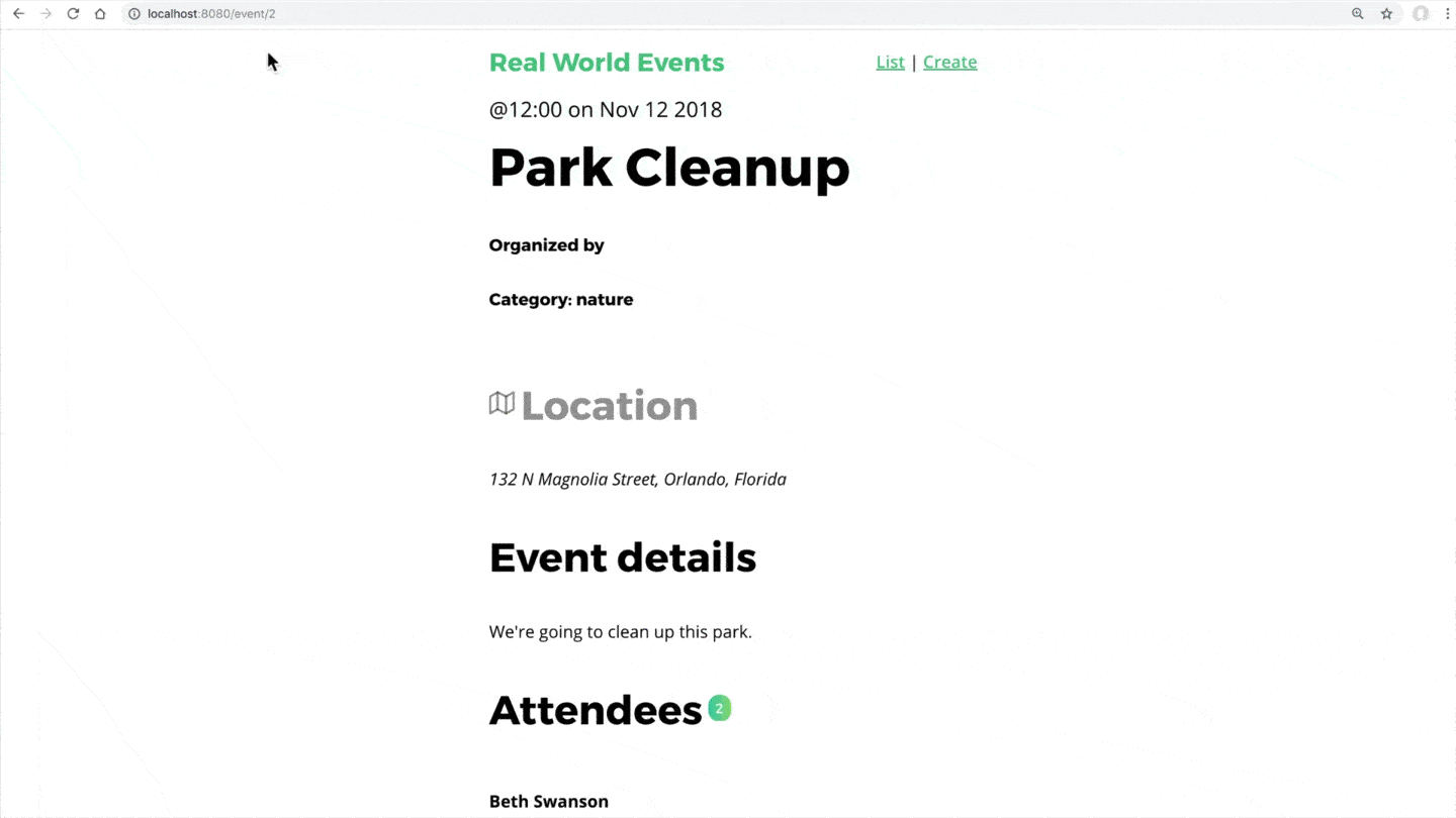
Once we pull up that localhost in our browser, we can see our app.
On the home page, we’re displaying a list of events that we’re pulling in with our API. When I click on an event, we’re taken to the event-show page, which displays the full details of that event. We’re using Vue Router for our navigation, which also allows us to navigate to the event-create page, where we can create an event. We’re alsoalso displaying notifications at the bottom right of our app whenever a form is submitted, or an API call error happens.
Now that we’ve seen the app running live, let’s look the project itself.
App Tour
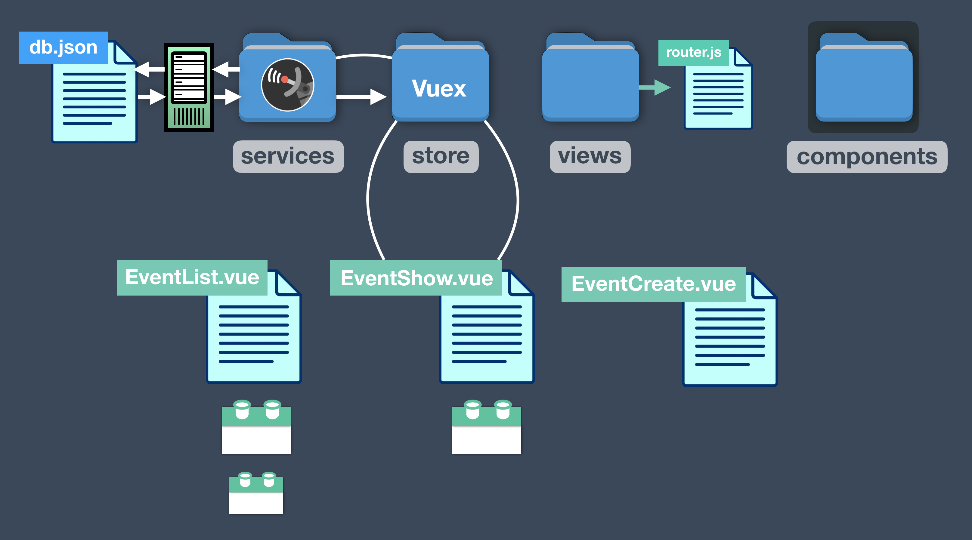
We created the app using the Vue CLI, which gave us this directory structure.
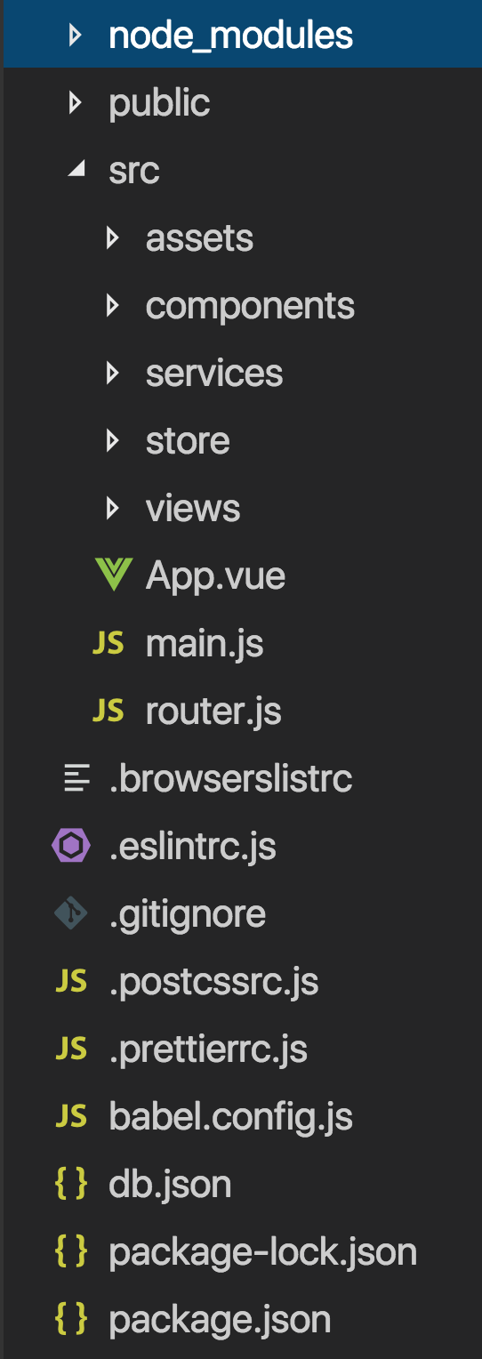
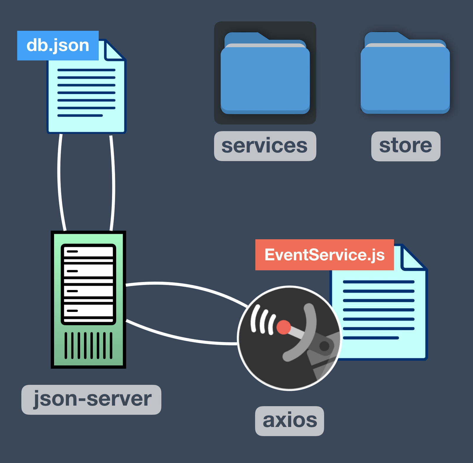
Primarily, what we’re concerned about our db.json file and these directories:
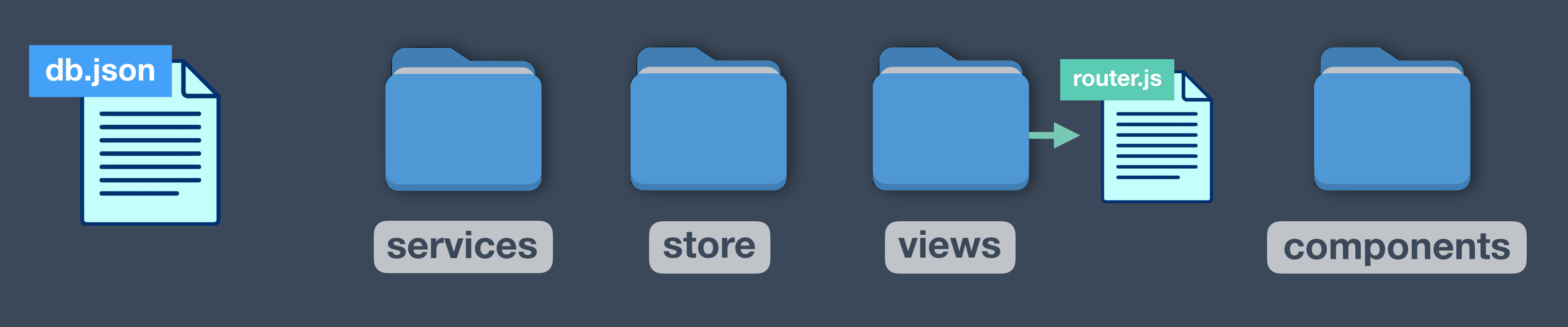
Let’s explore what’s happening in these files.
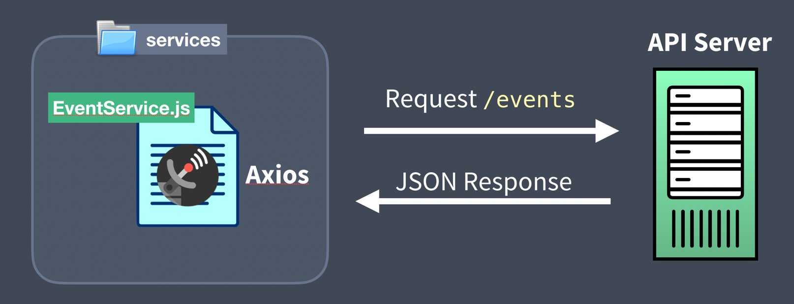
In our services directory, we have EventService.js , which creates our single Axios instance and which uses json-server to make calls to and from our mock database, which is db.json .
The store directory contains all of our Vuex code, including store.js , which is the root state, off of which branch three Vuex modules: event.js , notification.js , user.js . These modules have their own State, Mutations and Actions, which use our EventService to perform API calls.
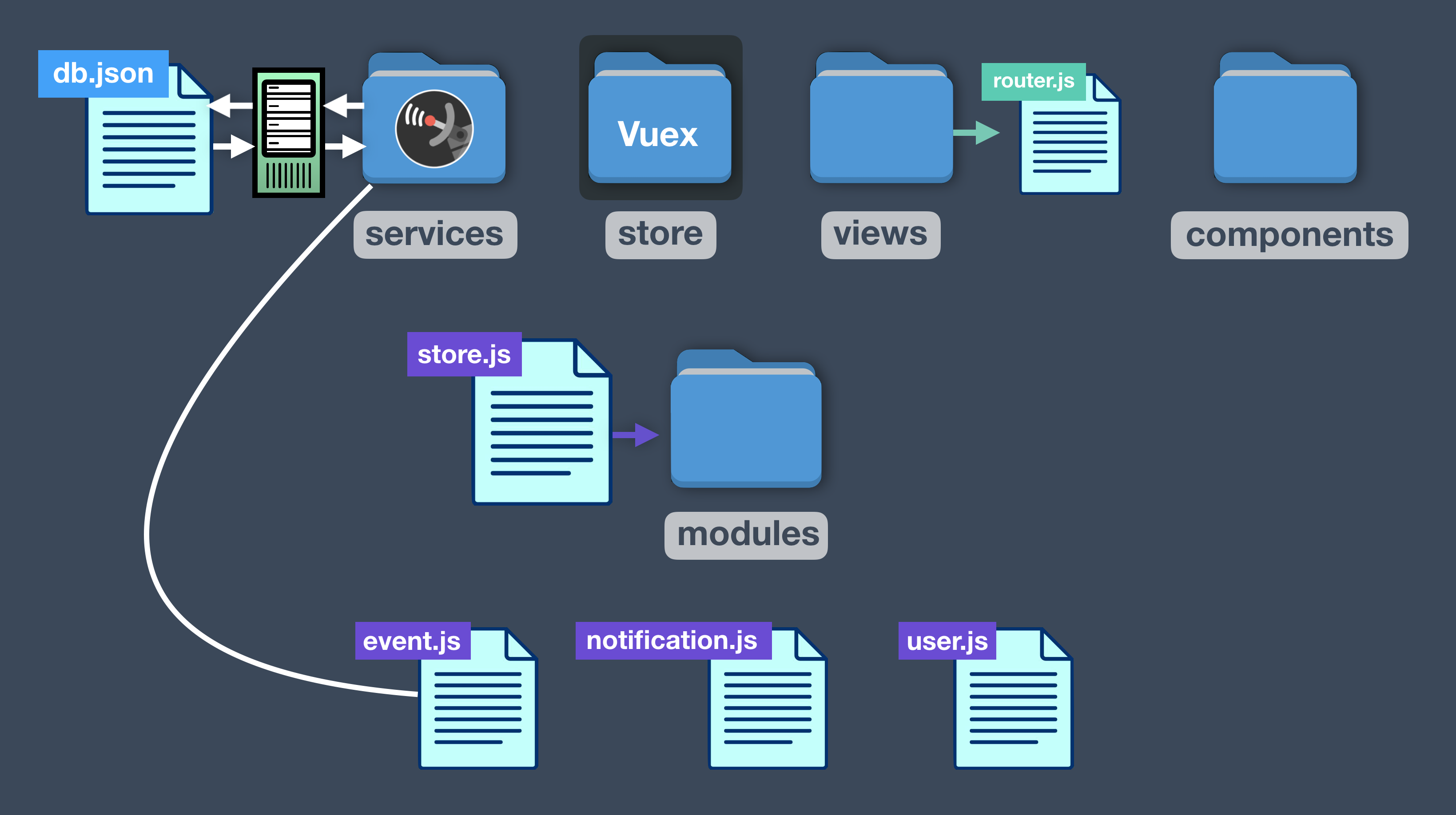
In our views directory we have three components that are loaded when we route to those views, some of which have child components. These view-level components include Vuex code as well.
Dive into the Code
Hopefully you have a better sense of what is happening in our project. We encourage you to download the app and explore these files if you haven’t yet taken our Real World Vue and Mastering Vuex courses. And if any of these prerequisite concepts are unfamiliar to you, you’ll want to visit those courses before moving on to this on.
Progress Bar: Axios Interceptors
Isn’t it frustrating when you click on a link and nothing seems to happen? The Internet isn’t always fast (or dependable), which is why it’s important to design user-friendly applications that give feedback when parts of your webpage are still loading. In this lesson and the next four, we’ll install a progress bar, and show a few different ways to control it in a Vue application.
In this video we’ll show one way to implement a progress bar by:
- Installing NProgress
- Using Axios Interceptors
 Problem: Our API calls might not always be super fast
We need to let our users know the data is on the way, and have something happen when they click a link that requires an API call.
If you’re building the event app alongside us, just know that after we install the NProgress bar, we’ll be showing you three different ways to implement it.
- Axios interceptors (in this lesson)
- In-component route guards (next lesson)
- Global and per-route guards (lesson after that)
Each of these solutions are 100% worth learning, as they’ll teach you additional Vue syntax.
 Solution #1: Progress Bar using API Interceptors
There are many ways to implement a progress bar, and we’re going to start with the simplest one. This one doesn’t even require you to use Vuex.
As I mentioned, we’re going to use NProgress, a progress bar library, inside our app. Let’s install it from the command line, though I could also have used the Vue CLI user interface:
$ npm install nprogress
Now that we have NProgress installed we need to include the CSS for it inside our main.js :
 /src/main.js
    ...
    import store from './store/store'
    import BaseIcon from '@/components/BaseIcon'
    import 'nprogress/nprogress.css' // <-----
Using Axios Interceptors
In our example app our API calls are all made inside EventService, and all use the Axios library.
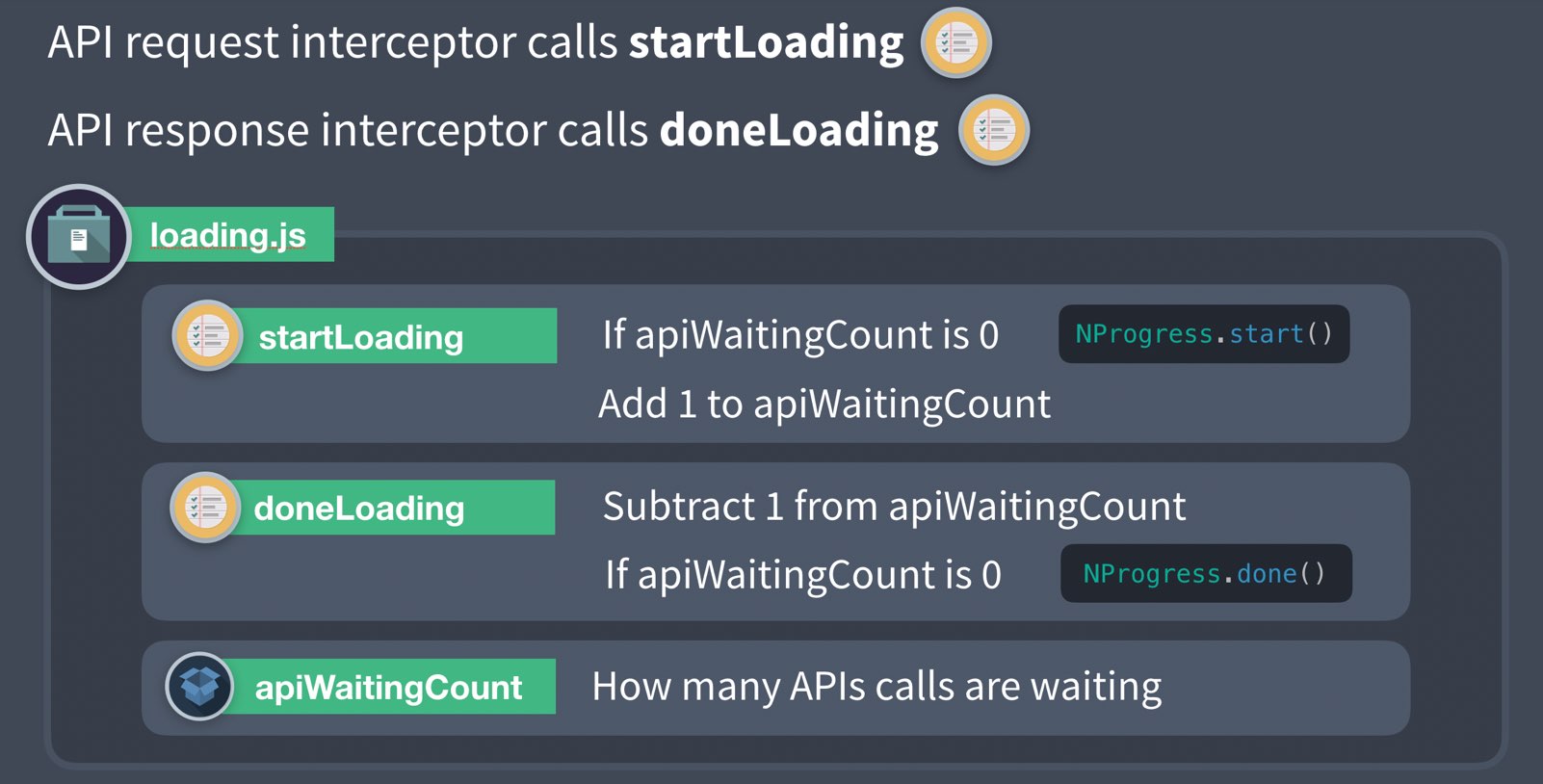
Axios Interceptors allow us to intercept our requests and responses adding additional functionality, like starting and stopping a progress bar as shown below:

As you can see, we call NProgress.start() to start our progress bar and NProgress.done() to finish the animation. As you might imagine, Axios Interceptors can be useful for many things including:
- On request to set proper authorization tokens.
- On response to format or filter data before it reaches into your app.
- On response to catch 401 not authorized responses.
Let’s figure out how to use Interceptors in our example app. Our EventService currently looks like this:
/src/services/EventService.vue
    import axios from 'axios'

    const apiClient = axios.create({  // The single Axios instance we use for calls
      baseURL: `http://localhost:3000`,
      withCredentials: false, // This is the default
      headers: {
        Accept: 'application/json',
        'Content-Type': 'application/json'
      }
    })

    export default {
      getEvents(perPage, page) {
        return apiClient.get('/events?_limit=' + perPage + '&_page=' + page)
      },
      getEvent(id) {
        return apiClient.get('/events/' + id)
      },
      postEvent(event) {
        return apiClient.post('/events', event)
      }
    }
Adding Axios Interceptors to our code looks like this:
/src/services/EventService.vue
    import axios from 'axios'
    import NProgress from 'nprogress' // <--- Import the library

    const apiClient = axios.create({ ... })

    apiClient.interceptors.request.use(config => { // Called on request
      NProgress.start()
      return config
    })
    apiClient.interceptors.response.use(response => { // Called on response
      NProgress.done()
      return response
    })

    ...
As you can see, Axios interceptors act like middlemen (or middleware) allowing you to run some code when a request is made, or when a response is received.
Before we jump into our browser to check it out, we need to simulate a slow API server. We are using json-server as a development API and our application ships with a db.json file with fake data. If you haven’t installed it, you can get it by running npm install -g json-server . We’ll run our API server with:
$ json-server -d 1500 db.json
With the -d 1500 the API server will add a 1.5 second (1,500 millisecond) delay before returning our data. Now in our browser we see that our progress bar ticks along for 1.5 seconds, before completing the request and populating our data.
This is a valid solution and may work great for you, but there are two caveats you should be aware of.
 Caveat #1 - Not optimal for multiple API calls at the same time
This works great until we are using two or more API calls to load a page. In this scenario we’d want to continue to show the progress bar until all API calls return. A common solution to this problem is to create a loading Vuex module that holds the loading State. Here’s what that might look like:
If you’d like to continue down this road, you might want to check out this post for another example implementation (Yes, the post is in TypeScript, but it’s still quite readable even if you’re not familiar).
Caveat #2 - Templates get rendered before the API call is returned
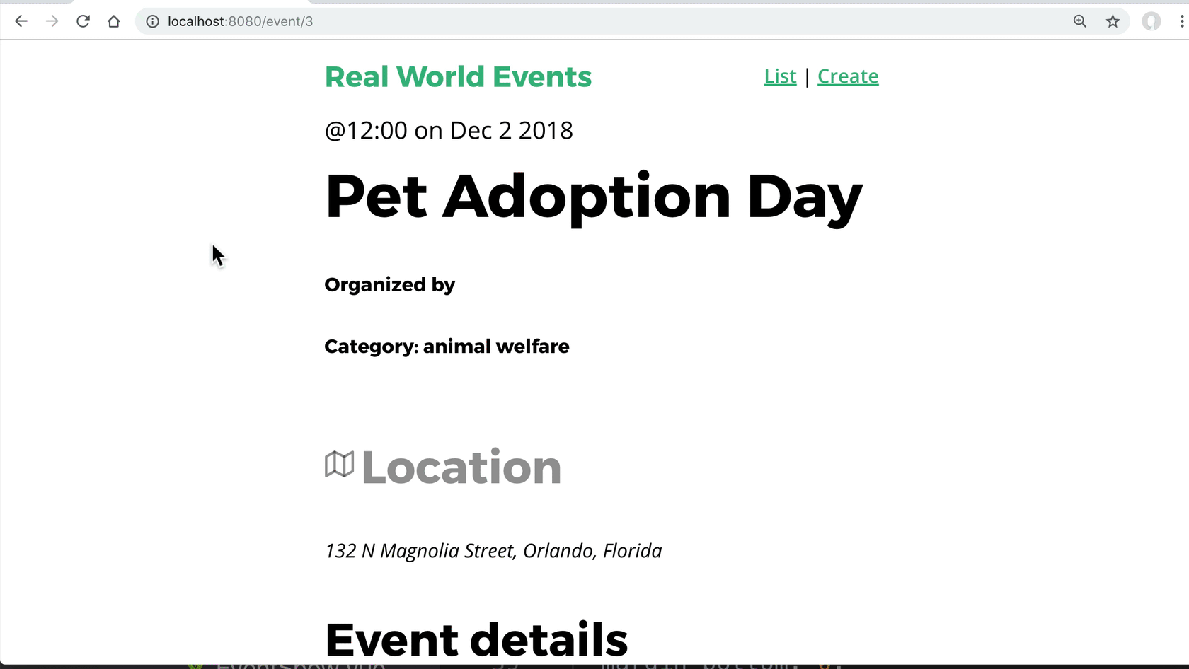
On some webpages, it’s not a great user experience to see the page before the data is populated in it reactively. You’ll notice when we load up /event/5 (an event that we have to pull from the API) that the page loads empty before the data flashes onto the screen 1.5 seconds later.
This is NOT an optimal user experience since the user sees the page broken before they see it working.
Over the next two lessons we’ll work towards a solution that solves for both of these issues. First, we’ll learn about In-Component Route Guards and then using Global with Per-Route Guards.
In-Component Route Guards
In this lesson we’ll use In-Component Route Guards to implement our progress bar, and ensure it only renders the template once we’re done fetching data from our API. The goal is to provide a better user experience.
Problem: When our API is slow our page looks broken
We need a way to account for a slow internet connection. In the previous lesson, we showed how to implement a progress bar using Axios Interceptors. In this lesson, we have a second potential solution so we’ll be starting from scratch. If you’re coding along with us you should know this isn’t the final solution we’re going to use in our example app, but it’s important to know how these Route Guards work.
Solution #2: In-Component Route Guards
We’ll need to have NProgress, our progress bar library installed. If you haven’t done that yet (from the last lesson) you’ll want to run:
$ npm install nprogress
and then add the CSS for NProgress:
/src/main.js
import 'nprogress/nprogress.css'
Vue gives us many different component lifecycle hooks, like created() , mounted() , updated() , etc. When using Vue Router, we get three more component hooks called ( Route Navigation Guards )[https://router.vuejs.org/guide/advanced/navigation-guards.html#in-component-guards]:
    beforeRouteEnter(routeTo, routeFrom, next)
    beforeRouteUpdate(routeTo, routeFrom, next)
    beforeRouteLeave(routeTo, routeFrom, next)
We can define each of these inside our components, just like lifecycle hooks. First, let’s learn about the Parameters:
- routeTo - This refers to the route that is about to be navigated to.
- routeFrom - This refers to the route that is about to be navigated away from.
- next - This is a function that must be called in each of them to resolve the hook, and continue navigation.
Now let’s take a closer look at when each of these is called when it’s defined inside a component.
beforeRouteEnter(routeTo, routeFrom, next)
This is called before the component is created. Since the component has not been created yet, we can’t use the this keyword here.
beforeRouteUpdate(routeTo, routeFrom, next)
This is called when the route changes, but is still using the same component. An example here is when we paginate, and we switch from page to page but still using the same component. It does have access to “this”.
beforeRouteLeave(routeTo, routeFrom, next)
This is called when this component is navigated away from. It does have access to “this”.
As I mentioned above, each of these methods at some point must call next() . Here’s what you can do with next:
**next()** - Called by itself will continue navigation to routeTo .
**next(false)** - Cancels the navigation.
**next('/')** - Redirects page to the / path.
**next({ name: 'event-list' })** - Redirects to this named path
Any options you might put in a router-link 's to property you can send into next() for redirecting navigation.
beforeRouteLeave Example
If I want to confirm that the user wants to leave the page before saving changes, I might use the following code:
    beforeRouteLeave(routeTo, routeFrom, next) {
      const answer = window.confirm(
        'Do you really want to leave? You have unsaved changes!'
      )
      if (answer) {
        next() // <-- Confirms the navigation
      } else {
        next(false) // <-- Cancels the navigation
      }
    },
How might we use these with our EventShow component
At the moment EventShow looks like this:

Notice that there’s no progress bar and the tempate shows up on the page before the data gets returned from the API call. We only want to see the template when the data arrives.
We have three steps to implement our solution:
- Start the progress bar when routing to the component.
- Make the API call, using the fetchEvent action.
- When API returns finish progress bar.
- Render the component template.
Our EventShow ****component ****currently looks like this:
/src/views/EventShow.vue
    <script>
    import { mapState, mapActions } from 'vuex'

    export default {
      props: ['id'],
      created() {
        this.fetchEvent(this.id)
      },
      computed: mapState({
        event: state => state.event.event
      }),
      methods: mapActions('event', ['fetchEvent'])
    }
    </script>
To use NProgress inside of this component, we need to do a few things here:
/src/views/EventShow.vue
    <script>
    import { mapState, mapActions } from 'vuex'
    import NProgress from 'nprogress' // <--- Include the progress bar
    import store from '@/store/store' // <--- Include our Vuex store

    export default {
      props: ['id'],

      beforeRouteEnter(routeTo, routeFrom, next) {
        NProgress.start() // Start the progress bar
        store.dispatch('event/fetchEvent', routeTo.params.id).then(() => {
          NProgress.done() // When the action is done complete progress bar
          next() // Only once this is called does the navigation continue
        })
      },

      computed: mapState({
        event: state => state.event.event
      })
    }
    </script>
There’s a lot going on here, so let’s break it down.
First, we include NProgress and the Vuex Store. Then we use the beforeRouteEnter navigation guard. This guard is called before the component is created, which means it doesn’t have access to this . That’s why we needed to import the store and why we’re calling the action explicitly and not using mapAction , which I’ve removed.
We start the progress bar, dispatch the fetchEvent Action, and then when the Action is done we finish the progress bar and call next() , which tells Vue to continue navigation to this component. Until next() is called, the web app is going to wait.
If we look in the browser, we see the progress bar working, but it doesn’t seem to be waiting for our API call to be finished before finishing the progress bar. What is going on?
Well, inside our event Module, in the fetchEvent action we aren’t returning anything that we can call then() on. See how the EventService isn’t returned?
/src/store/modules/event.js
    ...
      fetchEvent({ commit, getters, dispatch }, id) {
        var event = getters.getEventById(id)
        if (event) {
          commit('SET_EVENT', event)
        } else {
          EventService.getEvent(id) // <--- No return here!
            .then(response => {
              commit('SET_EVENT', response.data)
            })
            ...
We can add a return so that line looks like this:
return EventService.getEvent(id)
When we look in our browser, the component now waits until the data is returned before calling next() and rendering the component.
Once again we have a valid solution, but there is one more way to do this which I know I liked the most. If you’re coding along with us, the next lesson is where you’ll want to follow along.
Global and Per-Route Guards
In this lesson we’ll learn how to use Global and Per-Route Guards to provide a progress bar when our application has slow internet API calls. This is the official solution we’ll be using in our example app, so now would be a great time to download our example app and get it up and running if you want to follow along.
Getting the App Setup (optional)
Here are the commands you’ll want handy once you have it installed. I’m assuming you already have npm installed.
To install dependencies:
$ npm install
To get json-server, which we use for our mock database
$ npm install -g json-server
To run the mock database (with a 1.5 second delay)
$ json-server -d 1500 --watch db.json
To run the server:
$ npm run serve
Problem: Our API calls might not always be super fast
The problem we’re trying to solve is still to account for the internet not always being fast. Right now when we view an event here’s what we see (and what you should see):
As you can see, it looks kinda broken. The template is loaded blank, and then the data pops in.
Solution #3: Global and Per-Route Guards
For this solution, we’ll be starting from scratch again, so we’ll need to install the NProgress library:
$ npm install nprogress
And then add the NProgress stylesheet as an extra import statement:
/src/main.js
import 'nprogress/nprogress.css'
Then we’ll use two new Global Route Guards inside our router.js and make the progress bar appear on every page of our app.
/src/router.js
    ...
    import EventShow from './views/EventShow.vue'
    import NProgress from 'nprogress' // <--- include the library

    Vue.use(Router)

    const router = new Router({ ... })

    router.beforeEach((routeTo, routeFrom, next) => {
      // Start the route progress bar.
      NProgress.start()
      next()
    })
    router.afterEach(() => {
      // Complete the animation of the route progress bar.
      NProgress.done()
    })

    export default router
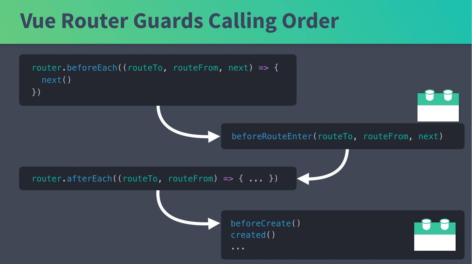
As you can see, now we’re storing our router in a router constant, and calling two Global Route Guards which start and stop our progress bar on each route. In case you’re wondering what order all these hooks get called, it looks like this:
If we go into our browser we can see this on every page, and it almost works like we want it:

As you can see, the progress bar finishes loading before our API gets loaded, just like before! We need a way to not load the component onto the page until it’s done loading, and only then finish the progress bar.
We need another Route Guard for this, and we could use beforeRouteEnter in our EventShow component, but I’m going to solve this a different way. This time I’ll use a Route Guard inside our router, rather than inside our component.
/src/router.js
    ...
    import EventShow from './views/EventShow.vue'
    import NProgress from 'nprogress'
    import store from '@/store/store' // <--- Include our store

    Vue.use(Router)

    const router = new Router({
      mode: 'history',
      routes: [
        ...
        {
          path: '/event/:id',
          name: 'event-show',
          component: EventShow,
          props: true,
          beforeEnter(routeTo, routeFrom, next) { // before this route is loaded
            store.dispatch('event/fetchEvent', routeTo.params.id).then(() => {
              next()
            })
          }
        }
      ] ...
By including our Vuex Store and using the Per-Route inside our router.js we can dispatch our fetchEvent Action (that we normally would call from our EventShow ), and only once that’s returned will we allow the navigation to continue by calling next() . However, in order for then() to get called when the API is returned we need to make sure this action returns a promise (we did this once before in the previous lesson if you’re following along):
/src/store/modules/event.js
    ...
      fetchEvent({ commit, getters, dispatch }, id) {
        var event = getters.getEventById(id)
        if (event) {
          commit('SET_EVENT', event)
        } else {
          return EventService.getEvent(id) // <--- Add return here
            .then(response => {
              commit('SET_EVENT', response.data)
            })
            ...
Now that we’re calling the Action from our router, we no longer need to call it from our EventShow action. This file shrinks a bit:
/src/views/EventShow.vue
    ...
    <script>
    import { mapState } from 'vuex'

    export default {
      props: ['id'],
      computed: mapState({
        event: state => state.event.event
      })
    }
    </script>
And if I look in the browser, everything is working as expected:
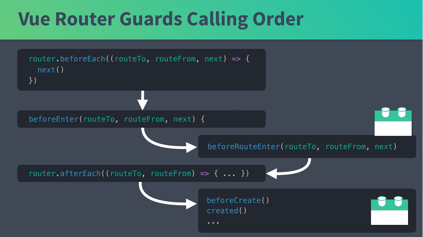
In case you’re wondering, here’s the calling order:
 Architectural Choice: Removing Vuex from our Components
Before we move on to the other components, there’s some fun refactoring we could do to this EventShow page. We could completely remove Vuex from EventShow , and send in event as a prop from our new Per-Route Guard. Our EventShow component ends up shrinking a lot:
/src/views/EventShow.vue
    ...
    <script>
    export default {
      props: {
        event: {  // Simply receive the event to render
          type: Object,
          required: true
        }
      }
    }
    </script>
    ...
Yeah, that’s it. Awesome huh? It’s now just a component that renders a single prop that is passed in. How does it get passed in? See below:
/src/router.js
    const router = new Router({
      mode: 'history',
      routes: [
        ...
        {
          path: '/event/:id',
          name: 'event-show',
          component: EventShow,
          props: true, // Set params to props
          beforeEnter(routeTo, routeFrom, next) {
            store.dispatch('event/fetchEvent', routeTo.params.id).then(event => {
              routeTo.params.event = event // <--- Set the event we retrieved
              next()
            })
          }
        }
In the code above, we now take the event which is returned and set it to the value of routeTo.params.event . Then after next() is called. Since props: true is set for the component, params.event gets sent in as the event prop, like we were doing with id before.
Notice how our then callback now has an event parameter, which is filled by the event that returns from the API. To make sure the value gets sent in the callback, we’ll need to add two returns to our event Module:
/src/store/modules/event.js
    ...
      fetchEvent({ commit, getters, dispatch }, id) {
        var event = getters.getEventById(id)
        if (event) {
          commit('SET_EVENT', event)
          return event // <--- Added return here
        } else {
          return EventService.getEvent(id)
            .then(response => {
              commit('SET_EVENT', response.data)
              return response.data  // <--- Added a return here
            })
Now when our fetchEvent A ction is called, it returns our event so our router can send it into EventShow as a prop. Pretty nifty, huh? It works just the same, but now the EventList component has one less dependency, making it easier to test and scale.
 Let’s Revue
In this lesson we learned how to use both Global Route Guards and Per-Route Guards which get called upon navigation before our component is created. These can be very useful when we need to fetch data from an API, or when we’re doing any type of authentication. In the next lesson we’ll finish up this implementation, building our progress bar into both our EventList and EventCreate components.
Completing our Progress Bar
In the previous lesson we learned how to use Global Route Guards and per-route Guards to implement our progress bar when we show events using the EventShow component. Now let’s build upon that to get the progress bar working with EventList and EventCreate . Both require slightly different implementations.
 Problem: We need EventList to use our Progress Bar
At the moment our EventList looks like this:
As you can see our progress bar starts and finishes instantly, which is not what we want. We want our progress bar to run and finish when our API call is returned and the data is loaded into the template.
In order to do this, there are a few things we need to do:
- Refactor the perPage variable into our state.
- Modify the router.js file
- Use beforeRouteEnter and beforeRouteUpdate in the EventList component.
Step 1: We need perPage to be in the state
We needed some way to keep track of how many events to display per page, and previously we used a local constant called perPage in our EventList component.
Declaring this.perPage = 3 in our created() lifecycle hook added perPage as a local constant we could access in other methods (like hasNextPage() ).
See below, this is the current state of our EventList.vue:
/src/views/EventList.vue
    <script>
    import EventCard from '@/components/EventCard.vue'
    import { mapState } from 'vuex'

    export default {
      components: {
        EventCard
      },
      created() {
        this.perPage = 3

        this.$store.dispatch('event/fetchEvents', {
          perPage: this.perPage,
          page: this.page
        })
      },
      computed: {
        page() {
          return parseInt(this.$route.query.page) || 1
        },
        hasNextPage() {
          return this.event.eventsTotal > this.page * this.perPage
        },
        ...mapState(['event', 'user'])
      }
    }
    </script>
In a minute we’re going to do what we did in the previous lesson inside EventShow , where we moved the Vuex Action outside of the created() lifecycle hook and into a route guard.
Since the route guards run before the component is instantiated, this does not exist yet. So, we need to move perPage into the Vuex State. You might think it belongs in the State, and we never should have put it in the component to begin with. However, there’s nothing wrong with placing it in either place.
/src/store/modules/event.js
    ...
    export const state = {
      events: [],
      eventsTotal: 0,
      event: {},
      perPage: 3
    }
    ...
    export const actions = {
      ...
      fetchEvents({ commit, dispatch, state }, { page }) {
        return EventService.getEvents(state.perPage, page)
          ...
All we changed here is adding perPage to the event State with a default of 3, and then we extracted the state parameter from the context object, and used the State inside our getEvent 's call. We also added a return to our EventService so we can only render our EventList component when the API call is finished.
That’s our next step:
Step 2 - Modify the router
At the moment, our router code looks like this:
/src/router.js
    ...
    const router = new Router({
      mode: 'history',
      routes: [
        {
          path: '/',
          name: 'event-list',
          component: EventList
        },
        ...
Here we want to dispatch the fetchEvents Action before the component is loaded like we did with EventShow with beforeEnter .
With all we’ve learned, you might think the code below would be what we need. However, This won’t work! Take a look at this code below, and then we’ll learn why it won’t work.
/src/router.js
    ...
    const router = new Router({
      mode: 'history',
      routes: [
        {
          path: '/',
          name: 'event-list',
          component: EventList,
          beforeEnter(routeTo, routeFrom, next) {
            const currentPage = parseInt(routeTo.query.page || 1)
            store
              .dispatch('event/fetchEvents', {
                page: currentPage
              })
              .then(() => {
                ...
If I were to use this code to call fetchEvents it would only get called when the route is initially loaded. Then when we hit the next page link, nothing would happen. ****Our route gets updated when we click on the next page, but since the component is not completely reloaded, fetchEvents doesn’t get called.
So we need another way to ensure fetchEvents is called both when the page is navigated to, and when we paginate.
For now, let’s finish up the code we need in router.js by setting props: true because we’ll be setting our current page as a parameter to pass in as a prop.
/src/router.js
    ...
    const router = new Router({
      mode: 'history',
      routes: [
        {
          path: '/',
          name: 'event-list',
          component: EventList,
          props: true // We'll set the page parameter, so we want to send it in as a prop
        },
        ...
Step 3 - Use beforeRouteEnter and beforeRouteUpdate in the EventList component
From our lesson on In-Component Route guards we learned that beforeRouteEnter is called when the component is created and beforeRouteUpdate is called when the route changes, but we’re still using the same component. This is what we need to ensure fetchEvents is called when we paginate.
Since both beforeRouteEnter and beforeRouteUpdate need to essentially call the same code, I’m going to extract this duplicate code into a function at the top of our EventList component, like so:
/src/views/EventList.js
    <script>
    import EventCard from '@/components/EventCard.vue'
    import { mapState } from 'vuex'
    import store from '@/store/store'

    // Moved the current page & action call outside the component
    function getPageEvents(routeTo, next) {
      const currentPage = parseInt(routeTo.query.page || 1)
      store
        .dispatch('event/fetchEvents', {
          page: currentPage
        })
        .then(() => {
          // pass it into the component as a prop, so we can print next pages
          routeTo.params.page = currentPage
          next()
        })
    }
    export default {
      props: {
        page: { // current page gets passed in as a prop
          type: Number,
          required: true
        }
      },
      components: {
        EventCard
      },
      beforeRouteEnter(routeTo, routeFrom, next) { // Before we enter the route
        getPageEvents(routeTo, next)
      },
      beforeRouteUpdate(routeTo, routeFrom, next) { // Before we update the route
        getPageEvents(routeTo, next)
      },
      computed: {
        hasNextPage() {
          return this.event.eventsTotal > this.page * this.event.perPage
        },
        ...mapState(['event', 'user'])
      }
    }
    </script>
We’ve changed a bunch in this file from before (if you want to look at the before, scroll up).
First, you’ll notice that we extracted our currentPage parsing code and Action call into a function called getPageEvents . We call this function from our beforeRouteEnter and beforeRouteUpdate route guards. These fire before we enter a route and before we update the route, which solves our problem of our Action only called once with beforeEnter .
You’ll also notice that there’s now a page prop, which contains the current page we’re on, parsed and passed in through getPageEvents .
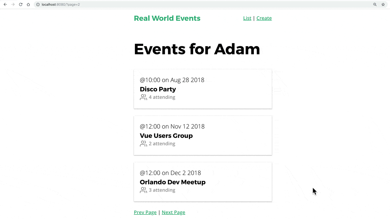
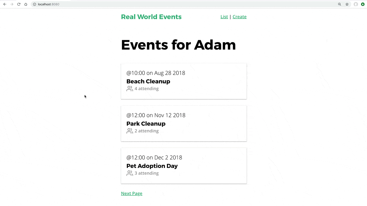
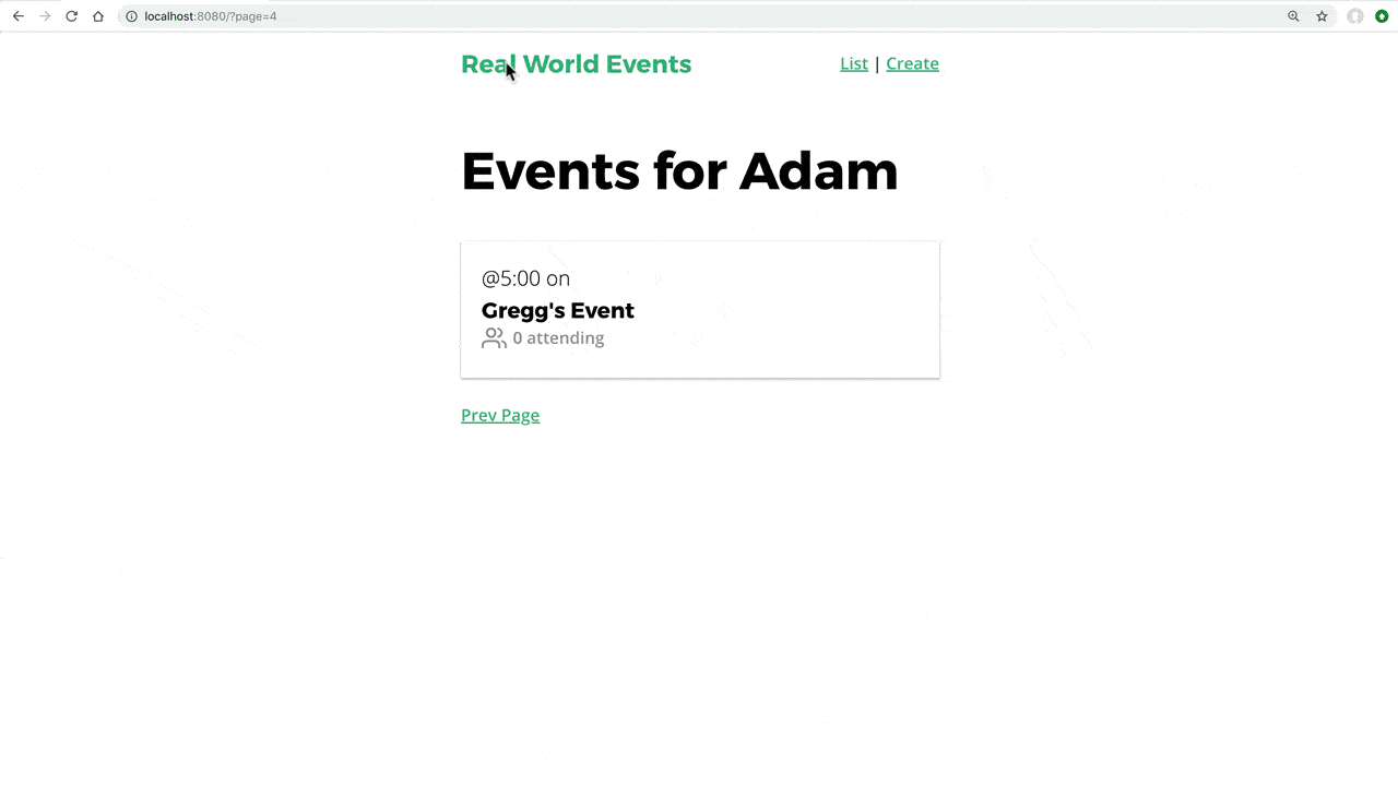
If we jump into the browser, everything is working as intended: The Progress bar flows across the top of the screen when we view the event list, and also works when we use the pagination links.
 You might have noticed:
We didn’t remove Vuex from the component.
Before we move on, I want to recognize that we did not remove Vuex from our component code in EventList, like we did with EventShow. We certainly could have passed EventList all of the props it needed to load through the router, like so:
/src/router.js
    ...
      routes: [
        {
          path: '/',
          name: 'event-list',
          component: EventList,
          props: route => ({
            page: route.params.page,
            perPage: route.params.perPage,
            events: route.params.events,
            eventTotal: route.params.eventTotal
          })
        },
        ...
However, we don’t have to go down this road, and set all these values. We already had to load in Vuex inside EventList for beforeRouteUpdate and beforeRouteEnter , so we can keep the Vuex code the same.
Again, this is a matter of preference.
Using the Progress Bar with EventCreate
When someone clicks submit on our EventCreate page, once again we need to make sure the Progress Bar starts, to ensure a good user experience. Updating this only requires adding NProgress to EventCreate.
Our EventCreate currently looks like this:
/src/views/EventCreate.js
    <script>
    import Datepicker from 'vuejs-datepicker'

    export default {
      ...
      methods: {
        createEvent() {
          this.$store
            .dispatch('event/createEvent', this.event)
            .then(() => {
              this.$router.push({
                name: 'event-show',
                params: { id: this.event.id }
              })
              this.event = this.createFreshEventObject()
            })
            .catch(() => { })
        },
        ...
We need to do two things here. We need to start the progress bar before we dispatch the event shown here, and we need to stop the progress bar if our Action errors out.
/src/views/EventCreate.js
    <script>
    import Datepicker from 'vuejs-datepicker'
    import NProgress from 'nprogress' // <--- Include NProgress

    export default {
      ...
      methods: {
        createEvent() {
          NProgress.start()  // <-- Start the progress bar
          this.$store
            .dispatch('event/createEvent', this.event)
            .then(() => {
              this.$router.push({
                name: 'event-show',
                params: { id: this.event.id }
              })
              this.event = this.createFreshEventObject()
            })
            .catch(() => {
              NProgress.done() // <-- if errors out stop the progress bar
            })
        },
        ...
As you can see, we’re just starting the NProgress bar and stopping it if we error out. When the Action is successful, we still use the router to push to the EventShow view, just like we were before.
When our router follows this path it will call NProgress.start() again. But since it’s already running, nothing new will happen and it will finish loading once the fetchEvent action is complete.
Here’s it working.

Let’s Revue
We now finished implementing our progress bar in our example app, and if our API calls ever take a while to return our user interface gives a great user experience.
Error Handling
It’s inevitable that people will end up navigating to pages on our website that don’t exist or used to exist. In our event application let’s figure out how to deal with this and also when we navigate to events that do not exist.
Problem: The Generic Not Found 404
Right now when I go to a URL that doesn’t exist I get a blank page with no information about what is going on.
Solution: A Not Found Component
Let’s create a generic Not Found Component that we’ll redirect to when a path is accessed that doesn’t exist.
/src/views/NotFound.vue
    <template>
      <div>
        <h1>Oops!</h1>
        <h3>The page you're looking for is not here.
        </h3>
        <router-link :to="{ name: 'event-list' }">Back to the home page</router-link>
      </div>
    </template>
Now we need to render this component when we go to a catch-all route, by updating our router.js file:
/src/router.js
    import NotFound from './views/NotFound.vue'
    ...
    const router = new Router({
      mode: 'history',
      routes: [
        ...
        {
          path: '/404',
          name: '404',
          component: NotFound,
        },
        { // Here's the new catch all route
          path: '*',
          redirect: { name: '404' }
        }
      ]
    })
As you can see, we’re creating a 404 path and name which loads our NotFound component, and then we are redirecting to the 404 path when we hit our new catch-all route.
There is a reason we’re redirecting to our 404 page (rather than just rendering the component), which will become clear in a minute. Now when we load up a path that doesn’t exist, like /login, we get:
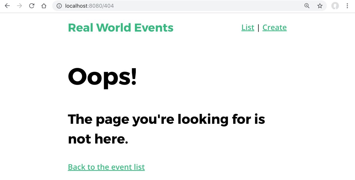
Looks great!
Problem: What about when we try to view a non-existent Event?
Right now, when we go to an event that doesn’t exist, like /event/1233 we see this:
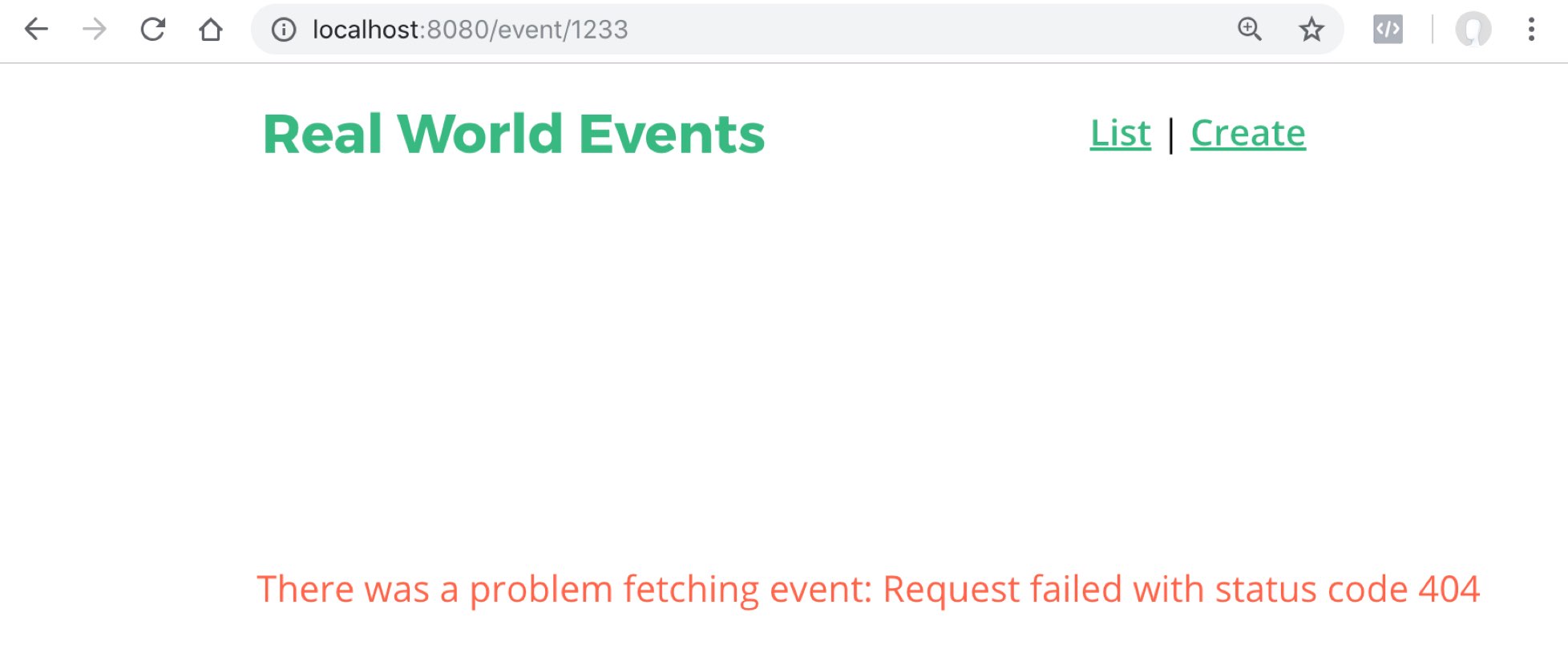
It’s not horrible, but nothing renders onto the page except a notification. A better solution would be to add onto our NotFound component and navigate the user there. The great part about navigation guards is that we can change where the user is navigating based on a condition (like if the event exists). Let’s try it!
Solution: Creating a 404 page for our EventShow
The solution kinda depends on you understanding our EventShow code, so you might want to watch the earlier videos if you start to get lost.
The first thing I’m going to do to make this work is to remove the catch in fetchEvent . We will catch the error further up the chain, and since we return request, we can catch errors up in our router, which we’ll do in a minute.
/src/store/modules/event.js
    ...
      fetchEvent({ commit, getters, dispatch }, id) {
        var event = getters.getEventById(id)
        if (event) {
          commit('SET_EVENT', event)
        } else {
          return EventService.getEvent(id)
            .then(response => {
              commit('SET_EVENT', response.data)
              return response.data
            })  // I just deleted the catch
        }
      }
    }
Then in the router I’m going to catch the error, and use the next() function to send navigation straight to the 404 route.
/src/router.js
    ...
      {
          path: '/event/:id',
          name: 'event-show',
          component: EventShow,
          props: true,
          beforeEnter(routeTo, routeFrom, next) {
            store
              .dispatch('event/fetchEvent', routeTo.params.id)
              .then(event => {
                routeTo.params.event = event
                next()
              })
              .catch(() => next({ name: '404', params: { resource: 'event' } }))
        },
        {
          path: '/404',
          name: '404',
          component: NotFound,
          props: true // I added this so we can receive the param as a prop
        },
        {
          path: '*',
          redirect: { name: '404', params: { resource: 'page' } }
                                  // I added this resource param here.
        }
    ...
You also should notice that I’m sending a resource parameter into our 404 component. This will allow me to write a more descriptive error message on our 404 page. In order to receive this param as a prop, I added props: true to my 404 path, added this param to our catch-all route configuration, and now I need to receive that param as an optional prop in my NotFound component.
/src/views/NotFound.vue
    <template>
      <div>
        <h1>Oops!</h1>
        <h3>The
          <template v-if="resource">
            {{ resource }}
          </template>
           page you're looking for is not here.
        </h3>
        <router-link :to="{ name: 'event-list' }">Back to the home page</router-link>
      </div>
    </template>
    <script>
    export default {
      props: {
        resource: {
          type: String,
          required: true
        }
      }
    }
    </script>
As you can see, if there is a resource passed in, then the verbiage is used in the user-friendly error message.
Now when we go to http://localhost:8080/event/123 we see:
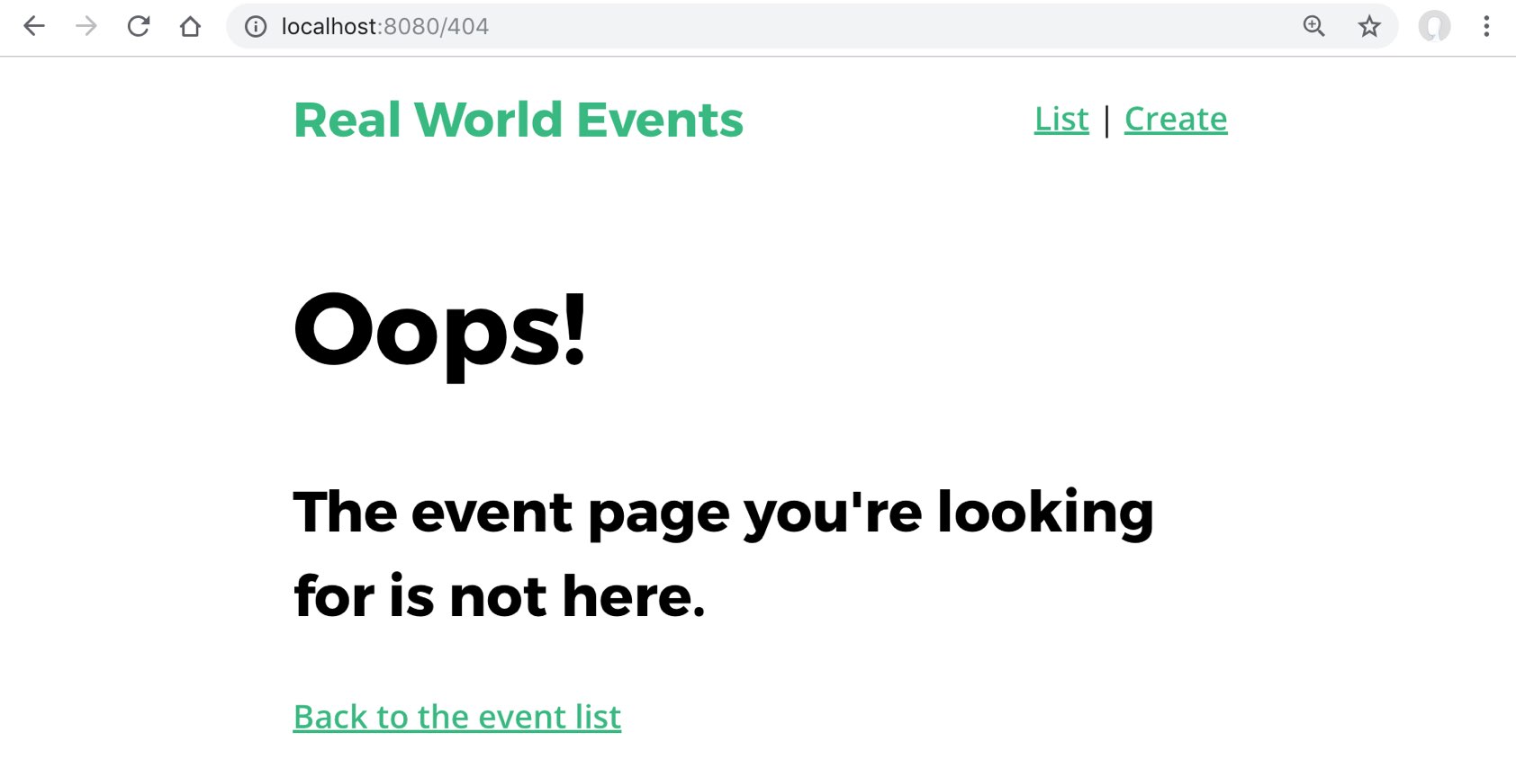
Great! Now when people link to events which don’t exist we have a really nice looking 404 page. Users hitting this page is inevitable since our users can delete events.
Problem: Errors won’t always be 404
The only issue with this solution is that we’re assuming all network errors we receive are 404 errors. However, what if the user’s Internet just died or they’re on a super slow connection? We don’t want to give them a 404 error if their Internet dies, but that’s what’s going to happen right now, so let’s fix this.
Solution: A NetworkIssue component
We’ll start by creating a new component:
/src/pages/NetworkIssue.vue
    <template>
      <div>
        <h1>Uh-Oh!</h1>
        <h3>It looks you're experiencing some network issues, please click the back button and try again.</h3>

        <router-link :to="{ name: 'event-list' }">Or go back to the event list</router-link>
      </div>
    </template>
We’ll add a simple route to our router:
/src/router.js
        {
          path: '/network-issue',
          name: 'network-issue',
          component: NetworkIssue
        },
Then in the router we need to check for the 404 error response from the API server, and send our response to the appropriate page.
/src/router.js
              .catch(error => {
                if (error.response && error.response.status == 404) {
                  next({
                    name: '404',
                    params: { resource: 'event' }
                  })
                } else {
                  next({ name: 'network-issue' })
                }
              })
Also, in EventService, let’s set a timeout, so that if our browser waits longer than 15 seconds for the API request to return, it’ll automatically throw an error that will lead to our NetworkIssue component.
/src/services/EventService.vue
    const apiClient = axios.create({
      baseURL: `http://localhost:3000`,
      withCredentials: false, // This is the default
      headers: {
        Accept: 'application/json',
        'Content-Type': 'application/json'
      },
      timeout: 15000
    })
Now if our API server goes down or takes too long to return, our users will get a network error rather than just getting a webpage that loads forever! See below for the improvements we just made:

Let’s Review
In this lesson we learned how to create a catch-all error page when the URL doesn’t match any of our routes. We then showed how to create a 404 Not Found page when the user navigates to an event that doesn’t exist, and then how to filter out those 404 errors from other network errors.
Reusable Form Components: BaseInput
In this tutorial, we’re going to learn about reusable form components. We’ll look at how we can take the form we currently have in our example app and break it apart into base form components. I’m assuming you already have an understanding of base and global components, which we covered in Real World Vue.
Scaling by Modularizing
If we take a look at our app’s EventCreate file, we’ll see there’s a form that is currently constructed with several input and select elements, along with a button to submit it.
But as our application grows, we could end up with multiple forms implemented by different developers, maybe even different front-end designers, and each one could look and behave differently. In our app, for example, we could eventually have a login form.
If the different parts of our form were encapsulated inside components, we could create a standard way of displaying input, select, and submit buttons. This way, as our application grows, it has a standardized user experience. Plus our forms would be more predictable, easier to manage, and to debug.
Creating a BaseInput
Let’s start with our input , which we’re currently using like this:
src/views/EventCreate.vue
    <div class="field">
      <label>Title</label>
      <input v-model="event.title" type="text" placeholder="Add an event title"/>
    </div>
Notice we have both label and input elements, which we’ll keep together in our BaseInput component since our input will always need a label.
src/components/BaseInput.vue
    <template>
      <div class="field">
        <label>Title</label>
        <input v-model="event.title" type="text" placeholder="Add an event title"/>
      </div>
    </template>
To make this label dynamic, let’s give our BaseInput a label prop, and bind it to our label element and to our input .
src/components/BaseInput.vue
    <template>
      <div>
        <label v-if="label">{{ label }}</label>
        <input
          v-model="event.title"
          type="text"
          placeholder="Add an event title"
        />
      </div>
    </template>

    <script>
    export default {
      props: {
        label: String
      }
    }
    </script>
Now we can pass a label into this component, like so:
src/views/EventCreate.vue
<BaseInput label="Title" />
This label prop will be used to determine if the label element needs to be rendered, and its text will be displayed within our component’s label element.
Handling our Input Value
As you can see with the code so far, we’re still using v-model="event.title" on our input to bind to the data in EventCreate. But v-model won’t work here because the BaseInput component won’t have its own event data. So how we do let our parent ( EventCreate ) know that there’s been a new value input into BaseInput component?
We can do this by listening for when a value was input, and then send it up to our parent.
So we can replace the v-model with @input="updateValue" , which will listen for when a value was input, then trigger the new updateValue method.
src/components/BaseInput.vue
    <template>
      <div>
        <label v-if="label">{{ label }}</label>
        <input
          :value="value" <!-- binds to our prop -->
          @input="updateValue" <!-- listens for input event and triggers method -->
          type="text"
          placeholder="Add an event title"
        />
      </div>
    </template>

    <script>
    export default {
      props: {
        value: [String, Number]
        label: String
      },
      methods: {
        updateValue(event) { // <-- method triggered by input event
          this.$emit('input', event.target.value)
        }
      }
    }
    </script>
The updateValue method allows us to emit whatever value was just input, so that our parent can use that value.
Notice how we also added a new prop: value . What is that doing there? We want to be able to take in an initial value as a prop, then display it as our input 's value , hence why we added this to our input :
        <input
          ...
          :value="value" <!-- binds to our value prop -->
          ...
        />
Now, when we actually use our BaseInput component, we’ll use v-model on it, like so:
src/views/EventCreate.vue
    <BaseInput
      label="Title"
      v-model="event.title"
    />
Using v-model here allows us to bind the value (that BaseInput emitted ) to EventCreate ’s event data and also pass that value back in to our BaseInput component.
If we look at the documentation for v-model , we’ll find that v-model="event.title" is really just syntactic sugar for:
    :value="event.title"
    @input="(value) => { event.title = value }"
In other words, when our BaseInput emits the input event, this triggers a function that takes the payload of that emission ( value ) and sets our EventCreate ’s event.title data equal to it. Then, we’re binding event.title to :value , which feeds the value back into BaseInput as a prop.
You may be wondering why we’re using this roundabout way of emitting the value up to the parent, which passes the value back in as a prop. Sure, BaseInput ’s updateValue method could’ve just set its own data value that the input could be bound to, but firstly, we want to avoid storing local state on these components, which are like the leaves on our component tree. Instead, these leaves can be fed the data they need from components that are closer to the trunk. We want BaseInput to behave like an input element, just with added features. It doesn’t need to store it’s own state, just like regular inputs don’t need to do that. Secondly, we want to be able to pass BaseInput an initial value.
For example, imagine if we used this BaseInput component on the edit view for a user’s profile. We’d want to be able to pass BaseInput the user value it needs, such as the user’s email, and use that as the starting value of the input field. Having a value prop like this allows us to do that.
Inheriting Attributes
We’re getting closer to making this BaseInput a standalone, reusable component. But notice how our type and placeholder attributes are still on this input element:
src/components/BaseInput.vue
    <input
      :value="value"
      @input="updateValue"
      type="text" <!-- still here -->
      placeholder="Add an event title" <!-- still here -->
    />
We could make BaseInput more flexible by cutting out these attributes from within the component, and adding them when we actually use the component, like so:
src/views/EventCreate.vue
    <BaseInput
      v-model="event.title"
      label="Title"
      type="text"
      placeholder="Add an event title"
    />
Now these attributes, type and placeholder , will be inherited by the BaseInput component. But there’s a problem with inheriting attributes like this. When we do so, those attributes are inherited by the root element, in this case the div that wraps everything:
src/components/BaseInput.vue
    <template>
      <div> <!-- this is where attributes will be inherited -->
        <label v-if="label">{{ label }}</label>
        <input
          :value="value"
          @input="updateValue"
        />
      </div>
    </template>
However, we can add an option to our component to turn off this automatic inheritance, with inheritAttrs: false .
src/components/BaseInput.vue
    <script>
    export default {
      inheritAttrs: false,
      ...
    }
    </script>
Then by using $attrs we can manually decide which element to forward our attributes to, like so:
src/components/BaseInput.vue
    <input
      :id="label"
      :value="value"
      v-bind="$attrs" <!-- specifies this element will inherit attributes -->
      @input="updateValue"
    />
Now only our input element will inherit our attributes.
Awesome. Our BaseInput is now entirely dynamic and reusable. And since we named it with “Base_____.vue” that means it will be automatically globally registered for us so we can use it anywhere in our app immediately. If that concept is new for you, you’ll want to learn about it in our Real World Vue lesson.
Putting it all together, now our form’s template looks like this:
src/views/EventCreate.vue
    <template>
      <div>
        <h1>Create an Event</h1>
        <form @submit.prevent="createEvent">
          <label>Select a category</label>
          <select v-model="event.category">
            <option v-for="cat in categories" :key="cat">{{ cat }}</option>
          </select>

          <h3>Name & describe your event</h3>
          <BaseInput
            v-model="event.title"
            label="Title"
            type="text"
            placeholder="Add an event title"
            class="field"
          />
          <BaseInput
            v-model="event.description"
            label="Description"
            type="text"
            placeholder="Add a description"
            class="field"
          />
          <h3>Where is your event?</h3>
          <BaseInput
            v-model="event.location"
            label="Location"
            type="text"
            placeholder="Add a location"
            class="field"
          />
          <h3>When is your event?</h3>
          <div class="field">
            <label>Date</label>
            <datepicker v-model="event.date" placeholder="Select a date"/>
          </div>

          <div class="field">
            <label>Select a time</label>
            <select v-model="event.time">
              <option v-for="time in times" :key="time">{{ time }}</option>
            </select>
          </div>

          <BaseButton @click="createEvent"/>
        </form>
      </div>
    </template>
Notice how our base components have a class of field . This is a global style we’re using to add some margin spacing.
Let’s ReVue
By breaking up our form into reusable base form components, we can make our app more scalable, and the behavior of additional forms that may be added to the app will be more uniform, predictable and debuggable. Componentizing our input is a great step towards that goal.
What’s next?
As you can see, we are still using raw select and option elements in this form. In the next lesson we’ll create a reusable BaseSelect component for this functionality.
eusable Form Components: BaseSelect
In the previous tutorial, we looked at how base form components can help our app’s forms be more modular, reusable and therefor cohesive. In this lesson, we’re going to continue breaking apart the form in our example app, this time looking at encapsulating our select code into its own BaseSelect component.
Creating BaseSelect
Taking another look at our EventCreate file, we have a couple places where we’re using a select input for our users to choose an option for the event.category and event.time .
src/views/EventCreate.vue
    <label>Select a category</label>
    <select v-model="event.category">
      <option v-for="cat in categories" :key="cat">{{ cat }}</option>
    </select>
    ...
    <label>Select a time</label>
    <select v-model="event.time">
      <option v-for="time in times" :key="time">{{ time }}</option>
    </select>
Let’s now make a BaseSelect component to encapsulate this into something we can reuse throughout an app. Since this component will be very similar to our BaseInput , we’ll just copy that code, paste it into a new BaseSelect.vue file, and tweak it.
src/components/BaseSelect.vue
    <template>
      <div>
        <label v-if="label">{{ label }}</label>
        <input
          :id="label"
          :value="value"
          v-bind="$attrs"
          @input="updateValue"
        />
      </div>
    </template>
    <script>
    export default {
      inheritAttrs: false,
      props: {
        value: [String, Number]
        label: String
      },
      methods: {
        updateValue(event) {
          this.$emit('input', event.target.value)
        }
      }
    }
    </script>
So what needs to change? We still need the label , so that’ll stay the same. But instead of the input we need to swap that out for a select and option elements, like so:
src/components/BaseSelect.vue
    <select :value="value"
            @change="updateValue"
            v-bind="$attrs">
      <option v-for="option in options"
              :selected="option === value"
              :value="option"
              :key="option">
              {{ option }}
      </option>
    </select>
Looking at the select element, we’re still binding to our value prop and our $attrs , but now we’re listening for an option to be selected with @change , which triggers our updateValue method, just like in our BaseInput component.
On the option element, we use v-for to create a new element for each option we have in our options prop.
We’re also checking to see if the option matches our value prop. If it does, we’ll add the selected attribute so that we can set the initial value of this select input.
And use it to set the value and key of each option element.
However, our options data lives on the parent, so we need to give BaseSelect options as a prop.
src/components/BaseSelect.vue
      props: {
        options: { // <-- new prop
          type: Array,
          required: true
        },
        value: [String, Number]
        label: String
      },
We’d pass in the options in EventCreate like this:
src/components/BaseSelect.vue
    <BaseSelect
      v-model="event.category"
      label="Select a category"
      :options="categories" <!-- passing in our categories options -->
    />
When we check this out in the browser, we see the BaseSelect component is showing up, and it’s full of our categories . But when we select a category, and our updateValue method is run, we’re not receiving that 'input' event and its payload in our parent scope.
So we need to add that in EventCreate .
src/views/EventCreate.vue
<BaseSelect label="Select a category" :options="categories" v-model="event.category"/>
As you can see, we added v-model=``"event.category" . As we learned in our previous lesson, using v-model here allows us to listen for the 'input' event that was sent up from BaseSelect ’s updateValue method. And when that event happens, we’ll set our EventCreate ’s event.category data equal to the value that was sent up. In this case, the value is whichever option was selected.
Additionally, v-model allows us to pass in a value as a prop, which is especially useful if our BaseSelect needs an initial, existing value fed into it. There’s just a bit more work we need to do to get that part working correctly.
Setting an initial option
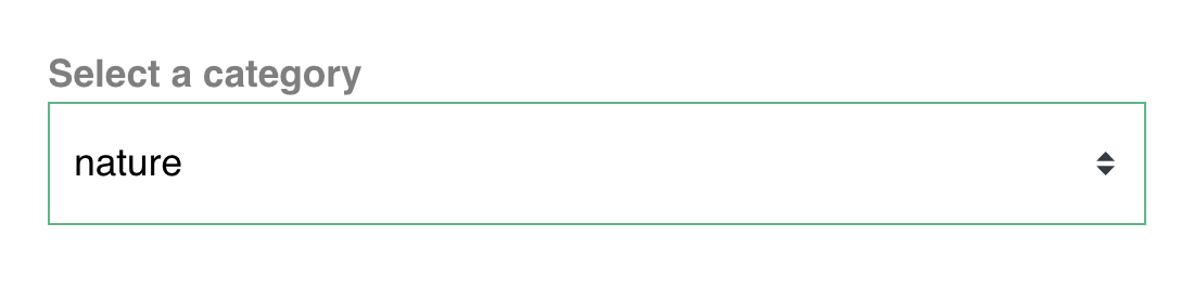
Our BaseSelect component may be used in a form where we need to display an initial value for its selected option. For example, BaseSelect might appear in an edit event form, and we need to pass this component the initial option value of “nature” so it can display that value as the selected option.
To achieve this, we can add the selected attribute to our component’s option element, and within it perform a conditional check to see if the option is equal to the initial value , like so:
src/components/BaseSelect.vue
    <option
      v-for="option in options"
      :value="option"
      :key="option"
      :selected="option === value" <!-- perform conditional check -->
    >{{ option }}</option>
Now, when this component loads, since it received "nature" as the initial value , it will display that as the selected option, like so:
Now our BaseSelect works as its own standalone component that we can use and reuse throughout our app’s forms.
src/components/BaseSelect.vue
    <template>
      <div>
        <label v-if="label">{{ label }}</label>
        <select :value="value"
                @change="updateValue"
                v-bind="$attrs">
          <option v-for="option in options"
                  :value="option"
                  :key="option"
                  :selected="option === value"
                  >
                  {{ option }}
          </option>
        </select>
      </div>
    </template>

    <script>
    export default {
      inheritAttrs: false,
      props: {
        options: {
          type: Array,
          required: true
        },
        value: [String, Number],
        label: String
      },
      methods: {
        updateValue(event) {
          this.$emit('input', event.target.value)
        }
      }
    }
    </script>
Getting more complex
While BaseSelect will work if our options are primitive data types, such as strings or integers, what if our our options were an array of objects? Or what if we needed the ability to select multiple options, not just one?
For more complex selecting components, we recommend exploring vue-multiselect. This is a robust library created and maintained by Core Vue Team Member Damian Dulisz.
Let’s ReVue
In this lesson, we continued learning about base form components and how they can be used throughout your app for a cohesive user experience.
What’s next
In the next lesson, we’ll build our final base form component: BaseButton .
Reusable Form Components: BaseButton
In our previous lessons on Reusable Form Components, we built our BaseInput and BaseSelect components. Now there’s one final form component we’ll learn how to create: a BaseButton . You can use this button component in each of your app’s forms, and we’ll also learn how to make it work for other purposes, outside the context of just forms. So let’s get started.
Creating BaseButton
Currently in our EventCreate.vue file, we are submitting our form with:
src/views/EventCreate.vue
<input type="submit" class="button -fill-gradient" value="Submit"/>
Instead, let’s encapsulate this functionality within a Vue component. We’ll start with some simple code for it’s template
src/components/BaseButton.vue
    <template>
      <button>
        <slot/>
      </button>
    </template>
As you can see, we’re using a button element that has a slot . If slots are unfamiliar to you, check out this lesson we made on the topic. In our parent scope, we’ll pass in “submit” into that slot.
src/views/EventCreate.vue
<BaseButton>Submit</BaseButton>
We can pass in whatever we need to when using this button component. For example, we could slot-in “Send” or “Message” in other parts of our app.
Getting the Button to Work
Now we need to get our BaseButton to submit the form. So I can add type=``"``submit``" on it like so:
src/views/EventCreate.vue
<BaseButton type="submit">Submit</BaseButton>
Now, since our form has <form @submit.prevent="createEvent"> on it, our BaseButton works! It submits our form, which creates our event.
Using BaseButton outside of a Form
While BaseButton now works to submit a form, we need to add to it if we want it to work outside the context of a form. For example, BaseButton could be used to send a message, which might look like:
<BaseButton @click="sendMessage">Message</BaseButton>
Since we’ve added the @click event listener here, we need to share that listener from the parent scope down to the child. The way we can accomplish that is to head into BaseButton and inherit those $listeners on the native button element itself.
src/components/BaseButton.vue
    <template>
      <div>
        <button v-on="$listeners"> <!-- inheriting event listeners -->
          <slot/>
        </button>
      </div>
    </template>
Now we can add dynamic event listeners onto BaseButton , and the native button inside will be able to “hear” those events (such as clicks) when they happen.
Now that our BaseButton should work wherever we need it, let’s think about how we can style it.
Styling BaseButton
Heading down into the style section of BaseButton, we’ll add some local styles.
src/components/BaseButton.vue
    .button {
      display: inline-flex;
      align-items: center;
      justify-content: space-between;
      height: 52px;
      padding: 0 40px;
      background: transparent;
      border: none;
      border-radius: 6px;
      text-align: center;
      font-weight: 600;
      white-space: nowrap;
      transition: all 0.2s linear;
    }
    .button:hover {
      -webkit-transform: scale(1.02);
      transform: scale(1.02);
      box-shadow: 0 7px 17px 0 rgba(0, 0, 0, 0.2), 0 6px 20px 0 rgba(0, 0, 0, 0.19);
    }
    .button:active {
      -webkit-transform: scale(1);
      transform: scale(1);
      box-shadow: none;
    }
    .button:focus {
      outline: 0;
    }
    .button.-fill-gradient {
      background: linear-gradient(to right, #16c0b0, #84cf6a);
      color: #ffffff;
    }
    .button:disabled {
      -webkit-transform: scale(1);
      transform: scale(1);
      box-shadow: none;
      background: #eeeeee;
    }
    .button + .button {
      margin-left: 1em;
    }
    .button.-fill-gray {
      background: rgba(0, 0, 0, 0.5);
      color: #ffffff;
    }
    .button.-size-small {
      height: 32px;
    }
    .button.-icon-right {
      text-align: left;
      padding: 0 20px;
    }
    .button.-icon-right > .icon {
      margin-left: 10px;
    }
    .button.-icon-left {
      text-align: right;
      padding: 0 20px;
    }
    .button.-icon-left > .icon {
      margin-right: 10px;
    }
    .button.-icon-center {
      padding: 0 20px;
    }
Now we have a list of style rule options that we can apply, or not, depending on how BaseButton is being used. We want the .button class to appear no matter what, so we’ll add that class to the native button element.
src/components/BaseButton.vue
    <template>
      <div>
        <button v-on="$listeners" class="button">
          <slot/>
        </button>
      </div>
    </template>
Dynamic Button Styles
Now we need to think about how we can add dynamic styles to our button. You might think that the solution would be to set inheritAttrs to false like we did in our BaseInput lesson, which allowed us to inherit attributes added on the parent scope. So it would make sense that we could just bind those attributes right onto the native button element, like:
However, this isn’t currently how Vue works. As of now, the class and style attributes aren’t available to you on $attrs . However, we can expect that to change in Vue 3.
So if we can’t v-bind to our $attrs , how can we apply a dynamic class to our BaseButton ? We can use props for that.
src/components/BaseButton.vue
    <template>
      <div>
        <button v-on="$listeners" class="button" :class="buttonClass">
          <slot/>
        </button>
      </div>
    </template>
    <script>
    export default {
      props: {
        buttonClass: {
          type: String
        }
      }
    }
    </script>
Now we have a buttonClass prop that we’ve bound to the button . This means we can now pass through class names from the parent scope, like our class of -fill-gradient .
src/views/EventCreate.vue
<BaseButton type="submit" buttonClass="-fill-gradient">Submit</BaseButton>
We still want to Inherit Attributes
Even though class and style aren’t currently available t us in $attrs , we’ll still want to be inheriting attributes because we still want to have the ability to inherit attributes added on the parent scope, such as disabled .
For example:
<BaseButton type="submit" buttonClass="-fill-gradient" disabled>Submit</BaseButton>
So we’ll add the ability to inherit attributes to BaseButton now.
src/components/BaseButton.vue
    <template>
      <div>
        <button v-on="$listeners" v-bind="$attrs" class="button" :class="buttonClass"> <!-- inheriting attributes here -->
          <slot/>
        </button>
      </div>
    </template>
    <script>
    export default {
      inheritAttrs: false, <!-- turns off default inheriting behavior -->
      props: {
        buttonClass: {
          type: String
        }
      }
    }
    </script>
We did it!
Great! Now BaseButton is ready to be used anywhere it’s needed throughout our app.
Here’s the complete code:
src/components/BaseButton.vue
    <template>
      <div>
        <button v-on="$listeners" v-bind="$attrs" class="button" :class="buttonClass">
          <slot/>
        </button>
      </div>
    </template>
    <script>
    export default {
      inheritAttrs: false,
      props: {
        buttonClass: {
          type: String
        }
      }
    }
    </script>
    <style scoped>
    .button {
      display: inline-flex;
      align-items: center;
      justify-content: space-between;
      height: 52px;
      padding: 0 40px;
      background: transparent;
      border: none;
      border-radius: 6px;
      text-align: center;
      font-weight: 600;
      white-space: nowrap;
      transition: all 0.2s linear;
    }
    .button:hover {
      -webkit-transform: scale(1.02);
      transform: scale(1.02);
      box-shadow: 0 7px 17px 0 rgba(0, 0, 0, 0.2), 0 6px 20px 0 rgba(0, 0, 0, 0.19);
    }
    .button:active {
      -webkit-transform: scale(1);
      transform: scale(1);
      box-shadow: none;
    }
    .button:focus {
      outline: 0;
    }
    .button.-fill-gradient {
      background: linear-gradient(to right, #16c0b0, #84cf6a);
      color: #ffffff;
    }
    .button:disabled {
      -webkit-transform: scale(1);
      transform: scale(1);
      box-shadow: none;
      background: #eeeeee;
    }
    .button + .button {
      margin-left: 1em;
    }
    .button.-fill-gray {
      background: rgba(0, 0, 0, 0.5);
      color: #ffffff;
    }
    .button.-size-small {
      height: 32px;
    }
    .button.-icon-right {
      text-align: left;
      padding: 0 20px;
    }
    .button.-icon-right > .icon {
      margin-left: 10px;
    }
    .button.-icon-left {
      text-align: right;
      padding: 0 20px;
    }
    .button.-icon-left > .icon {
      margin-right: 10px;
    }
    .button.-icon-center {
      padding: 0 20px;
    }
    </style>
What’s next?
Now that we’ve built our reusable form components, in the next lesson we’ll start learning how to add validation to our forms, so they can’t be submitted if they’ve been filled out incorrectly.
Form Validation with Vuelidate
A form is only as good as the data it collects from your user. If it’s not collecting what you need, your form isn’t serving its purpose. This is why we need form validation. In this tutorial, we’ll be exploring how to add validation to Vue forms.
Problem
Currently, if a user fills out our EventCreate form, they are able to leave fields blank and still submit the form. We don’t want that to happen. We need to make sure those fields are filled in, and with the right kind of information.
Solution: Vuelidate
While it’s possible to write all of your form validation from scratch, fortunately we don’t need to do that. There are already quality libraries that can help with that, and we’ll be using one of them in this lesson. Vuelidate is a popular and lightweight validation library created by Paweł Grabarz and Damian Dulisz, who is a member of the Vue core team. It’s also quite flexible and can scale with you as your app, and its validation needs, grows.
We’ll install Vuelidate by running this command in our terminal:
npm install vuelidate --save
To get started using it, we’ll head to our main.js file, and import vuelidate here and tell Vue to use it.
src/main.js
    ...
    import Vuelidate from 'vuelidate'

    Vue.use(Vuelidate)
    ...
Now we can use Vuelidate globally throughout our app.
Getting Started with Vuelidate
In the next lesson we’ll look at implementing Vuelidate in our example app’s form (within EventCreate ). But for now, we’re going to get started learning about validation with a simpler example.
Example.vue
    <template>
      <div>
        <input type="email" placeholder="What's your email" v-model="email"/>
        <button type="submit">Submit</button>
      </div>
    </template>

    <script>
    export default {
      data() {
        return {
          email: null
        }
      }
    }
    </script>
As you can see, in the template we have an input to collect a user’s email, which is bound with v-model to this component’s email data.
In order to start validating this, we’ll add a validations option to our component. This option isn’t something provided to us by Vuelidate; it’s just an option we’re adding, which Vuelidate can make use of.
Example.vue
    <script>
    export default {
      data() {
        return {
          email: null
        }
      },
      validations: { <!-- new option here -->
        email: {}
      }
    }
    </script>
Within the validations option, we can write email , which refers to our email data. This allows us to start validating that value. So how do we want to validate it? Well we want it to be required , and we also want to make sure it actually is an email. So we’ll import required and email from Vuelidate. These are built-in Vuelidate validators. The email validator contains a regular expression that makes sure the input value is an actual email.
Now let’s add those validators to our validations option within the email property.
Example.vue
    <template>
      <div>
        <input type="email" placeholder="What's your email" v-model="email"/>
        <button type="submit">Submit!</button>
      </div>
    </template>

    <script>
    import { required, email } from 'vuelidate/lib/validators'

    export default {
      data() {
        return {
          email: null
        }
      },
      validations: {
        email: {
          required,
          email
        }
      }
    }
    </script>
Checking the Browser
Now let’s check this out in the browser, and look at the Vue DevTools. We can see that Vuelidate has added a computed property called $v . If we look inside, we’ll see it contains the current state of our validations. What we’re really concerned about here is the email object since that contains the state of our email validations.
So let’s open that up:
Inside, we can see that $invalid is true . That’s because Vuelidate has already started validating our form. If we look at required we’ll see that it’s false . We want that to be true , but since there’s currently nothing input in our email field, required will be false until the field contains a value.
We can also see the value of email is true . That’s because no one has typed into the email field, so Vuelidate has nothing to check its regular expression against to determine if the input value is an email or not. Let’s start typing into the input and watch what happens.
If I type “adam”, required turns true since we now have a value in the field, but email has turned false , as it should since the string “adam” is not a valid email. Because our email is not valid, our $invalid state is true .
But if I continue typing and write “adam@gmail.com” our validation states will change.
email is now true since I’ve typed a valid email, and since the field is not blank, required is also true . With no invalid states, $invalid is now false .
Perfect. We’re starting to understand how and when Vuelidate is validating our form. But when these state changes are happening, and there’s problems with our form, we aren’t letting our user know. So let’s start displaying messages that alert the user when the form is invalid.
Letting Our User Know
By checking $v.email.email we can access a boolean for whether the input value is an actual email or not. If it’s not an email (e.g. false ), we can display an error, telling the user to enter a valid email.
Example.vue
<p v-if="!$v.email.email">Please enter a valid email address.</p>
Since this is a required field, we also can’t have the user leaving this blank. We can use $v.email.$required to display an error message when the field is left blank, with this v-if :
Example.vue
<p v-if="!$v.email.required">Email is required.</p>
Notice how in both of these v-if directives, we’re using ! . In other words, we’re saying if there is not a valid email or there is not any value input, we’ll display these error messages.
Now let’s check this out in the browser.
When this component first loads, we immediately see the “Email is required” message because $v.email.required is false . So far so good. What happens when we start typing?
As I type “adam”, the “Email is required” message goes away since $v.email.required turned true and “Please enter a valid email” shows up since $v.email.email is now false .
If I keep typing out a complete email, “Please enter a valid email” goes away and $invalid turns false . If I delete everything I just typed, I’ll get “Email is required” again since that will have caused $v.email.required to be false again.
Great. We’re now effectively displaying errors to our user when there’s problems on our form. But it’s not a great user experience to be displaying the ”Email is required” error message automatically. Imagine if our form had 12 fields and each one was displaying an obnoxious ”___________ is required” message. If I found a form like that, I’d be like give me a chance to fill this out before telling me I’ve done something wrong.
So we can hide that ”Email is required” error message until something happens. What do we want to happen before we display that message? Well, we can give the user a chance to fill it out before telling them it’s required. In other words, if a user touches the form then clicks away, we can let them know that it’s required.
Fortunately, there’s a name for that: When a user focuses on an element and then focuses away from it. It’s called blur . So we can listen for the blur event on our input.
Example.vue
    <input
      type="email"
      placeholder="What's your email"
      v-model.trim="email" <!-- trimming off any whitespace -->
      @blur="??" <!-- listening for blur events, but then what? -->
    >
So the question now is: What do we want to trigger when the blur event happens?
The way Vuelidate works, validations are run on each change, as we observed earlier. But in order for the $error state to be true , a field needs to be both $dirty and $invalid . So we need to be triggering the $dirty state to be true after a user has interacted with the field so that we can make this field have an $error . We then can use that $error state to our advantage, as we’ll see in a minute.
But what does it mean for a field to be $dirty ? That term just means the field has been interacted with, or in other words: touched. We can imagine that once it’s been clicked on or input into, that it’s now dirty with the fingerprint of our user. So in order to change the state of this field to $dirty , we can trigger Vuelidate’s touch method on blur , like so:
Example.vue
    <input
      type="email"
      placeholder="What's your email"
      v-model.trim="email"
      @blur="$v.email.$touch()" <!-- triggering the $dirty state on blur -->
    >
Now once a user has focused on this input, then focused away from it, the $dirty state will be true, and if the field is also blank, then $v.email.required will be false , which means the field is $invalid . Again, the way Vuelidate works, if a field is both $dirty and $invalid then that means there is an $error .
So now we can use this $error state to our advantage. We can wrap our error messages in a div, and only display that div once it is true that there is an $error on this field.
Example.vue
    <div v-if="$v.email.$error"> <!-- hides messages until field has error -->
      <p class="errorMessage" v-if="!$v.email.email">Please enter a valid email address.</p>
      <p class="errorMessage" v-if="!$v.email.required">Email is required.</p>
    </div>
Great. Now when this component first loads, our error messages will be hidden until an $error occurs, which means the user has actually touch ed the field and left it blank, or input an incorrect value.
Error Styling
To improve our user interface and clarify where errors are occurring, we can add some error-based styling.
Let’s add a class of errorMessage to our error messages, which will color them red.
    <div v-if="$v.email.$error">
      <p v-if="!$v.email.email" class="errorMessage">Please enter a valid email address.</p>
      <p v-if="!$v.email.$error" class="errorMessage">Email is required.</p>
    </div>
It would be even more clear for our users where an error is if an error-ridden input field also appeared red. We can achieve that by binding an error class to our input element whenever there is an error associated with that field.
Example.vue
    <input
      type="email"
      placeholder="What's your email"
      :class="{ error: $v.email.$error }" <!-- added error class binding -->
      v-model="email"
      @blur="$v.email.$touch()"
    >
With :class="{ error: $v.email.$error }``" , our class of error will be applied whenever that field contains validation errors. error is simply a global style that adds a red border around the input element.
By the way, error and errorMessage are both global classes.
Disabling Our Button
If our form does have any errors, we probably don’t want our user being able to click our submit button. So let’s disable that whenever the form is invalid.
If we open the Vue DevTools again in the browser, and take a look higher up in our $v computed property, we’ll see there are some more validation states we can make use of for this purpose.
$v.$invalid will be true whenever there are any errors associated with our validations. So we’ll apply the disabled attribute to the button whenever that’s the case.
<button type="submit" :disabled="$v.$invalid">Submit</button>
Below the button, let’s also display a message when the form needs more work, by using the $anyError state, like this:
Example.vue
<p v-if="$v.$anyError" class="errorMessage">Please fill out the required field(s).</p>
Now if the form has errors, the button will be disabled, and the user will be told to fill out the required fields, which should be outlined in red and accompanied by their respective red error messages.
Validating Upon Submit
A common way to validate forms is to check their validity before submission. You can accomplish this easily by checking for the $invalid state before submitting the form.
So we change out the div wrapping this component for a form element, and add @submit.prevent="submit" on the opening tag.
Example.vue
    <template>
      <form @submit.prevent="submit">
        <input
          type="email"
          placeholder="What's your email"
          v-model="email"
          :class="{ error: $v.email.$error }"
          @blur="$v.email.$touch()"
        >
        <div v-if="$v.email.$error">
          <p v-if="!$v.email.email" class="errorMessage">Please enter a valid email</p>
          <p v-if="!$v.email.required" class="errorMessage">Email is required</p>
        </div>
        <button :disabled="$v.$invalid" type="submit">Submit</button>
        <p v-if="$v.$anyError" class="errorMessage">Please fill out the required fields</p>
      </form>
    </template>
Now let’s add a submit method to this example component.
Example.vue
    methods: {
      submit() {
        this.$v.$touch()
        if (!this.$v.$invalid) {
          console.log('Form Submission:', this.email)
        }
      }
    }
Inside here, we’re calling $touch() again, which will change the $dirty status on all form validations, causing $error to be true for all $invalid fields.
If our form is valid ( !this.$v.$invalid ), we’ll submit the form. In our example’s case, we’re just logging the email to the console.
Awesome! It works. Here is the code in its entirety:
Example.vue
    <template>
      <form @submit.prevent="submit">
        <input
          type="email"
          placeholder="What's your email"
          :class="{ error: $v.email.$error }"
          v-model.trim="email"
          @blur="$v.email.$touch()"
        >
          <p v-if="!$v.email.email" class="errorMessage">Please enter a valid email address.</p>
          <p v-if="!$v.email.required" class="errorMessage">Email is required.</p>

        <button type="submit" :disabled="$v.$invalid">Submit!</button>
      </form>

    </template>
    <script>
    import { required, email } from 'vuelidate/lib/validators'
    export default {
      data() {
        return {
          email: null
        }
      },
      validations: {
        email: {
          required,
          email
        }
      },
      methods: {
        submit() {
          this.$v.$touch()
          if (!this.$v.$invalid) {
            console.log('Form Submission:', this.email)
          }
        }
      }
    }
    </script>
More than one way to skin this cat 
With this introduction to validating our forms with Vuelidate, you should now feel comfortable starting to use this helpful library for your use cases. The solution demonstrated in this lesson is one of many implementations that are available to you with this flexible library. Additionally, you are not limited to the built-in validators that Vuelidate provides for you. You can also write your own custom validators.
What’s next?
In the next lesson, we’ll look at adding Vuelidate validations to our reusable form components.